


Copperplate Gothic: A Passage in Time
This project was conceived not merely as a typographic manual, but as a time machine. It is a book about the past, crafted from the materials of the past, designed to house a typeface that remains strikingly timeless in the modern world: Copperplate Gothic.
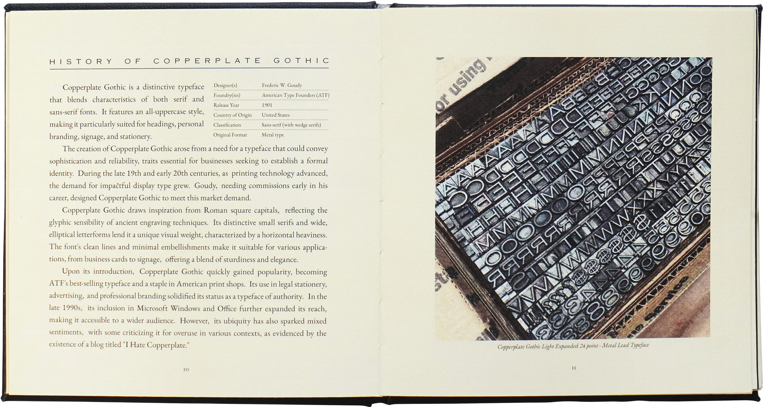
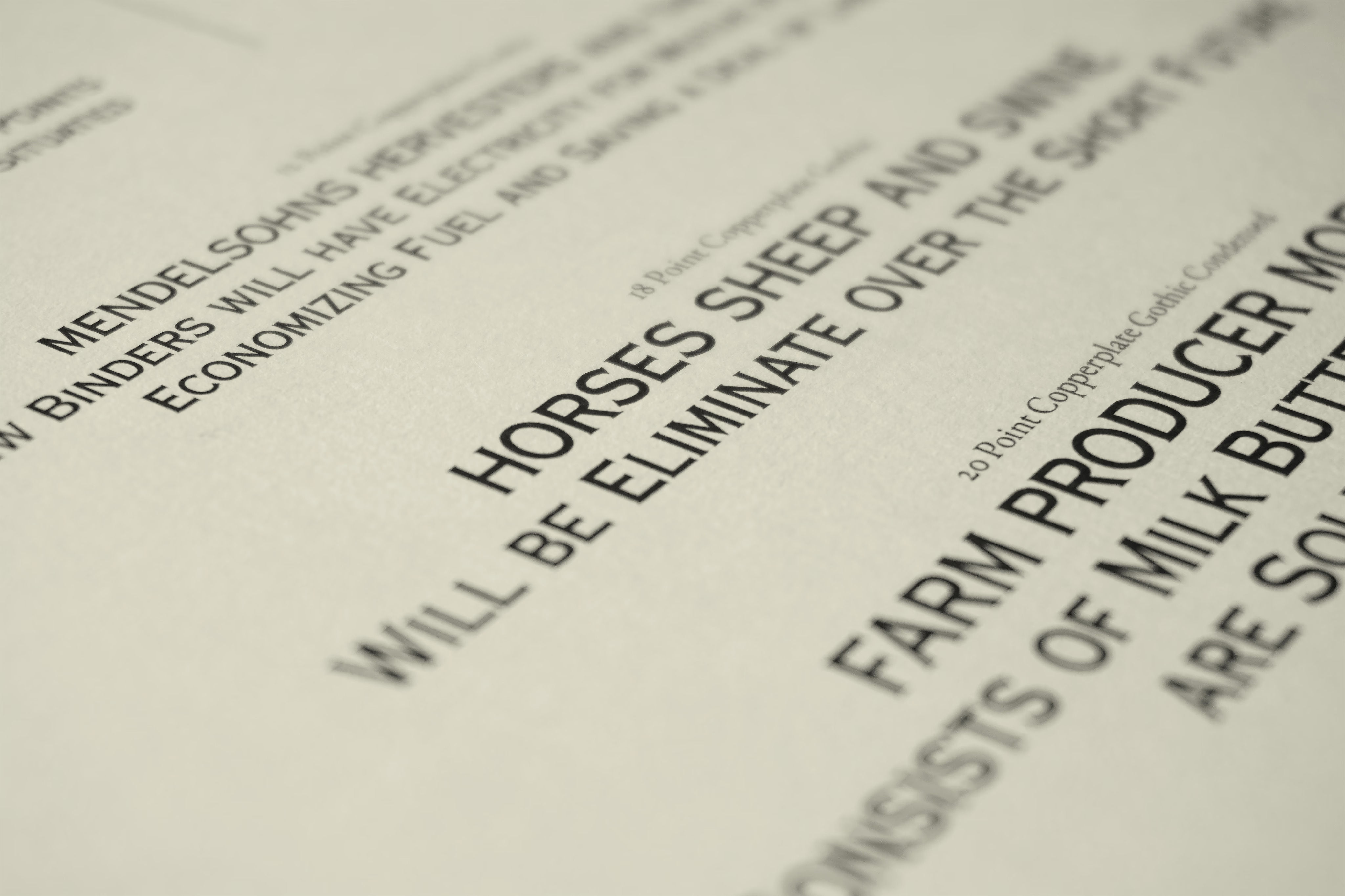
Originally designed by Frederic W. Goudy in 1901, Copperplate Gothic is a typeface with a heavy industrial legacy. For this university Typography course project, the objective was to explore the history, anatomy, and application of the font. However, as a designer who naturally leans towards the clean, Swiss-style modernism of Helvetica, being assigned a rigid, historic typeface initially felt like a limitation. I chose to turn this challenge into a defining feature of the project. Instead of forcing the typeface into a contemporary grid, I decided to let the design transport the reader back to the early 20th century.
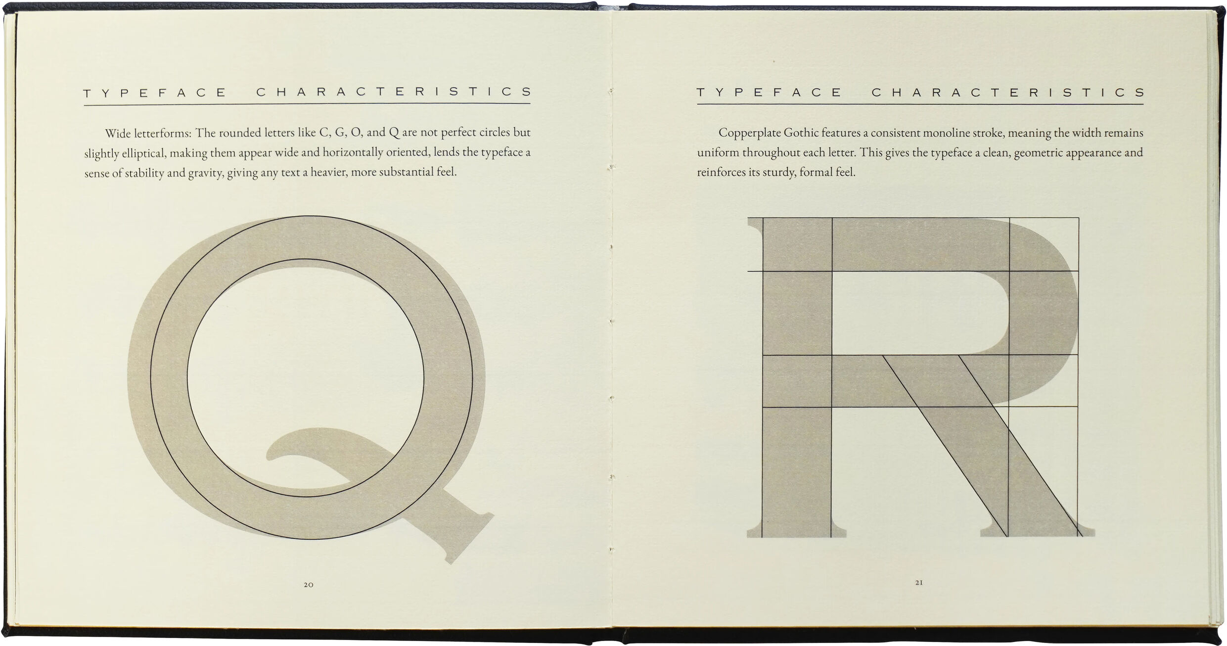
Research into the ATF archives and vintage newspapers informed the layout. The visual language mimics the print media of the 1900s, utilizing a symmetrical, column-based structure, drop caps, and specific typographic quirks – such as slightly embossed capital letters – to simulate the physical “bite” of metal type into paper. To complement the sharp, industrial serifs of Copperplate Gothic, Garamond was selected for the body text, providing a refined and classic historical context.
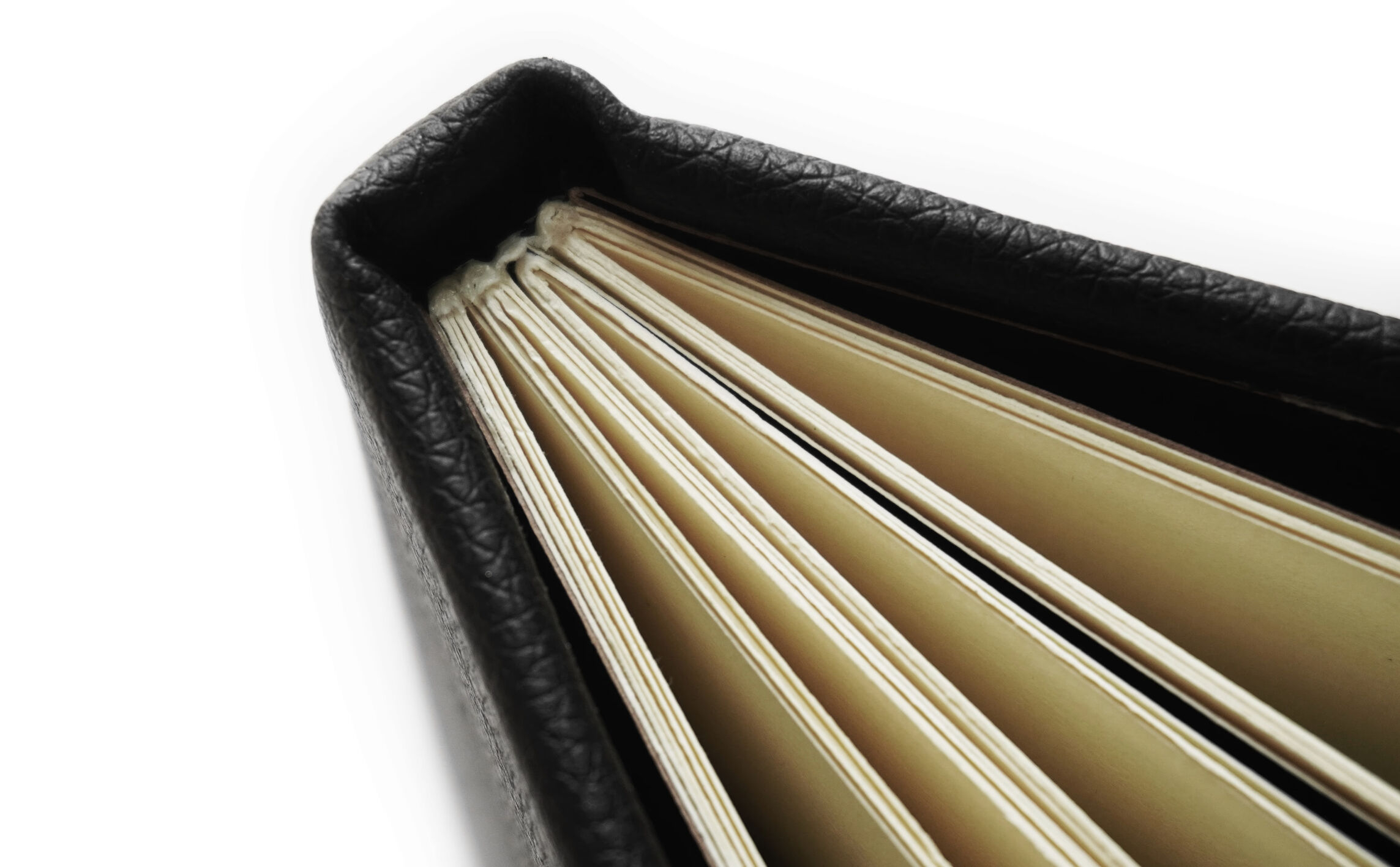
In an increasingly digital design landscape, this project prioritizes materiality and the tactile experience. The goal was to create an object that felt as if it had been pulled from a dusty library shelf in 1905. The production involved sourcing yellow-tinted, textured paper to replicate aged stock. The cover is handcrafted using faux leather and chipboard, utilizing traditional bookbinding techniques to achieve a hardbound finish.
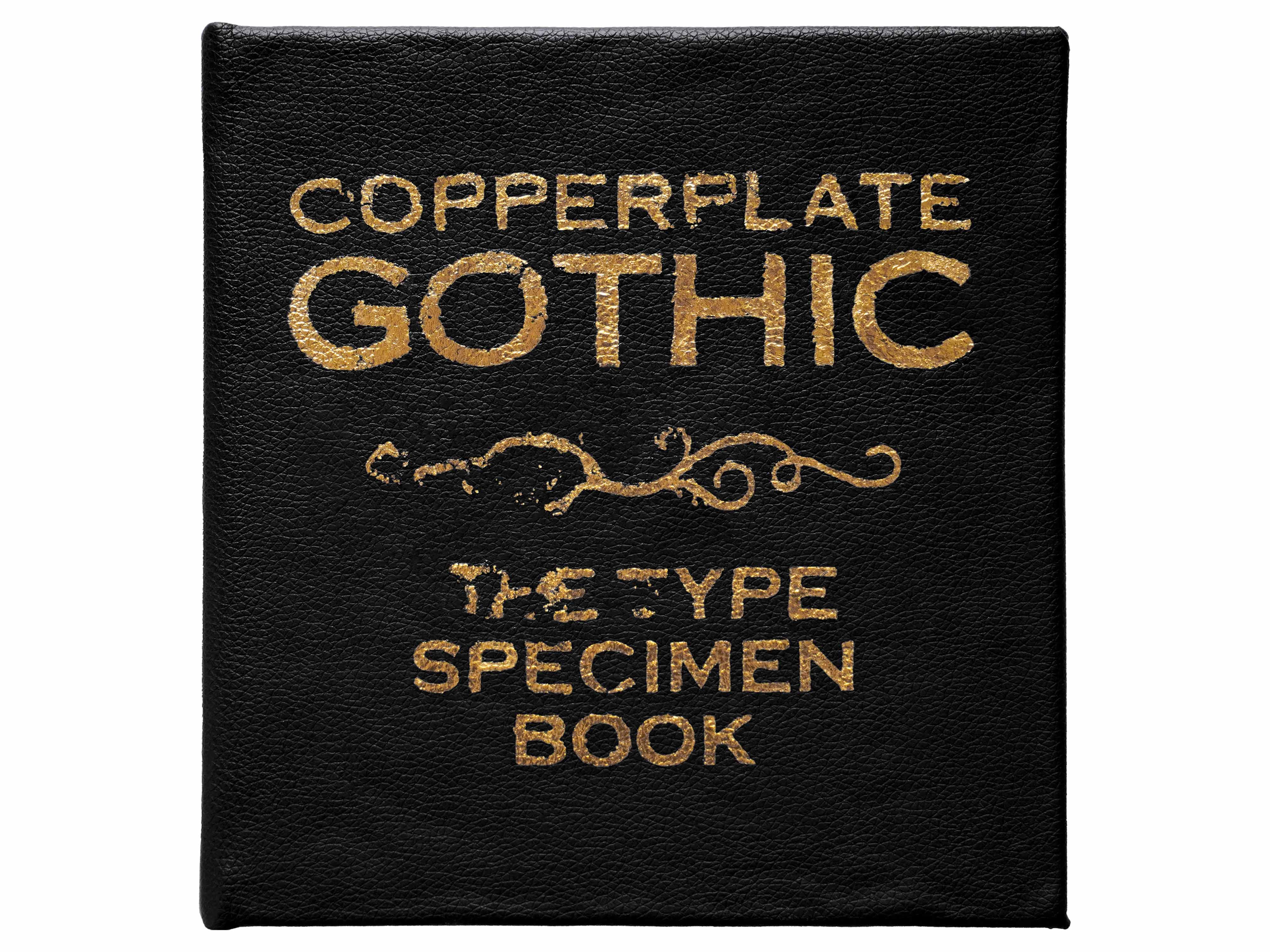
A defining feature of the book is the gold foiling on the cover. Due to the limitations of a student production run, traditional hot stamping was unavailable. I improvised by using a hand-gilding technique with a decal stencil and adhesive. The process was difficult, and the result produced a slightly imperfect, weathered texture to the gold lettering. Rather than a flaw, this “happy accident” enhanced the concept, making the book appear genuinely worn by time and human hands.
CREDIT
- Agency/Creative: Thuan Ngo
- Article Title: Thuan Ngo Presents a Timeless Typographic Journey with Copperplate Gothic
- Organisation/Entity: Student
- Project Type: Typography
- Project Status: Published
- Agency/Creative Country: Vietnam
- Agency/Creative City: Ho Chi Minh City
- Market Region: Global
- Project Deliverables: Editorial Design
- Industry: Education
- Keywords: copperplate gothic typeface
-
Credits:
Graphic Designer: Ngô Đăng Thuận


