Sophia Georgopoulou | Design – Anastopoulos Estate
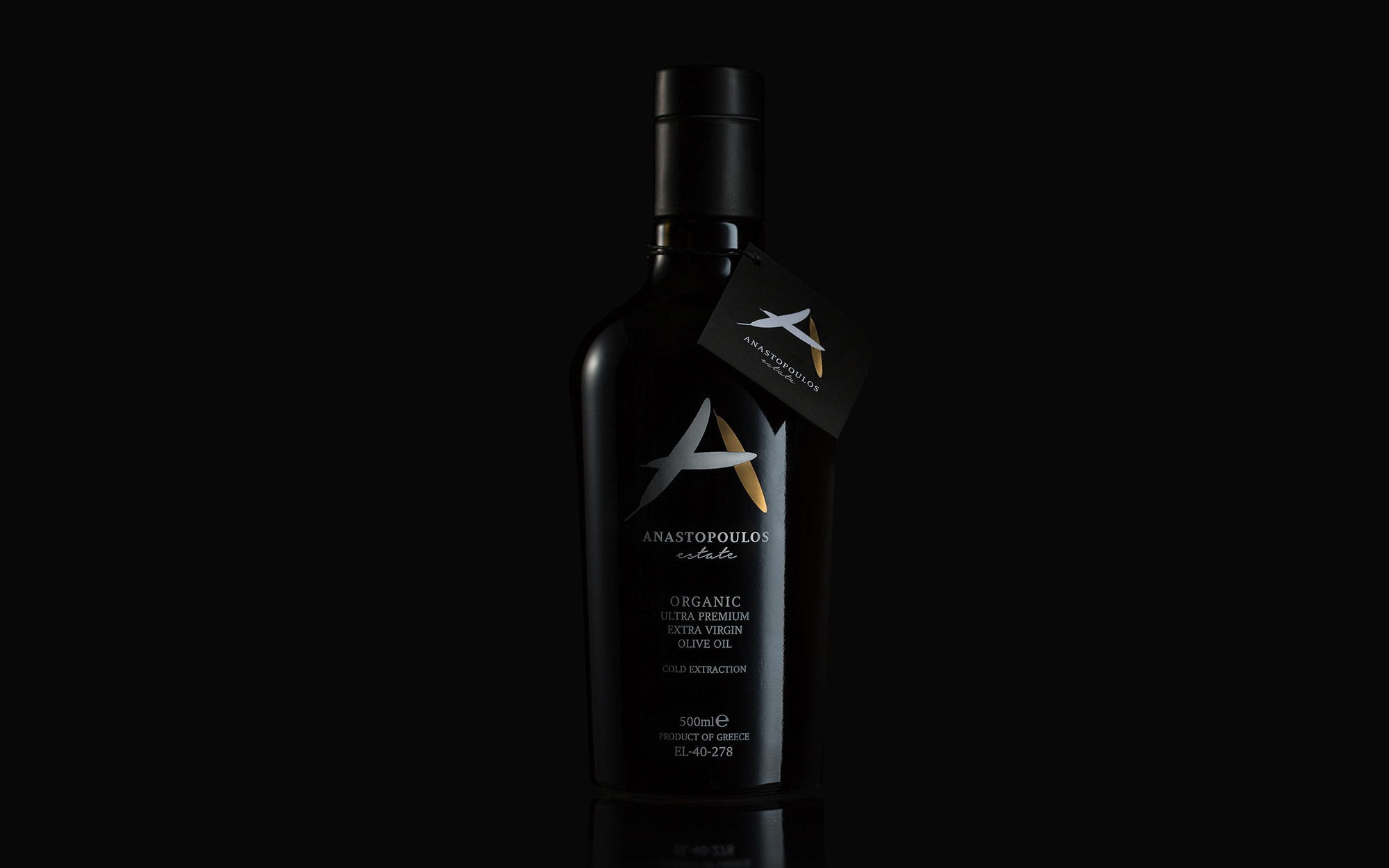
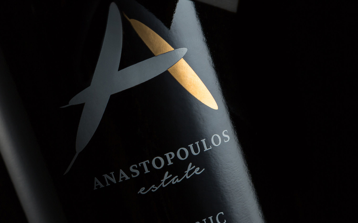
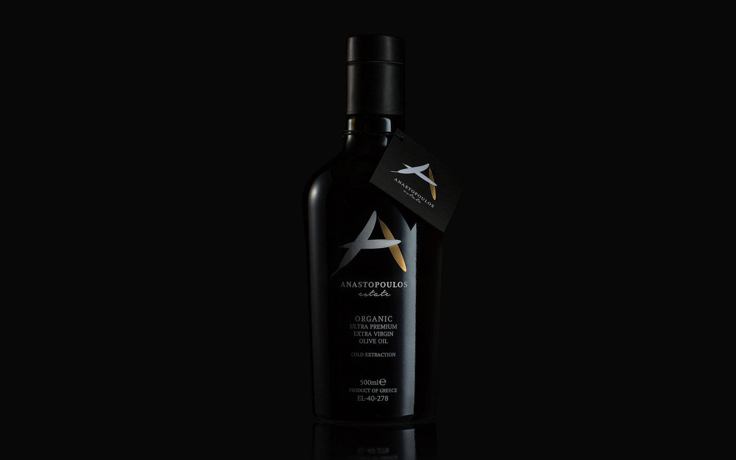
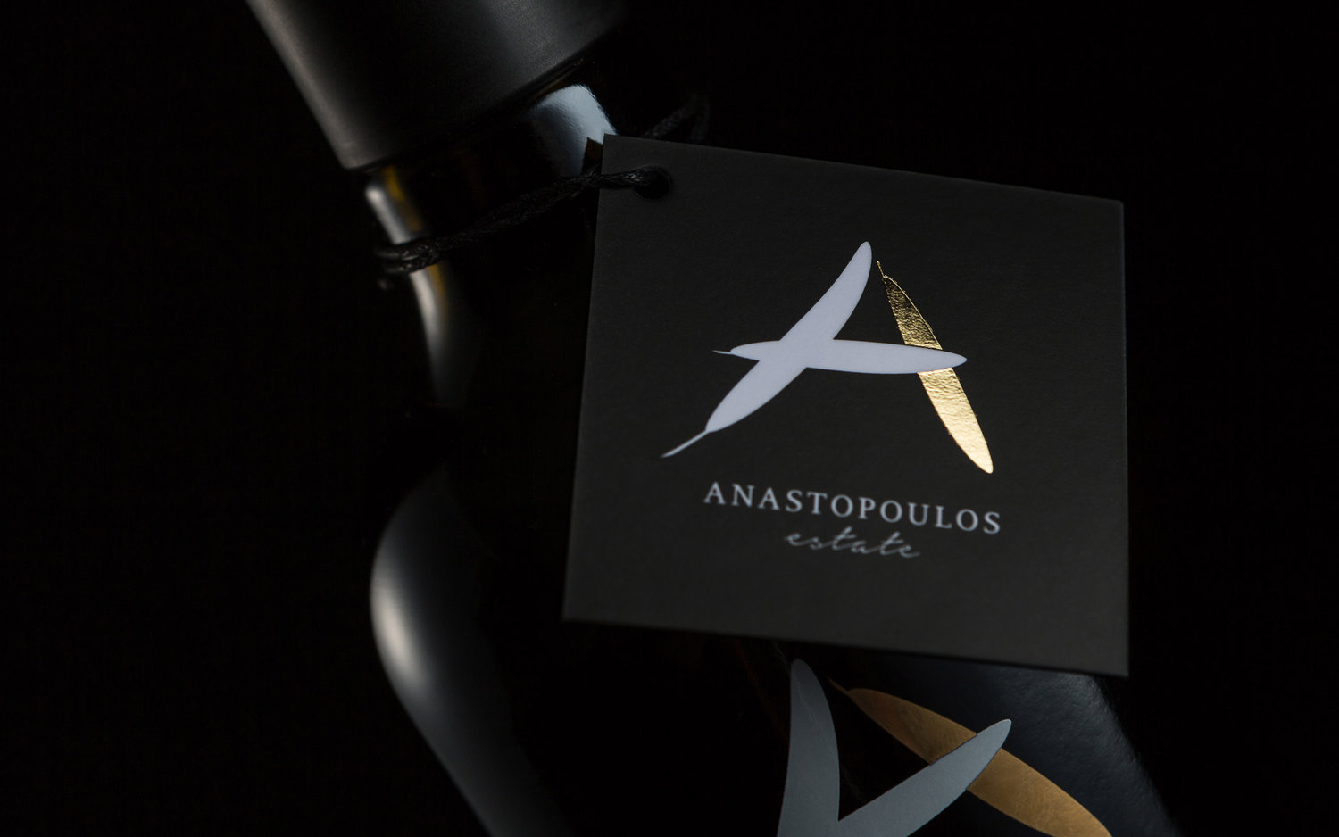
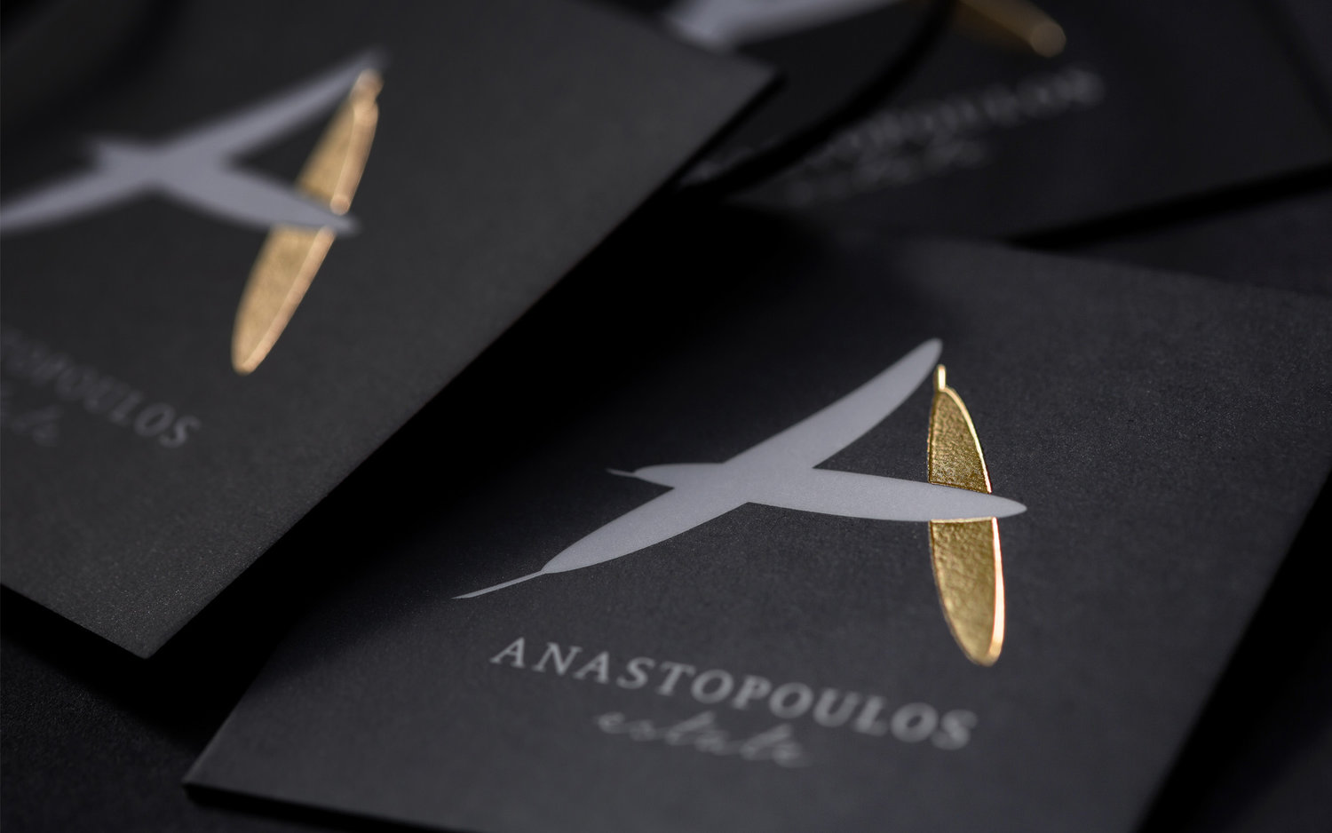
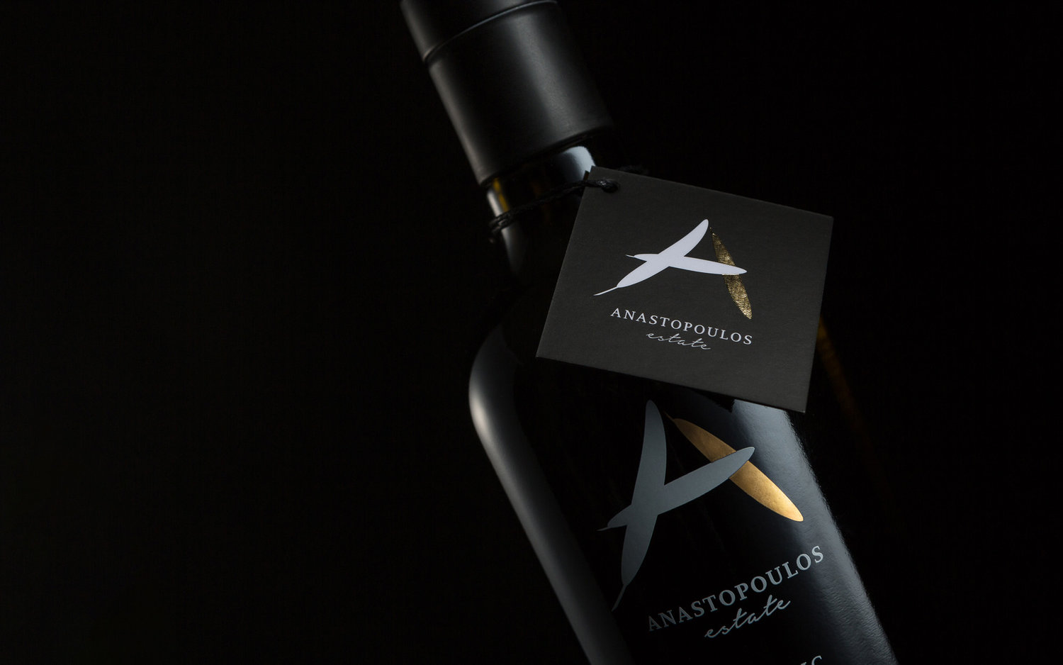
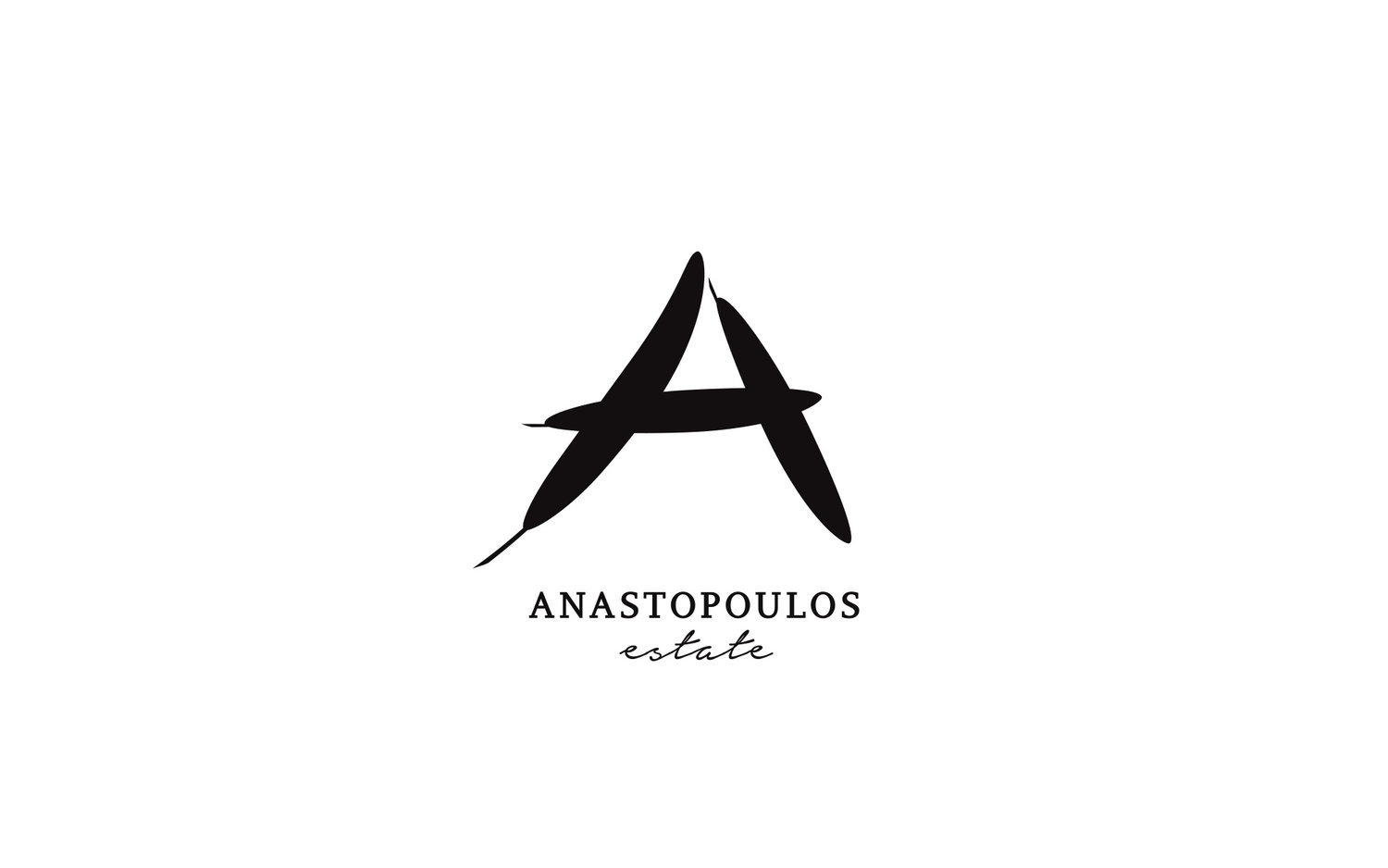
BRIEFDuring recent years, Greek Olive Oil has witnessed an intense activity especially from brands that target the Export Market. Anastopoulos Estate was such a brand, producing premium quality extra virgin olive oil and looking outside of Greece for growth. The challenge was to establish itself against a multitude of well-known as well as up-and coming brands – not only from Greece, but from places all over the Globe. In this effort, the brand’s logo and visual language were called to play a key role.TARGET GROUPHigh-end consumers of Olive Oil, in export markets outside Greece exclusively.CREATIVE CONCEPTThe brand’s needs called for a differentiated identity that at the same time would stay true to what the product itself was all about – pure, of superior quality and ultimately precious. In line with these imperatives, it was decided to go for a minimalistic aesthetic that would provide a solid starting point for the brand’s message.DESIGN APPROACHThe well-recognized elongated shape of the Olive tree leaves was chosen to create the logo – three leaves overlapping in such a way so as to create the initial of the brand – a big, clear ‘A’. One of the three leaves was golden, a clear marker of superior quality. A script typeface was added for the word ‘Estate’ hinting at something personal, artisanal and of smaller quantity. The bottle chosen – black and reminiscent of a wine bottle- added more nuances of preciousness, a takeout further enhanced by the seal-like carton placed at the neck of the bottle.SERVICESLogo, branding, packaging

CREDIT
- Agency/Creative: Sophia Georgopoulou | Design
- Article Title: Three Leaves, One Message that Stays
- Organisation/Entity: Freelance, Published Commercial Design
- Project Type: Packaging
- Agency/Creative Country: Greece
- Market Region: Multiple Regions
- Format: Bottle
- Substrate: Glass


