


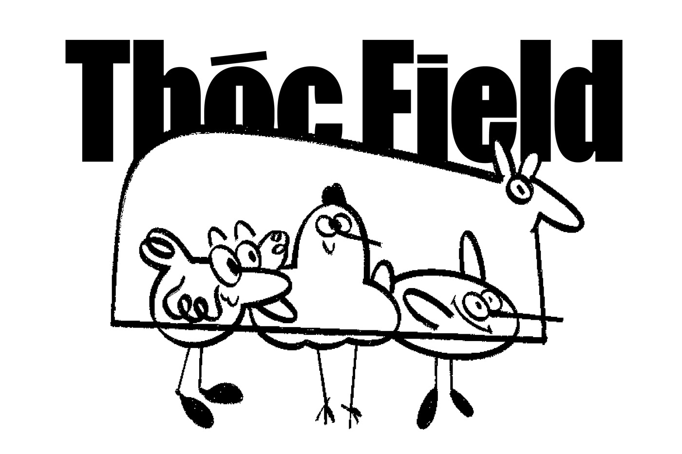
Thóc Field is an open space that provides creative workshops for designers and those who want to become graphic designers to focus on liberating the potential in each individual, through specialized knowledge and designed experimental exercises. Thóc Field believes that each of us has areas of outstanding potential and that is the foundation for nurturing long-term passion. Therefore, Thóc Field was born to accompany you on that journey. Based on our premise, “Every Pixel Matters” concept was formed and developed into an identity system with a spirit of experimentation and discovery.
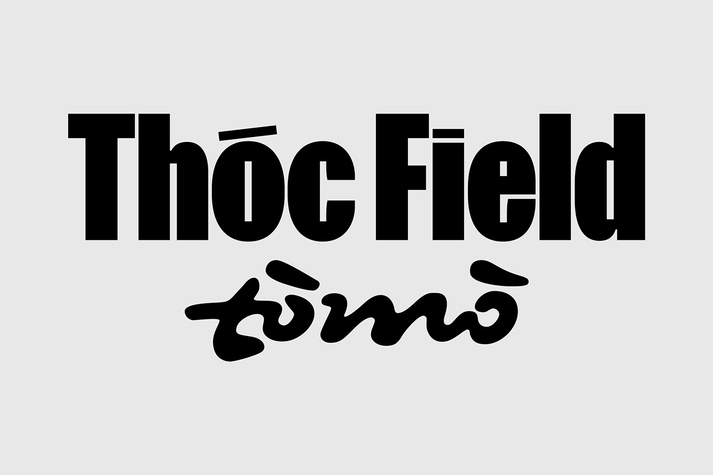
Thóc Field logo brings a feeling of solidity and reliability, as a foundation to encourage participants to express themselves freely. The negative spaces of the characters are customized into square pixels to align with the brand’s visual concept.
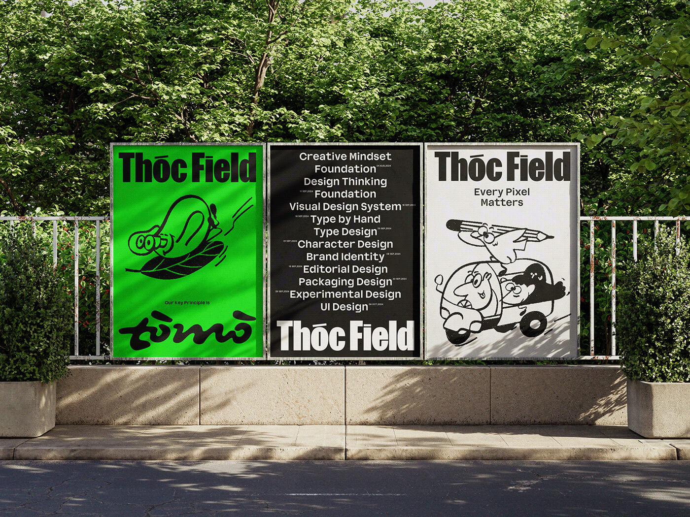
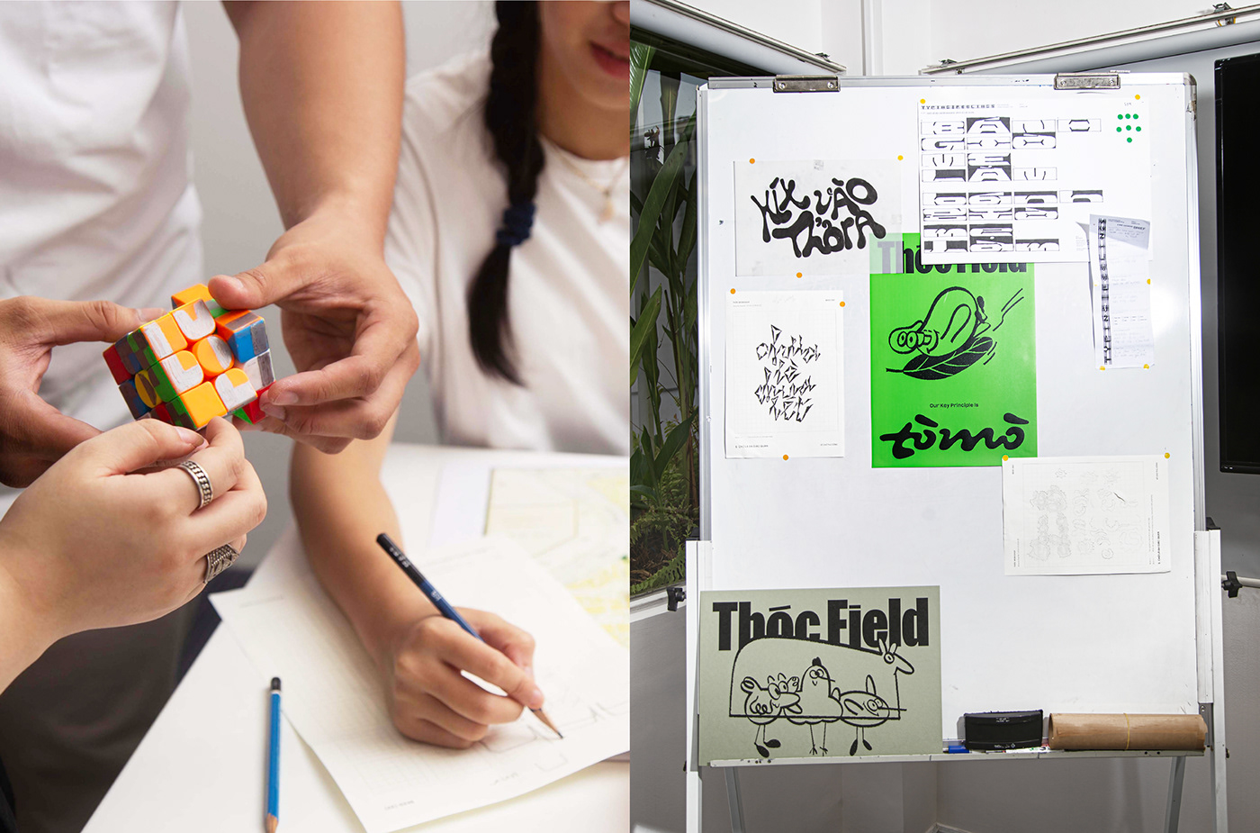
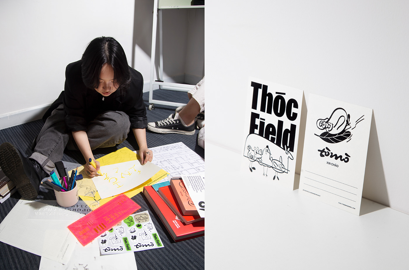
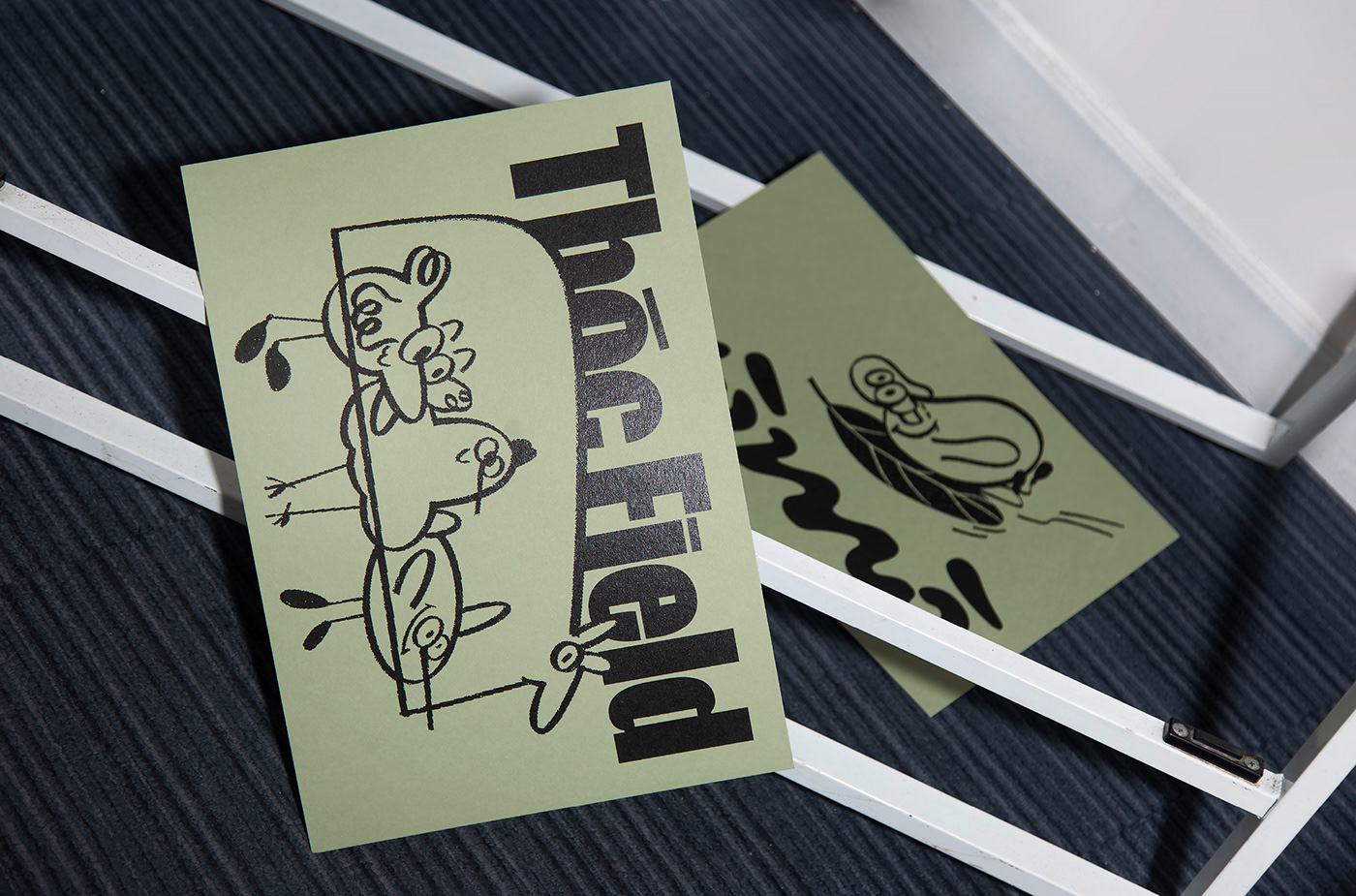
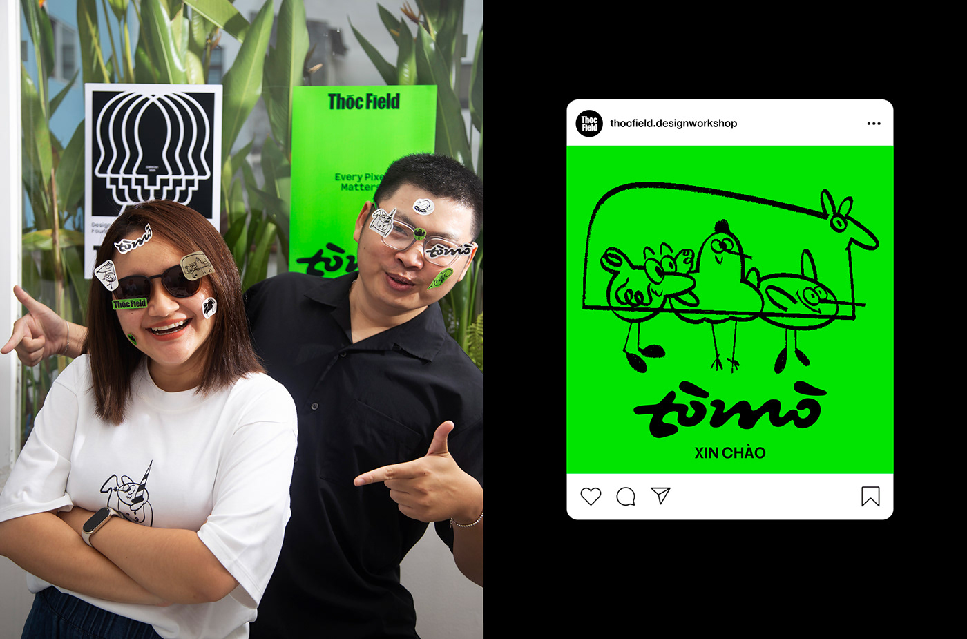
Besides, Tò Mò (which means Curiosity) is the key principle expressed in every part of Thóc Field driven by the motivation of curiosity about everything in the world from learning, connecting, and experimenting. That’s why the lettering “Tò Mò” was created is full of experimentation.
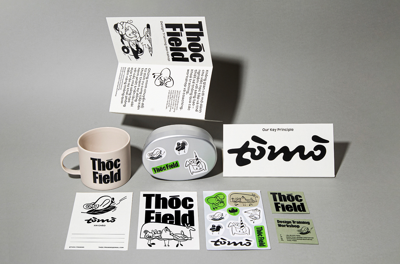
In addition to being a key principle, Tò Mò is the name of Thóc Field’s mascot. The content of the character Tò Mò is built around some classic games that require harmony between logic and creativity. Above all, the design of the character Tò Mò also creates the effect of curiosity. It is an abstract image that each person imagines about this character. In addition to curiosity, this character also has some other personalities such as: diligent, eager to learn, humorous, clumsy,… This helps Thóc Field create feelings of fun, connection, and inspiration. Everyone can be themselves and join in exciting experimental activities.
Illustration of the brand identity is also developed from the concept of “Every Pixel Matters”, through pixelation of sketches. Illustrations create a modern, contemporary feel but are still based on the core foundation of creativity. Combining these two techniques simultaneously creates an outstanding identity for Thóc Field.
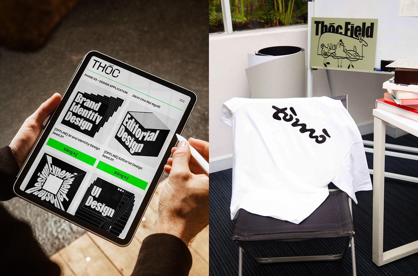
The posters of the workshops still align with the overall concept of Thóc Field. Still, the designs are approached more logically through the metaphor that each individual is a pixel in the creative industry, and the potential of each pixel is limitless. From a single pixel, there are many ways to experiment to adapt to each workshop poster.
CREDIT
- Agency/Creative: Thóc Field
- Article Title: Thóc Field Brand Identity for Design Training Workshop
- Organisation/Entity: In-House
- Project Type: Identity
- Project Status: Published
- Agency/Creative Country: Vietnam
- Agency/Creative City: Ho Chi Minh City
- Market Region: Asia
- Project Deliverables: Brand Identity, Graphic Design, Illustration, Typography
- Industry: Education
- Keywords: Design Traning Workshop, Education, Curiousity
-
Credits:
Art Director & Graphic Designer:: Minh Thống
Illustration Artist:: Astro
Lettering Artist:: Lan Anh Ng
Photographer:: Geno Korner
Motion Designer:: Quỳnh Như
Organizer:: Tú Uyên
Typeface:: FK Screamer by Florian Karsten
Typeface:: BD Fauxtronic by Đinh Hải
Model:: Trần Khánh, Kris Tran, Huy Trần, Tú Uyên, Astro


