


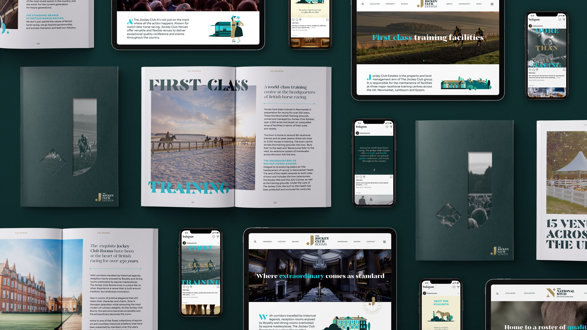
The Jockey Club is one of the largest sports businesses operating in the UK today. They run 15 of the country’s leading racecourses across 14 unique locations, and they have several other owned businesses within their portfolio that span hospitality, breeding and training.
Following a strategic decision to create marquee brands for the business’s three flagship events (The Grand National, Cheltenham Festival and The Derby), we needed to create a brand that would power these experiences, grow audiences and commercial partners across the sport, and change perceptions of the business itself.
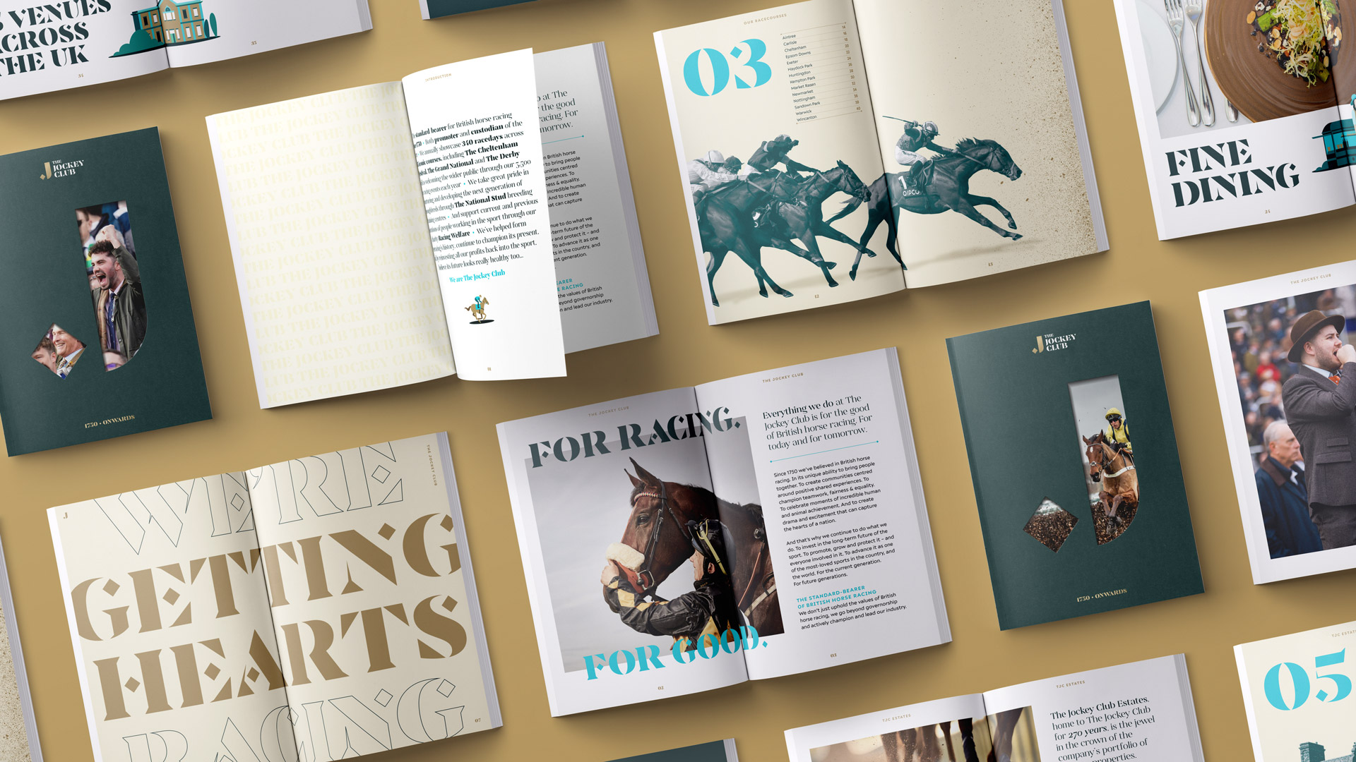
With a history dating back to 1750, The Jockey Club has played a huge role in developing British horse racing. Today, under the governance of its Royal Charter, it invests all the profit it makes back into the sport. But these stories weren’t being communicated well to a wider audience.
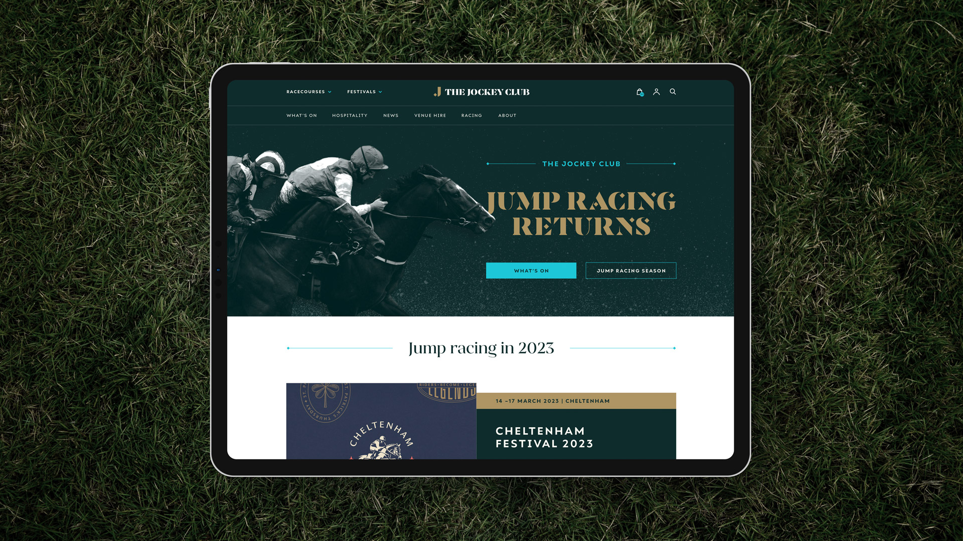
The brand needed some strategic clarity to identify where it sits in the high octane world of sport, and needed to tell The Jockey Club story in a more compelling way that would engage new audiences. The visual identity was also feeling dated, lacking distinctive assets and not flexible enough for the digital world, making it more difficult to attract new and younger demographics.
Having got to grips with the business strategy, we saw an opportunity to build a brand promise and purpose that allowed The Jockey Club to retain the integrity of being a custodian of the sport, whilst also moving beyond that and positioning the brand as the most important promoter and advocate of horse racing.
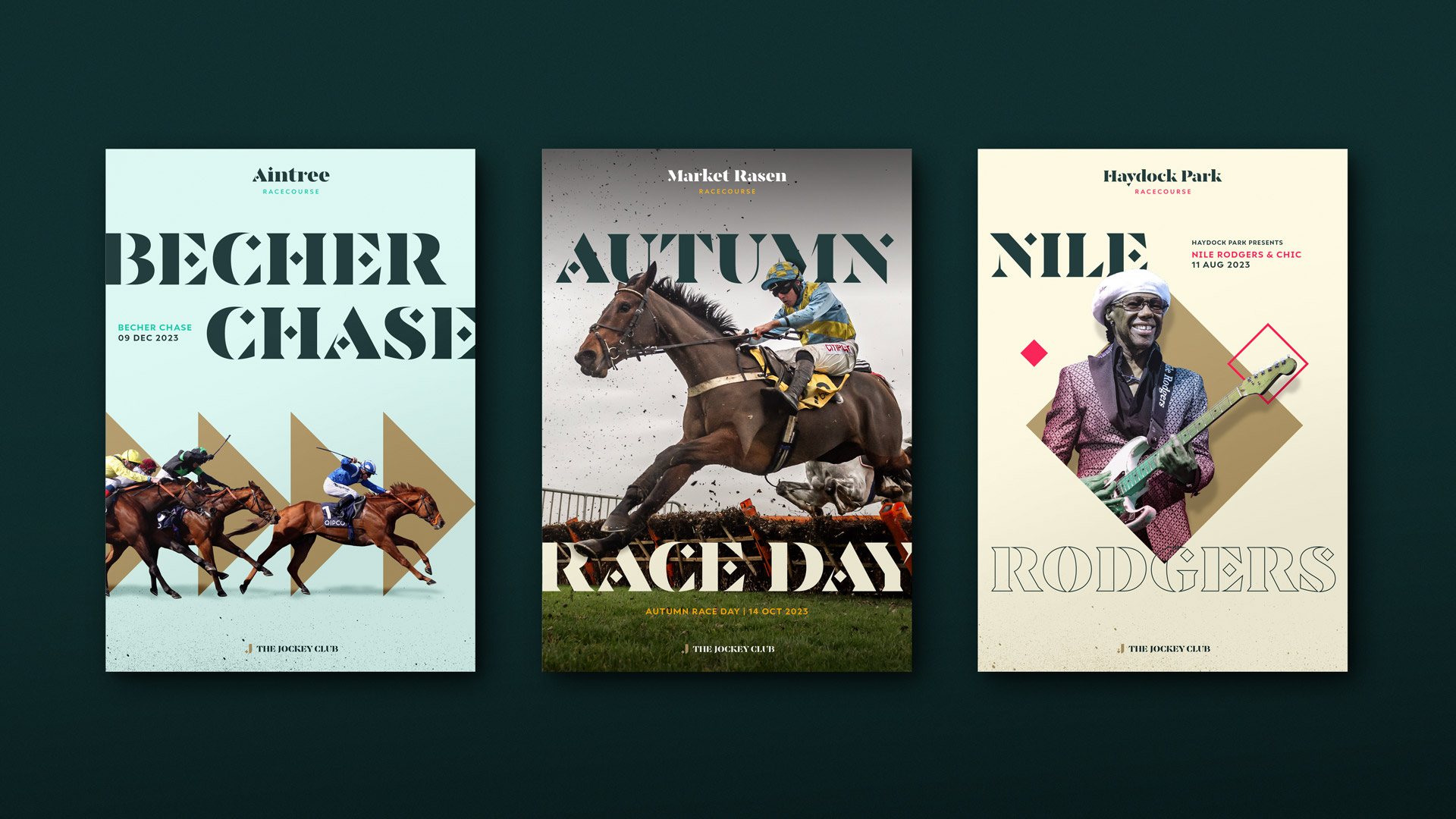
This enabled the brand to take on the role of an ‘endorser’ and to power the business’s three marquee events, selling the experience of attending them and putting the customer experience first. We also wanted to recognise the role of all of their racecourses and what makes them unique, building value in each one.
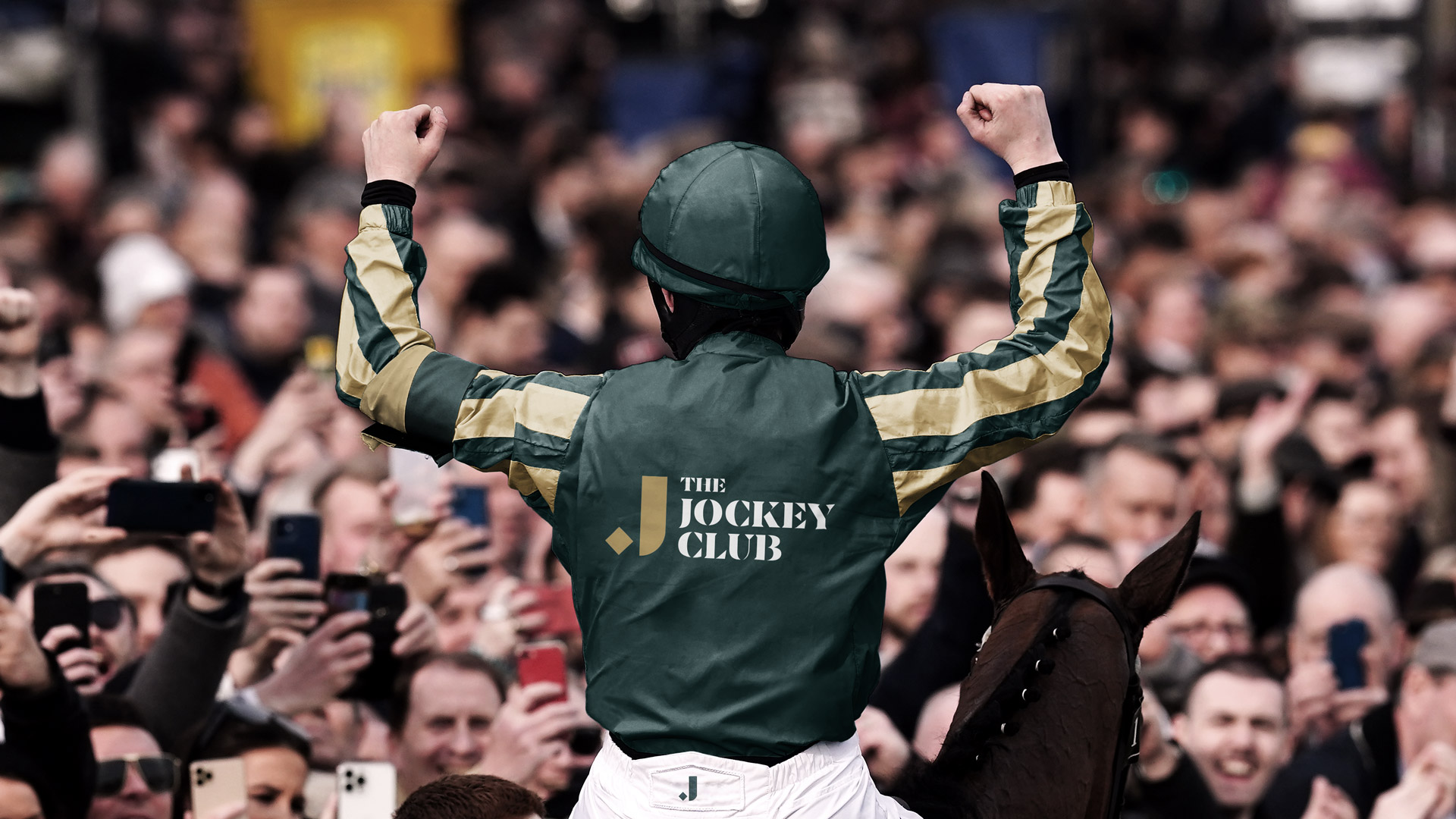
The universal truth at the heart of the sport is the excitement of watching a race. The athleticism and beauty of horse and jockey in tandem, paired with the energy and excitement of being amongst a crowd is an experience unlike any other. With this in mind, we developed a brand platform around the idea of ‘Getting Hearts Racing’.
To support this idea and promote the brands not-for-profit position, we developed the clear brand purpose of ‘For Racing. For Good.’ This clearly defines the intention of acting in the best interests of the sport, whilst also positioning The Jockey Club as the standard-bearer for British horse racing, now and in the future.
The previous brand identity had a very homogenized feel, and relied heavily on the use of diamonds derived from the previous brand logo. Due to the prolific use of the diamond across the 15 racecourses, we wanted to acknowledge its previous role without it being the main focus of the identity.
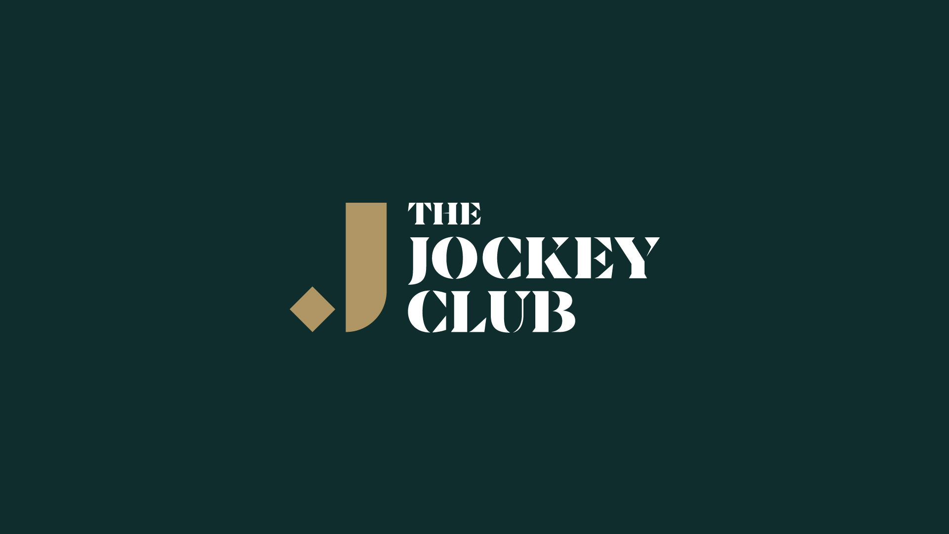
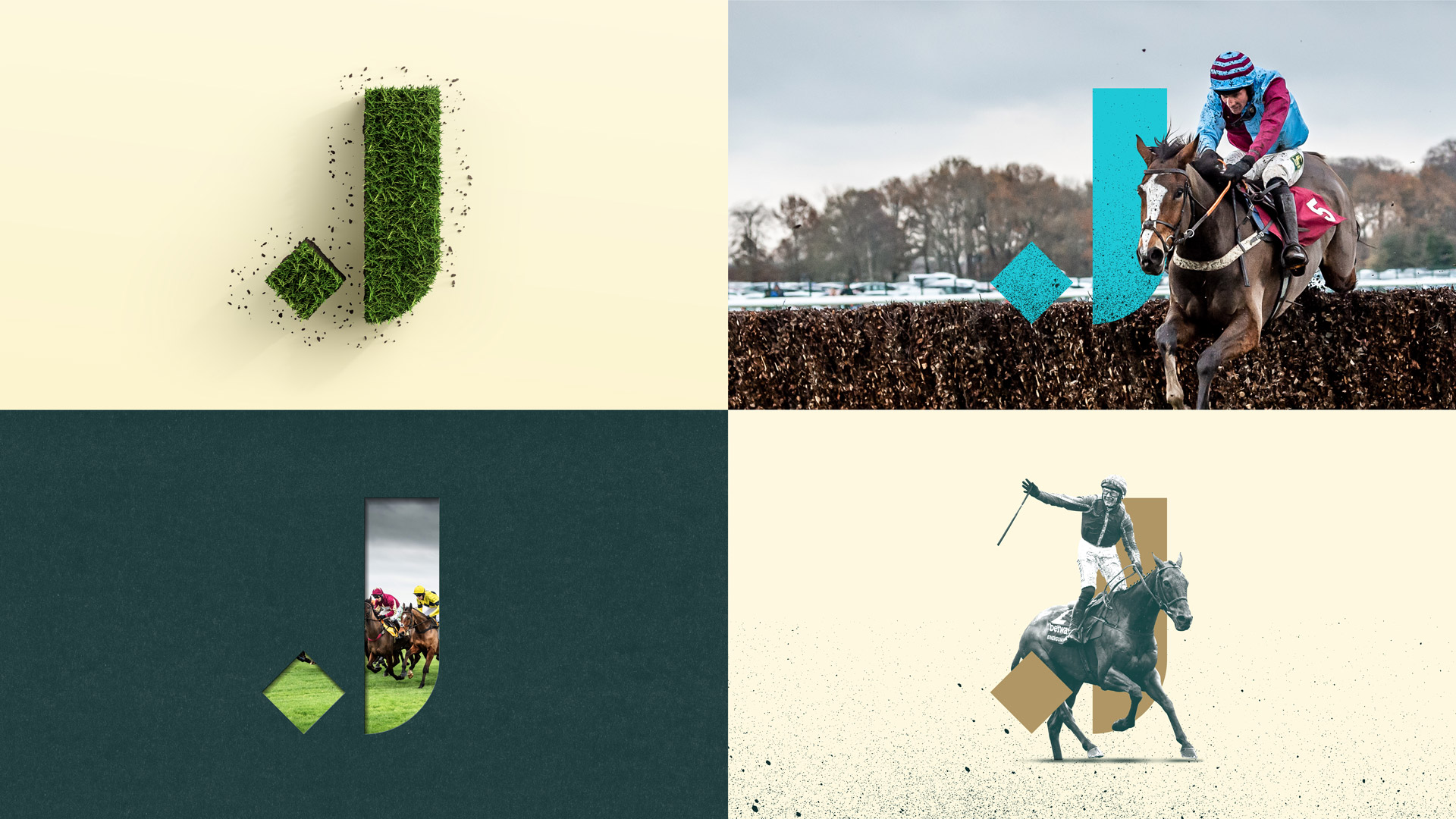
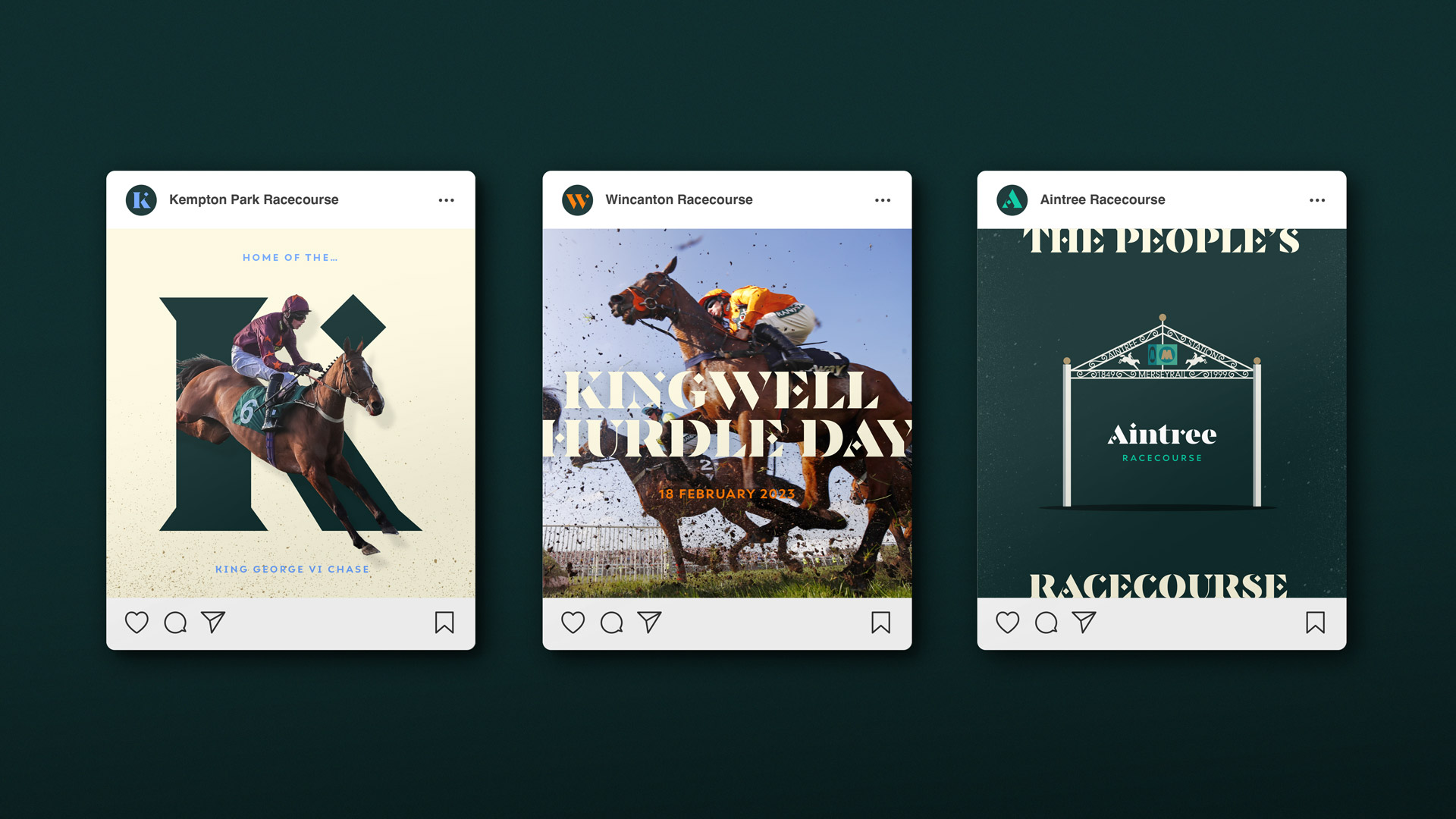
This led us to create a contemporary marque using one diamond that formed a letter ‘J’. This simple graphic approach enables it to be used as an endorsement and marque of quality across the brand’s channels.
Taking inspiration from the diamond element of the logo, we worked with typographer Océane Moutot to produce a bespoke display typeface that subtly incorporates a diamond element into certain letterforms and serifs.
This typeface was then used as the basis for all of the racecourse logotypes, and became the common thread that ties the brand’s other businesses together.
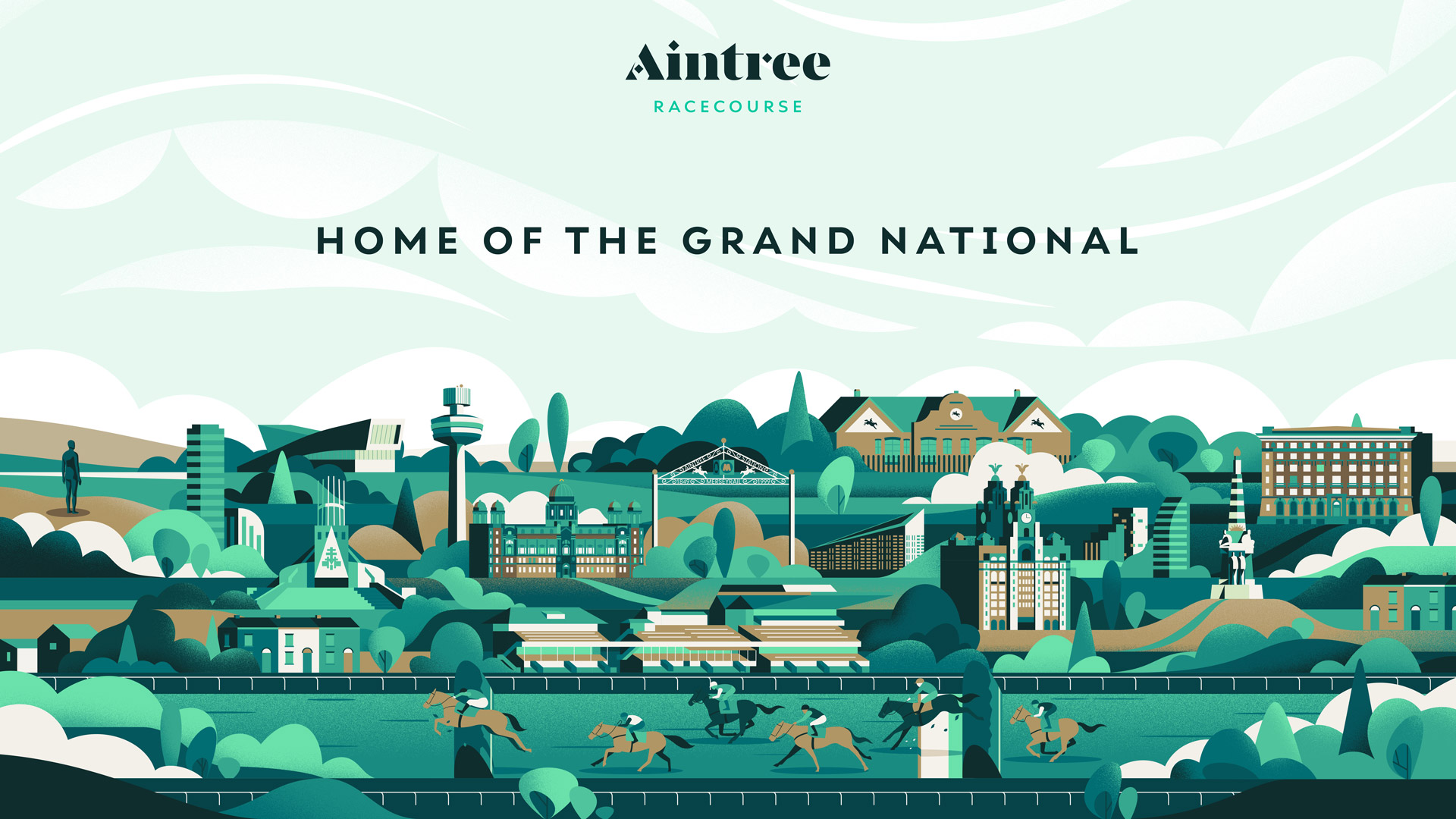
A key part of the brief was to make each racecourse feel distinct, and give them their own assets to use across their channels. With this in mind, we worked with Jack Daly to develop a set of illustrations that showcase the unique aspects of each racecourse as well landmarks in the surrounding area.
Individual elements of each illustration could also be pulled out to use as details within communications.
To compliment the racecourse assets we also wrote a piece of emotive boilerplate copy for each location that highlights their uniqueness and speaks to what can be experienced at each venue.
CREDIT
- Agency/Creative: Thisaway
- Article Title: Thisaway Aims to Change the Face of British Horseracing With the Rebrand of the Jockey Club
- Organisation/Entity: Agency
- Project Type: Identity
- Project Status: Published
- Agency/Creative Country: United Kingdom
- Agency/Creative City: Bath
- Market Region: Europe
- Project Deliverables: 2D Design, 3D Design, Animation, Art Direction, Brand Architecture, Brand Creation, Brand Design, Brand Experience, Brand Guidelines, Brand Identity, Brand Mark, Brand Redesign, Brand Rejuvenation, Brand Strategy, Brand Tone of Voice, Brand World, Branding, Copywriting, Creative Direction, Design, Graphic Design, Identity System, Illustration, Logo Design, Motion Graphics, Photography, Rebranding, Tone of Voice, Type Design, Typography, Writing
- Industry: Entertainment
- Keywords: Horseracing, Sport, Sportsbranding
-
Credits:
Typographer: Océane Moutot
Illustrator: Jack Daly


