


The snack aisle has a problem: it’s become absurdly complicated. Endless ingredient lists, health claims that require a science degree to decode, and packaging that looks like it belongs in a pharmacy. British startup LAMA is calling time on the nonsense with Datekin – a snack brand that goes back to basics with hand-selected Sukkari dates and a visual identity that celebrates simplicity.
Working with international digital agency Signifly, Datekin rejects the clinical “health food” aesthetic that’s taken over better-for-you snacking. Instead, the brand leans into joy, colour, and unapologetic indulgence – proving that when your product is genuinely simple and nutritious, your design doesn’t need to whisper apologies.
When “Better-For-You” Became Worse
The better-for-you snack category has engineered itself into a corner. In their race to be healthier, brands have stripped out the pleasure, the taste, and increasingly, any sense of fun. The result? Sterile packaging, defensive messaging, and products that feel like penance rather than treats.
“The market has created this false choice: either it tastes good or it’s good for you,” says Christopher Ashton, Senior Digital Designer at Signifly. “Consumers are tired of that compromise. They want the endorphin hit of something sweet, the satisfaction of great taste, and the reassurance that it’s good for them. All in one moment.”
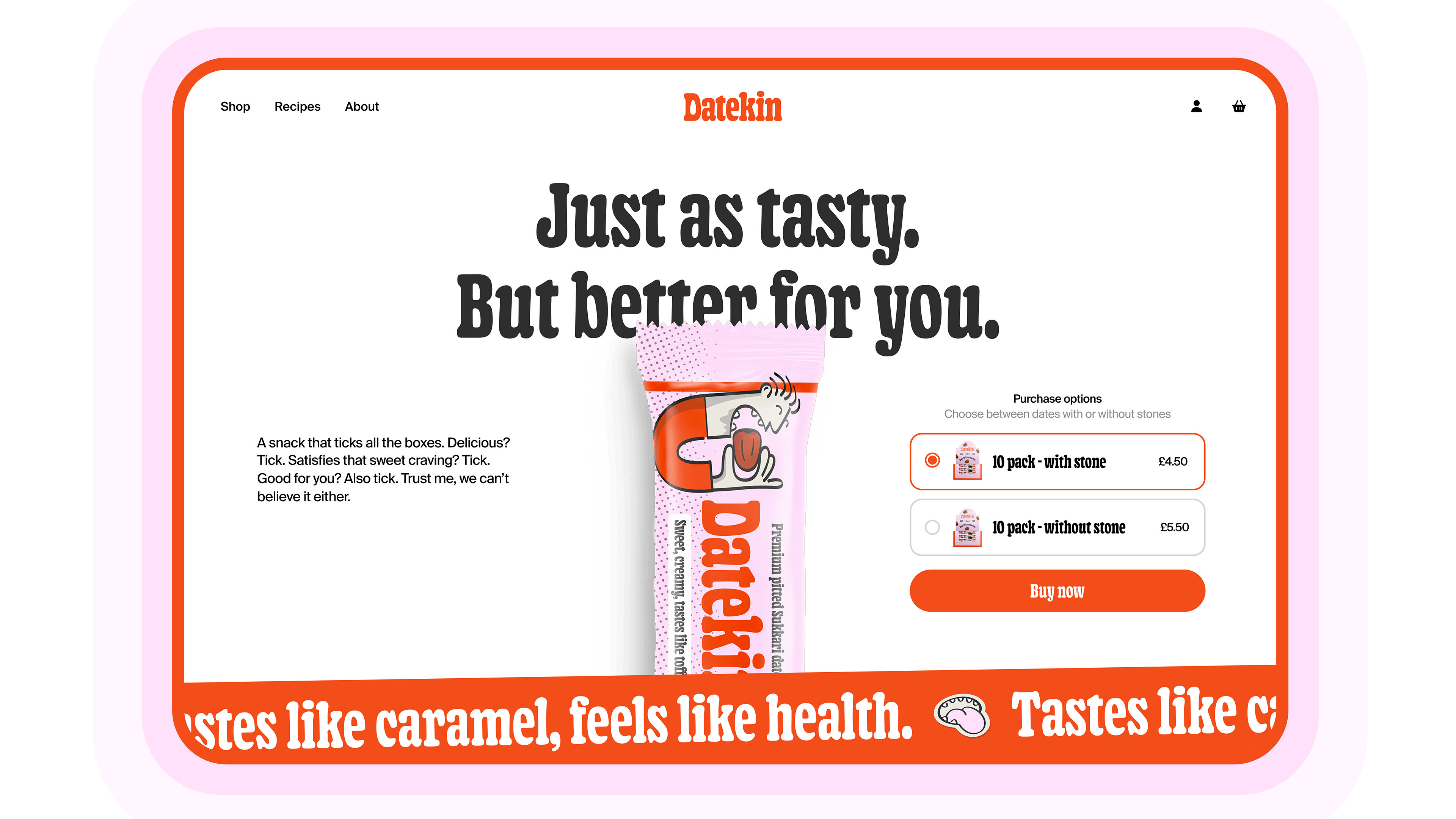
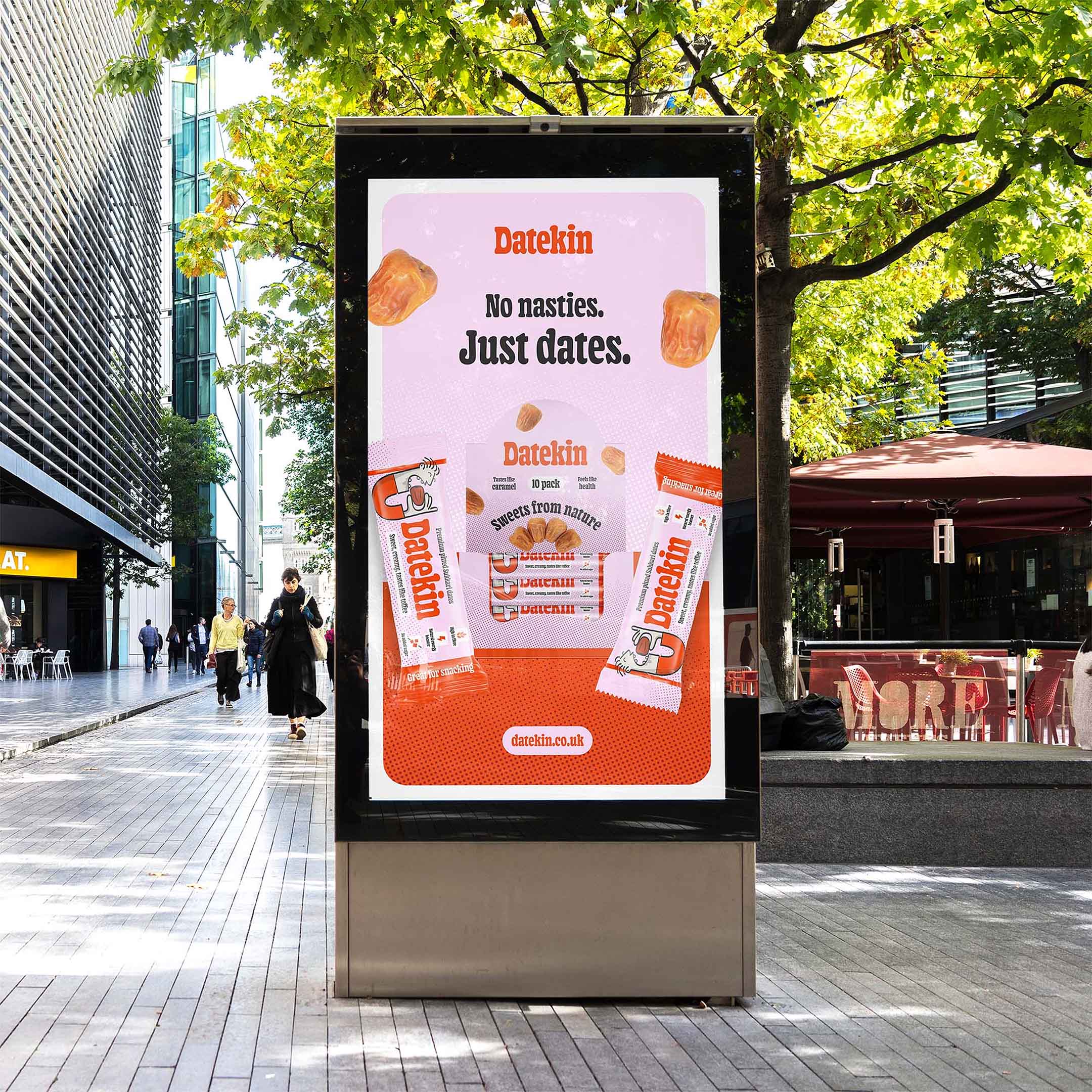
Datekin’s answer is radical in its simplicity: just dates. Hand-selected Sukkari dates from Saudi Arabia, naturally sweet with a caramel-like flavour, conveniently pitted, and packed with fibre, vitamins, and slow-release energy. No added sugar, no processing, no ingredient list that reads like a chemistry experiment.
Celebrate What’s There, Not What’s Missing
Where most healthy snacks obsess over what’s *not* in the product, Datekin celebrates what *is* there. And the visual identity reflects that confidence.
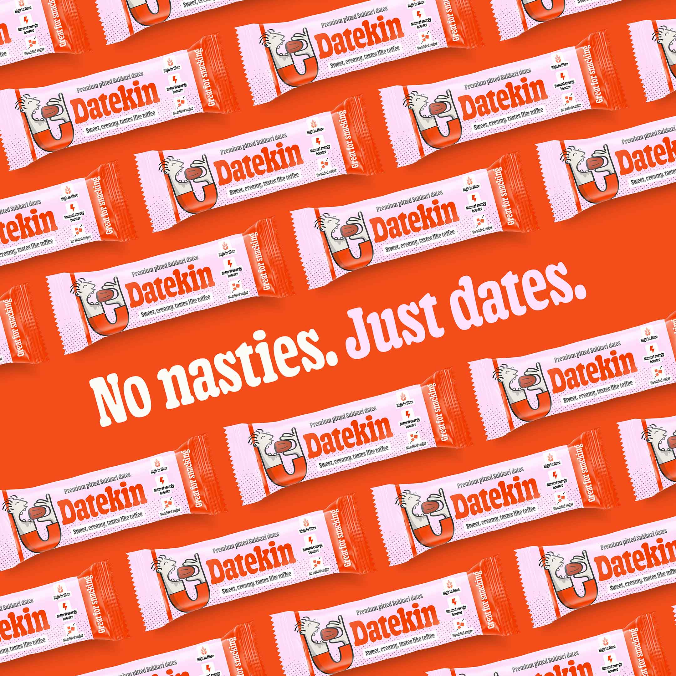
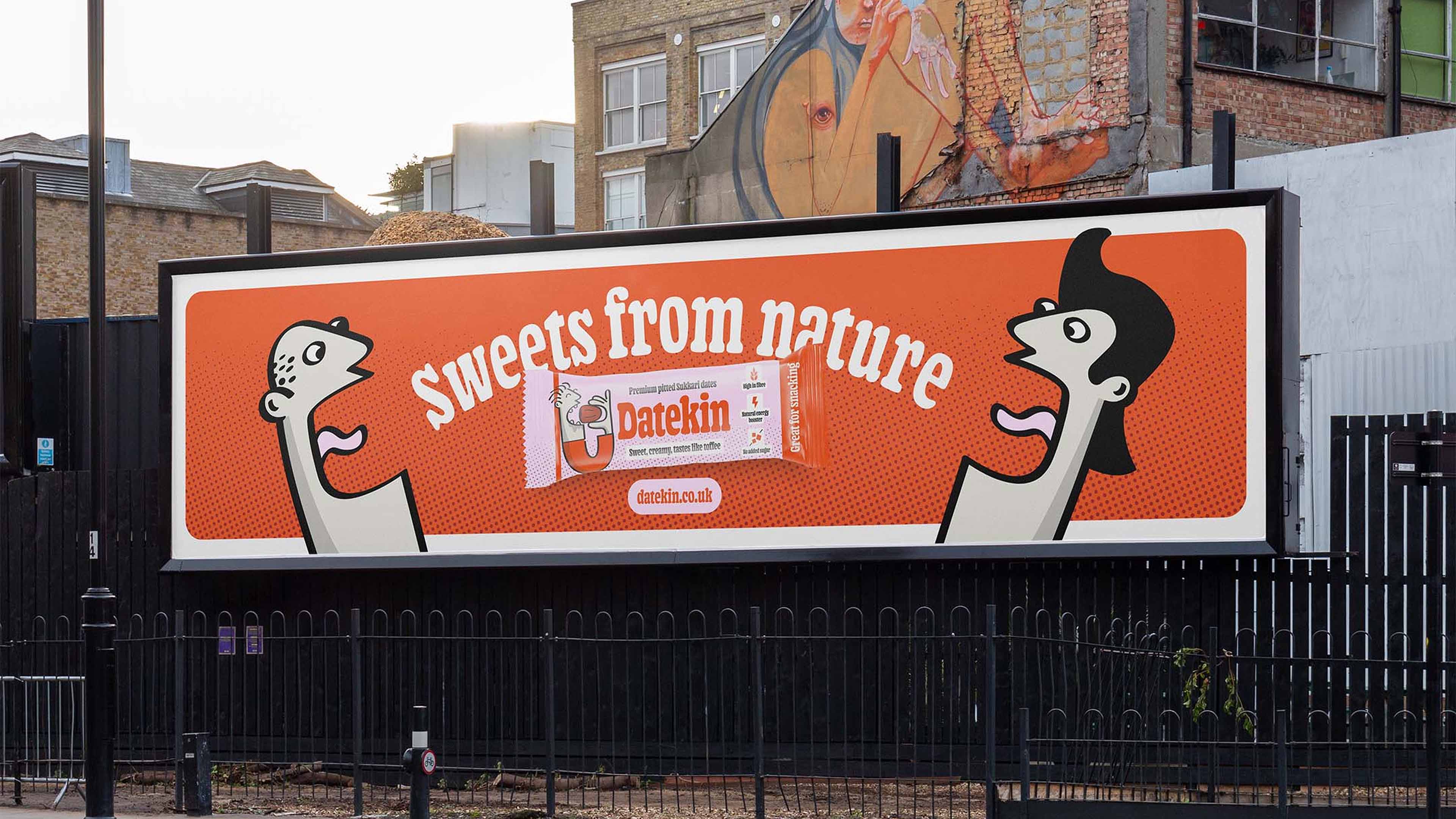
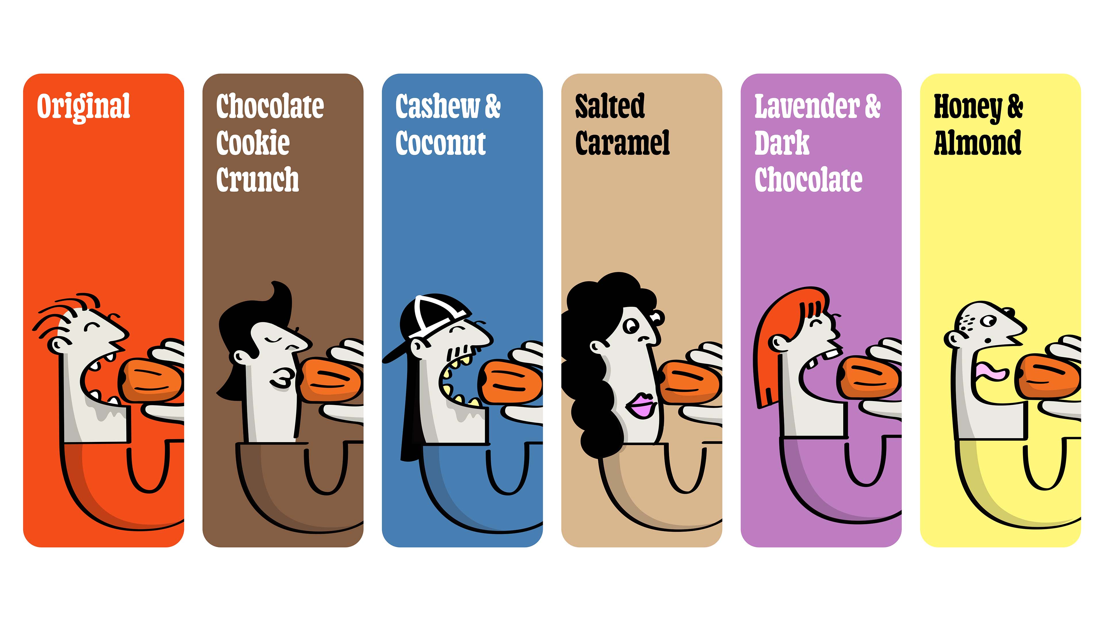
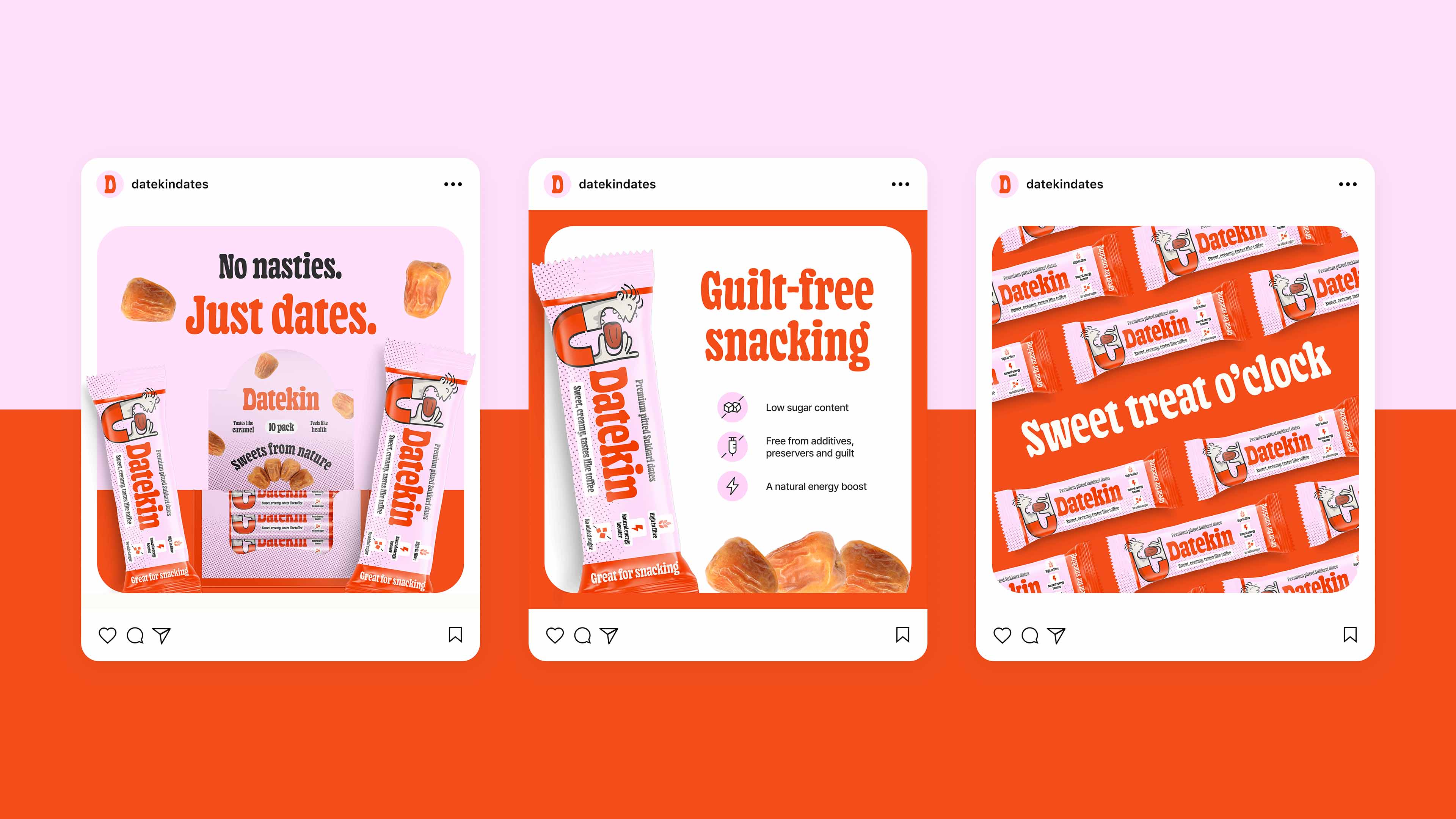
The brand features vibrant colours, illustrated characters, and packaging that feels more like a sweet shop than a health food store. It’s a deliberate provocation in a category that’s forgotten snacks are supposed to be fun.
“We wanted to kill the guilt before it even starts,” explains Ashton. “Most healthy snacks look like they’re apologising for existing. Datekin doesn’t apologise – it celebrates. The visual language is deliberately playful, nostalgic, almost candy-like. Because the product delivers both the health benefits and the satisfaction, the design can be honest about both.”
The approach challenges the entire category’s design playbook. Instead of muted earth tones and cautious claims, Datekin shouts its message: this is delicious, this is real, and yes, it’s good for you.
“We looked at what dates actually are – naturally sweet, indulgent, satisfying – and asked why the design shouldn’t reflect that,” Ashton adds. “The brand doesn’t whisper ‘it’s okay to eat this.’ It shouts ‘this is delicious and good for you.’ That’s the whole point.”
Priced at £1.49 per pack and packaged in home-compostable materials, Datekin is now stocked at major retailers including Amazon, eBay, East of England Co-op, NHS outlets, Porridge, Beanfreaks, The Beecham Weigh, Wyedean Healthfoods, Natural Health Hertford, and Planet Food.


CREDIT
- Agency/Creative: Signfily
- Article Title: This UK Snack Brand Rebels Against Over Complicated Food With Guilt-free Products and Delicious Design
- Organisation/Entity: Agency
- Project Type: Identity
- Project Status: Published
- Agency/Creative Country: United Kingdom
- Agency/Creative City: London
- Market Region: Europe
- Project Deliverables: Brand Design, Brand Identity, Web Design
- Industry: Food/Beverage
- Keywords: dates, fmcg, webshop, website, brand identity, start-up, London,
-
Credits:
Client Lead: Dženita Džindo
Designer: Christopher Ashton
Strategy Lead: Kathrine Elvira Boysen
Junior Strategist: Gul Cheema
Signal Mining Strategist: Ellie Valentine


