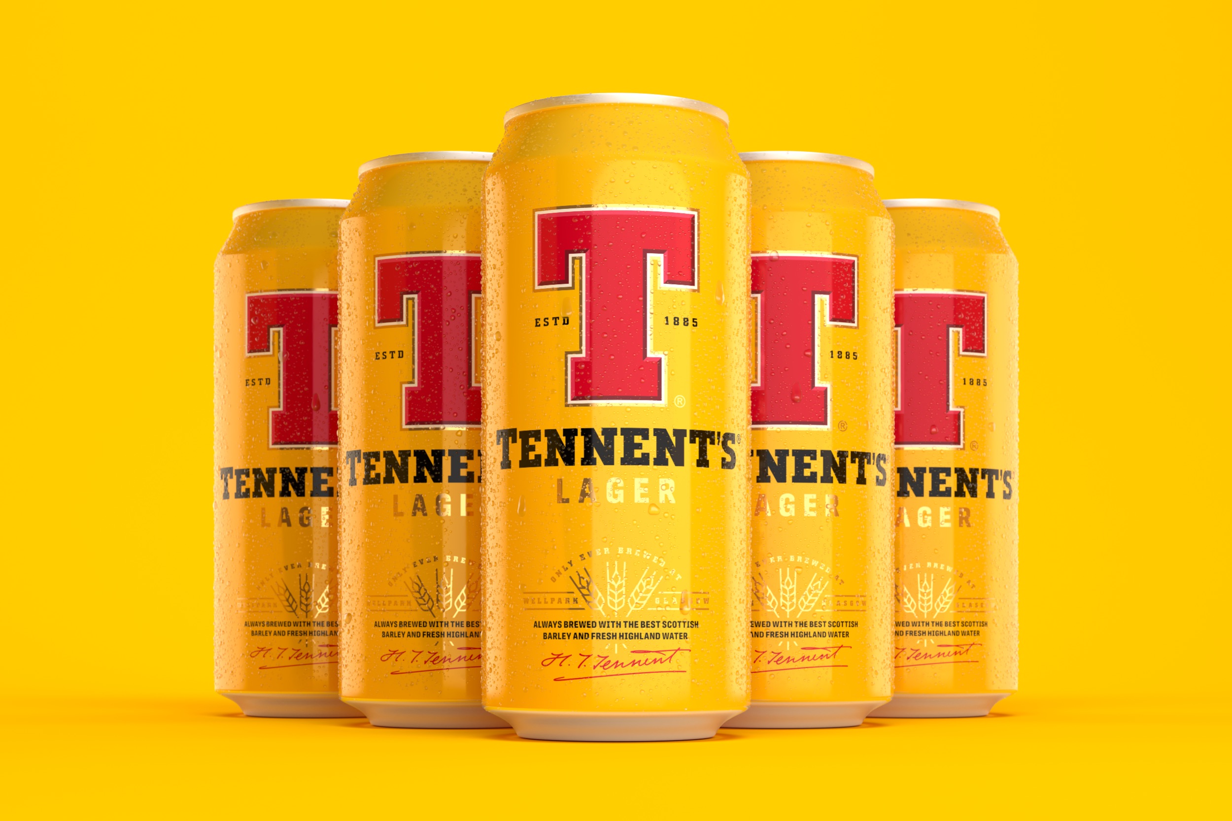
Tennent’s lager, Scotland’s best-selling beer brand, has long been renowned for its iconic can; in order to secure its position as the nation’s most loved lager they partnered with global creative company,Thirst, to create a new modern visual identity that reflects the brand’s heritage as they look to the future.
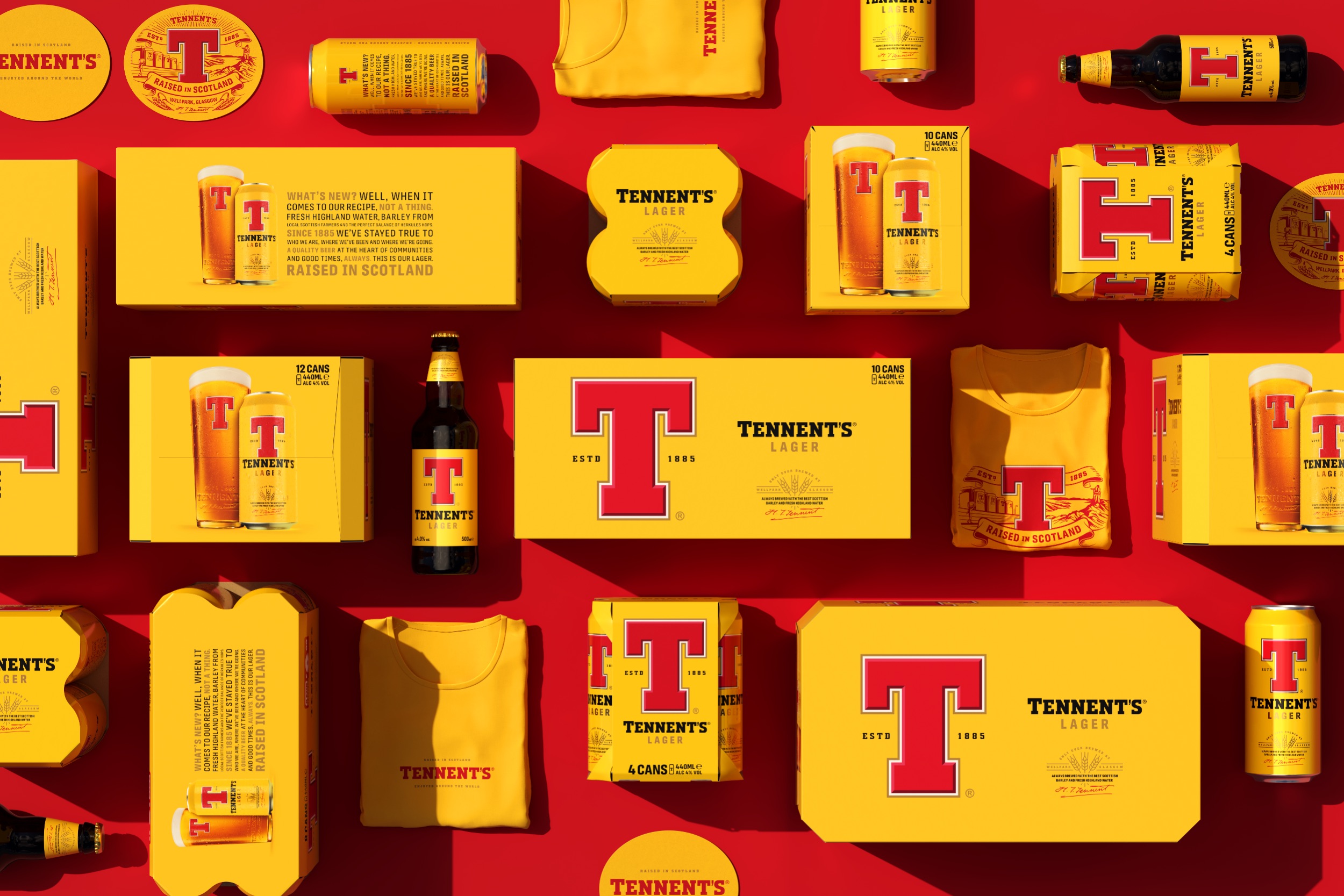
The redesign, which is the first since 2018, aimed to build on Tennent’s Wellpark Brewery’s historic place in Scottish culture and its position as the founder of Scotland’s original pilsner brewed on the same site since 1885. To bring this to life, the team at Thirst dug into how Tennent’s operates as a brewery. Drawing on its pride for Scotland; from the locally sourced ingredients, of only barley, hops, yeast, and water, that go into every can of Tennent’s Lager, to the brewery’s commitment to sustainable practices as well as its place in Scotland’s communities.
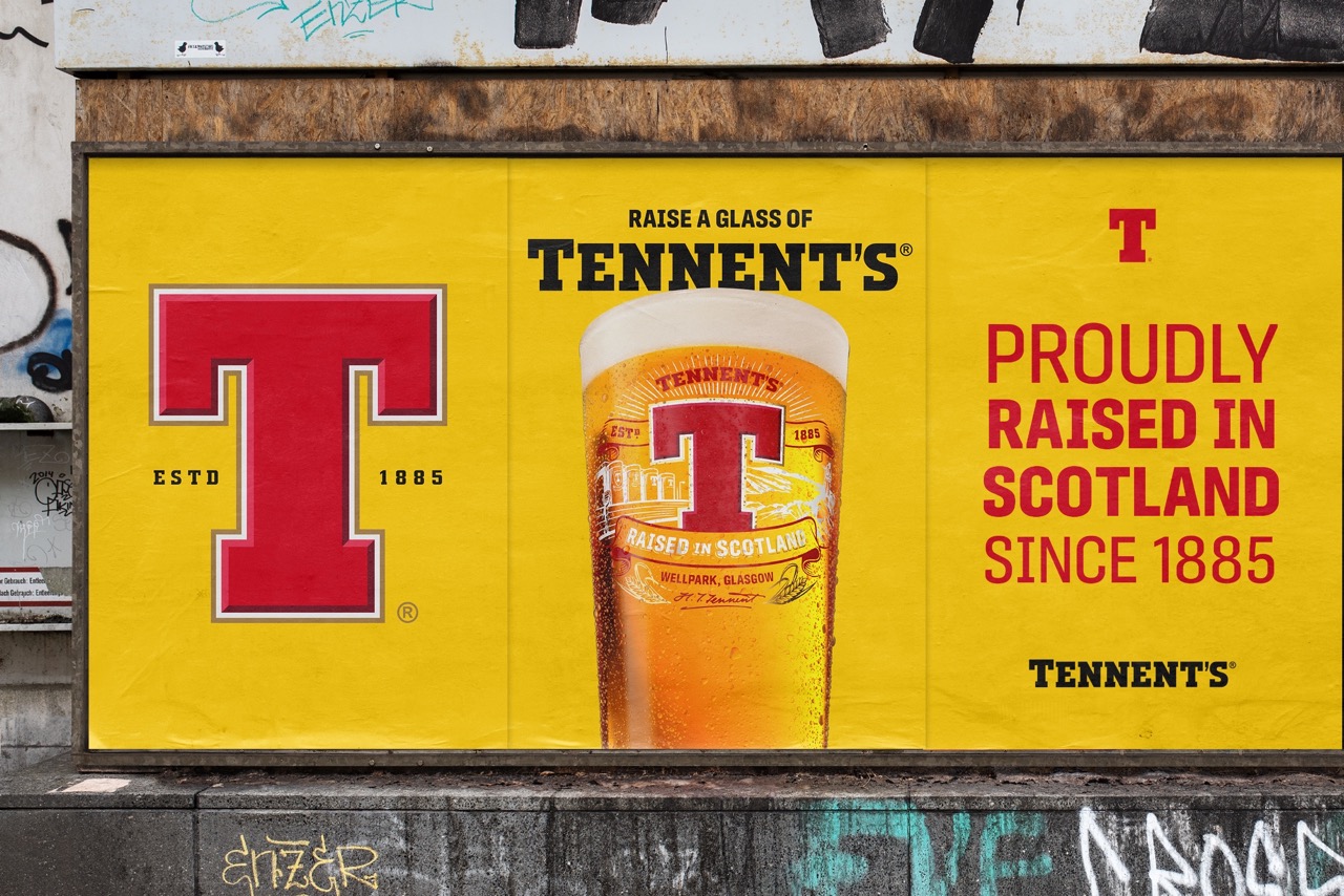
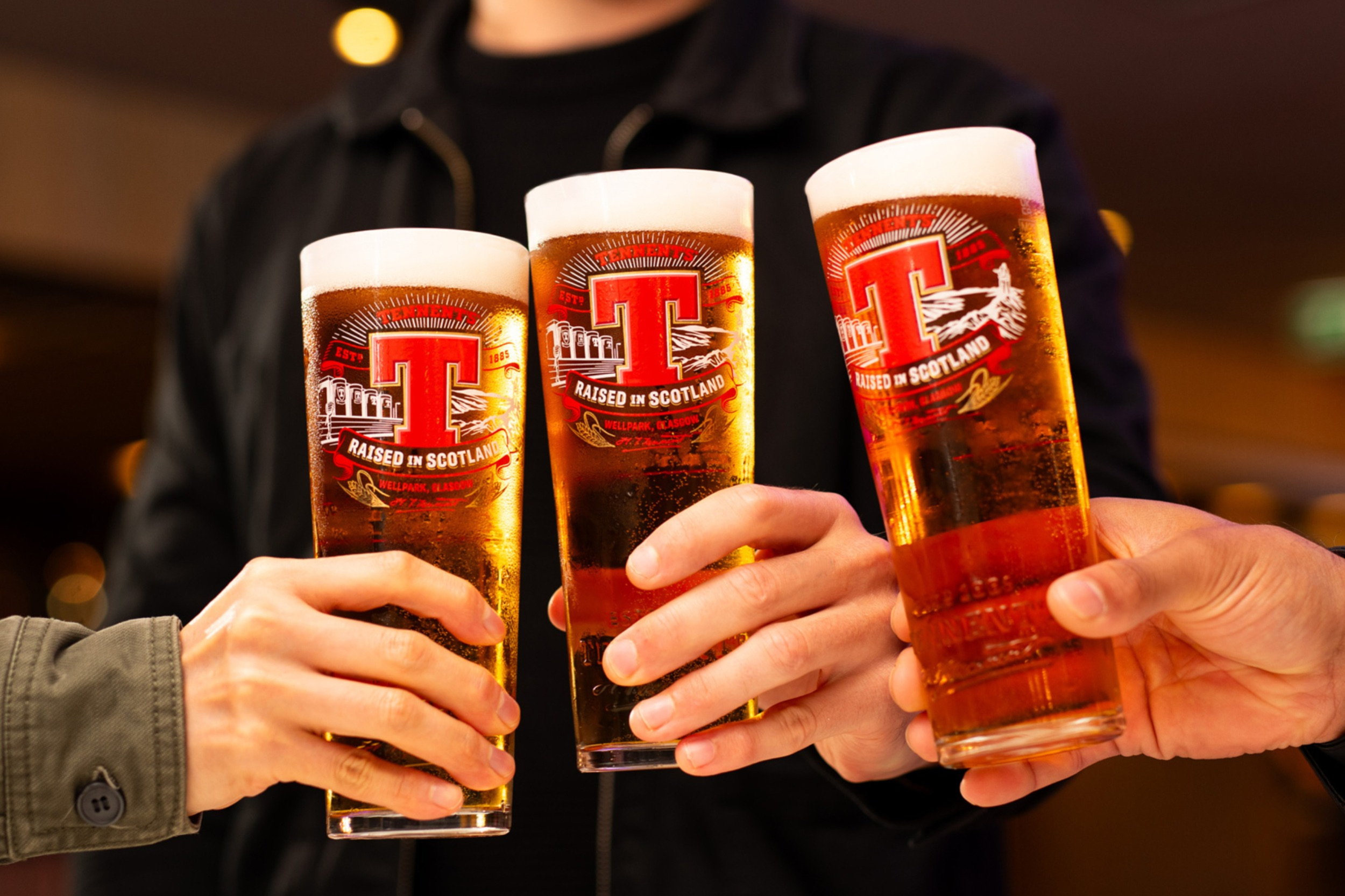
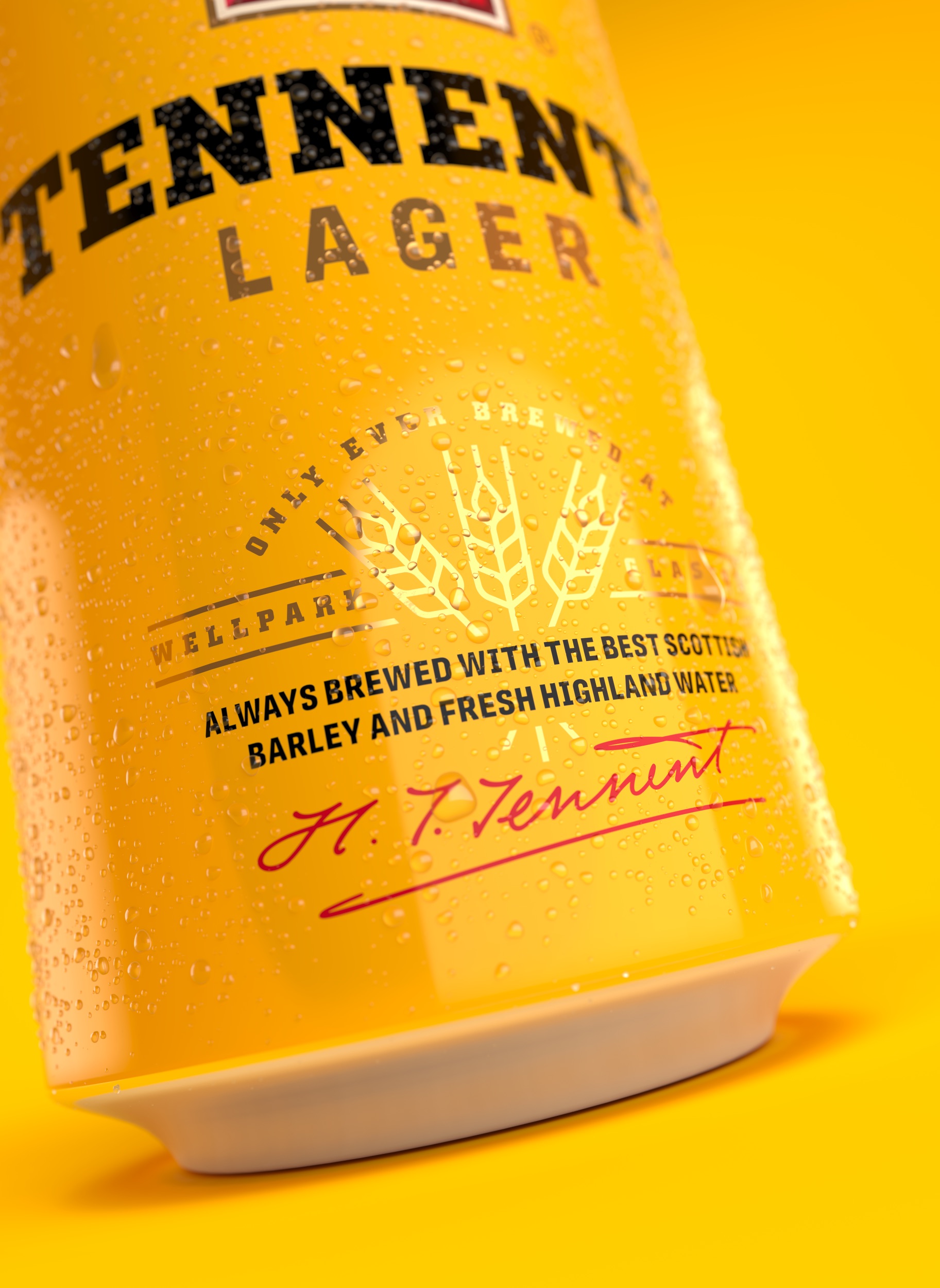
The identity has been developed to lean into the quality of C&C Group’s Tennent’s Lager with a richer yellow to amplify a bolder red ‘T’ brandmark at the heart of the can, embellishing the existing keylines round the ‘T’ with a bevelled detail to add depth and craft, as well as evolving the messaging hierarchy on pack. The new BVI includes limited edition glassware featuring illustrations by Tobias Hall.
Revisiting the beloved iconography, adding depth and richness, and introducing new markers in the barley motif, along with the retained Hugh Tennent’s signature, tells the story of the quality and skill that bring the lager to life and re-energise the brand.
An evolution of a Scottish icon.
CREDIT
- Agency/Creative: Thirst
- Article Title: Thirst Refresh a True Scottish Icon – Tennent’s Lager
- Organisation/Entity: Agency
- Project Type: Packaging
- Project Status: Published
- Agency/Creative Country: United Kingdom
- Agency/Creative City: Glasgow
- Market Region: Global
- Project Deliverables: Brand Guidelines, Brand Identity, Brand Redesign, Brand World, Packaging Design
- Format: Can
- Substrate: Metal
- Industry: Food/Beverage
- Keywords: WBDS Agency Design Awards 2023/24
- Keywords: Tennent's Lager, Beer, Scotland, Packaging
-
Credits:
Executive Creative Director: Matt Burns


