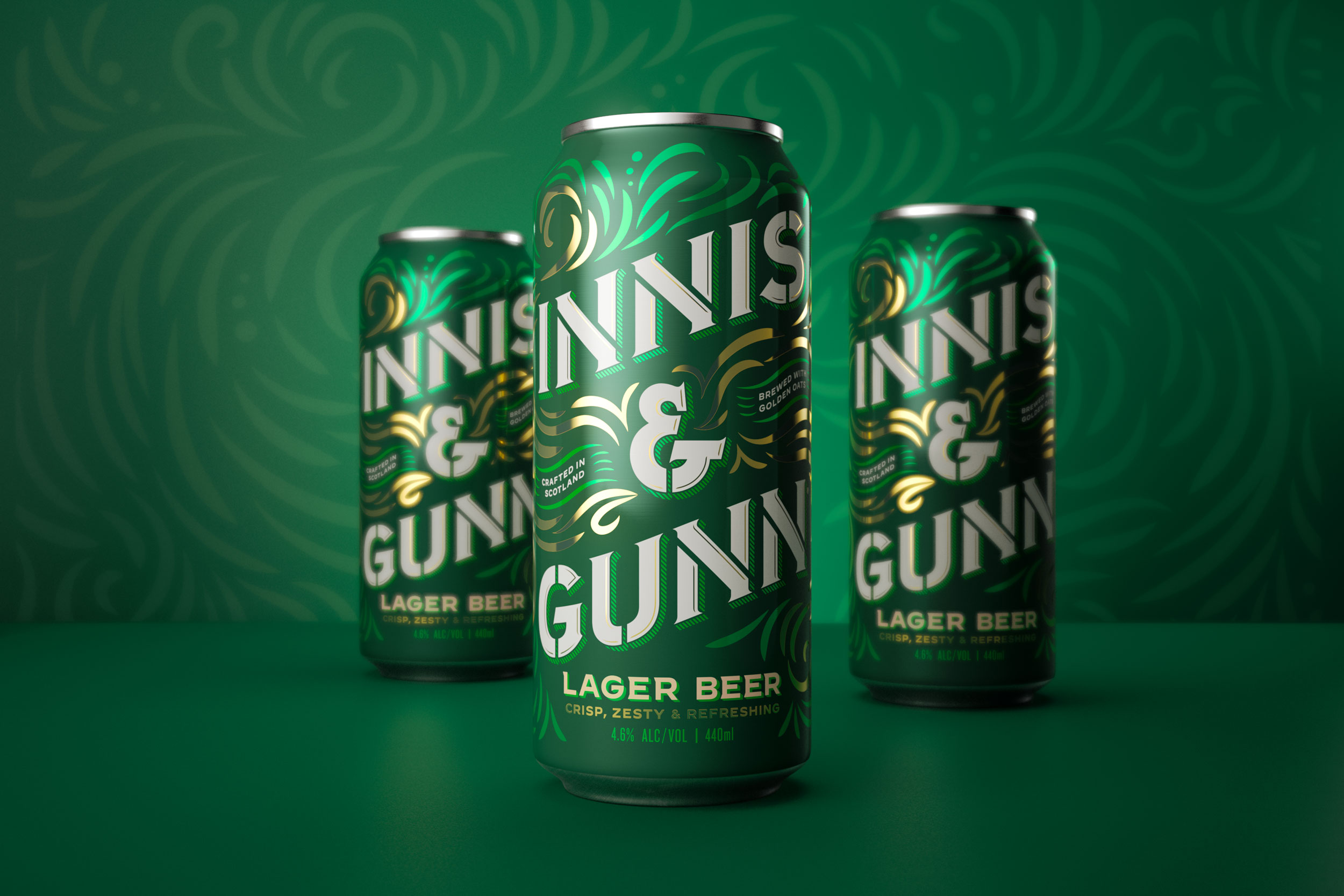
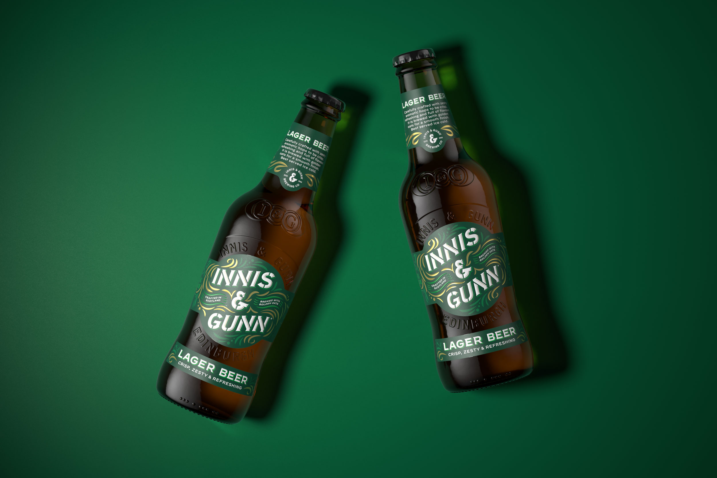
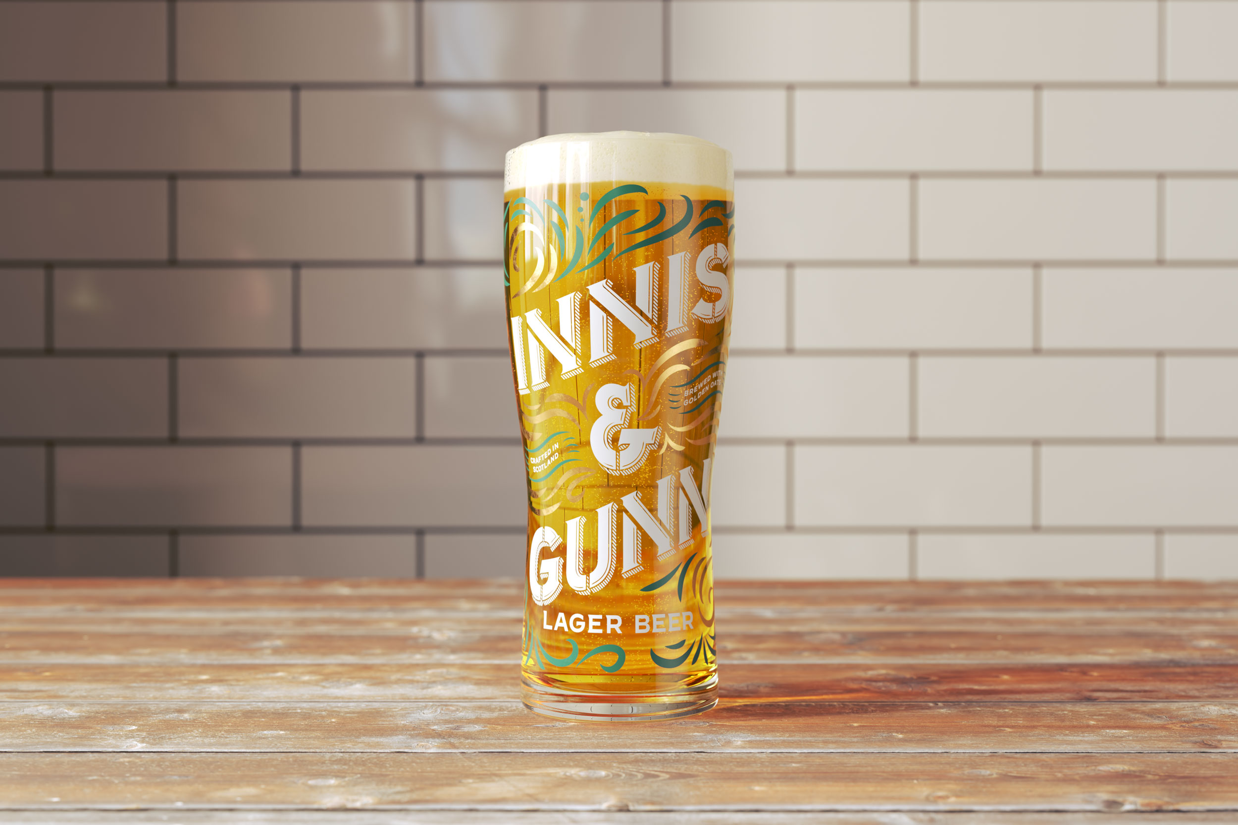
Famously the most ‘borrowed’ glass in pubs, Innis and Gunn Lager is already a Scottish icon.
With a mission to build on its success and bring its originality to an even wider audience, the brand team partnered with the specialist drinks design agency, Thirst, to modernise and premiums its full craft range.
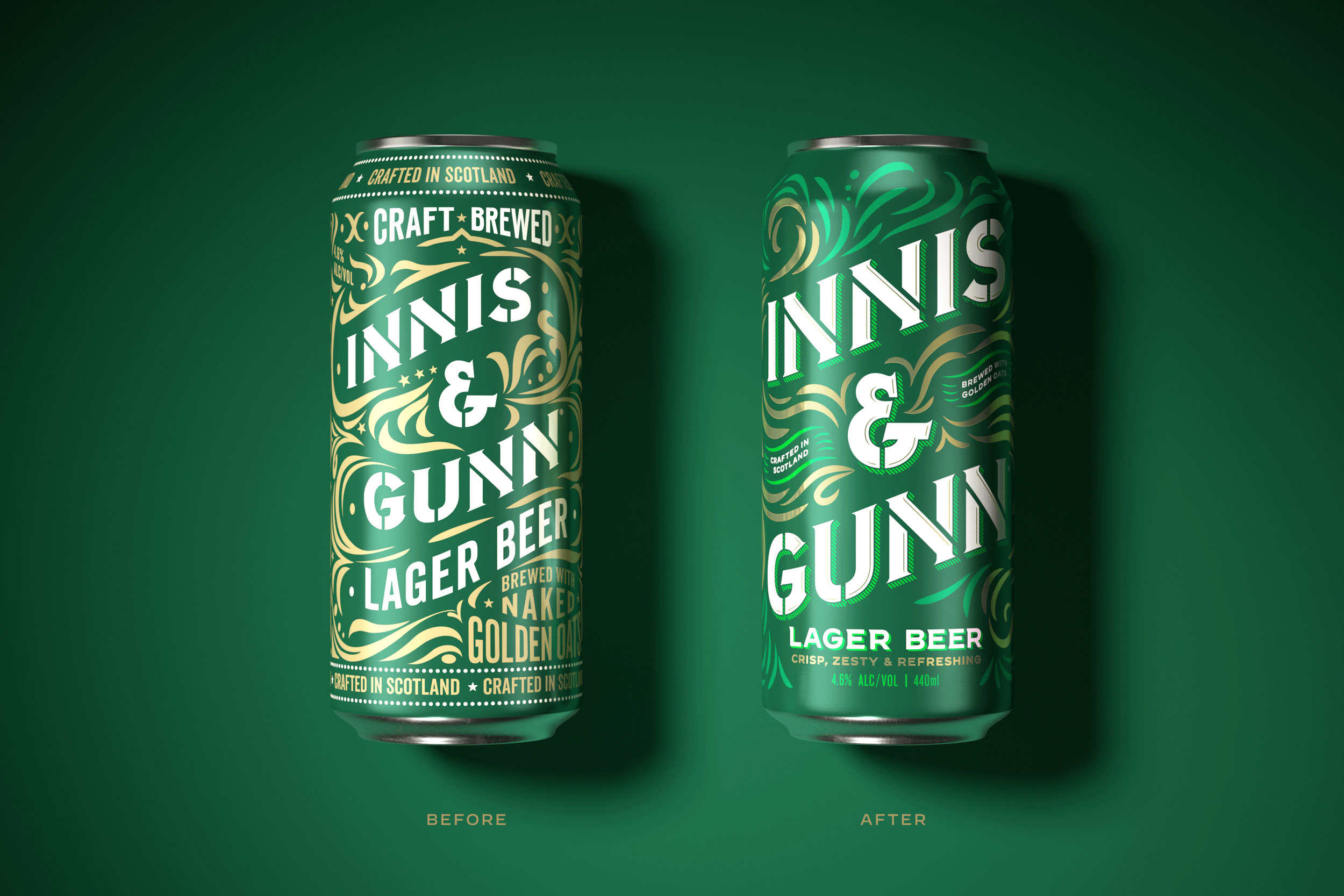
Made with golden oats and brewed to be different since 2013, Thirst knew that Innis and Gunn Lager is, and always has been, refreshingly original. Setting out to amplify the brand’s authentic spirit, Thirst wanted Innis and Gunn Lager to start behaving like the hero product it was. Reducing noise to increase the brand’s impact and confidence.
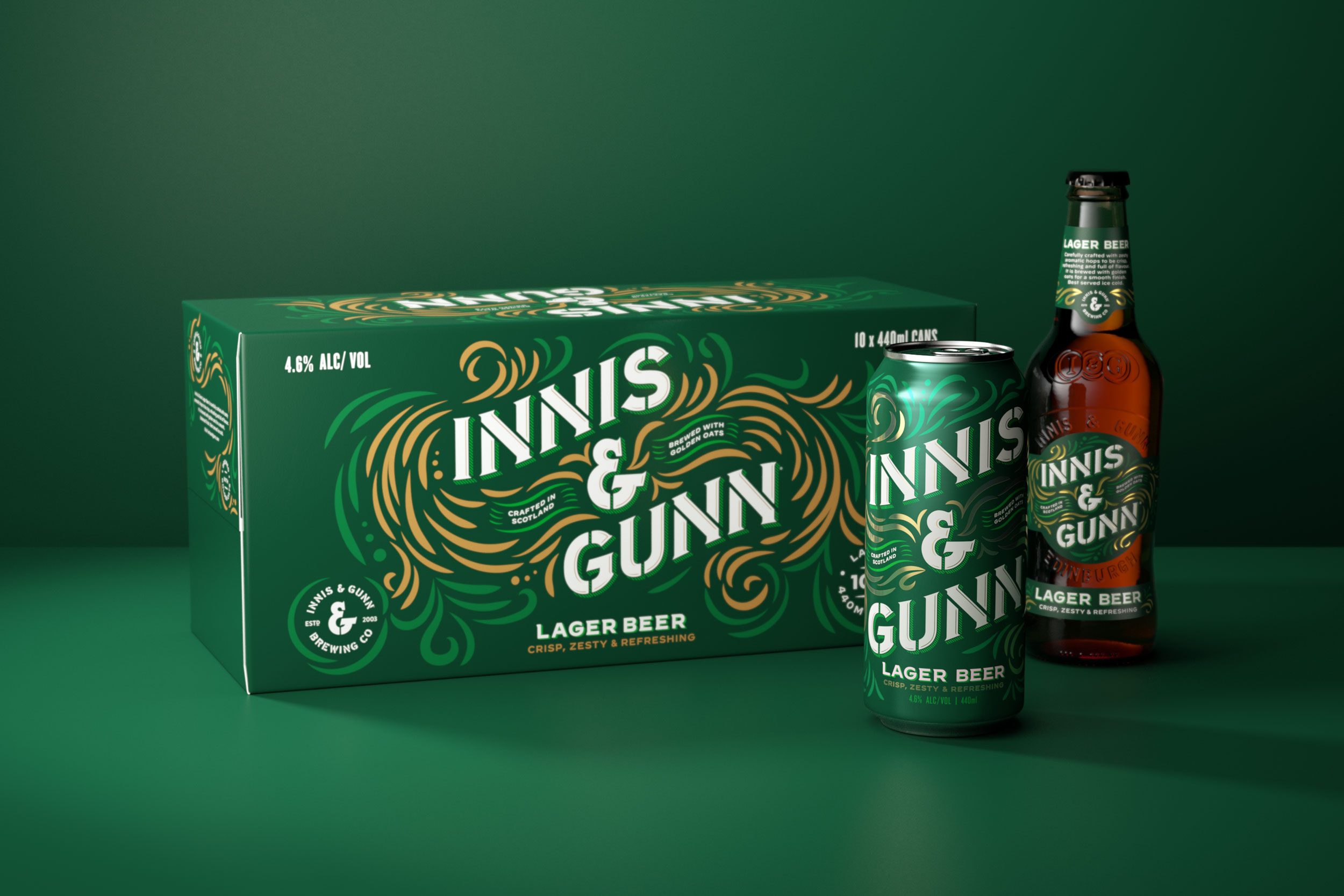
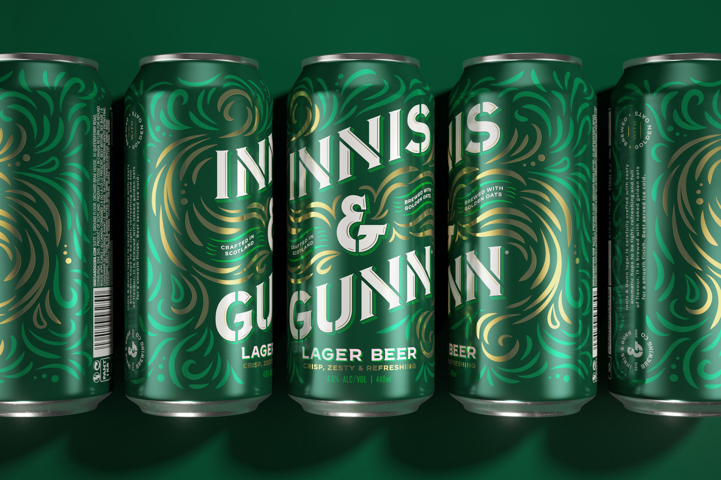
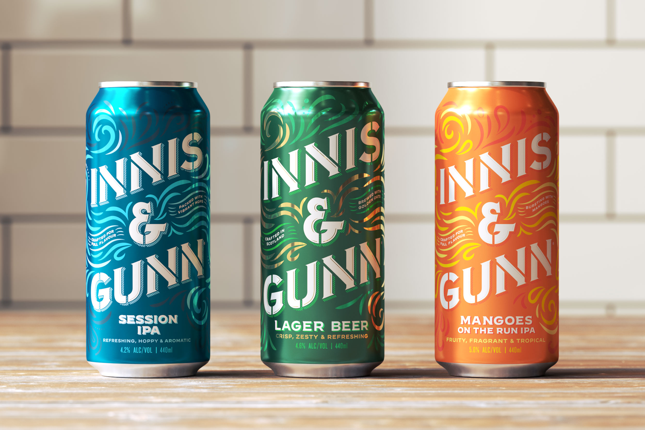
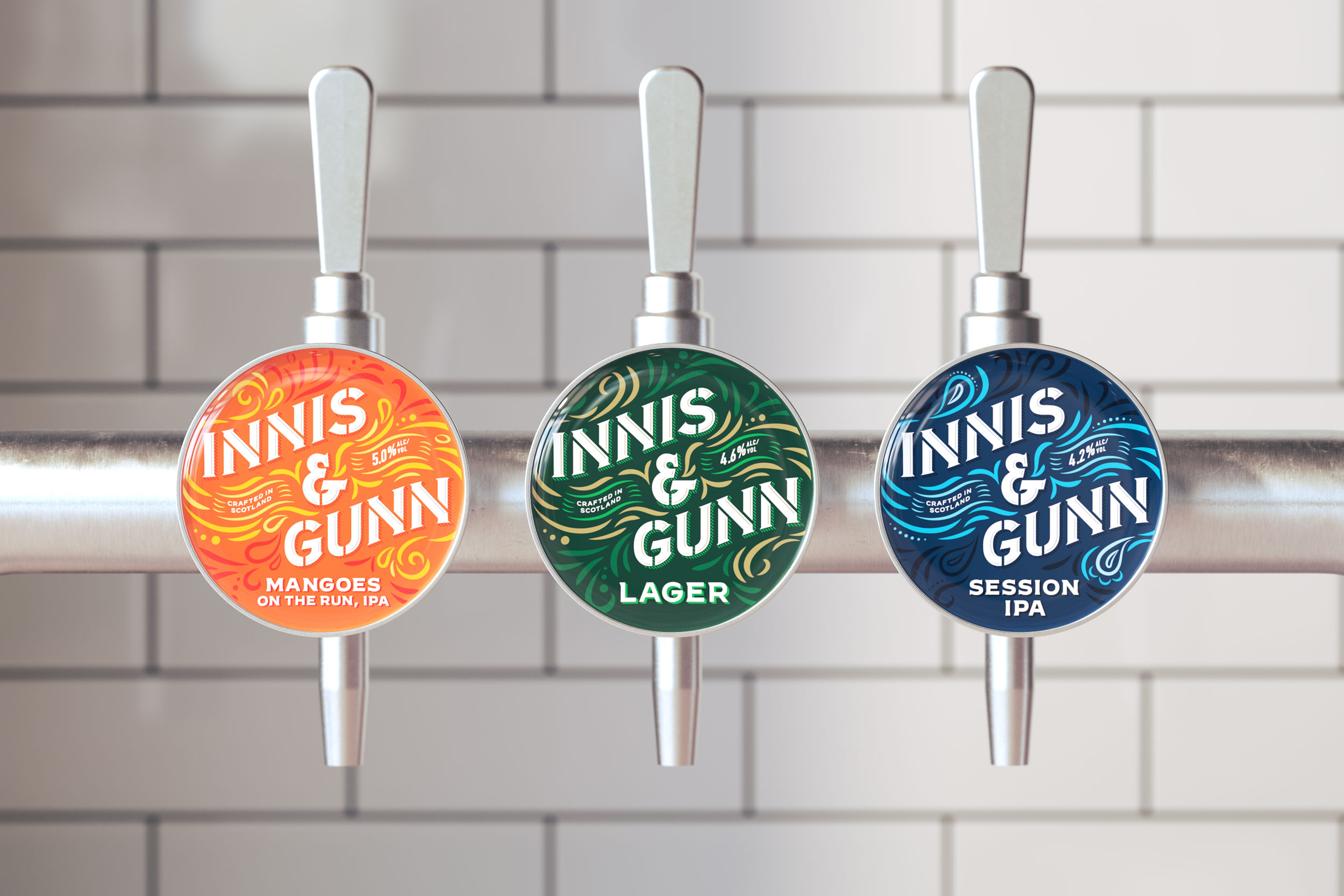
With beautifully detailed craft, Thirst evolved and elevated the wordmark to give it pride of place. No longer camouflaged by the brand’s flourishes, but framed by them. The flourishes themselves begin to flow, becoming the originality that runs through Innis and Gunn’s bones and beer. This refreshed visual language takes on a life of its own off pack, speaking to the brand’s liquid creativity. Finally, the colour palette is freshened with a vibrant green and brighter gold to capture the deliciousness within.
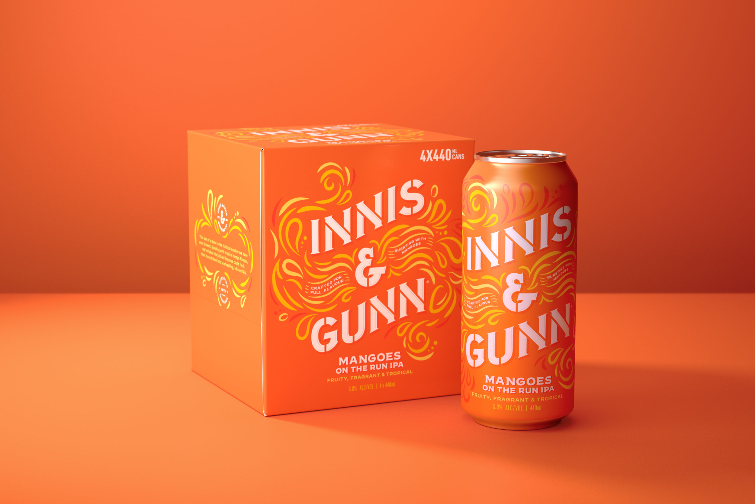
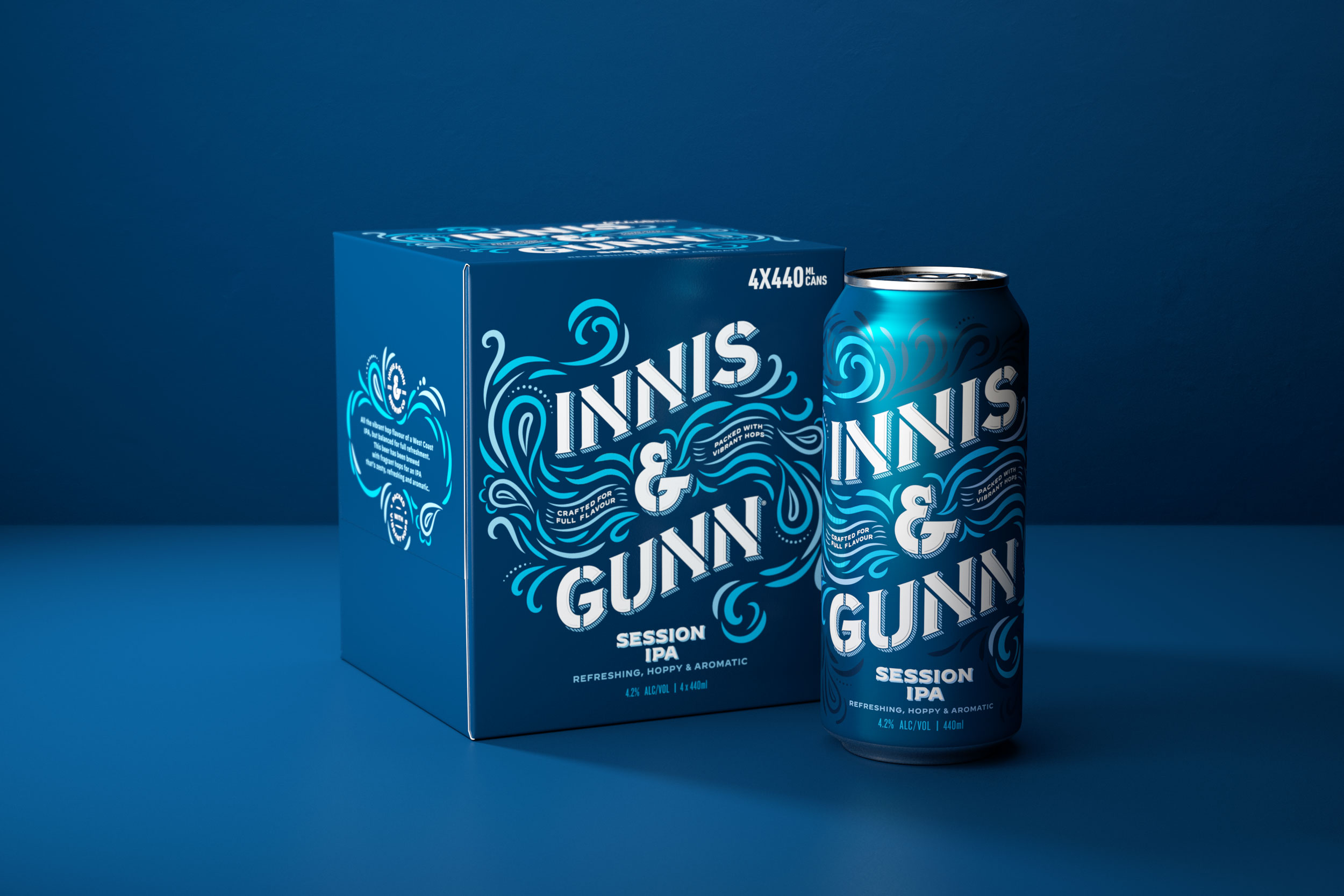
As the emboldened hierarchy is rolled out across the rest of the craft range, Thirst subtly change the flourishes to reflect the proposition of each flavour, from delicate droplets in the Session IPA to juicy mangoes for Mangoes on the Run.
Thirst’s bold evolution of the much-loved Innis & Gunn craft range doesn’t lose an ounce of originality. Instead, it shows the range as it should be: proudly authentic, courageously creative, refreshingly original.
CREDIT
- Agency/Creative: Thirst Craft
- Article Title: Thirst Gives Innis and Gunn’s Craft Range a Refreshingly Original New Look
- Organisation/Entity: Agency
- Project Type: Packaging
- Project Status: Published
- Agency/Creative Country: United Kingdom
- Agency/Creative City: Glasgow
- Market Region: Europe
- Project Deliverables: Brand Architecture, Brand Design, Brand Redesign, Packaging Design
- Format: Bottle, Box, Can
- Substrate: Glass, Metal
- Industry: Food/Beverage
- Keywords: WBDS Agency Design Awards 2021/22
- Keywords: Thirst Craft, Thirst, Innis and Gunn, Lager, Craft Lager, beer, Craft beer
-
Credits:
Creative Director: Matt Burns


