


Made in SE16 since 2013, Fourpure was brewing beer in a Bermondsey industrial estate before it was cool. But while Fourpure’s business moved from strength to strength, their brand lacked direction. Having changed four times in eight years, Fourpure’s equities were left undefined and its messaging diluted.
With big ambitions to be one of the top craft beers in the UK, Fourpure knew they needed to show the world who they were and what they stood for. Starting with their flagship lager, Fourpure’s internal team partnered with Thirst to develop a full repositioning and redesign.
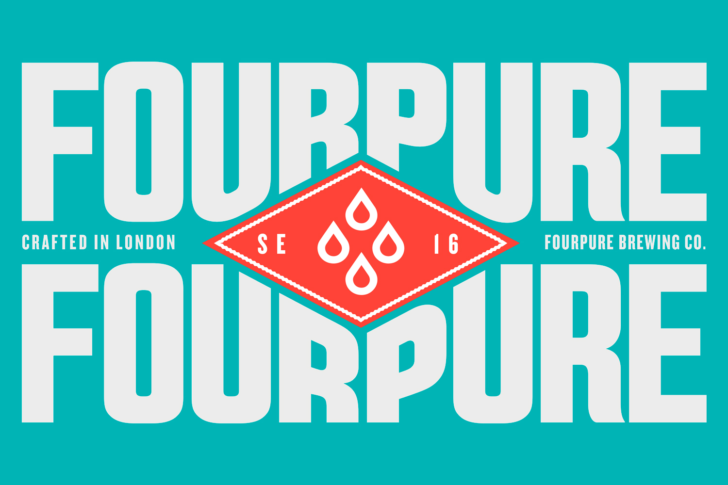
Despite people craving simplicity in their lives, the explosion of the craft category has brought with it hops, hype and a hell of a lot of complexity. To break down barriers and open the craft gates to all, we knew Fourpure’s brand had to be like its name: refreshingly simple.
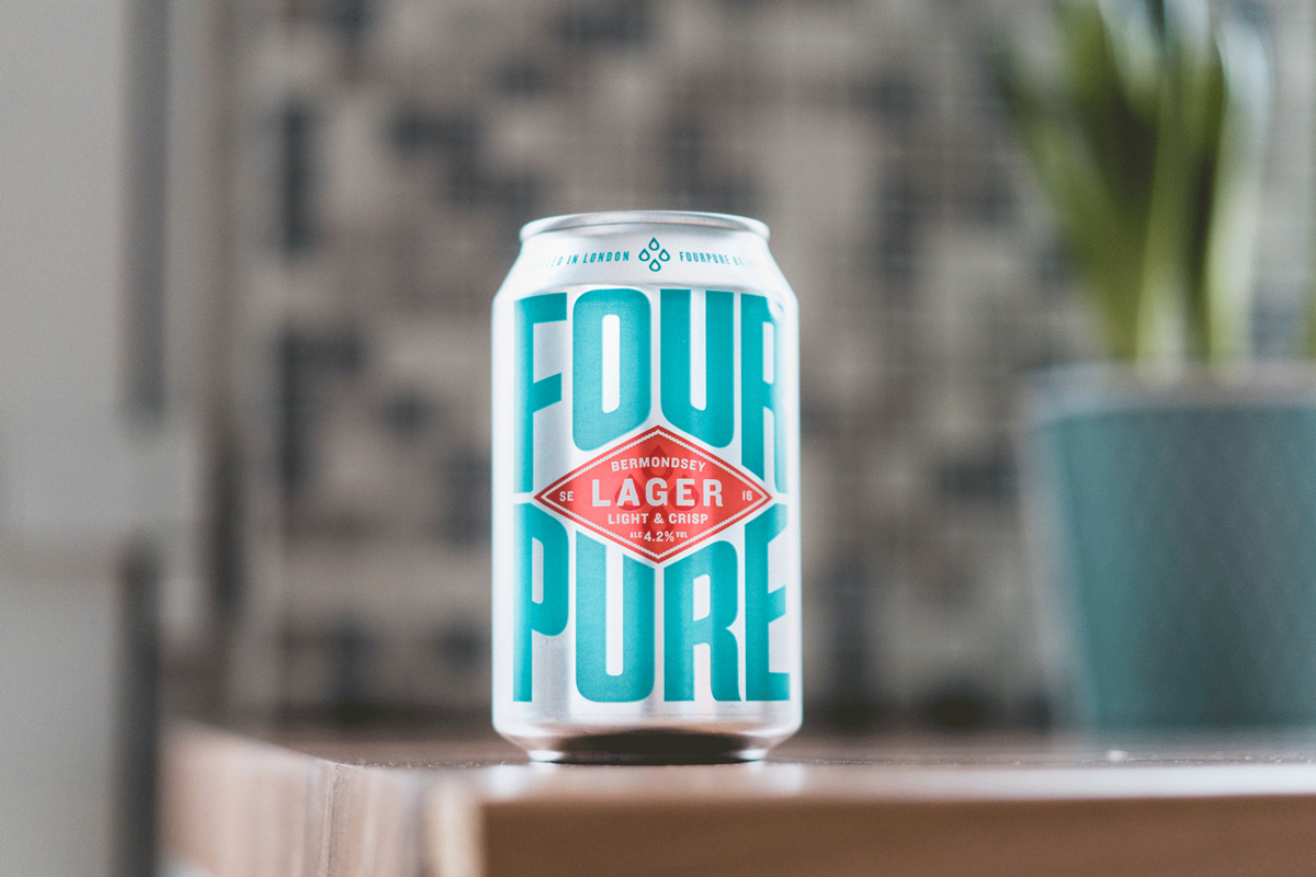
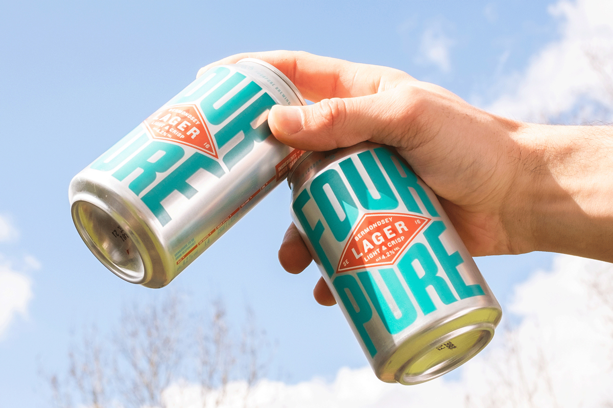
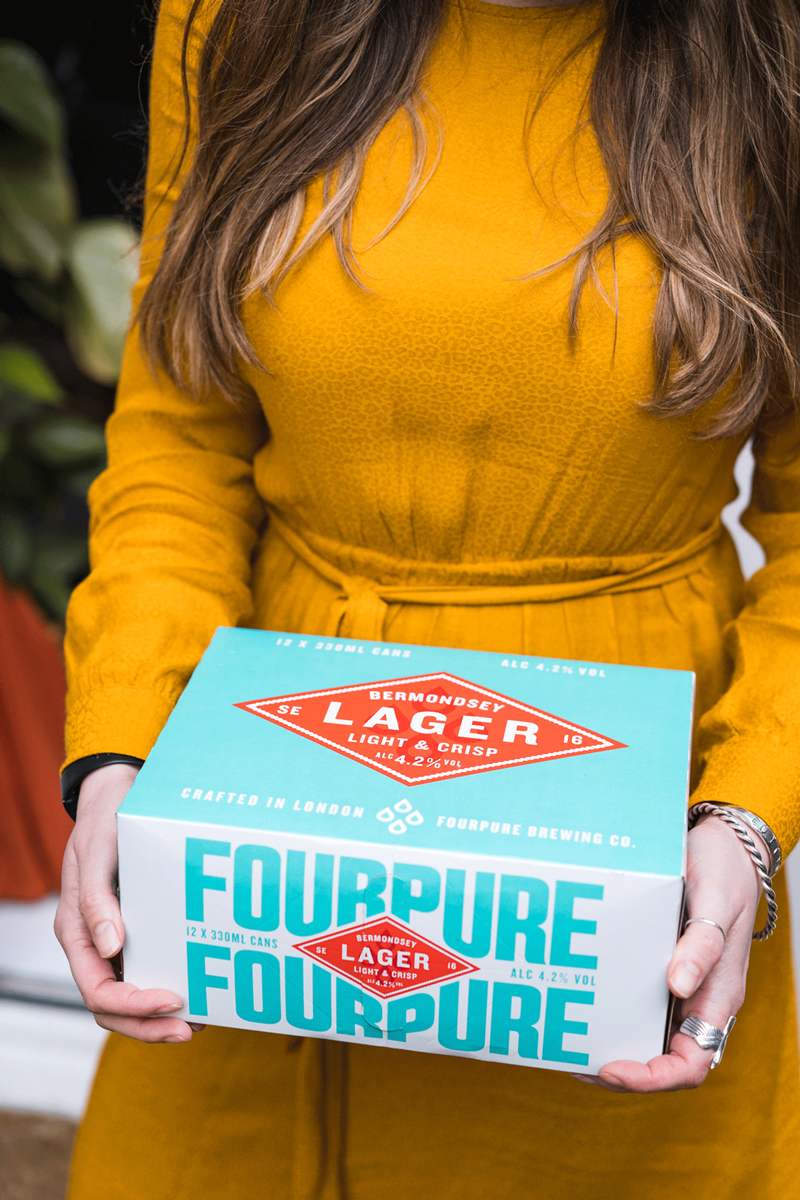
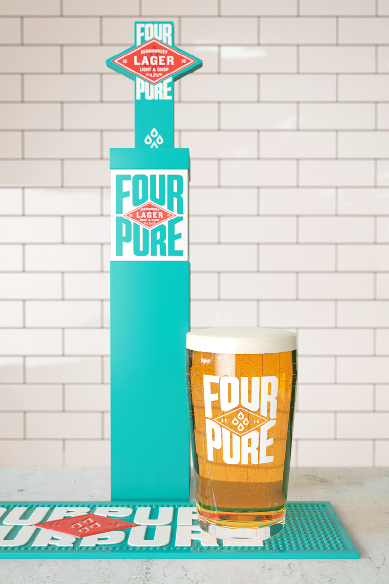
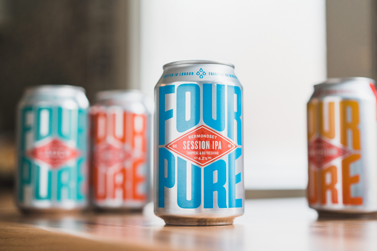
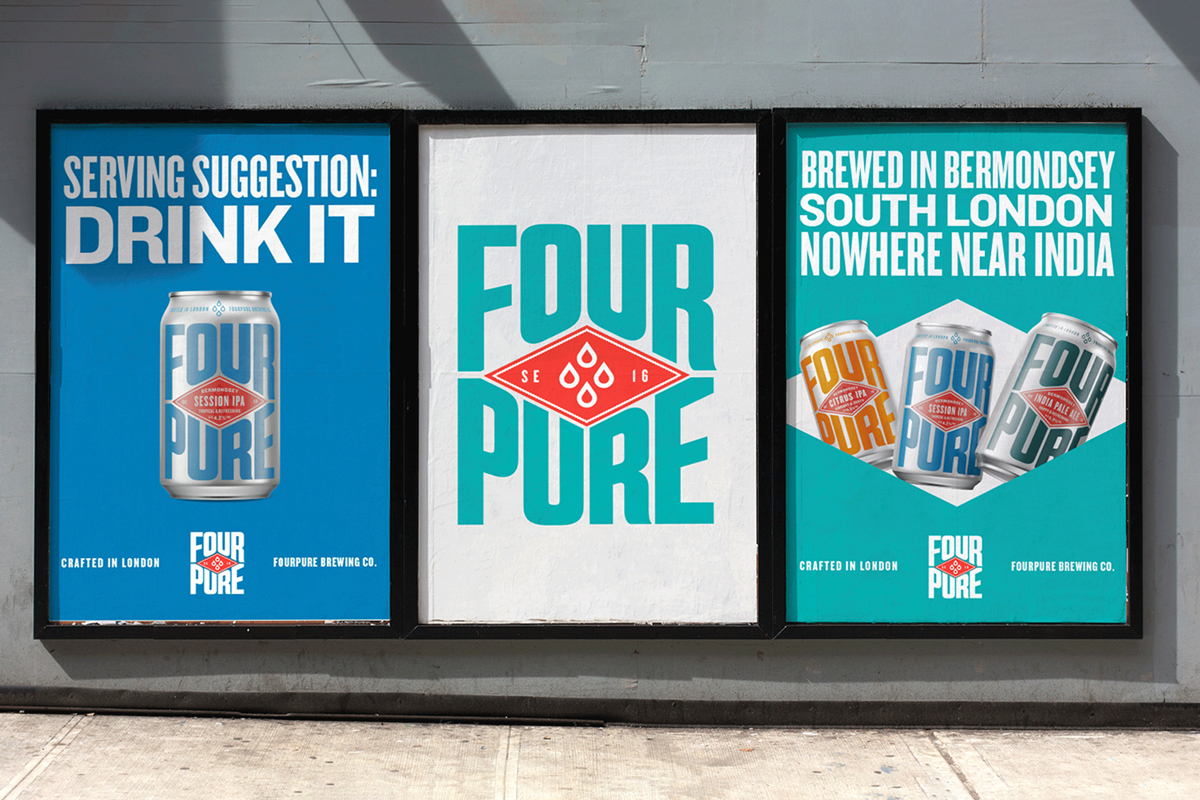
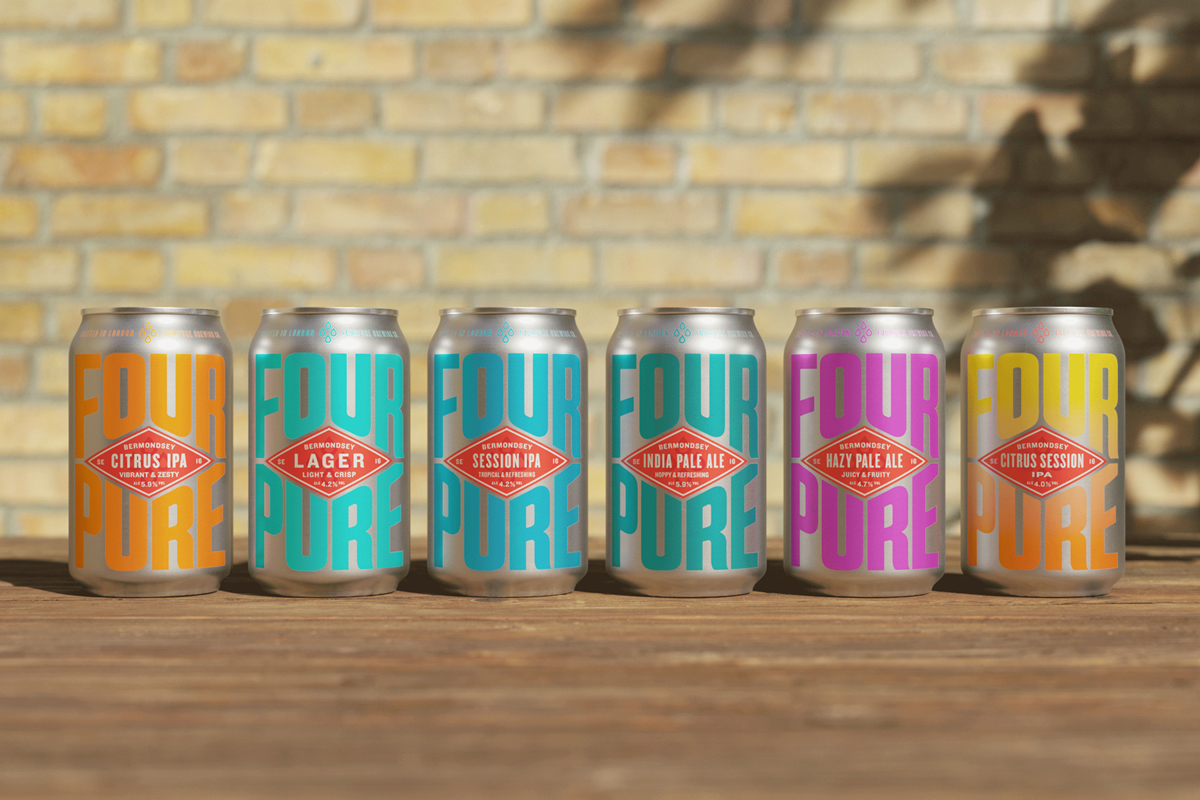
Just like beer is at the heart of good times, the new brand places beer and Bermondsey at the heart of Fourpure. A distinctive red diamond device is surrounded by confident, industrial lettering that flexes to fill its canvas.
A simple Four Drop icon symbolises the Fourpure name and alludes to each beer’s four base ingredients. Finally quality cues and a subtle nod to Bermondsey’s textile past are added through edged detailing around the diamond.
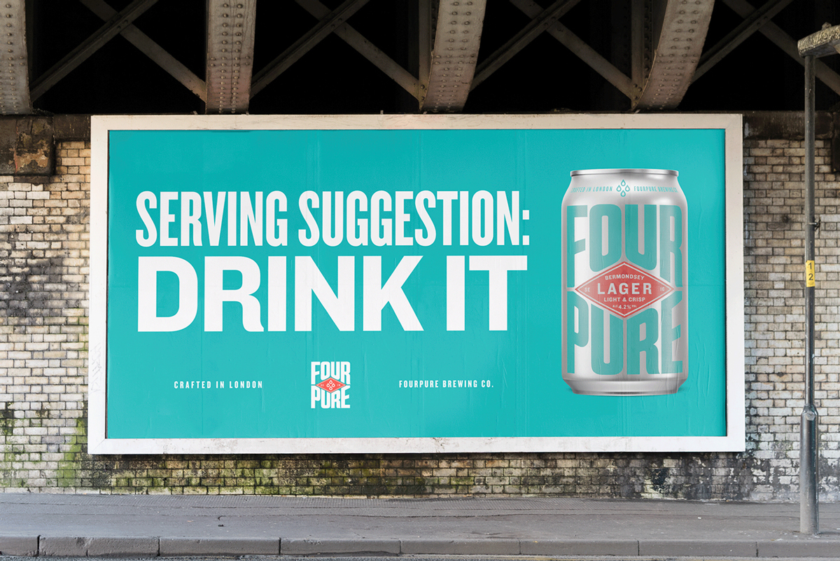
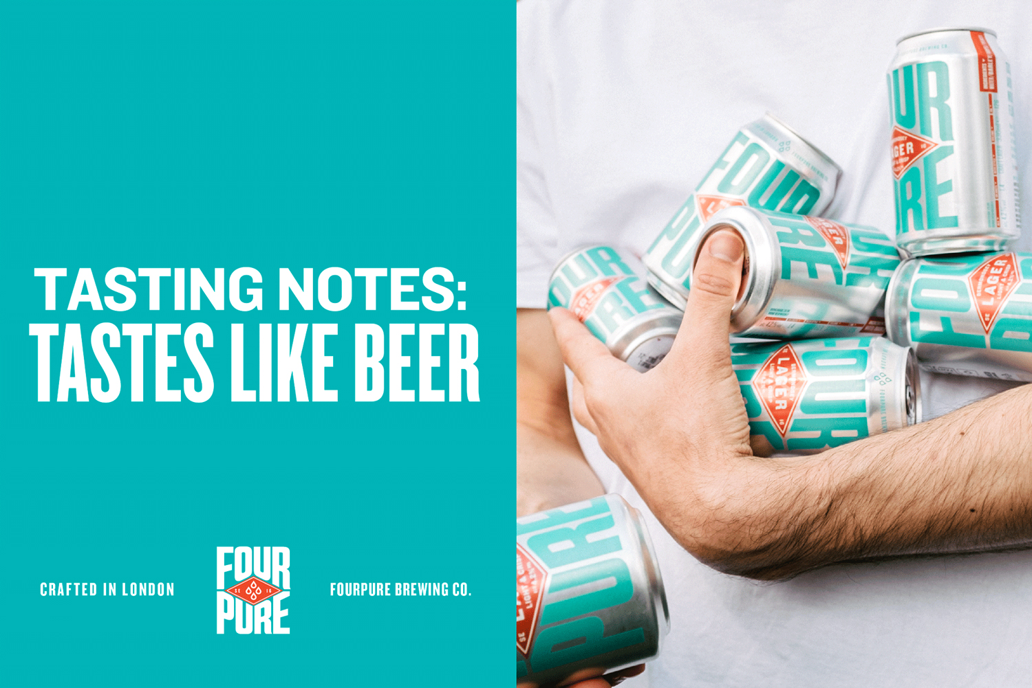
A proud product of its postcode, Fourpure’s new refreshingly simple ethos is brought to life across social and advertising. With a playfully unpretentious tone of voice and a strikingly straightforward art direction to match, there’s no thesaurus needed for these tasting notes or serving suggestions.
From its Basecamp Bermondsey taproom, to in store and on the road activations, Fourpure’s new contrasting colours and strong, scalable assets mean it supercharges stand out in any environment.
With Fourpure’s internal team rolling the visual identity out across the full range, the new brand is a return to Fourpure’s fundamentals: great beer meets Bermondsey attitude, pure and simple.
CREDIT
- Agency/Creative: Thirst Craft
- Article Title: Thirst Craft Returns to Fourpure’s Fundamentals to Forge a Refreshingly Simple New Look
- Organisation/Entity: Agency
- Project Type: Packaging
- Project Status: Published
- Agency/Creative Country: United Kingdom
- Agency/Creative City: Glasgow
- Market Region: Europe
- Project Deliverables: Brand Redesign, Brand Tone of Voice, Brand World, Packaging Design, Rebranding
- Format: Can
- Substrate: Metal
- Industry: Food/Beverage
- Keywords: Thirst, Fourpure, Fourpure Brewing, Craft Beer, Beer, Cans, Rebrand, Brewery
-
Credits:
Creative Director: Matt Burns


