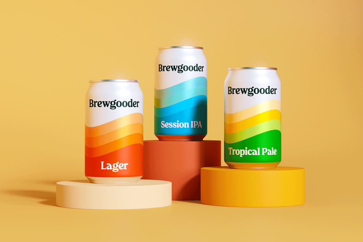
Inspired by a trip to Nepal, where a bad experience with contaminated water unearthed greater questions, Brewgooder made it their mission to provide access to clean water, drive positive change and empower communities. An ambition that swiftly propelled them from crowdfunding success to retailer listings nationally in only two years.
As people are increasingly becoming more invested in the impact of their choices and actions, most beer brands have turned to sustainability and environmental efforts as means to their CSR goals. Whilst everyone is fighting the category, Brewgooder wanted to fight for a cause, claiming its place as the people-positive pioneer set to spearhead a new chapter in beer.
To mark this shift in direction, the Thirst team worked closely together with the two visionaries behind the Brewgooder brand on refreshing their strategy and reimagining the visual identity to be fit for the future.
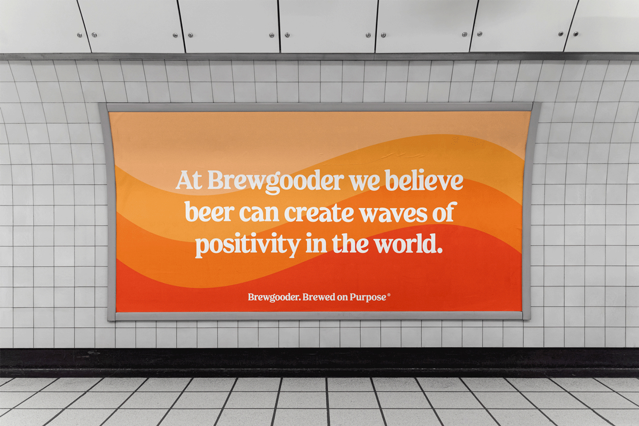
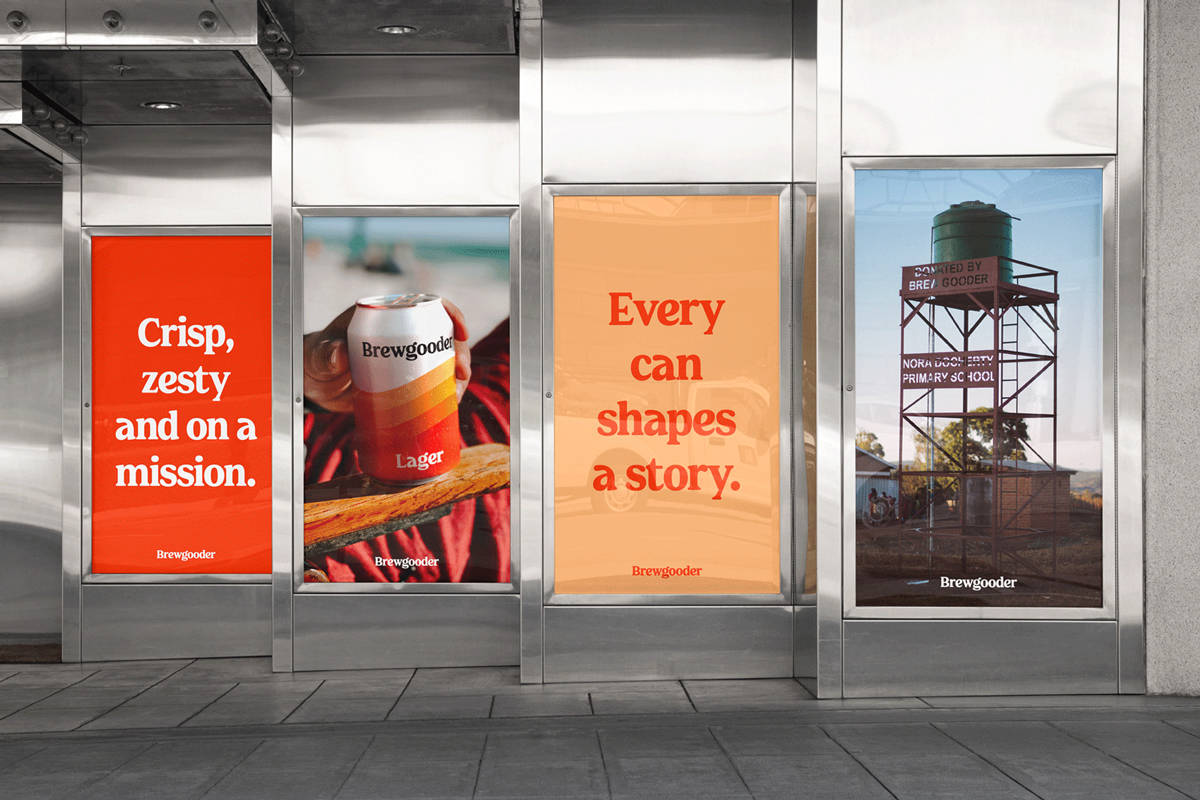
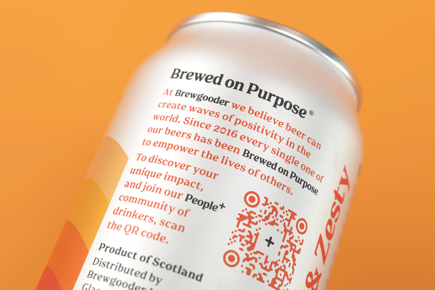
With every can providing 100 times its volume in clean water to communities, the brand is turning its drinkers into a driving force for progress and beer into an icon of empowerment. We instantly knew the new design therefore had to be as immediate as the brand’s impact.
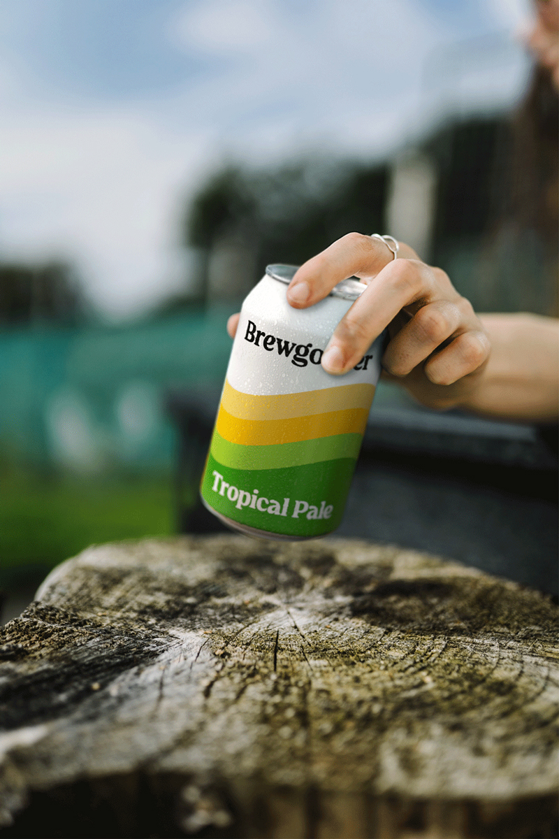
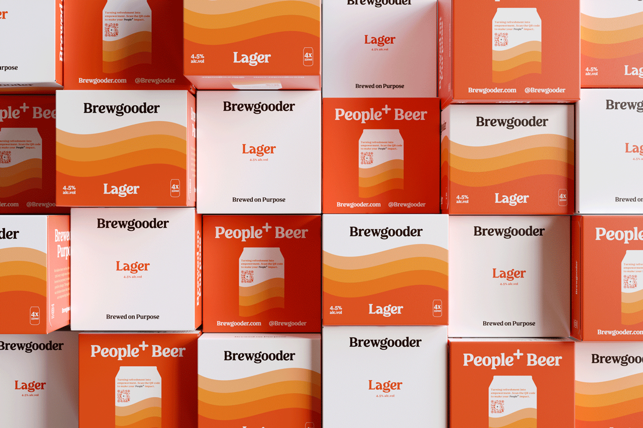
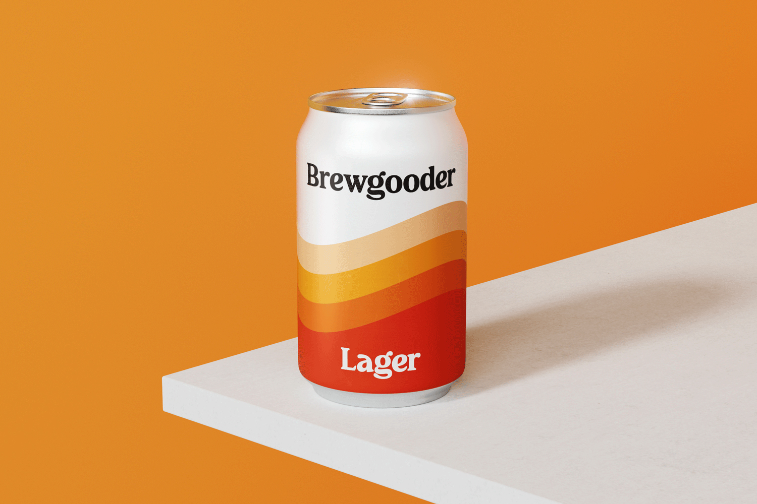
A metaphor for the positive ripples of change, the wave device speaks to beer, clean water and the power of togetherness in equal measure. Bold, simple and unburdened by category conventions, it’s a symbol of a new type of beer: one that’s Brewed on Purpose.
In reimagining the brand palette, we defined the Brewgooder orange as our hero colour. A symbol of warmth, optimism and positivity which, paired with a hint of crisp white, instantly becomes a shortcut to the brand’s vision. Rolled across the core lager and the brand world, it builds overall cohesion and sets the brand apart in the category.
The new brandmark is a departure from the start-up days and a step towards iconic confidence. Whilst looking established and proud, we crafted a human touch within it to reflect the brand’s people-centric ethos.
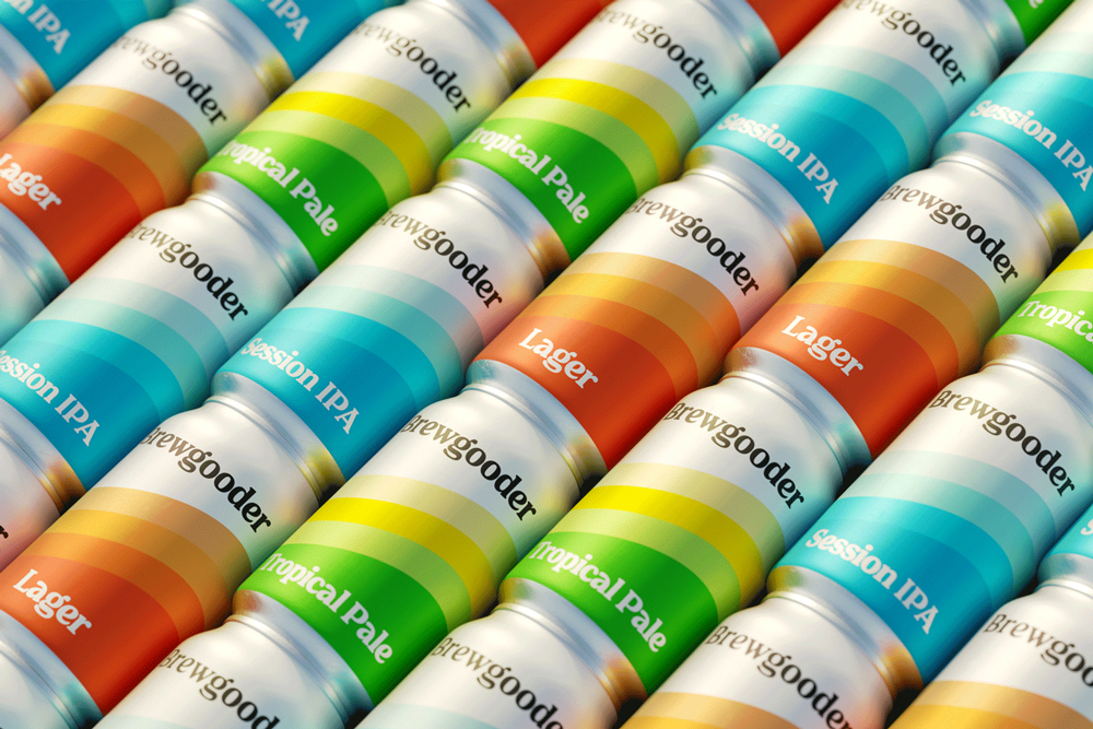
Extended across the entire product portfolio, the new design system is a flexible canvas for the brand’s ongoing collaborations with other like-minded breweries. Making even bigger waves of change, whilst brewing great beer too.
“Working with Thirst has been one of the most important steps in realising the potential of the Brewgooder brand,” commented Alan Mahon, Founder of Brewgooder. “They gave us scalable simplicity, and a beautiful confidence in who and what we are as a brand”
“Brewgooder brew great beer, but what sets them apart is their incredibly powerful purpose that we wanted to celebrate through design,”added Matt Burns, Thirst Creative Director and Founder. “Whilst retaining cues of refreshment and taste through colour and simplicity, we transcended the category and stripped away any expected craft beer language, visually positioning Brewgooder as a beacon of positivity and progress.”

CREDIT
- Agency/Creative: Thirst Craft
- Article Title: Thirst Craft Making Waves of Change on Brewgooder Redesign
- Organisation/Entity: Agency
- Project Type: Packaging
- Project Status: Published
- Agency/Creative Country: United Kingdom
- Agency/Creative City: Glasgow
- Market Region: Europe
- Project Deliverables: Brand Guidelines, Brand Identity, Brand Redesign, Brand Strategy, Brand Tone of Voice, Brand World, Packaging Design
- Format: Can
- Substrate: Metal
- Industry: Food/Beverage
- Keywords: WBDS Agency Design Awards 2021/22
-
Credits:
Creative Director: Matt Burns


