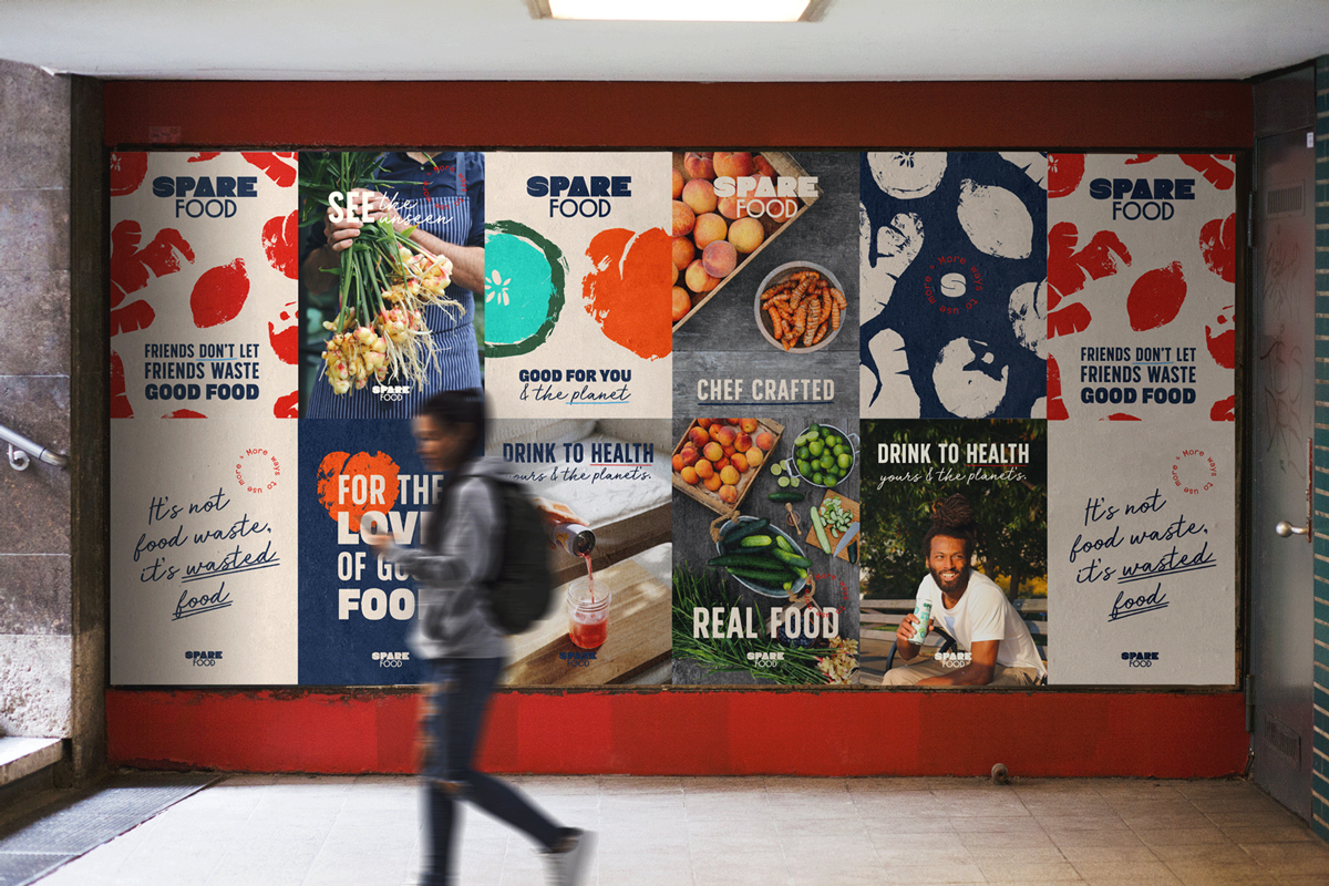
Chef Douglas McMaster of Silo famously called waste “a failure of the imagination”. Yet food waste is a global crisis, with 20-70% of many ingredients being “lost” between farm and table. This way of producing the world’s nourishment is not efficient, sustainable or resilient and needs to change. Which is exactly why two brothers, united by their vision for a post-food waste world, began Spare Foods.
Adam Kaye, formerly Culinary Director at Blue Hill and his brother Jeremy, previously at Patagonia, joined forces to reframe food waste as simply wasted food. With chef-led recipes, they set out to repurpose ‘spare’ ingredients which would otherwise go to waste and develop them into delicious lines of food and drink. With their flagship product, Spare Tonic, in the wings, they partnered with Thirst to supercharge this food revolution with a rallying identity.
Spare Foods is all about finding more ways of using more, seeing ingredients where others see waste. We wanted their identity to be an instant shortcut to this sentiment, with an iconic S hinting at infinite possibilities for use.
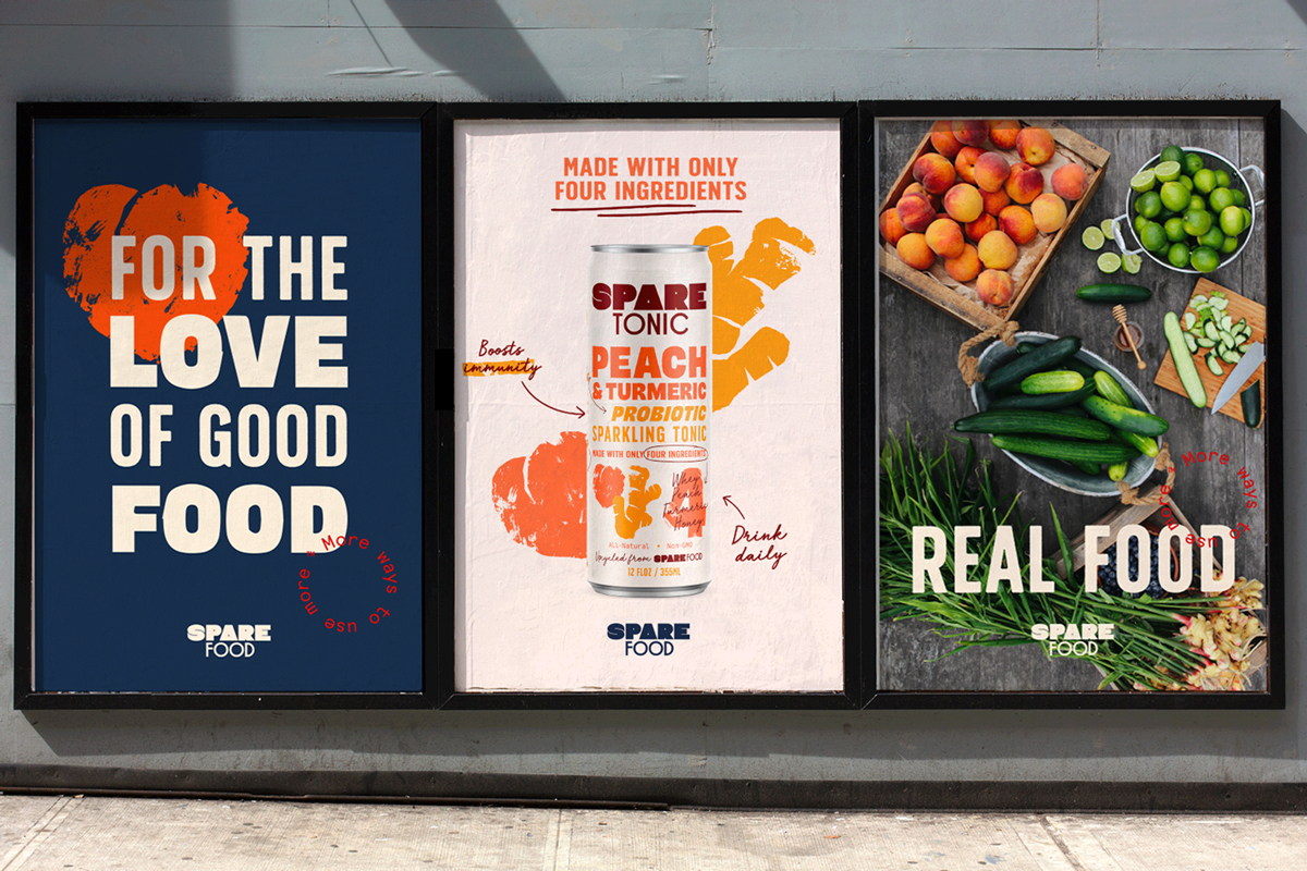
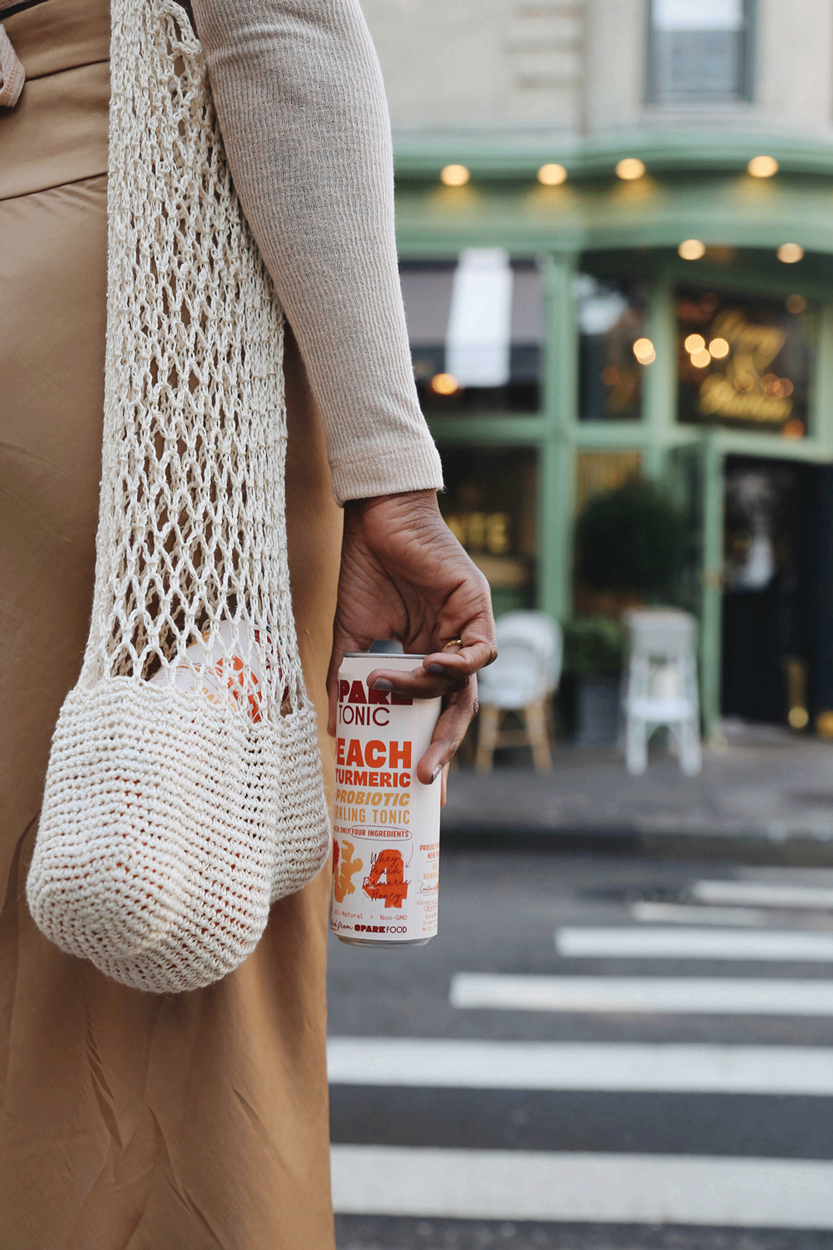
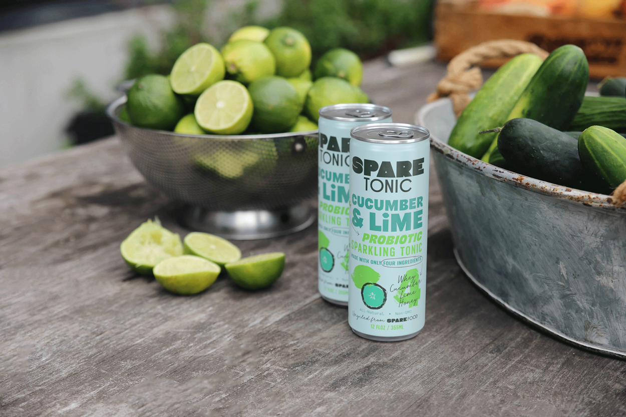
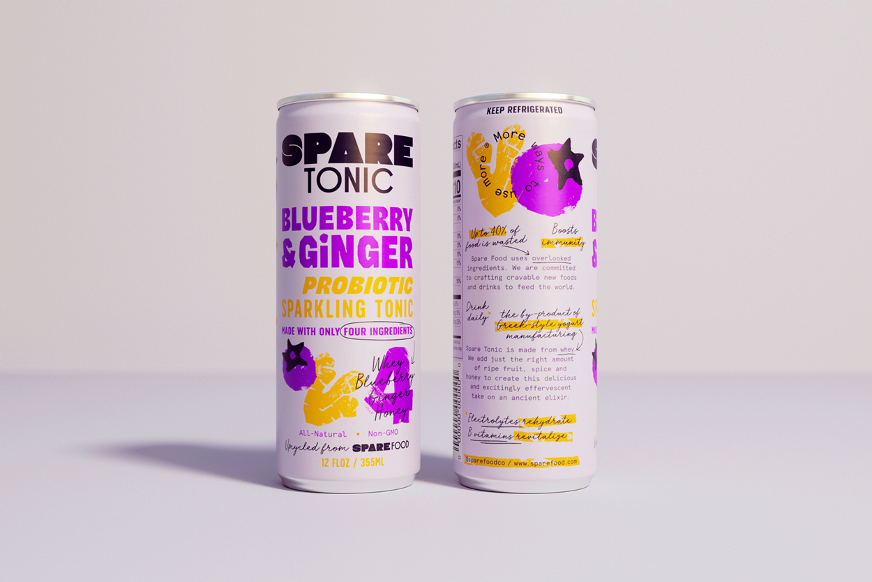
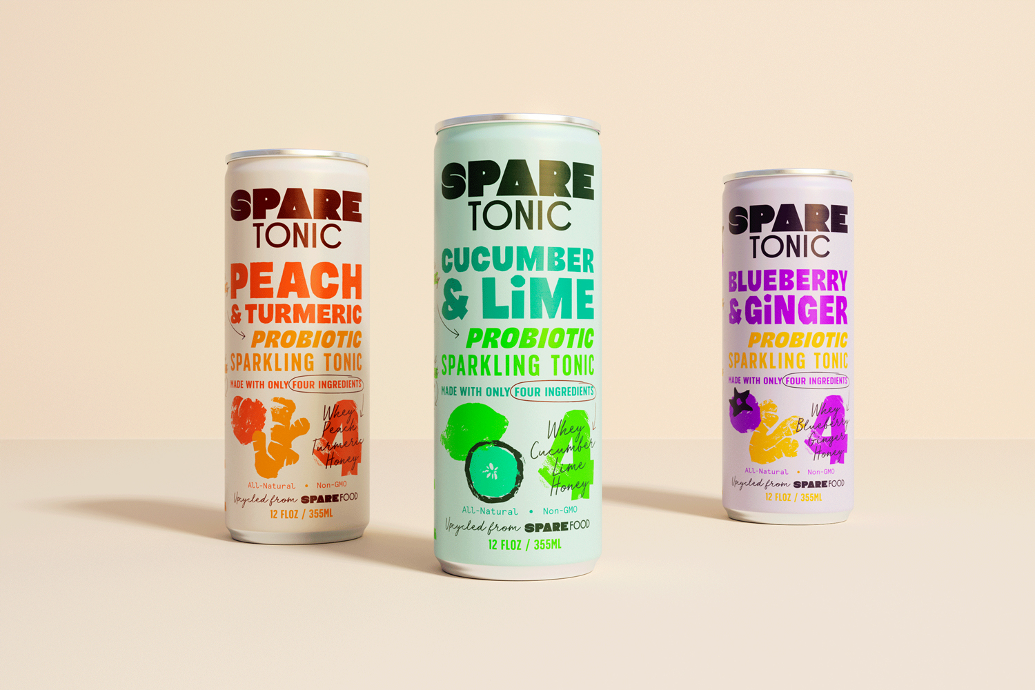
With an ambition to span multiple categories, Spare Foods’ first product is a sparkling probiotic drink made with four simple ingredients including ‘wasted’ whey (a byproduct of Greek yoghurt production 60% of which usually ends up in the bin). Through Spare Tonic we wanted to establish a natural and friendly visual brand identity which could transfer onto future Spare Foods products and open up the dialogue off pack.
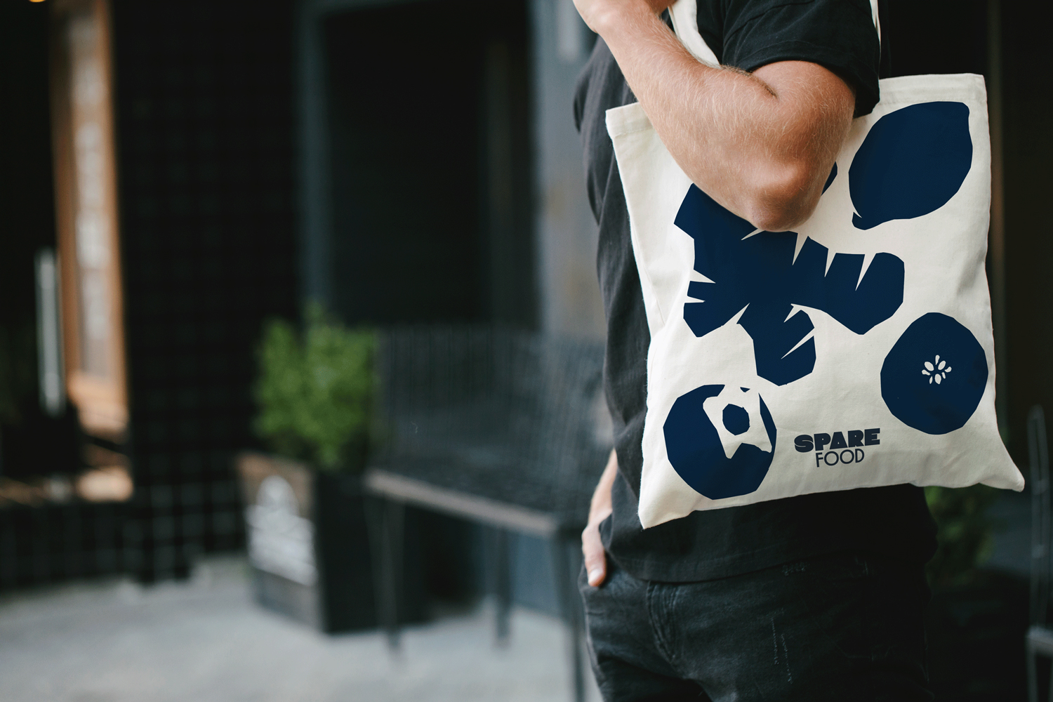
Playful typographic styles bring a friendly touch, highlighting benefits and speaking to transparency while inviting people into the conversation. A fresh colour palette paired with hand printed ingredient depictions dial up naturalness and simplicity while showing each and every Spare Food product is made with real ingredients.
Already a firm favourite with Momofuku, Trash Tiki and Gramercy Tavern, Spare Tonic is just the beginning for Spare Foods. Stay tuned as they continue to show the world more ways to use more.

CREDIT
- Agency/Creative: Thirst Craft
- Article Title: Thirst Craft Campaign and Packaging Design Communicate More Ways of Using More with Spare Food Co
- Organisation/Entity: Agency
- Project Type: Packaging
- Project Status: Published
- Agency/Creative Country: United Kingdom
- Agency/Creative City: Glasgow
- Market Region: North America
- Project Deliverables: Brand Guidelines, Brand Identity, Brand World, Packaging Design
- Format: Can
- Substrate: Metal
- Industry: Food/Beverage
- Keywords: WBDS Agency Design Awards 2021/22
- Keywords: Thirst, Spare food, tonic, tonic water
-
Credits:
Creative Director: Matt Burns


