


We set out to create a bold new brand that could unlock the fast-growing hard juice opportunity. Working with Boston Beer Company on their latest innovation, the goal was clear: craft a real fruit, non-carbonated RTD that delivers all the enjoyment without the bloat.
In a crowded category full of seltzers and carbonated competition, we spotted a fresh opportunity. One that taps into the desire for full flavour, natural refreshment and easy, sessionable drinking. The result? A standout new to world brand ready to squeeze more joy into the RTD shelf.
We began by exploring multiple proposition territories rooted in consumer trends and insights, shaping a strategic foundation for a brand that would feel immediately refreshing and full of life. Naming was key—and when we landed on Just Hard Squeezed, the rest followed naturally.
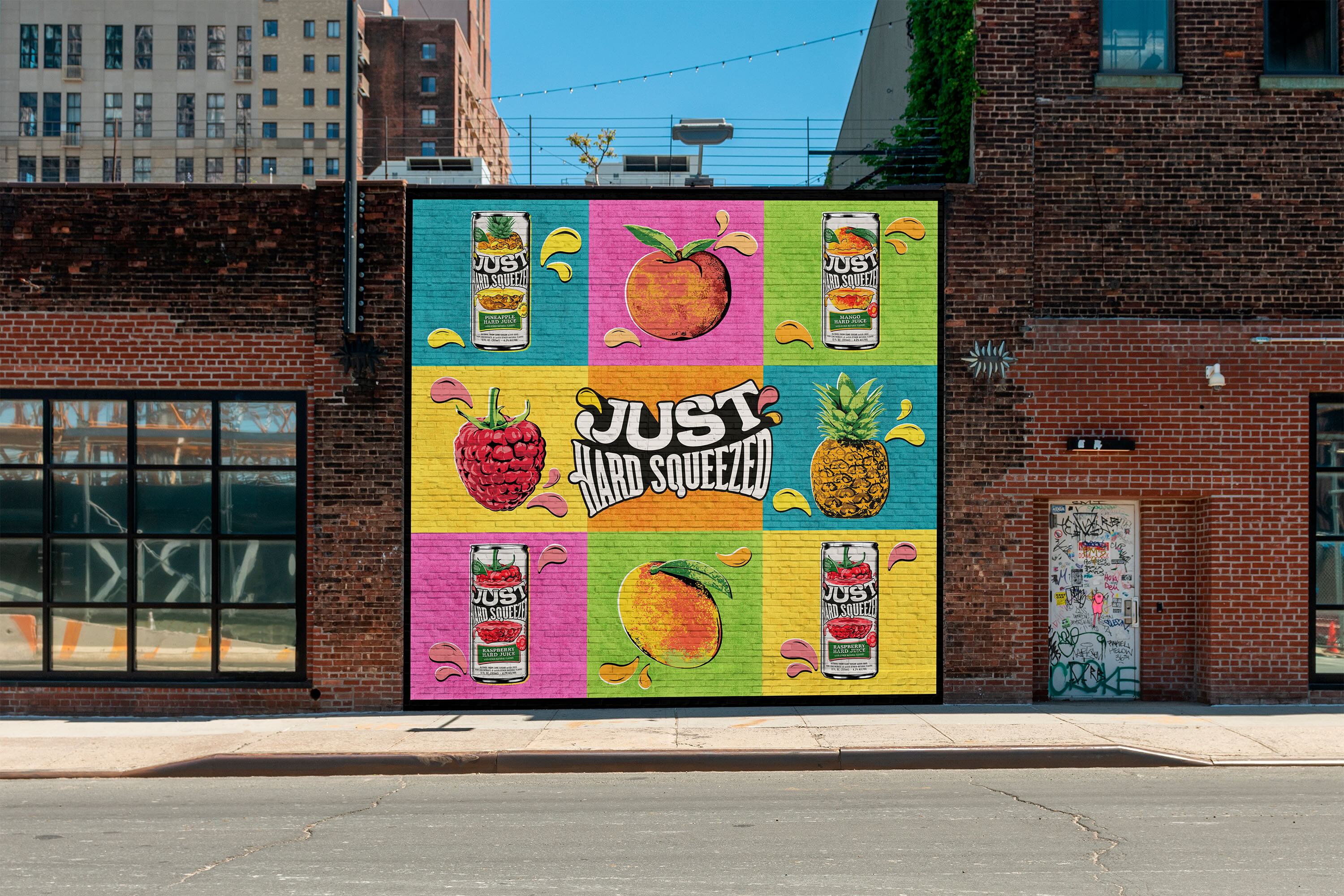
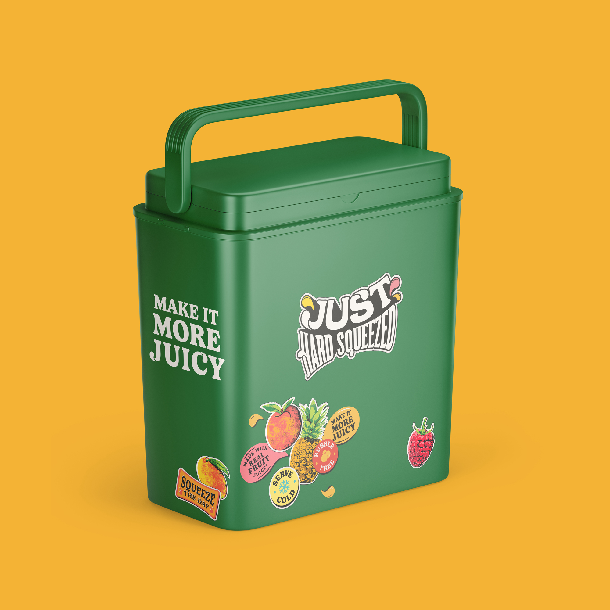
Our brand strategy centered around the Squeeze Squad, consumers who live to make every moment more juicy. This informed the creative platform Make Moments More Juicy and guided a design world packed with playful energy and visceral refreshment.
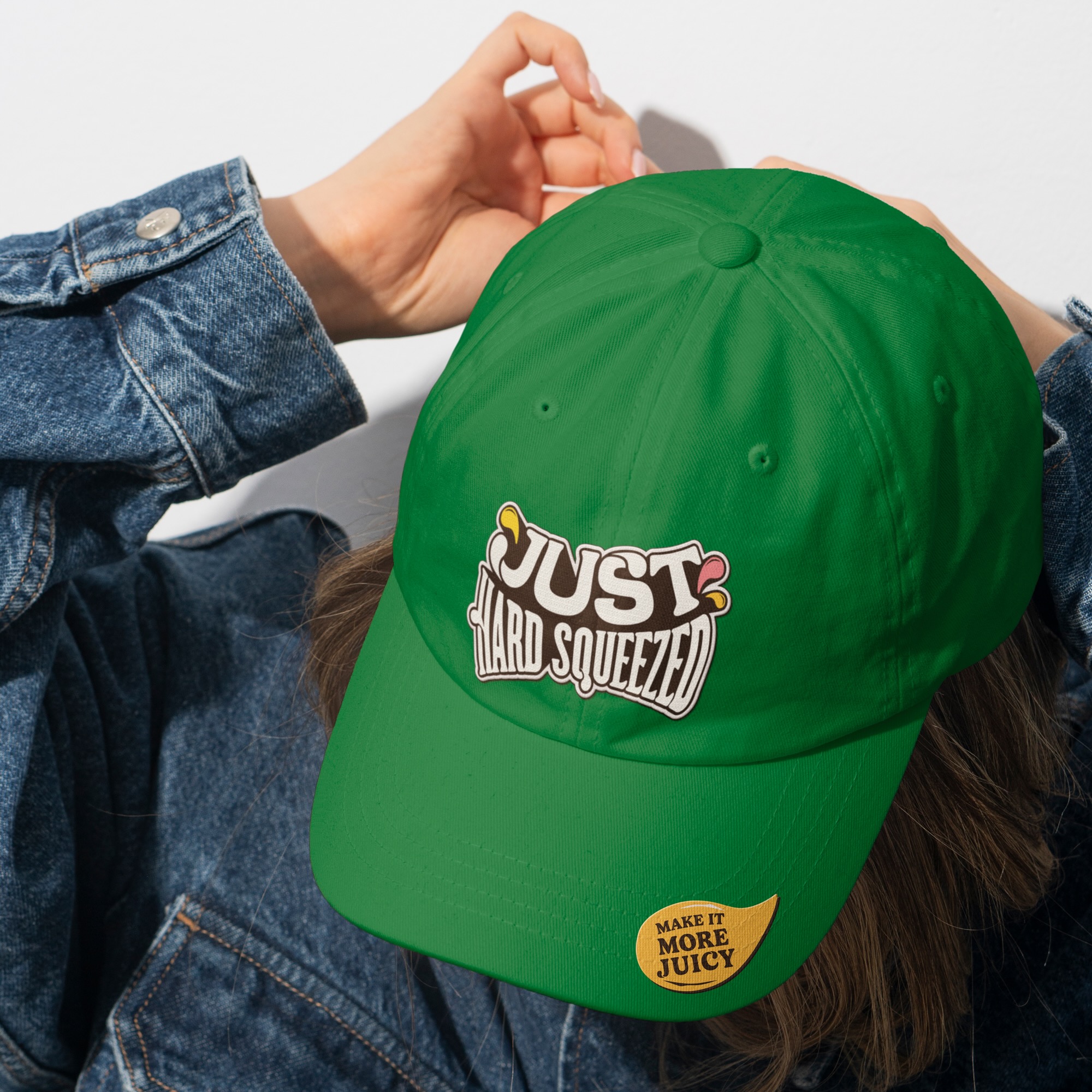
Every element of the identity dials up the flavour: from the juicy, squeezed typography to fruit illustrations that burst with colour and character. Pop-art inspired, bold and a little imperfect, the brand world feels real, fun and utterly thirst-quenching, just like the product itself.
Press Release:
Just Hard Squeezed arose from Boston Beer Company’s desire to fill a gap in the RTD category with a non-carbonated, hard juice made with real fruit, catering to consumers seeking bland compromise and breaking free of boring rituals and lackluster options. Working closely with the brand’s innovation team, the agency extracted the pulpy essence of the beverage for consumers who are thirsty for new concoctions in the RTD market.
At the heart of Thirst’s brand strategy, the mission to “Make Moments More Juicy” became a guiding principle that permeated every aspect of the project, from the spirited visual design to the delightful brand world. “The tagline became an ethos for us to live by as we were building the brand in the way we wanted everything to look but also how we wanted everything to behave. It’s a call to action to make the most out of life and to squeeze every last drop of fun out of every moment. We wanted to create a brand that captured this mindset by stripping everything back to its boldest and juiciest so that the moment you come into contact with Just Hard Squeezed, you’re met with the immediacy of ‘juicy,'” says Glen Thorpe, Thirst Associate Creative Director.
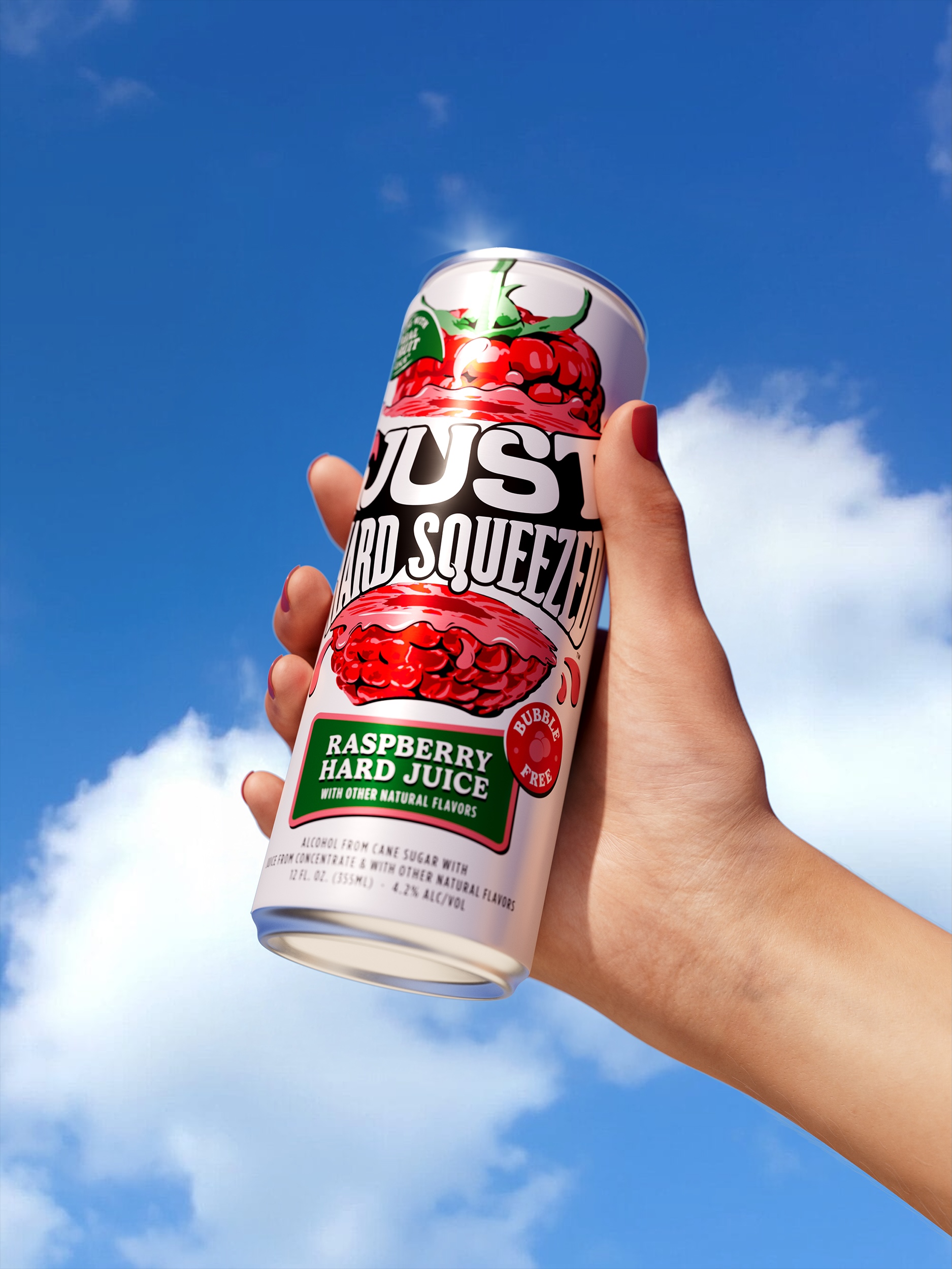
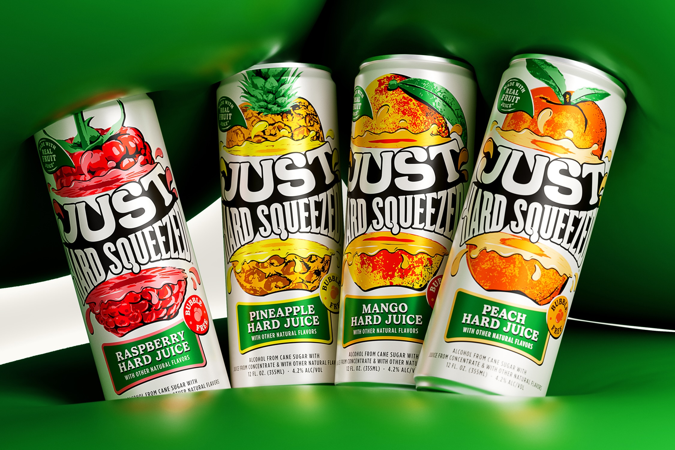
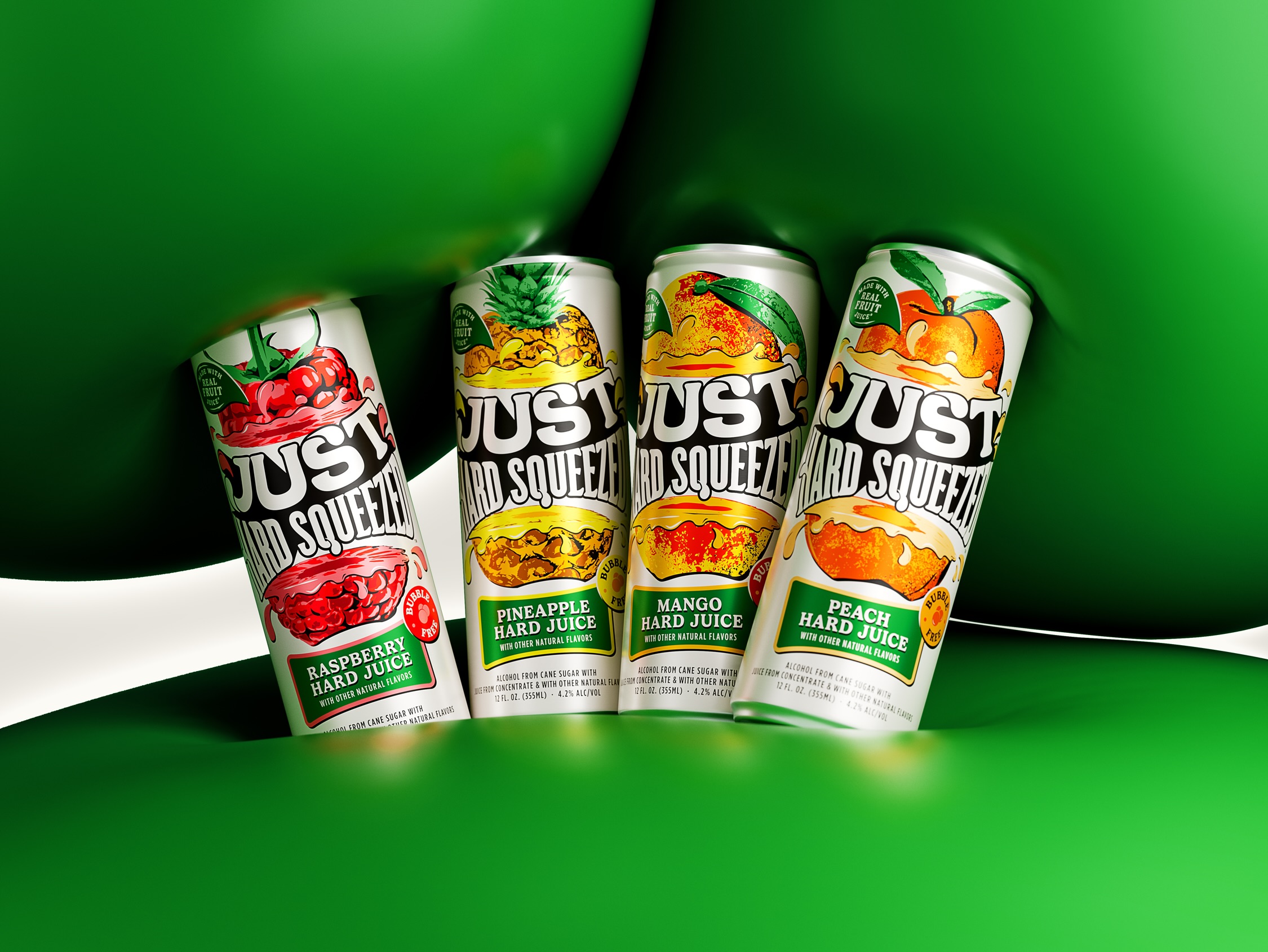
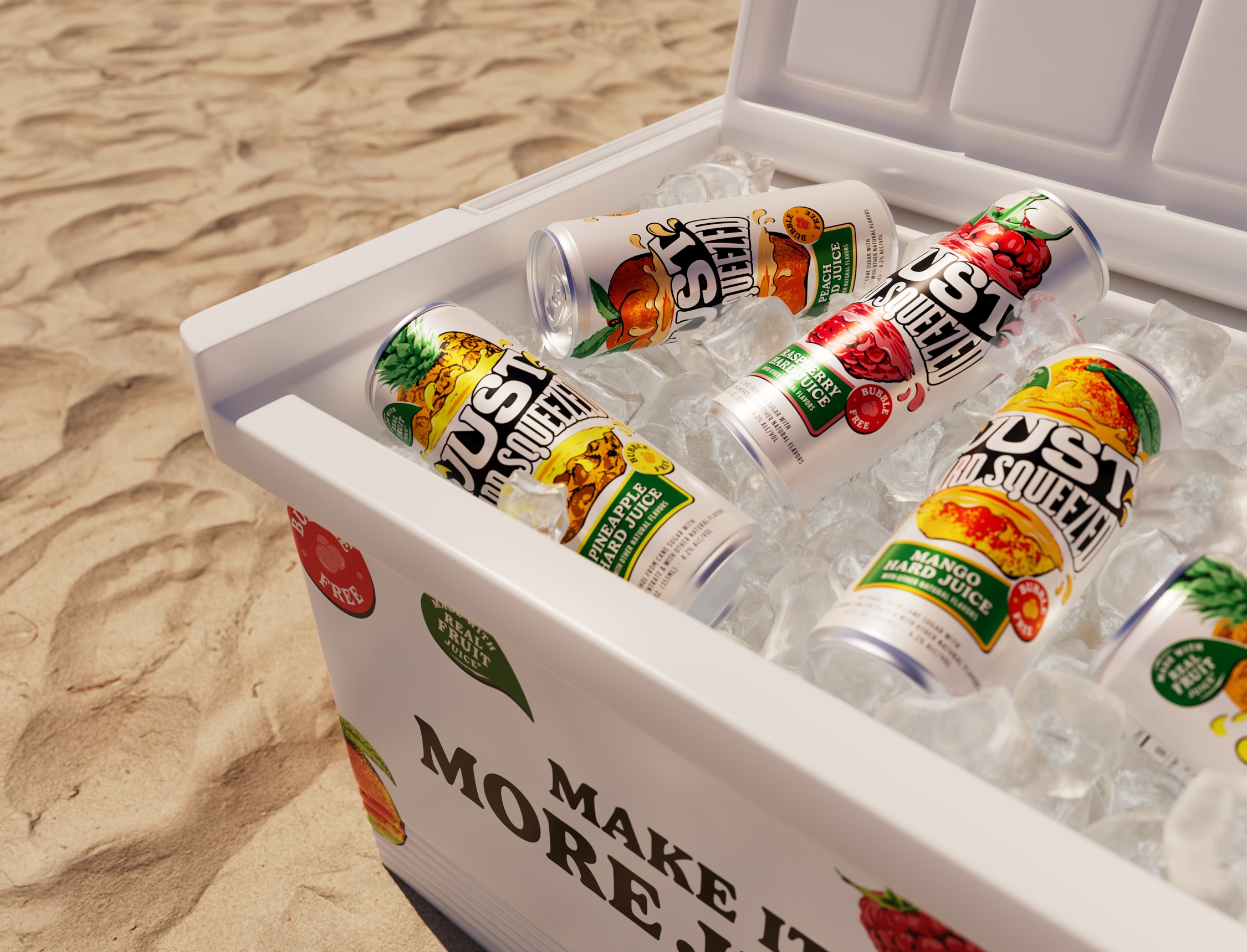
As the beverage is made with genuinely real fruit juice, it was crucial that the tagline also served as an immediate visual cue for consumers, from how the wordmark is “hard squeezed” and releases cartoonish droplets to the bright colors and illustrations on the pack. Even seemingly secondary design choices like the supporting type and iconography possess a ripe, thirst-quenching quality with natural curves and bulbous proportions.
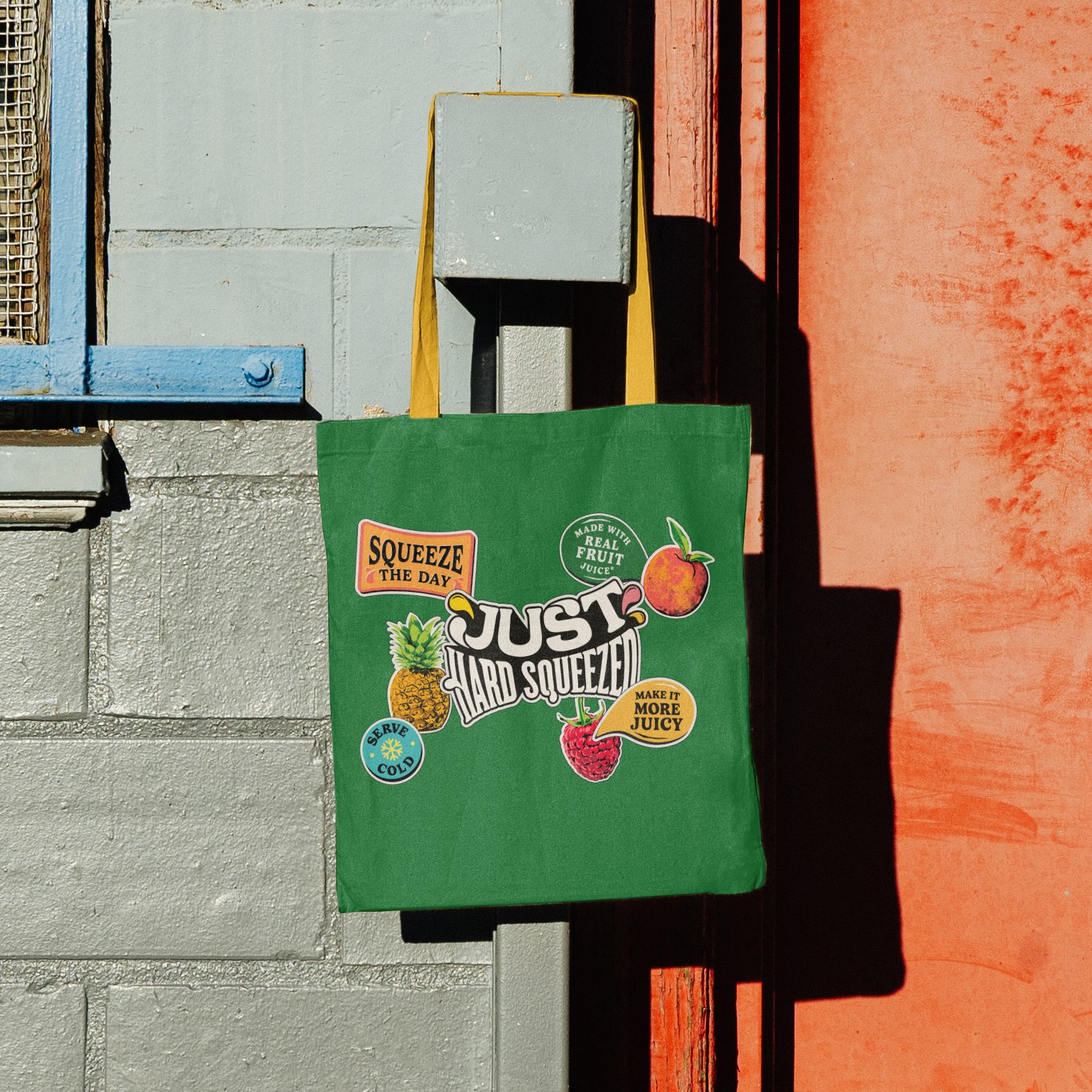
A significant influence on Just Hard Squeeze’s distinctive identity was Pop Art and editorial print ads of the 1950s and 1960s. Thirst leaned into these visual directions to balance attitude with a playful “juicy” aesthetic, allowing the agency to tap into a nostalgic space without being overtly retro. The result is a brand bursting with unbridled fun and mouthwatering energy.
Every design touchpoint was crafted to communicate the brand’s core message and philosophy to squeeze the day:
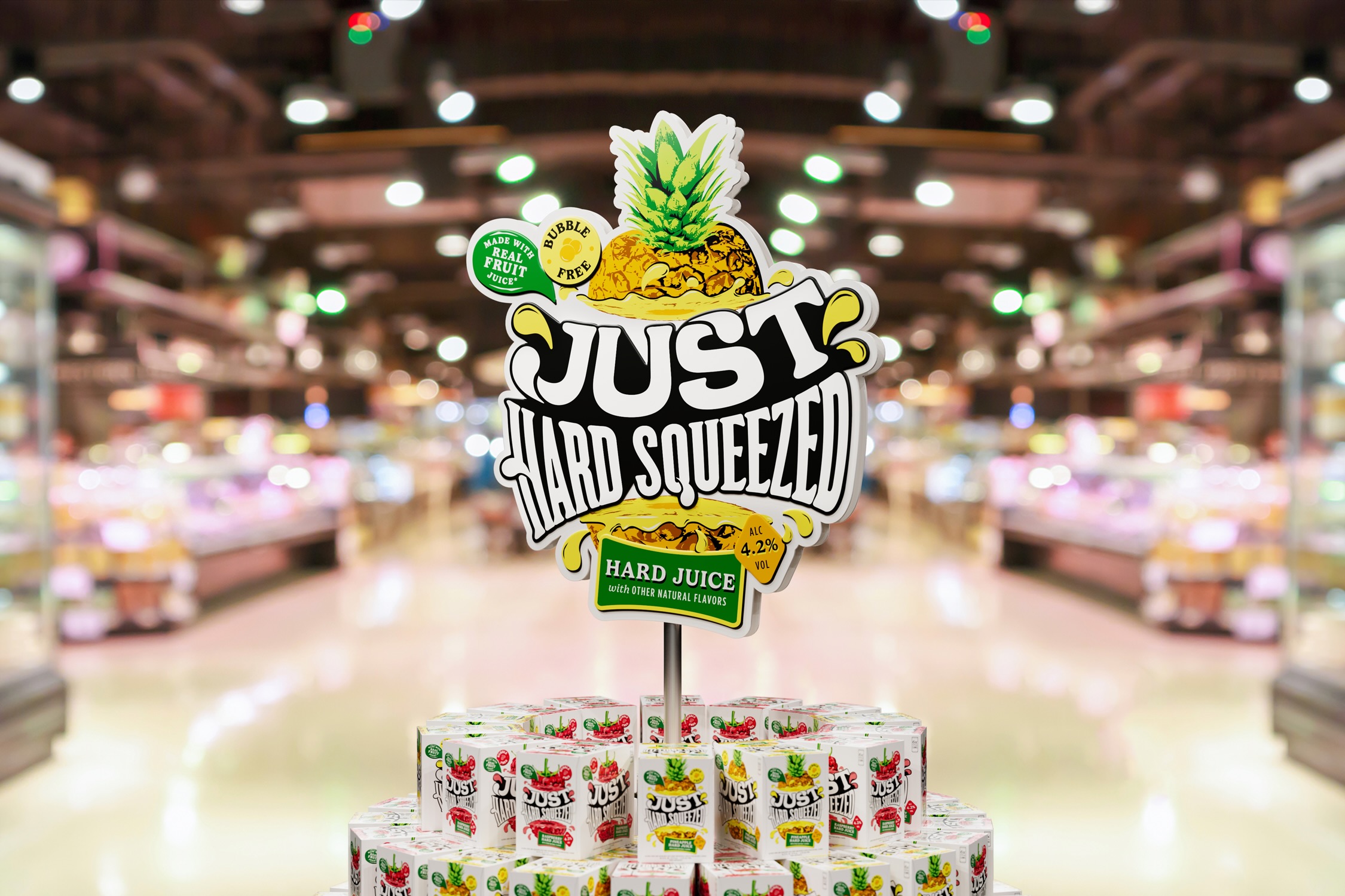
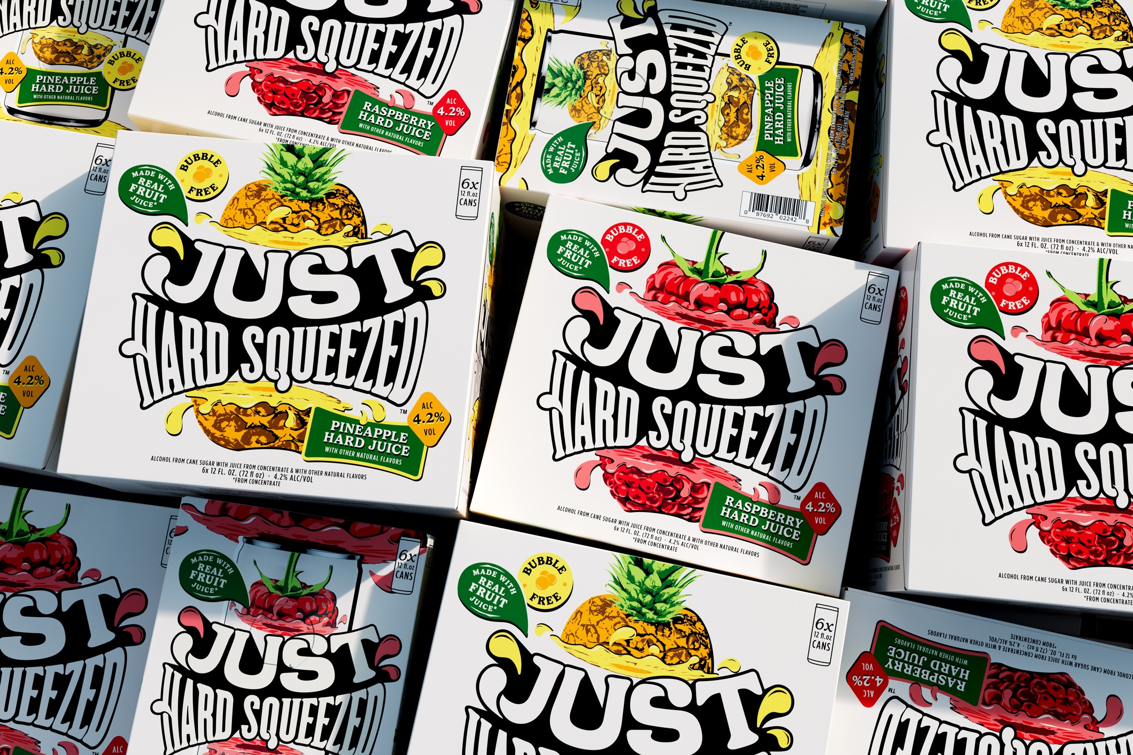
The Wordmark: The “Just Hard Squeezed” wordmark is cleverly designed to appear as if it’s being squeezed by a manual juicer. For flavor-specific communications and primary packaging, these droplets dynamically change color to match the corresponding fruit, creating continuity across the brand.
Illustrations: Fruit illustrations were created in-house by Thirst, and they amplify the flavor explosion of the drink’s natural ingredients in a lively manner. Meanwhile, stickers inspired by the same ones you would find on fruit in the produce aisle also appear throughout the brand world and help boost the brand’s attributes and character.
Typography: The brand employs Gelica and Gotham Condensed to ensure clarity and consistency across all communications. Typographic headlines are also given a graphic drop shadow treatment, seamlessly aligning with the brand’s Pop Art-inspired illustration style.
Photo Assets: Just Hard Squeezed’s product photography mirrors the drink’s taste with images that are full of life. The brand rejects fussy, posed placements and instead captures the drink in its natural state, a place where good times unfold with friends. Fruit is a significant part of the product story and features prominently in the photography in fun and subversive ways, reinforcing the “less is more” boldness guiding the entire brand: it’s just hard juice, good times, and great people.
With Just Hard Squeezed, Thirst has created a brand that rallies against predictable rituals, turning the ordinary into something unforgettable. The result is an unapologetically dynamic brand poised to make a splash in the RTD market, inviting consumers to escape the mundane and squeeze more out of life, no matter the occasion.
CREDIT
- Agency/Creative: Thirst
- Article Title: Thirst Brings Real Fruit Energy to Life with Just Hard Squeezed for Boston Beer Company
- Organisation/Entity: Agency
- Project Type: Packaging
- Project Status: Published
- Agency/Creative Country: United Kingdom
- Agency/Creative City: Glasgow, Scotland
- Market Region: North America
- Project Deliverables: Brand Identity, Brand Strategy, Packaging Design
- Format: Can
- Industry: Food/Beverage
- Keywords: RTD, Hard Juice
-
Credits:
Agency: Thirst


