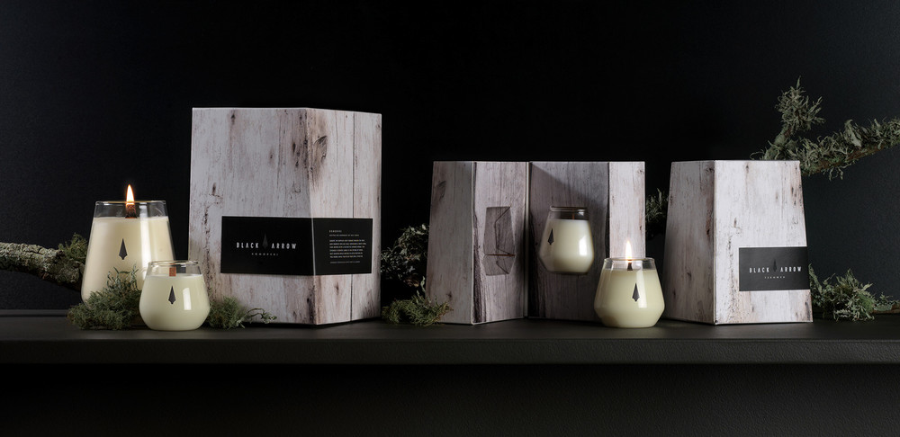
“Black Arrow Candles are an inimitable, sophisticated brand of soy wax candles, hand crafted and lovingly poured and packaged to order. Highly sought after by stylish, eco-conscious humans around the globe, their bold fragrance blends are either synthetic or derived from natural plant extracts. No animal-based products are used including honey, musk, milk or beeswax, making each candle reassuringly animal and vegan-friendly. Good for you, and good for the earth.
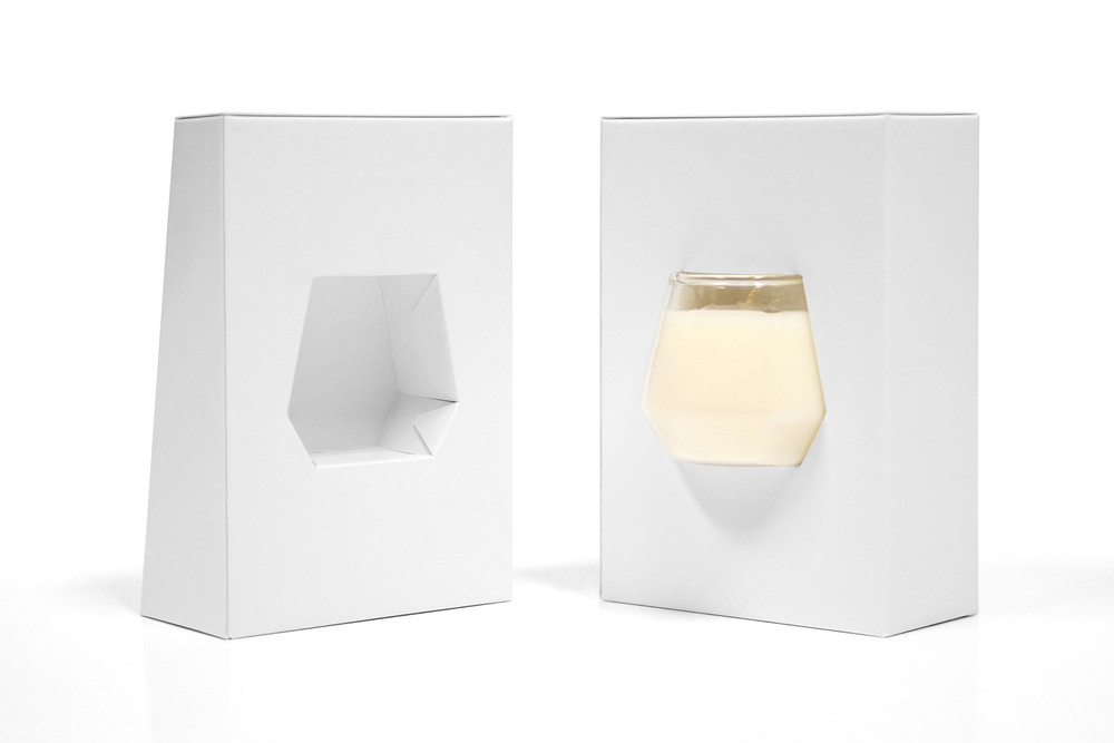
I was commissioned to create a unique, bespoke packaging piece for the new Arrowhead range. The challenge: it had to be distinctive and elegant, but robust enough to protect the high quality, hand blown glass vessel enveloping the candle.”
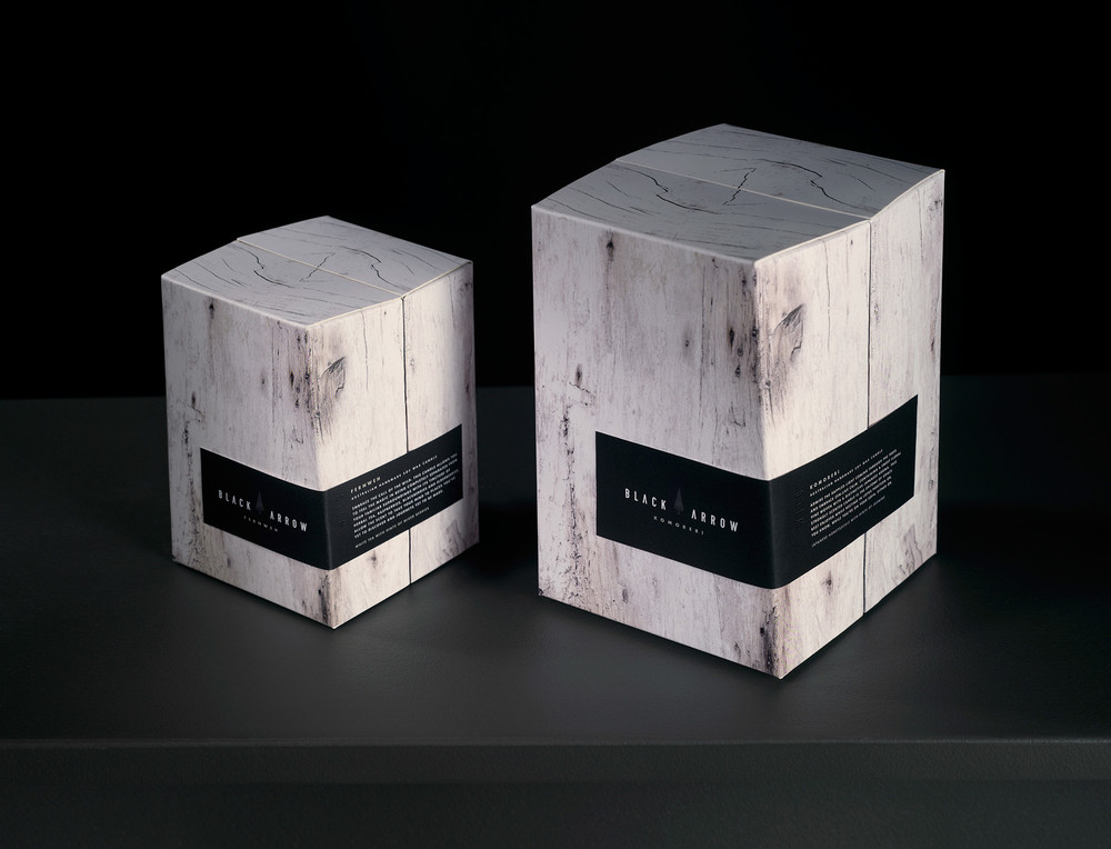
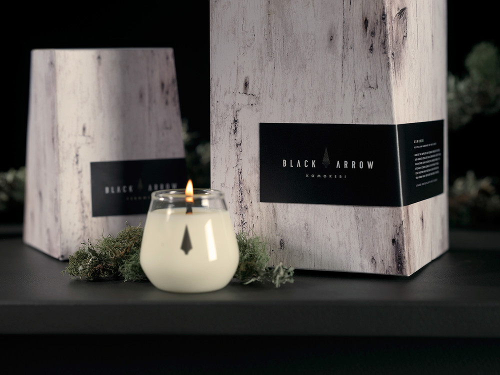
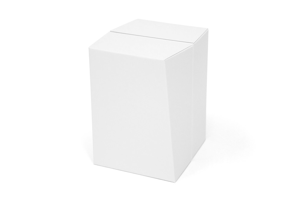
“Inspired by memories of Robin Hood firing arrows deep into the middle of tree trunks, the client had a clear vision of basing the packaging an this archery theme-yet with a modern, ready-for-retail look and feel. Accordingly, the ‘arrowhead’ (the candle) was set into a package that looks like a beautiful, modern, lime washed piece of wood. It is designed to be very deceptive – to draw customers in, to pick it up and discover the beautiful candle within.
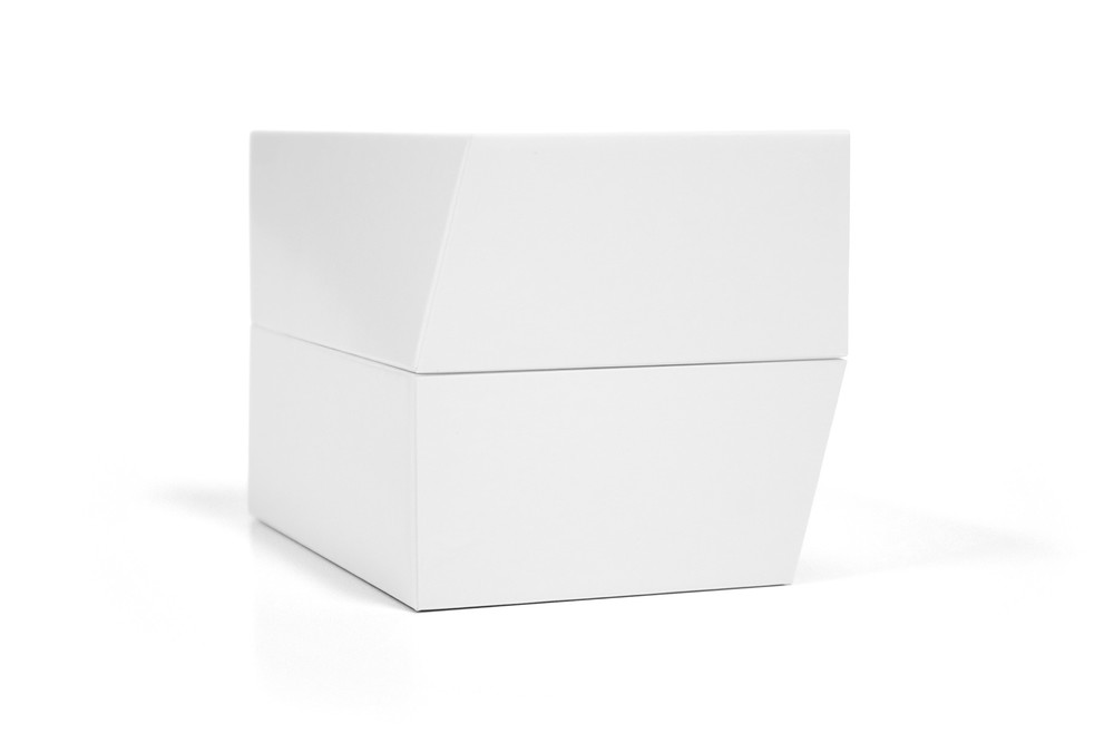
Then came the difficult part, the execution. No block of wood is the same, nor is it straight edged, so the plan was to design a cardboard form that was actually imperfect. A disruptive, yet natural shape was engineered by chamfering off the top right edge to create a unique, organic look and feel, just like wood. As the pack hinges in half, the two sides are actually the same piece, yet mirrored – resulting in a perfect balance of straight versus angled lines for the front, back, top, and bottom view points.
… backed by beautiful pack design.”
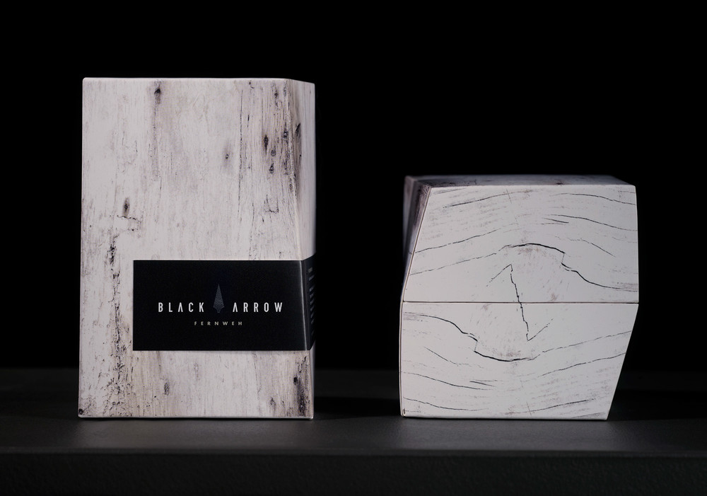
“To compliment this pack, Curious Design created a sophisticated piece of branding and labeling that embodies the spirit of Black Arrow.
A signature arrowhead was devised as a visual icon that can be integrated with the brand name, or used independently in a symbolic context. The two ‘A’s in the Black Arrow typography also have the horizontal bars between the outer slopes removed-to create subtle arrow shapes and reflect the marque.
The colour palette is deliberately understated and the arrowhead has been embossed with a ‘black on black’ texture for a tactile quality. All of these nuances ensure that the graphic content works harmoniously with the unique pack shape.”
CREDIT
- Agency/Creative: THINK Packaging
- Article Title: THINK Packaging – Black Arrow Candles – Arrowhead Edition
- Project Type: Packaging


