


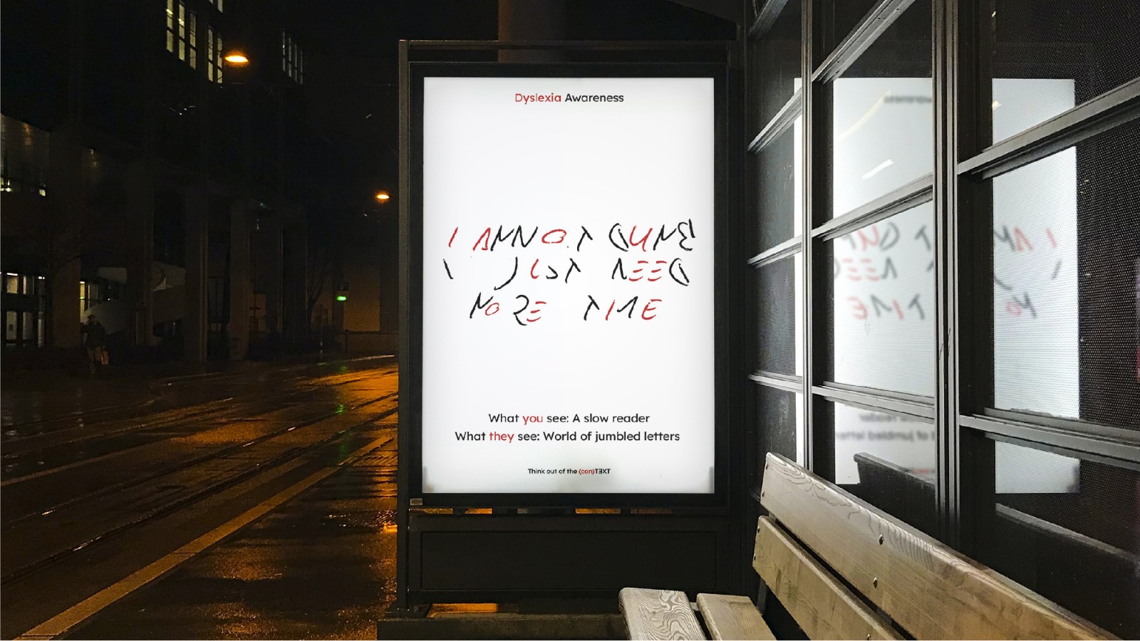
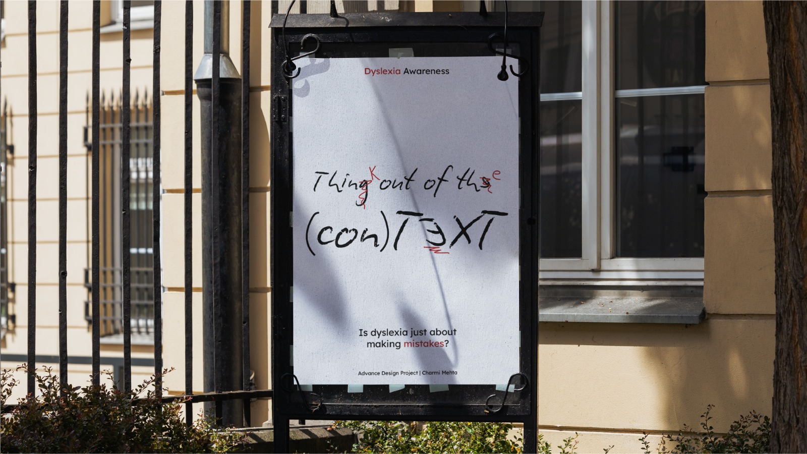
Think out of the (con)TEXT is a research-driven communication design project that challenges the deep-seated myths and societal misconceptions surrounding dyslexia in the Indian context. While traditional awareness campaigns often rely on static definitions and statistics, this project introduces a design-led framework that prioritizes experiential empathy over passive information. By translating abstract neurological challenges into perceivable visual narratives, the work invites neurotypical audiences to momentarily inhabit the cognitive environment of a dyslexic reader.
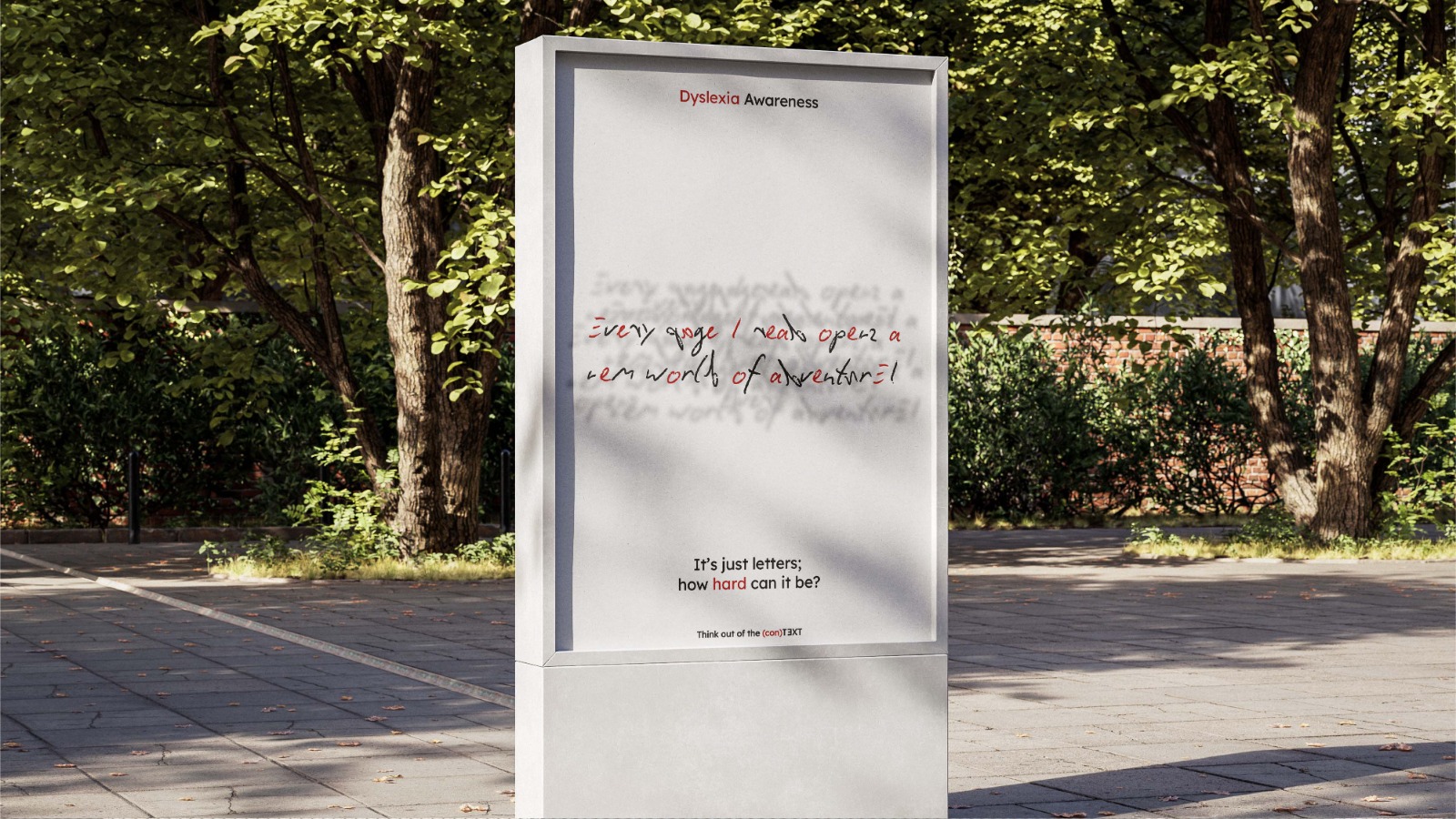
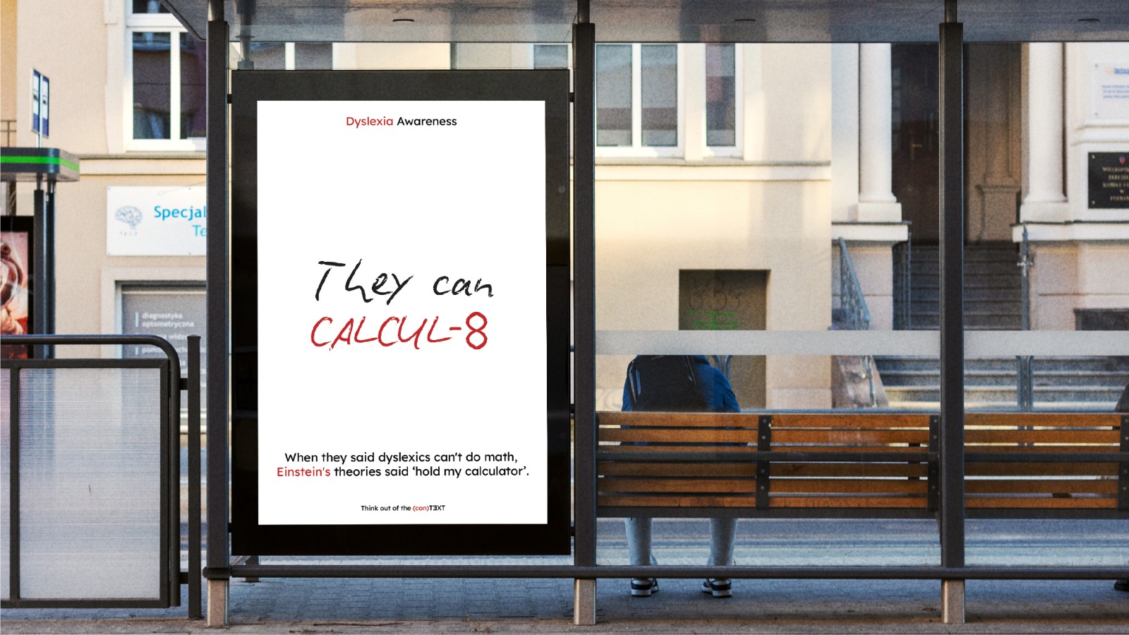
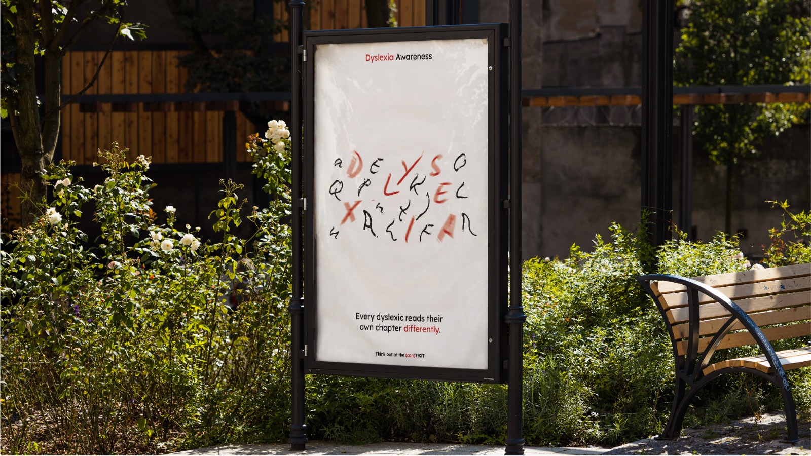
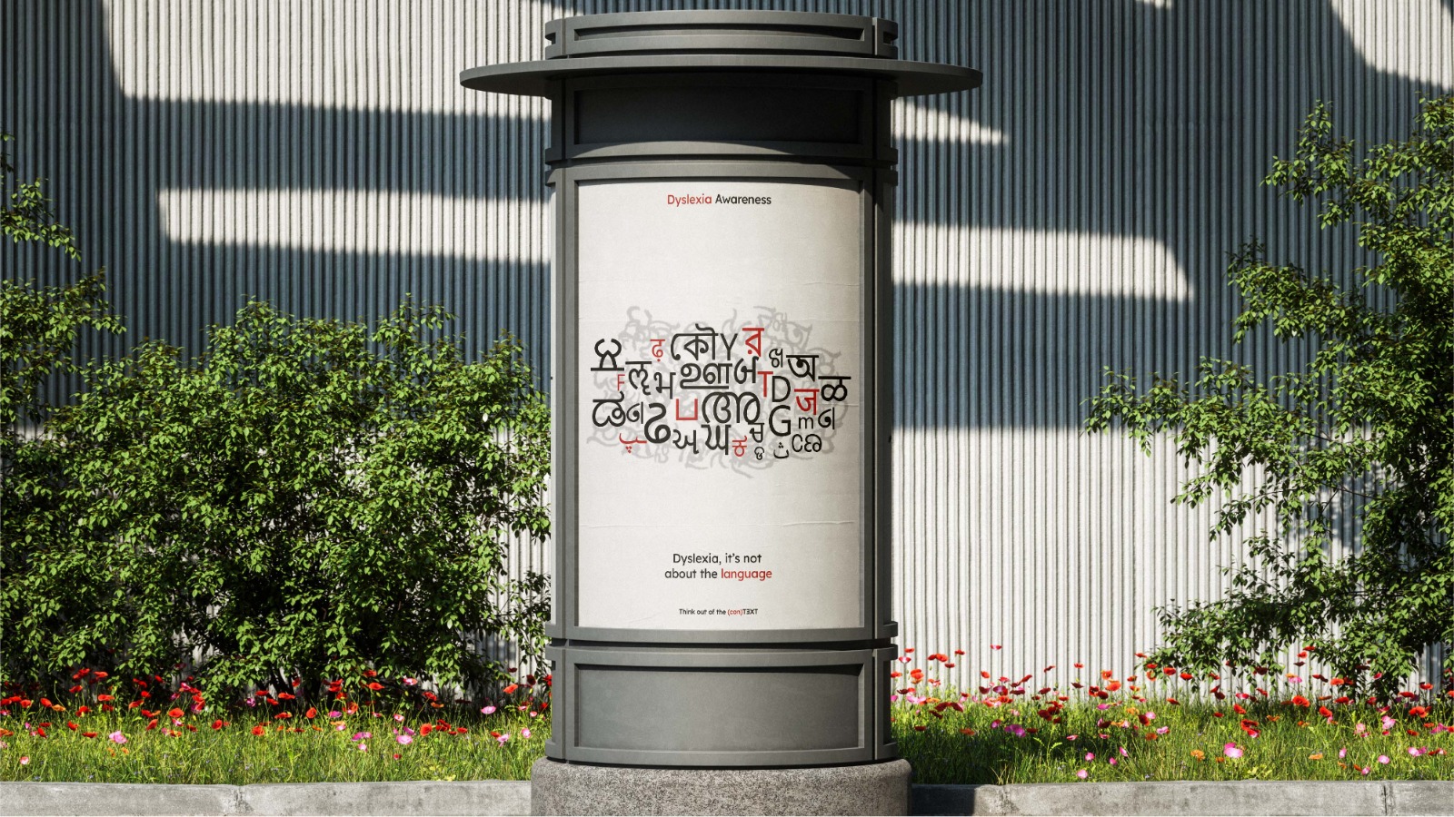
The visual system is anchored by a strategic dual-typography approach. It utilizes Lexend, a typeface designed specifically to reduce visual stress and improve readability, contrasted against Biro Script, which is manipulated through intentional typographic distortion. These distortions serve as a powerful visual metaphor, simulating the letter confusion, fragmented patterns, and perceptual instability that characterize the dyslexic experience. This intentional disruption of legibility encourages the audience to reconsider assumptions that often link reading difficulties to laziness or low intelligence.
Through a cross-media campaign addressing six core myths—ranging from the misconception that dyslexia is a simple language barrier to the false belief that it affects analytical reasoning—the project demonstrates the scalability of a unified visual identity. The effectiveness of this approach is backed by rigorous user testing; preliminary results showed a significant shift in participant understanding, moving from a 46% baseline to 90% post-exposure. By bridging the gap between clinical reality and public perception, Think out of the (con)TEXT establishes communication design as a vital tool for neurodiversity advocacy, transforming misconceptions into meaningful moments of empathy and education.
CREDIT
- Agency/Creative: Charmi Mehta
- Article Title: Think out of the (con)TEXT- Communication Design for Dyslexia Awareness
- Organisation/Entity: Student
- Project Type: Campaign
- Project Status: Non Published
- Agency/Creative Country: India
- Agency/Creative City: Ahmedabad
- Market Region: Asia
- Project Deliverables: Art Direction, Typography, User Experience
- Industry: Non-Profit
- Keywords: Dyslexia, Communication Design, Typographic Distortion, Empathy-Driven Awareness, User Centered Methodology,Visual Metaphor
-
Credits:
Student: Charmi Mehta


