


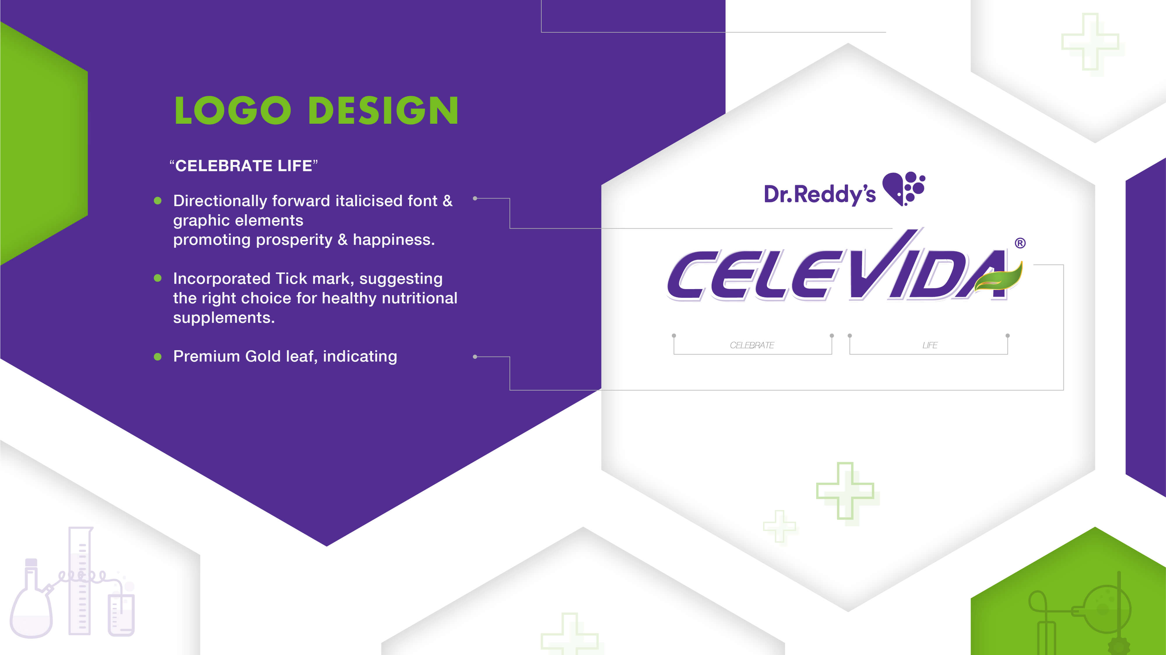
Working on Celevida with Dr. Reddy’s gave us the opportunity to shape a brand deeply rooted in the belief that Good Health Can’t Wait. For the core Celevida MFD variant, our task was to create a strong brand identity and packaging system for a product designed to help manage blood sugar, weight, and overall wellness. We approached this by portraying a dynamic, active lifestyle as the key benefit. To build credibility, we introduced subtle scientific touches and a clear, explanatory mnemonic that communicated the product’s functional logic. A bold purple became the anchor of the brand—eye-catching, distinct, and cohesive across flavours—helping the entire range stand out while supporting easy navigation.
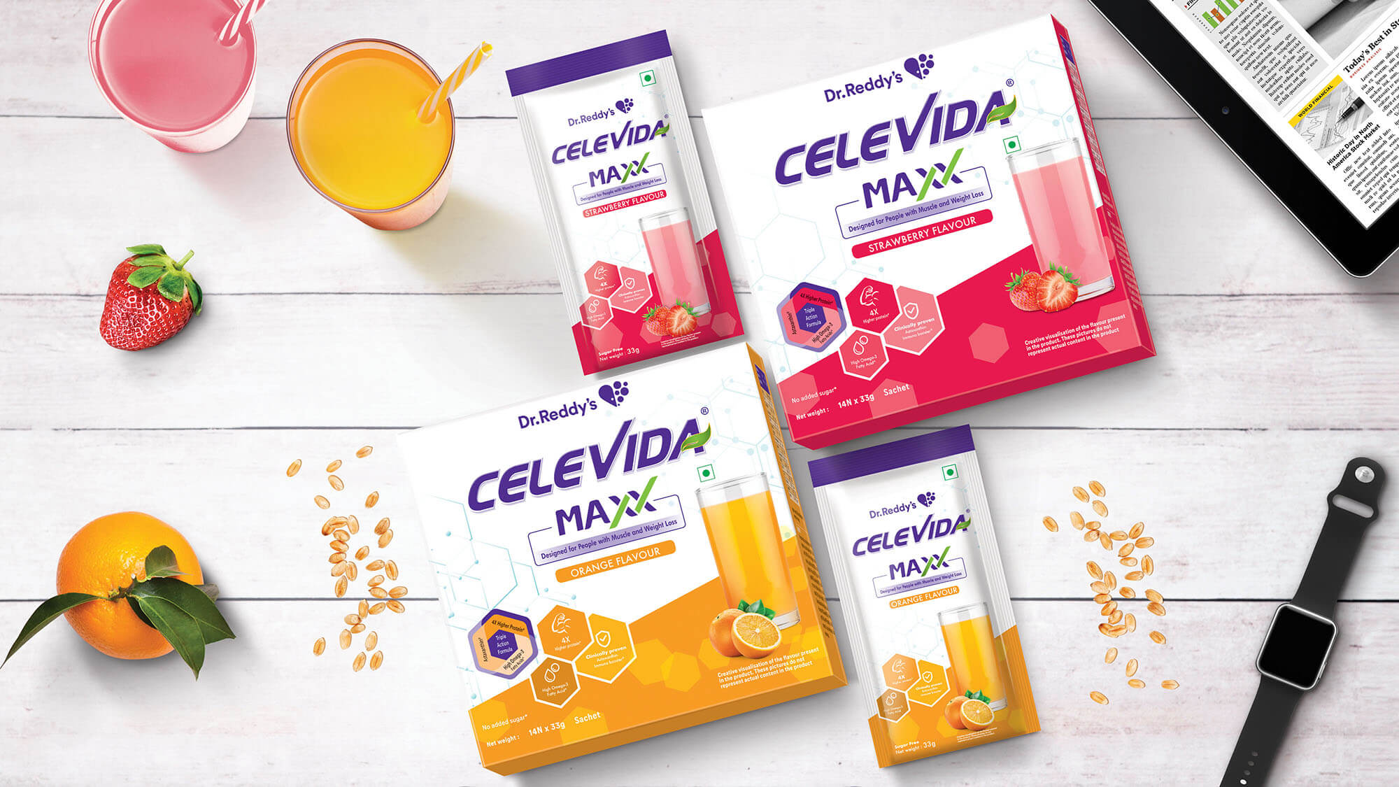
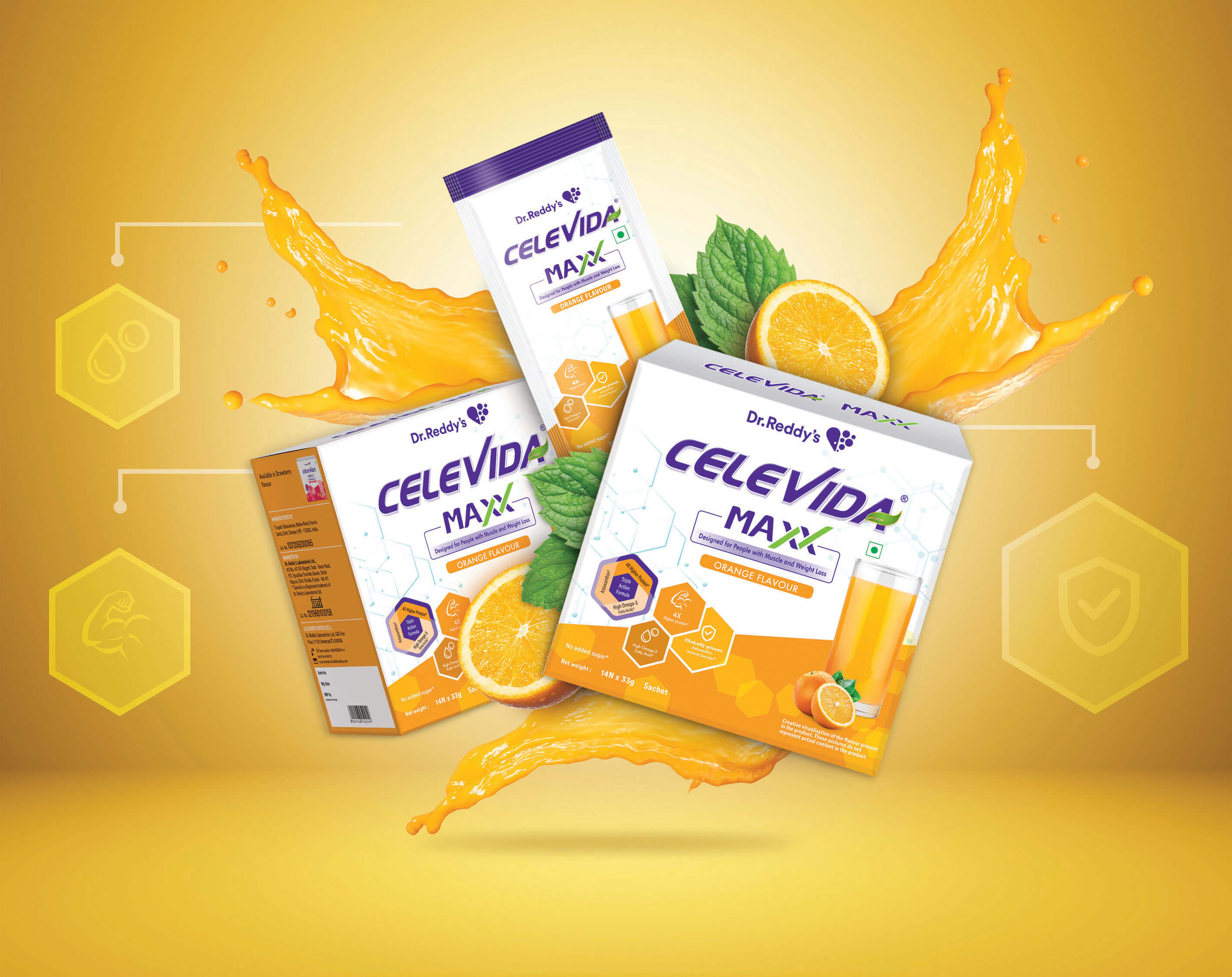
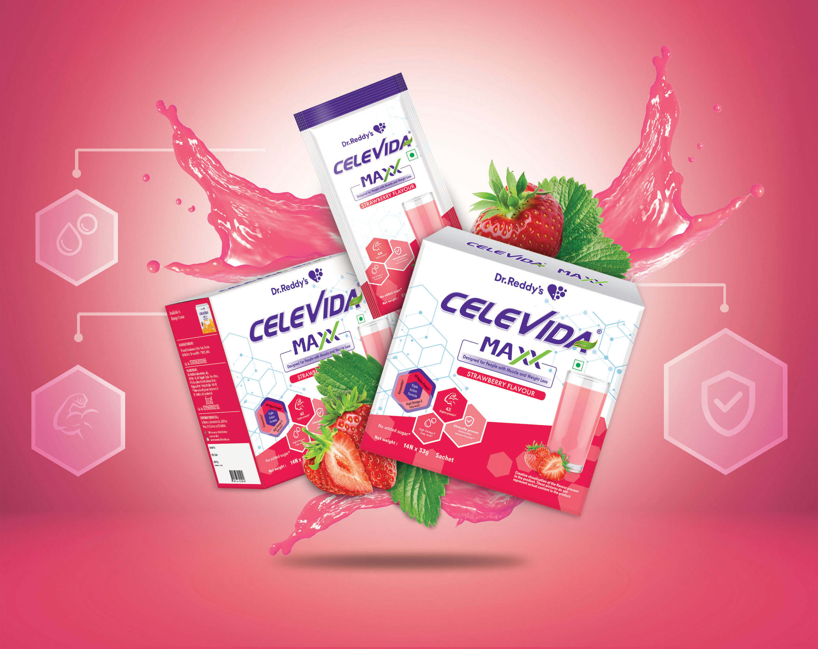
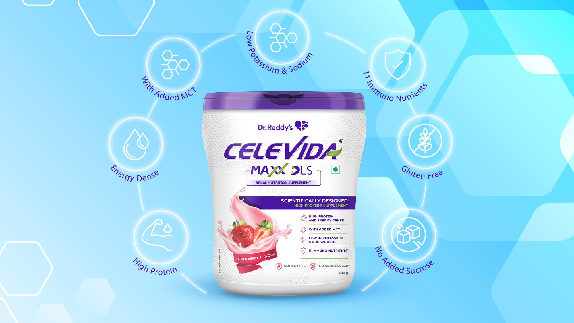
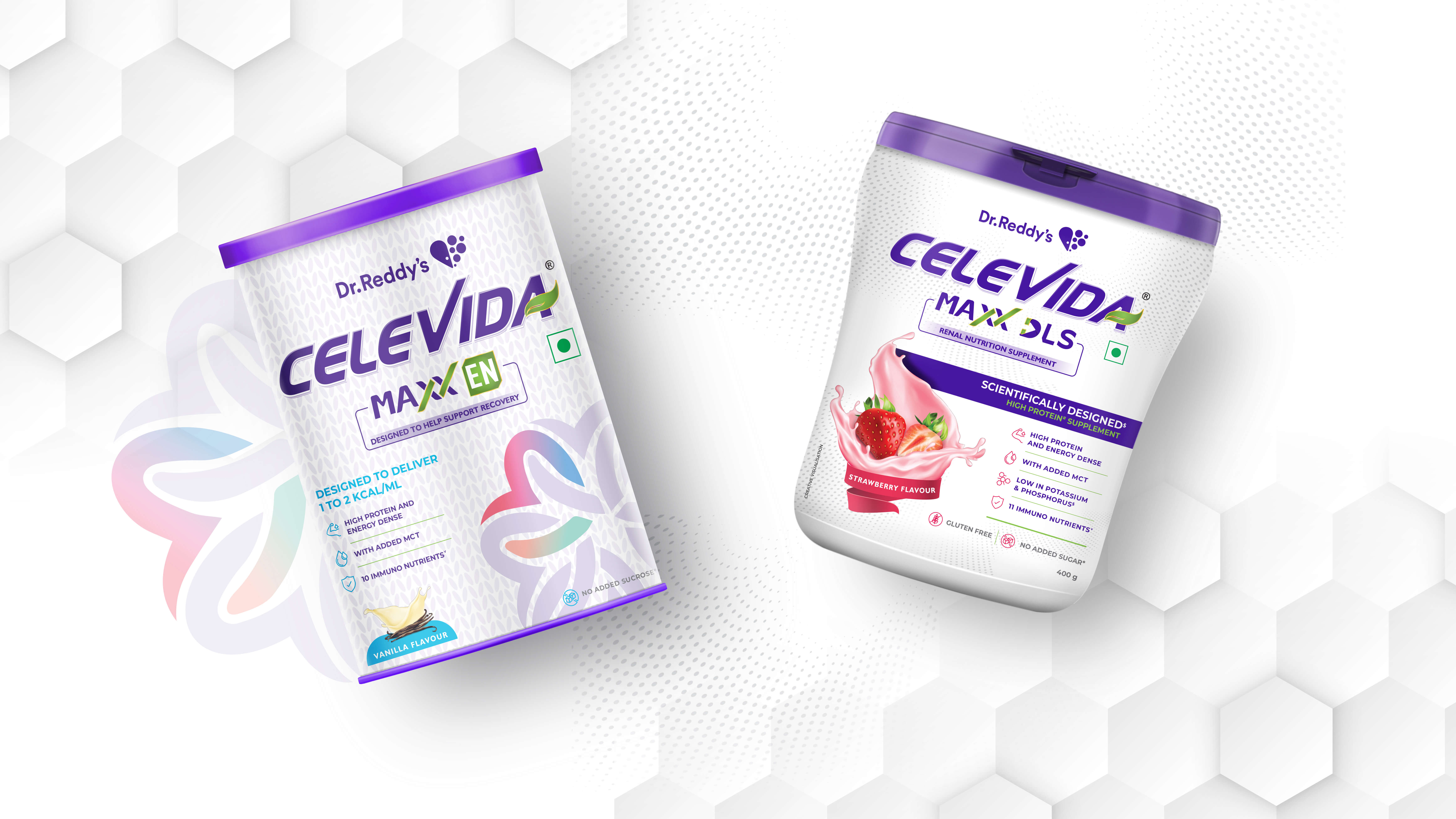
When the brand decided to extend into oncology nutrition with Celevida Maxx, we had to shift the tone while staying true to the master identity. Oncology nutrition is often seen as clinical, serious, and unappetizing, so our goal was to create a balance between scientific rigour and emotional comfort. We used molecular patterns and hexagonal structures to express the advanced science behind the formulation, while the colour palette and product shots introduced a sense of warmth and appetite appeal. This helped make the pack feel trustworthy for doctors and dieticians yet encouraging and uplifting for patients undergoing a strict 7-day nutritional regime.
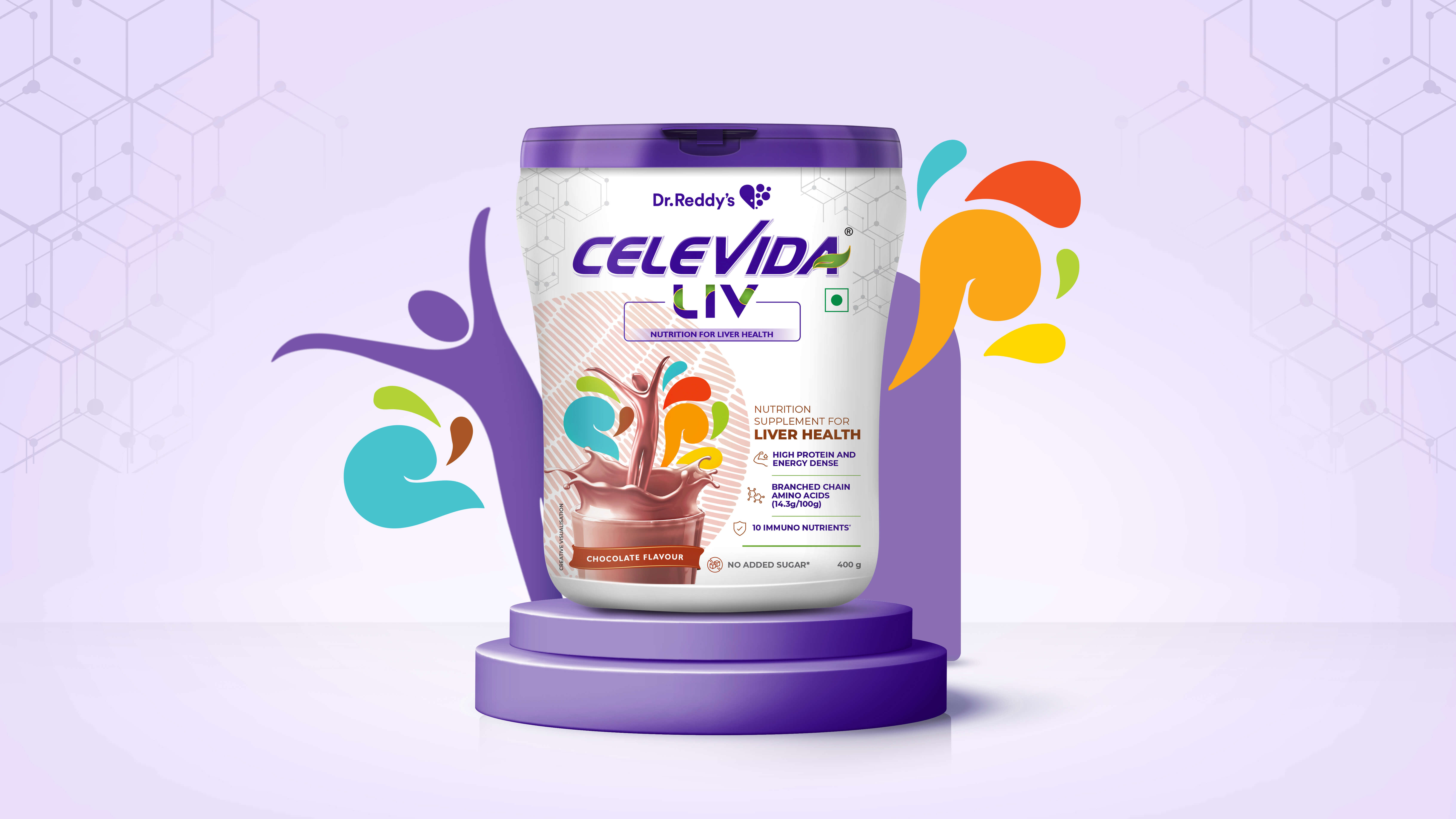
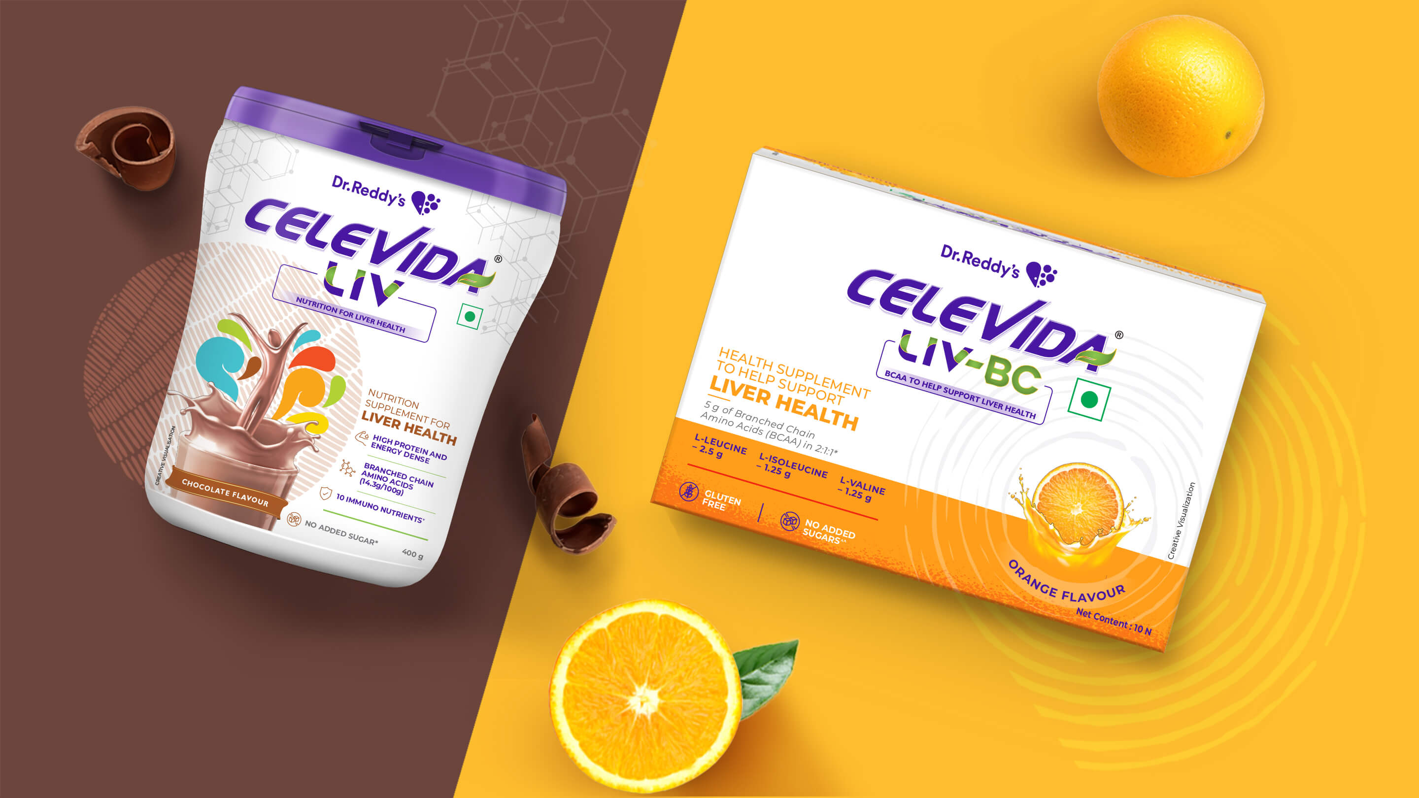
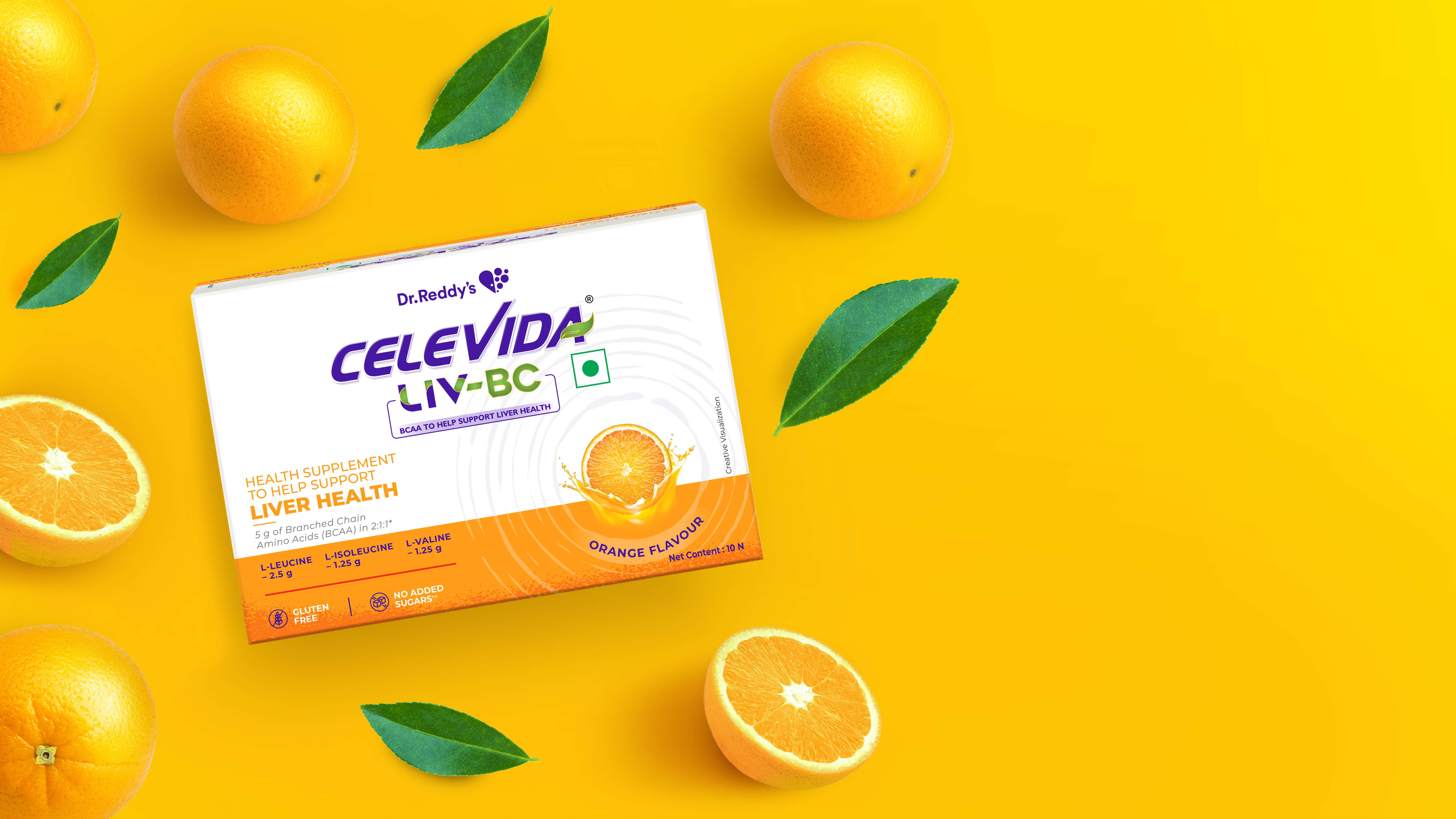
As the portfolio expanded further into liver health with Celevida Liv, we aimed to refine the system for this specialised space while keeping it visually connected to the Celevida family. For this variant, our focus shifted to depicting and celebrating an active lifestyle—showcasing the renewed energy and vitality that effective liver nutrition can bring. We introduced fun, uplifting colours within the design to visually express movement, optimism, and everyday activity, ensuring the pack felt positive, motivating, and aligned with the brand’s larger promise of healthier living.
Together, these designs helped build a cohesive yet flexible visual system that allowed Celevida to grow across specialised nutrition segments. By balancing science with approachability, we reinforced the brand’s promise of timely, effective wellness. Each variant stands distinct yet unmistakably part of the Celevida family.
CREDIT
- Agency/Creative: TheDesignPeople
- Article Title: TheDesignPeople Elevates Celevida with a Strategic Packaging System That Redefines Specialized Nutrition
- Organisation/Entity: Agency
- Project Type: Packaging
- Project Status: Published
- Agency/Creative Country: India
- Agency/Creative City: Mumbai
- Market Region: Asia
- Project Deliverables: Logo Design, Packaging Design
- Format: Box, Tin
- Industry: Health Care
- Keywords: fmcg packaging, healthy lifestyle
-
Credits:
Co-founder: Sneh Sheth


