Toro Pinto – Nahnya
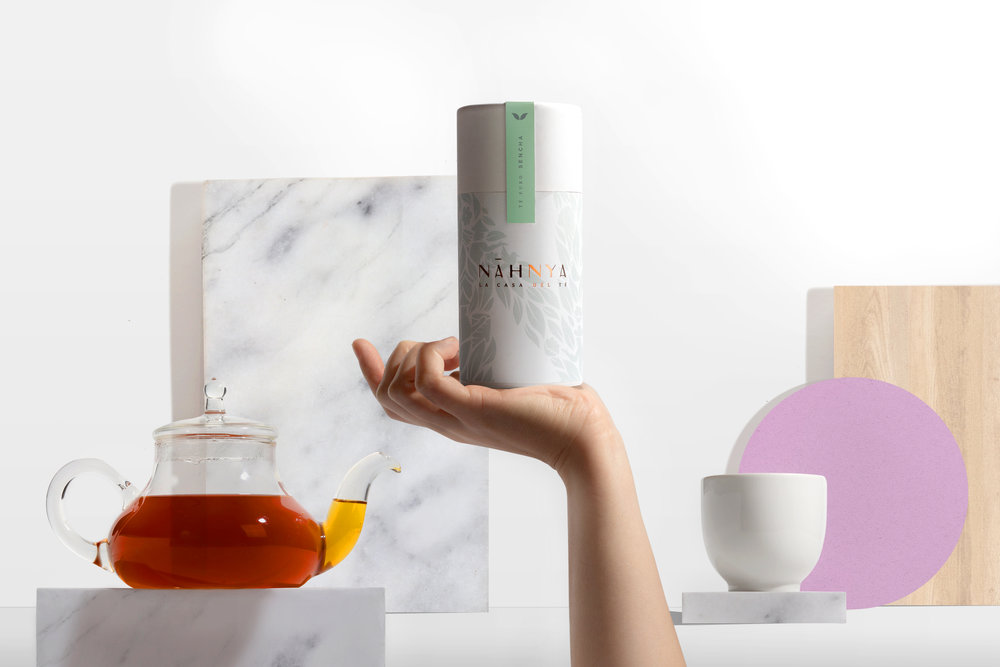
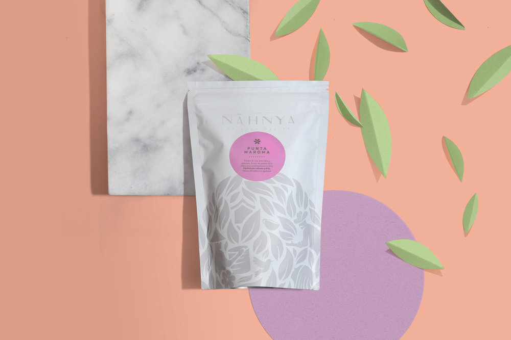
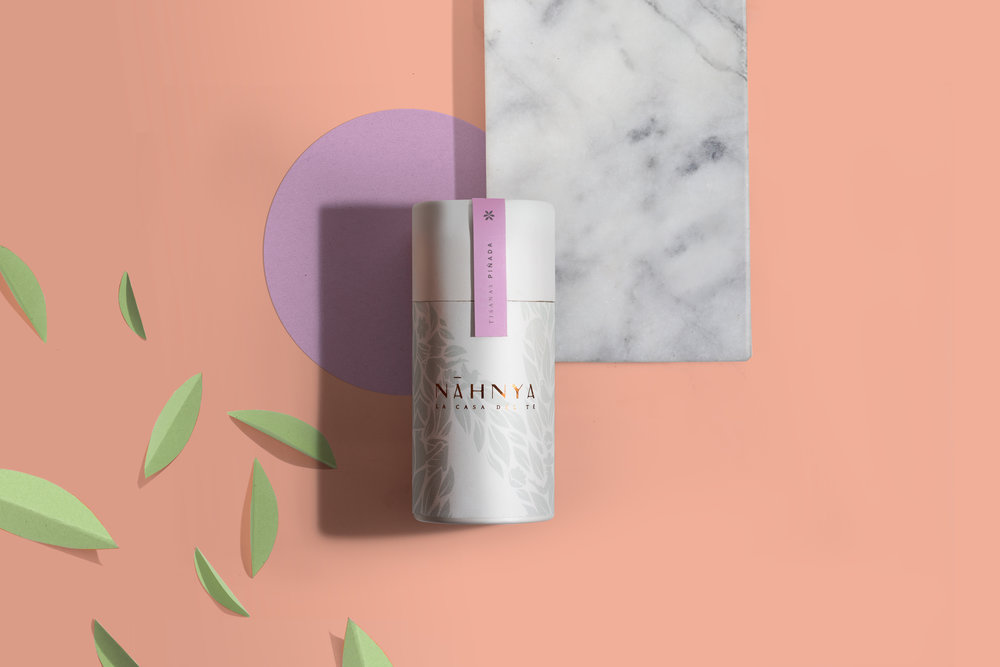
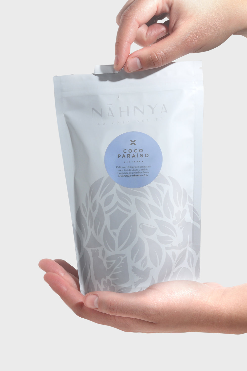
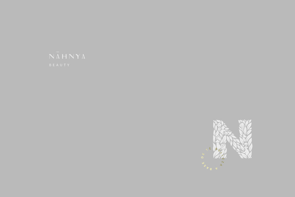
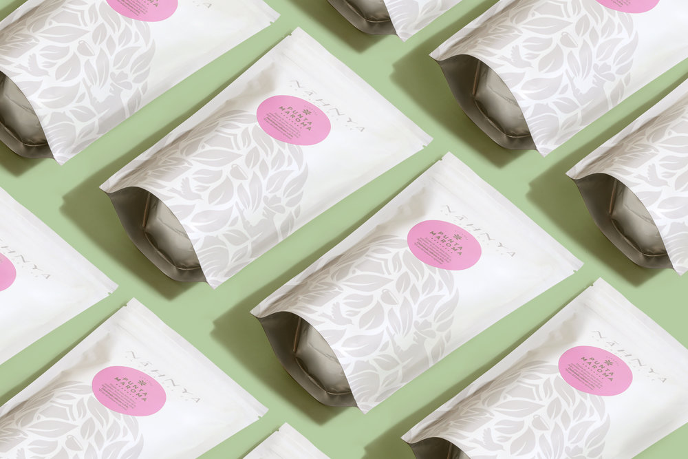
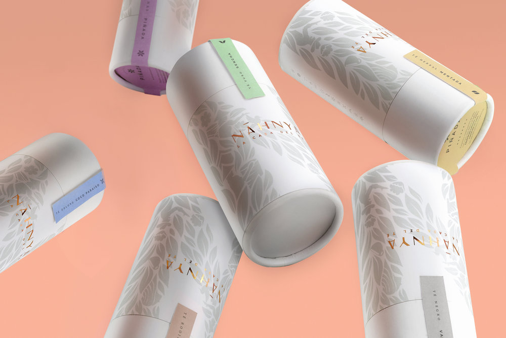
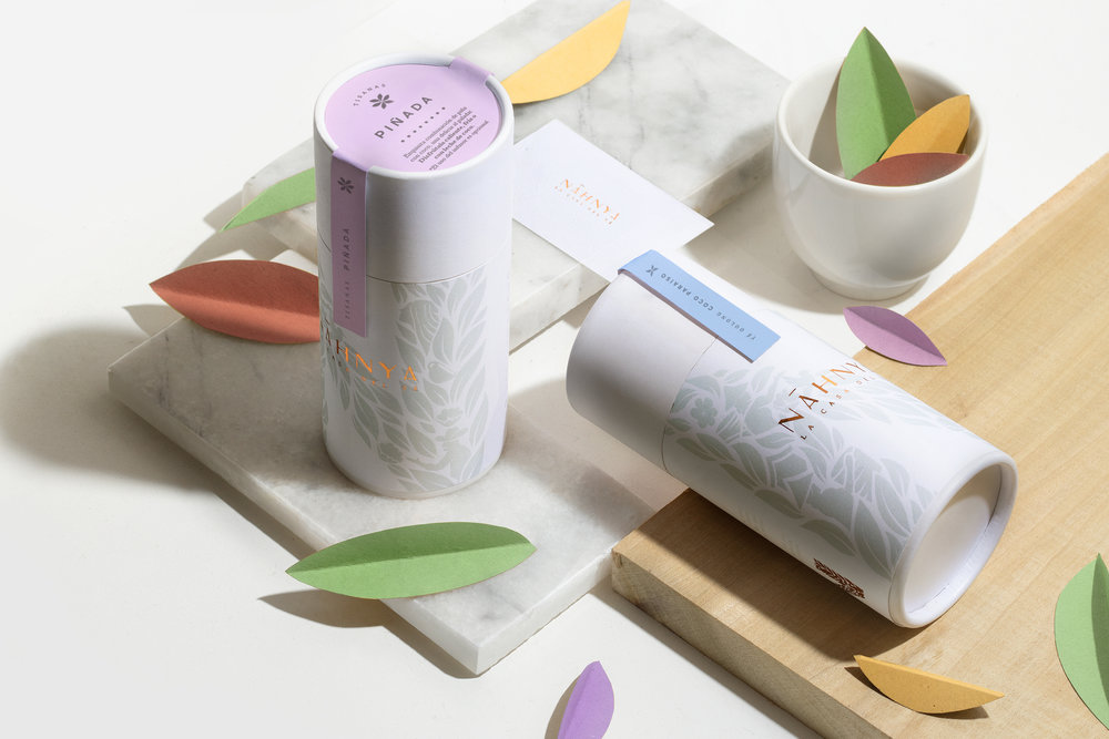
Nāhnya is a Mexican brand that involves tea, infusions and beauty products that are a blend of asian practices and hints of the mexican countryside.
We developed the name following two concepts: nah- which means house in Mayan and nia which means ours in Esperanto. This feminine neologism with Pre-Columbian traits is an amulet that takes us back to our home.
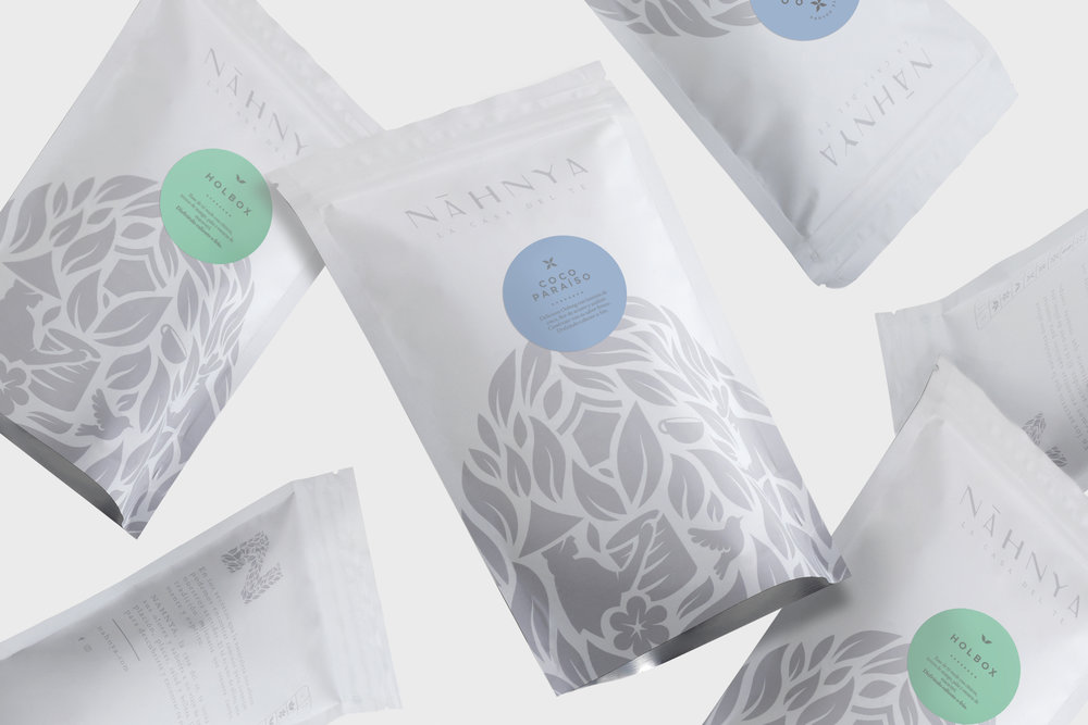
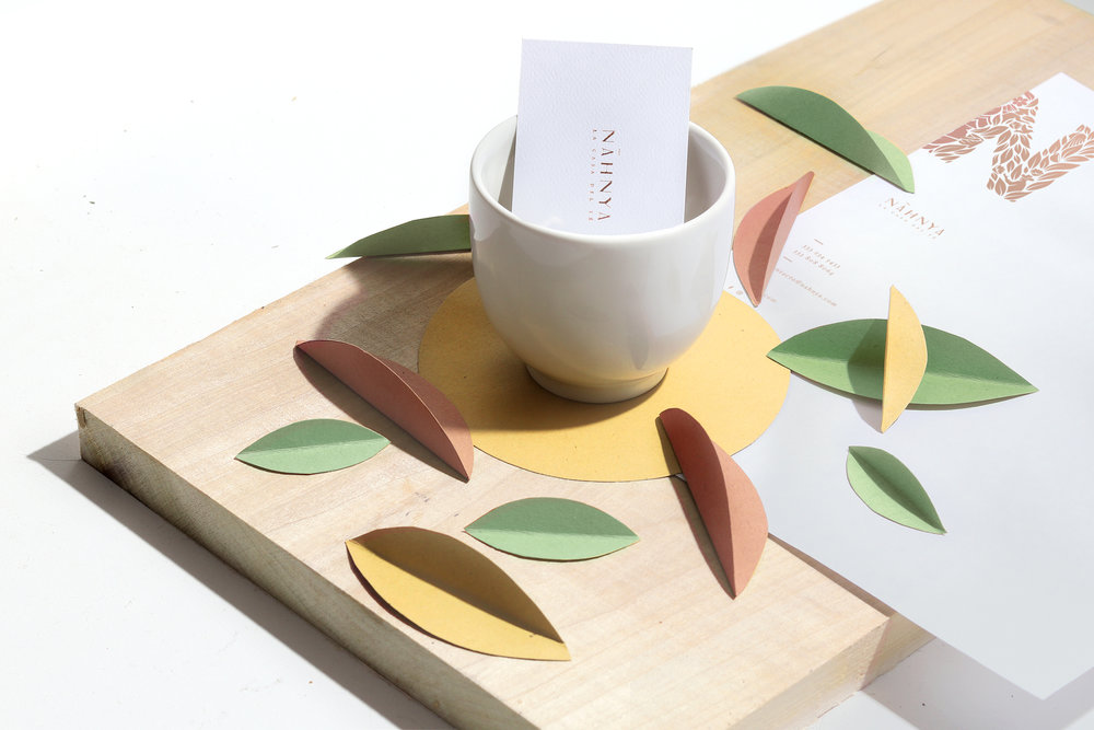
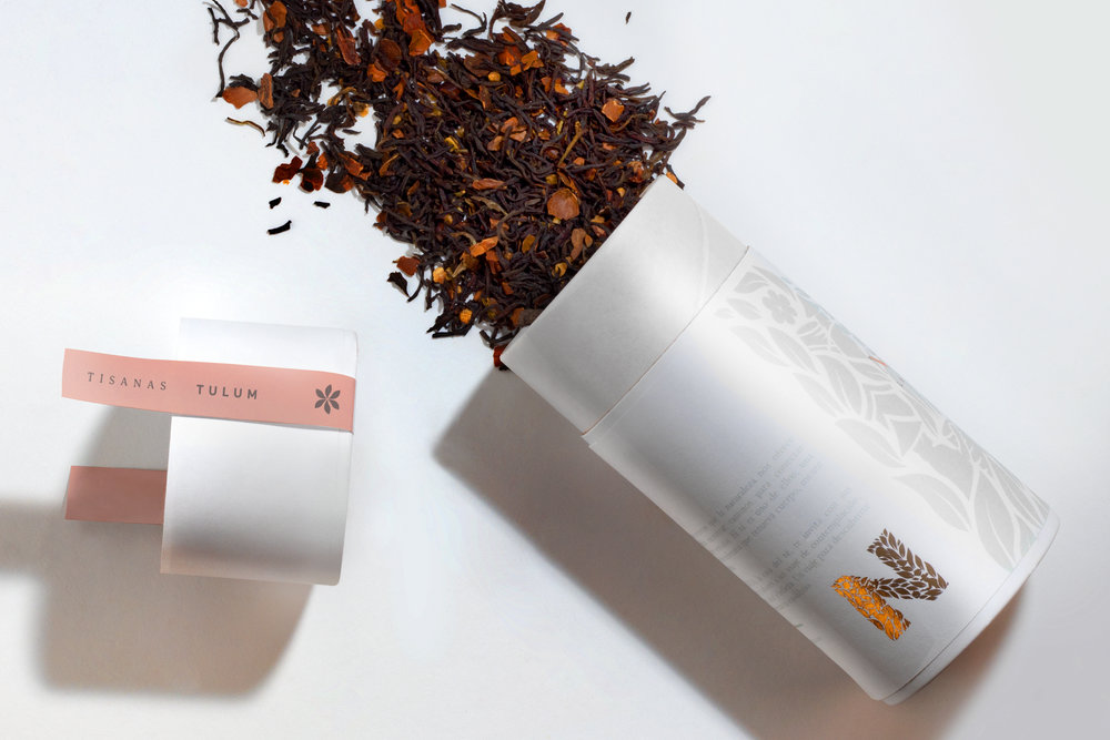
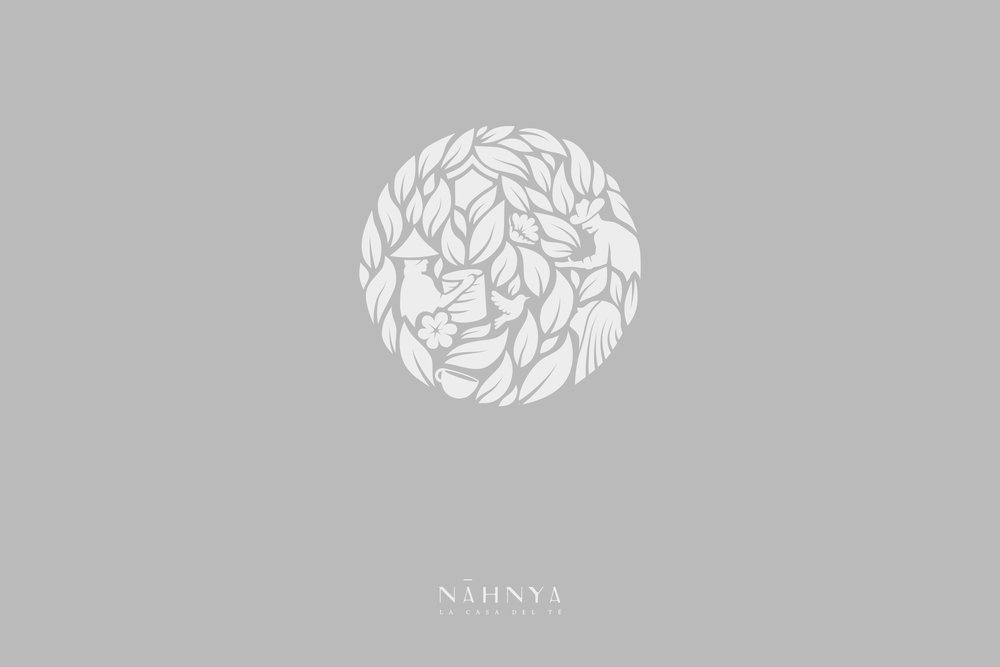
The graphic identity involves the connection of two worlds, two cultures through: camellia sinensis leaves (tea leaf), women who harvests leaves representing the asian cultural part of the product, a local farmer who represents the Mexican cultural part of the brand. The brand appeals to nature -as a home. who is bountiful and provides products for our selfcare.













CREDIT
- Agency/Creative: TORO PINTO
- Article Title: The World as One Single Home in This Tea Products Brand
- Organisation/Entity: Agency Commercial, Published
- Project Type: Packaging
- Agency/Creative Country: Mexico
- Market Region: North America
- Format: Bottle, Can, Pouch, Tin
- Substrate: Metal, Plastic, Pulp Carton
FEEDBACK
Relevance: Solution/idea in relation to brand, product or service
Implementation: Attention, detailing and finishing of final solution
Presentation: Text, visualisation and quality of the presentation


