


Catalys: A Bridge that Turns Products into Experiences
The French gourmet market is saturated with Spanish proposals repeating the same clichés: ham, paella, bulls. Catalys needed to break that pattern without losing authenticity. The challenge was to create a brand capable of operating on two cultural fronts simultaneously. On one hand, earning the trust of artisanal producers from Northern Spain who are wary of intermediaries. On the other hand, seducing a French market that already has access to everything but is always looking for the next story to tell. The answer wasn’t to become just a more efficient distributor, but to act as a cultural catalyst — transforming exceptional products into memorable experiences.
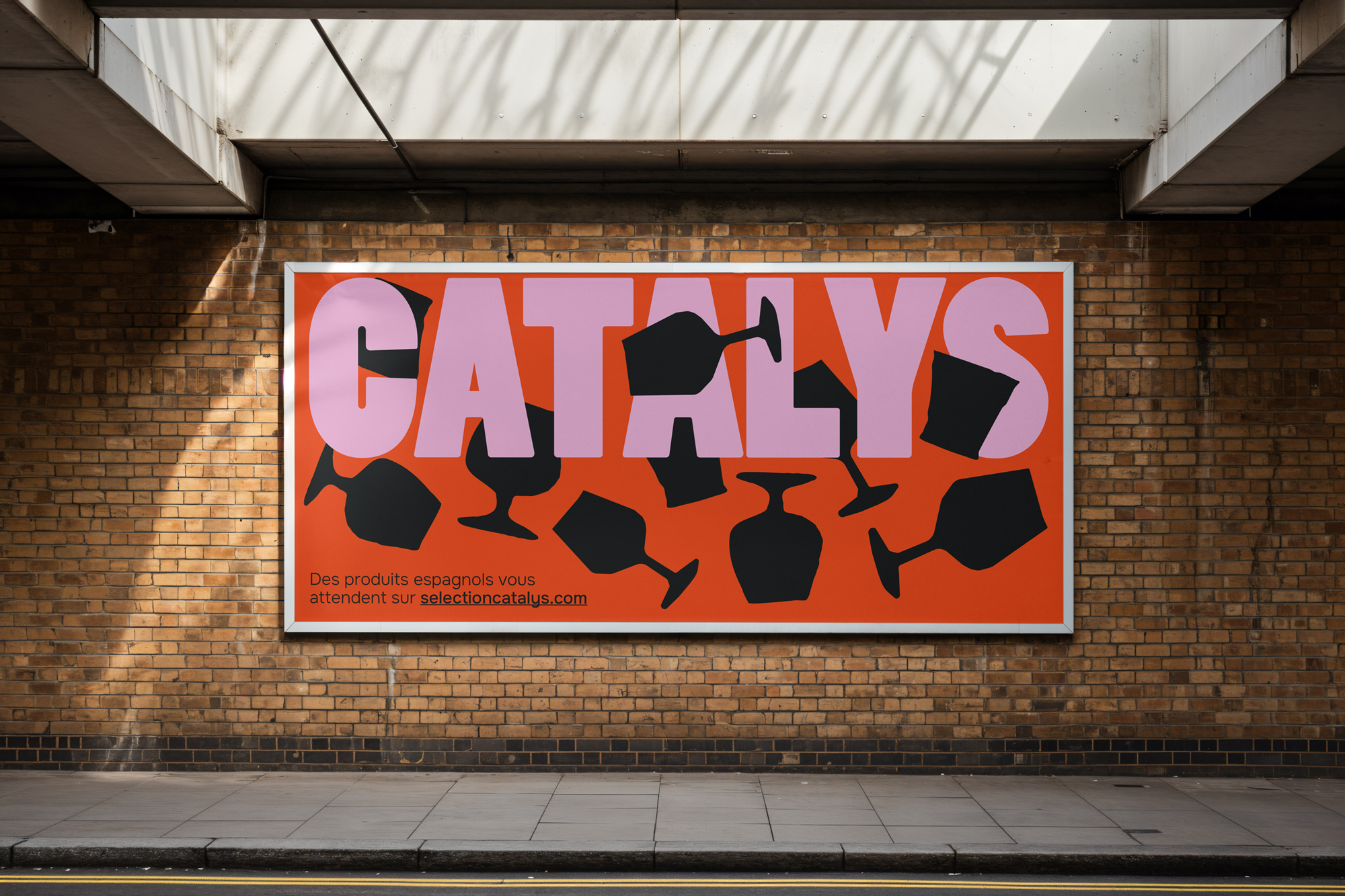
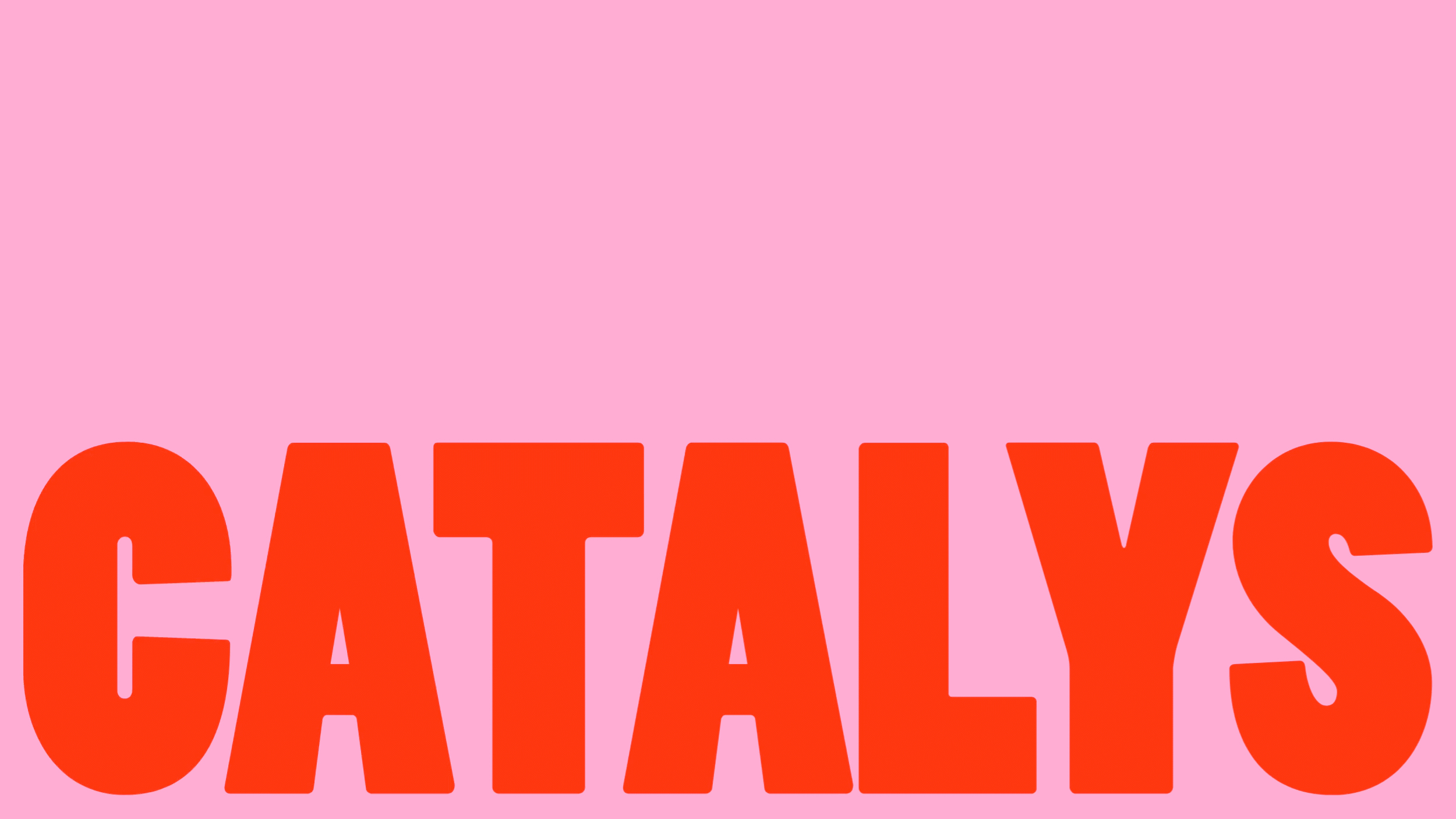
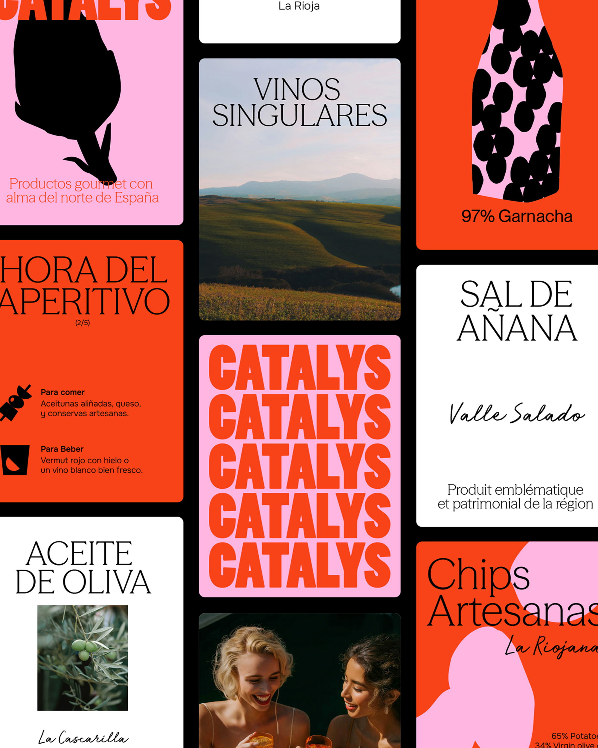
When it came to naming, Catalys emerged as an elegant solution that works on multiple levels. Phonetically, it connects “cata” (Spanish tasting culture) with “lys” (the French national flower), building a natural bridge between the two worlds. Conceptually, it evokes catalysis — that chemical process in which an element facilitates a reaction without being consumed by it. This metaphor became the brand’s narrative backbone: we are not the protagonists, we are the facilitators. We don’t sell products, we reveal stories. Our tone respects without sanctifying, seduces without manipulating.
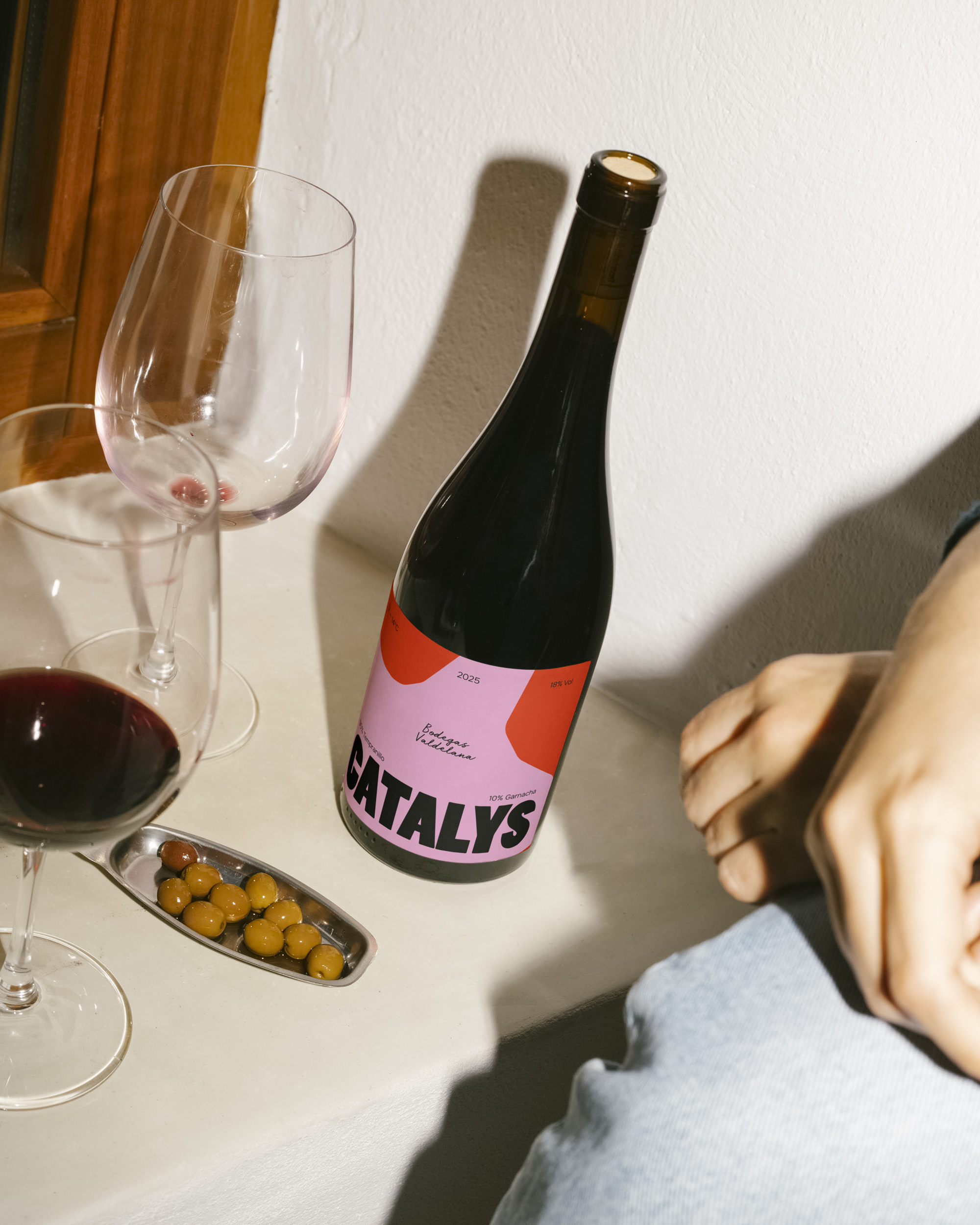
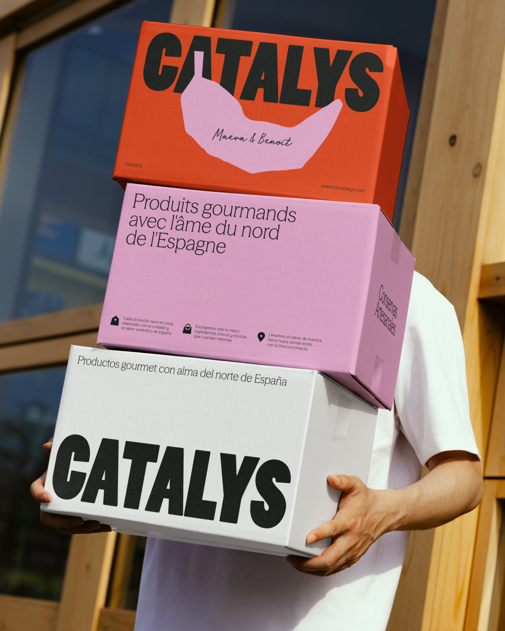
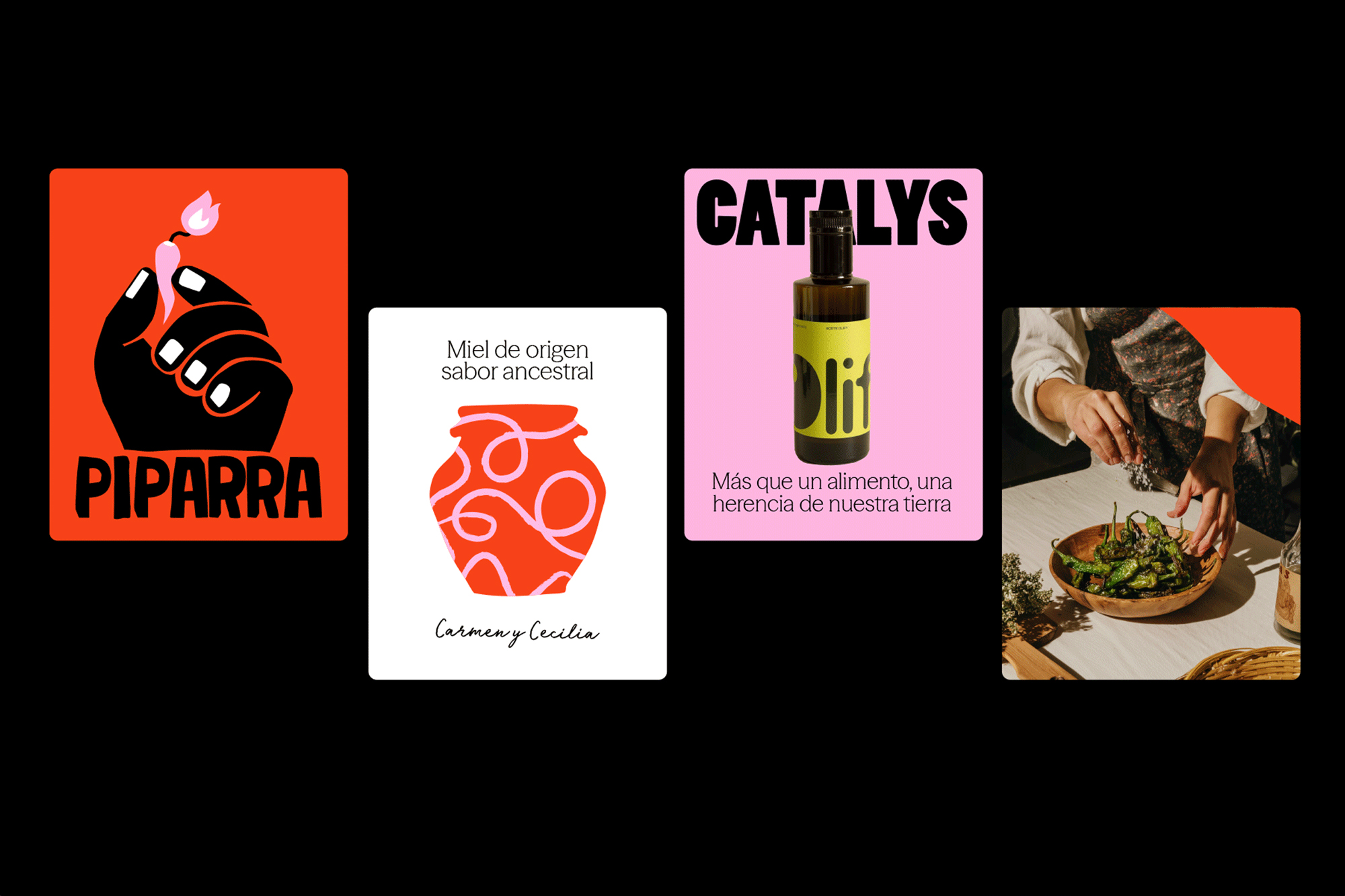
Catalys’ visual system proves that strategic design goes beyond aesthetics. Each color in the chromatic architecture activates specific personality traits. Pepper represents the intensity and passion that the premium market had forgotten, and Catalys brings back. The true differentiator is Soft Peony, a pink that works as a cognitive disruptor: when it appears, the perception of the brand shifts from “exclusive” to “exclusive, but just for you.”
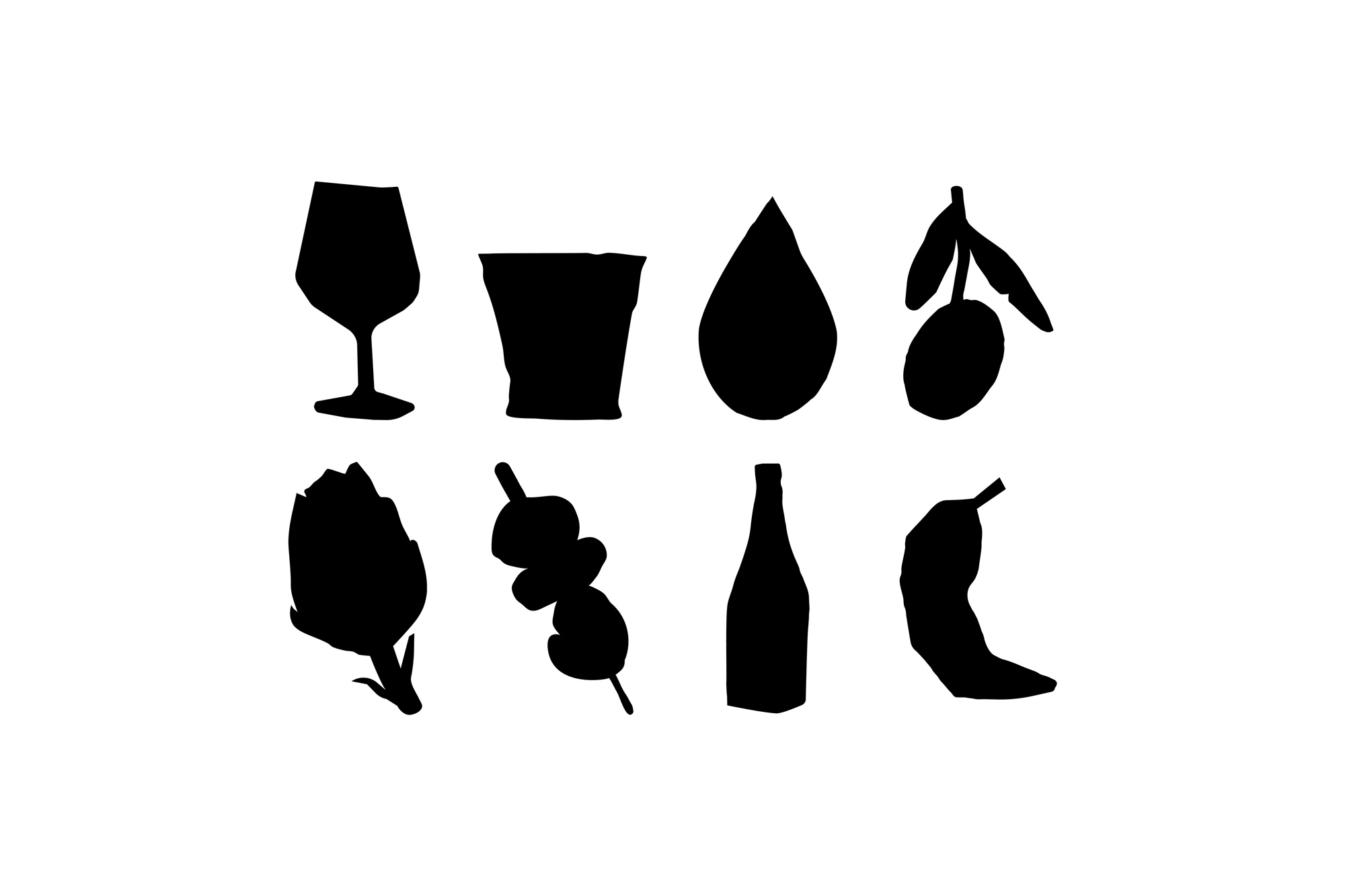
The hand-drawn illustrations are not a stylistic whim but a strategic decision: in a world of digital perfection, controlled imperfection communicates authenticity and artisanal origin. The system is completed with bold color blocks that create visual architecture without resorting to traditional grids, allowing flexibility without losing consistency. A brand firm in essence, flexible in form.
CREDIT
- Agency/Creative: The Woork
- Article Title: The Woork Elevates Catalys as a Cultural Bridge Between Spanish Tradition and French Refinement
- Organisation/Entity: Agency
- Project Type: Identity
- Project Status: Published
- Agency/Creative Country: Spain
- Agency/Creative City: Madrid
- Market Region: Europe
- Project Deliverables: Brand Creation, Brand Design, Brand Guidelines, Brand Identity, Brand Naming
- Industry: Food/Beverage
- Keywords: brand, branding, brand creation, visual identity, brand identity, logotype, logo, naming, gastronomy, food, beverage, packaging
-
Credits:
Branding Studio: The Woork


