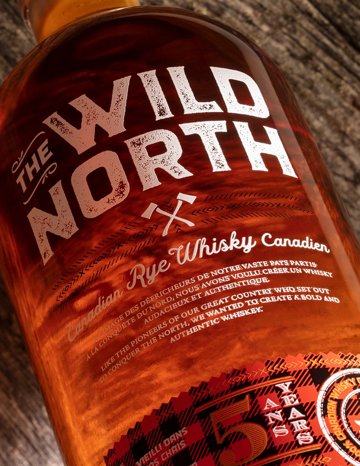
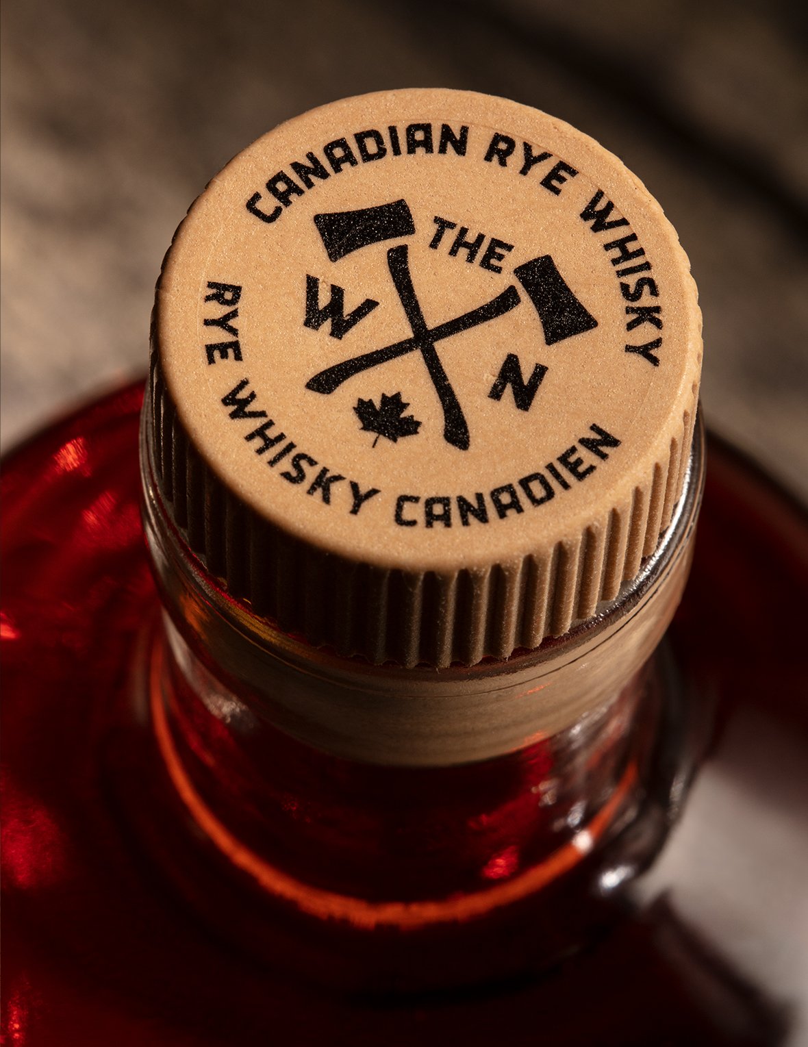
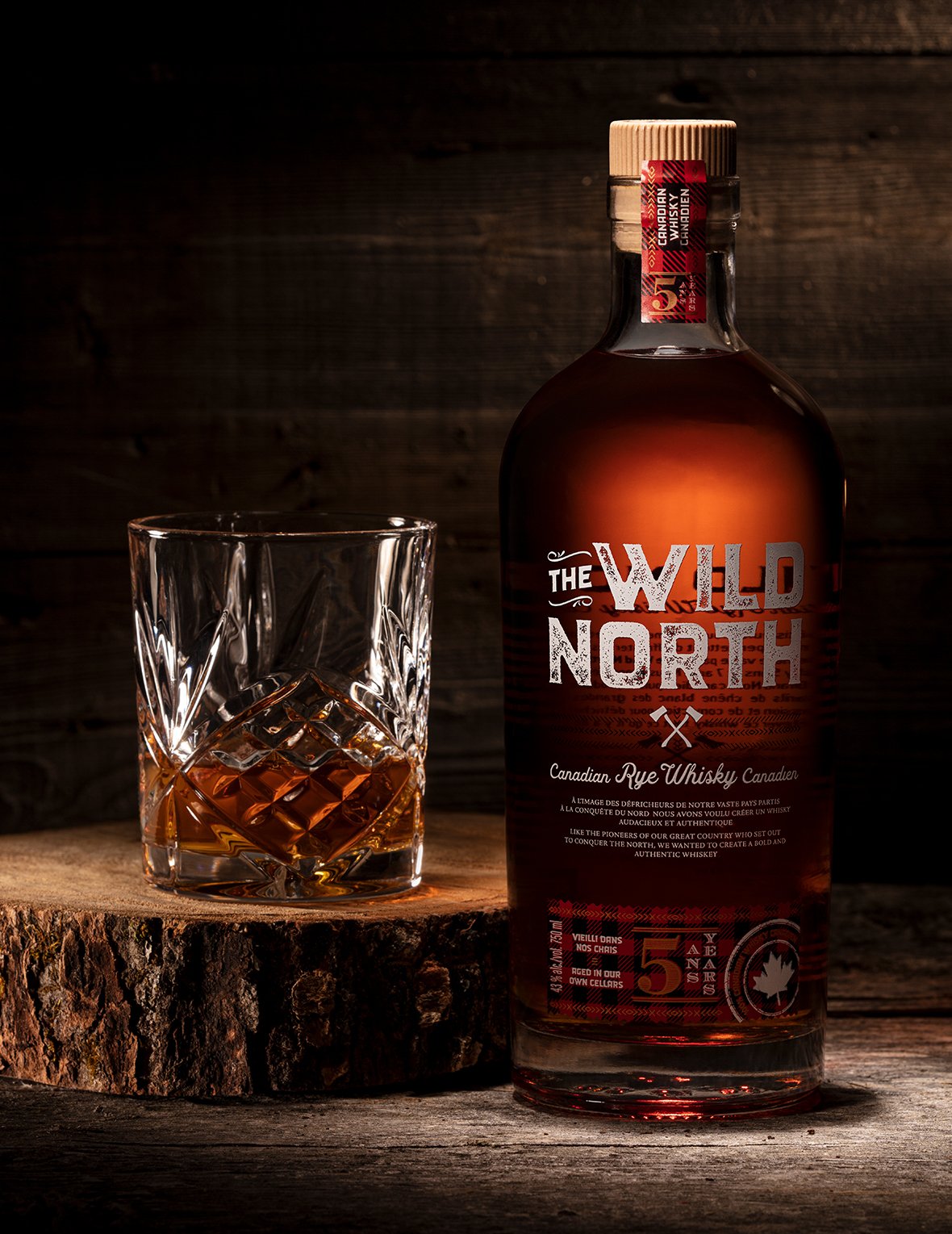
Station 22 wanted to launch a typical Canadian whiskey brewed from authentic local ingredients. The concept, with its original recipe, had to have a packaging design that was just as unique as the product itself. EZI imagined a rustic and strong image, inspired by the pioneers of the Great North and builders of Canada, with a robust typography and typical canadian textures.


CREDIT
- Agency/Creative: Eziwine
- Article Title: The Wild North Canadian Dry Whisky Packaging Designed By Eziwine
- Organisation/Entity: Agency, Published Commercial Design
- Project Type: Packaging
- Agency/Creative Country: Canada
- Market Region: North America
- Project Deliverables: Brand World, Graphic Design, Illustration, Packaging Design
- Format: Bottle
- Substrate: Glass Bottle
FEEDBACK
Relevance: Solution/idea in relation to brand, product or service
Implementation: Attention, detailing and finishing of final solution
Presentation: Text, visualisation and quality of the presentation


