


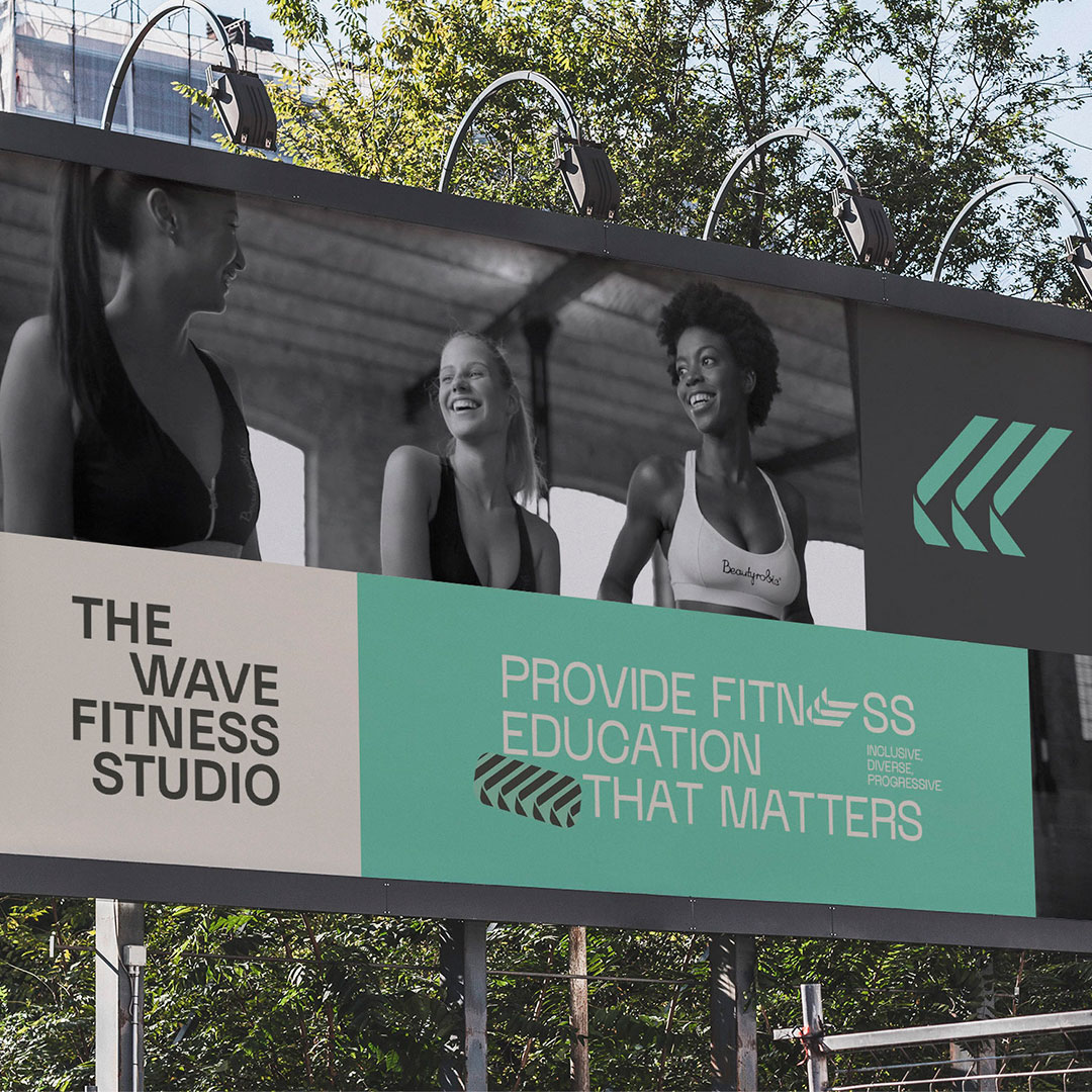
The Wave Fitness Studio is a place that aims to impact women’s lives through movement. With a multitude of physical activities and professionals from various segments, the focus of the place is to celebrate the female body, making their clients believe in themselves. To do this, the studio focuses on valuing its team, generating a wave of confidence that comes from the inside out, making everyone feel good in the environment, and transmitting care and security.
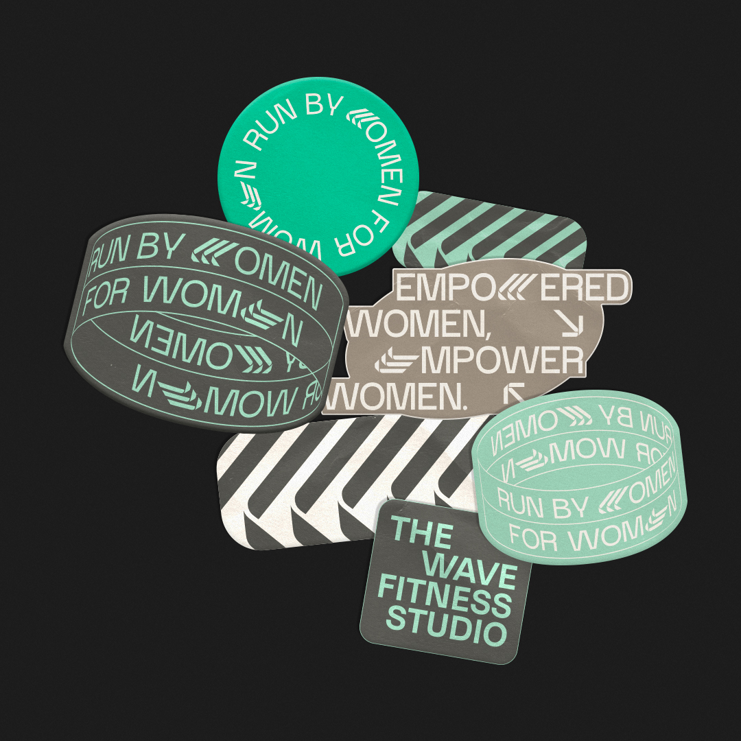
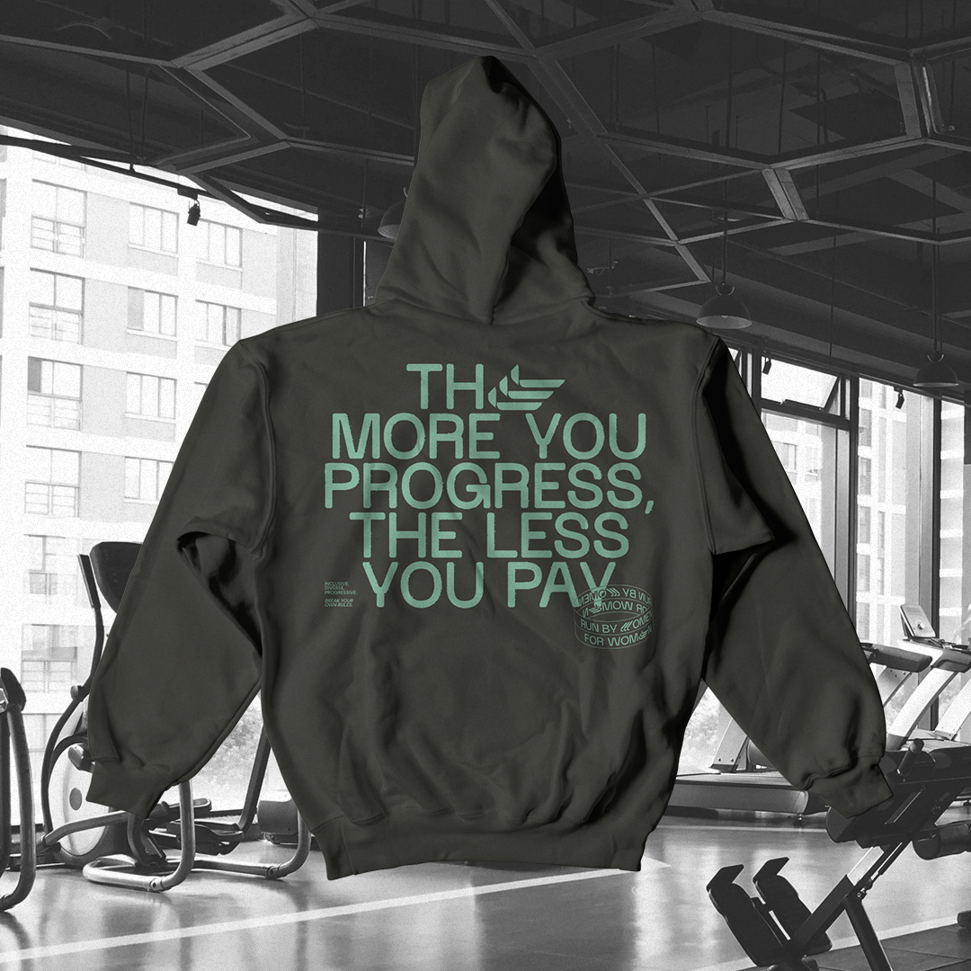
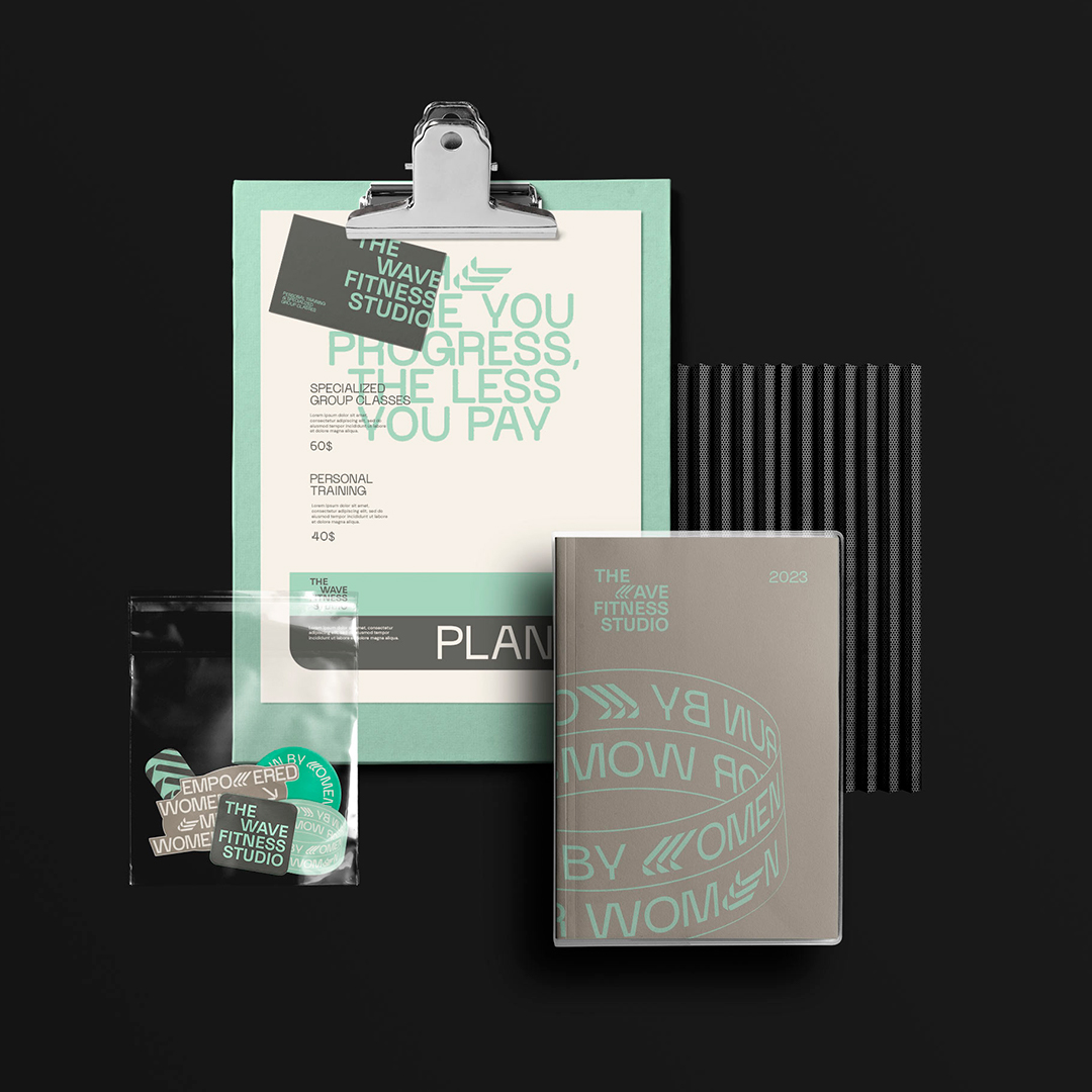
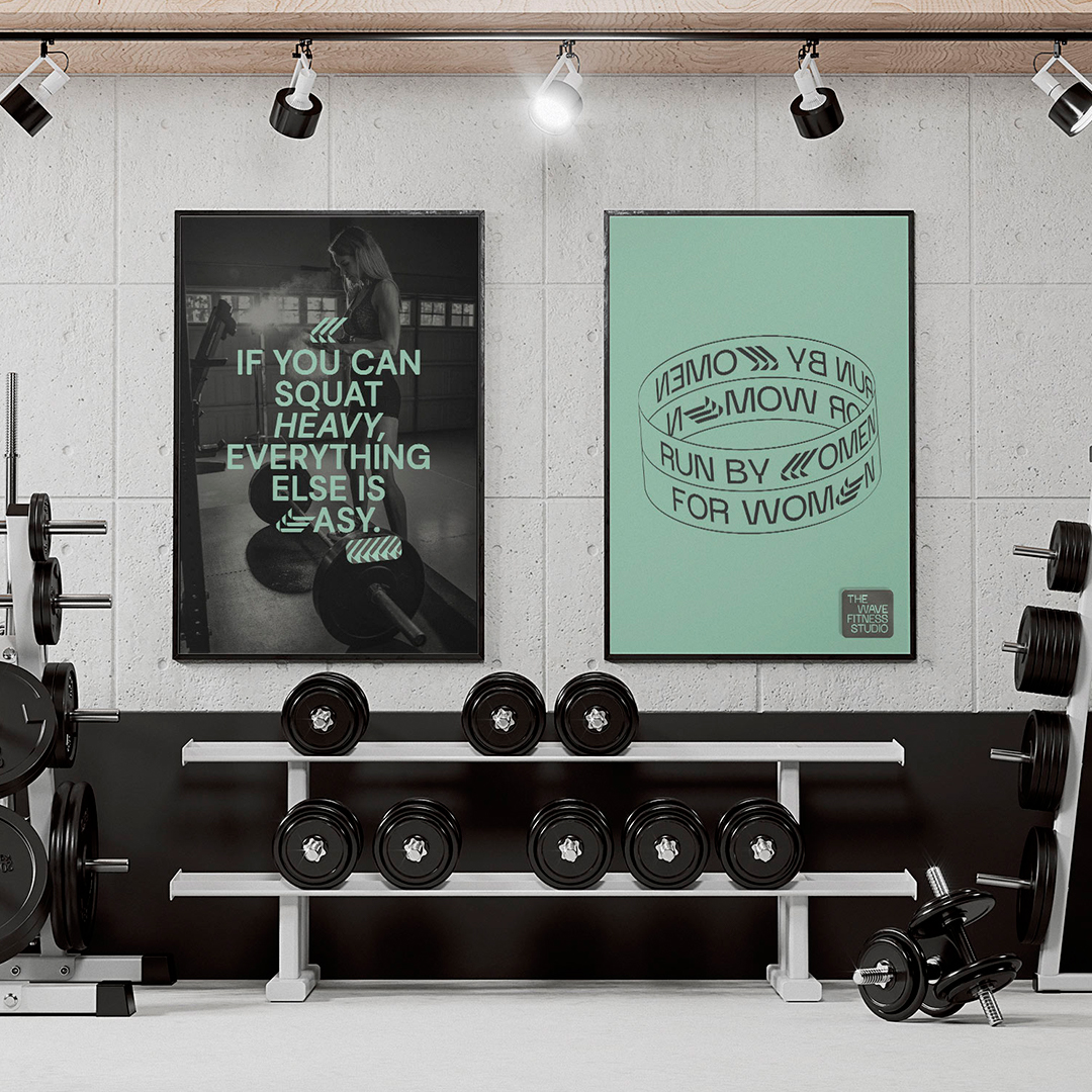
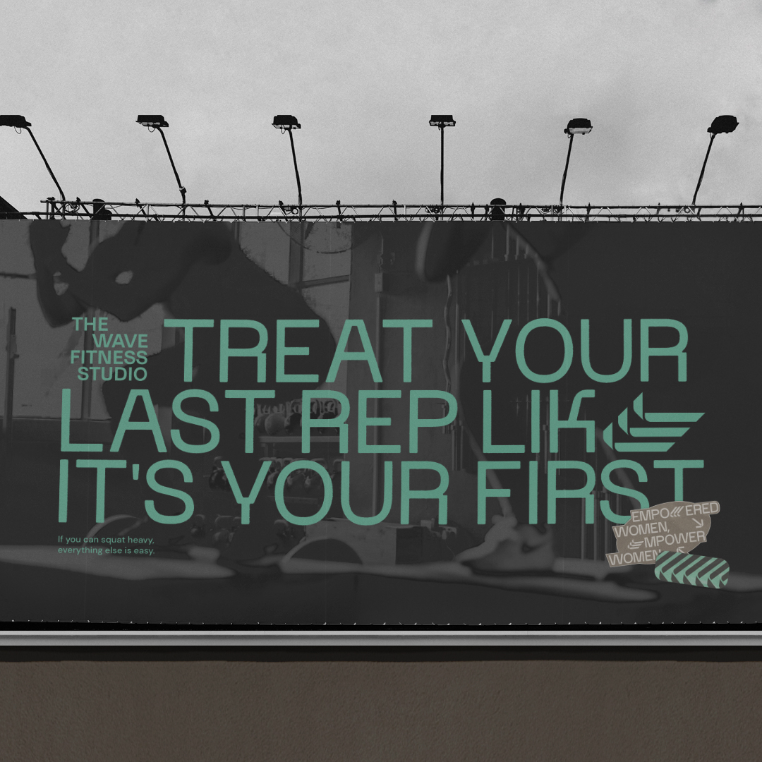
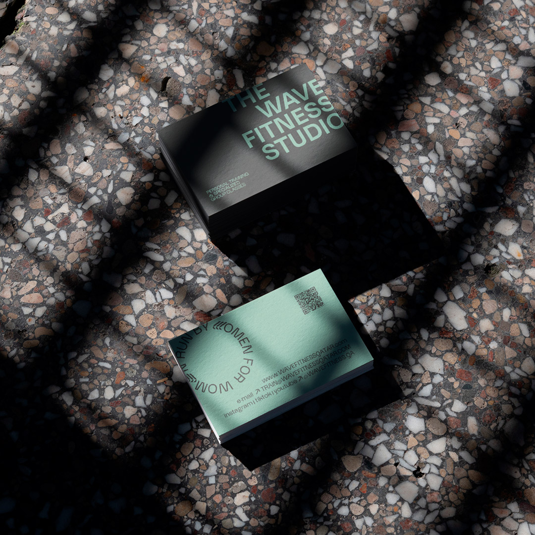
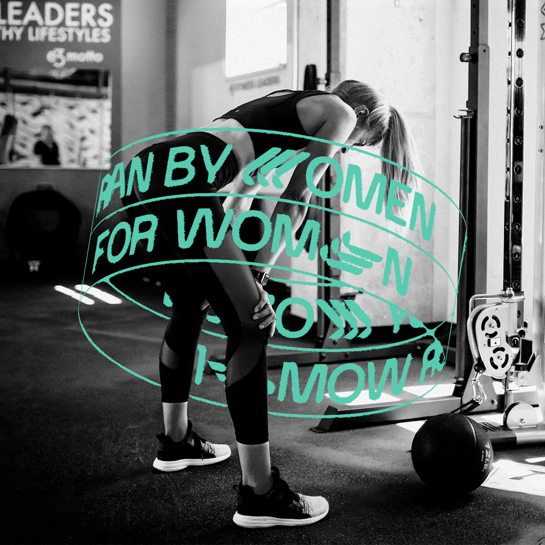
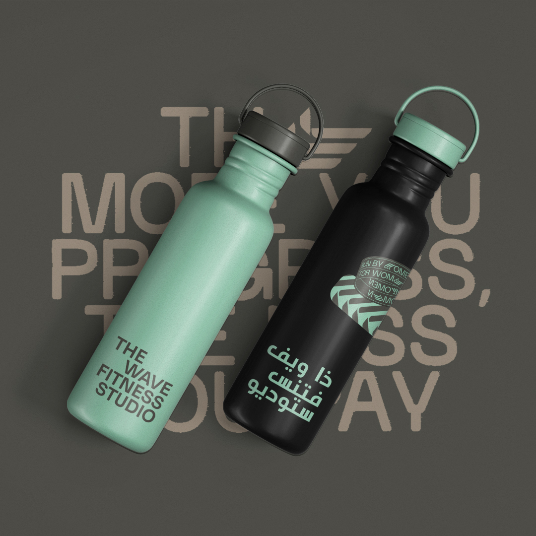
Aiming to translate all these purposes, we created a strong and impactful visual identity. For the typography, we chose a more minimalist and sans-serif font, transmitting the message clearly and objectively, bringing the concept of femininity in a subtle way. In the other visual complements, the focus was to demonstrate the power of physical activities to empower body and mind. Circles and more organic shapes were responsible for highlighting these concepts.
In the colors, the idea was to generate contrast between the weight of the activities and the ligthness it provides. Shades of gray and turquoise blue express this duality so important to the studio, escaping from the stereotype of colors that refer to the female universe.
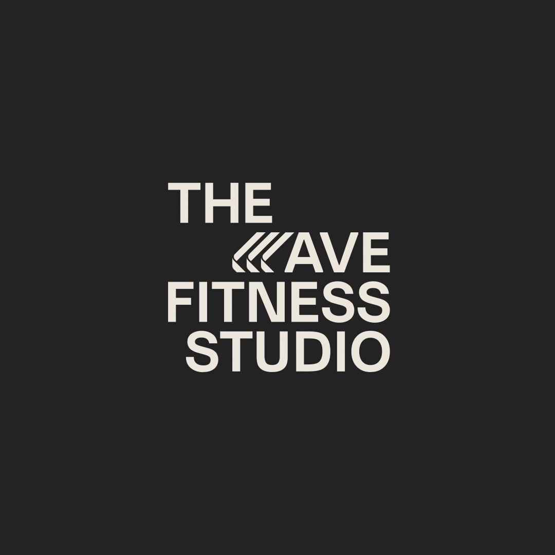
The brand’s symbol was the result of a mix of letters, since in different orientations it transforms into the “W”, “V” and “E”, creating a closure for the brand. In addition, it brings the idea of waves, in a deconstructed way, referring to the purpose of creating a wave of positivity that impacts all women who are part of the studio.
This project was created in partnership with Monga Design, combining several creative minds to transmit a powerful result that expressed clearly and impactfully the objectives of the brand in question.
CREDIT
- Agency/Creative: Sete Design
- Article Title: The Wave Fitness Studio Visual Identity
- Organisation/Entity: Agency
- Project Type: Identity
- Project Status: Published
- Agency/Creative Country: Brazil
- Agency/Creative City: Jaraguá do Sul
- Market Region: Middle East
- Project Deliverables: Brand Identity
- Industry: Health Care
- Keywords: fitness, identity, women, empowered, female power
-
Credits:
Graphic Designer: Nicole Vázquez
Project management: Marco Tomazeli
Project management: Michel Refatti
Visual Thermometer: Mateus Yuzo
Partnership: Monga Design
Meeting: Marina


