


Api is an artisanal honey brand dedicated to preserving ancestral, sustainable harvesting practices. The design pays visual homage to the “nectar of our land”, it draws inspiration from the magic of the jungle on the shores of the Strait of Angostura, where local wild flowering gives life to a truly unique honey. Through surreal illustrations, the scarcely documented endemic flowers of the region are rescued and placed at the heart of the visual narrative. Every element is crafted to highlight its unique character, bolstered by the direct involvement of its beekeepers. With Api, the aim is to redefine what the local market conceives as honey; from the bottle to the label and logo, every detail is custom designed, breaking standards and elevating a truly special product that honors every step of its creation.
Solution:
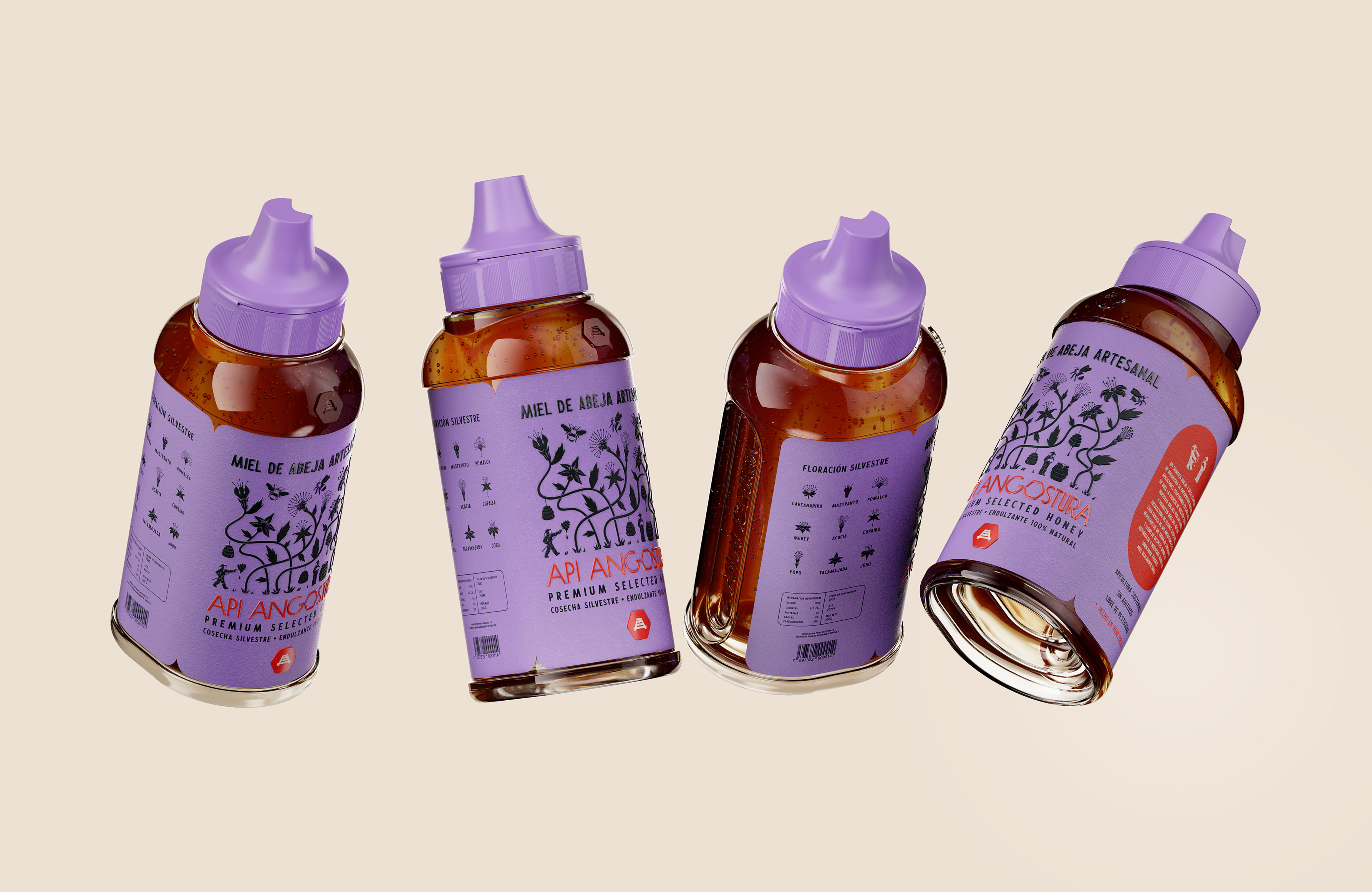
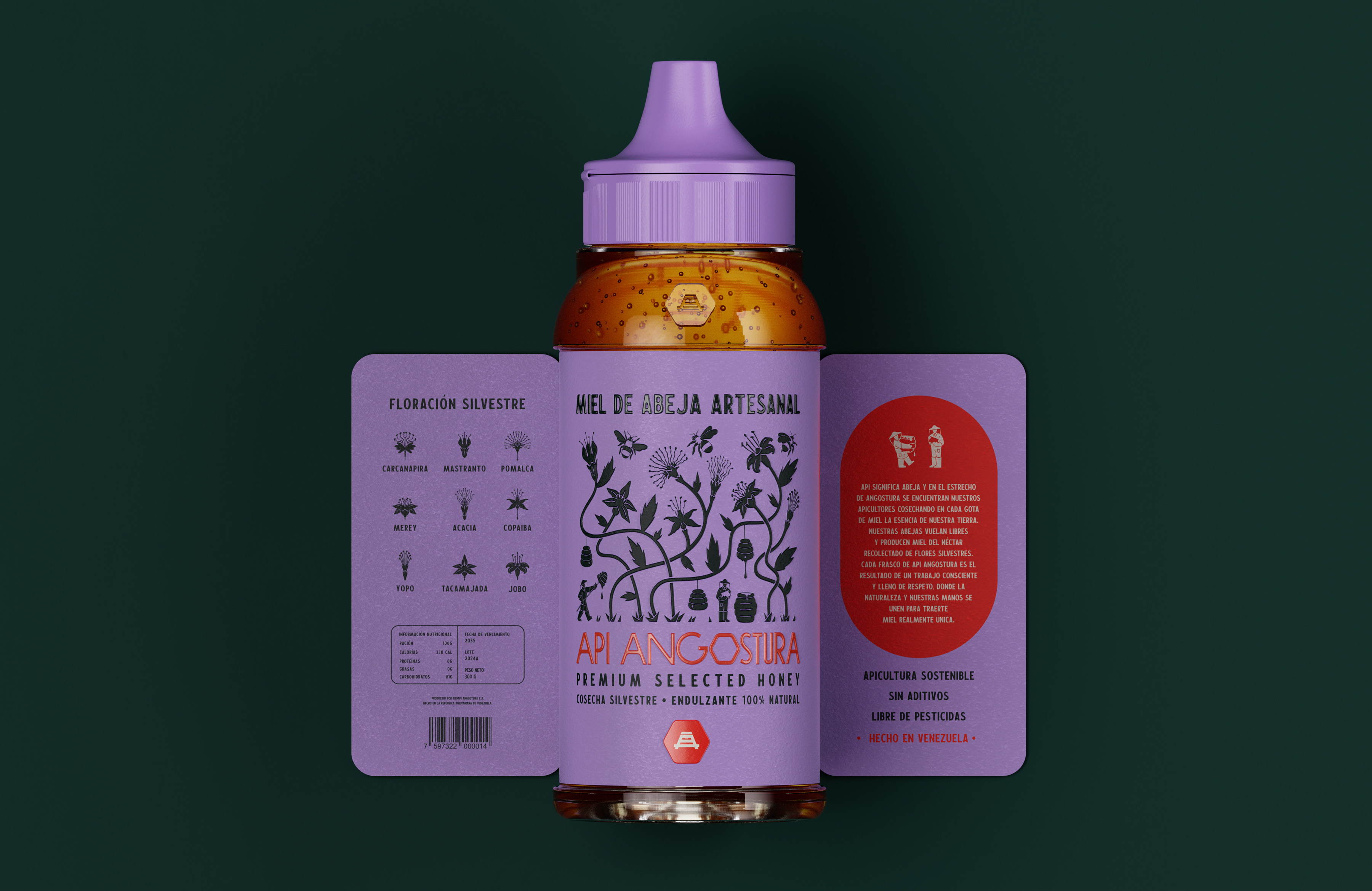
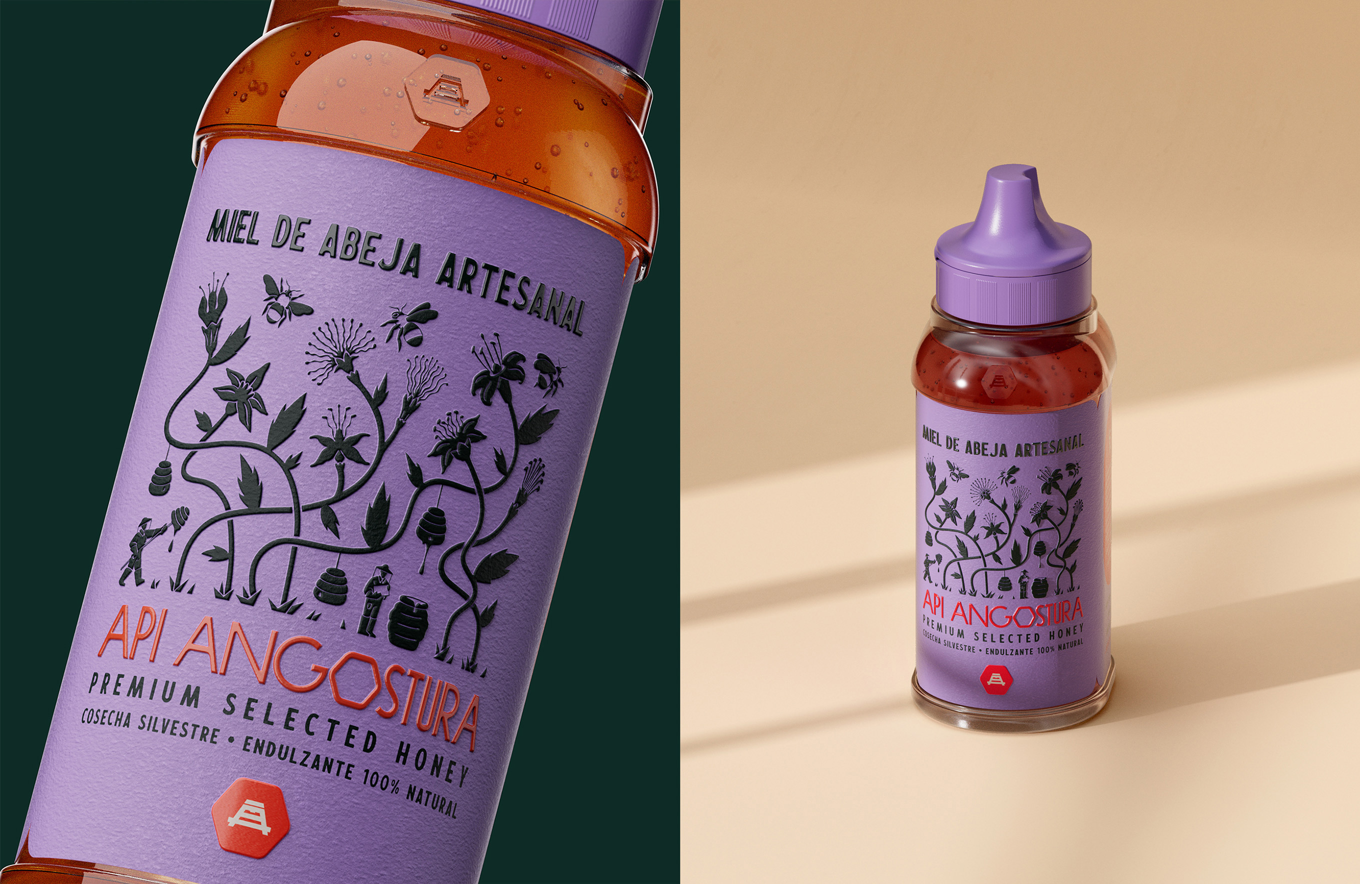
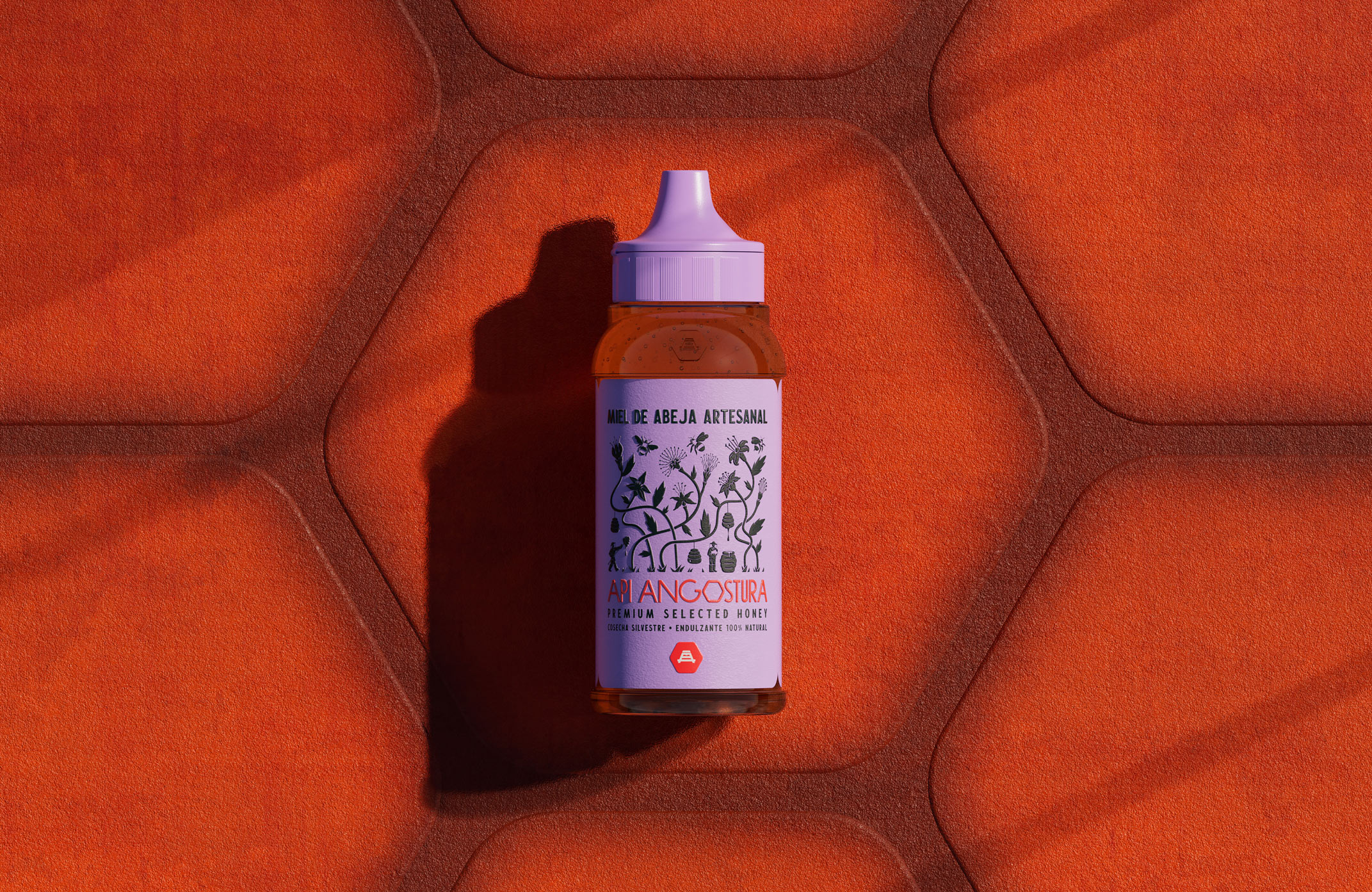
The packaging was conceived as a comprehensive visual communication system. The bottle features a narrow front face that, when displayed on shelves, immediately captures the consumer’s attention. At the bottom of the bottle, stepped depths were incorporated to evoke the structure of a beehive. The color palette, highlighted by a purple inspired by the mastranto flower, breaks away from the predominance of yellows in the market, while the label is divided into three parts, the two side panels pay homage to the wildflowers and narrate the brand’s history and sustainable commitment. The custom-designed logo is inspired by the beehive’s hexagon and the organic banks of the Orinoco River, where the variation in the type’s thickness evokes the river’s characteristic narrowing.
Cultural Context:
In an environment where traceability is scarce, Api stands as the only Venezuelan honey in the medium market that guarantees the origin of every drop. This commitment is reinforced by directly employing its beekeepers, under fair trade practices, strengthening the bond between tradition and conscious production. This project redefines the market; with Api, every element was transformed into a call for revaluing a product that is typically sold on roadside stands. Moreover, the ergonomic bottle caters to traditional consumption practices, where honey is preferred to be squeezed directly.


CREDIT
- Agency/Creative: The Wave Estudio
- Article Title: The Wave Estudio Shapes a Lush, Jungle-Born Honey Identity for Api Through Surreal Flora and Ancestral Detail
- Organisation/Entity: Agency
- Project Type: Packaging
- Project Status: Published
- Agency/Creative Country: Venezuela
- Agency/Creative City: Caracas
- Market Region: South America
- Project Deliverables: Packaging Design
- Format: Bottle
- Industry: Food/Beverage
- Keywords: honey honeypackaging bottledesign packaginghoney bottlepackaging branding branddesign labeldesign packagingdesign
-
Credits:
Art Director: Andrea C Marcano López
Creative Director: Celine Moreno
Illustrator: Mariana Madalena
Industrial Design: Andres Febres
Copywriting: Sara Lovera


