Introducing our latest creation: branding for Episode!
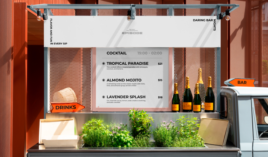
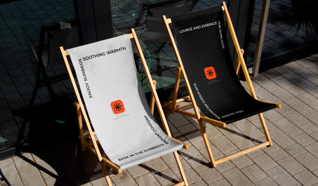
Episode is more than just a story; it’s an immersive experience crafted through the language of colors and shapes. Our inspiration for this project stems from the vivid and invigorating hues of orange sunsets, exuding energy and encapsulating the essence of joy. This unique and vibrant look that we’ve carefully curated is a testament to our dedication to making every Episode unforgettable.
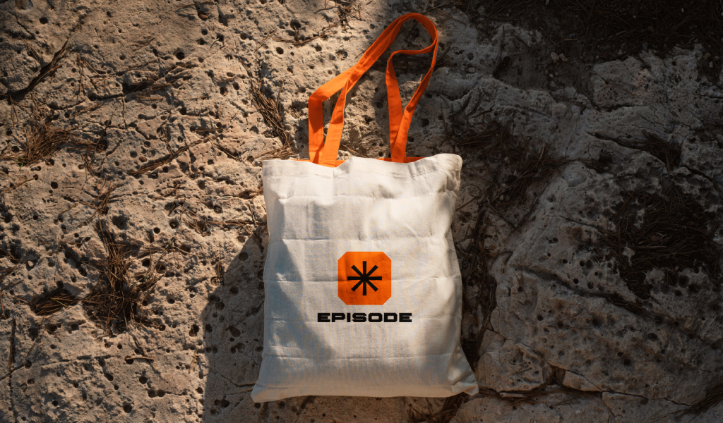
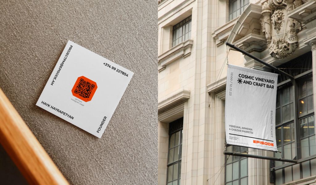
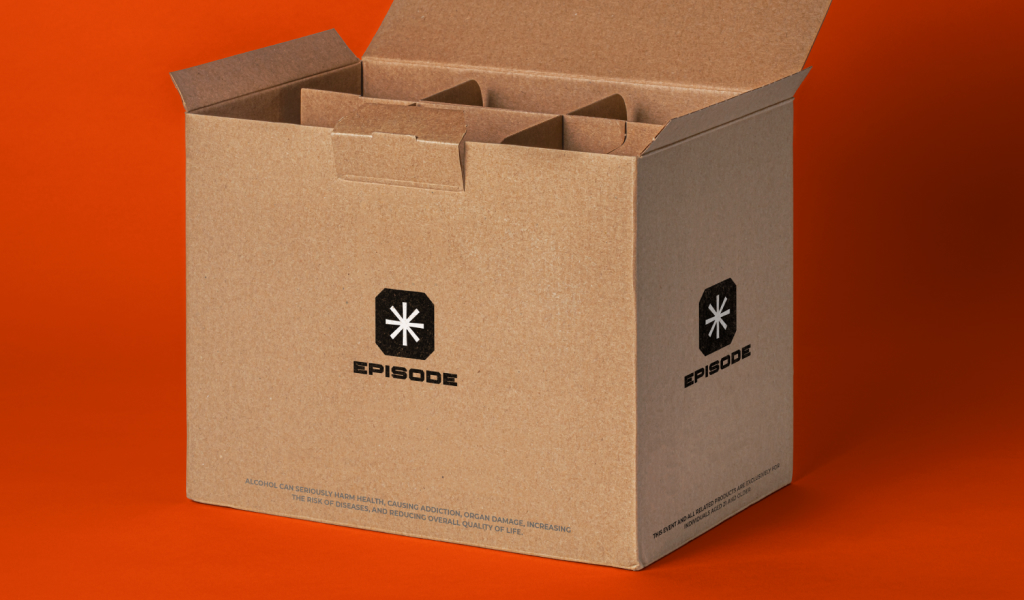
Our approach to branding Episode encompasses the logo, color palette, typography, and graphic elements, all harmoniously coalescing to deliver a consistent and compelling style. This unity in design serves to underscore the distinctive character of the Episode brand.
The new Episode logo is not merely an emblem; it’s a symbol of our unbridled passion for crafting extraordinary moments and events. It acts as an open invitation, encouraging everyone to step into a world where orange serves as the wellspring of inspiration. With each touchpoint of Episode’s branding, we aim to transport you to a realm where the ordinary is transformed into the extraordinary.
We take immense pride in our involvement in this project, and we’re filled with confidence that the new Episode design will fortify its position in the market. It’s not just about aesthetics; it’s about creating a brand identity that resonates with clients and solidifies Episode’s standing as a trustworthy partner in the realm of event organization.
Our journey with Episode has been a thrilling one, as we’ve delved deep into the nuances of design, color psychology, and the art of storytelling through branding. Every element of our work has been carefully crafted to encapsulate the spirit of Episode and its dedication to bringing joy and energy to every event.
In a world filled with countless options, Episode sets itself apart with its commitment to creating unforgettable experiences, and our branding reflects this commitment. Orange sunsets, with their vibrant and energetic hues, have served as our guiding light, infusing our work with the same warmth and dynamism.
We are excited to unveil this new Episode brand, and we hope it resonates with our audience just as it resonated with us during its creation. Whether you’re a past, present, or future partner, Episode’s new look is an emblem of our dedication to your success and the success of every event we’re a part of. We’re ready to embark on this exciting journey together, confident that the Episode brand will shine brightly in the world of event organization, inspiring trust and enthusiasm in all who encounter it.
CREDIT
- Agency/Creative: Garoon
- Article Title: The Visual Identity for the Event Organization Company Episode
- Organisation/Entity: Agency
- Project Type: Identity
- Project Status: Published
- Agency/Creative Country: Armenia
- Agency/Creative City: Yerevan
- Market Region: Europe
- Project Deliverables: 2D Design, Art Direction, Brand Creation, Brand Design, Brand Guidelines, Brand Identity, Branding, Logo Design
- Industry: Entertainment
- Keywords: Visual identity, logotype, icons,
-
Credits:
Art Director: Rafayel Danielyan


