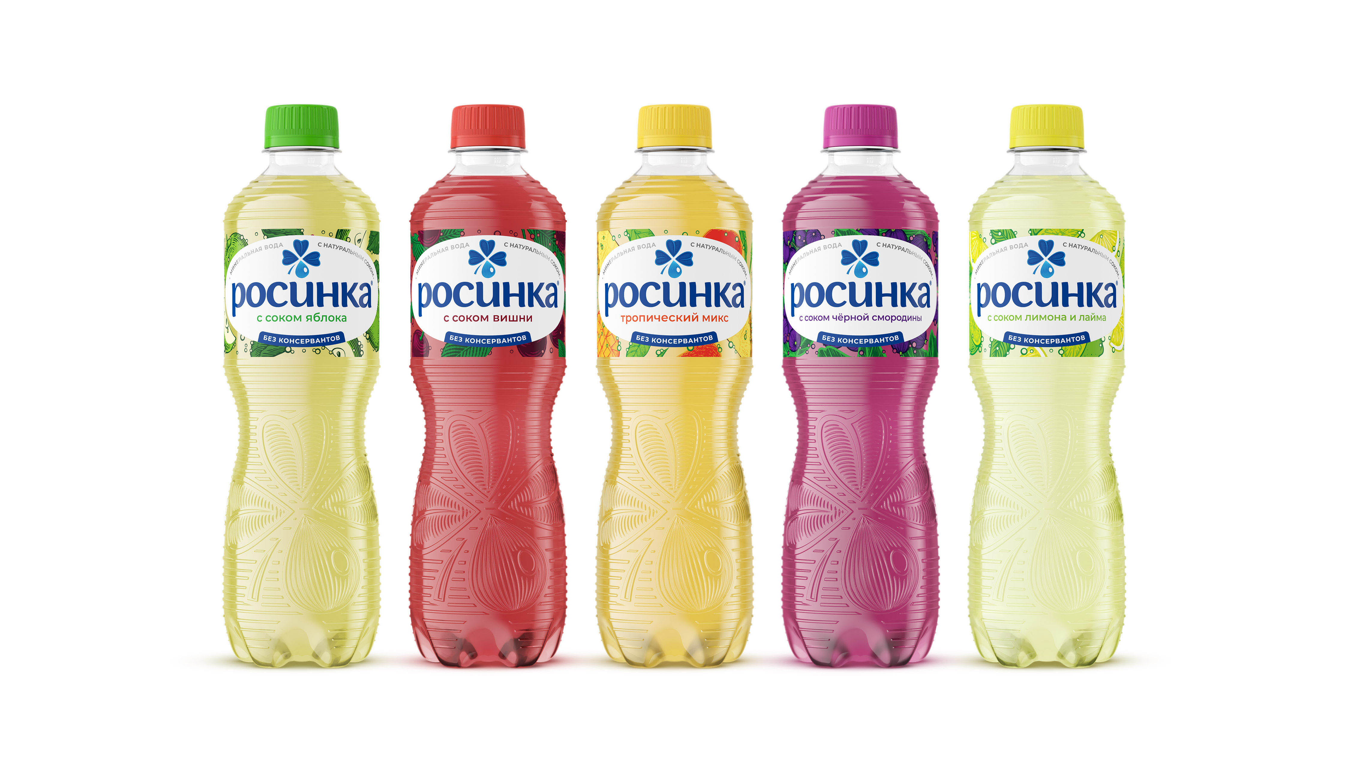
The agency team was faced with the task of carrying out an evolutionary restyling of the brand: to make the image more modern and vibrant, while maintaining the brand values and design continuity.
It was decided to abandon the monument to the founder of Lipetsk mineral waters, Peter the Great, in the brand image and use the recognizable quatrefoil – a graphic element of the logo of the manufacturing company. The typography of the brand block was also updated, the logo became more friendly. Due to the rejection of large “heavy” elements and the use of transparent zones, the label became “light”, “airy” and “clean”. The new bottle shape with a distinct silhouette has become more ergonomic. Thanks to the redesign, it was possible to create a bright and modern image reflecting the communication and philosophy of the Rosinka brand — “naturalness of products” and “purity of production”.
The project included updates to the brand identity, bottle shape and decor, style-forming elements, and label design.
The packaging design of the children’s drinking water “Bright Childhood” and the design of the line of mineral water with natural juice were also updated.


CREDIT
- Agency/Creative: CUBA Branding
- Article Title: The Updated Design of the Rosinka Brand by CUBA Branding
- Organisation/Entity: Agency
- Project Type: Packaging
- Project Status: Published
- Agency/Creative Country: Russia
- Agency/Creative City: Lipetsk
- Market Region: Europe
- Project Deliverables: 3D Modelling
- Format: Bottle
- Industry: Food/Beverage
- Keywords: cubabranding, packaging, branding, brand design, redesign, rosinka
-
Credits:
Creative Director: Evgeny Dyakonov


