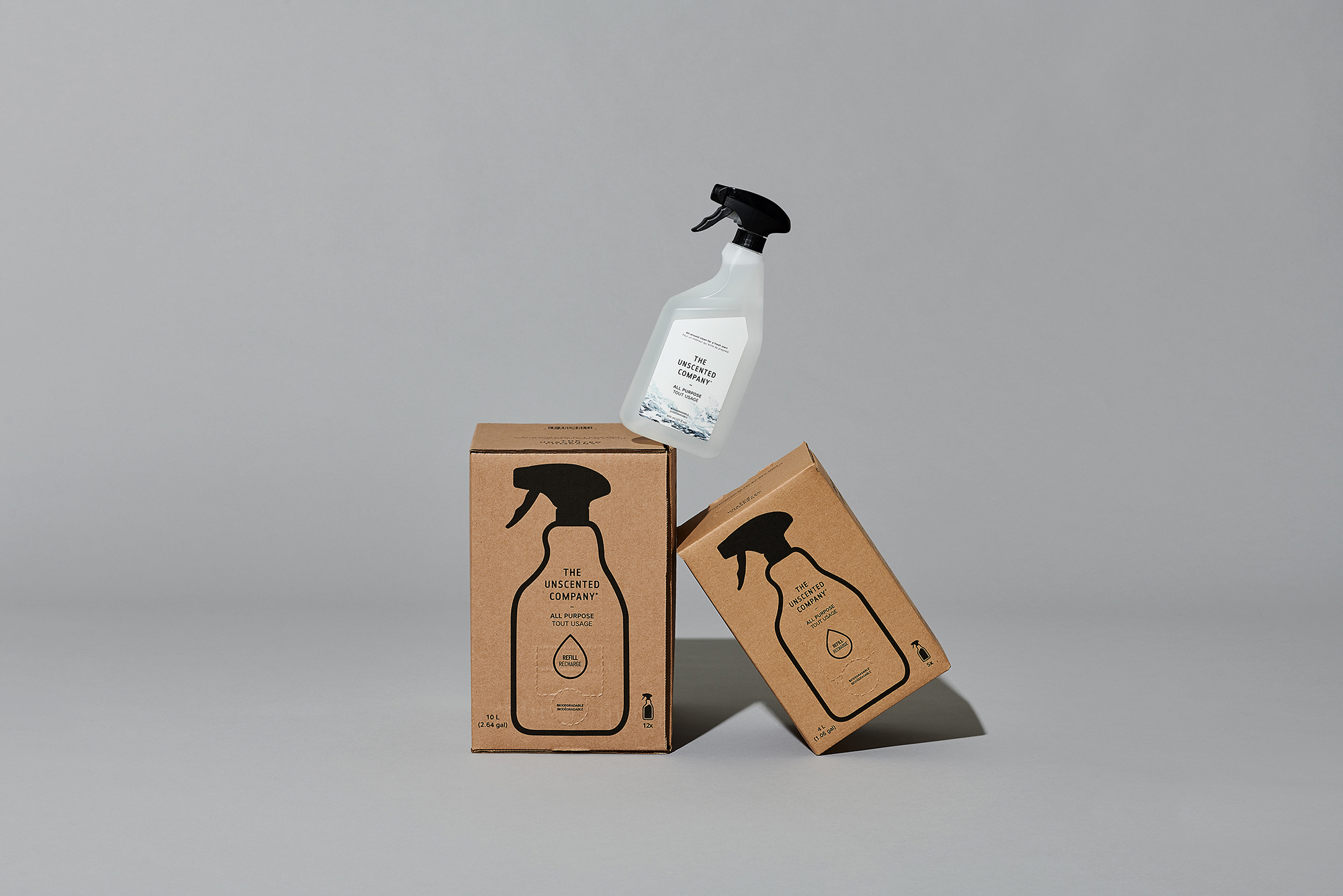
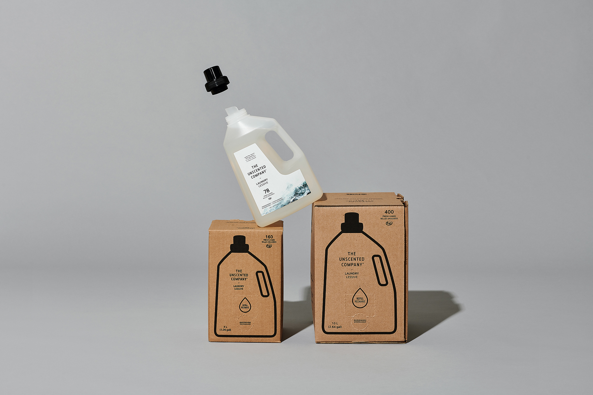
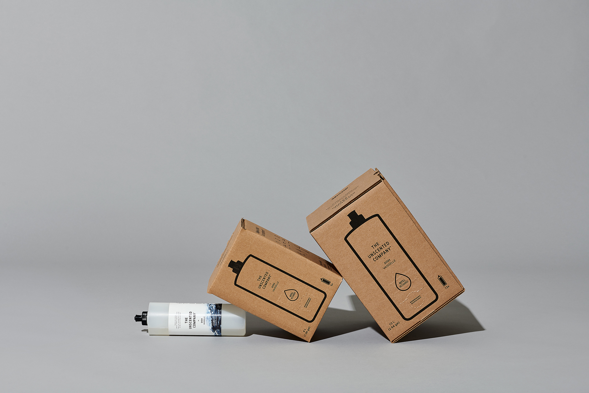
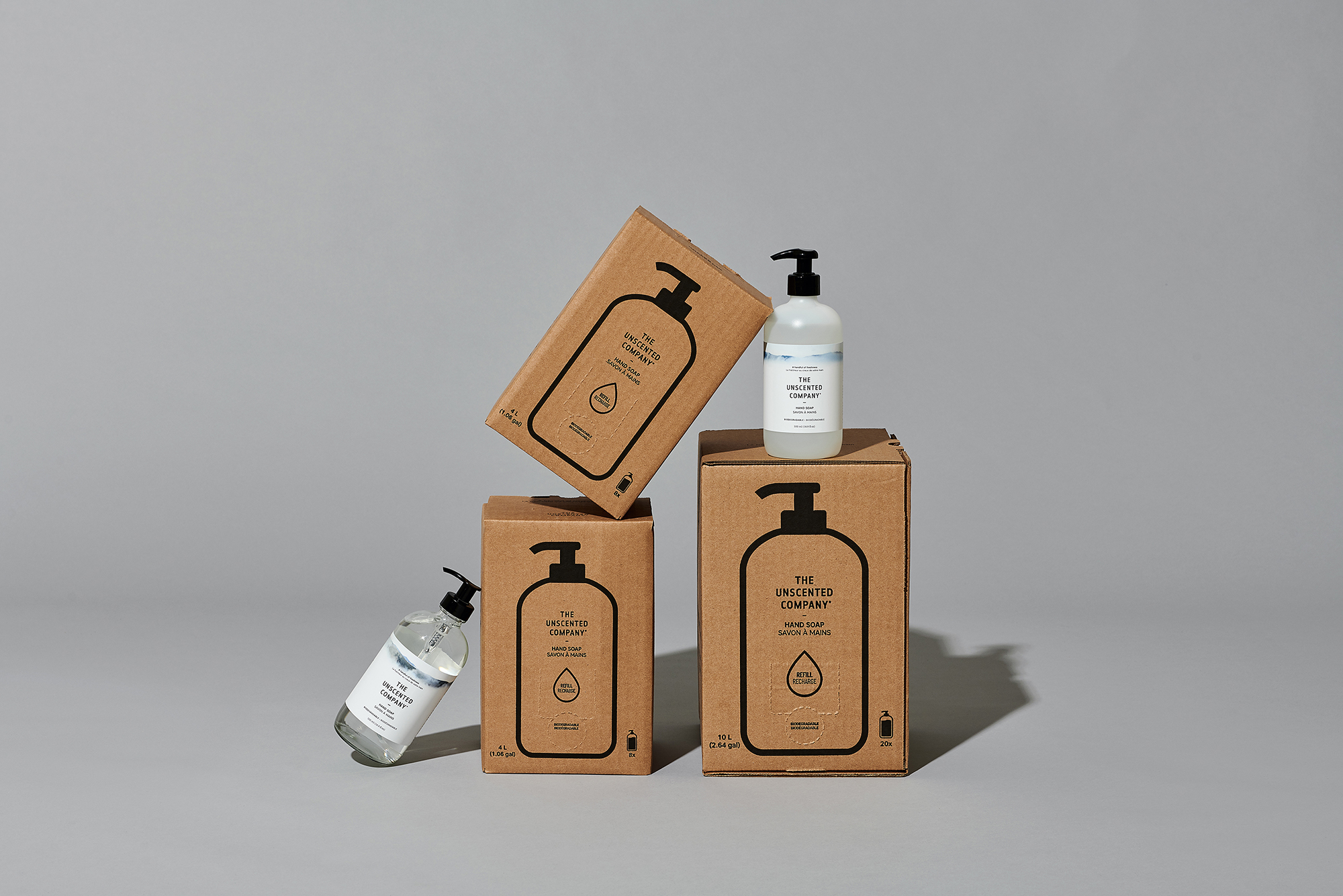
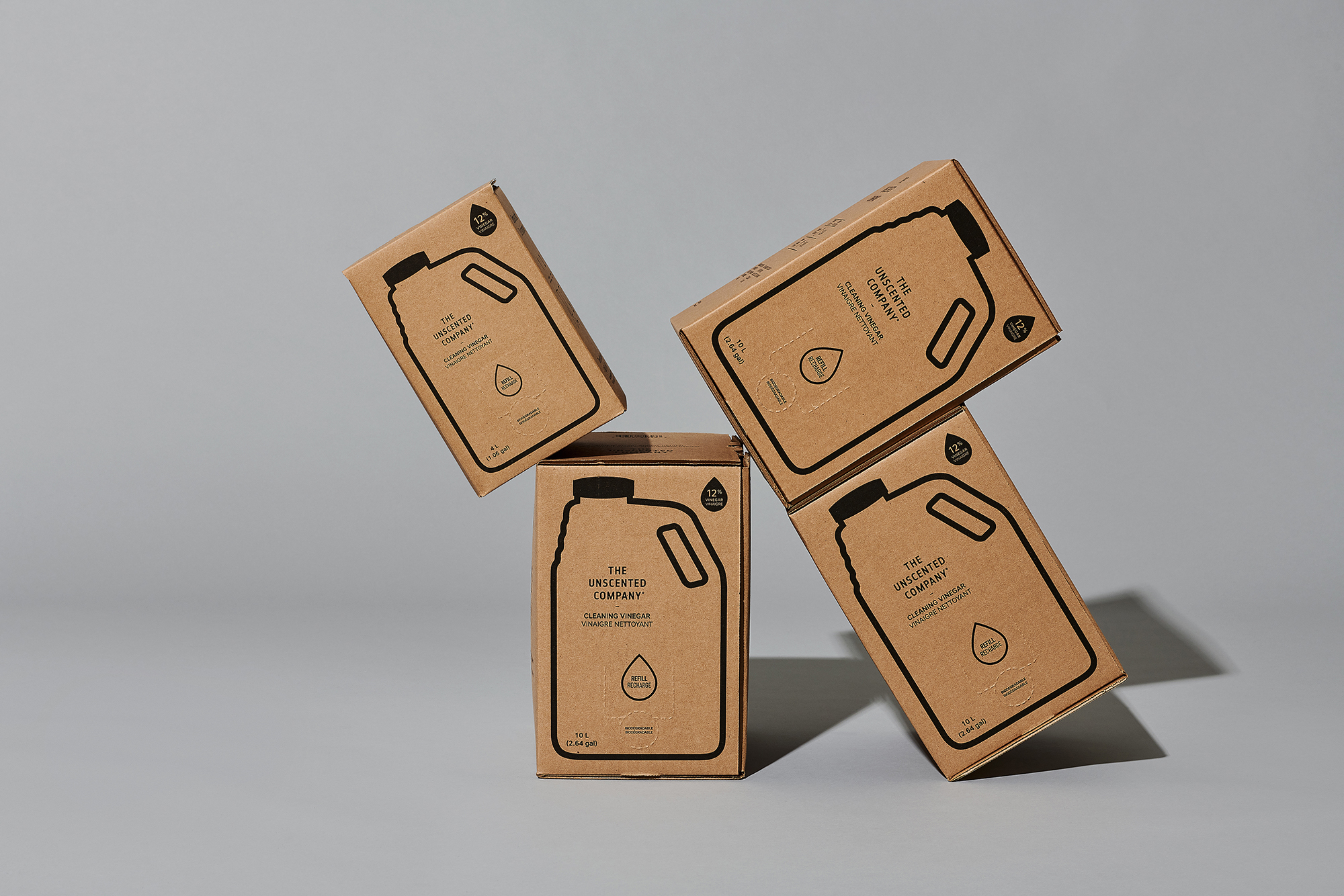
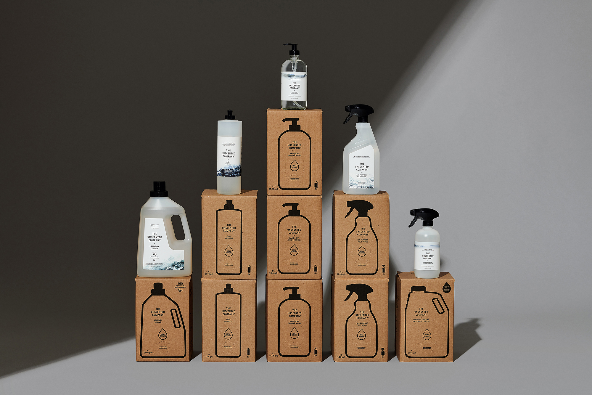
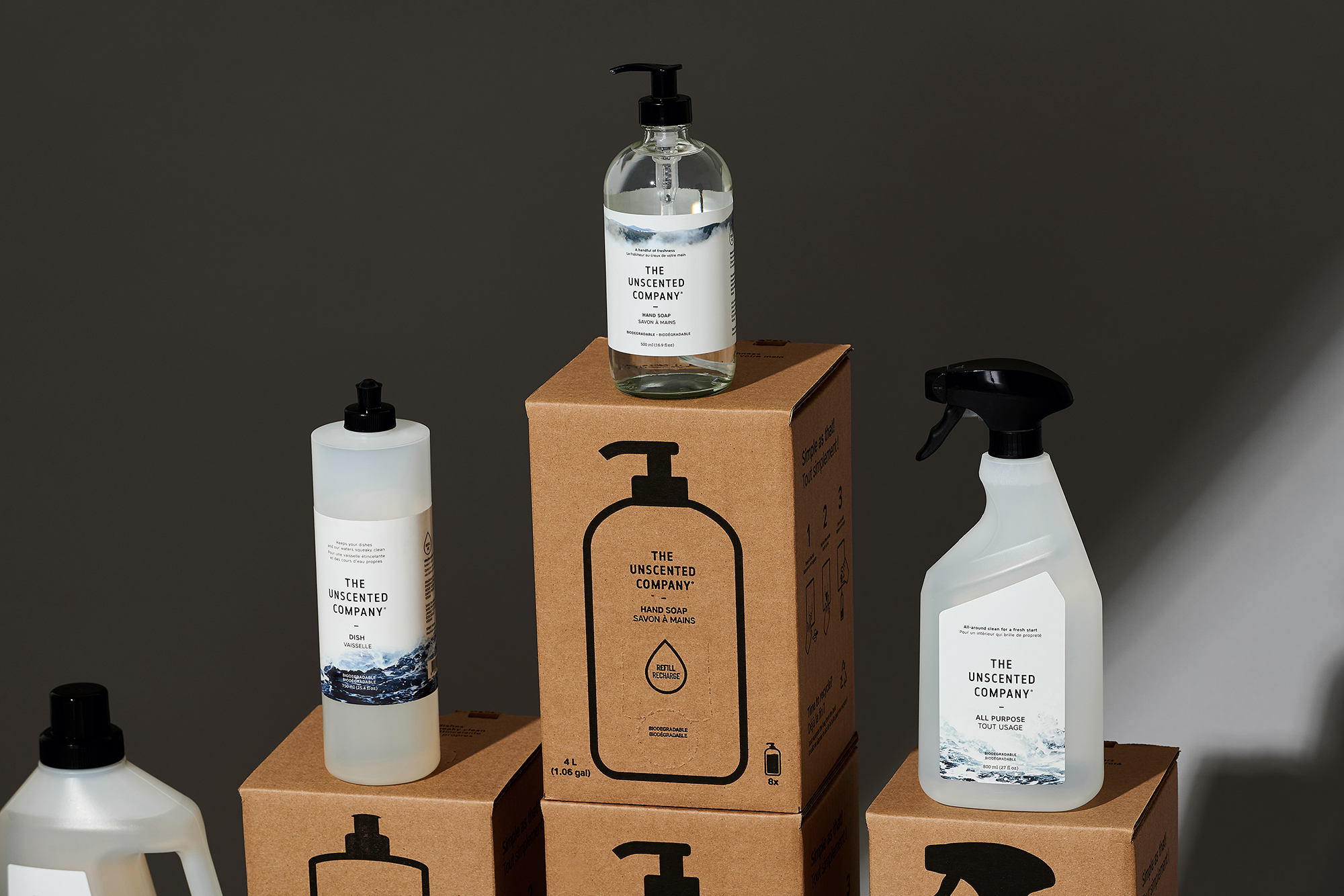
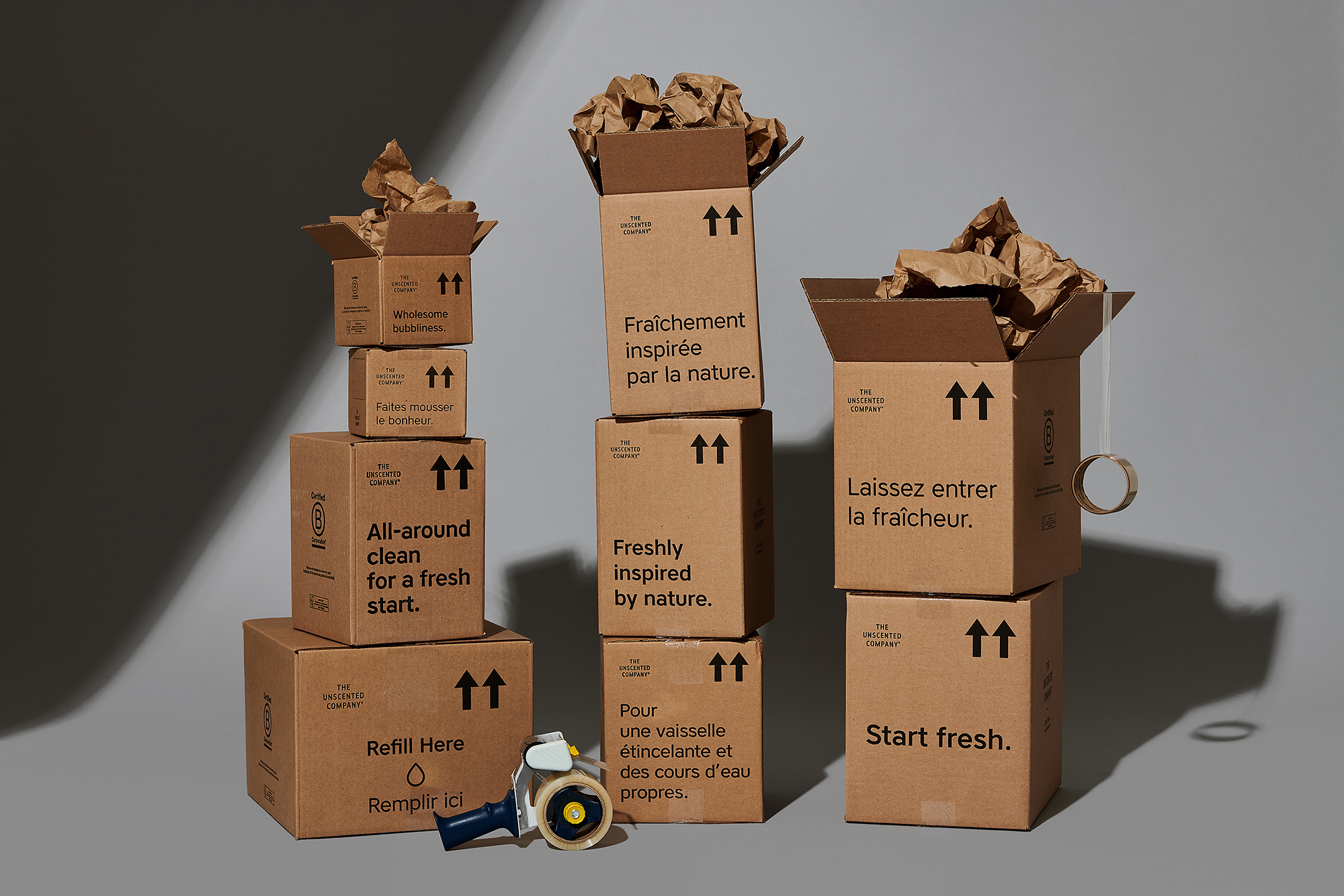
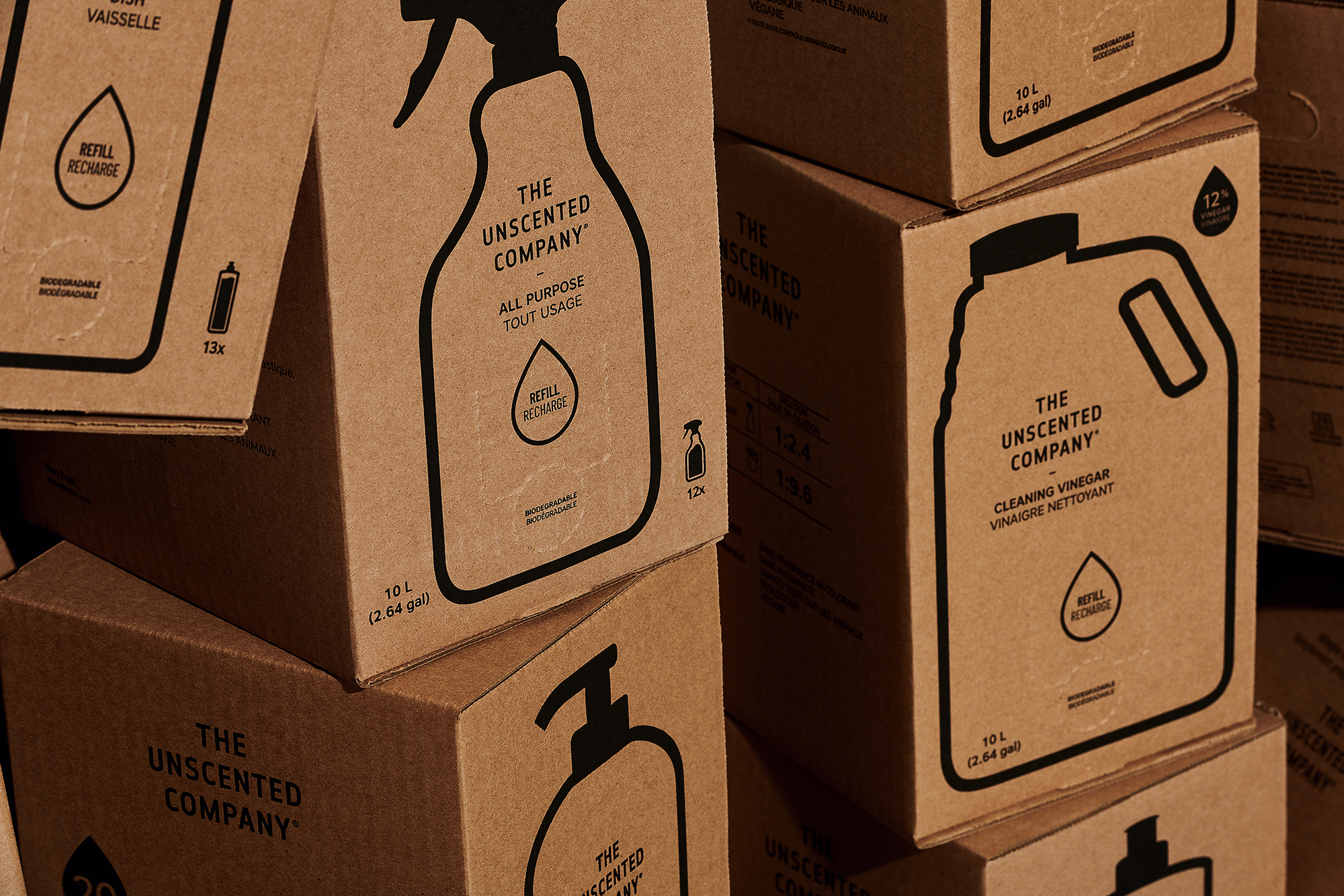
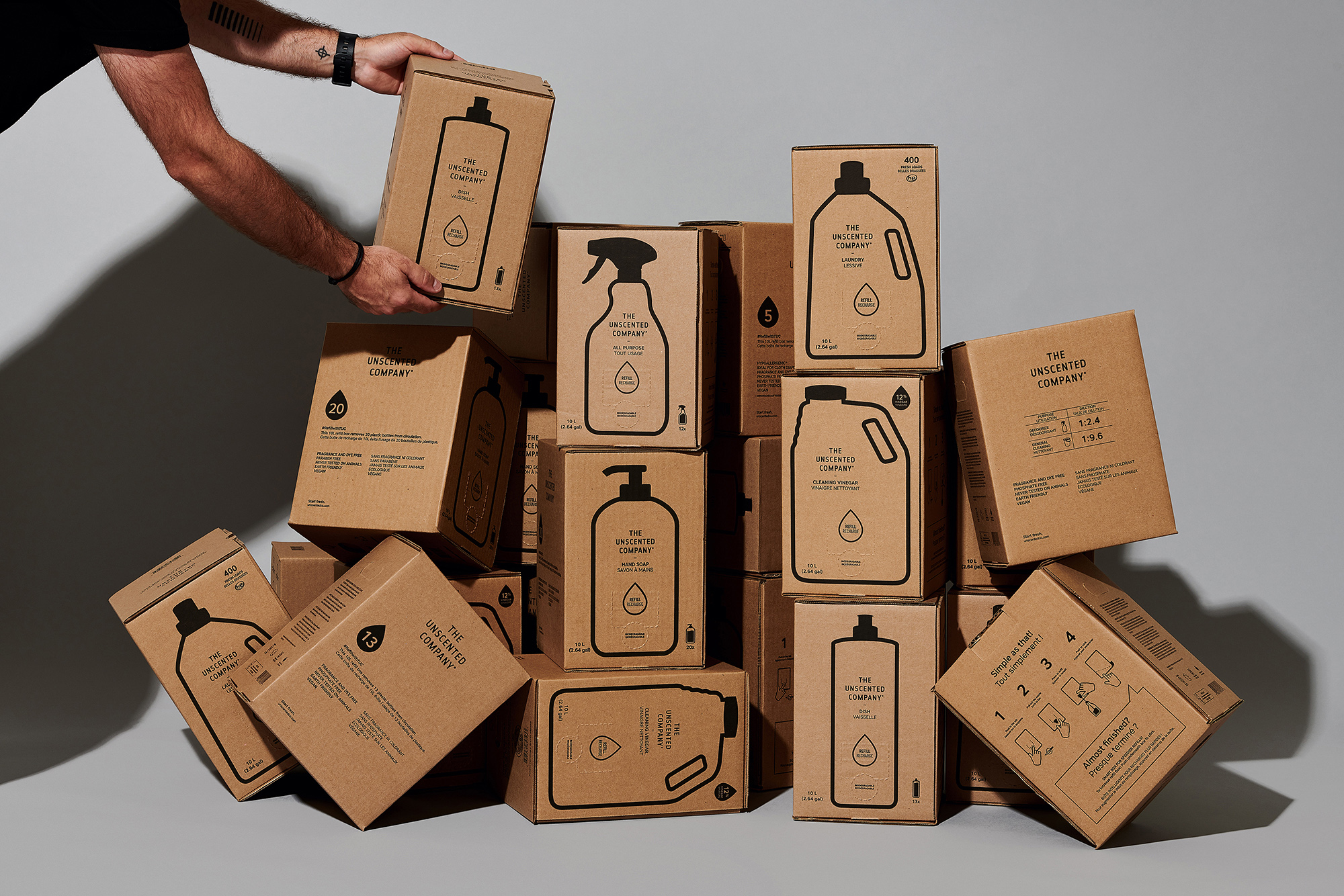
The objective was to make the main surface of their many refill boxes more appealing, and to add a pleasant touch to their daily expedition boxes. Due to a format change of the 4 L and the 10 L boxes, now glue-free, we were able to use contour lines on the main surfaces to represent the products. This decision allows using the filling pumps directly from a representation of the product on the front of the box, and it eases the identification and use of the refill stations, at home and in stores. As for expedition boxes, a bilingual description of each product, in English and in French, was applied on the boxed in their respective typographic weights. The 2 boxes for special shipments were illustrated by hand, namely a wave and a mountain representing TUC’s 2 product categories (Home + Body). That way, every kraft cardboard box from TUC goes well with all of their products.
CREDIT
- Agency/Creative: BangBang
- Article Title: The Unscented Company Refill Station and Shipping Boxes Created by BangBang
- Organisation/Entity: Agency, Published Commercial Design
- Project Type: Packaging
- Agency/Creative Country: Canada
- Market Region: North America
- Project Deliverables: Brand Experience, Brand Strategy, Graphic Design, Illustration, Packaging Design, Photography, Retail Brand Design
- Format: Box
- Substrate: Pulp Carton


