


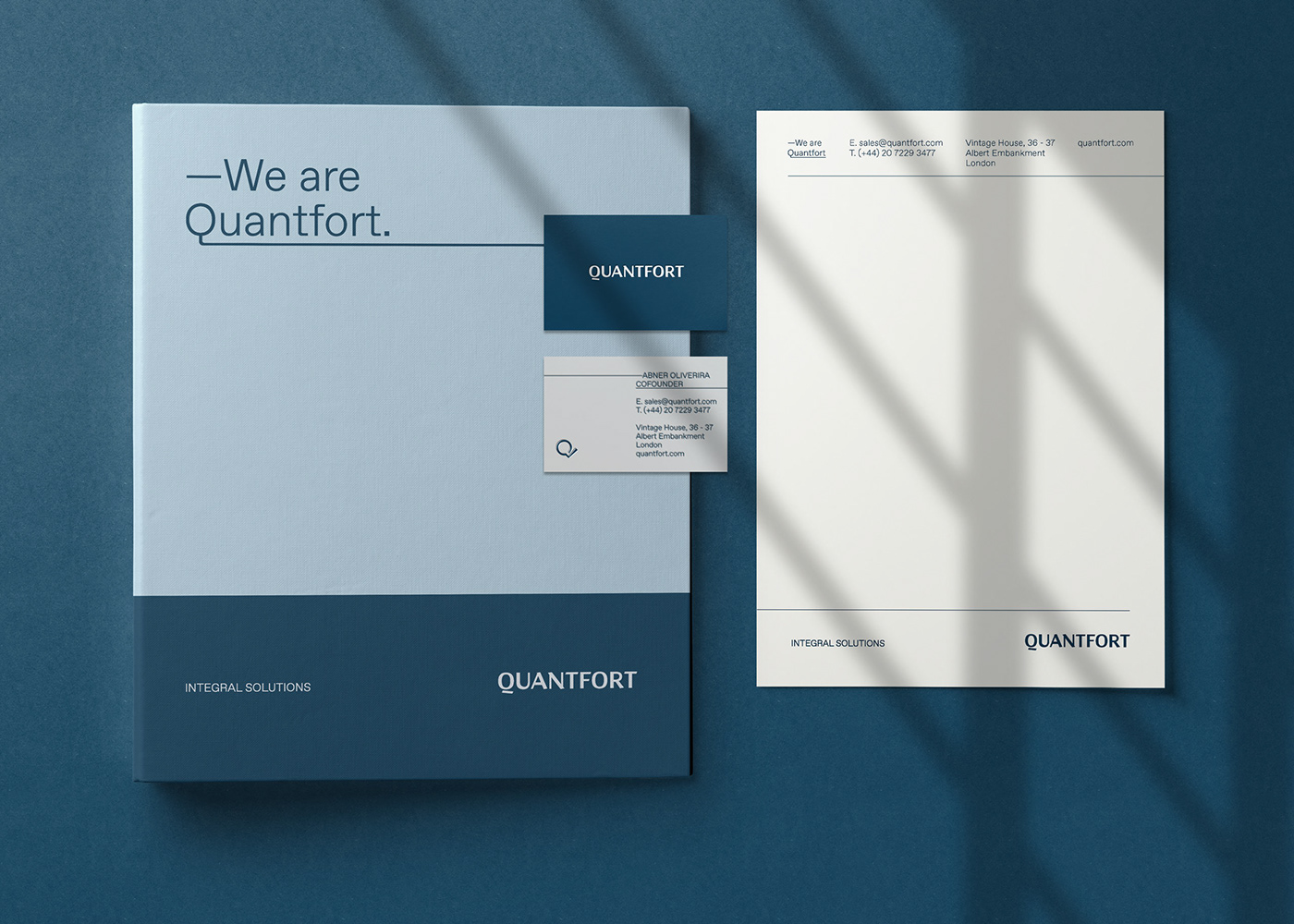
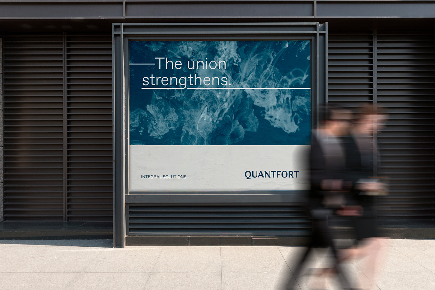
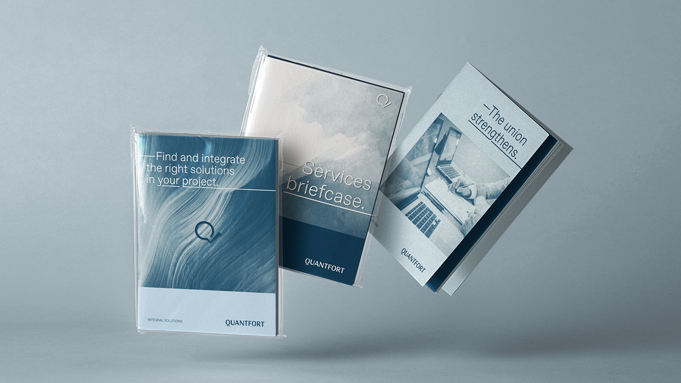
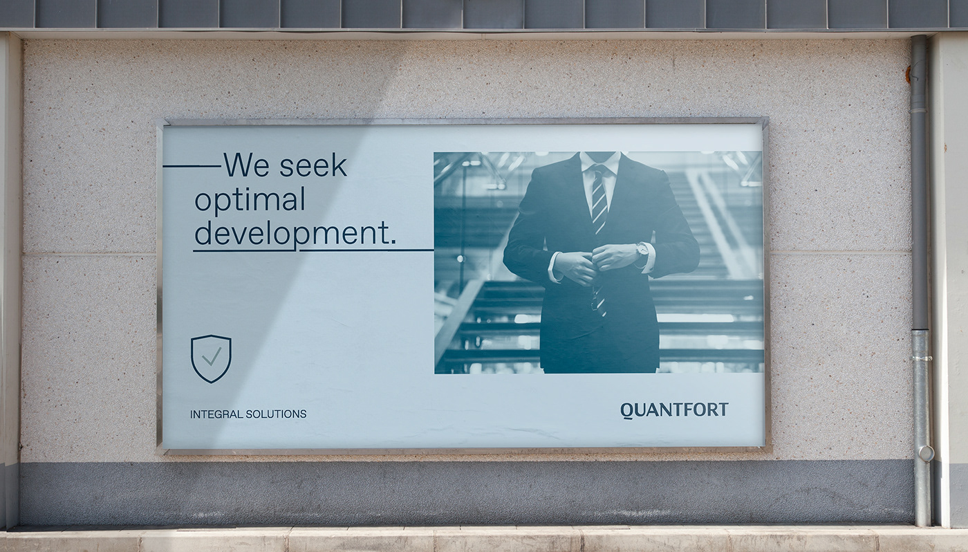
QUANTFORT is a technology and services integration house of the global financial sector. Its essence is the union and connection between client and its services.
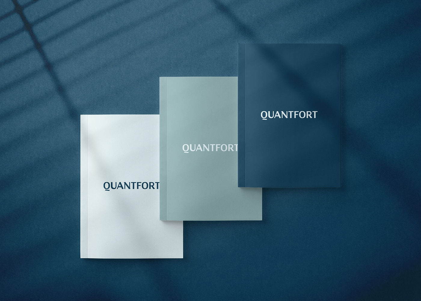
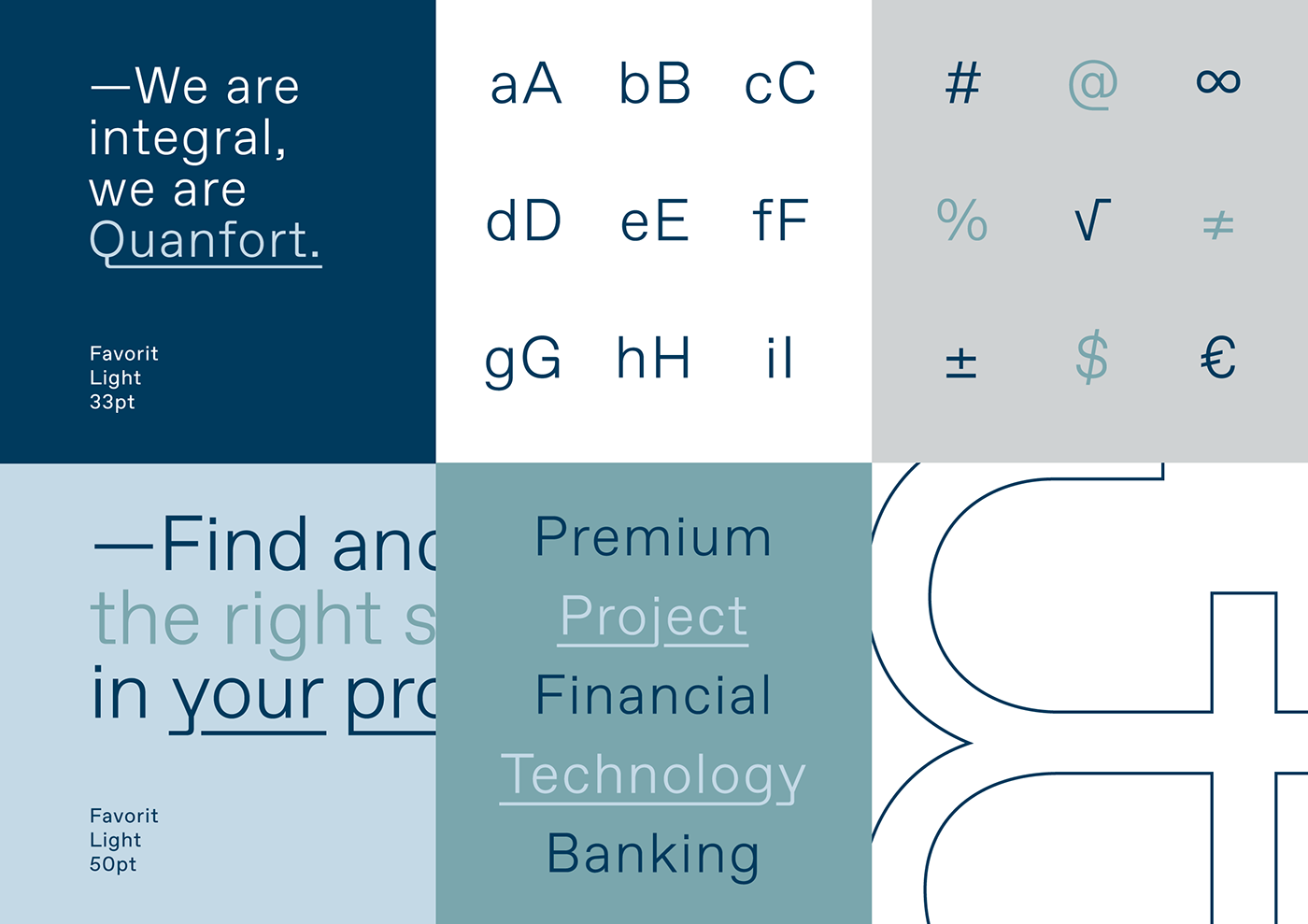
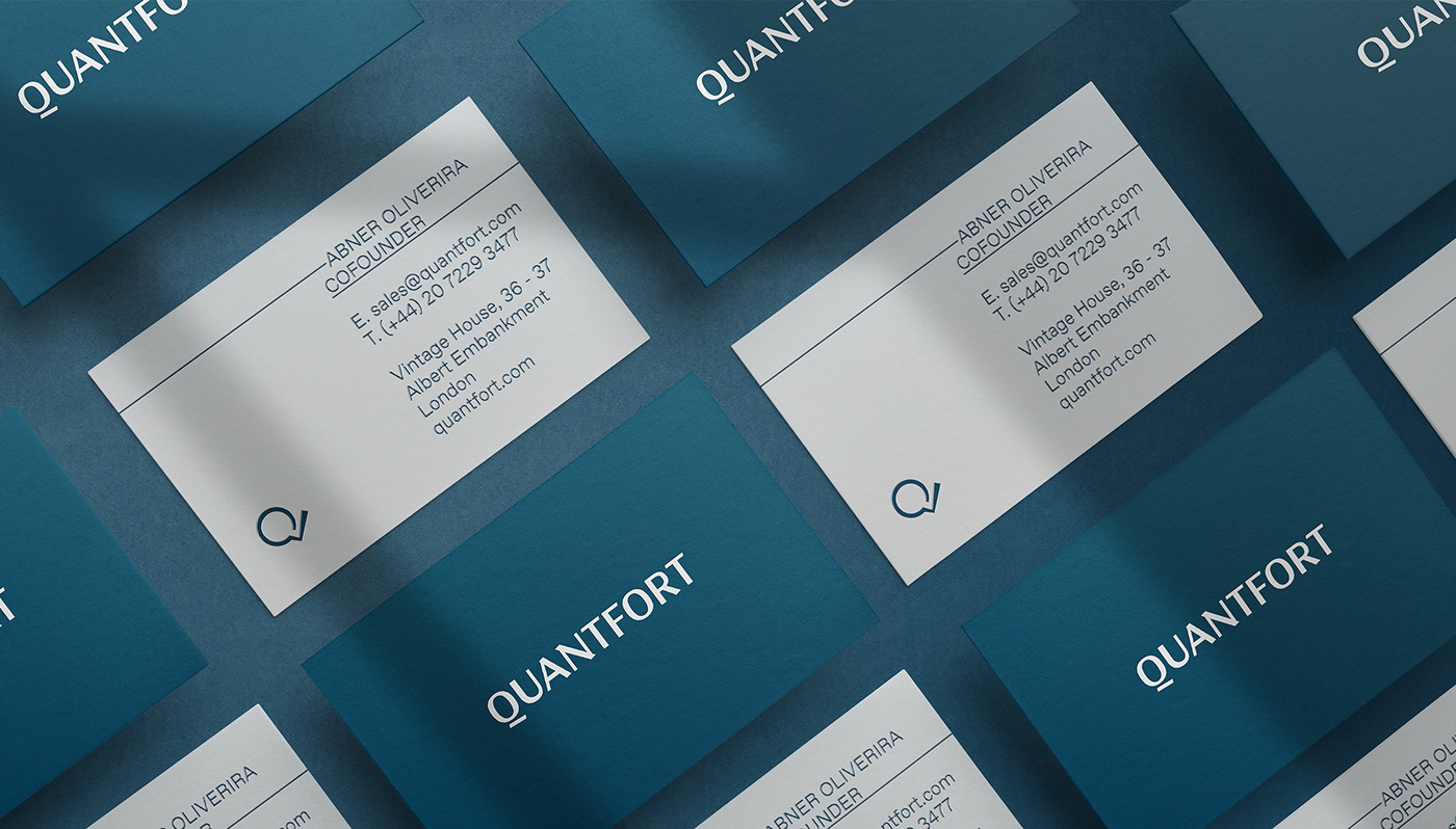
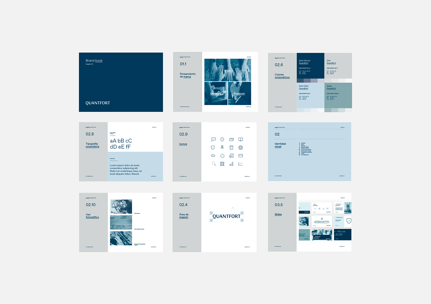
Thanks to the brand DNA, we create an elegant, sober and premium brand visual identity. A typographic logo was developed in capital letters especially for the brand, with angles and contrasts in its forms. Like a symbol that gives that professionalism to the brand.
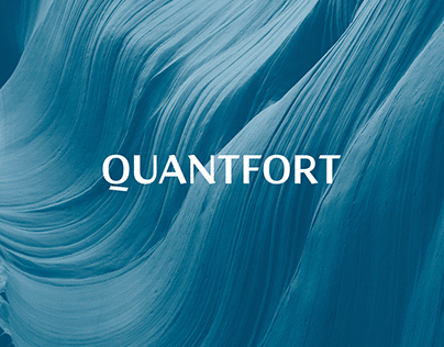
We used a serie of elements that help to convey our brand pillar, which is the union between QUANTFORT and the client, through metaphorical photographs and textures that help us strengthen the concept.

CREDIT
- Agency/Creative: SERENA STUDIO, S.L.
- Article Title: The Union Strengthens
- Organisation/Entity: Agency, Published Commercial Design
- Project Type: Identity
- Agency/Creative Country: Spain
- Market Region: Europe
- Project Deliverables: Brand Creation, Brand Guidelines, Brand Identity, Brand Redesign, Brand Refinement, Brand Rejuvenation, Brand Strategy, Branding, Graphic Design, Identity System, Illustration, Rebranding, Research
- Industry: Technology
- Keywords: Technology, services, global, financial, customers, elegant, sober and premium.
FEEDBACK
Relevance: Solution/idea in relation to brand, product or service
Implementation: Attention, detailing and finishing of final solution
Presentation: Text, visualisation and quality of the presentation


