In the last decade, a new generation of people has been trying to find an alternative to natural meat or completely abandon it for ethical or environmental reasons, because not only the chemical industry and mining, but also meat production negatively affects the ecology of the Earth.
Animal husbandry is a major source of greenhouse gas emissions due to the ammonia that animals produce and the carbon associated with the feed they eat. The same harm from the use of fossil fuels, methane emissions by animals, sewage pollution, water consumption and occupation of large areas of the earth are just some of the environmental consequences associated with meat production, while cultured meat produces much less greenhouse gas emissions than conventional meat. Moreover, its production of 1000 kg will require 7-45% less energy, 99% less land and 82-96% less water.
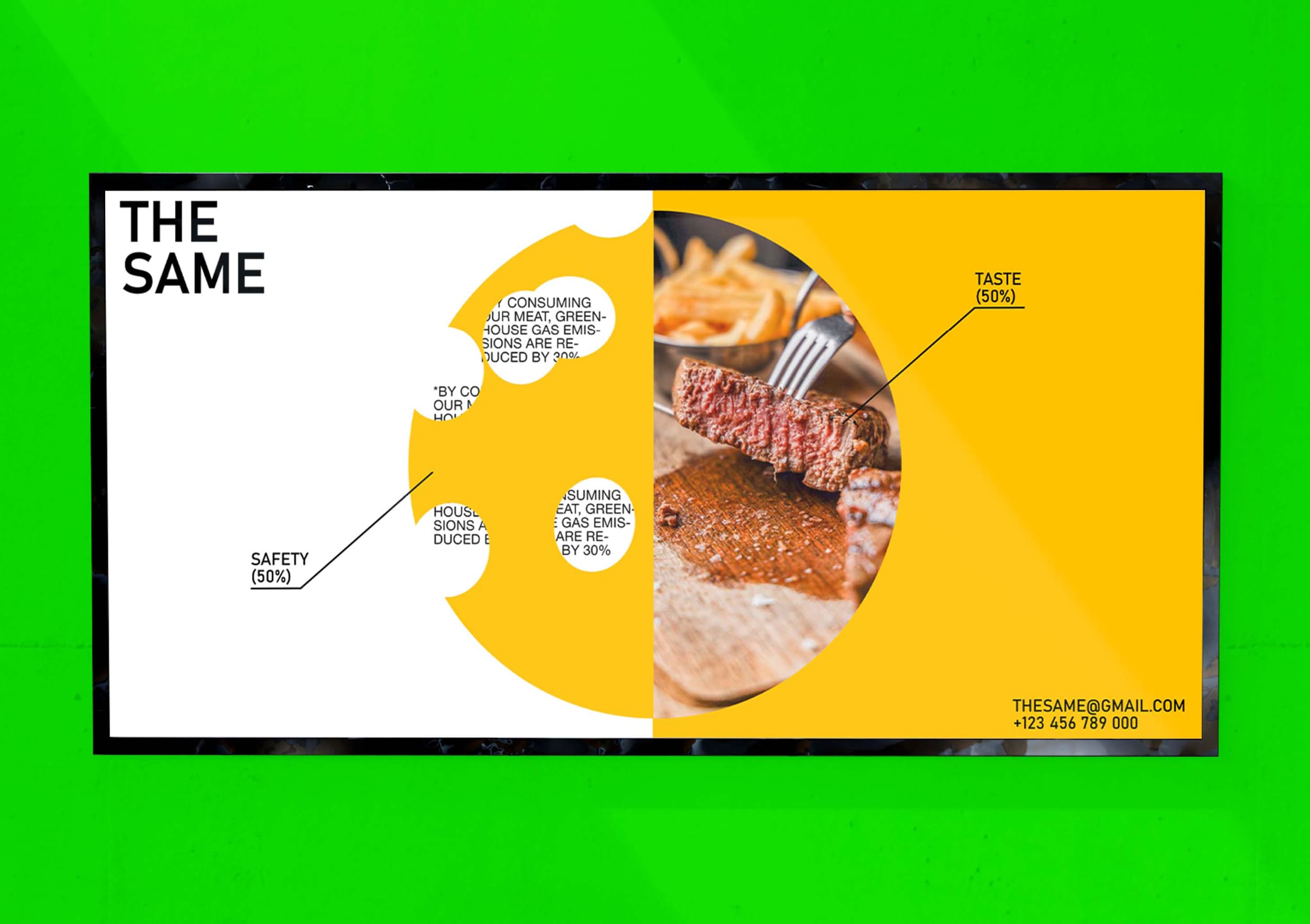
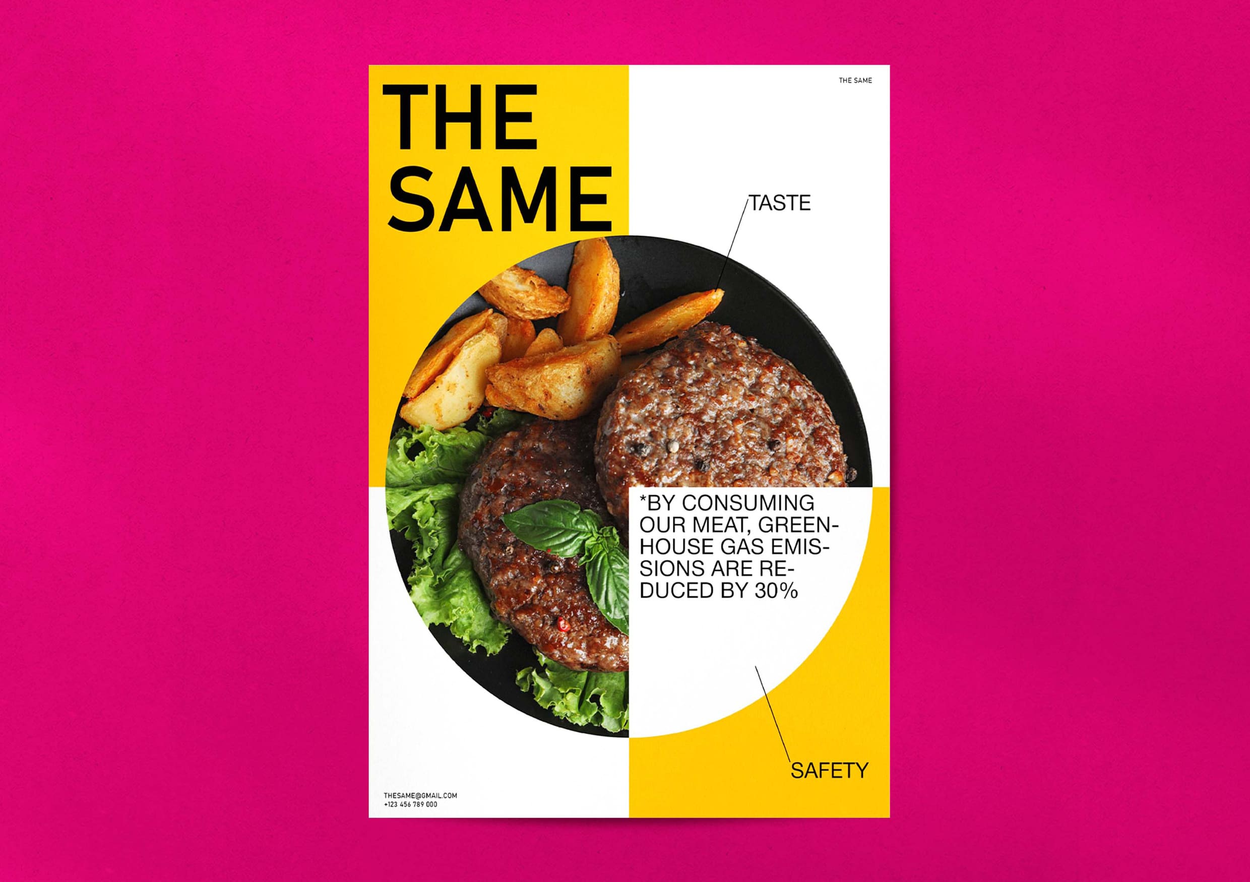
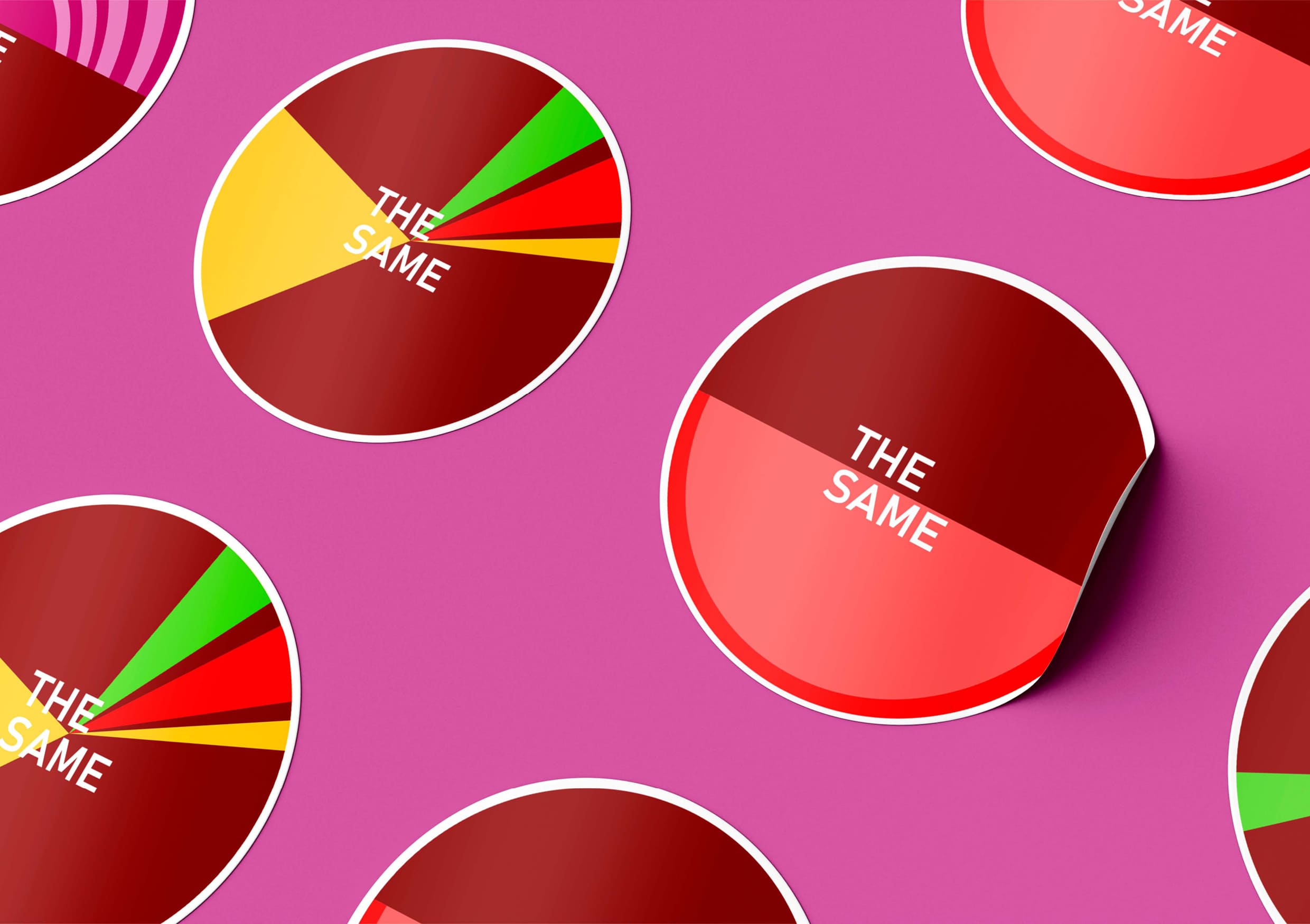
For clarity, the information is depicted graphically, for example, in the form of pie charts, which have a similar shape to a cutlet, which becomes the main idea for the corporate identity of The Same company, which produces cutlets from cultured meat.
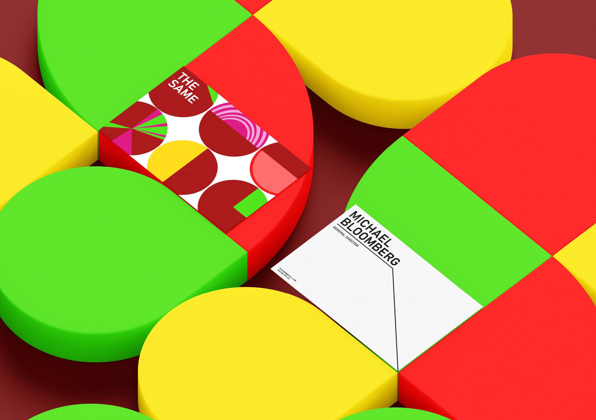
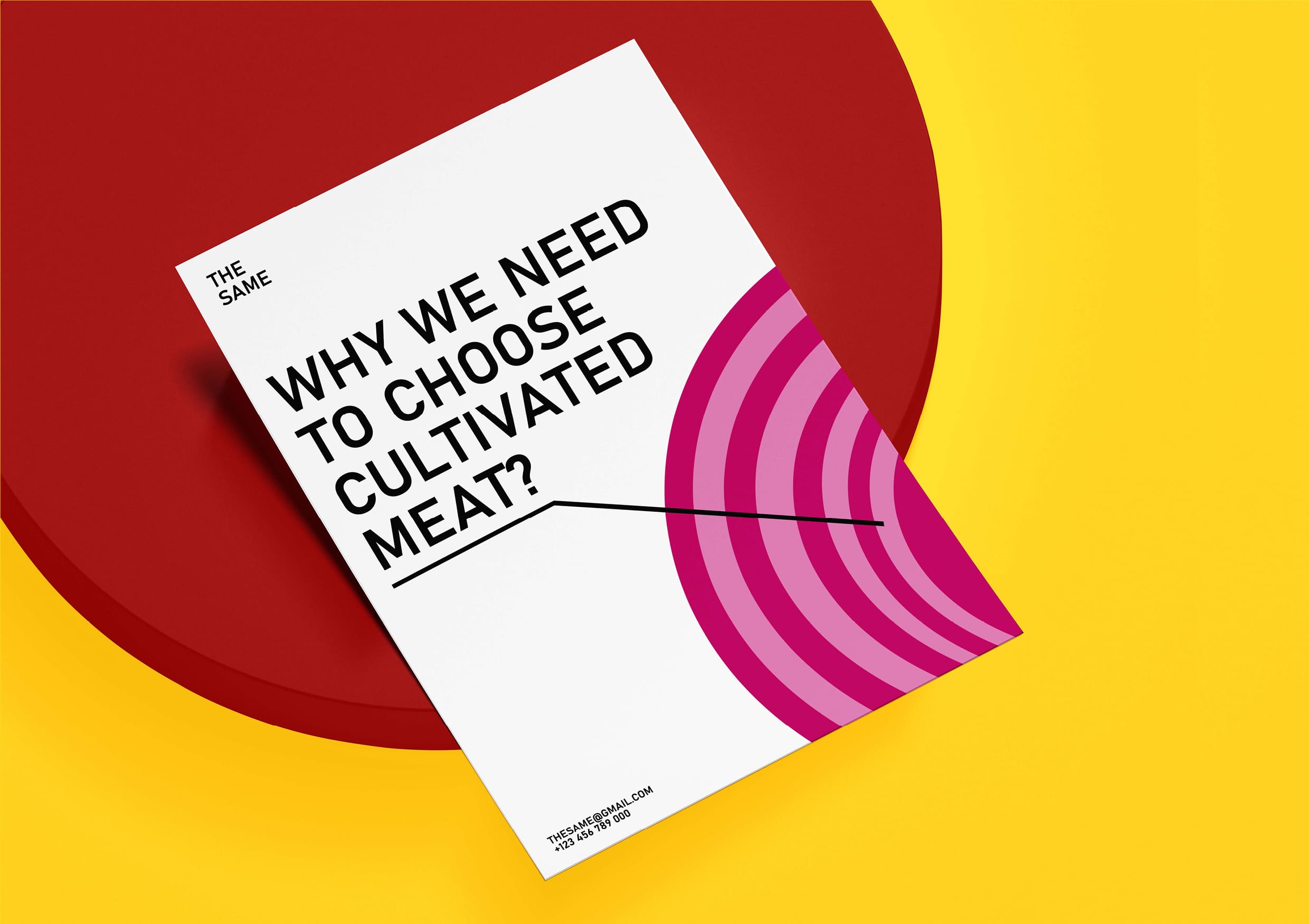
Due to the fact that the diagrams have many combinations of sectors and colors, the style turns out to be very bright and played out in different ways. Parts of the cutlets are painted in the colors of the products we are familiar with, with which you can usually, for example, eat a burger: purple – onion, red – tomato, yellow – cheese and green – greens. In order to be able to read the image of the cutlet, part of the diagram is filled with brown color. In addition to simple filling and standard shapes, patterns can be added to the sectors, such as cheese circles or onion rings.
To make the colored circle refer more to the diagrams, additional shapes and symbols are used, such as the title, text footnotes and percentage (%). There are two main colors: yellow, which sets brightness and juiciness, and white – a sign of purity and openness. Due to the use of bright graphics, the logo is typed in a simple font, which is usually used in tables and diagrams.
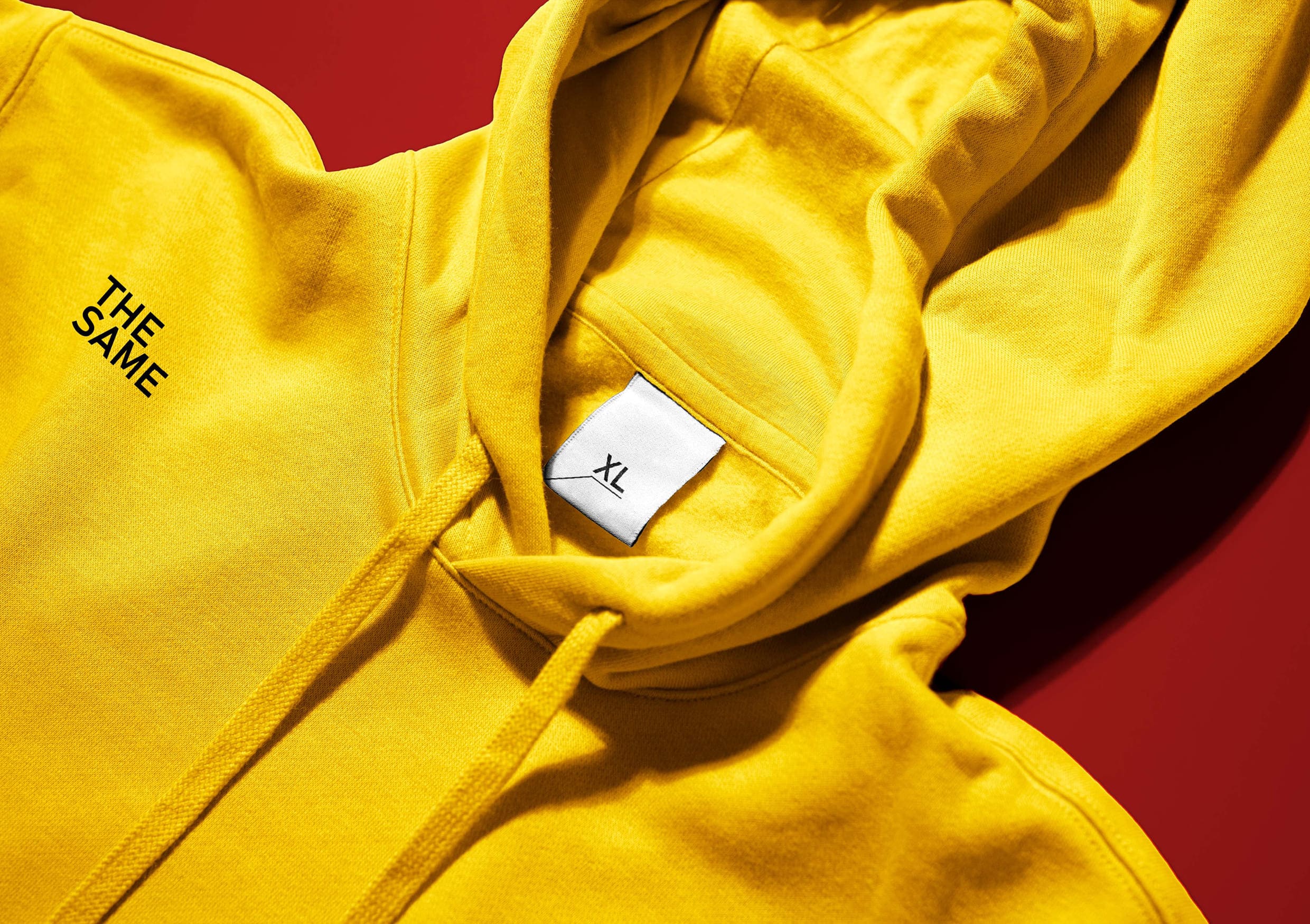
For those who want to draw people’s attention to environmental problems and declare that meat can be consumed without harm to the planet, as well as for those who want to remain bright and stylish, an appropriate merch has been developed in which you will definitely not go unnoticed.
CREDIT
- Agency/Creative: Katya Nadina
- Article Title: The Third Variant of the Corporate Identity of the Company Growing Cultivated Meat by Katya Nadina
- Organisation/Entity: Student
- Project Type: Identity
- Project Status: Non Published
- Agency/Creative Country: Russia
- Agency/Creative City: Katya Nadina
- Market Region: Global
- Project Deliverables: Brand Identity
- Industry: Food/Beverage
- Keywords: Katya Nadina brand identity the third variant of the corporate identity of the company growing cultivated meat
-
Credits:
Tutor: Tanya Dunaeva


