TTnTA or The Thinker and The Adventurer is a short story book that started from a thought experiment. A hypothetical scenario involving two imaginary characters conversing with each other developed into a full-fledged story expanding across several chapters. And thus began the project….
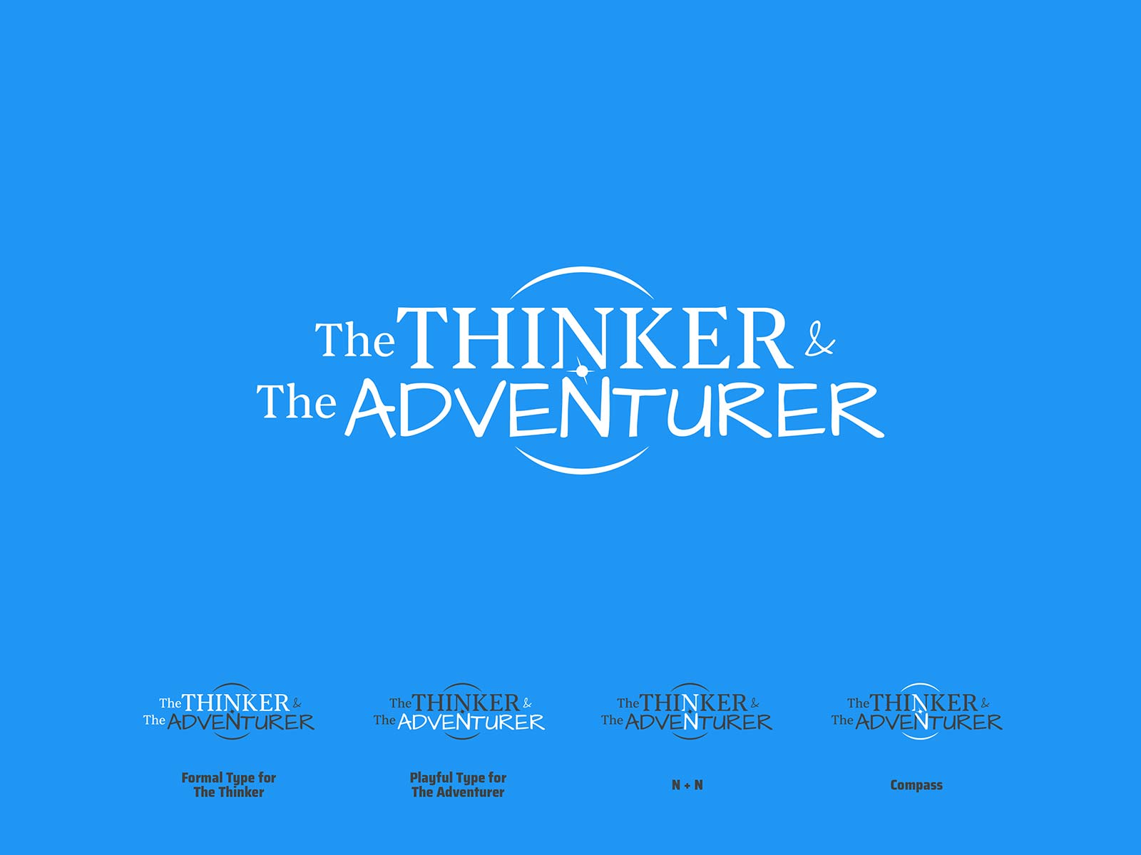
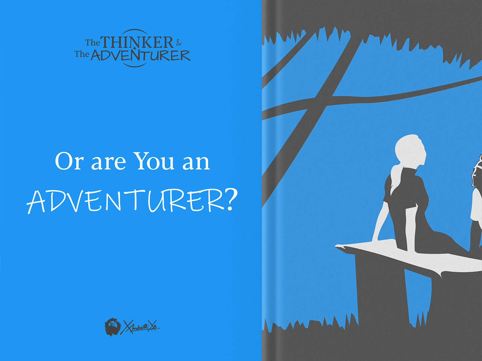
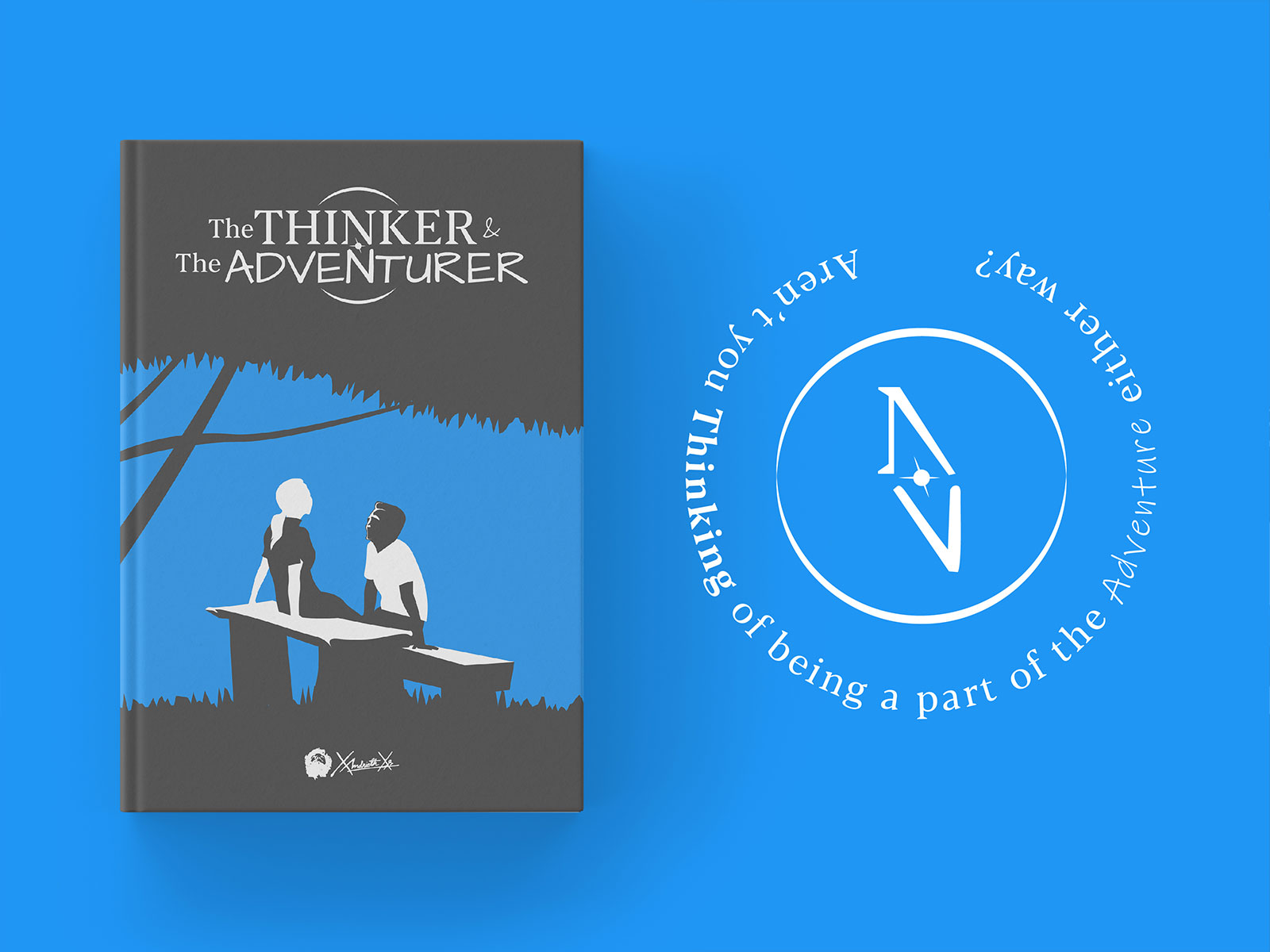
Although the project started as something casual, we couldn’t help ourselves taking the branding seriously. The logo is a combination of two typefaces and a compass hidden in it….
The two very different typefaces represent the two very different personalities of the two characters while the compass hints at the call for adventure….
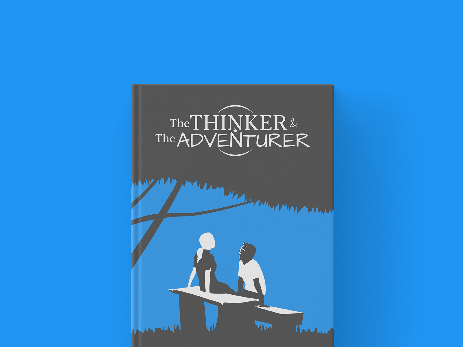
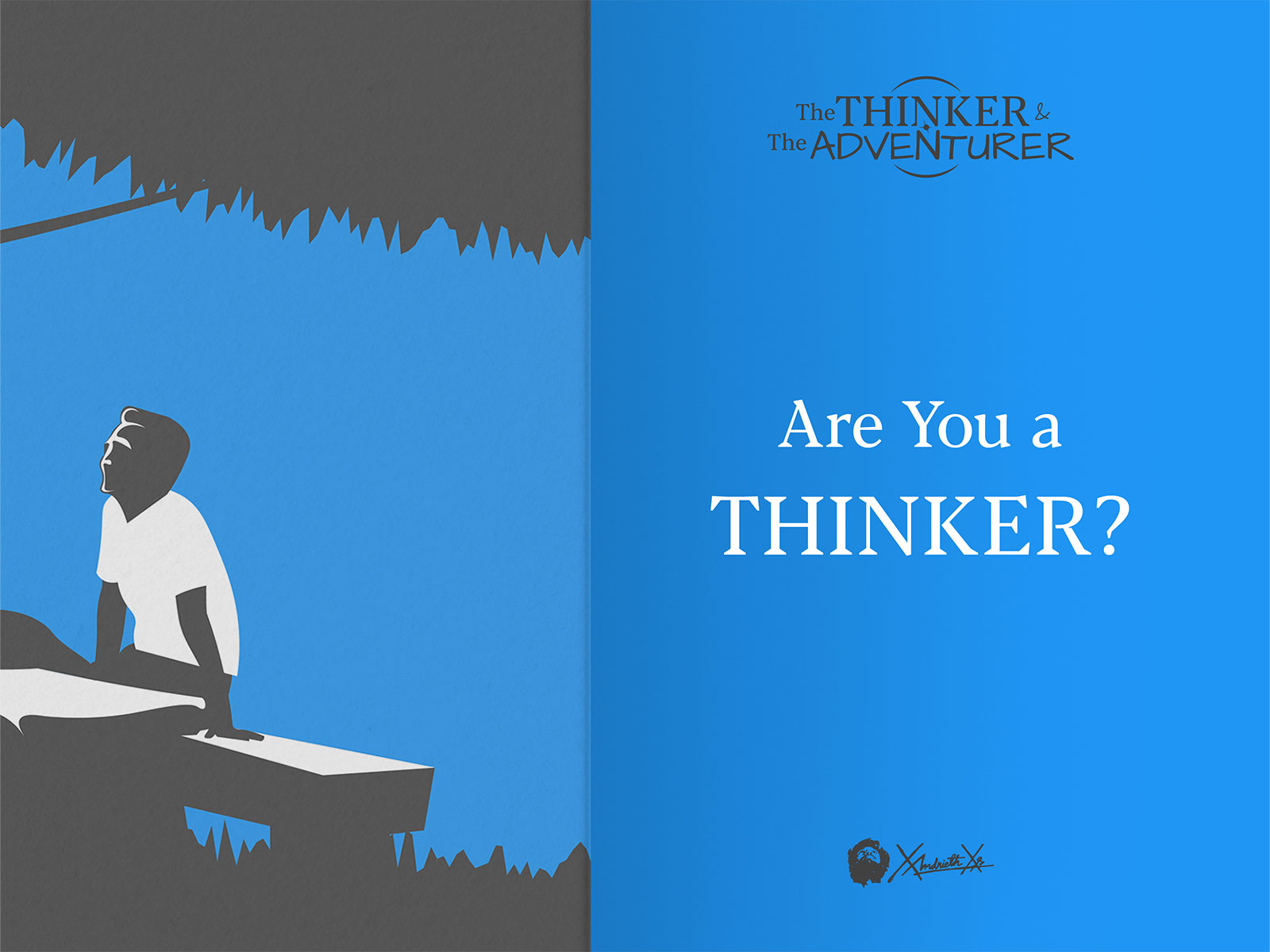
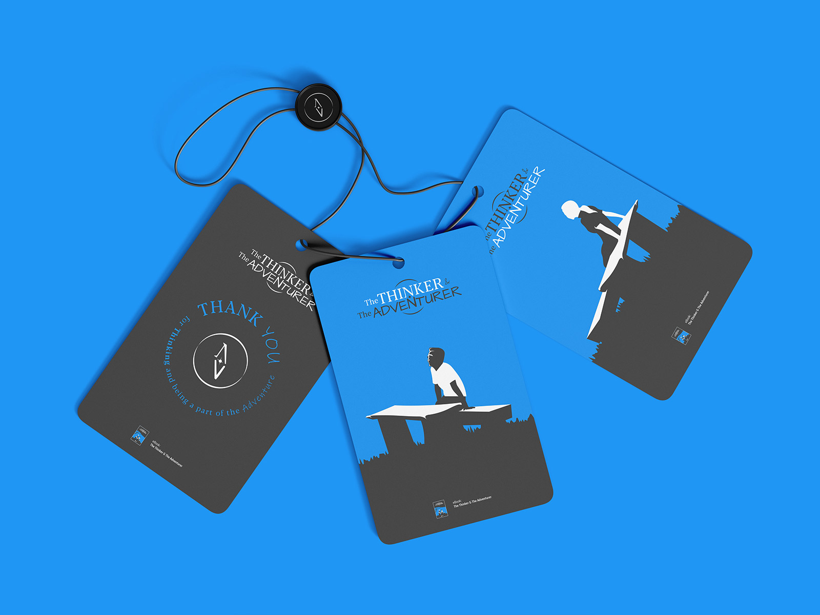
The main illustration that also serves the key art is an enactment of the setting of the story. The artwork is created in a minimal style using only three colours in a vector format to maximize the scalability. The vector art focuses on the two main characters from the story – the Thinker and the Adventurer amid their conversation. The minimal illustration is created in such a way that makes it possible to extract parts of it and function individually wherever necessary. It has a cute playful nature without compromising functionality….
Although the inner pages are only text, we didn’t wanna compromise on the design. We gave special treatment to the pages declaring new chapters. To do so we combined the two typefaces representing the two characters from the story. For the rest of the pages we stuck to the reading friendly serif typeface….
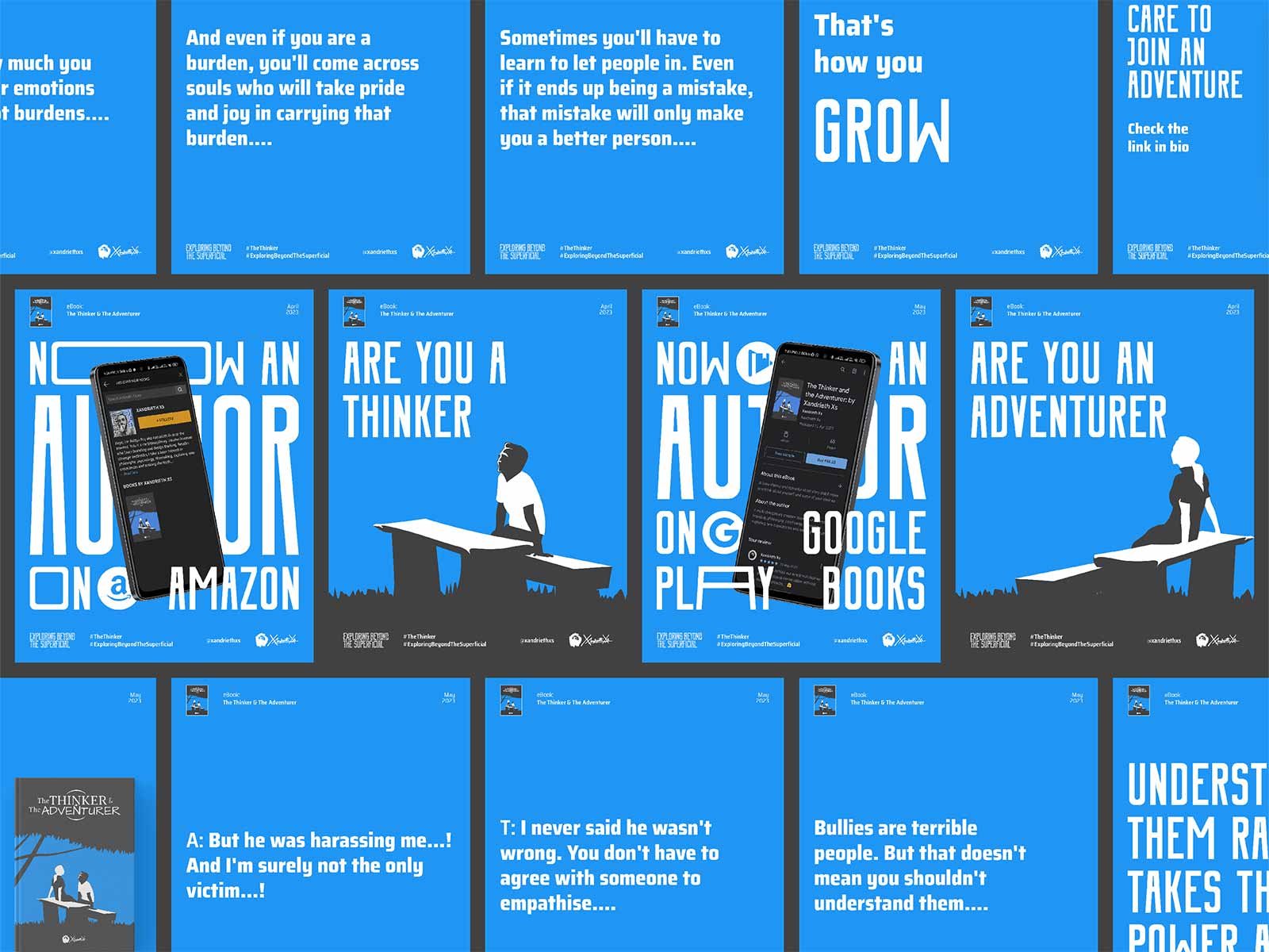
Selling explicitly is very outdated and invasive. Hence we prefer social media to develop contents that can attract the right audience by offering value upfront. The book is a casual conversational short story that is designed to make the readers rethink their emotional decisions. So, we developed content surrounding the emotional and philosophical questions the story asks without giving out any plot points or spoilers. And as planned, the illustration played an important role in the content creation process. For the platforms, we focused on Medium, Instagram, Twitter and Pinterest….
Once the branding and the formation of the book were done, it was time to put it on prominent marketplaces. Beyond the obvious choice of the author’s Gumroad page, Amazon Kindle and Google Play Books were the platforms of choice. Both Amazon and Google have their own set of requirements and checklists that one needs to pass to be able to put their ebooks on their platforms. After some to-and-fro, the digital copy of the book is available on Gumroad, Amazon Kindle and Google Play Books. The book is also a part of the Amazon Kindle Unlimited program….

CREDIT
- Agency/Creative: XAXs Corps
- Article Title: The Thinker and the Adventurer Logo, Branding, Illustration and Book Design
- Organisation/Entity: Agency
- Project Type: Identity
- Project Status: Published
- Agency/Creative Country: India
- Agency/Creative City: Bhubaneswar
- Market Region: Asia
- Project Deliverables: Brand Creation, Brand Identity, Brand Mark, Copywriting, Creative Direction, Identity System, Illustration, Logo Design, Writing
- Industry: Entertainment
- Keywords: Fun, Cute, Romantic, Juvenile, Minimal, Welcoming, Casual, Illustrative,
-
Credits:
Creative Director, Brand designer, Illustrator, Author: Aditya Roy


