Maira Marques Chocolateliê (combination, in Portuguese, of chocolate with atelier) is a small chocolate company, located in Porto Alegre (Brazil), whose main products are Nutella straws, gingerbreads and bonbons.
The brand sought to reposition itself in the market and create a more classic image, like those of the traditional Belgian chocolatiers. It was also seeking growth strategies by improving exposure at points of sale. However, the lack of professionalism of the packaging, the difficulty of organizing the packages in the shelves of points of sale and the lack of packaging aimed at direct sales made it difficult to achieve these objectives.
With that in mind, StudioBah started the work with a brand positioning strategy, understanding the essence behind the business, moving, in sequence, to the development of a set of consistent packages and coherents to the company’s intentions.
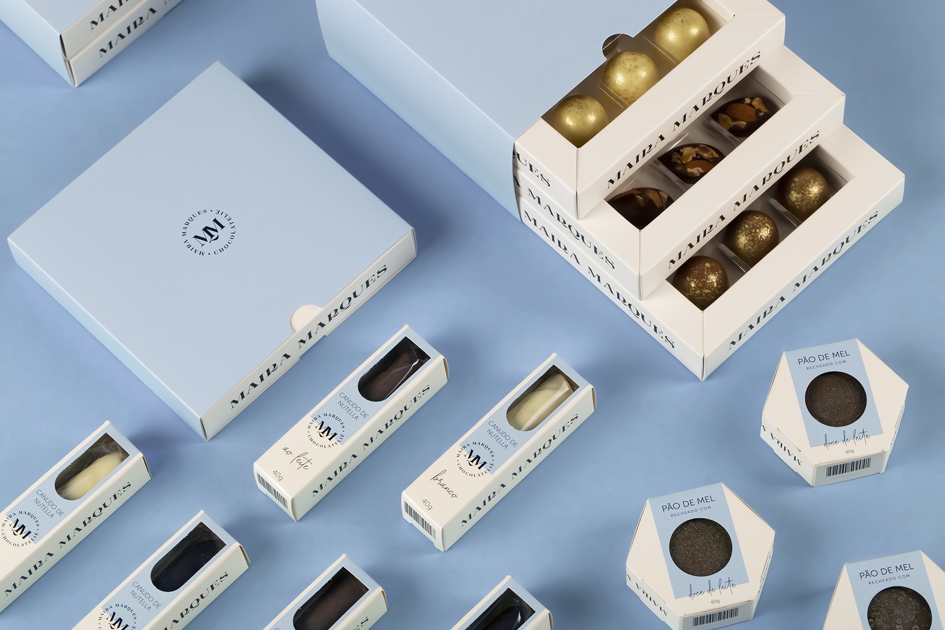
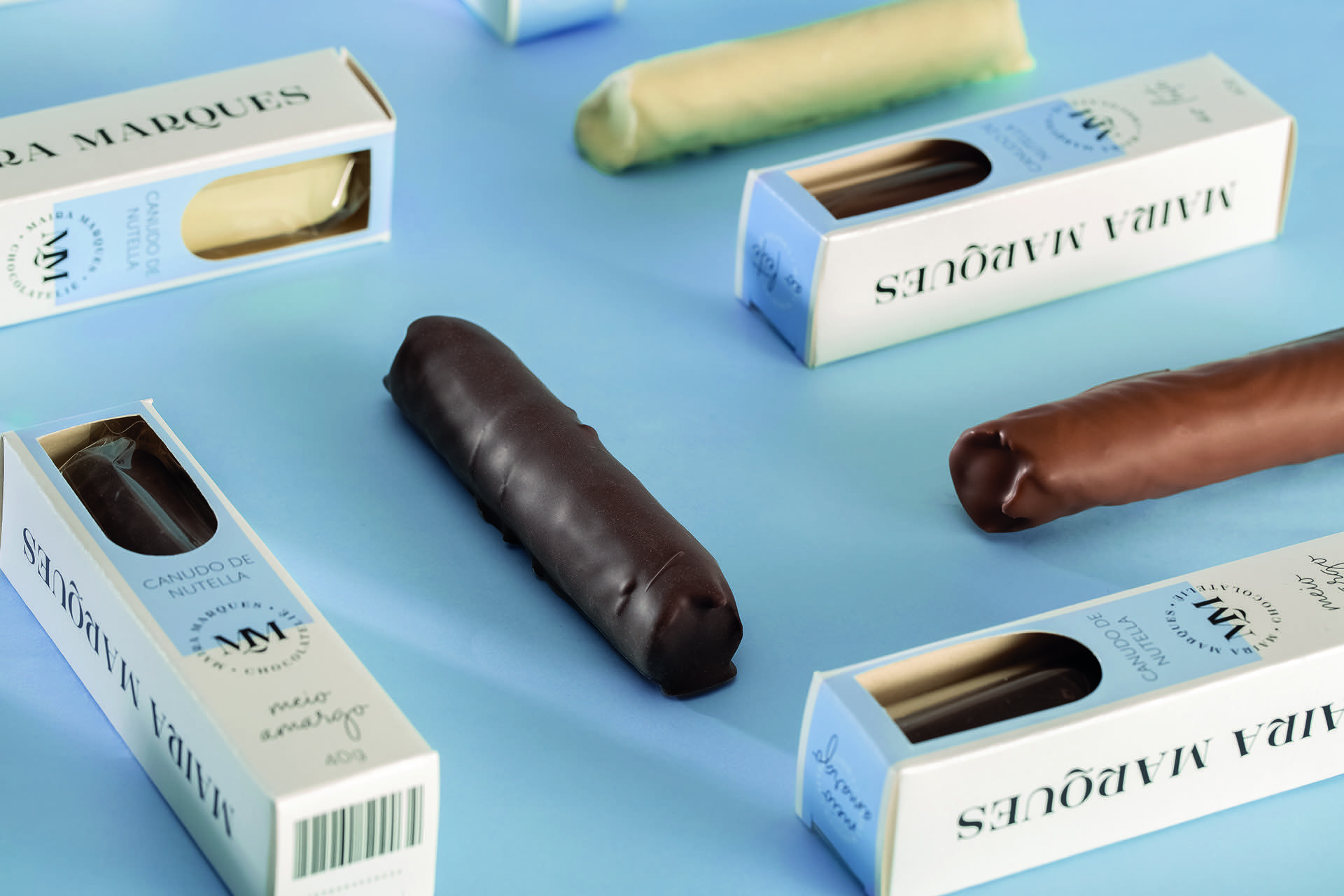
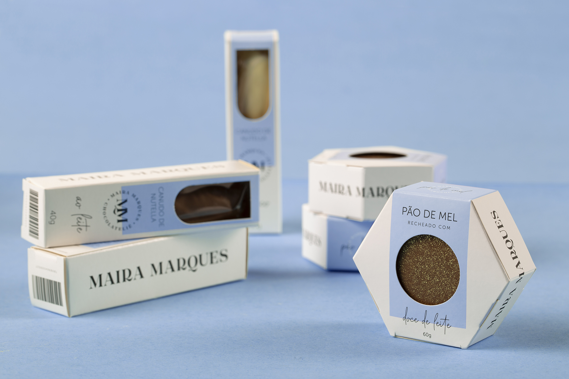
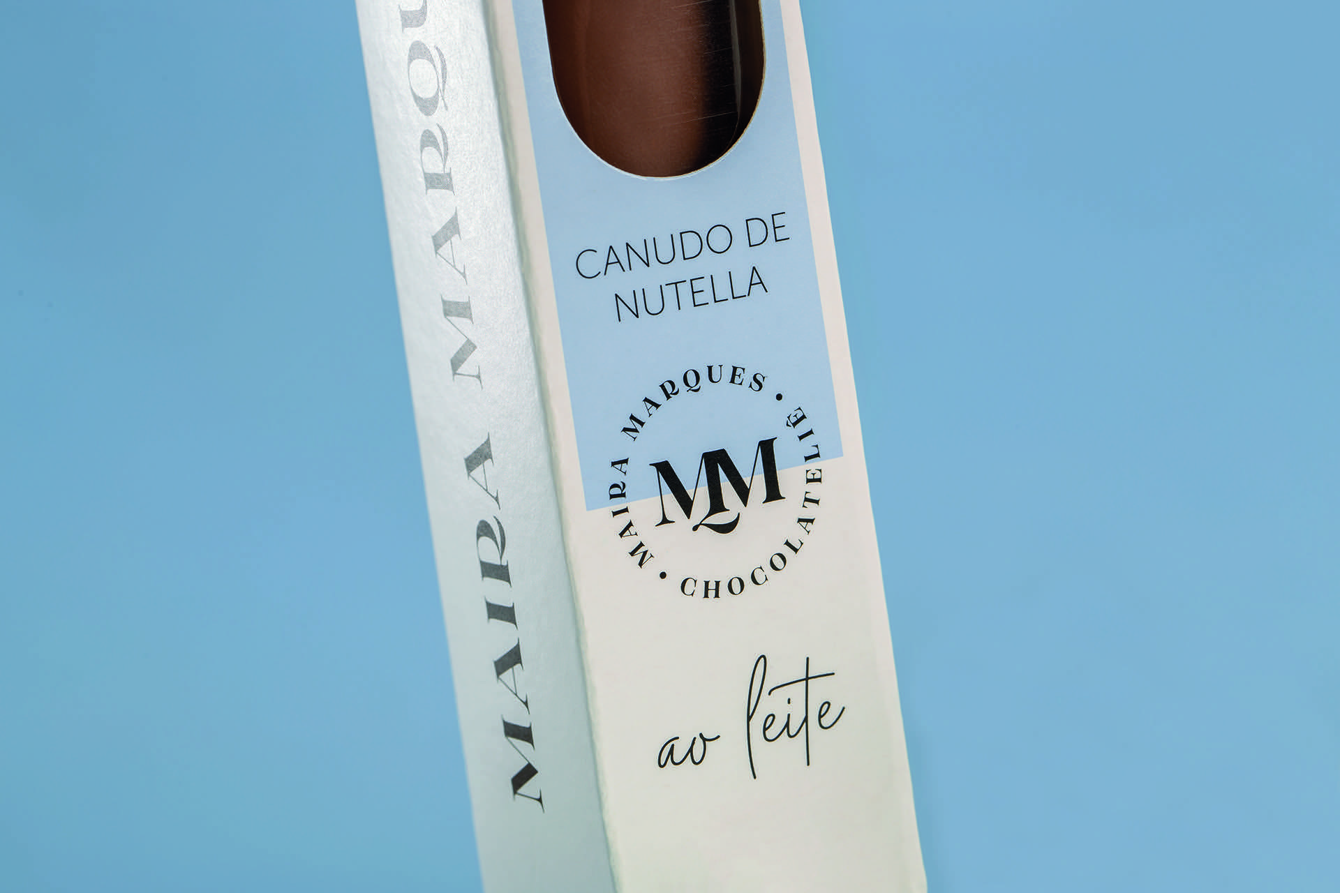
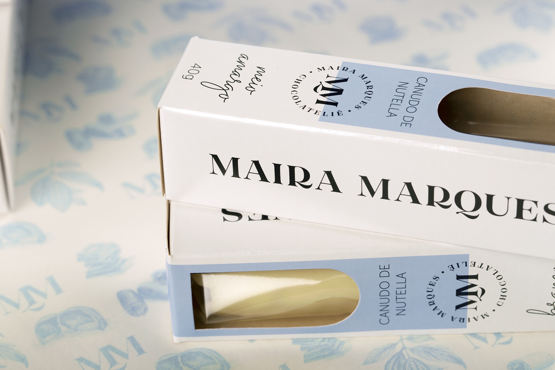
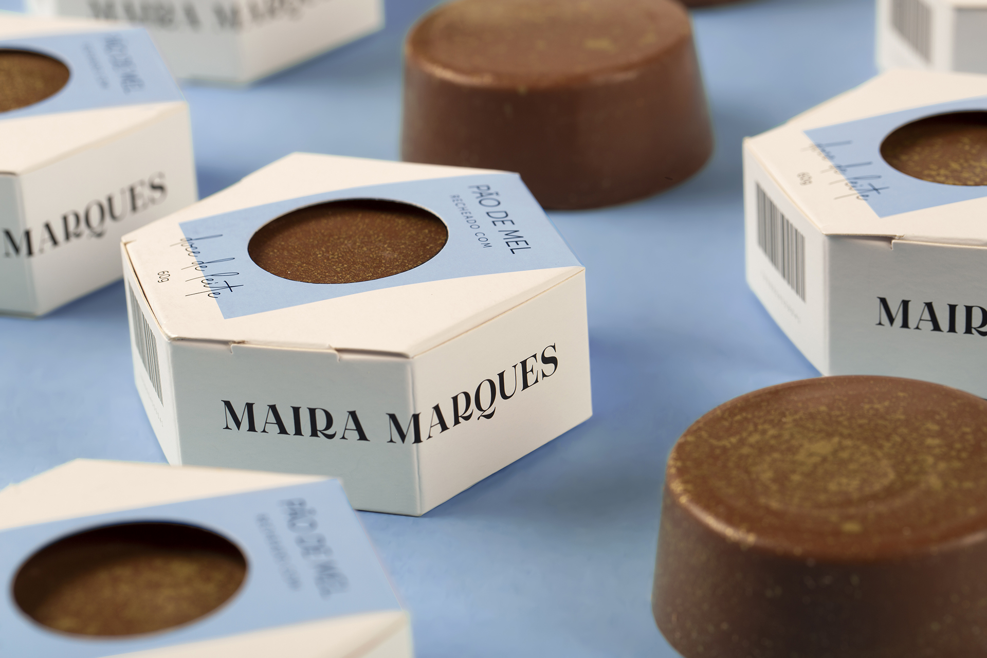
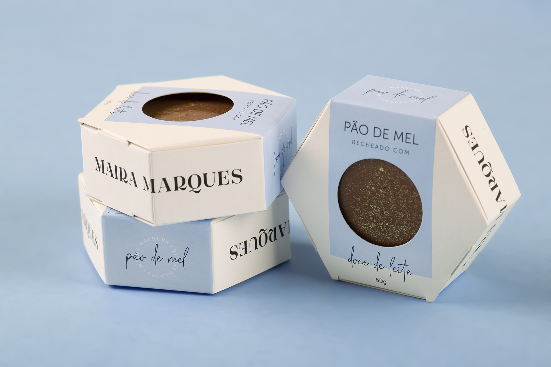
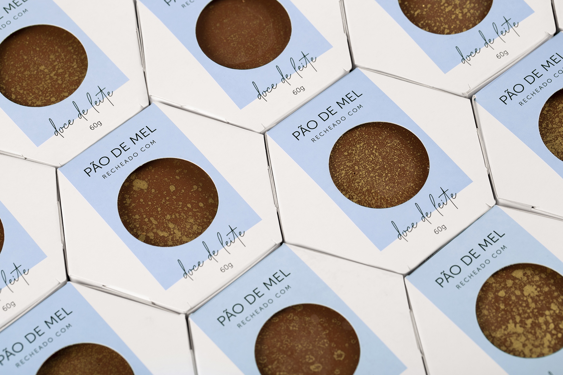
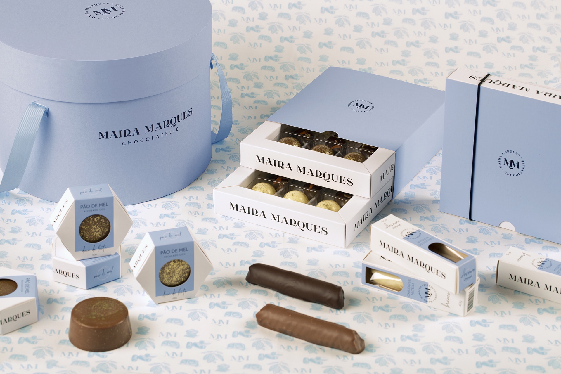
In order to create a standard that is easily recognizable by the public, decisions taken at the visual identity level were highlighted, as well as a responsive character was brought to the different SKUs. The blue bands, characteristic of the brand’s visual identity, were prominently applied to those packaging whose primary destination was the points of sale (more specifically, the Nutella straws and honey buns packages), generating differentiation on the shelves when compared to other brands and creating the desired aesthetic association.
As an identity reinforcement, other elements of the visual identity system were brought to the packages, such as the logo and the brand seal, also being applied with relevance with the same intention of generating faster identification. And the front “windows” facilitate the identification of the flavor and people’s understanding of the product.
As a result of these graphic decisions, when arranged in sets, the Nutella straws and the gingerbreads create homogeneity, generating an expressive graphic visual stain at the points of sale.
On the other hand, the bonbons boxes, which have no contact with the point of sale, were also designed according to the brand’s visual standards, but in a more minimalist way, emphasizing the atelier day-to-day functionality. They were developed in a stackable, reusable and modular format in order to avoid higher expenses in production with boxes of different sizes.
When selling sets of boxes, the strap that surrounds them is the only variable element (produced in three sizes, according to the three possibilities of floors). Because they are direct sales from the atelier (and not at points of sale), they have the function of refills, encouraging people to make new purchases directly on Maira’s store. The box holds, in its dimensions, the bonbons and also the other two products of the brand.
The result of the project solves the business problems presented in the briefing, ensuring the preservation, organization and display of products at points of sale and the increase in direct sales via the studio. The new packaging was a turning point in the life of the brand, allowing it to assume a professional character and transcend the walls of the atelier, causing the growth of sales of other company products, including in other regions of Brazil.

CREDIT
- Agency/Creative: StudioBah
- Article Title: The Sweet Rise of Maira Marques’ Chocolateliê – Packaging Design by StudioBah
- Organisation/Entity: Agency
- Project Type: Packaging
- Project Status: Published
- Agency/Creative Country: Brazil
- Agency/Creative City: Porto Alegre
- Market Region: South America
- Project Deliverables: Brand Design, Brand Experience, Branding, Graphic Design, Identity System, Packaging Design
- Format: Box
- Substrate: Pulp Paper
- Industry: Food/Beverage
- Keywords: chocolate; food; sweets;
-
Credits:
Strategy Direction: Natália Athayde Porto
Creative Direction: Felipe Bernardes Amaral
Strategy Team: Bianca Groff, Gabriela Chrusciel
Design Team: Bianca Groff, Pedro Kaiser
Illustration: Alu00edcia Camejo
Photography: Duda Bussolin (Moropolo Studio)
Retouch: Pedro Kaiser


