


Studio Blackburn, brand strategy and design studio has designed a new brand identity for The Summit Foundation, a private family foundation that is committed to a world where people can thrive and nature can flourish. They seek to promote the health and well-being of the planet — its people and its natural environment — by achieving gender equality, protecting the earth’s biodiversity and making cities liveable.
Studio Blackburn was tasked with revitalising the brand identity of the foundation, with a challenge to articulate their brand clearly in the world of sustainability, net-zero and human rights by thinking about who they are, what they’re for, and what their role in the mix is. The foundation has no competitors and has no earned revenue, the scale of their funding compared to the magnitude of the crises they seek to address often requires that they look for creative and catalytic solutions. It was important to not fall into the trap of an ‘activist’ brand identity and to spread the message without shouting. The key phrase that came through meetings with stakeholders was ‘amplified-humbleness’ and we used this as a jumping off point for the identity.
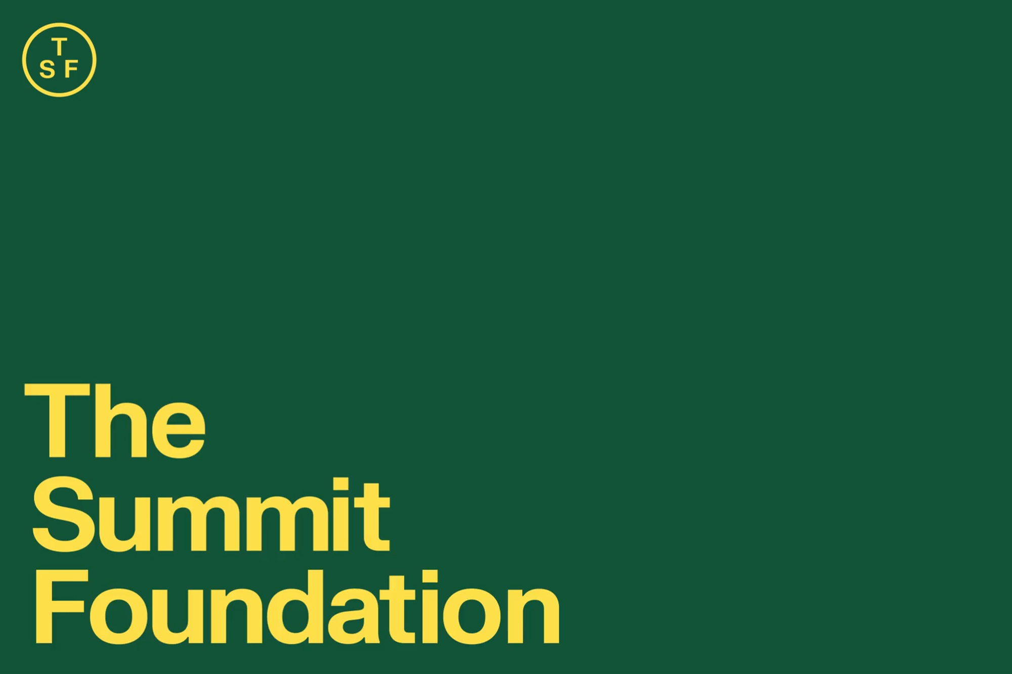
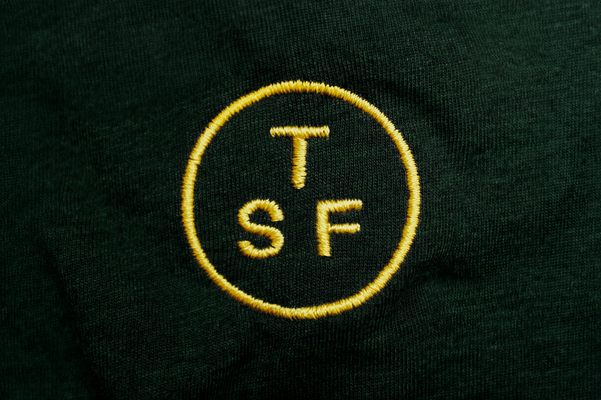
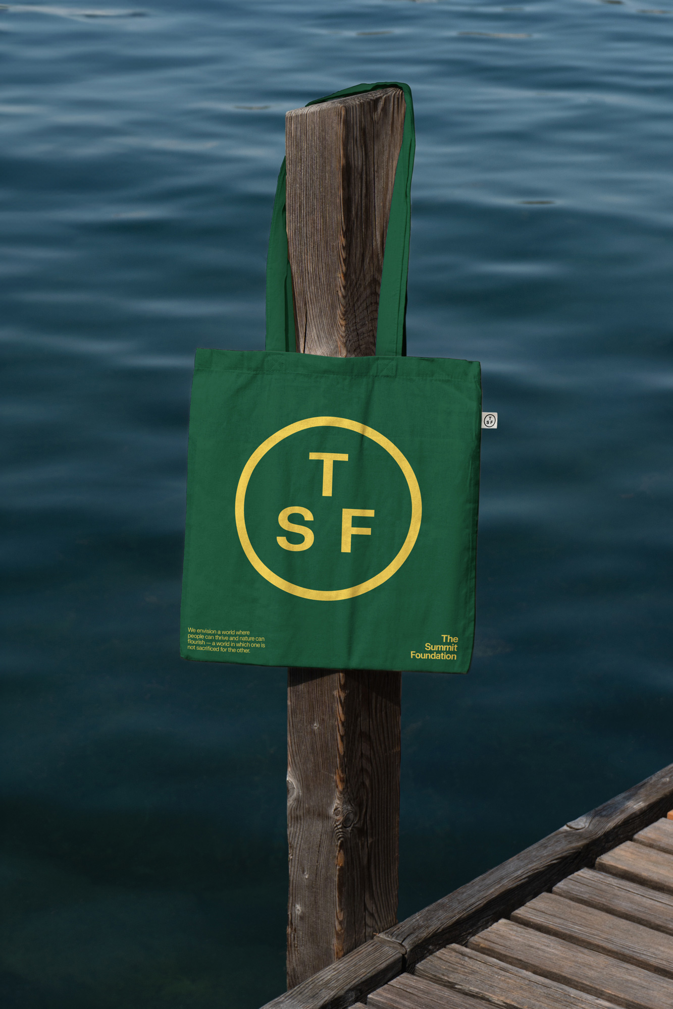
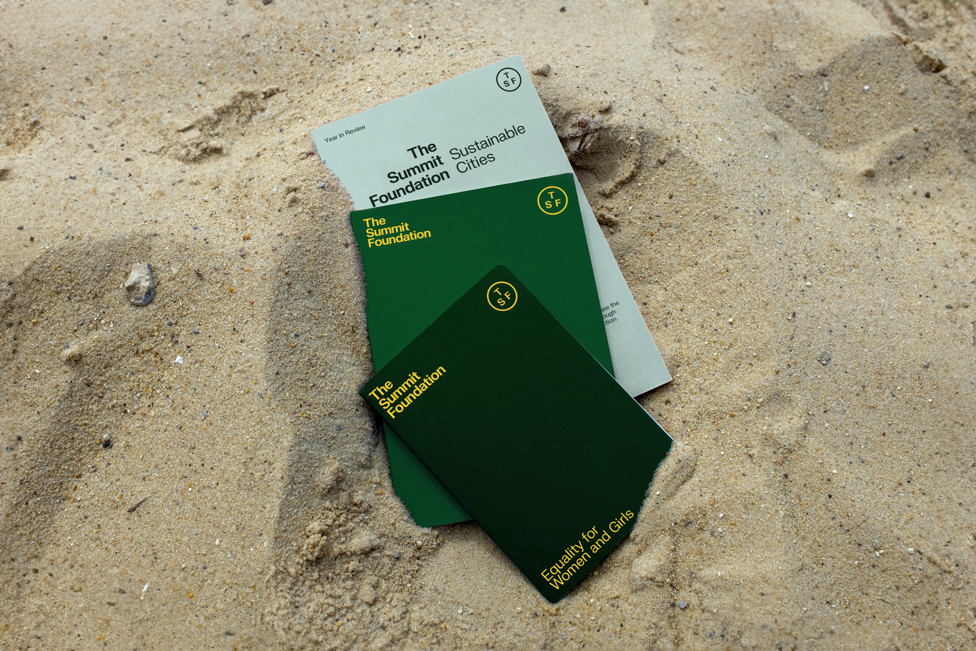
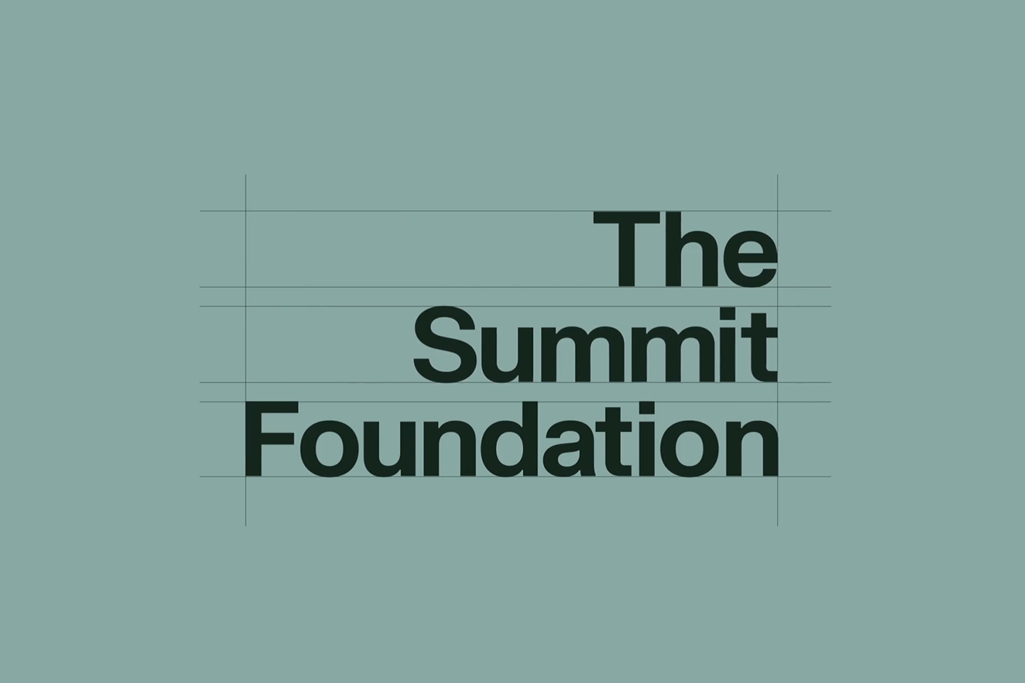
The identity includes a wordmark which has two variations, shifting momentum from left to right, creating something that is never fixed and adaptable to its environment. As well as a simple emblem that distils the name down to its simplest form, serving as a hallmark of quality and a recognisable icon for the brand. Each programme can utilise a lock-up that gives it the ability to sit alongside the main wordmark and scale-up in order for it to become more visually prominent. This celebration of each programme is to give them all its own identity and sometimes even more importance than the sum-of-its-parts.
The brand includes two typefaces: ‘FK Grotesk Neue’—which serves as the primary typeface for the application of the brand. It is contemporary, down-to-earth and approachable, with its simplistic quality making it feel like something that has always been there. ‘Reckless Neue Book’ — is used as a secondary typeface with hints to a calligraphic style, giving more of an editorial feel, communicating the human nature of the foundation and the impactful stories they have to tell.
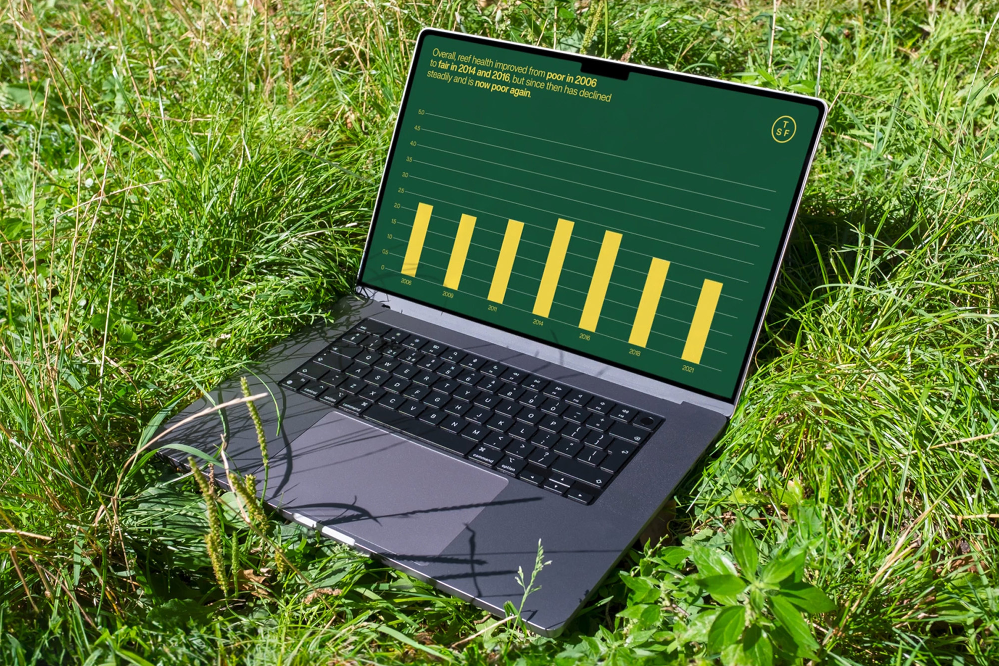
The colour palette includes a vivid yellow—that can be used for typography only—in order to make any content feel quite ‘filmic’ and ownable. With yellow being such a vibrant colour, the way in which it is used within the identity had to be carefully controlled, serving as a key colour but never overtly in-your-face. It has been paired with neutral greens to give a recognisable/humble look and feel.
Mark Jones, Design Director at Studio Blackburn, said ‘Comprising of three distinct programmes (Equality for Women and Girls, Sustainable Cities, and the Mesoamerican Reef) each of which felt quite different from one another when we first started working on the project. Through conversations with the foundation we began to realise how intrinsically linked all these subjects where and a task we gave ourselves was creating an identity that also gave weight to each individual practice area as well as the family as a whole.’
Lex Sant, President of The Summit Foundation, said ‘The Studio Blackburn team studied who we were, they deepened and refined their insights until what was reflected back to us began to express our identity better than we had ourselves expressed it. And so, when we arrived at the brand design, that product became born of that process and vested with that insight. Somehow, they had the essence almost from the very beginning.’
CREDIT
- Agency/Creative: Studio Blackburn
- Article Title: The Summit Foundation Brand Design
- Organisation/Entity: Agency
- Project Type: Graphic
- Project Status: Published
- Agency/Creative Country: United Kingdom
- Agency/Creative City: London
- Market Region: Global
- Project Deliverables: Brand Guidelines, Brand Mark, Creative Direction, Design, Editorial Design, Graphic Design, Infographic, Typography
- Industry: Non-Profit
- Keywords: Foundation
-
Credits:
Design Director: Mark Jones
Senior Designer: Adam Moore
Midweight Designer: Will Cooper


