


Fusion in Black: A Marriage of Textures
Imagine a label blending the sturdy weight of heavy stock with the tactile caress of cotton texture and smooth paper. It’s more than a visual spectacle; it’s a dance beneath your fingertips, an invitation to explore the nuanced interplay of materials.
A Modern Muse: The Winery’s Logo as the Protagonist
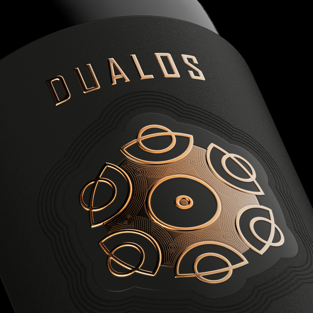
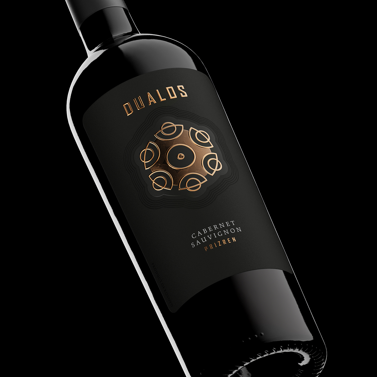
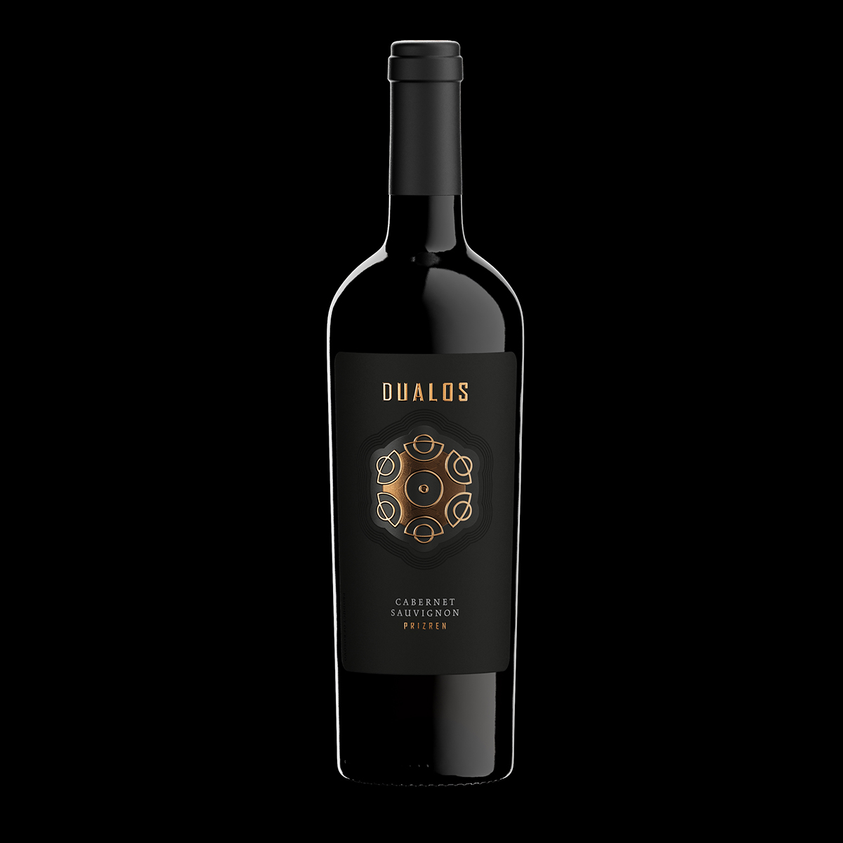
The label orbits around Kantina Dualos’ contemporary emblem. In the quiet depths of black, the logo assumes the spotlight, a silent protagonist whispering sophistication and mystery. With modest yet potent flair, the logo, along with the revered Dualos brand, crowns the label. No grand announcements, just a subtle declaration of identity, echoing with the elegance of strong, precise embossing.
Geometry of Mystery: The Mandala-Inspired Logo
Delve into the enigma of the logo, a swirling dance of circles reminiscent of a mandala’s mystique. An unsaid story unfolds, an abstract canvas inviting each observer to interpret its geometric embrace uniquely.
Copper Symphony: Foils with Microembossing Intricacies
Two copper foils gracefully embellish the label, their shimmering presence adding depth with delicate microembossing. It’s a subtle symphony of metallics, weaving finesse into the bold black canvas.
Classic Bottle, Timeless Elegance: Italian Tapered Artistry
The wine rests in a classic tapered Italian bottle, a nod to timeless elegance. More than a vessel, it’s a homage to tradition, allowing the label to harmonize seamlessly with the wine it cradles.
Bold Yet Gentle: A Masculine Minimalism
The label emanates a bold, masculine aura, tempered by a gentle touch. It’s a paradoxical dance – a bold presence that murmurs sophistication and a minimalist design that resonates volumes through restraint.
Understated Class: The Limited Edition Legacy
The label, minimalist yet opulent, stands as a beacon of understated class. Crafted with precision, it’s not a boast of grandeur but a quiet nod to exclusivity, a member of the limited edition lineage, brought to life by the skilled hands at Dagaprint.com.
As the architect, I welcome you to discover the implicit symphony within the label—a blend of ink and texture, geometry, and elegance. Our black fused wine label isn’t merely a design; it’s a canvas inviting each sip to venture into the understated sophistication defining Kantina Dualos. Here’s to the quiet artistry of celebration! Cheers!
CREDIT
- Agency/Creative: the Labelmaker
- Article Title: The Subtle Mastery of Black Fused Wine Labels
- Organisation/Entity: Agency
- Project Type: Packaging
- Project Status: Published
- Agency/Creative Country: Bulgaria
- Agency/Creative City: Sofia
- Market Region: Europe, North America
- Project Deliverables: CGI, Label Design, Packaging Design
- Format: Bottle
- Industry: Food/Beverage
- Keywords: dualos fused label, fused label design, label over label, copper foil label, wine label innovation, wine design, wine label art, jordan jelev, thelabelamker, black wine label, black label design, wine label art, wine design
-
Credits:
Client: Kantina Dualos
Design & CGI: the Labelmaker


