


Brand Story – King’s Fortune Merlot
In the heart of the Barossa, where the land holds the memory of generations, King’s Fortune was born, a tribute to craft, patience, and the quiet confidence of those who work the soil. The Barossa is not a place that shouts; it hums. It hums with the rhythm of warm winds moving through rows of vines, with the low thrum of cicadas at dusk, and with the steady pulse of tradition that has defined this region for centuries. Here, winemaking is not a performance, it’s a practice of devotion, of understanding the subtleties of time, texture, and earth.
When we were approached to create the brand identity for King’s Fortune Merlot, we knew immediately that this was not a story to be told with excess or opulence. It was one to be whispered with restraint and reverence. This wine wasn’t about grandeur in the royal sense it was about mastery. About knowing your craft so intimately that excellence feels effortless. That was the essence we sought to capture: the quiet confidence of those who work the land and let their work speak louder than words.
A Land of Character
The Barossa Valley is more than geography it’s a living texture. The soil here, sunbaked and ancient, holds a deep red hue that stains the hands of those who till it. Its ironstone and clay produce wines of extraordinary depth and warmth, rich with dark fruit and subtle spice. There’s something deeply humbling about standing among these vines, feeling the weight of history underfoot.
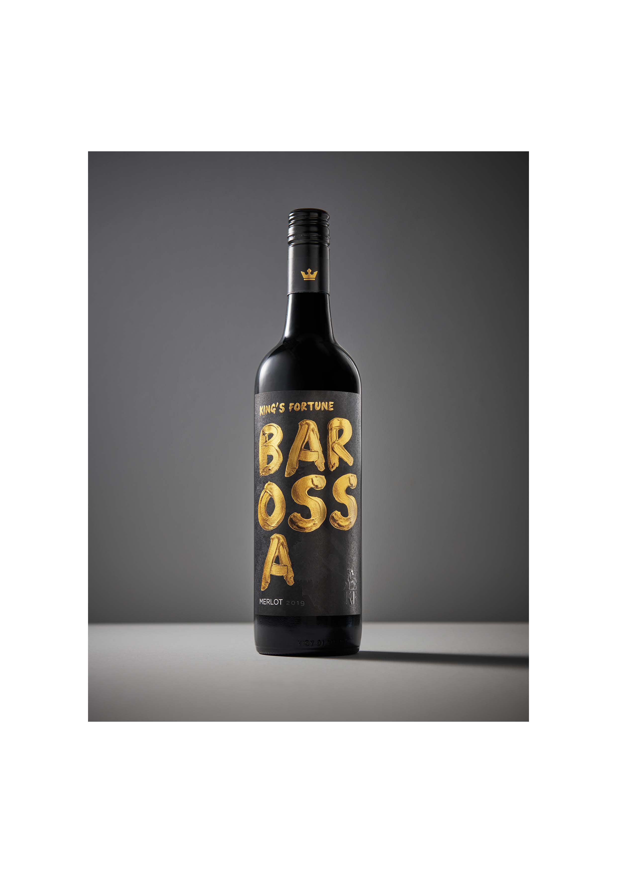
Our creative direction began here, in the dirt. We wanted the design to mirror the honesty of that earth, to feel grounded, tactile, and real. The base of the label became a deep charcoal tone, a nod to the Barossa’s mineral-rich soil and the dusky shadows that fall across the valley as the sun begins to sink. It’s a colour that doesn’t demand attention, but holds it, a foundation for everything that follows.
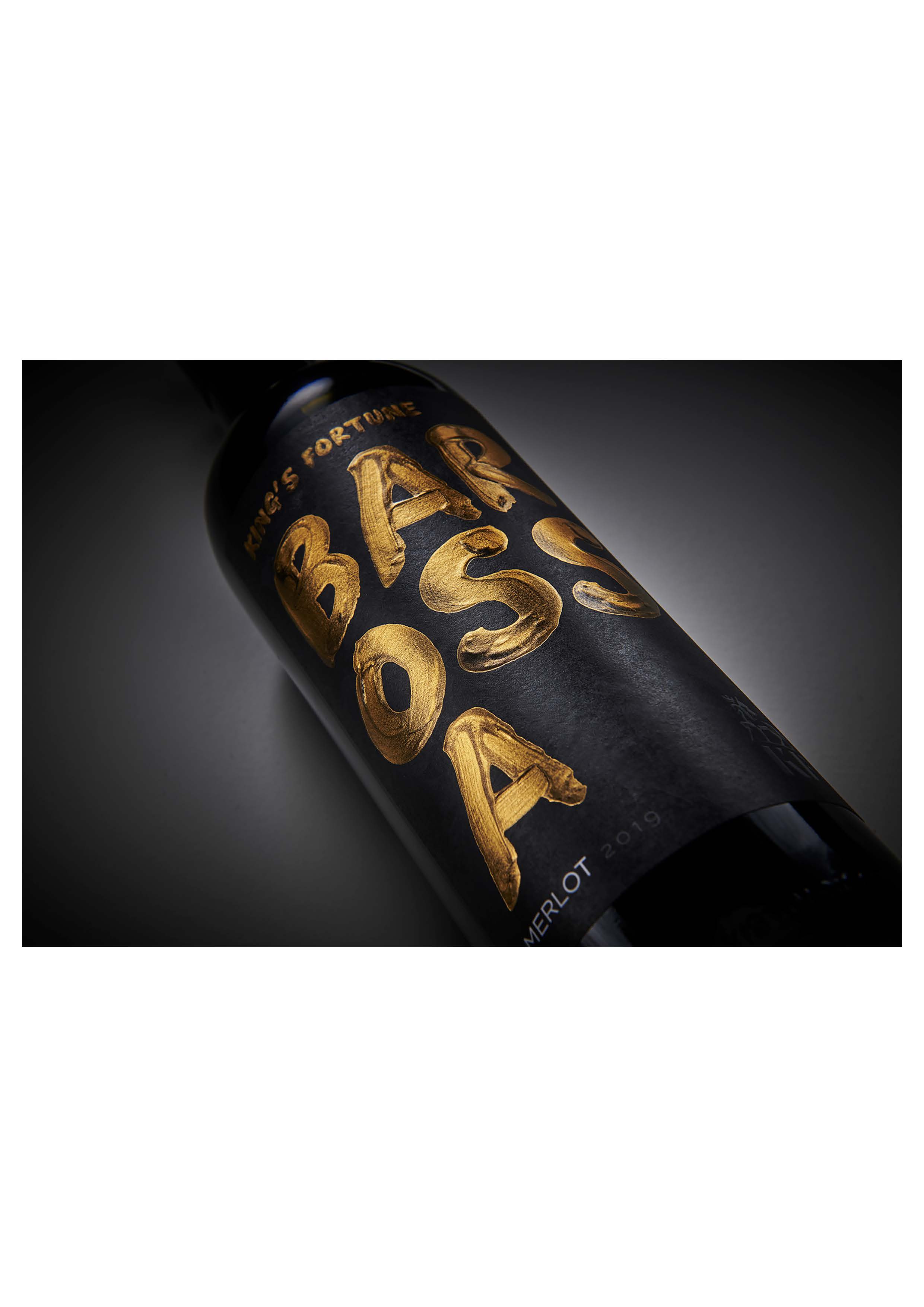
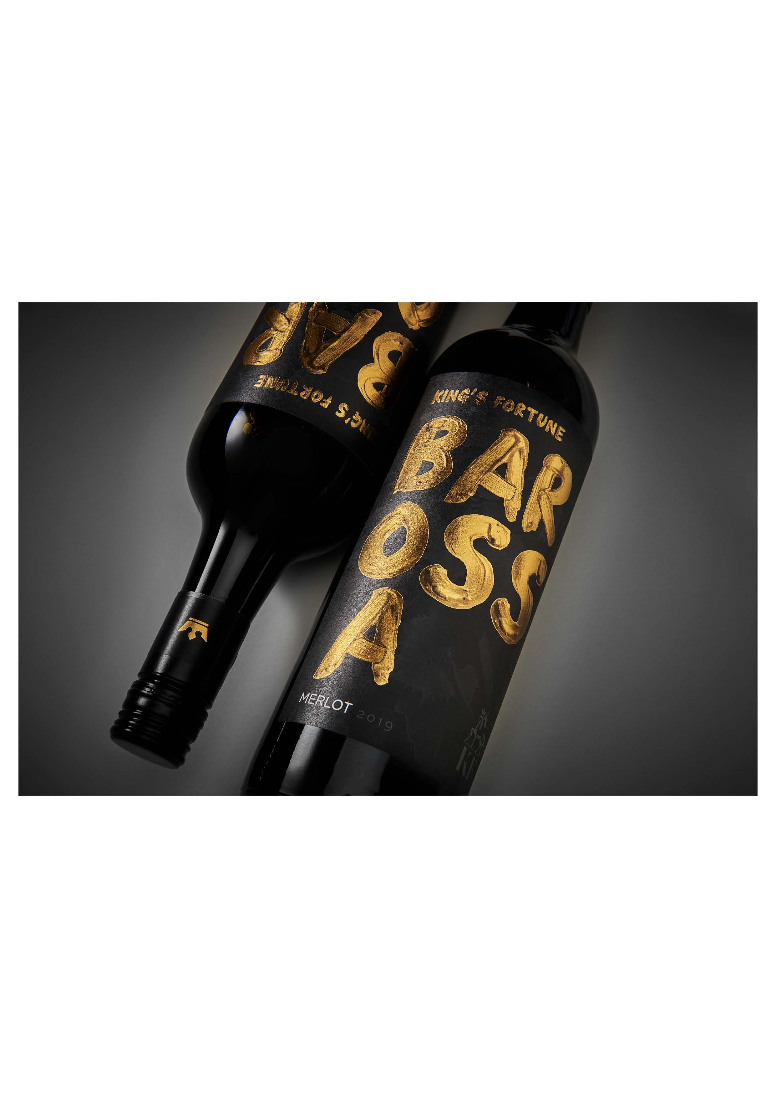
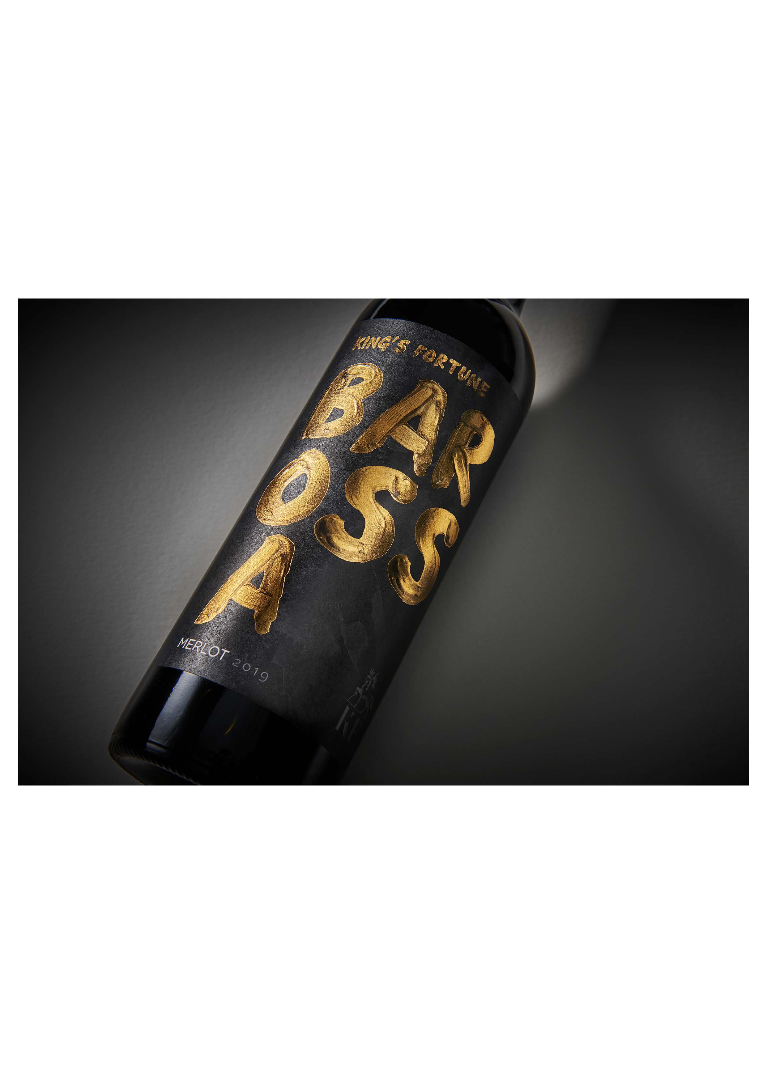
Across that dark expanse, the word BAROSSA sprawls in bold, burnished gold brushstrokes, expressive yet imperfect, each letter painted by hand. Those strokes became the heartbeat of the design, a reflection of the artisanal process behind both art and winemaking. Like a winemaker blending intuition with discipline, each letter was formed not for precision but for emotion. The metallic gold carries texture, catching the light like the last rays of sun glancing off ripened fruit, like dusk settling gently on the vines.
A Tribute to Craft and Character
King’s Fortune is not a name born from royalty, but from reverence. It speaks to the kind of wealth that cannot be counted, the fortune of land well-tended, of seasons well-watched, of patience rewarded. Our role as designers was to translate that philosophy into something you could feel the moment you held the bottle in your hand.
We approached every detail with a craftsman’s intent. The embossed textures along the edges of the label were designed to evoke the ridges of vineyard rows, those rhythmic lines carved by generations of farmers. You can trace them with your fingers, just as a winemaker might run their hands along the vine. The small crown emblem, subtle, understated, became the signature of mastery. It doesn’t announce itself with grandeur, but with grace. It’s a symbol of earned respect, not inherited privilege.
Typography, too, played a vital role in this story. We chose a serif typeface that carried a quiet dignity, with letterforms that feel classic but not archaic. The interplay between the gold brushwork and the refined typography mirrors the duality at the heart of King’s Fortune, the meeting of art and agriculture, wildness and discipline, heritage and innovation.
The label’s deep charcoal base mirrors the earth itself, rich, grounding, timeless while bold brushstrokes of burnished gold spell out BAROSSA with expressive imperfection. Each letter was painted by hand, echoing the tactile process of winemaking, from soil to barrel to bottle. The metallic texture catches light like dusk over the vineyards, a moment of warmth and promise. Subtle embossed details and the small crown emblem nod to the name’s quiet grandeur, not of royalty, but of mastery
Designing the Soul of a Wine
Designing for wine is unlike designing for any other product. A wine label must carry more than information it must carry emotion. It is the first taste before the cork is pulled, the first story told before the glass is poured. For King’s Fortune, that emotion was confidence born of authenticity.
We drew inspiration from the winemaking process itself. The brushstrokes mimic the gestures of a winemaker stirring the ferment, testing the clarity of the wine, feeling its progression. The tactile layering of textures the matte charcoal base, the glint of gold, the raised emboss mirrors the sensory experience of tasting Merlot: the initial smoothness, the depth that unfolds, the lingering warmth at the finish.
Even the bottle shape was chosen with intention. Its form is classic, with generous shoulders, a silhouette that communicates strength and heritage but refined in proportion, suggesting poise and precision. Together, label and bottle form a single statement: elegant, timeless, grounded.
The Spirit of the Barossa
We wanted the label to feel like it belonged in that landscape to speak the same visual language as the region itself. The palette emerged naturally: deep earth tones, hints of amber and gold, and subtle shadows. These hues recall the Barossa at sunset, when the hills glow with warmth and the vines cast long, soft silhouettes across the land.
The result was a design that doesn’t shout from the shelf, but draws you in, inviting you to look closer, to feel its weight, to sense its story. Like the best wines, it rewards attention.
From Soil to Soul
We often describe design as storytelling through material. Every decision, the texture of the paper, the depth of the emboss, the sheen of the foil, adds a word, a pause, a rhythm to the narrative. For King’s Fortune, every tactile element was intentional. The label stock was chosen for its subtle tooth, reminiscent of aged parchment, evoking craftsmanship and time. When you hold it, you feel a quiet resistance under your fingers, a sense of something handmade.
We worked closely with local printers and artisans to ensure that the finish reflected the wine’s personality. The gold foil gives a soft relief that changes with the light, never gaudy, always graceful. The varnish was applied selectively, creating a play of gloss and matte that mirrors the interplay of fruit and oak in the wine itself.
It’s in these subtleties that the brand comes alive. Because like the winemaker, our craft lives in the details, those small, deliberate gestures that together create something enduring.
A Modern Classic
While King’s Fortune is steeped in tradition, it is not bound by it. We wanted to balance heritage with a contemporary edge, to create a label that feels timeless today and timeless tomorrow. The brushstrokes, though hand-painted, have a raw, modern energy. The minimalist layout allows breathing space, giving the artwork room to resonate. The typography, clean yet classic, bridges eras.
This balance is what gives King’s Fortune its unique voice. It speaks of the Barossa’s proud past, but with an eye to the future, a generation of winemakers blending old wisdom with new thinking. The result is a wine that feels both familiar and fresh, both grounded and aspirational.
The Story in the Glass
Ultimately, the design is only half the story. The other half lives in the glass. King’s Fortune Merlot is a wine that mirrors its landscape, warm, generous, and quietly complex. Notes of dark plum, blackberry, and cocoa unfold with patience, layered with the soft spice of French oak. There’s a velvety balance to it, a harmony that speaks of careful hands and a watchful eye.
Our goal was not to outshine the wine, but to frame it, to let the design become an extension of its character. When you pour a glass of King’s Fortune, you’re not just tasting the Barossa—you’re experiencing a philosophy of creation. The label, the name, the story, all of it becomes a single expression of what it means to craft with care.
The Fortune of Mastery
The “fortune” here is not opulent; it’s earned. It lies in the years of tending vines through drought and rain. In the steady hands that prune, harvest, and press. In the patience to let the wine evolve at its own pace. That same philosophy guided our creative process. We resisted the urge to over-design, allowing space for imperfection, gesture, and authenticity.
What emerged was something that feels human, a design that bears the mark of the hand, not the machine. Because beauty, in its truest form, is rarely perfect. It’s lived-in, layered, and real.
Where Art and Agriculture Meet
King’s Fortune Merlot stands as a testament to the meeting of art and agriculture, the place where the tangible and the poetic intertwine. It’s a wine that reflects the hands that made it and the earth that sustained it, a design that carries that same duality of strength and grace.
For us, crafting this brand was an act of translation: turning the story of a place, a process, and a philosophy into a visual language that could be felt before a single sip was taken. Every brushstroke, every texture, every line was chosen to honour that legacy.
In the end, King’s Fortune is not about kings at all. It’s about those who have found fortune in their mastery, in the patience to wait, the skill to craft, and the humility to let the land lead. It’s about the quiet, enduring wealth of knowing your craft and doing it well.
And in that sense, the name finds its truest meaning.
Because the greatest fortune is not what you hold in your hands but what you’ve built with them.
CREDIT
- Agency/Creative: The Spice Agency
- Article Title: The Spice Agency Transforms King’s Fortune Merlot into a Tribute to Barossa Tradition
- Organisation/Entity: Agency
- Project Type: Packaging
- Project Status: Published
- Agency/Creative Country: Australia
- Agency/Creative City: Sydney
- Market Region: Oceania
- Project Deliverables: Brand Design, Brand Mark, Design, Label Design, Packaging Design, Typography
- Format: Bottle
- Industry: Food/Beverage
- Keywords: Wine, Luxury, Print Embellishment,
-
Credits:
Director: Dimity McDonald


