


The Slow Ice Company: Crafting Clarity in Every Cube
The Slow Ice Company is India’s first brand dedicated to crystal‑clear, slow‑melt ice for hospitality and home enthusiasts. The brand needed an identity that could elevate ice from a commodity to a crafted ingredient, one that bartenders, hotels, and drink lovers would recognise as a mark of precision and care.
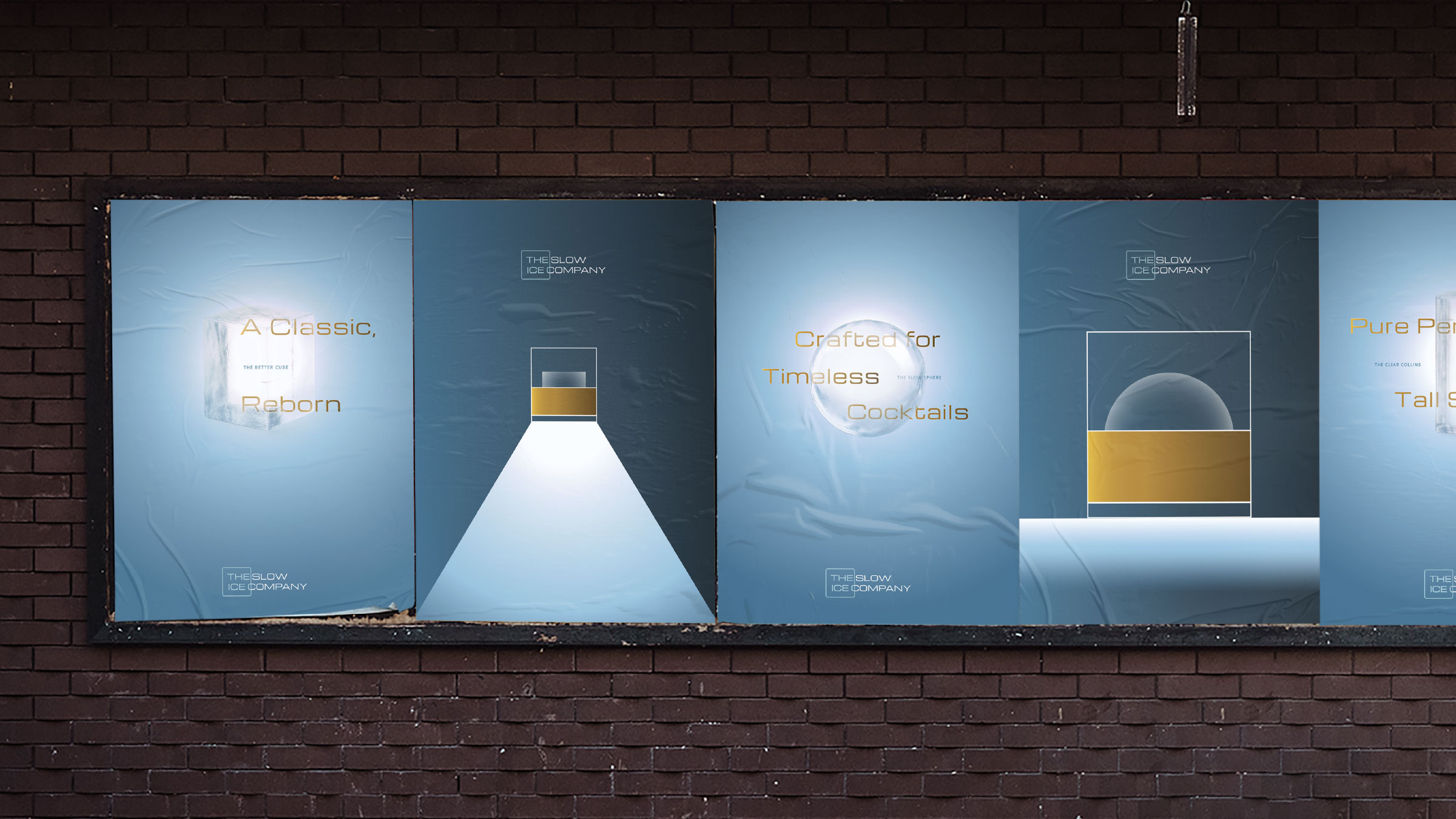
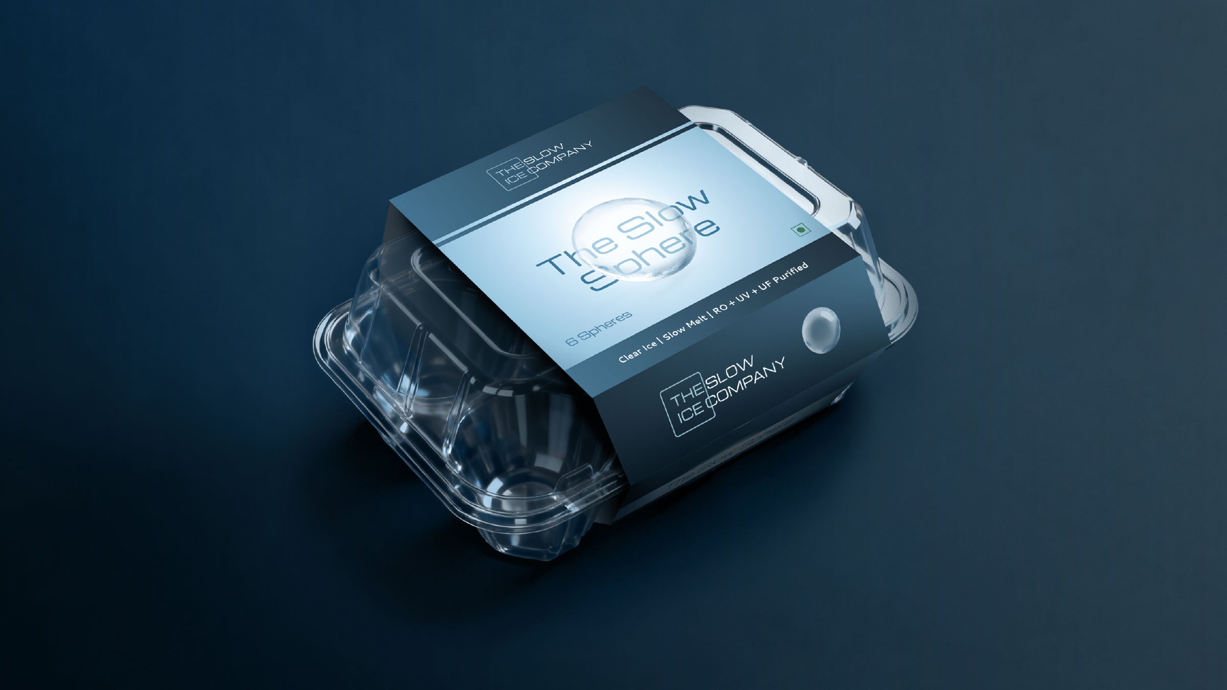
The concept for the identity begins with the product’s defining feature: clarity. The logo is built around a single square that represents an ice cube, positioned so that the words “The Ice” sit legibly behind it. This simple move visualises the promise of clear ice in the most direct way while type remains readable through the shape, as if seen through a perfectly transparent block. The same idea is repeated across packaging and communication, where product names and descriptors sit behind illustrated cubes, spheres and Collins columns, reinforcing the positioning at every touchpoint.
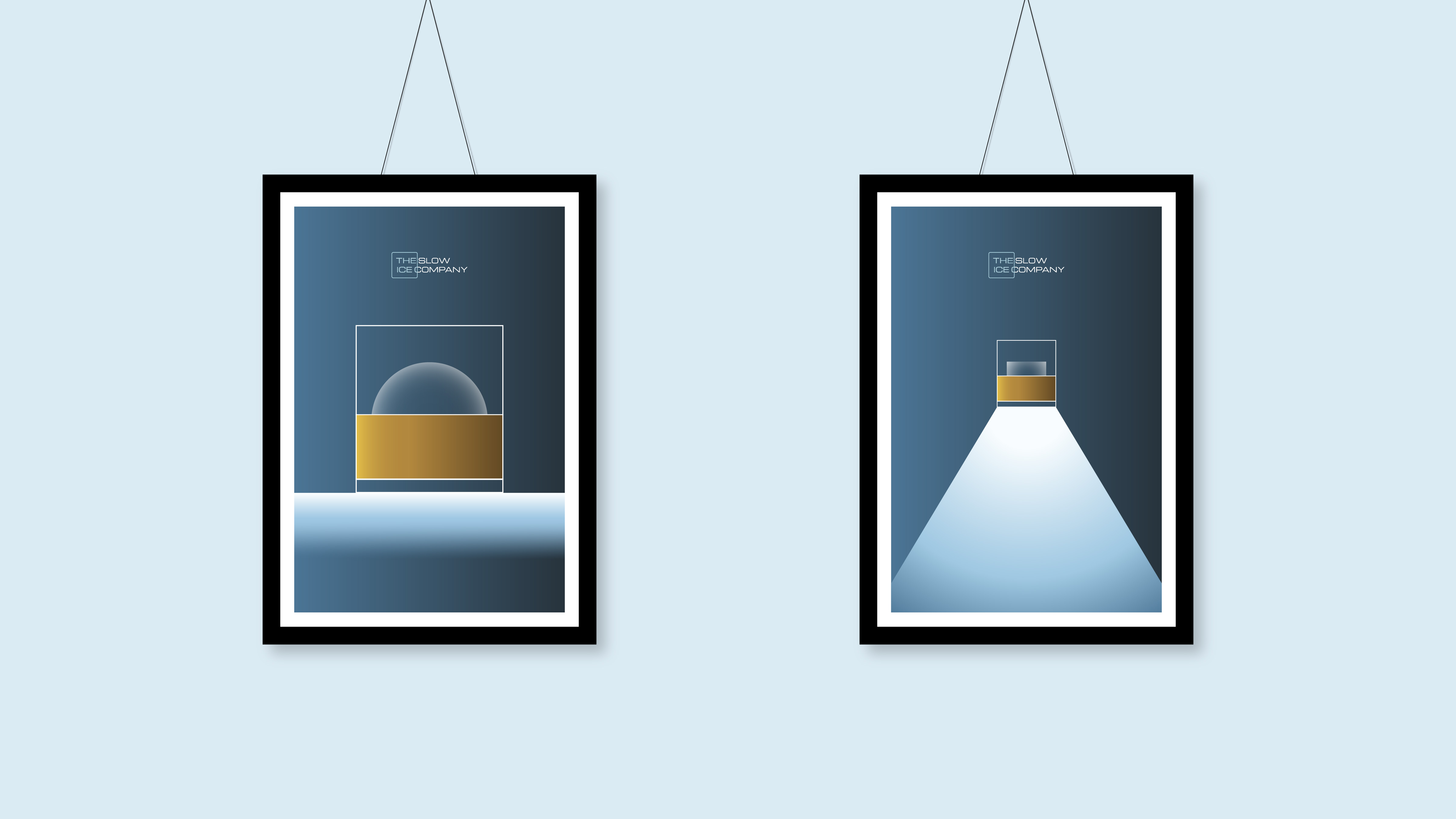
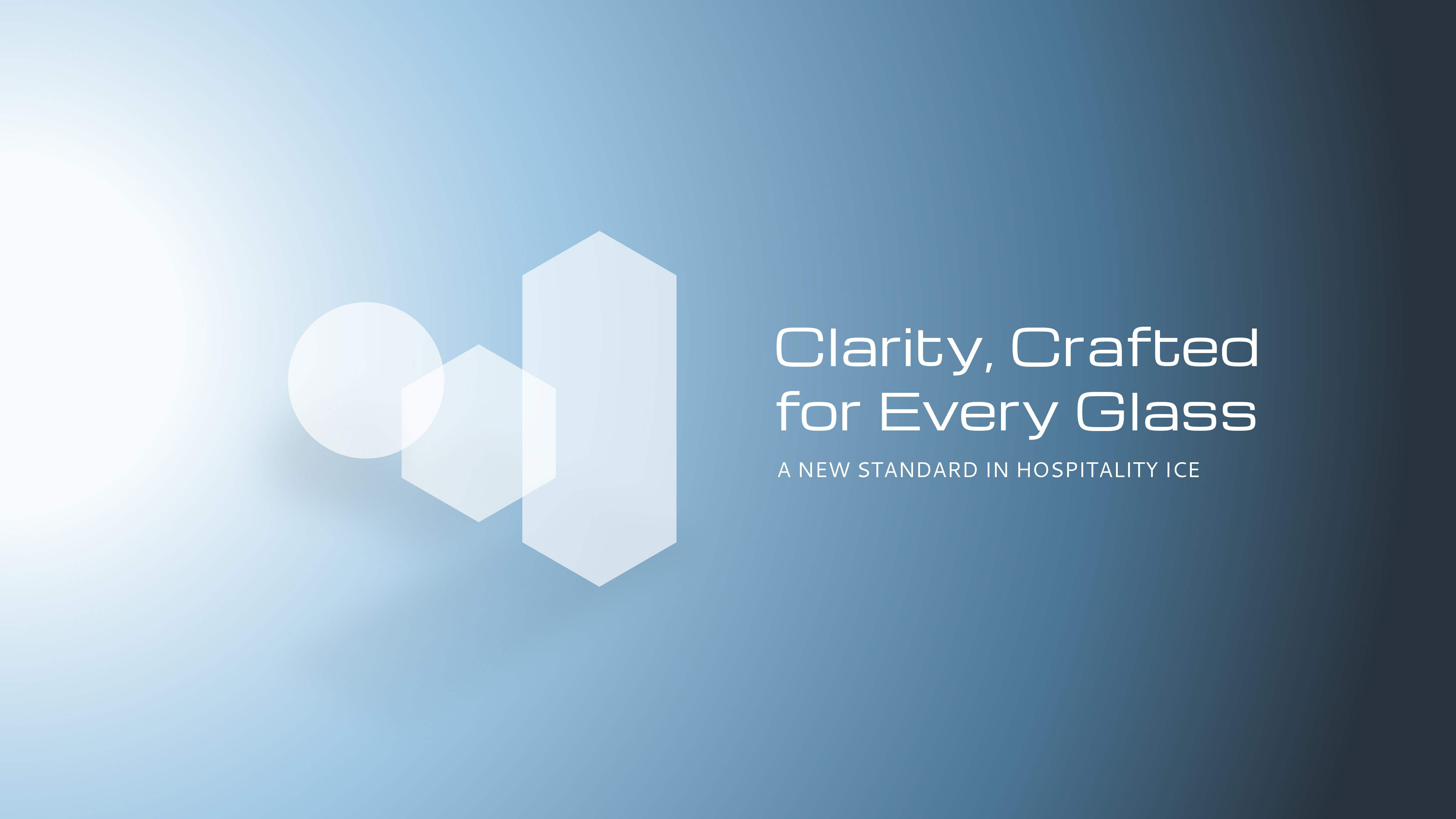
The visual language is intentionally minimal, using only essential geometric forms to depict glasses, ice, and liquid. A palette of deep blues and cool gradients evokes the cold purity of ice, while a warm golden gradient stands in for whisky or cocktails, creating an immediate association with elevated drinking experiences. This contrast between cold and warmth helps the brand live comfortably in both industrial and lifestyle contexts.
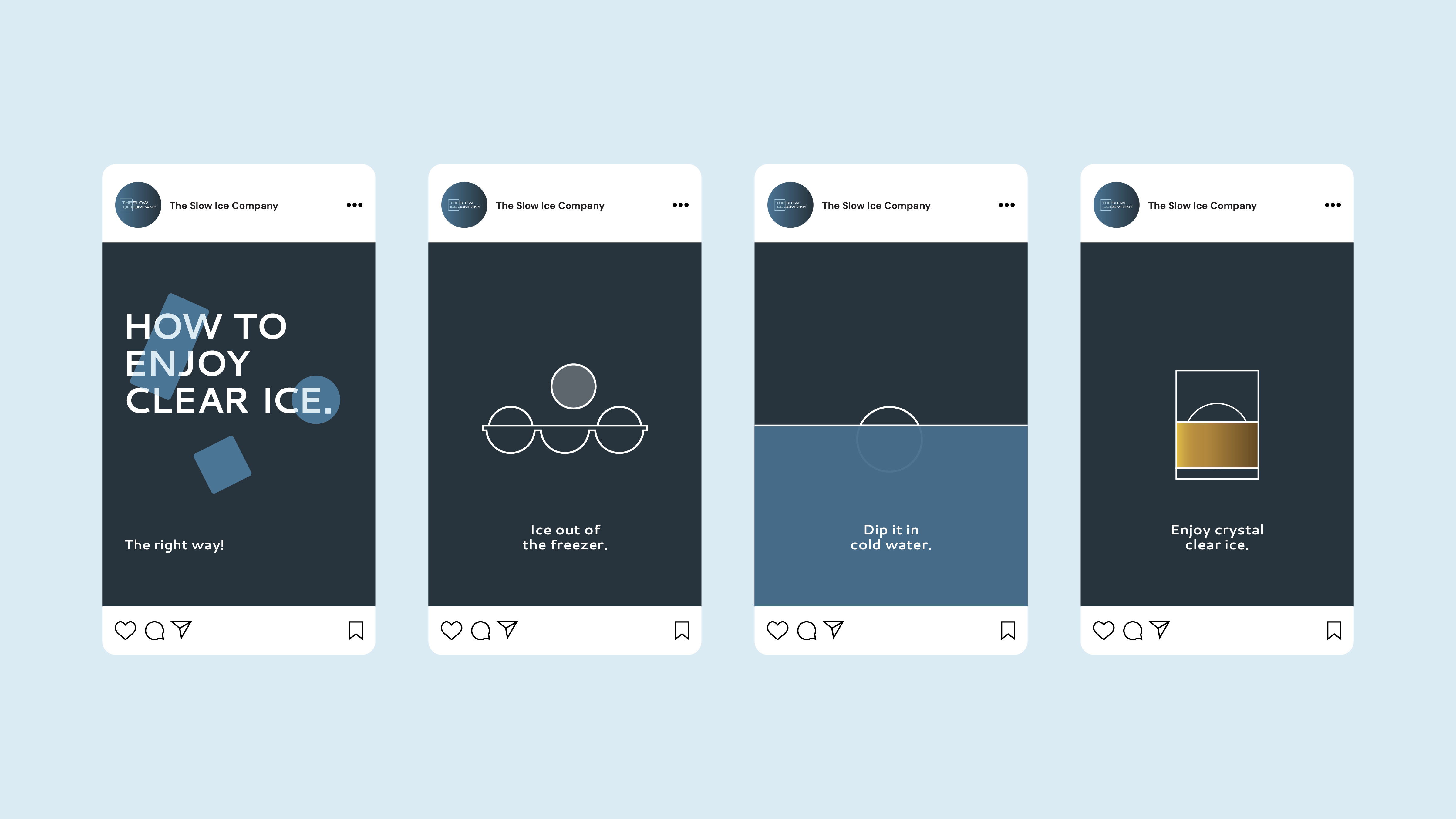
Packaging for formats like The Slow Sphere and The Clear Collins applies this system with quiet confidence. Clear product photography and diagrammatic line illustrations sit on calm, spacious layouts, allowing the transparency of the ice to take centre stage. On social media frames, simple step‑by‑step visuals show how to enjoy clear ice the right way, turning functional education into a refined, almost ritualistic moment.
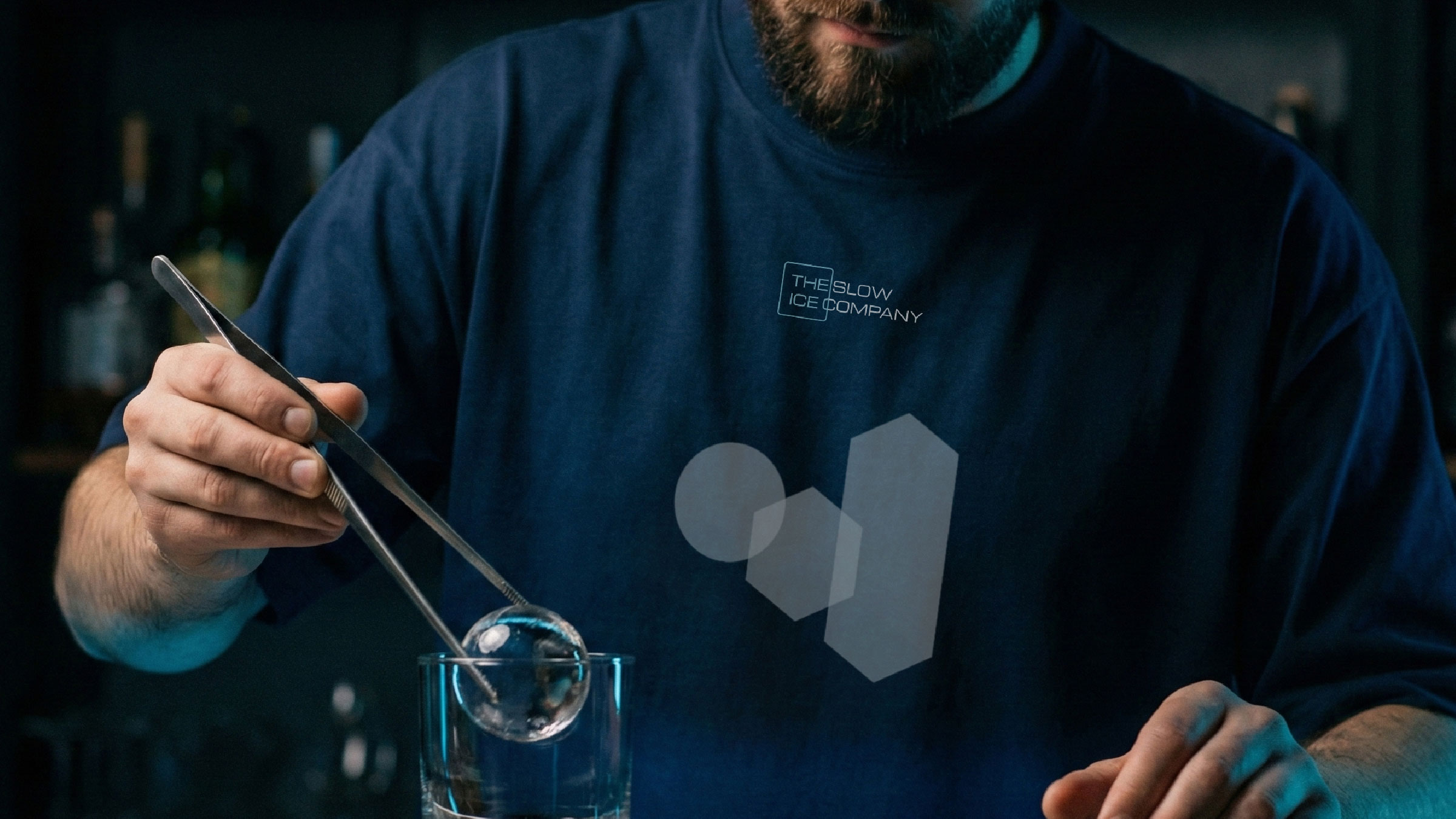
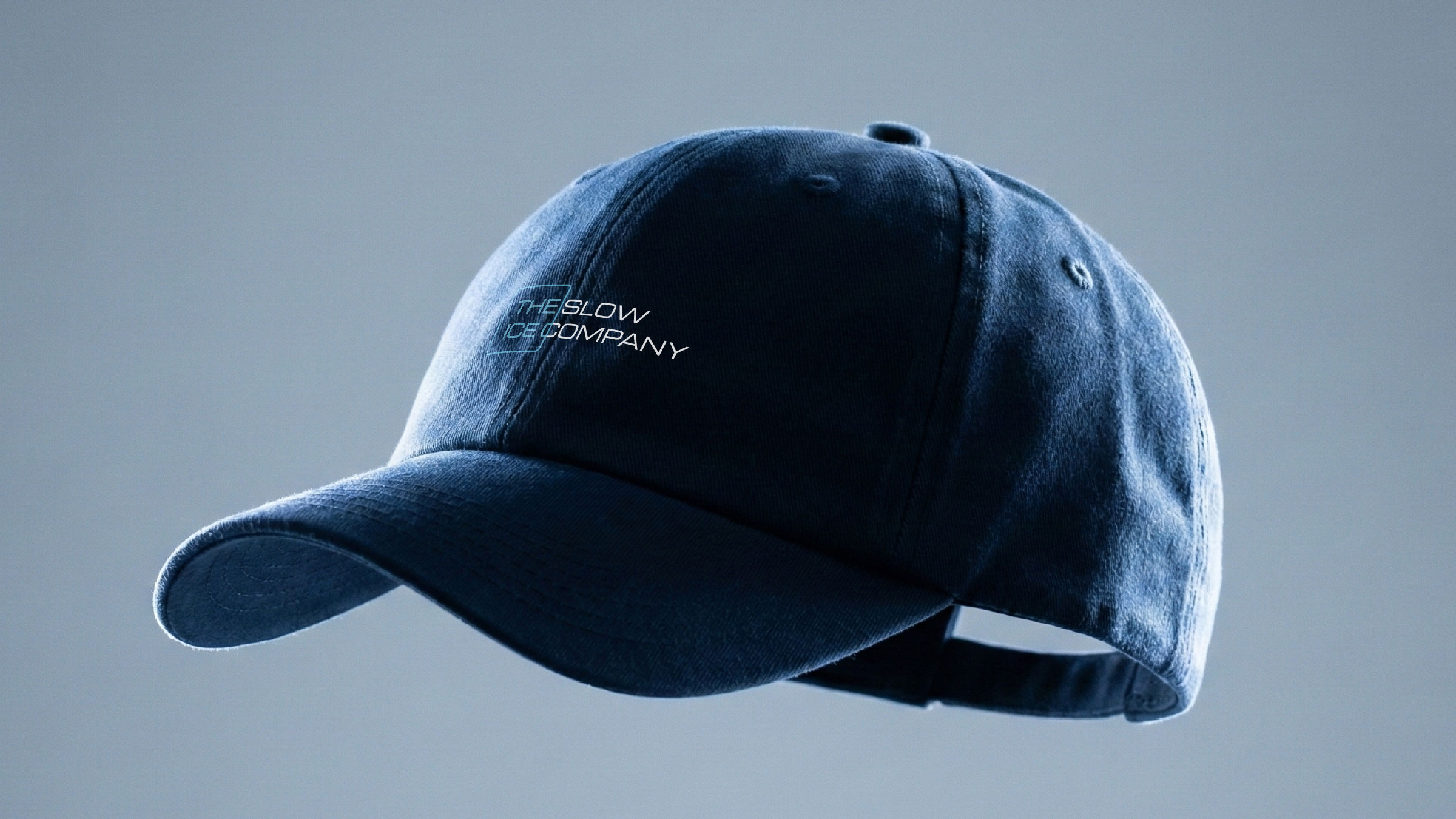
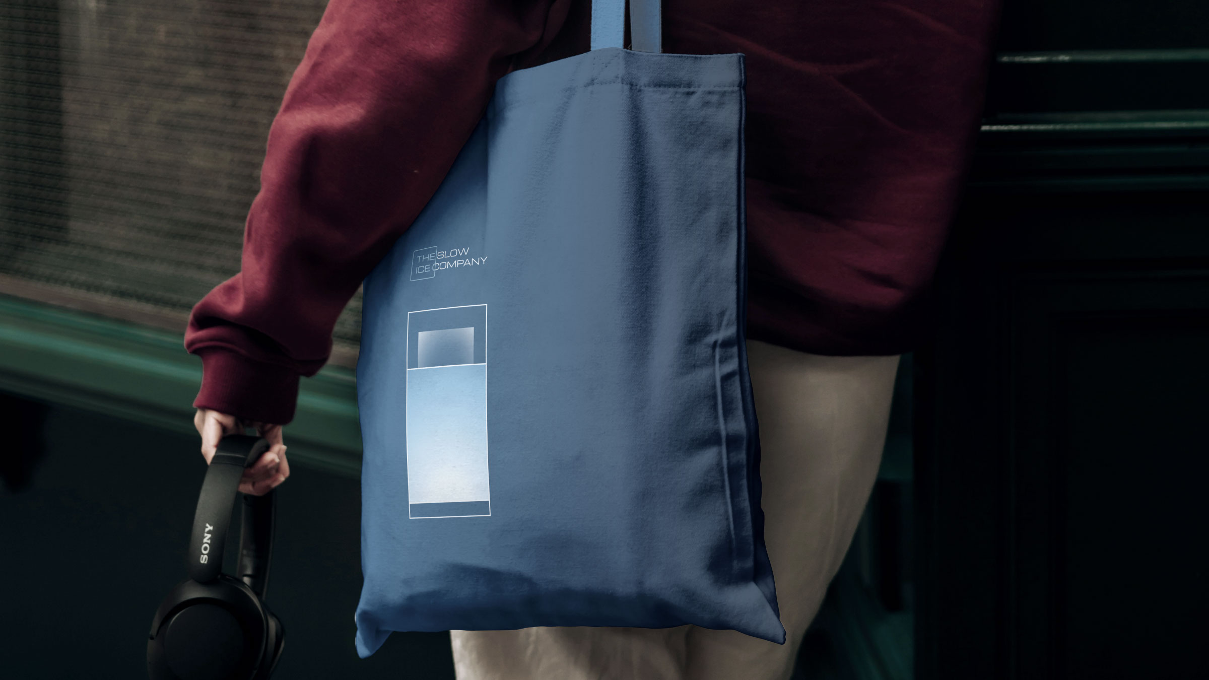
Across posters, tote bags, apparel, and in‑bar applications, the identity remains consistent yet flexible. Geometric compositions of glass and ice become art‑like prints, while the logo and shapes sit subtly on uniforms and accessories, integrating the brand seamlessly into bar settings without visual noise.
By anchoring every element, from logo construction to packaging hierarchy in the idea of clarity, The Slow Ice Company identity turns a technical achievement into a distinctive, ownable brand world. The result is a system that feels premium, modern, and surprisingly expressive for such a minimal toolkit, setting a new visual standard for hospitality ice in India and beyond.

CREDIT
- Agency/Creative: Qoyn Collective
- Article Title: The Slow Ice Company Delivers Pure Precision in Every Cube Through Design by Qoyn Collective
- Organisation/Entity: Agency
- Project Type: Identity
- Project Status: Published
- Agency/Creative Country: India
- Agency/Creative City: Mumbai
- Market Region: Asia
- Project Deliverables: Brand Design, Brand Guidelines, Brand Identity, Brand Naming, Illustration, Packaging Design, Poster Design, Product Naming
- Industry: Food/Beverage
- Keywords: Ice, Clear Ice, Ice Branding, The Slow Ice Company, Slow Ice Company, F&B Branding, Hospitality, Whiskey, Cocktails
-
Credits:
Head of Design: Sushant Anikhindi
Co-Founder and Head of Innovation: Bhavana Kumaraswamy
Co-Founder and Head of Strategic Growth: Noaman Shaikh


