The Shanghai Syndicate was born out of friendship and a passion for Scotch Whisky. From Shanghai, a group of friends sought out casks from Scotland’s most well respected distilleries, building a collection of some of the finest and most unique whiskies and releasing them in limited batches.
Our task is to create a new brand which has the authenticity of its Shanghai origin and the appeal of a fine Scotch whisky.
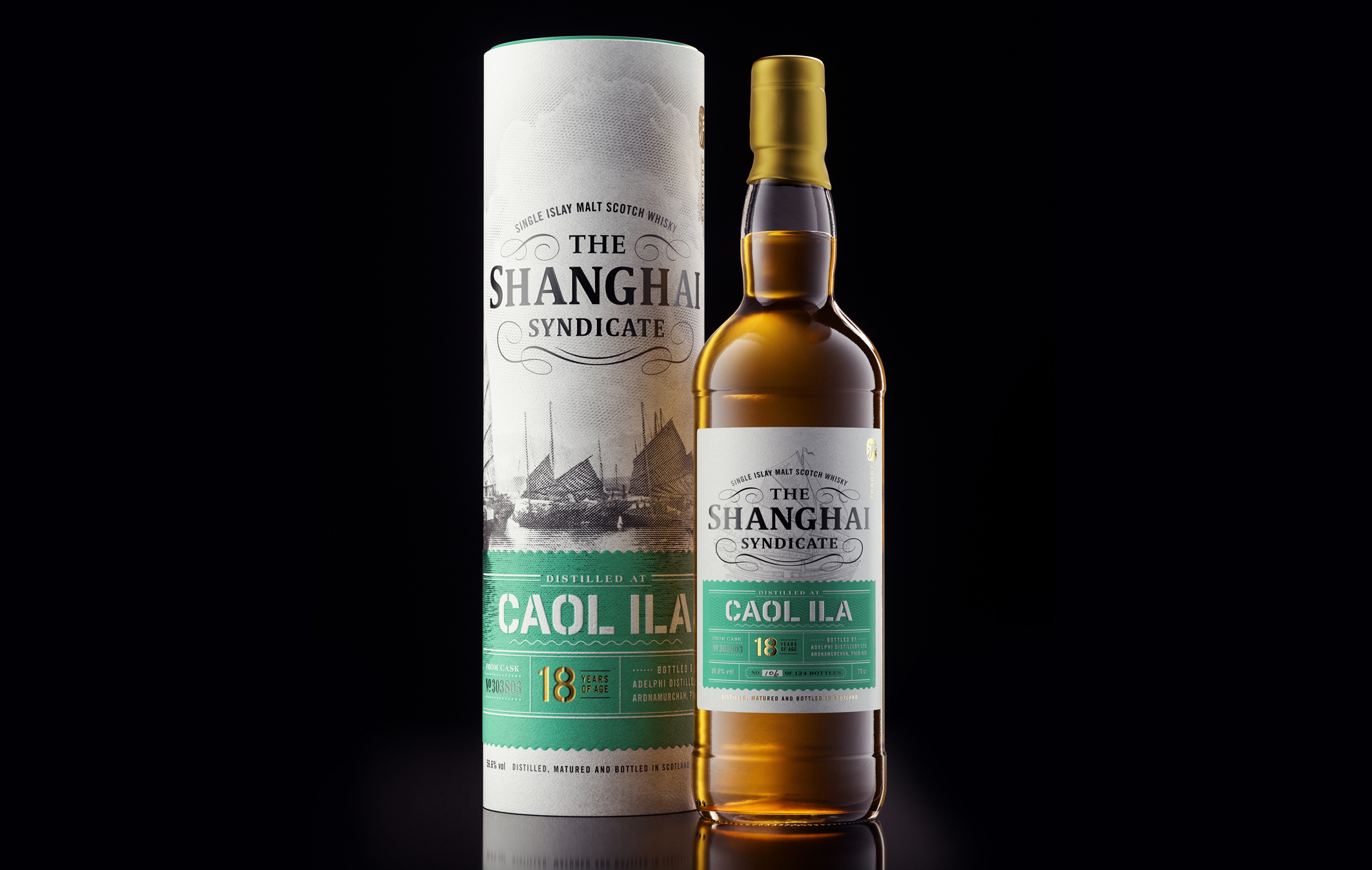
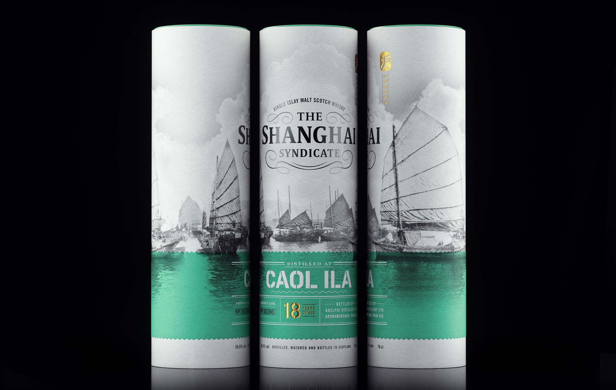
The design is a classic, premium Scotch whisky with a twist, evoking a period of Shanghai’s vibrant historical navel trade in the 1900s. One of the most recongisable symbols of Shanghai is ‘The Bund’. The word bund means an embankment or an embanked quay. It is a famed promenade facing the Huangpu River (Mother River of Shanghai) which served as an important financial and cultural hub of the treaty port in the last century.
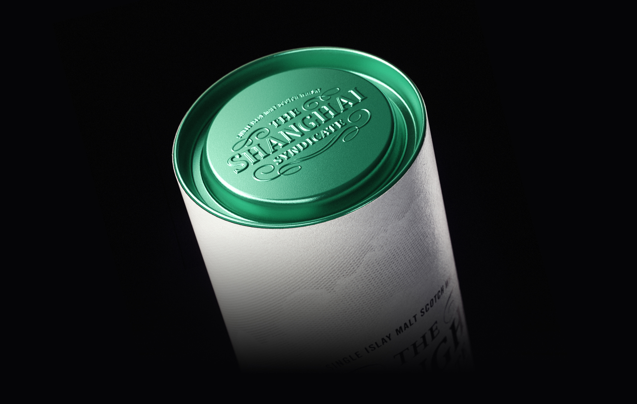
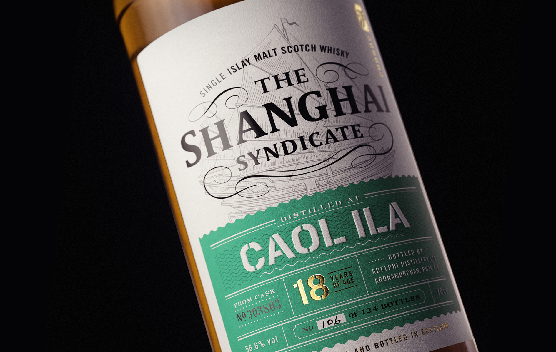
The label design drew inspiration from the Bund and the Chinese junks which were an iconic part of the river for trade. The outer carton is a perfect canvas for a mesmerising panaroma view of the design. A modern Chinese gold foil stamp is seen as a premium detailing, formed by the Chinese character ‘Hu’ (short name of Shanghai) and the number ‘200002’ (the postal code of the Bund area).


CREDIT
- Agency/Creative: Blackmoon Studio
- Article Title: The Shanghai Syndicate by Blackmoon
- Organisation/Entity: Agency, Published Commercial Design
- Project Type: Packaging
- Project Status: Published
- Agency/Creative Country: Singapore
- Market Region: Multiple Regions
- Project Deliverables: Brand Creation, Brand Identity, Branding, Graphic Design, Illustration, Packaging Design, Research
- Format: Bottle, Box
- Substrate: Glass Bottle
- Keywords: WBDS Agency Design Awards 2020/21


