In the ever-changing landscape of digital communication, standing out is not only a matter of content, but also of image. “The Agency,” an established agency specializing in social media strategy and content creation, decided to undertake a redesign project to strengthen their visual presence while keeping intact the spirit that has defined their success. This operation, which involved the redesign of the logo and the development of a new brand identity, proved crucial in consolidating the agency’s image as a key player in the industry.
Background and target audience
The Agency is known for its ability to create tailored communication strategies for modern, dynamic and innovative brands, companies that wish not only to improve their online visibility but also to establish an authentic relationship with their audience. With a target market that includes cutting-edge entrepreneurial realities, the agency caters to those clients who seek effective digital solutions aligned with the latest trends, but without sacrificing the quality and consistency of the message.
The challenge: combining tradition and innovation
The restyling project set a specific goal: to renew The Agency’s image without sacrificing its original essence. It was a matter of creating a logo and brand identity that reflected the agency’s professionalism and dynamism, ensuring that the new identity was recognizable and consistent across all communication channels. A task that required great sensitivity to balance tradition and innovation, and had to be carried out with the expectations of an increasingly demanding target audience in mind.
The execution: a geometric and dynamic design
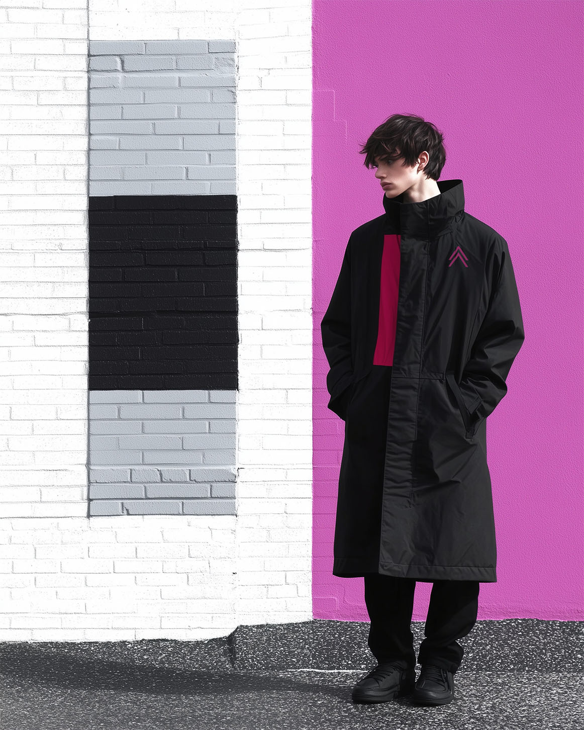
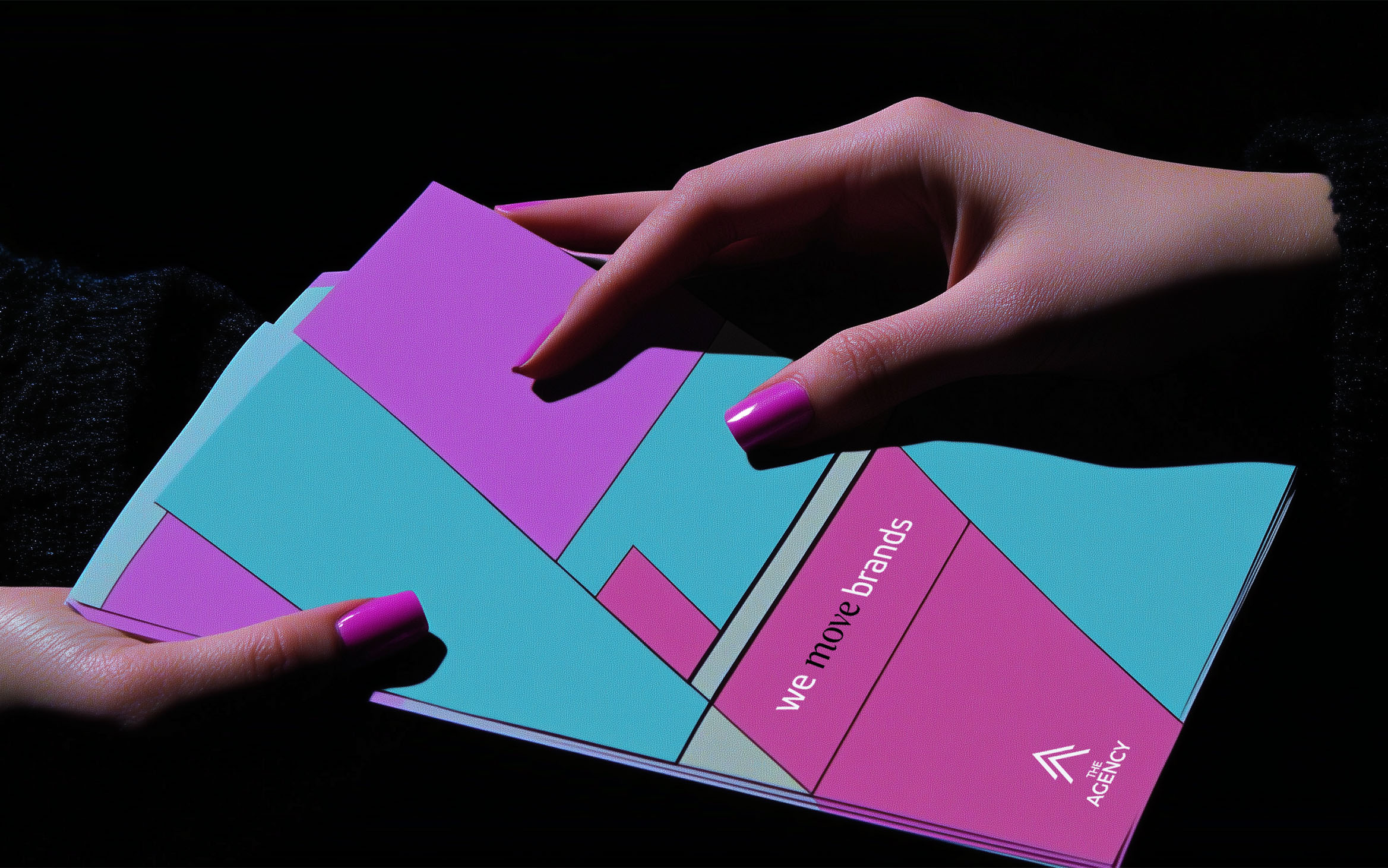
The restyling process began with the logo, which underwent an intervention aimed at strengthening its visual impact. The pictogram, the heart of the visual identity, was redesigned in a geometric key to give greater stability and strength to the overall design. The font update maintained a sense of continuity with the previous version, but it was the naming arrangement that made the difference: the word “Agency” was emphasized to more strongly convey the brand positioning.
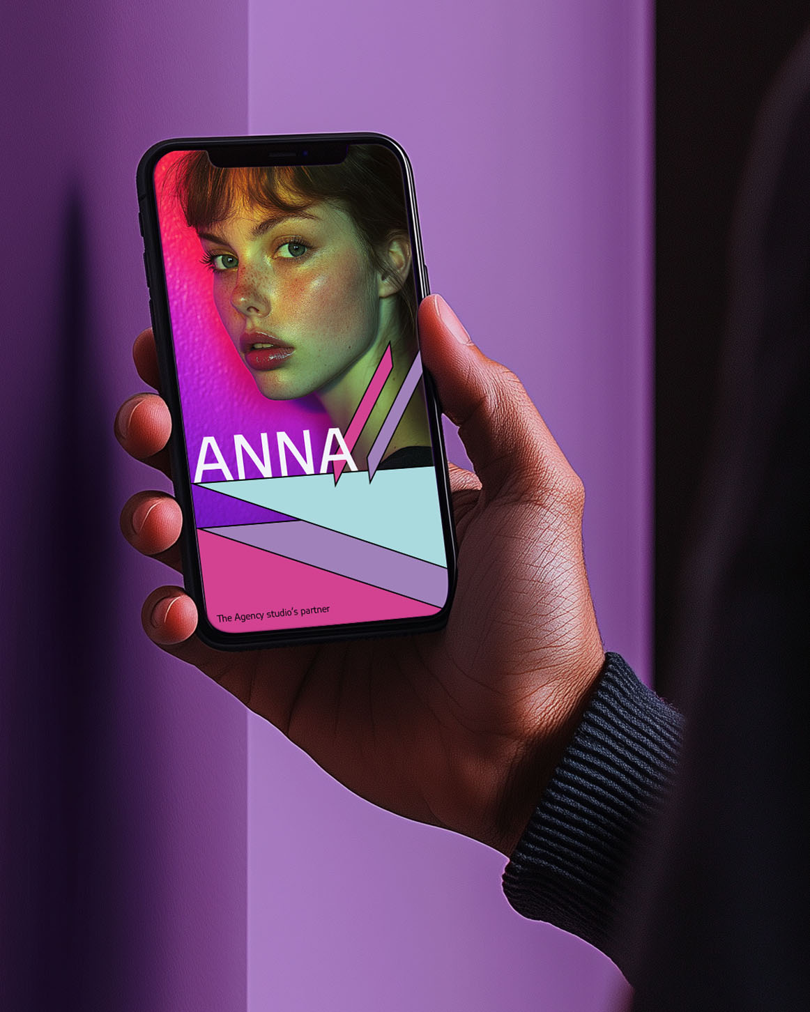
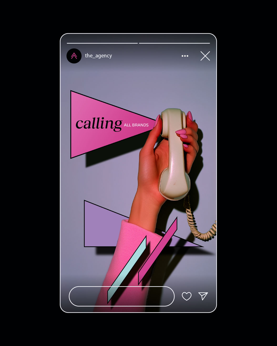
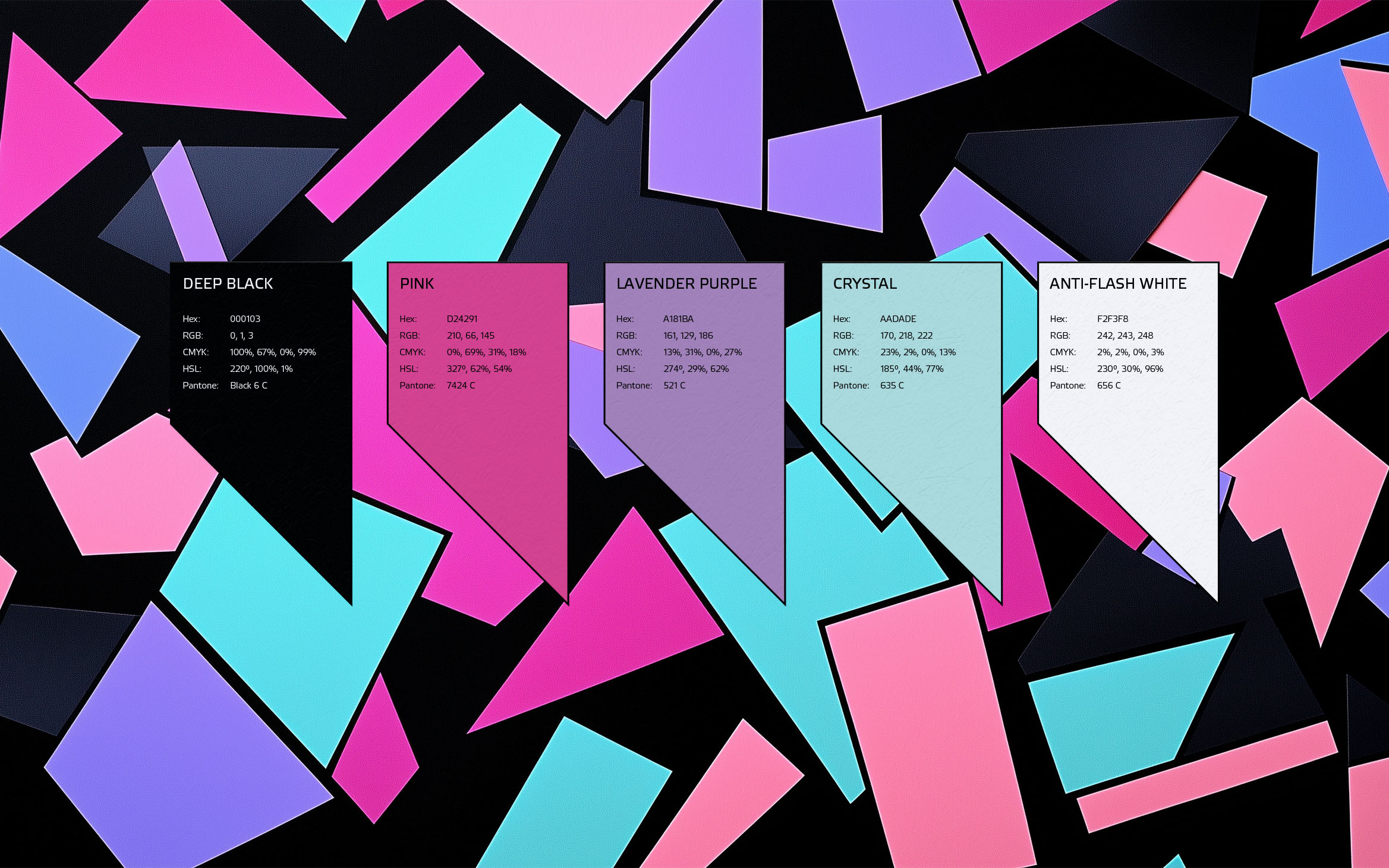
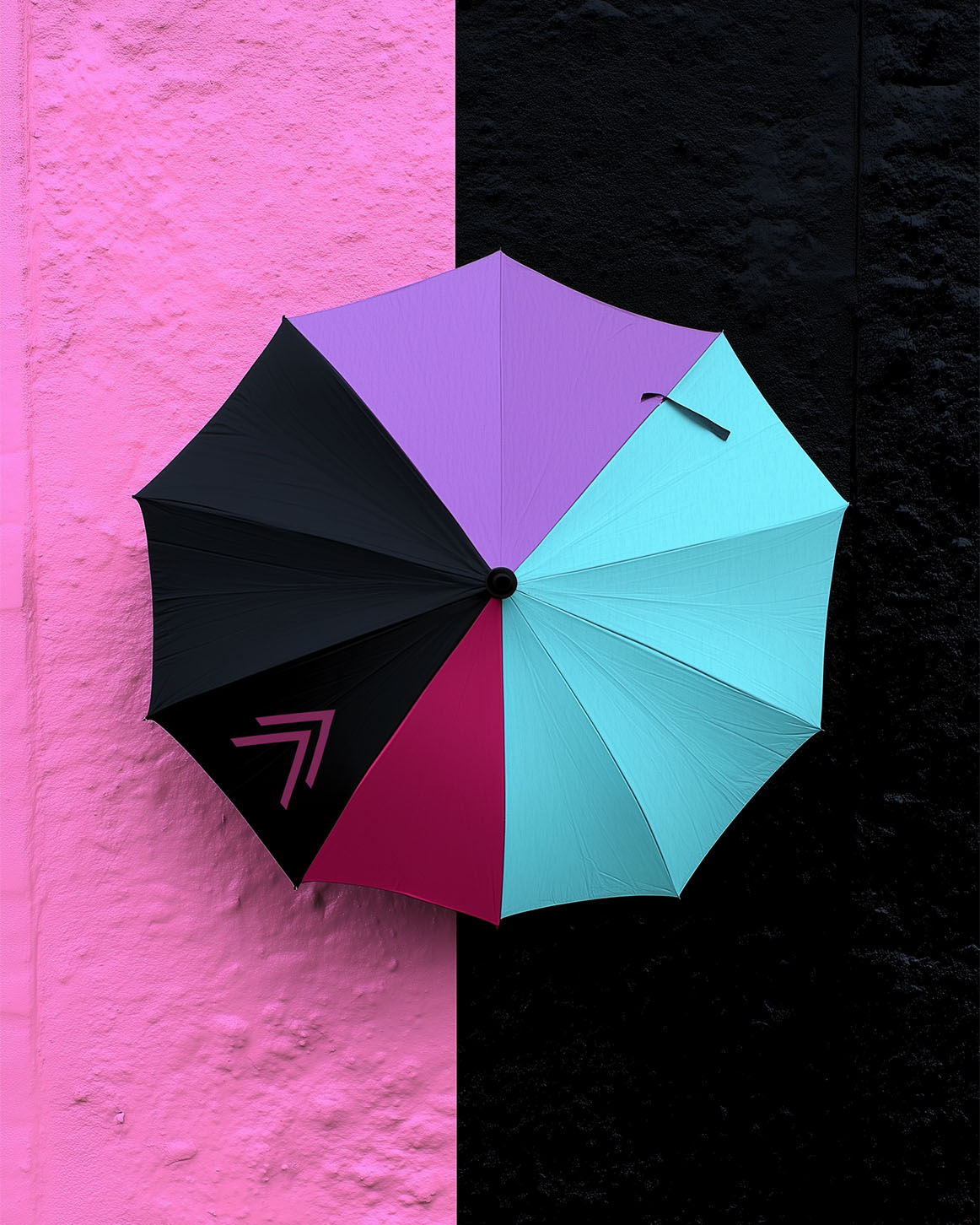
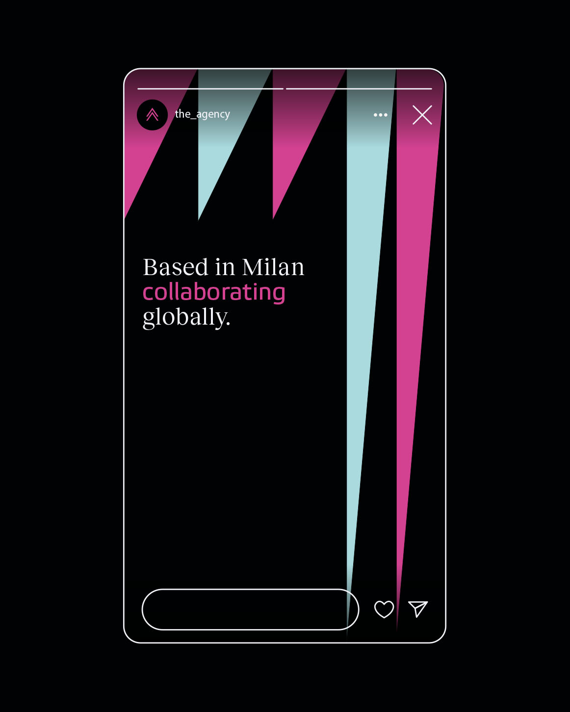
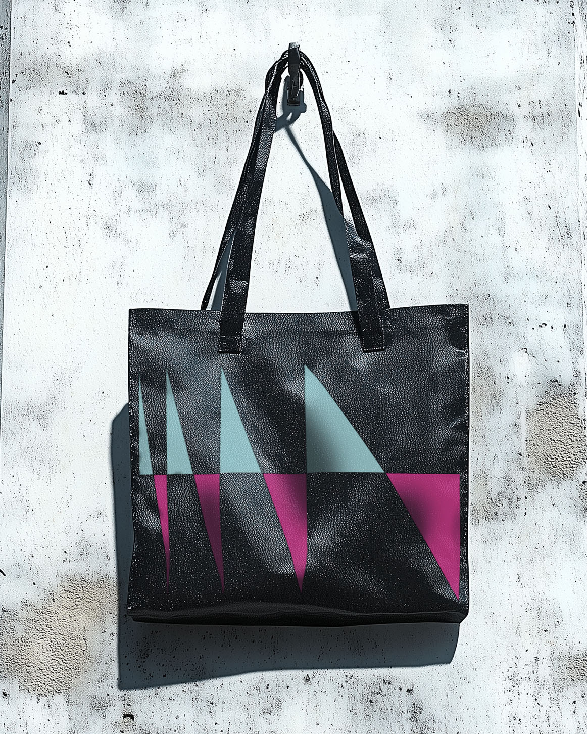
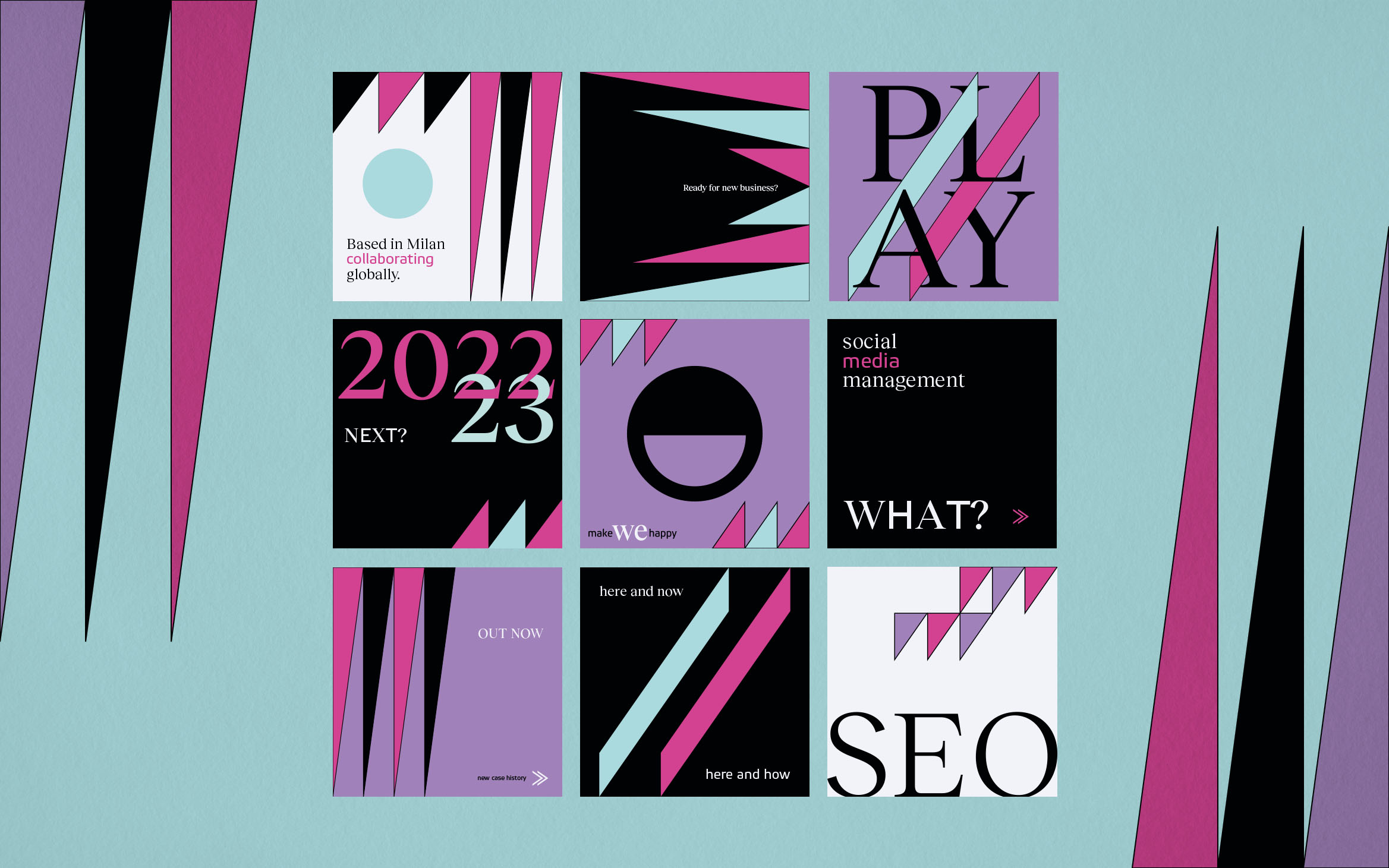
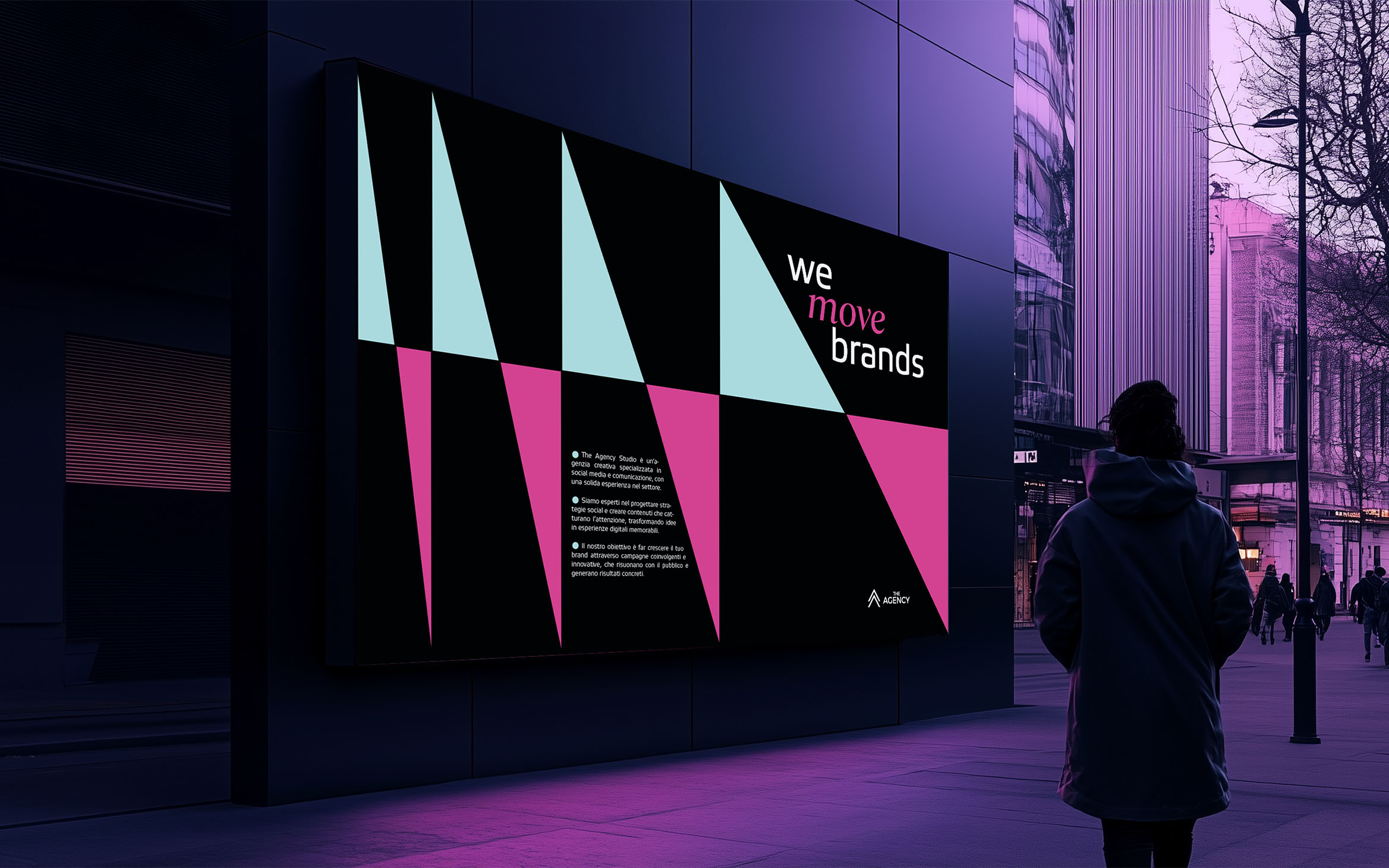
Not only the logo, but the entire visual identity was rethought to ensure consistency across all digital touchpoints. Polygonal shapes, born from the expansion of the negative spaces of the pictogram, became the leitmotif of the graphic content, adding rhythm and dynamism to the compositions. This approach resulted in a versatile visual identity, capable of adapting to different formats and contexts, without ever losing effectiveness.
A result that lives up to expectations
The new look of The Agency perfectly embodies the balance between tradition and modernity. The restyling has been able to maintain the original essence of the agency, while adding that touch of freshness necessary to continue to respond to the needs of a constantly changing market. Thanks to a more solid logo and a refined and dynamic visual identity, The Agency can now communicate its values with even greater clarity and professionalism, consolidating its position as a point of reference in the world of digital communication.
CREDIT
- Agency/Creative: Andrea Del Prete
- Article Title: The Restyling of “The Agency”: A Renewed Identity for More Incisive Communication
- Organisation/Entity: Freelance
- Project Type: Identity
- Project Status: Published
- Agency/Creative Country: Italy
- Agency/Creative City: Naples
- Market Region: Europe
- Project Deliverables: Art Direction, Branding, Creative Direction, Graphic Design, Logo Design, Rebranding
- Industry: Mass Media
- Keywords: Restyling logo The Agency
-
Credits:
Designer: Andrea Del Prete


