


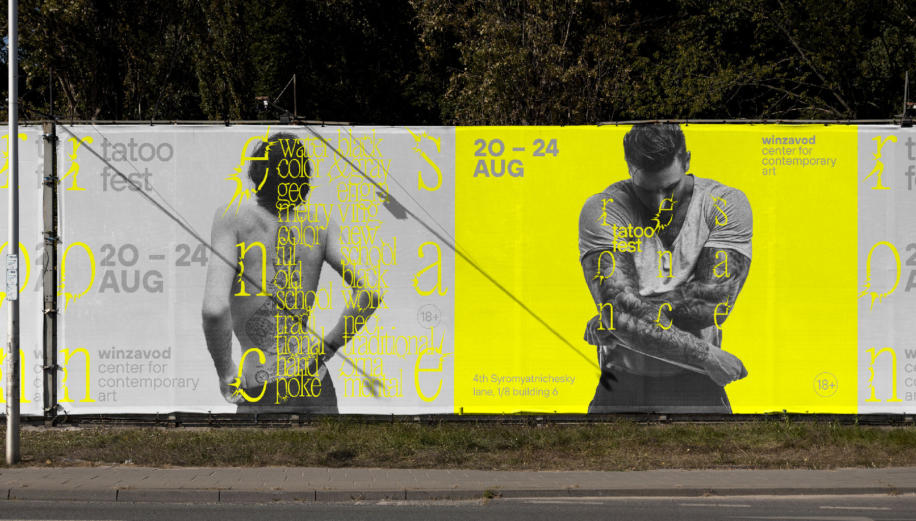
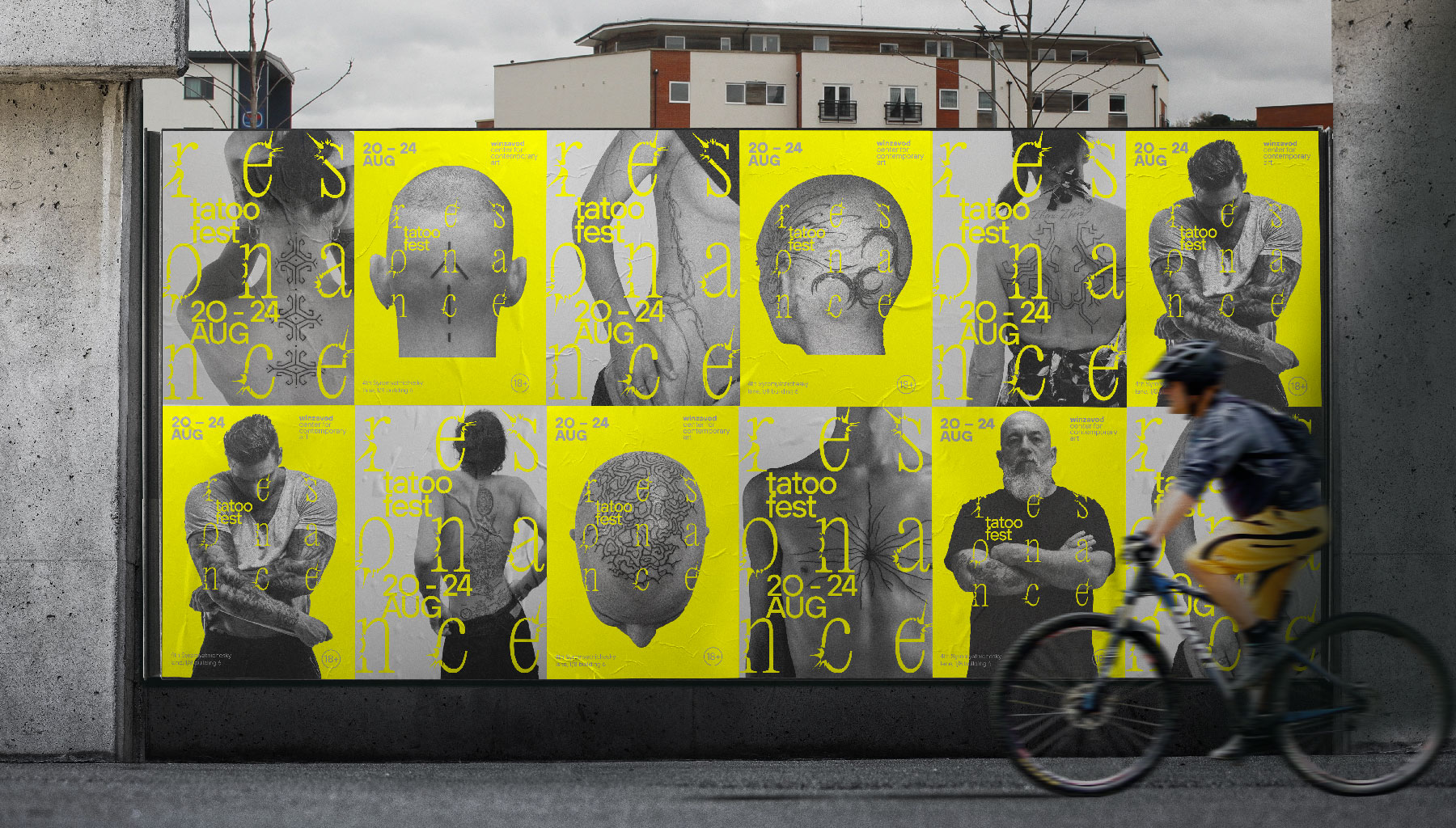
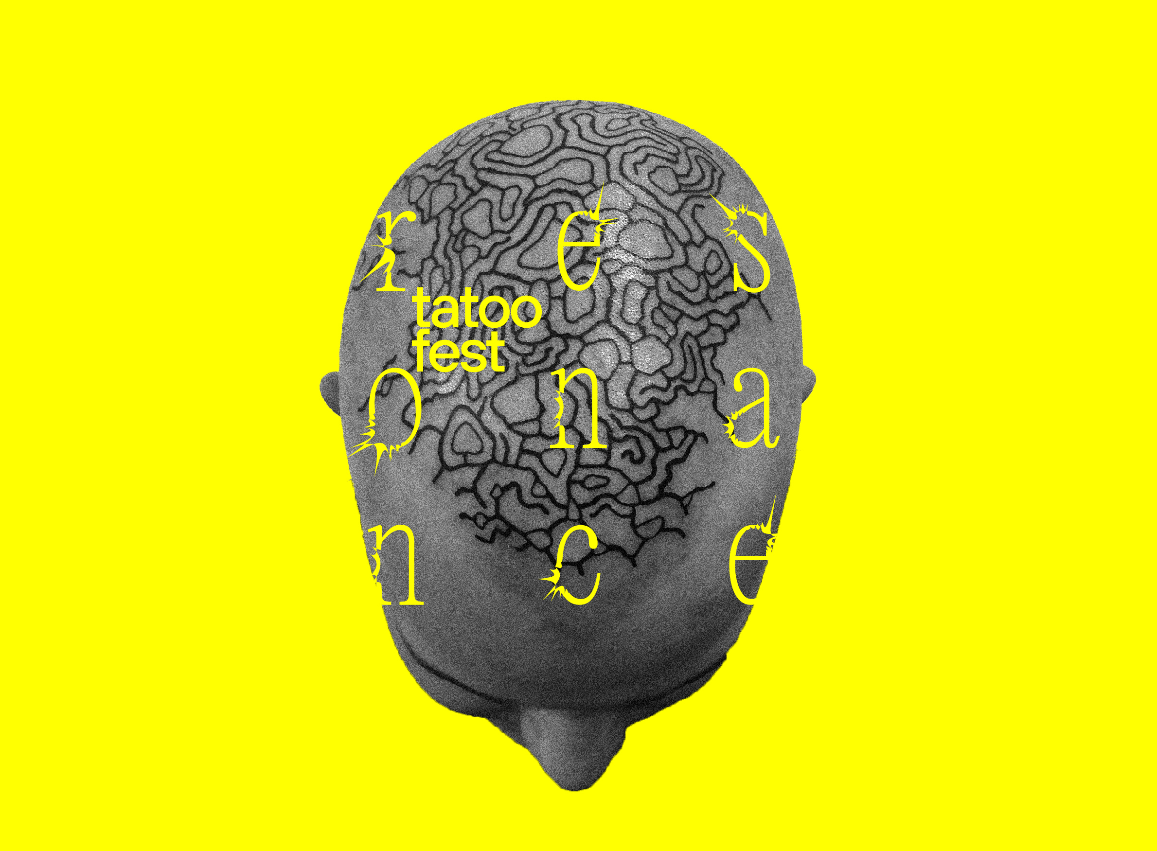
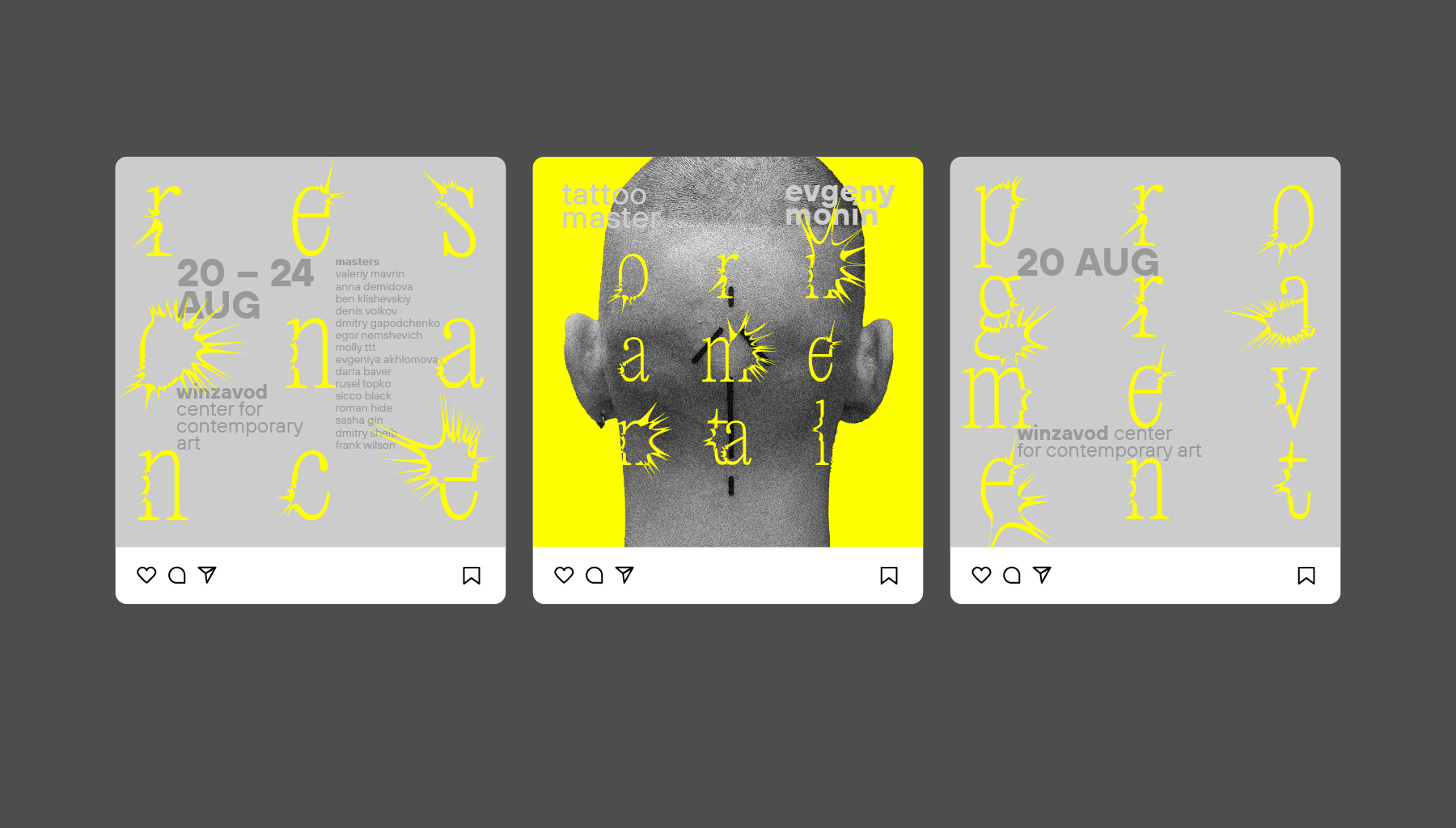
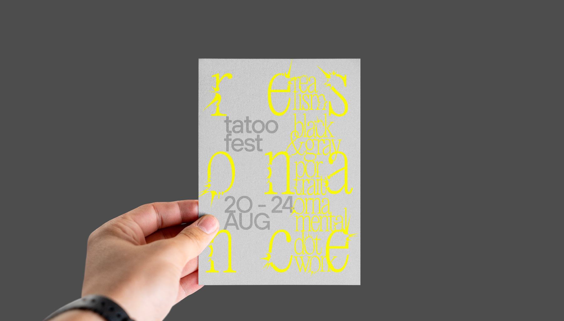
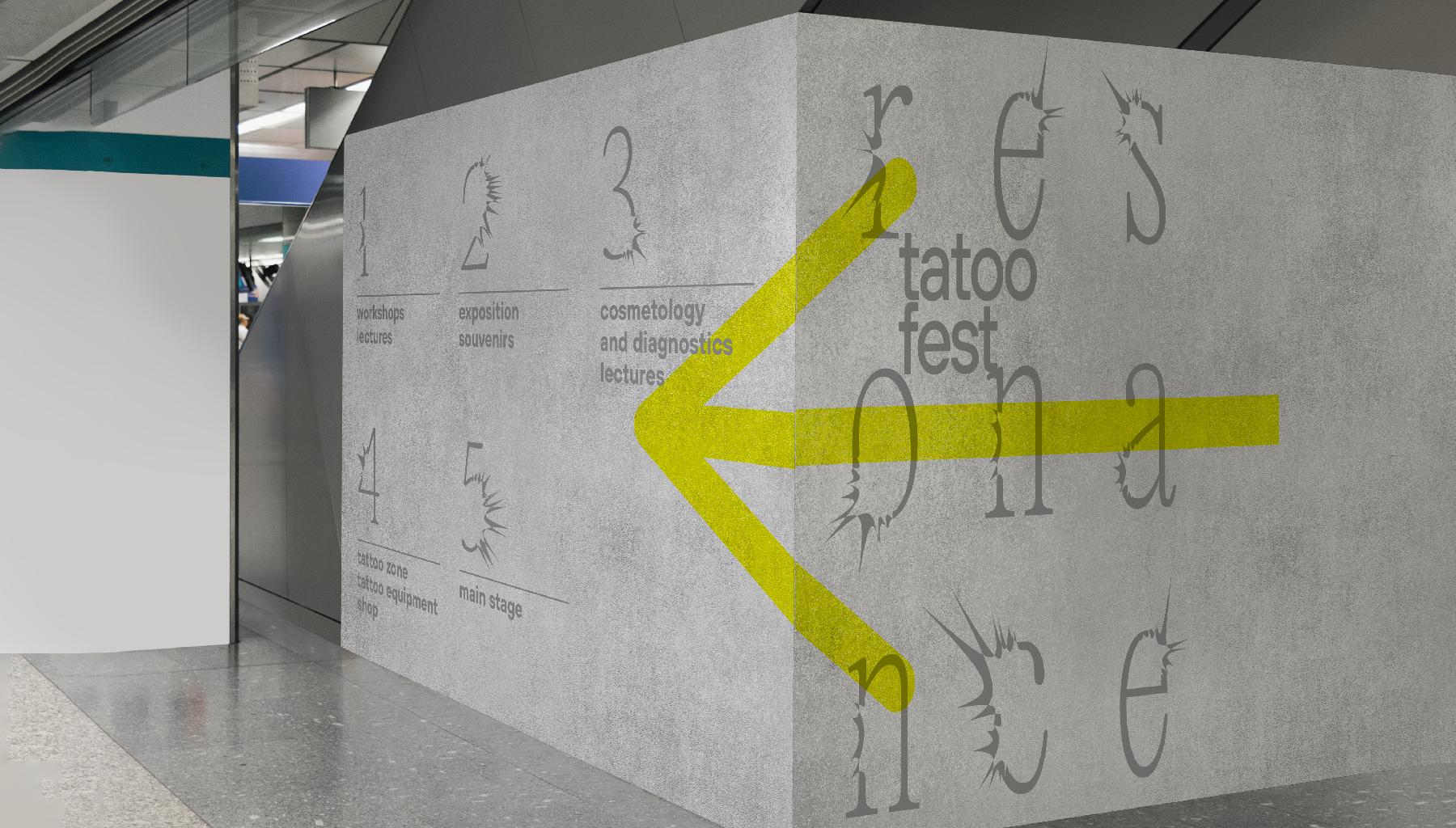
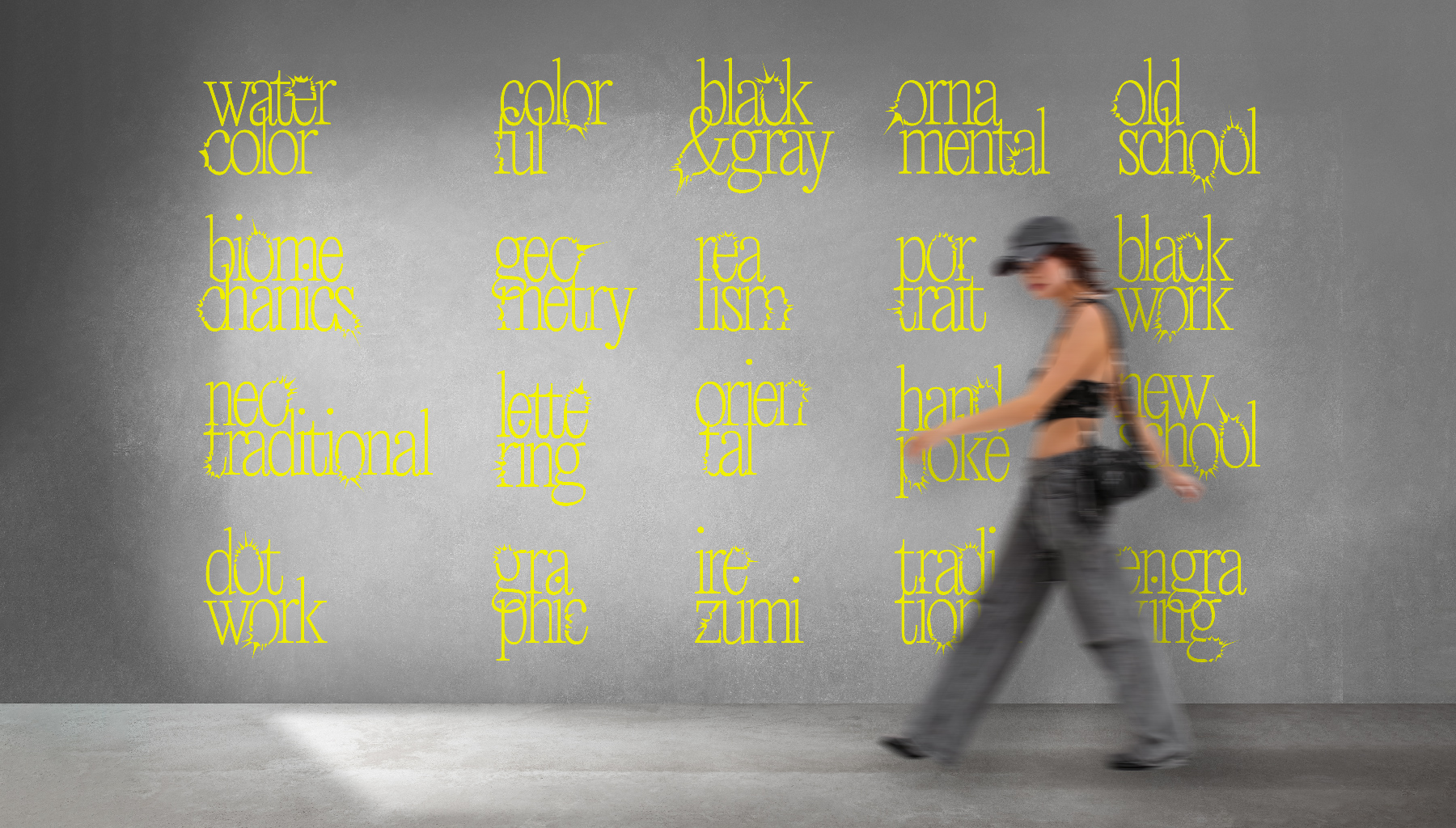
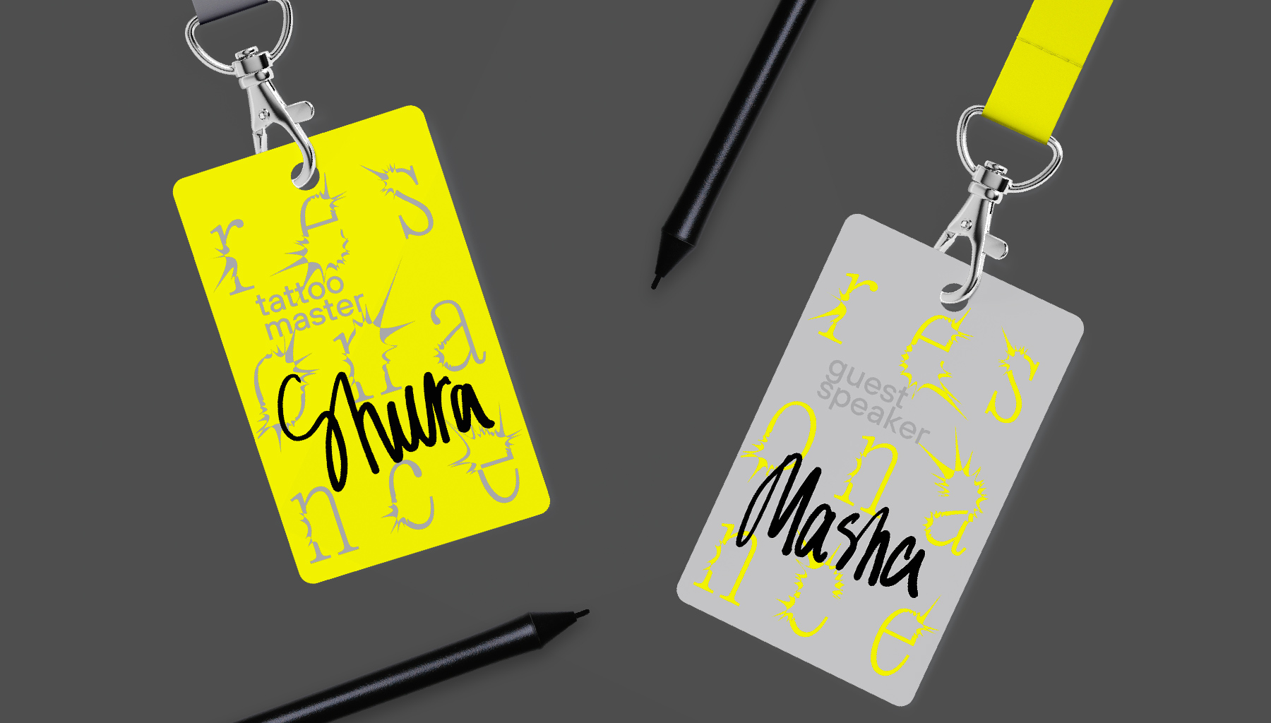
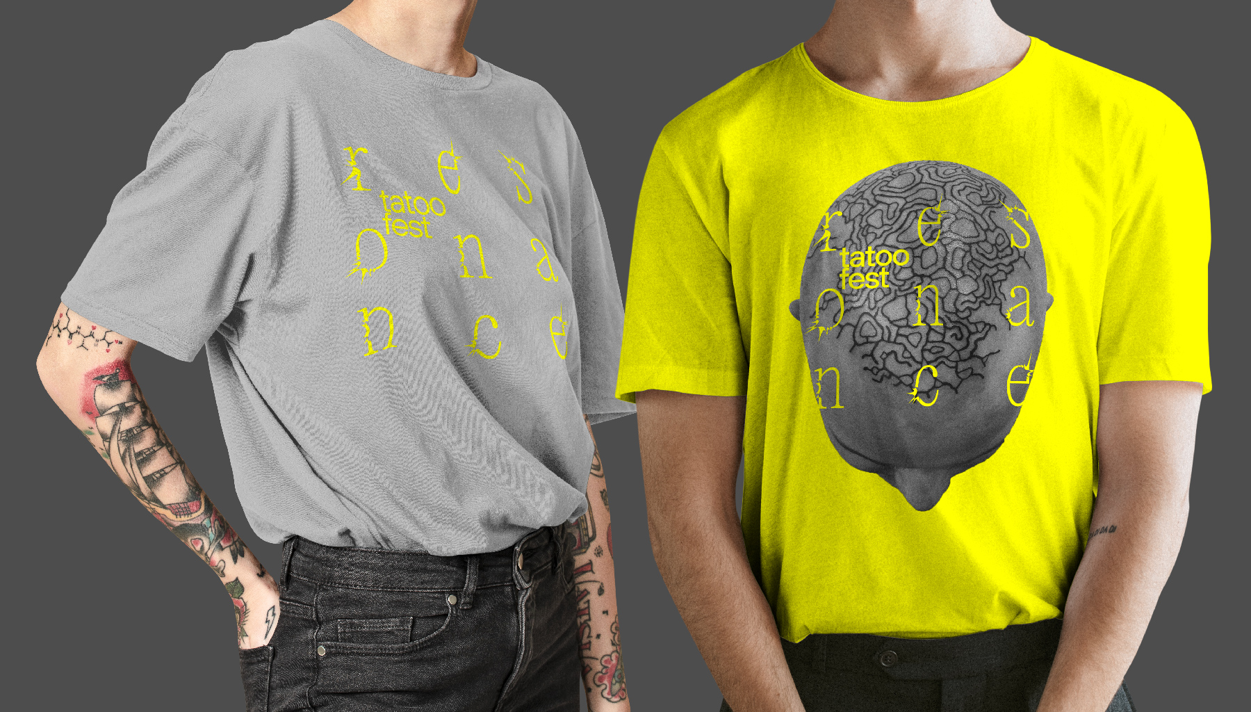
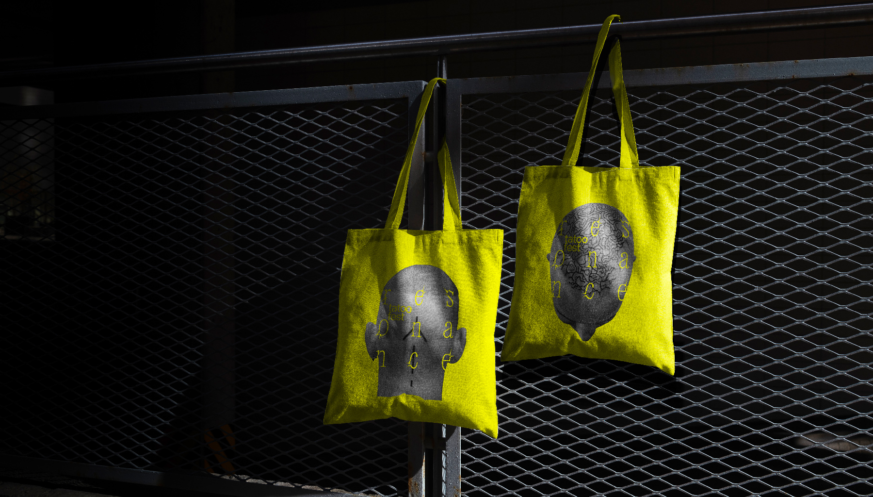
The visual metaphor, which reflects the tattoo process, both from the side of the artist, who concentrates the resonance at one point on the body, and from the side of the client, who receives it, is conveyed through the display font developed for the project.
Editorial New script was used as a base, which was deformed using the Crystallize tool. The main feature of the deformation is the randomness of the resonating effect, just as in the tattoo process, where the pain from the needle can be either more or less severe. This effect is conveyed through the breaking resonance in the text part of the images: some letters are more distorted than others.
To compensate for the active font, a strict modular grid was built, locking active and “rebellious” letters inside the layouts.
The main color of the project is a combination of gray and yellow. Yellow pigment is finely divided and the rarest in tattooing, because it quickly disappears inside the skin and fades, so most often in tattoo culture yellow symbolizes the skin. The most common tattoo color is black, but in this concept black is replaced with gray to avoid roughness and strong contrast.
The graphic part of the project is contrasting photographs of a tattooed body, to demonstrate the different styles and beauty of designs on the body. For the yellow background, individual parts of the body, such as the head, were used, and for the layouts on a gray background, photographs of people with tattoos were used, demonstrating the different personalities and uniqueness of people with tattoos.
Modern Russian tattoo culture is replete with stereotyped techniques based on old-school style, which does not fully reflect the diversity and specificity of tattoos as a phenomenon of culture and art. In view of this, the main goal of the project is to create a new vision of tattoo art for the audience and introduce the user to this type of body modification.
CREDIT
- Agency/Creative: Alexandra Kashentseva
- Article Title: The Resonance Tattoo Festival
- Organisation/Entity: Student
- Project Type: Identity
- Project Status: Published
- Agency/Creative Country: Russia
- Agency/Creative City: HSE Art and Design School
- Market Region: Europe, Global
- Project Deliverables: Art Direction, Graphic Design
- Industry: Entertainment
- Keywords: tattoo, festival, recreation, art, body modification, cosmetology
-
Credits:
Curator: Leonid Slavin
Photo: Evgeniy Monin
Photo: Darya Zamyatina
Photo: Egor Stepanenko


