The Challenge
The Client approached us to do the rebranding of their line of dairy products that has been on the Armenian market for years.
In this market the dairy presence is very fierce given that a very big number of brands are competing against one another. Studying the market, we noticed that there is an unhealthy competition environment, where each brand wants to look like the other. Therefore the market lacks for a unique design that stands out of the lot. Furthermore, from a creative perspective, we notice that the branding and design approach for all these dairy products is overall chaotic and lacks an impactful strategic plan. With all the present dairy product brands having the same schemes of color, patterns and elements that presented non harmonic and unfit solutions for dairy product.
So our task was to create a successful solution that would translate as well in a merchandising success, with a new design that will be different and stand out among all the other brands out there.
However, before undertaking any project, first and foremost, we have to make sure that the actual product to which we will be providing our design, has a very high quality and is of the finest standards.
So after making sure that the quality of dairy in this new ANI Product was improved and became of the highest standard, we have agreed to embark on the rebranding journey.
The Solution
In a rebranding project, research and statistic play a key role in helping us understand the exact needs of the market in order to come up with the most efficient solutions. During the design and concept finalization stages, it is extremely important to test the result with targeted tools among research consumers.
Our agency has developed several variants of packaging concepts that have been tested by the R-Insights research agency through focus group discussions based on our target groups. As a result of this research, the most consumer-approved concepts were selected and developed into the final form.
The visual approach was decided to be minimal and modern.
Also this new design had to reflect the high quality of the product that was inside of the packaging, therefore, just by looking at the packaging, the goal was to let the customer understand, that this particular brand contains a natural, pure product inside, therefore making them want to try it and choose it amongst its competitors.
Finally, we had to create an emotional engagement factor between the consumers and the ANI Product line, so that it becomes their go to brand. In order to do that we had to set up the base for strong visual communication, an image so captivating and impactful, that it will grab attention and create an emotional link with the customers.
The Result
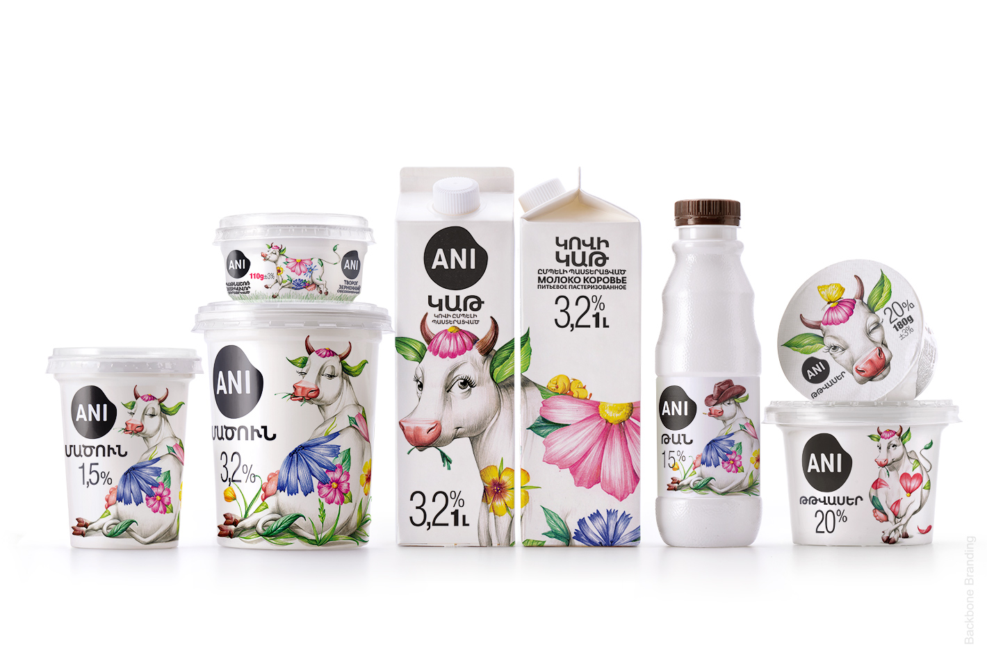
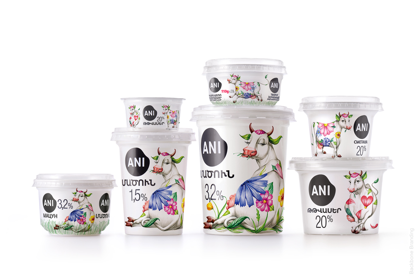
In the Armenian village culture, cows play a very important role, and people have over the centuries created a very strong bond with this mammal, given that usually entire families and villages depended on this animal for a living. So villagers used to give popular and affectionate names to their cows such as ‘’Maral’’, ‘’Jeyran’’ (both meaning deer), Sirun (meaning beautiful), etc
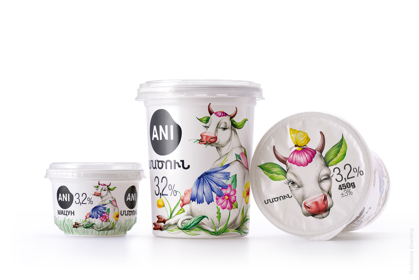
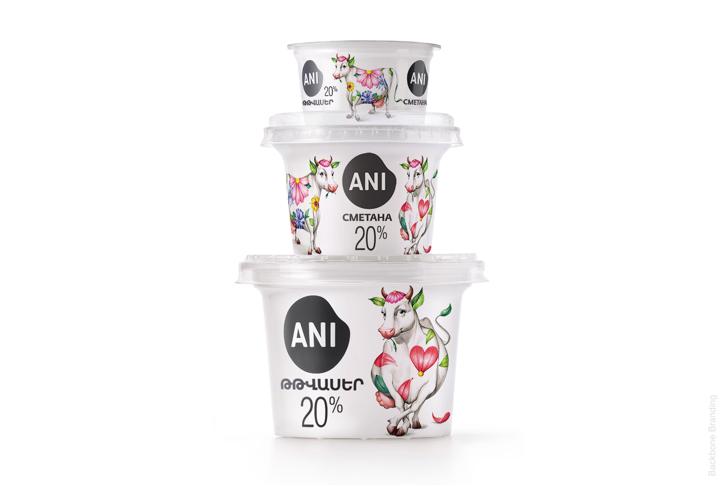
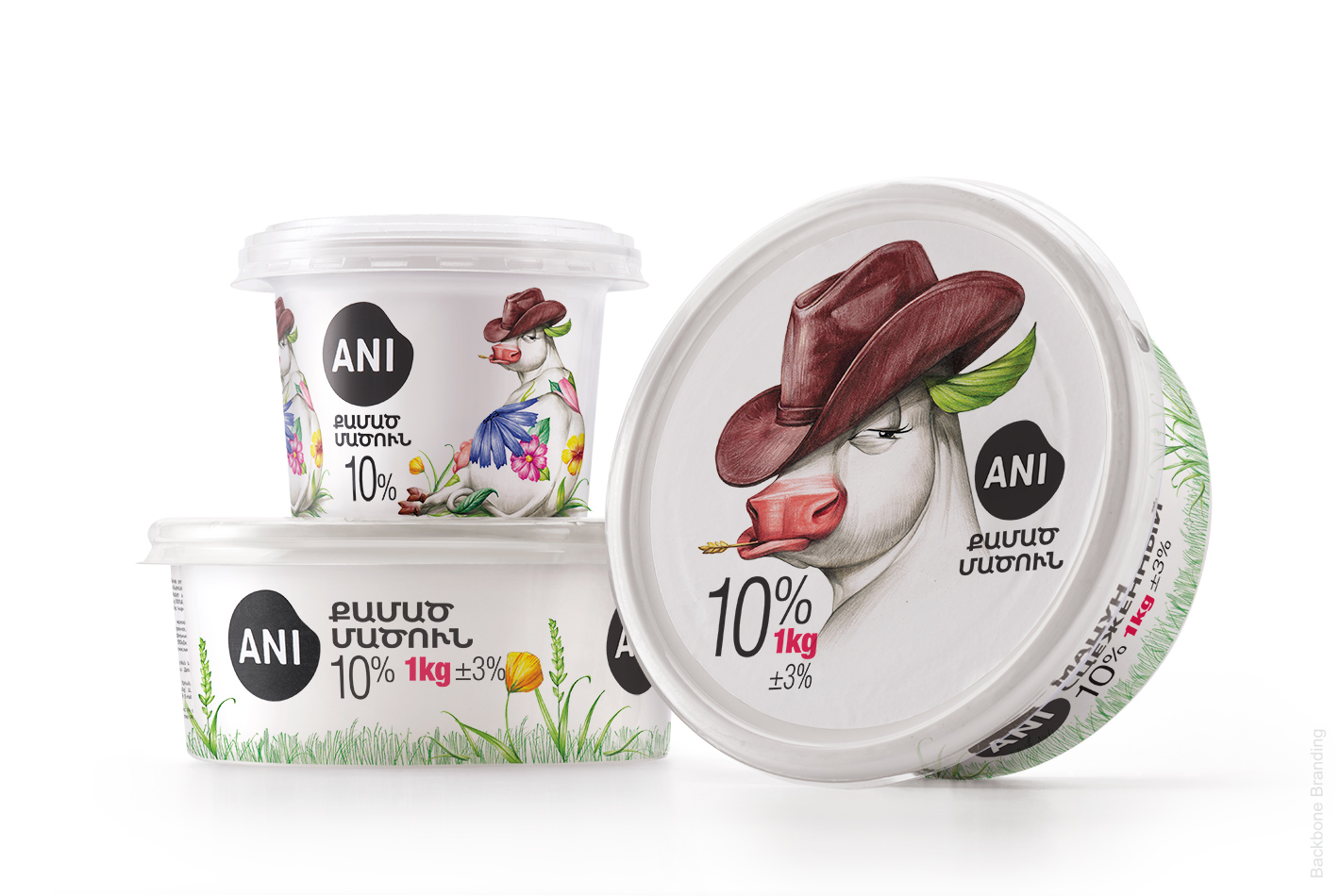
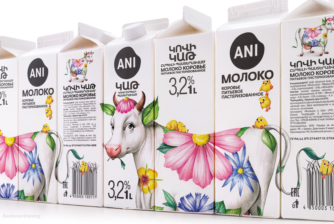
The most popular is the name “tzaghik kov”, which is used to designate the most beautiful cow. So by illustrating the ‘’tzaghik kov’’ on our packaging, the idea was that people would immediately – given that they are familiar with this saying – understand that we are signaling the most beautiful and well-formed cow. Pointing that the brand’s cow feeds on clean grass and flowers in order to produce the highest quality dairy.
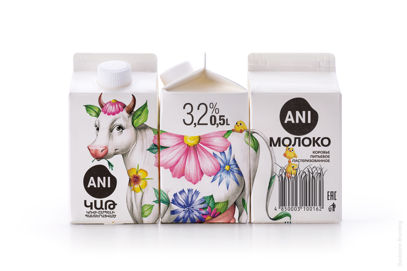
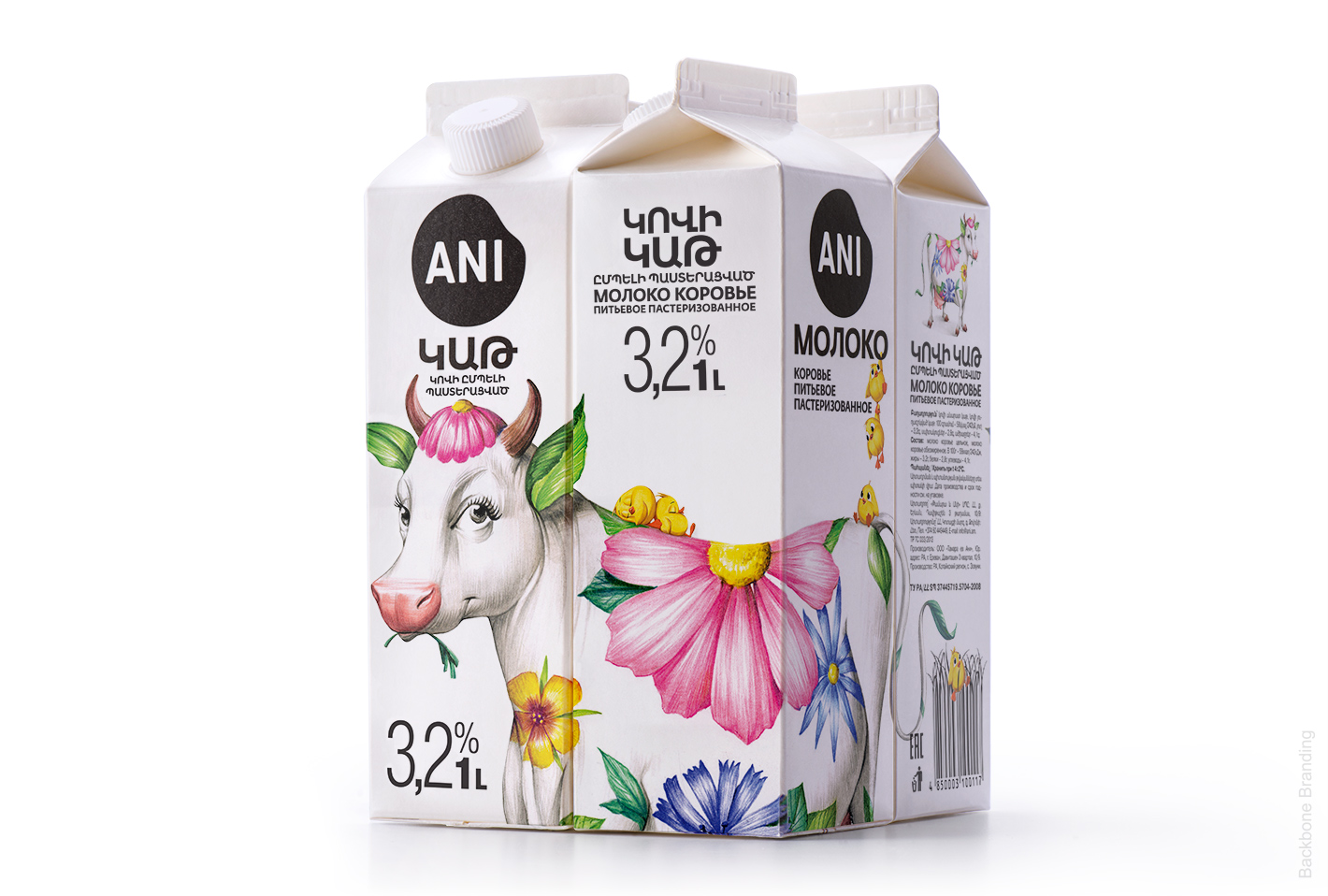
We then have developed the character of our ‘’dzaghik kov’’and storyline by adding mischievous, yellow chicks which kept our cow company. We wanted to show by our illustrations the reality of the healthy environment in which those cows are kept. Therefore, our’’dzaghik kov’’ was depicted in her natural habitat where she grows surrounded by domestic animals.
Finally, those bright colored decorations were intended to contrast with the overall pure whiteness of the packaging. Furthermore the new logo and the text were chosen to be black in order to clearly pop out to the eye and make it easily readable.
Finally the design of the logo is a simple black spot which is a nod to the spot from the mammal’s body.
After the new redesigned line was launched on the Armenian market, the brand had a great feedback and very considerable rise in the sales for all its items. With the popularity of the rebranded ANI Products getting bigger and bigger, we can confirm that a good and successful visual communication strategy, has a direct and straightforward impact not only on a visual level, but also from a merchandising and business point of view. Branding is really a powerful tool!
CREDIT
- Agency/Creative: Backbone Branding
- Article Title: The Rebranding of a Dairy Product Line
- Organisation/Entity: Agency, Published Commercial Design
- Project Type: Packaging
- Project Status: Published
- Agency/Creative Country: Armenia
- Market Region: Europe
- Project Deliverables: Brand Architecture, Brand Naming, Brand Redesign, Brand Strategy, Illustration, Packaging Design, Rebranding, Research
- Format: Bottle, Box
- Substrate: Plastic, Pulp Carton
- Keywords: WBDS Agency Design Awards 2020/21


