


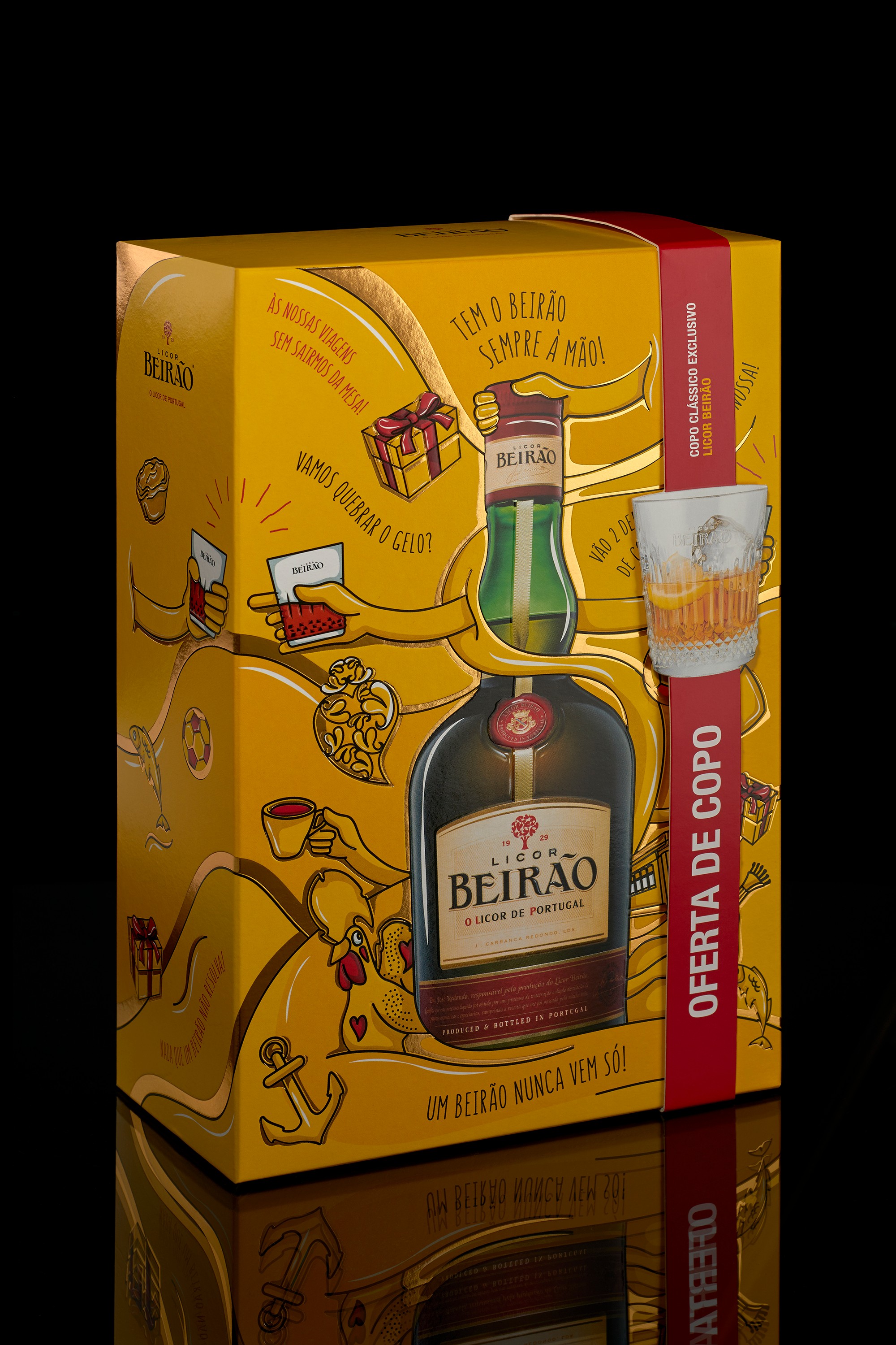
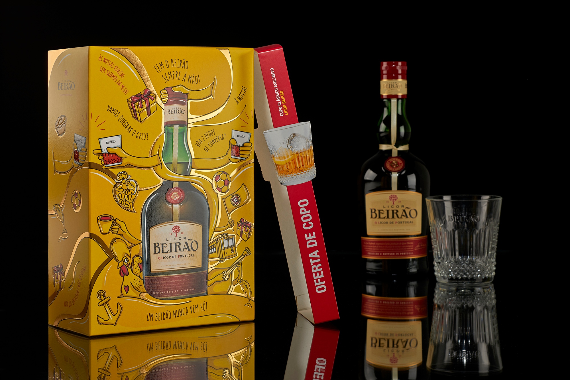
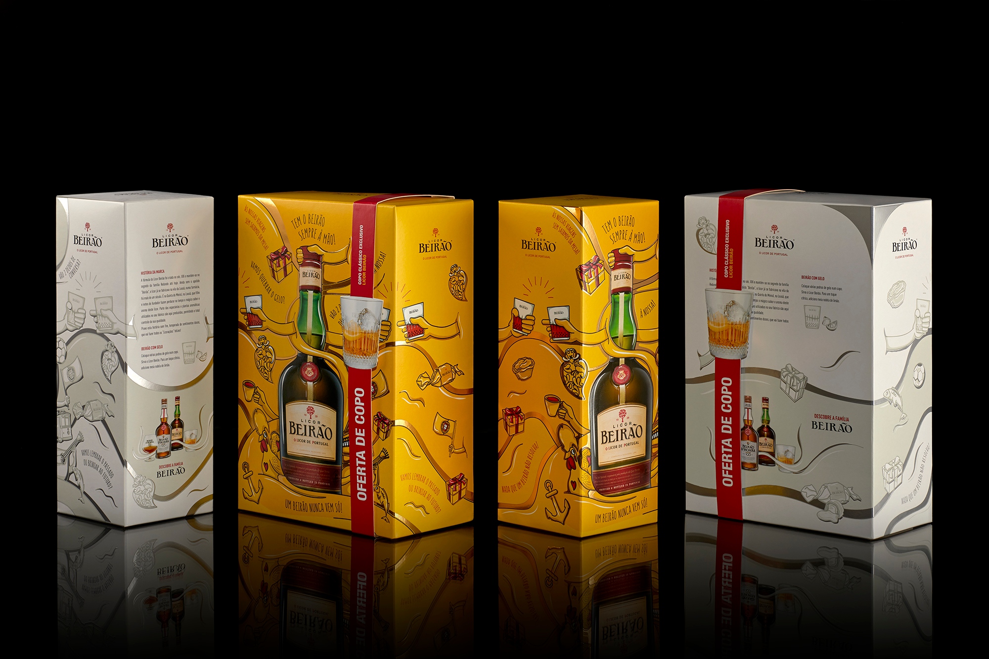
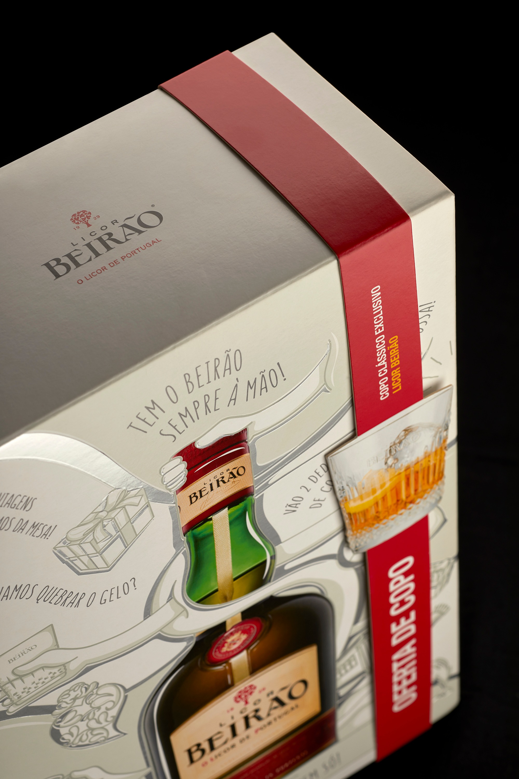
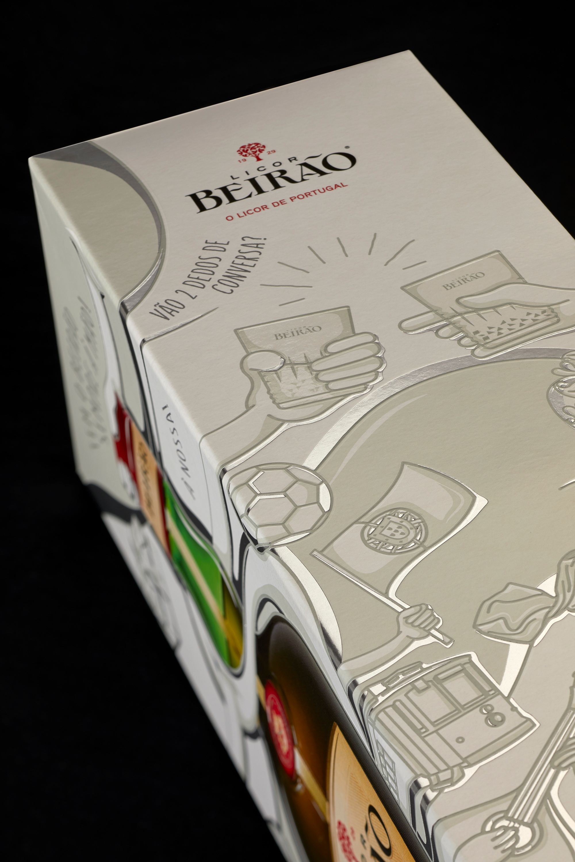
Licor Beirão, an iconic Portuguese brand, chose Omdesign to develop their new packaging that is presented in two distinctive versions: one yellow, colour that was always part of the Licor Beirão’s DNA, since 1929, and the other one in silver, an option more proper to be offered.
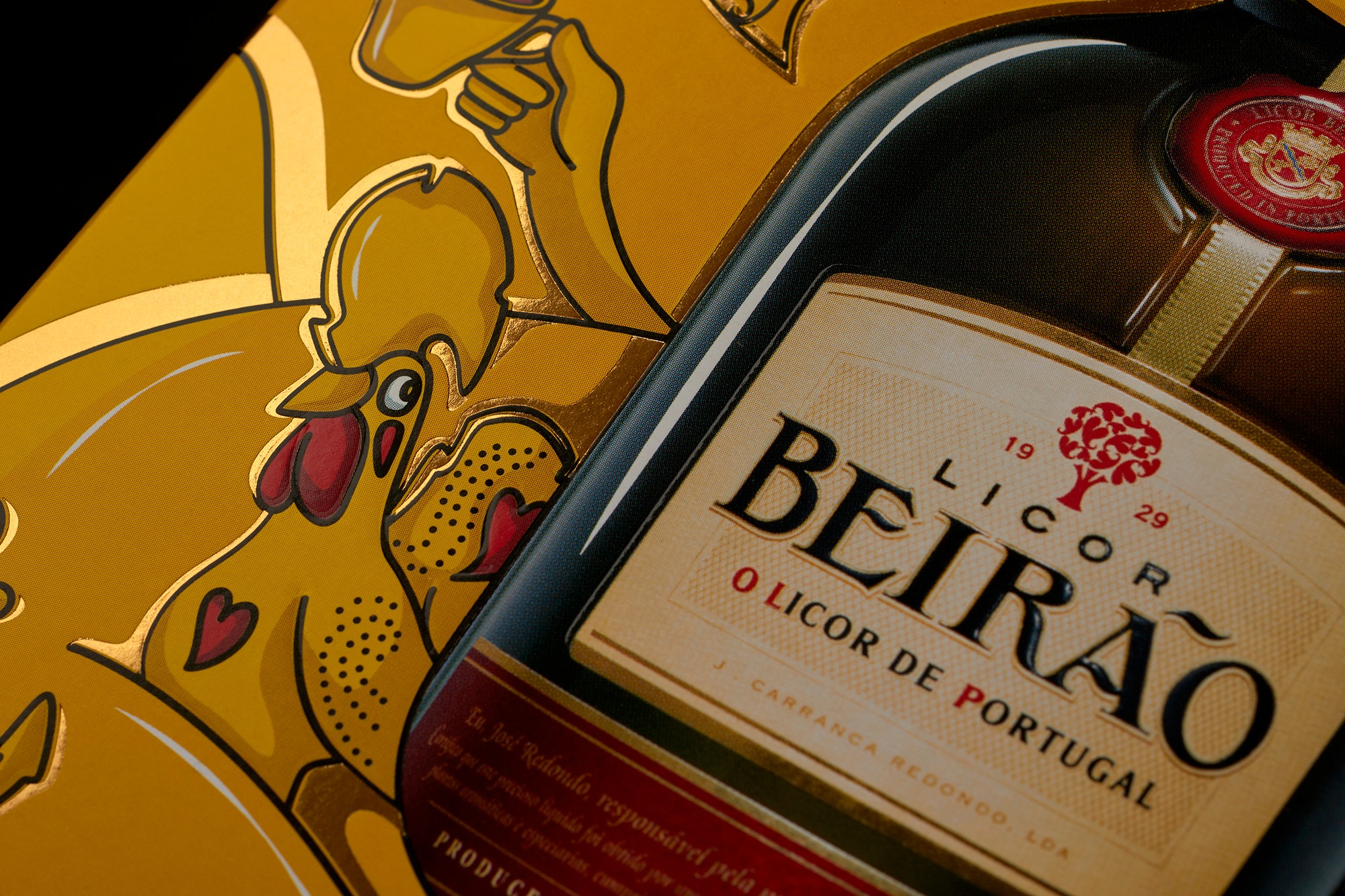
The two packages count with original illustrations, exclusively created by the agency of Leça da Palmeira to the “Liquor of Portugal”, allusive to the Portuguese feeling always defended by the brand, as well as expressions of celebration that are, simultaneously, an invitation to enjoy this drink with more than 90 years, that keeps, until today, its formula preserved within the Redondo family.
The finishing selected by Omdesign to decorate these packaging, as the foil stamping, in gold or silver, and the relief, make them even more special and appellative, an excellent option to offer to those you like the most.

CREDIT
- Agency/Creative: Omdesign
- Article Title: The Portuguese Feeling of Licor Beirão Illustrated by Omdesign
- Organisation/Entity: Agency, Published Commercial Design
- Project Type: Packaging
- Agency/Creative Country: Portugal
- Market Region: Multiple Regions
- Project Deliverables: Brand Redesign, Brand Strategy, Graphic Design, Illustration, Packaging Design, Rebranding, Research
- Format: Box, Case
- Substrate: Glass Bottle, Pulp Carton, Pulp Paper


