


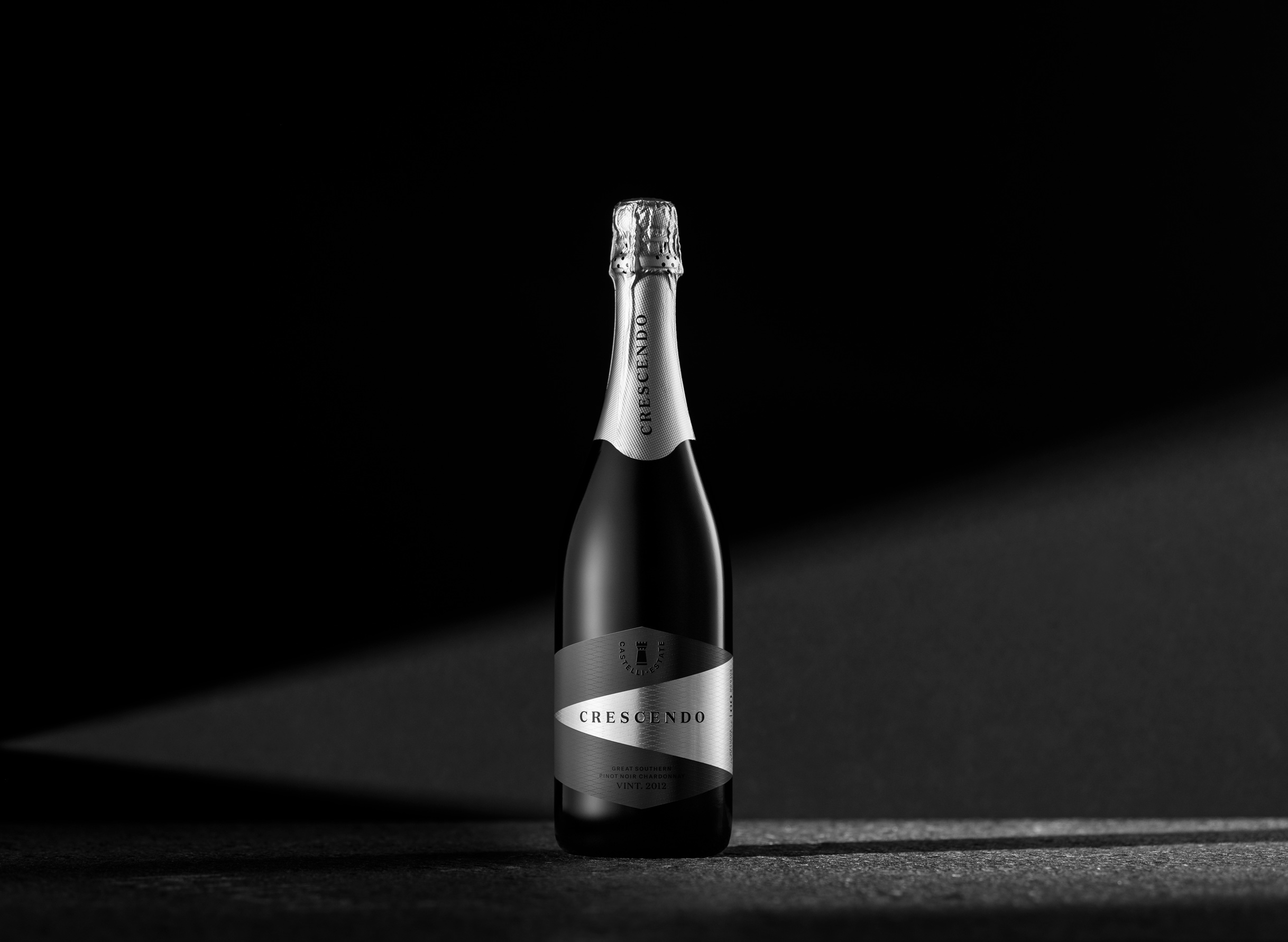
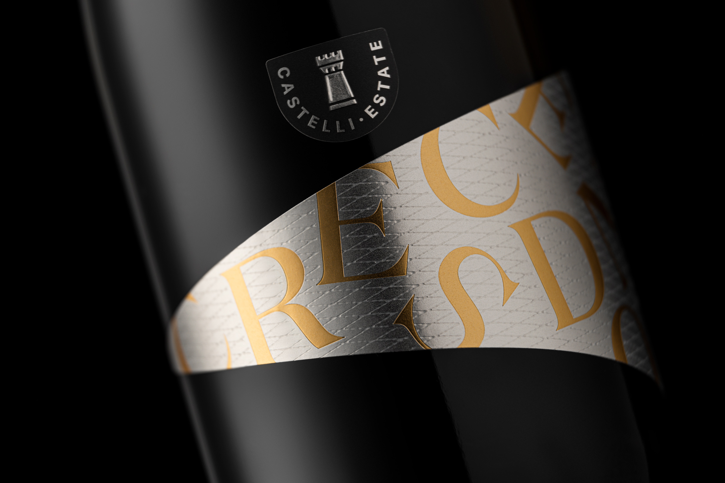
Castelli Wines decided that their ‘Checkmate’ sparkling wine needed repositioning in a space that was more premium and exciting. A name change to ‘Crescendo’ was the first stage to be followed by a completely new packaging design—with no reference to the previous Checkmate.
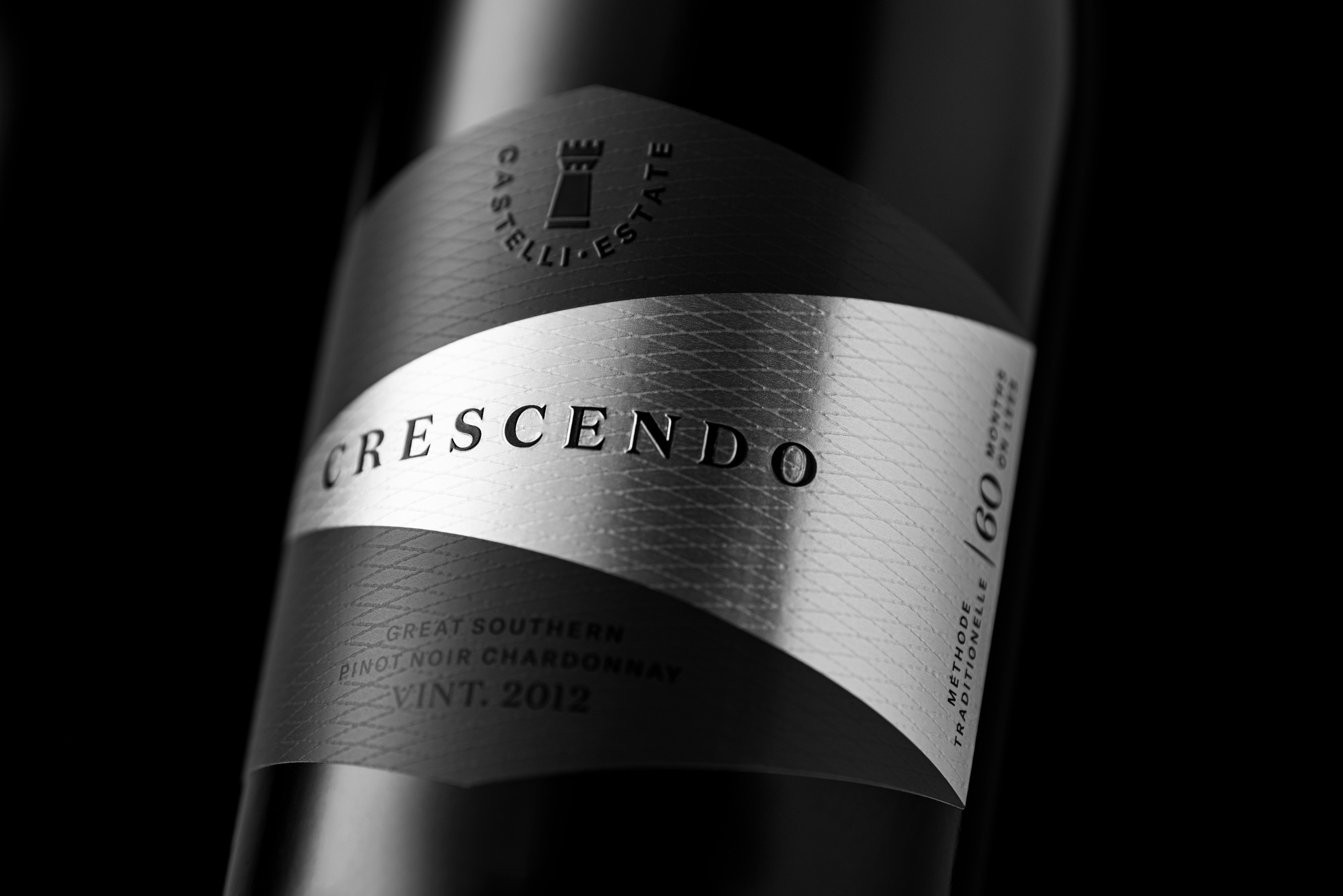
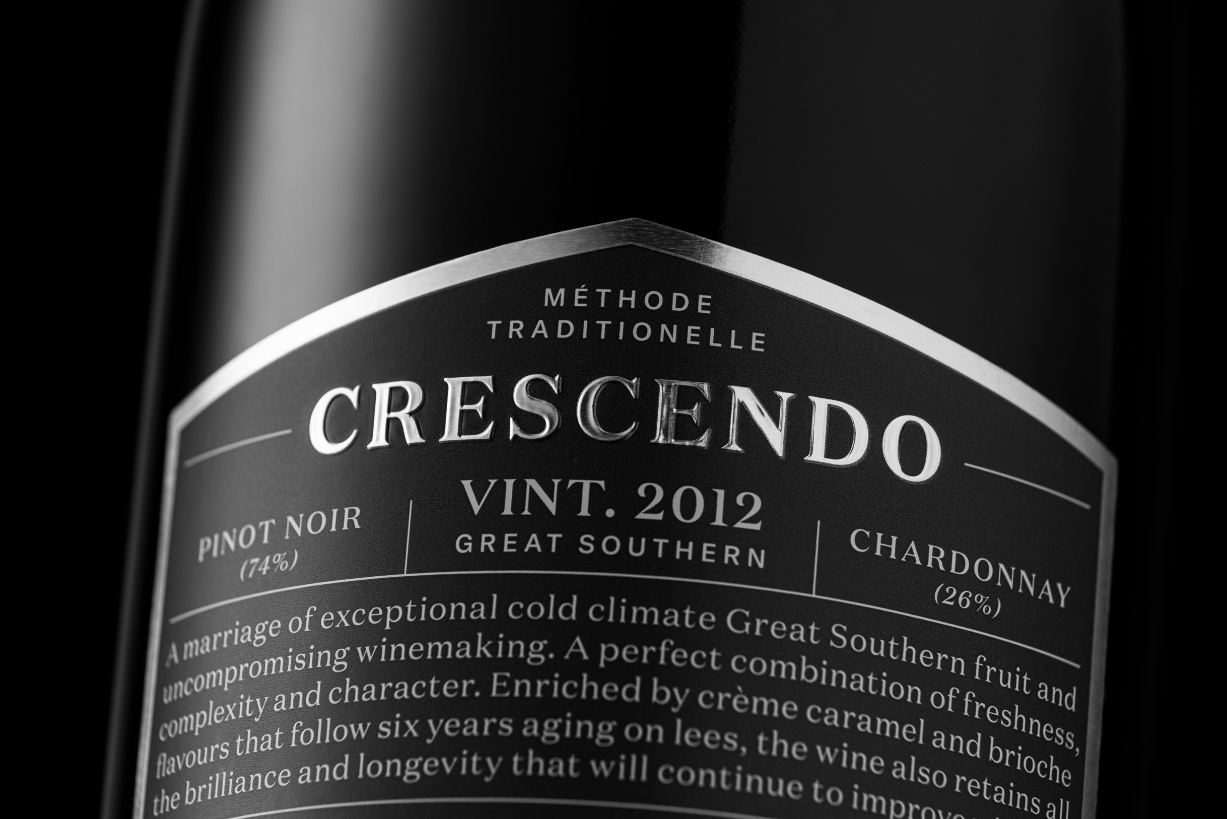
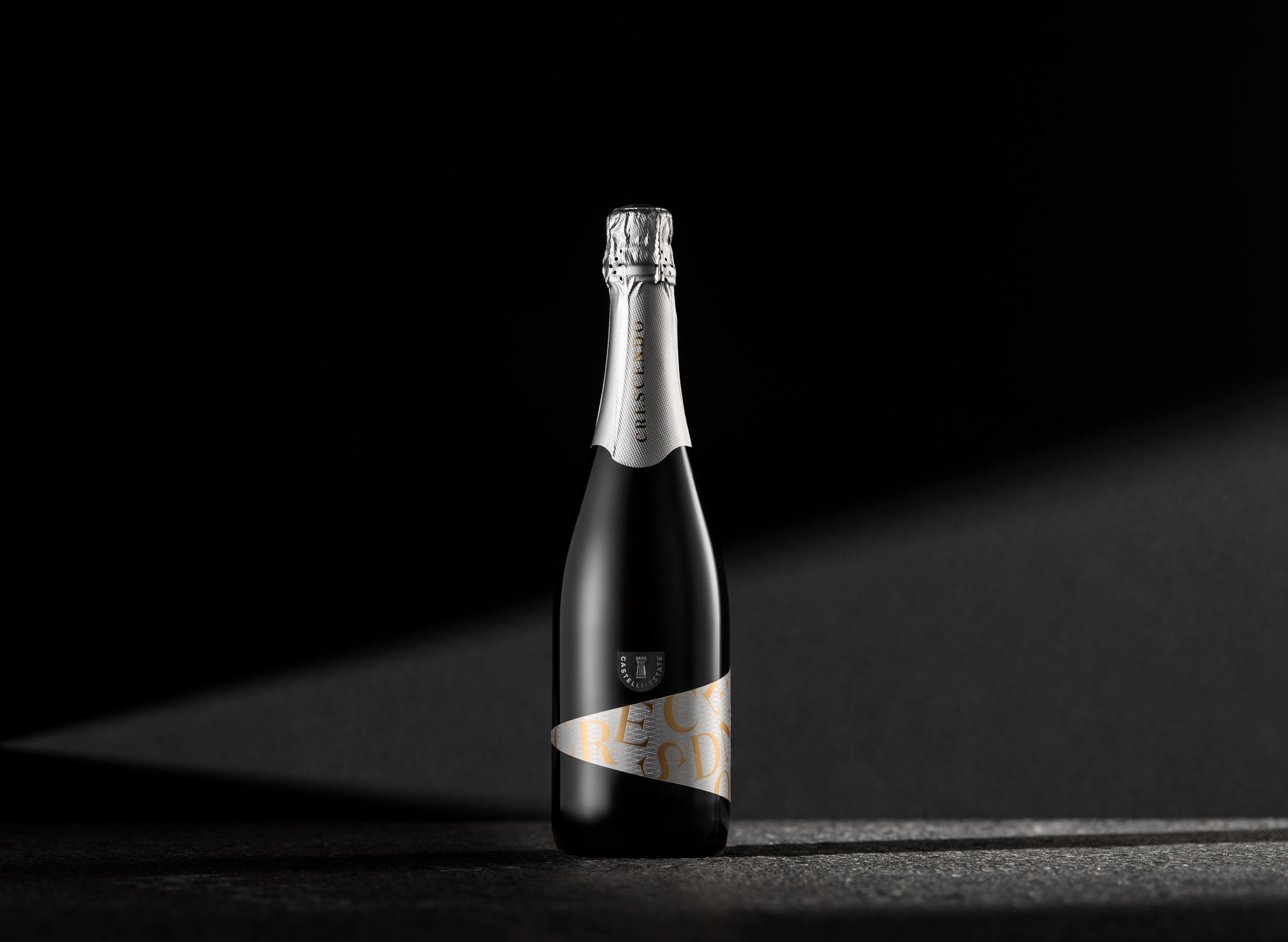
‘Crescendo’ is an evocative name describing something getting louder, or greater in intensity, over time. And thus, the label shape follows the form of the crescendo, creating a unique and memorable asymmetrical application. Large, playful gold-foil typography is scattered within the crescendo form, adding to the sense of growing excitement.
CREDIT
- Agency/Creative: Voice
- Article Title: The Peak of a Gradual Increase
- Organisation/Entity: Agency, Published Commercial Design
- Project Type: Packaging
- Agency/Creative Country: Australia
- Market Region: Multiple Regions
- Project Deliverables: Brand Creation, Graphic Design, Illustration, Packaging Design, Research
- Format: Bottle
- Substrate: Glass, Glass Bottle, Metal, Pulp Paper
FEEDBACK
Relevance: Solution/idea in relation to brand, product or service
Implementation: Attention, detailing and finishing of final solution
Presentation: Text, visualisation and quality of the presentation


