


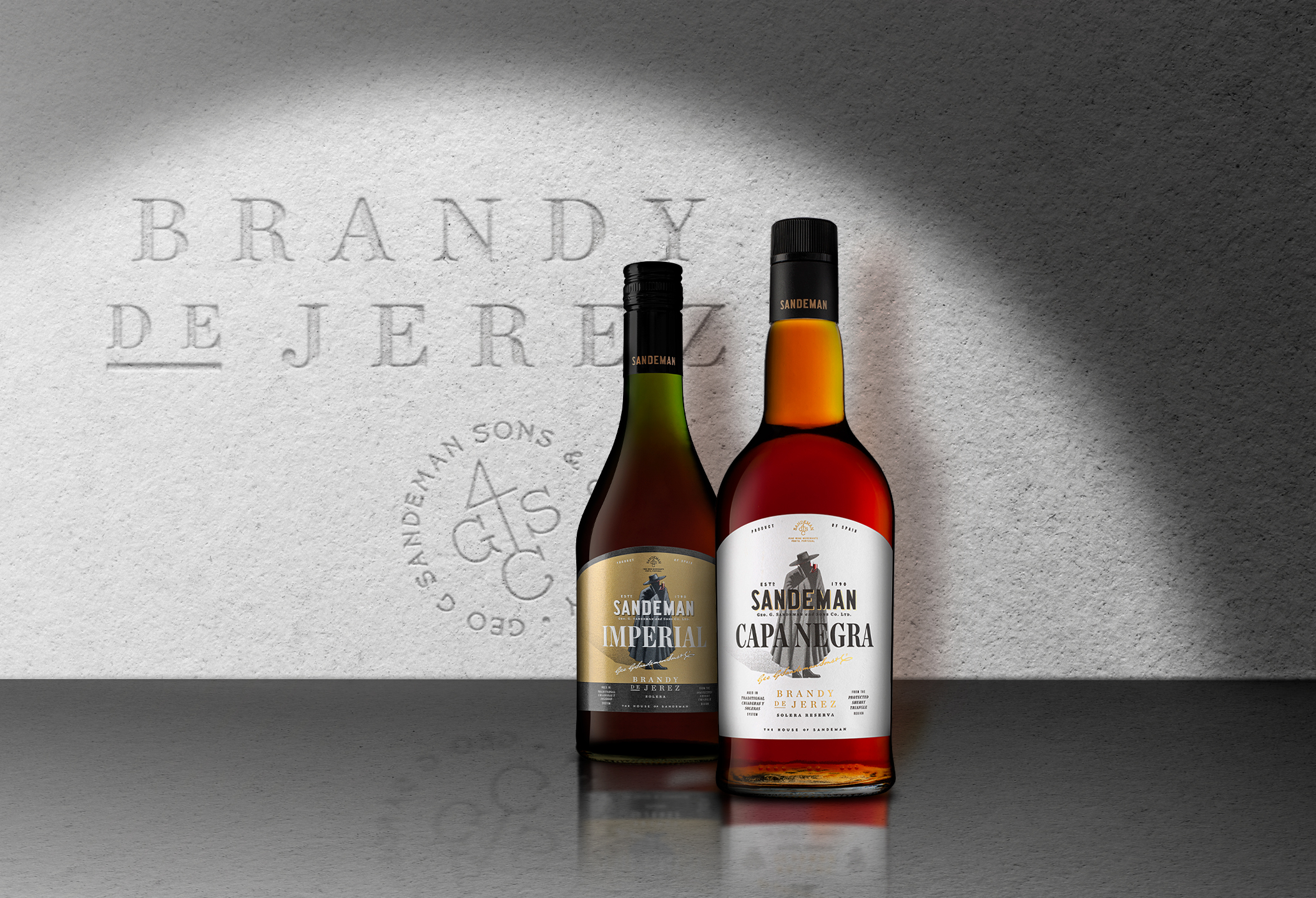
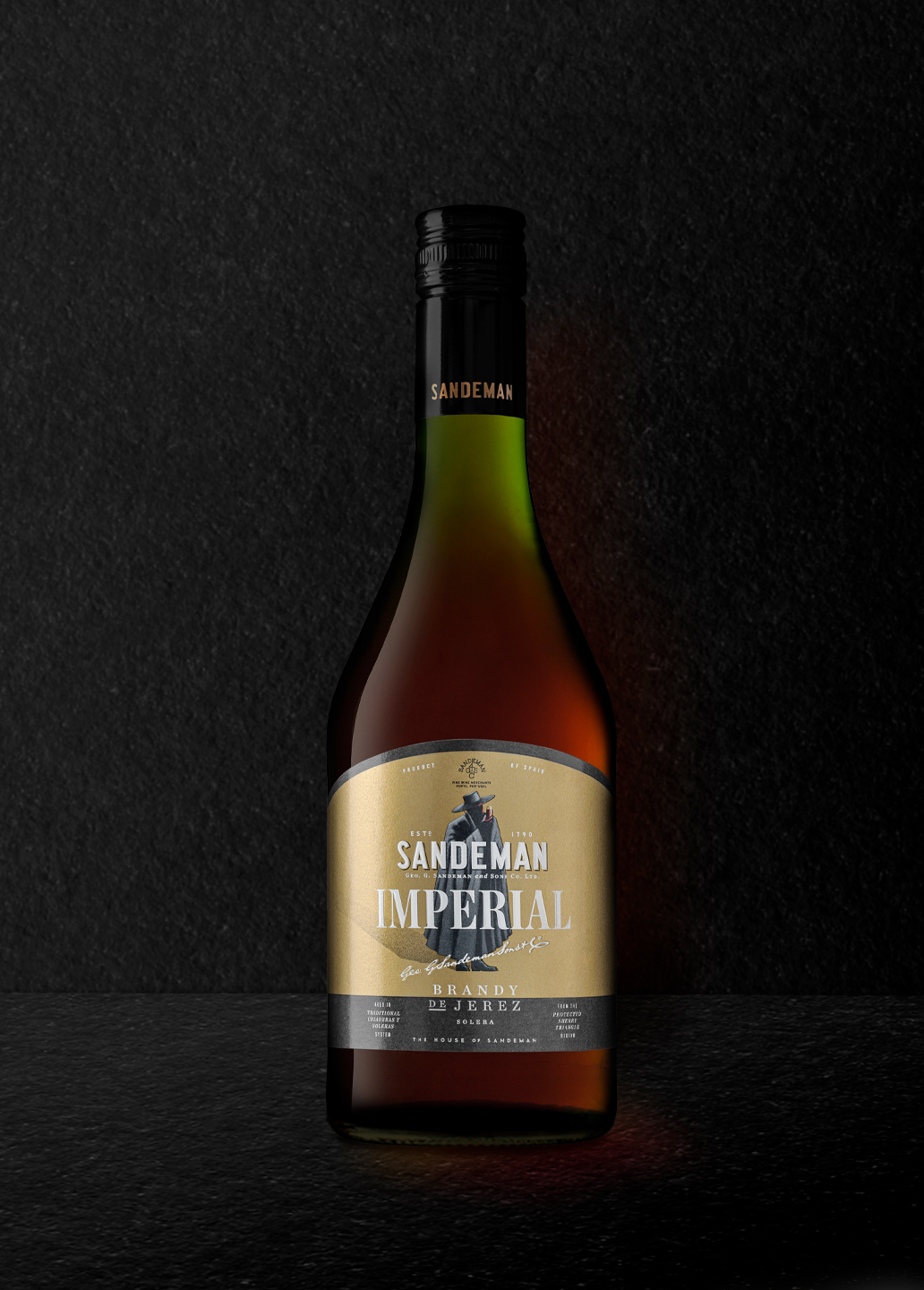
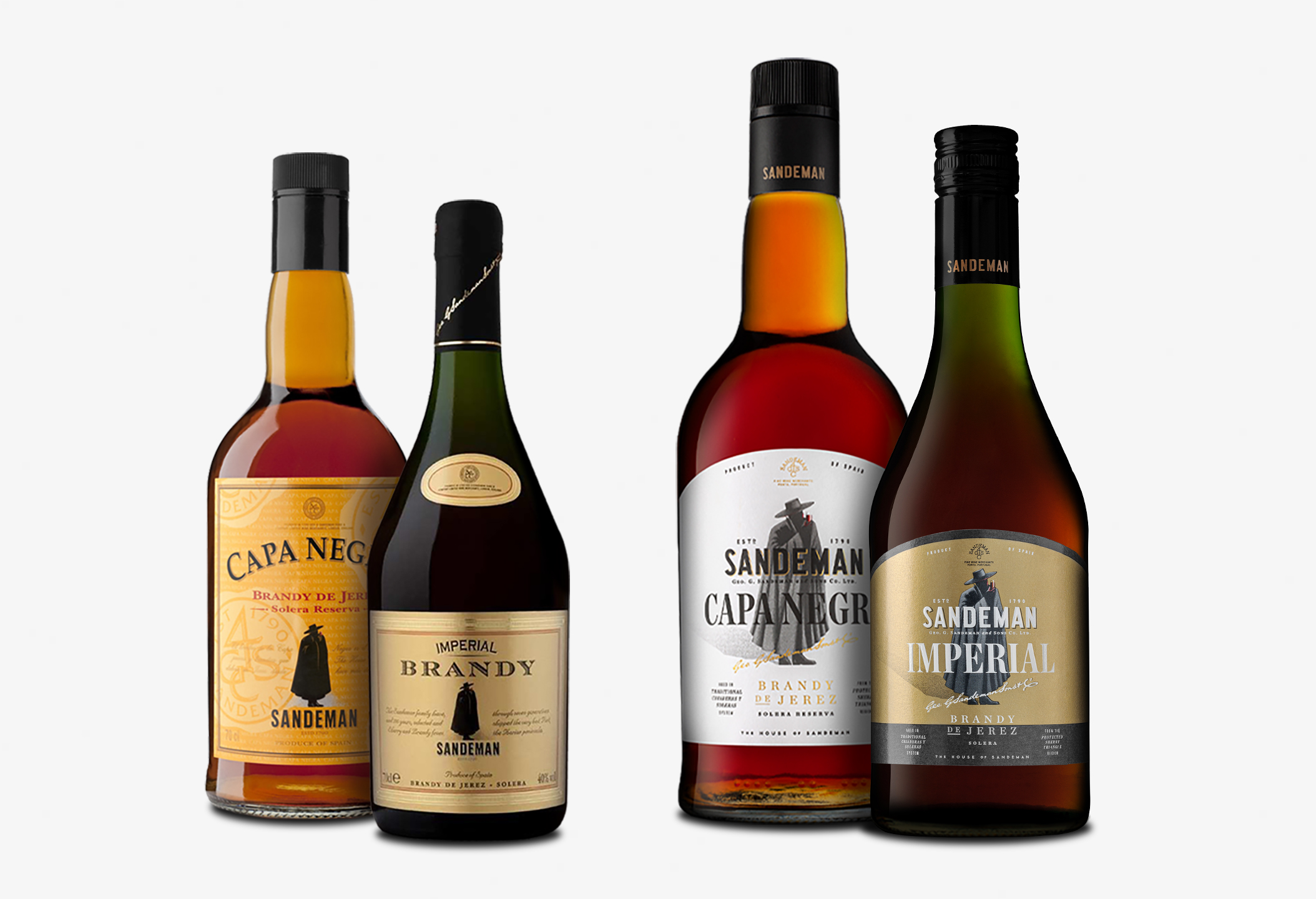
Sandeman Brandy Imperial and Brandy Capa Negra are the latest result of Volta Studio’s continued collaboration with Sandeman. They asked us for a clean and effective redesign that would lift the premium perception of these products.
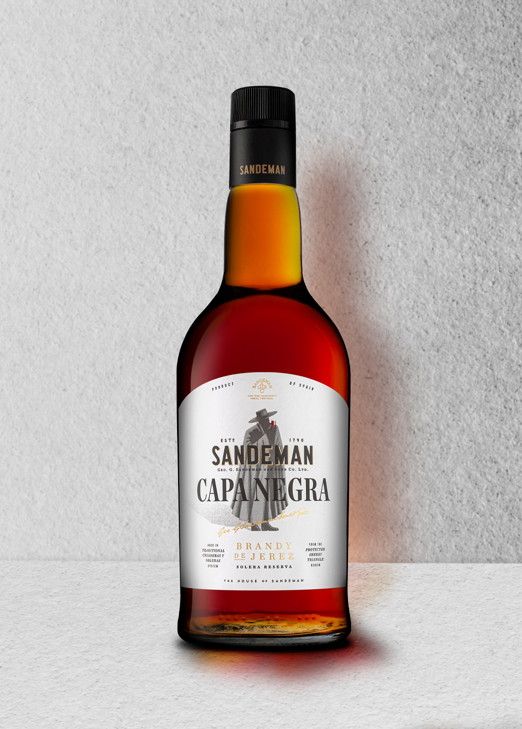
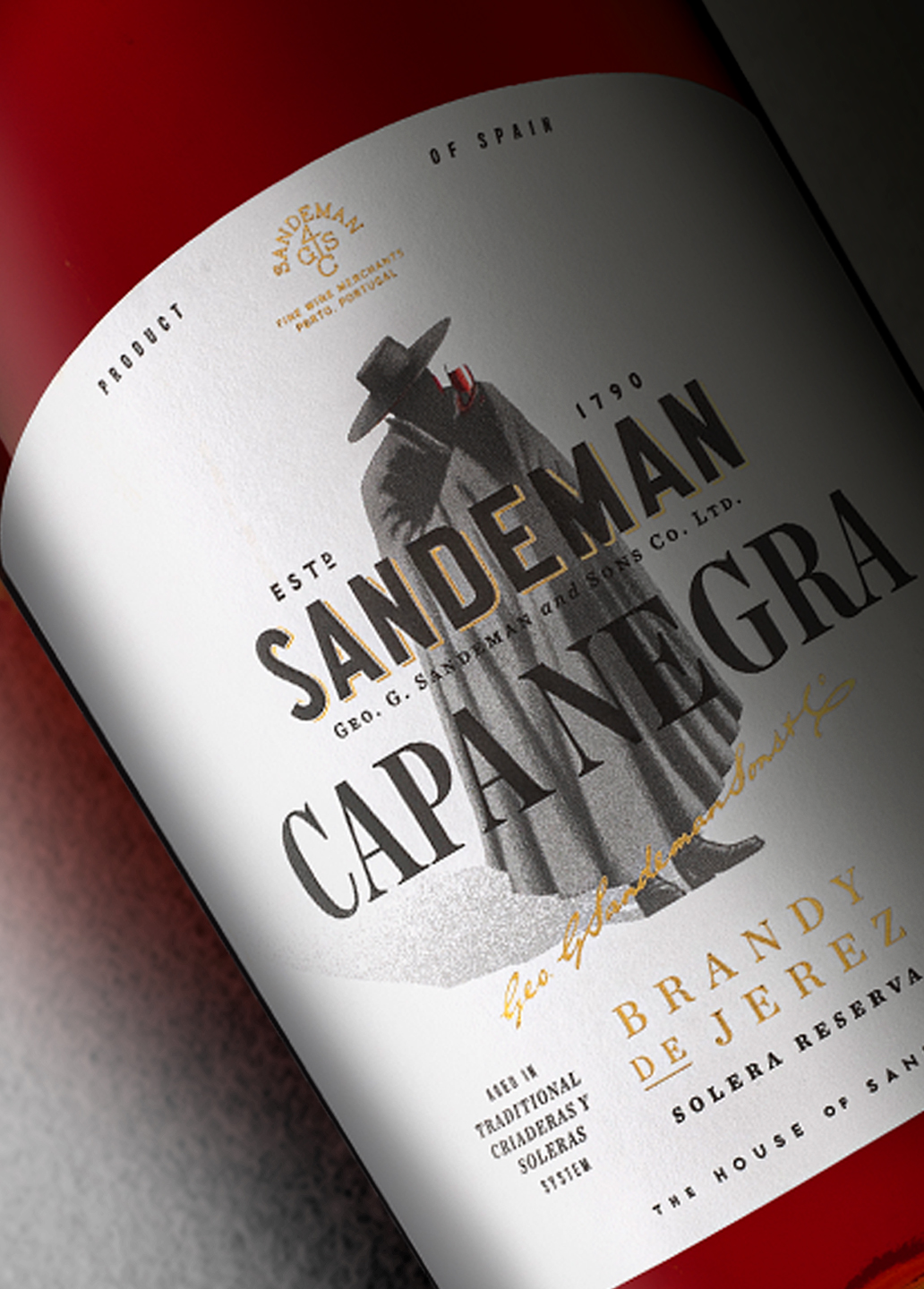
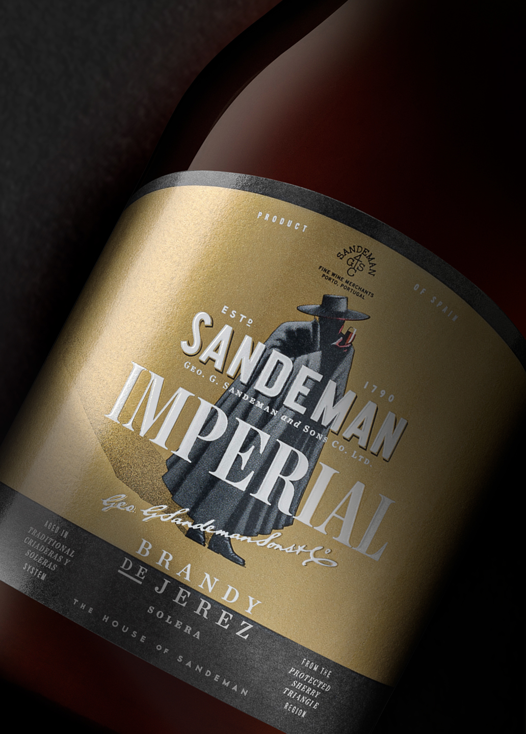
Brandy Imperial and Brandy Capa Negra are aged in the traditional Solera method in the bodegas of Jerez de la Frontera, and are the result of Sandeman’s over 200 years of experience: our design is supposed to emulate the balanced, round and full bodied style of these Brandies. We opted for an arched label shape that combines perfectly with the rounded bottles. The Don is now the label’s protagonist, set on a clean and premium background of textured white for the Brandy Capa Negra and shiny gold for the Brandy Imperial. Finally, classic typography combinations on a very balanced layout, coherent with the brand’s graphic style were the ideal choice to meet Sandeman’s premiumness requirements for this project.
CREDIT
- Agency/Creative: VOLTA Brand Shaping Studio
- Article Title: The New Sandeman Brandies by Volta Studio
- Organisation/Entity: Agency, Published Commercial Design
- Project Type: Packaging
- Agency/Creative Country: Portugal
- Market Region: Europe
- Project Deliverables: Brand Refinement, Brand World, Graphic Design, Packaging Design
- Format: Bottle
- Substrate: Glass Bottle


