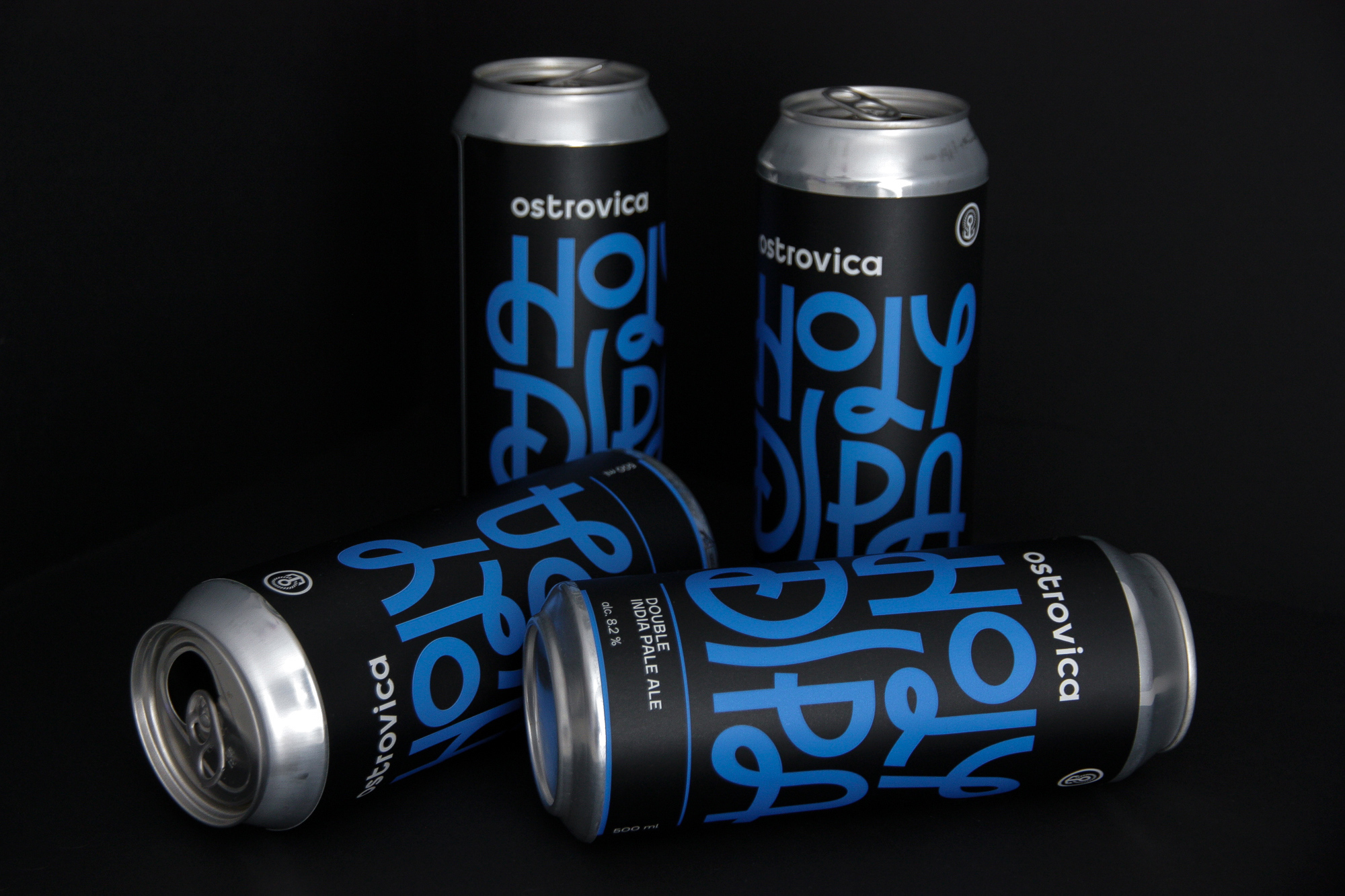
Ostrovica is a kraft microbrewery in a small Russian town. It was founded in 2014. In 2015, the identity and labels design were developed for the very first series of beer. That’ s how the story began. With the development of the brewery, the number of beer varieties increased, and the beer types themselves became more complex and diverse. In Russia, there was a craft beer revolution.
There came a moment when the developed design system could no longer manage with the identification of new varieties, and it became difficult to distinguish them from those which already produced. Moreover, in 2018, the brewery switched to bottling beer in cans. By that time, about 50 labels had been issued.
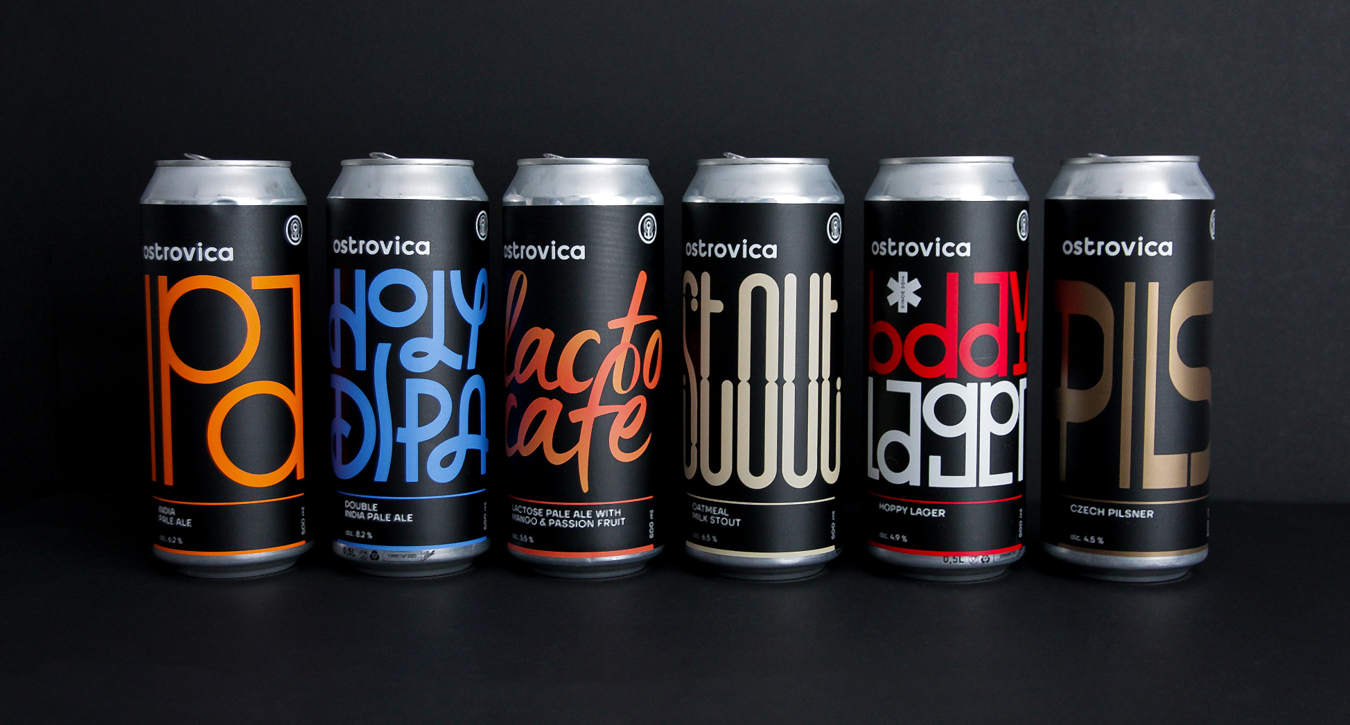
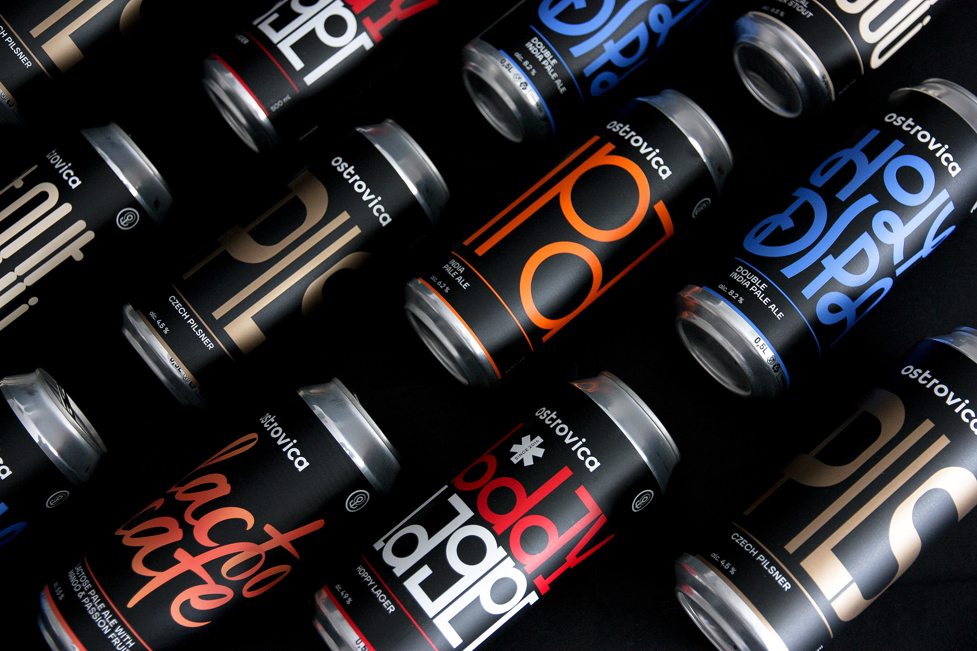
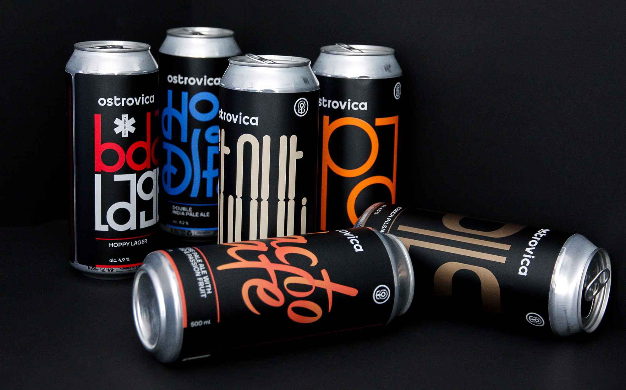
By that time the positioning of the brewery has changed and we realized the need to redesign the identity and packaging. The task was to divide the basic line of 6 varieties that came out constantly and new releases, collaborations and experiments due to different labels.
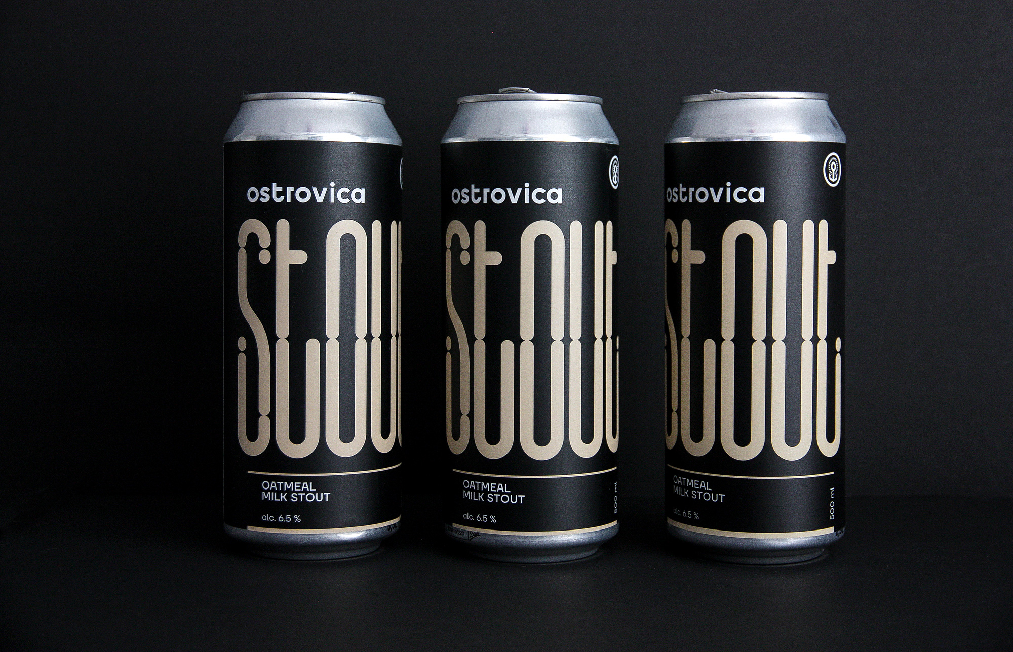
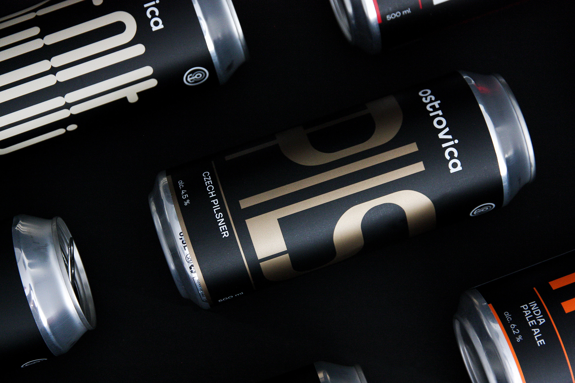
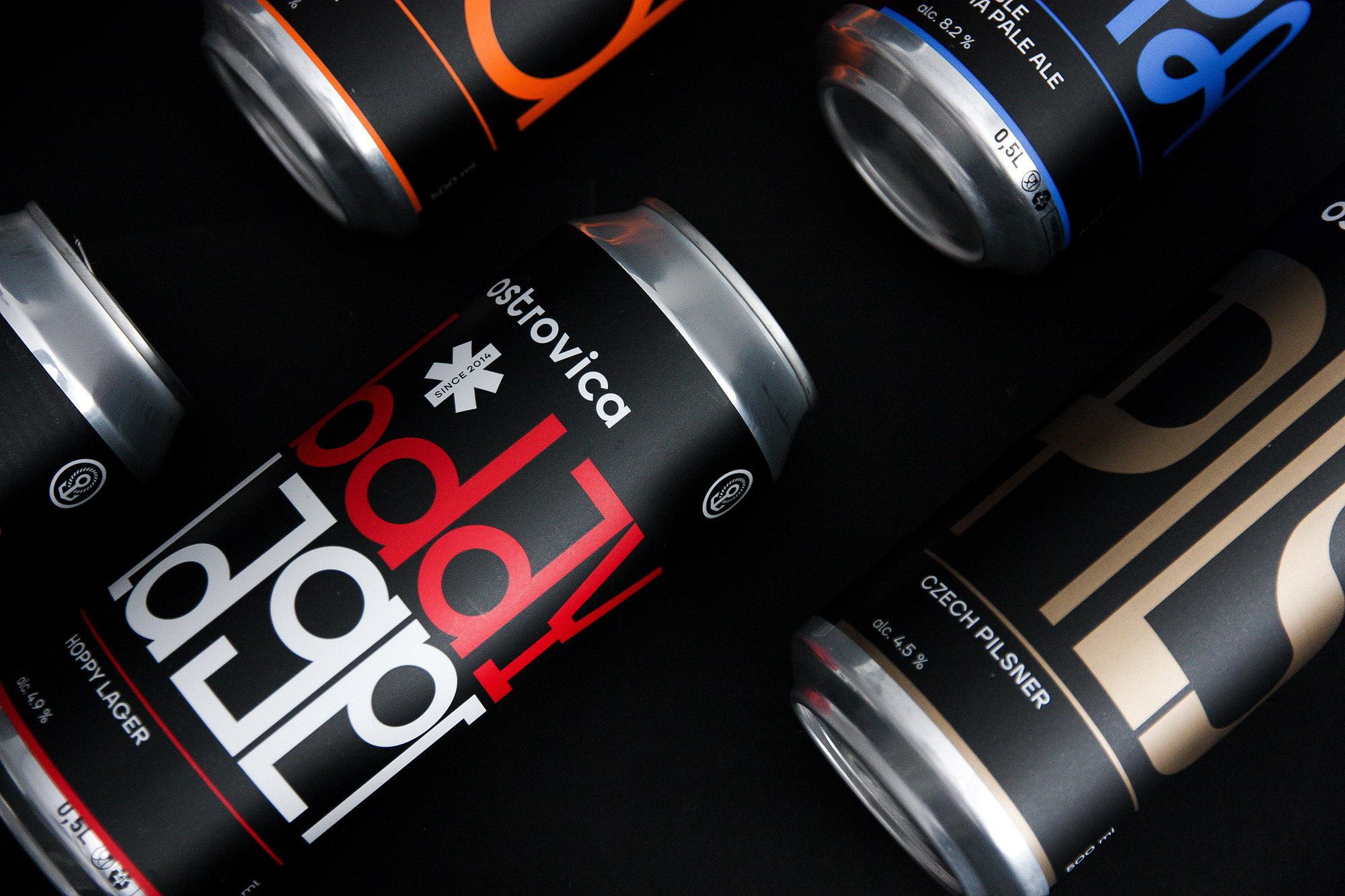
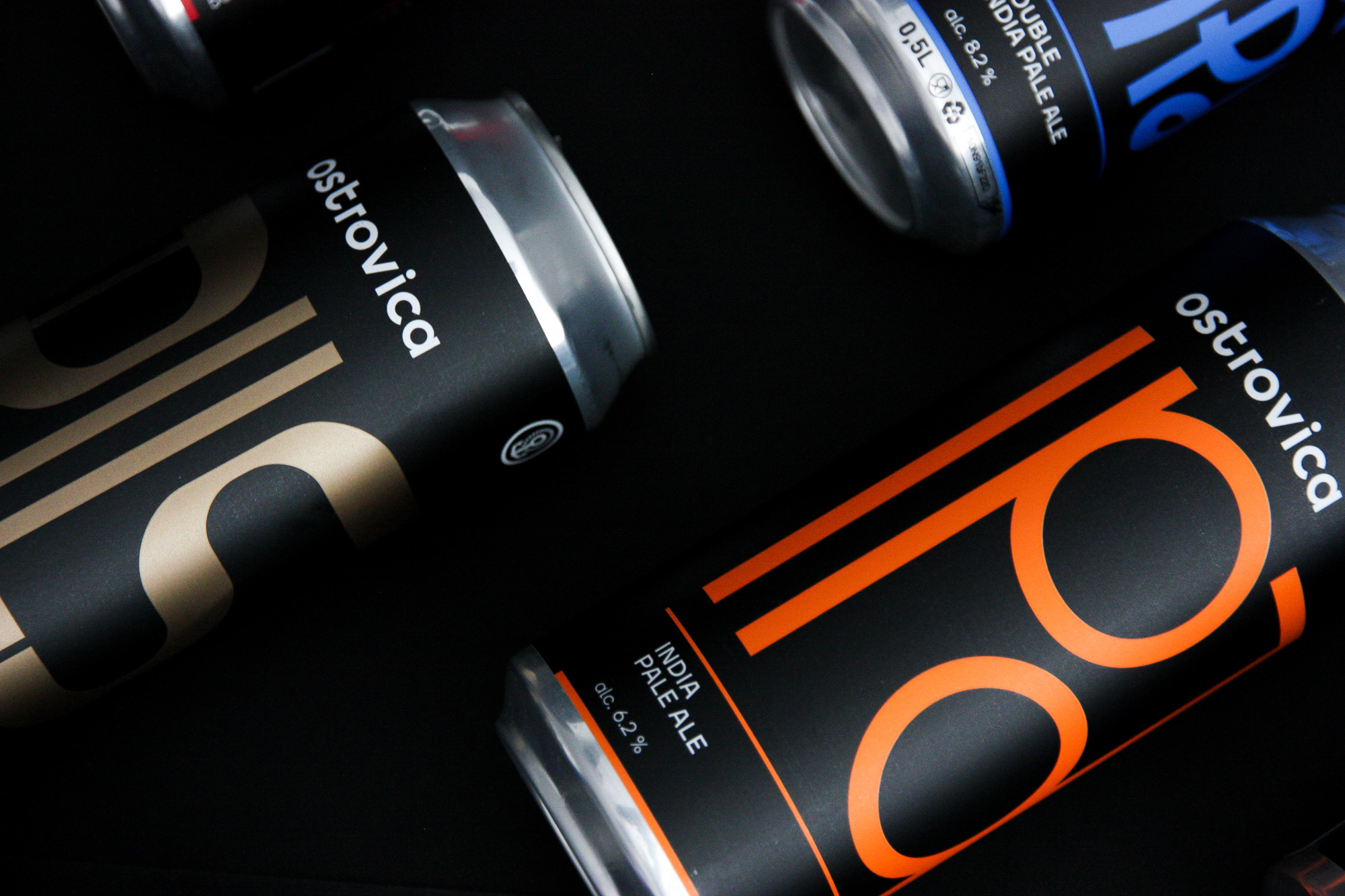
For the basic varieties was developed a label design based on lettering reflecting the character of the beer. The color scheme remained consistent, but the number of colors was limited, which allowed printing labels in 2 Pantone colors.
CREDIT
- Agency/Creative: Daniil Shumakov
- Article Title: The New Identity and Label Design of the Ostroviсa Brewery
- Organisation/Entity: Freelance, Published Commercial Design
- Project Type: Packaging
- Agency/Creative Country: Russia
- Market Region: Europe
- Project Deliverables: Brand Architecture, Graphic Design, Packaging Design, Rebranding
- Format: Can
- Substrate: Metal


