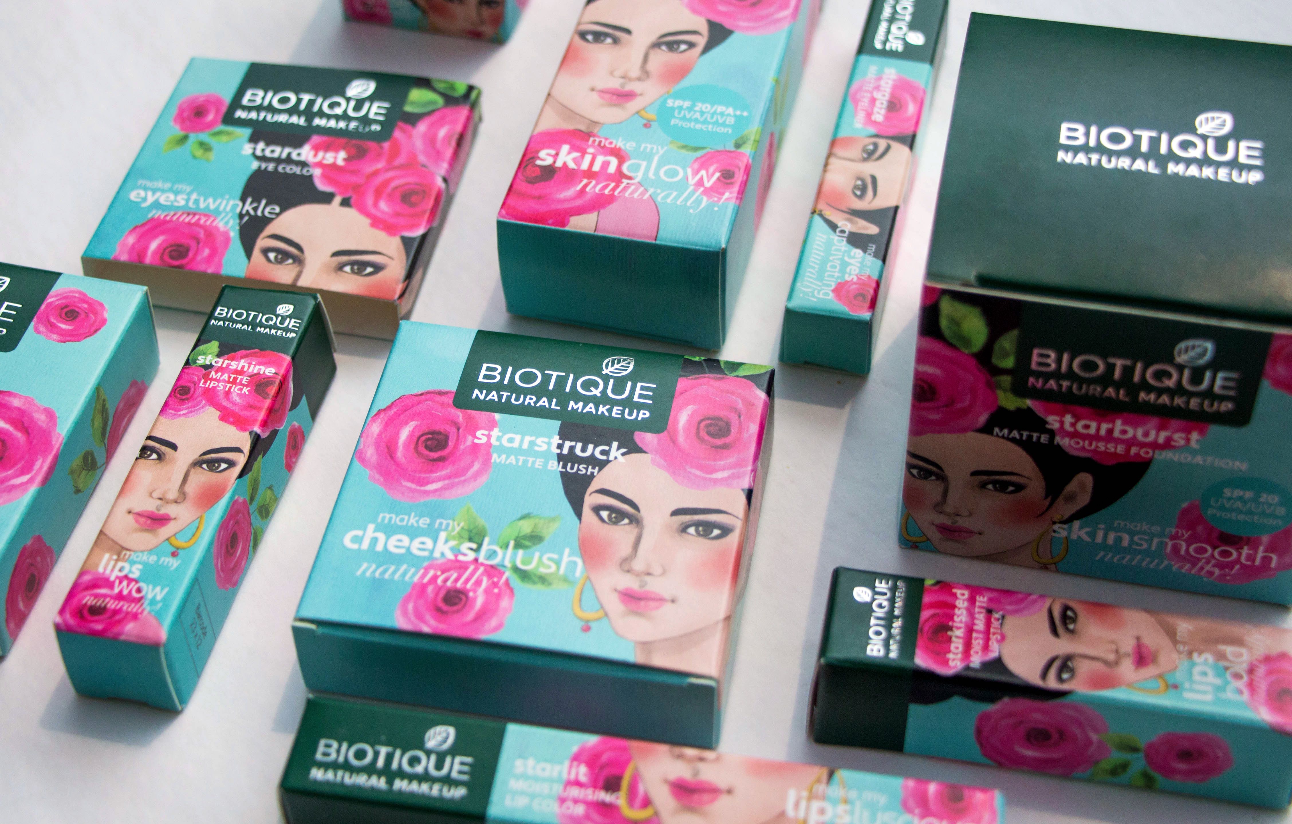
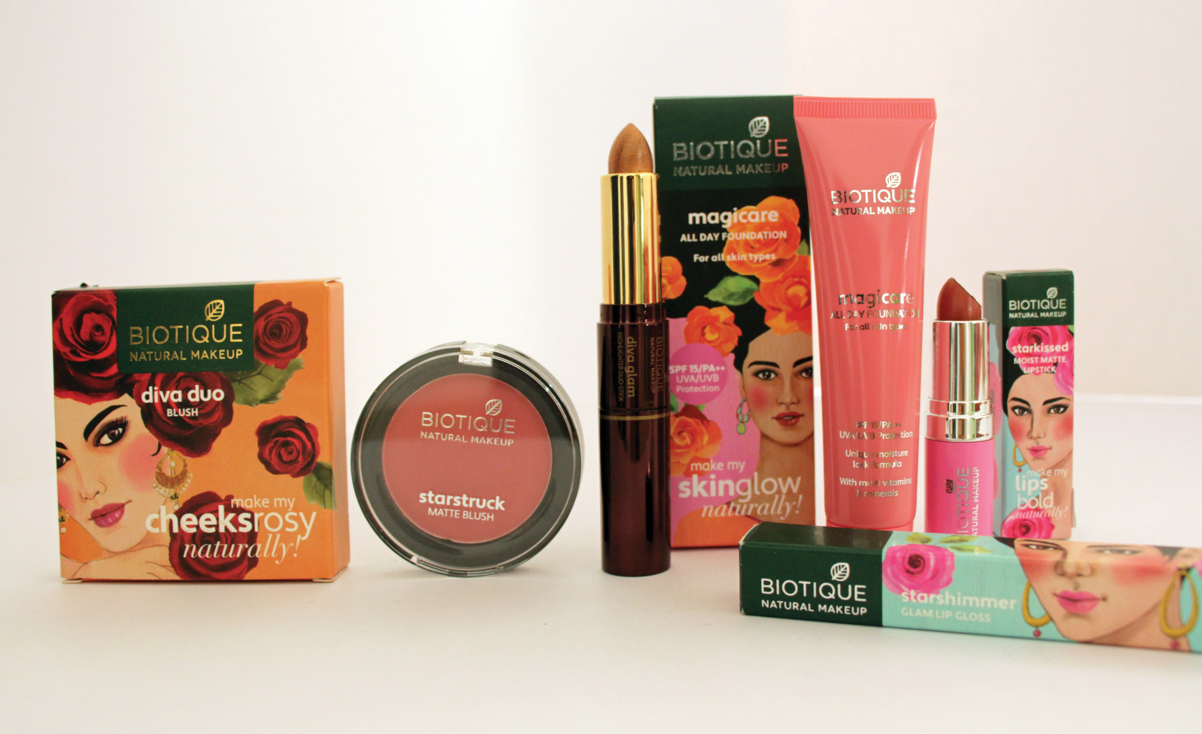
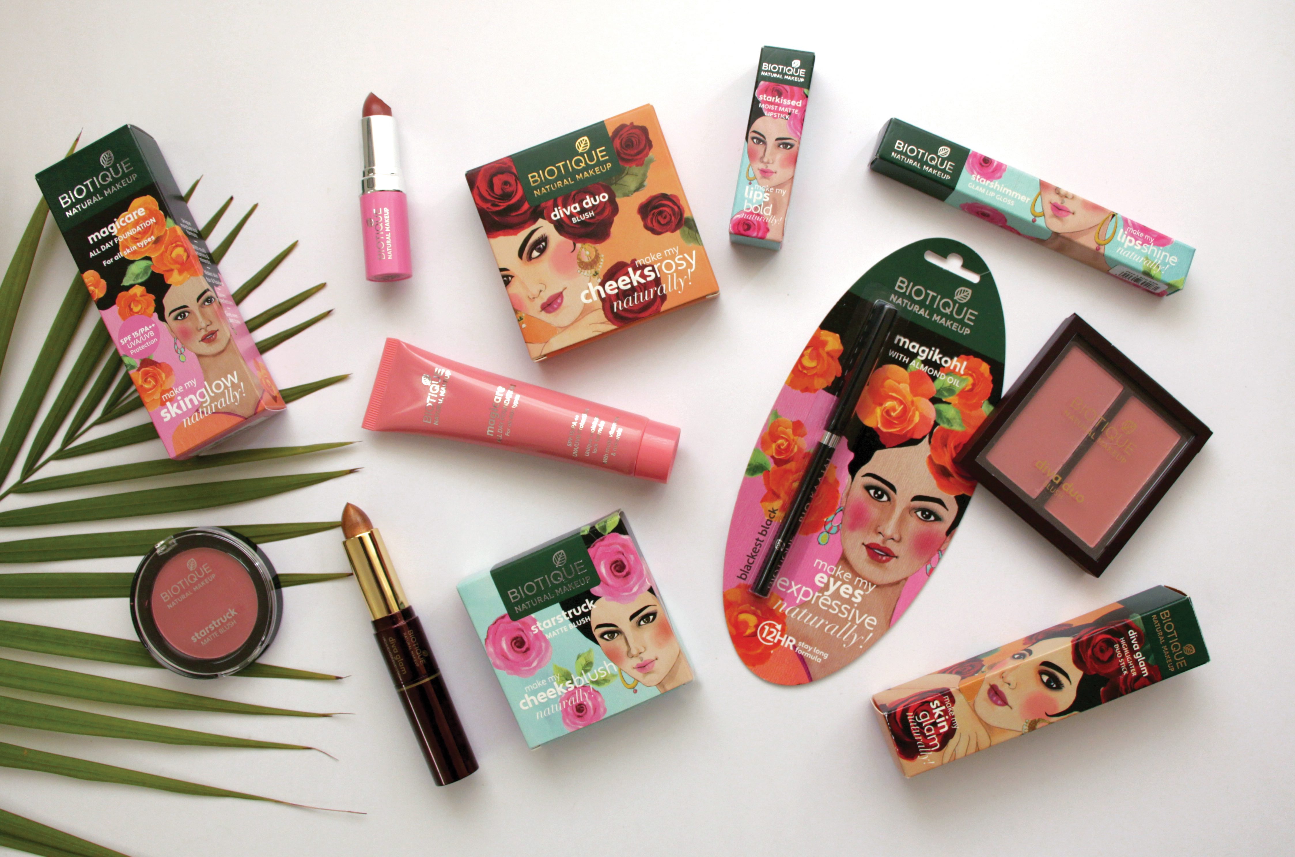
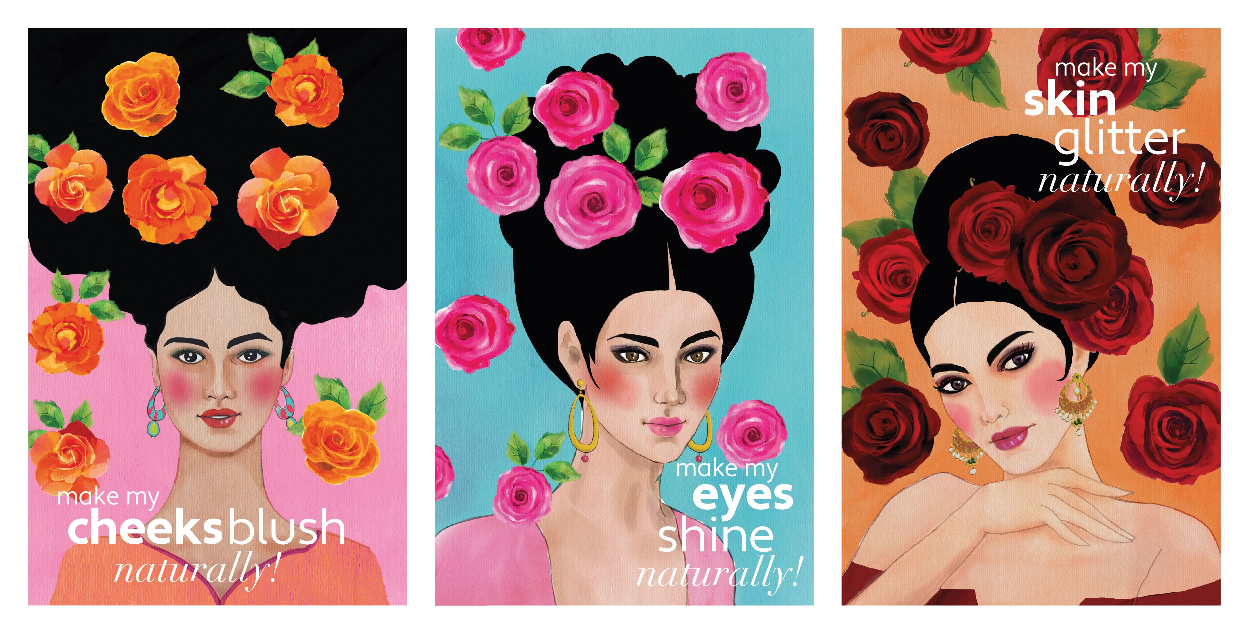
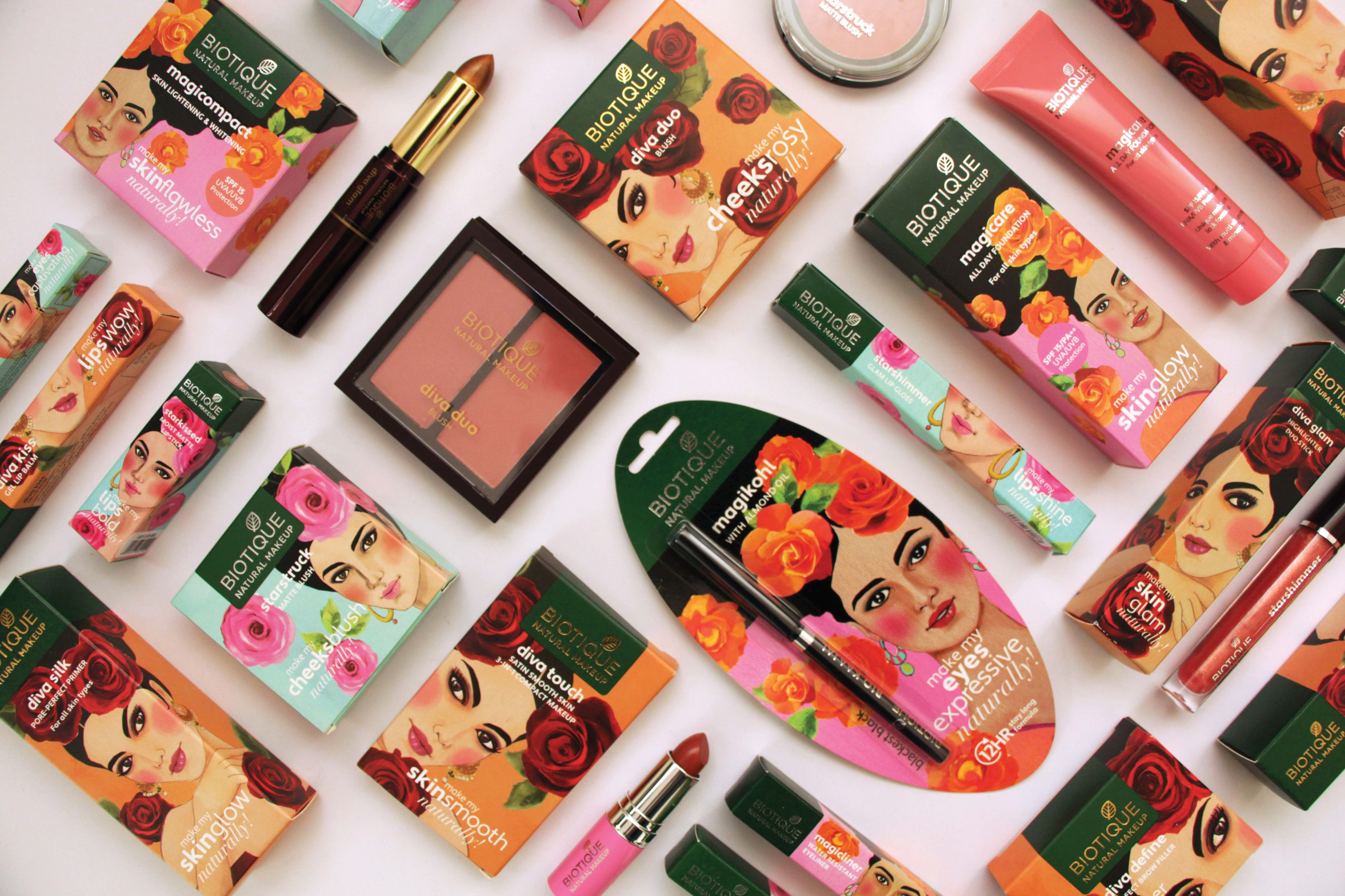
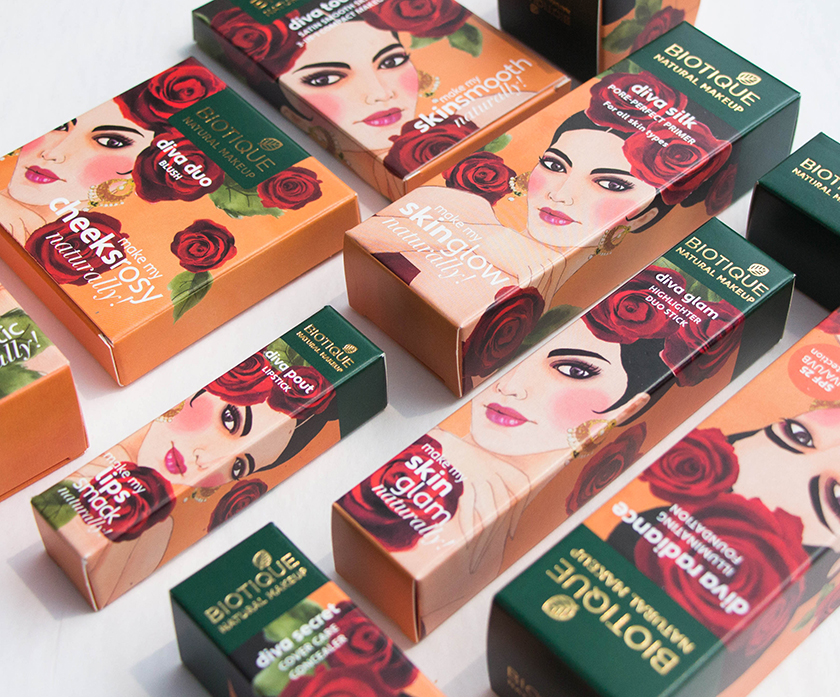
To develop the brand strategy and packaging identity for a new range of colour cosmetics by Biotique, an organic and ayurvedic skin and hair care company in India. The primary task was to highlight the natural story of the brand in the cosmetic packaging. We designed the face of the brand for Biotique’s entry into the cosmetic market. Keeping ‘natural’ as the primary message to be communicated, a distinct visual language was created using watercolour illustrations of exotic women as the dominant visual on all the packaging. The three price ranges were colour coded in pink, blue and orange, to distinguish them clearly. The unique design approach, vibrant graphics and colours made Biotique colour cosmetics stand out in a cluttered retail environment. The ‘natural’ story and the aspirational value was embedded boldly into the brand language.
CREDIT
- Agency/Creative: GCD STUDIO
- Article Title: The New Face of Biotique Colour Cosmetics by GCD Studio
- Organisation/Entity: Agency, Published Commercial Design
- Project Type: Packaging
- Agency/Creative Country: India
- Market Region: Asia
- Project Deliverables: Brand Architecture, Brand Strategy, Identity System, Illustration, Packaging Design, Product Naming, Retail Brand Design, Tone of Voice
- Format: Blister-Pack, Box, Jar, Tube
- Substrate: Plastic


