


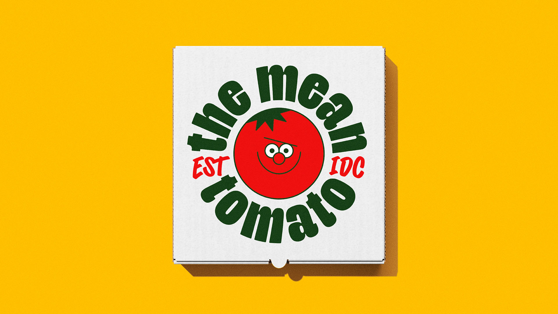
The take-out pizza category is an extremely crowded one. Pretty much everything that can be said about pizza has been said, and it’s becoming increasingly hard for brands to break through the cheesy noise… Enter The Mean Tomato – created exclusively for delivery service Gopuff.
In order to stand out, we knew we needed to create a pizza brand that acted a little differently. So, although this brand leans into a lot of the classic NY pizzeria tropes, the brand mascot certainly does not. Rather than bringing yet another “Gr-r-reat” overly enthusiastic mascot into the world, we took a more unexpected approach and created one who could work a bit harder for the brand, or not, depending on how you look at it.
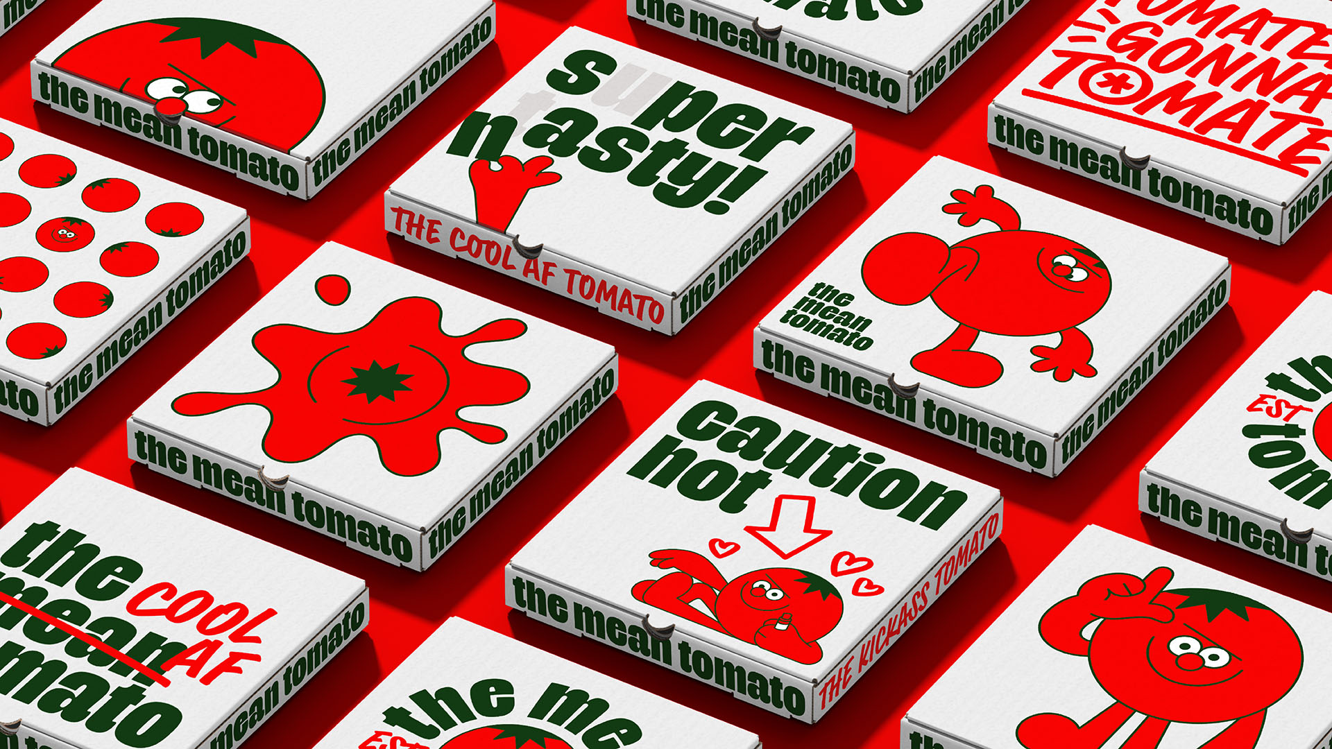
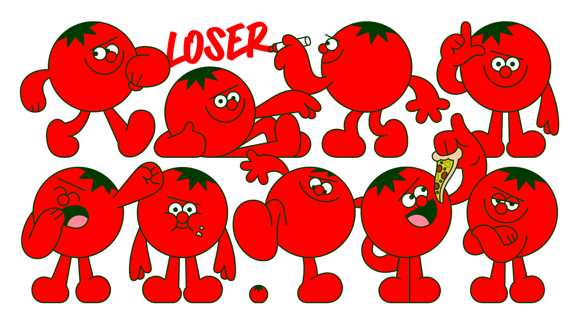
Put simply, this mascot is less of a sidekick and more of a sided*ck. He’s a native New Yorker – lovably mean – who exists for two reasons: to eat pizza, and to ruin as many brand touchpoints as is physically possible for a cartoon tomato. Essentially, he’s a catalyst for humour and storytelling – allowing the brand to have a dialogue with itself, or with the consumer – calling out BS where he sees it, and delivering something that everyone is craving these days: realness. Whichever way you look at it, he’s one hell of a tool.
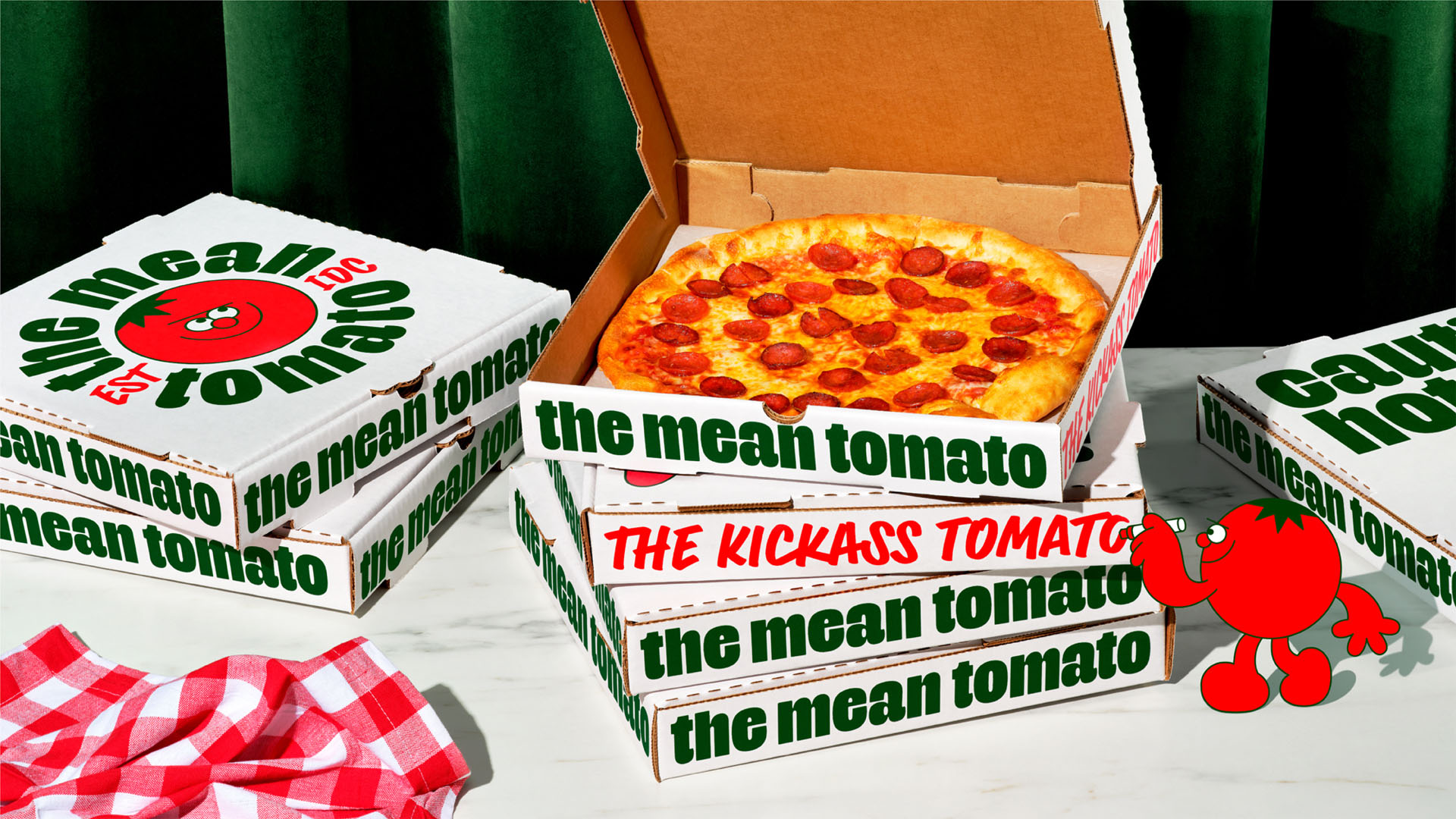
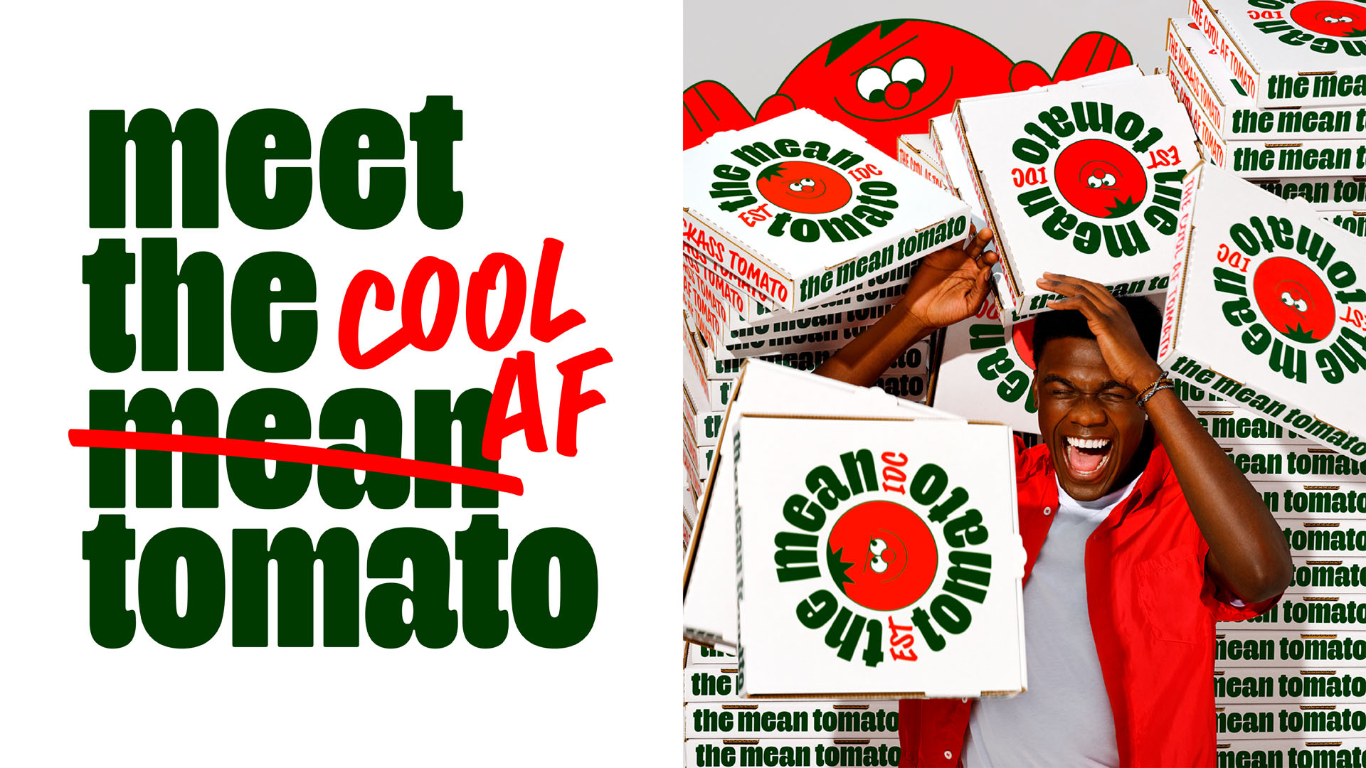
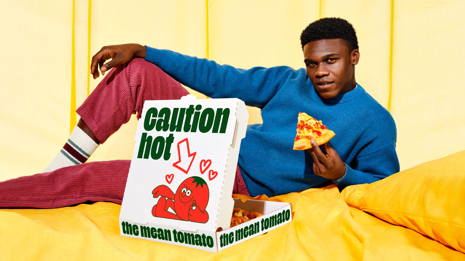
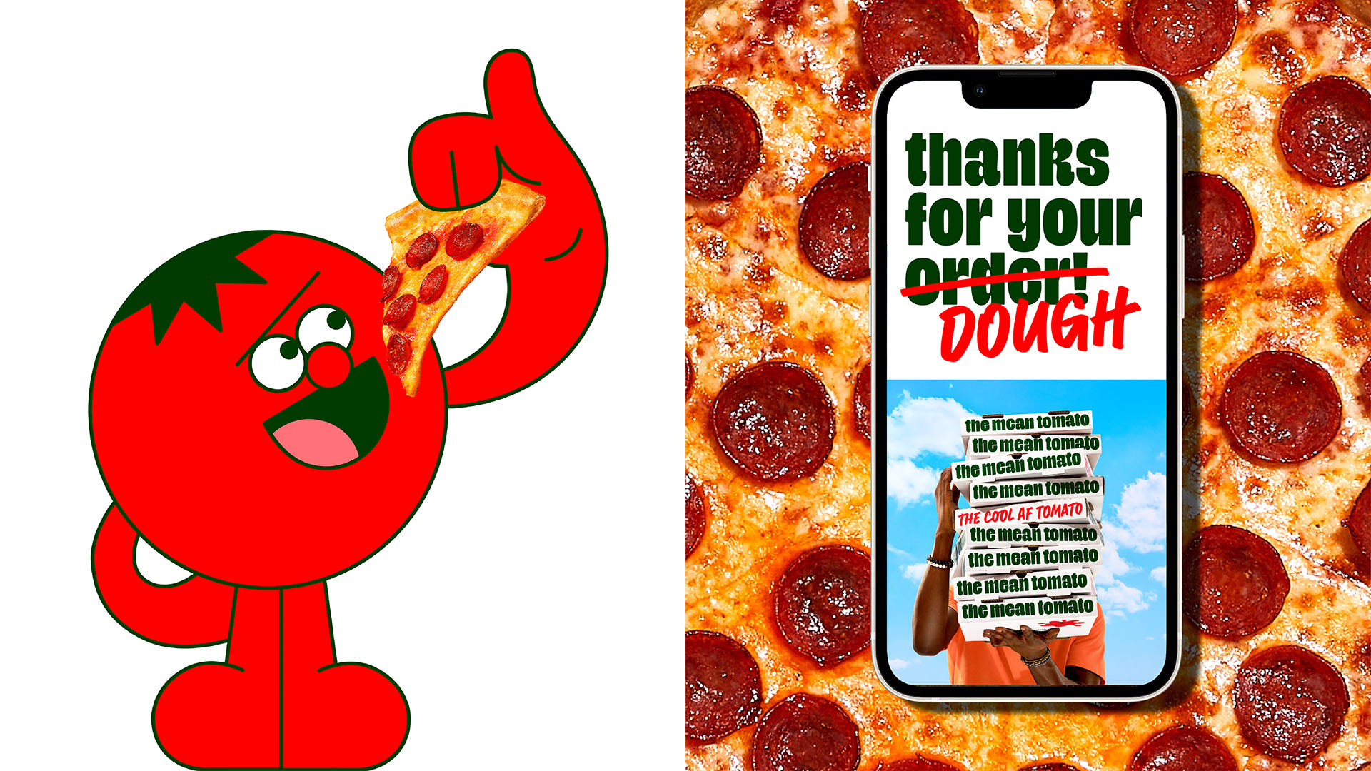
The foundations of this brand’s visual identity intentionally mimic that of your expected consumer-pleasing fast-food chain. At a glance it’s bold, colourful and inoffensive in every way. The mascot would describe this as “basic”, and that’s the whole point, because really this layer of the identity only exists to be his playground – a world where he can steal pizza, edit brand messaging, and show-off at every possible opportunity. The result of this personality-clash is particularly striking on the series of vandalised pizza boxes – each with the intention of acting more like an attention-grabbing social post than a piece of packaging. The boxes will be released periodically to keep the brand as fresh as the pizza is.
This ‘paint the town red’ approach is what makes The Mean Tomato’s visual identity so distinctive, however it meant that it was imperative for us to carefully craft each of our brand assets, and to build a fool-proof design system to implement them.
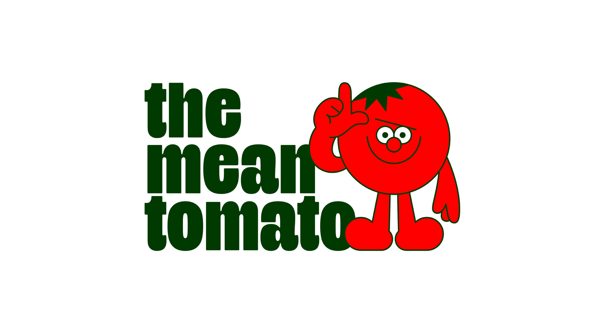
We started by commissioning the best in the cartoon business, Dan Woodger (represented by Jelly), to create a mascot with a very specific personality. Of course he needed to be mean – but he also needed to be cheeky, witty,
absolutely full of himself, but most importantly, still lovable. There is a lot of visual nuance in this mix of personality traits, and Dan expertly captured them in his delightfully squishy style. We then worked together to produce a suite of character poses and animations that could be used flexibly throughout the brand.
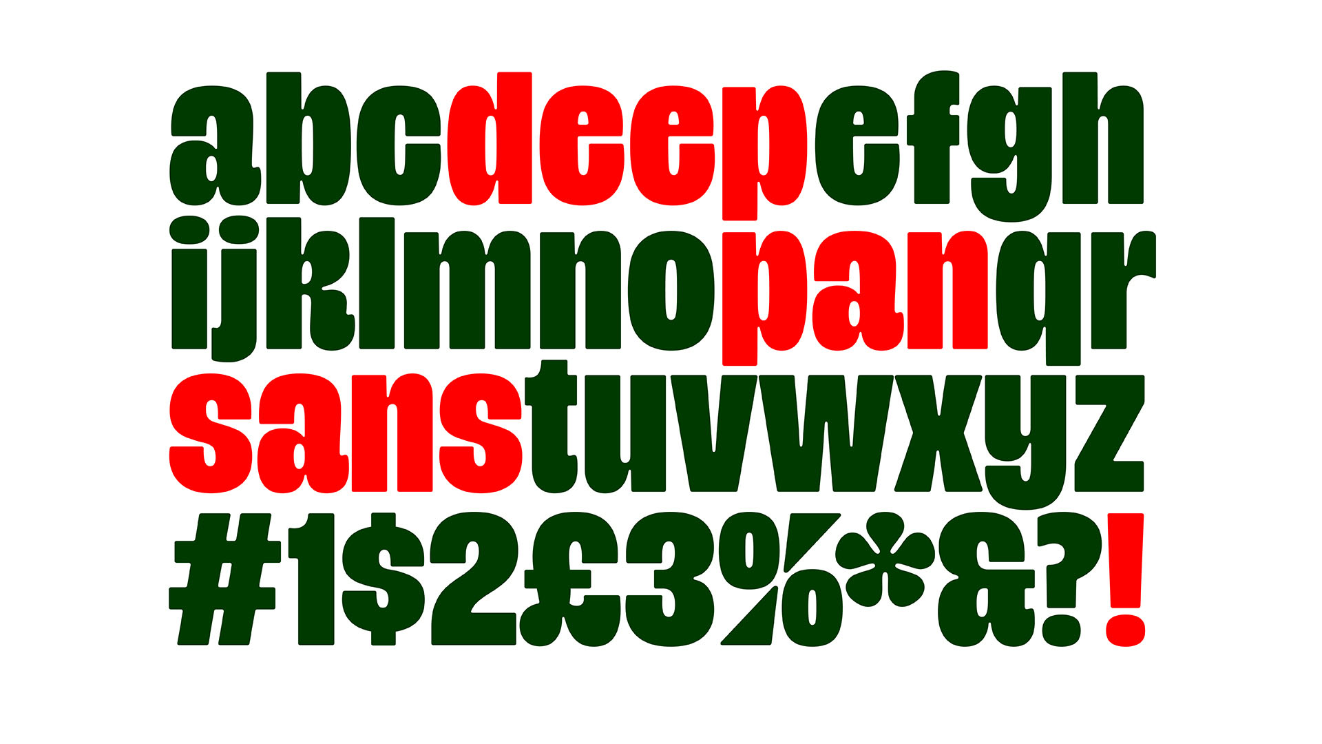
Typography also has a particularly important role to play in this identity. With two very different voices fighting for attention, we needed two typefaces that could embody their personalities: with enough visual contrast to pull them apart and let them interact with one another.
The first – Deep Pan Sans – is a deliciously chunky custom typeface (designed in collaboration with the brilliant Polytype). Its purpose is to embody the ‘brands’ tone of voice: lovably cheerful, stuffed with positivity, and blissfully unaware that it’s about to be unapologetically brandalised.
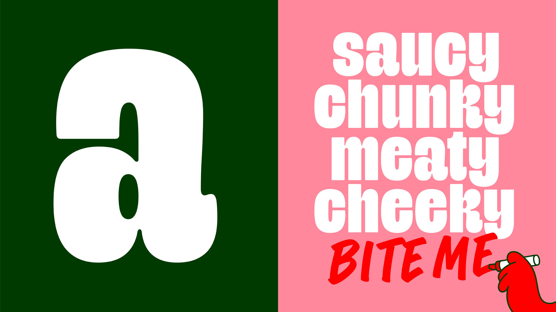
The second – Sandwich Marker Pro (by Mathias Zimmermann) – is the typographic embodiment of the tomato himself: quick, careless and full of swagger. So much so that it’s used to represent his own handwriting. With a vast array of ligatures and alternate letterforms, it always feels organic and never premeditated.
These contrasting typefaces are accompanied by an equally contrasting colour pairing of green and red, which utilise some well-known semiotics. Green is yes – red is no. Green is pass – red is fail. Green is go – red is stop. Green is brand – red is tomato. These two colours, on a fresh white back-drop, make up the brand’s core colours, referencing the classic Italiano tri-colour of the NY pizzeria: a North Star for a lot of the brand’s visual references.
The last, but certainly not least, component of this new brand is its suite of lifestyle and product photography (captured by the masterful Davide Luciano and team). With the pizza boxes acting as a strong branding device in the images, the models freely live and breathe the brand in colourful settings, as they are either terrorised by the mascot, or by absorbing some of his mean attitude themselves.
Serving up this brand has been a labour of love for so many people – collaboration at its finest. With Alec Tear at the design helm and Kuba
Wieczorek (Founder of Kuba & Friends) managing the project, the two worked closely with the team at Gopuff and enlisted the help from a talented team of independent collaborators to bring The Mean Tomato to life.
CREDIT
- Agency/Creative: Alec Tear X Kuba & Friends
- Article Title: The Mean Tomato Take-Out Pizza Branding and Packaging Design
- Organisation/Entity: Freelance
- Project Type: Identity
- Project Status: Published
- Agency/Creative Country: Netherlands
- Agency/Creative City: Amsterdam
- Market Region: North America
- Project Deliverables: Animation, Brand Creation, Brand Identity, Brand Naming, Brand Strategy, Brand Tone of Voice, Character Design, Illustration, Motion Graphics, Packaging Design, Type Design
- Industry: Food/Beverage
- Keywords: Gopuff Pizza Delivery Service
-
Credits:
Creative Direction: Alec Tear
Director: Kuba Wieczorek
Creative Producer: Nikki Ford
Brand Strategist: Alex Hamilton
Brand Naming: Suzanne Hails
Copywriter: Anthony Falvo
Illustrator: Dan Woodger
Photographer & Food Stylist: Ficca + Luciano
Type Designer: Polytype


