


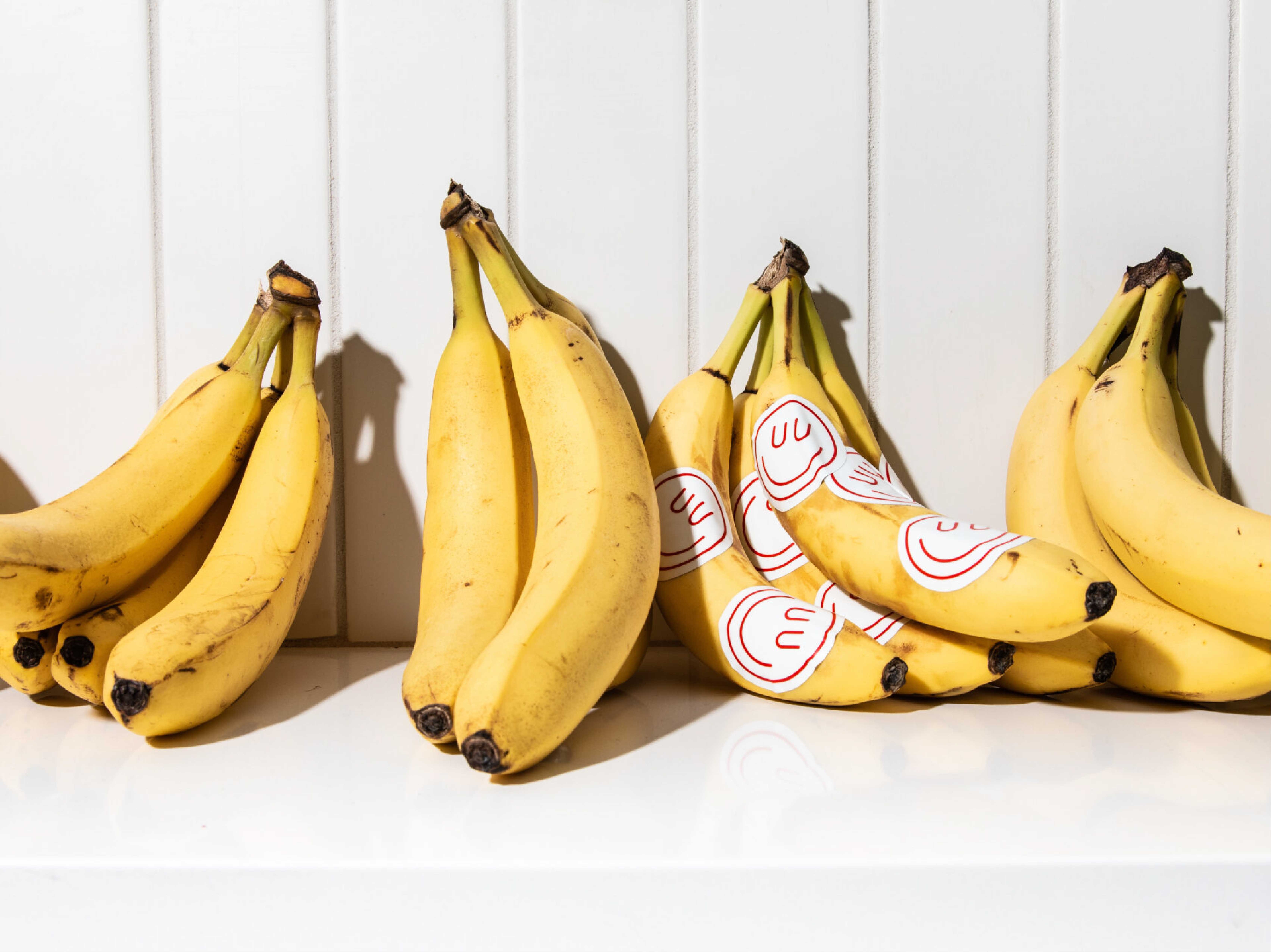
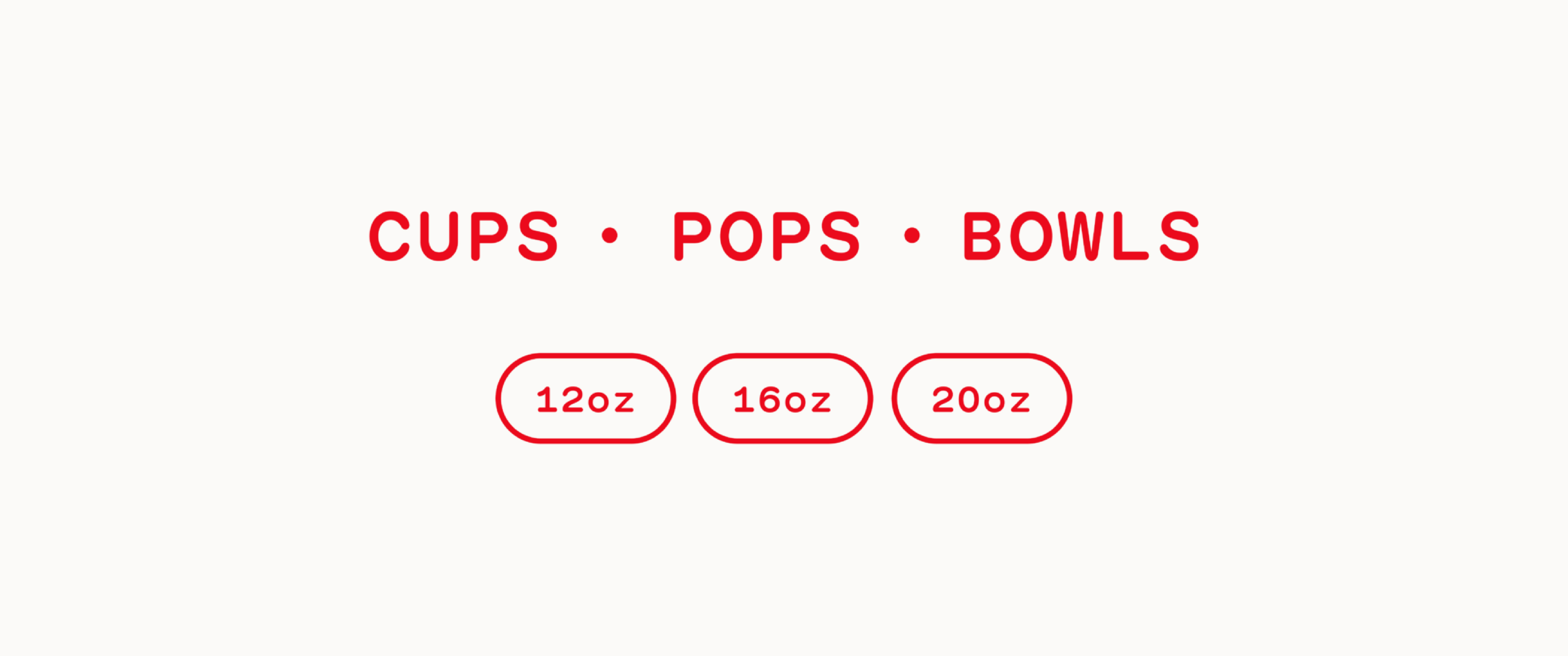
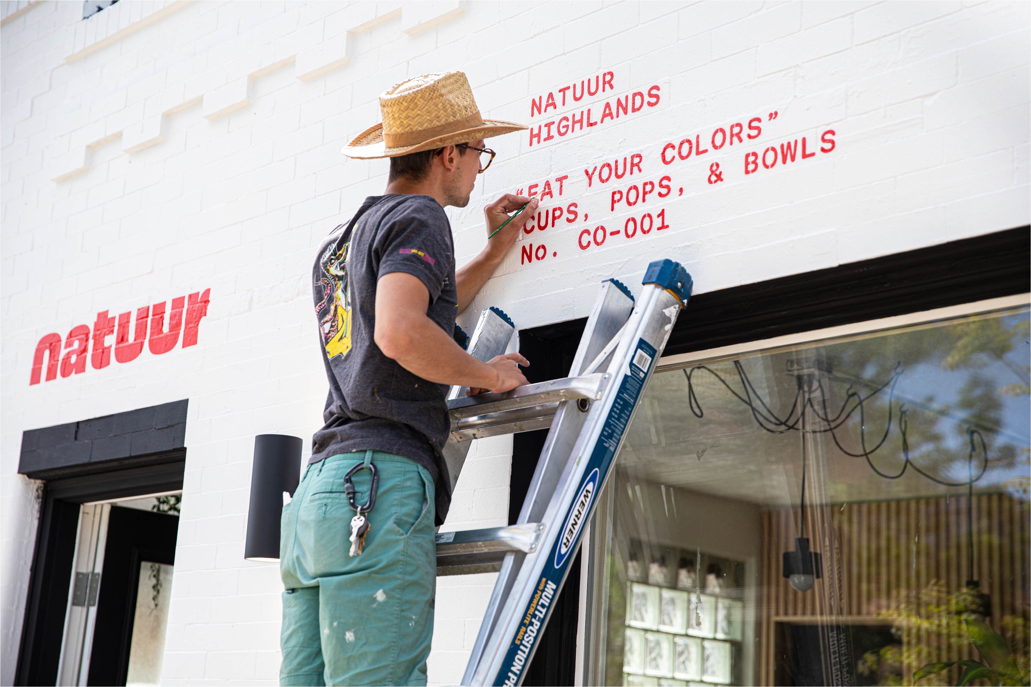
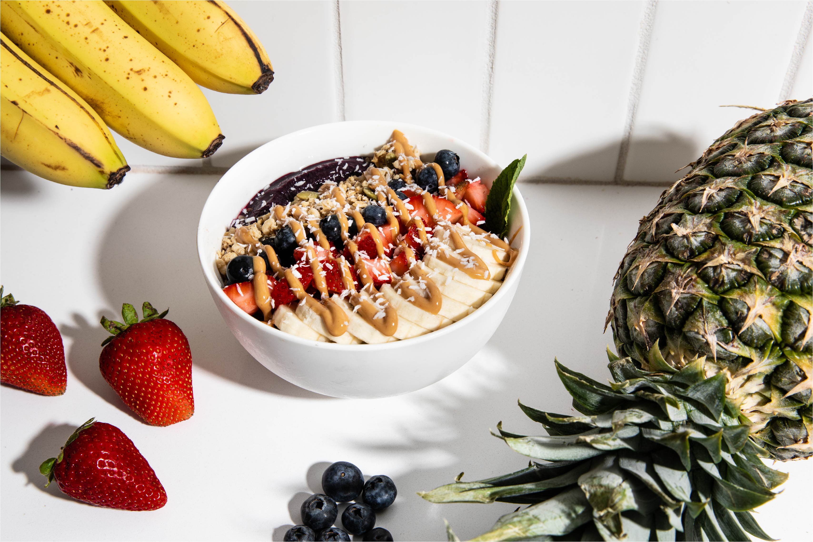
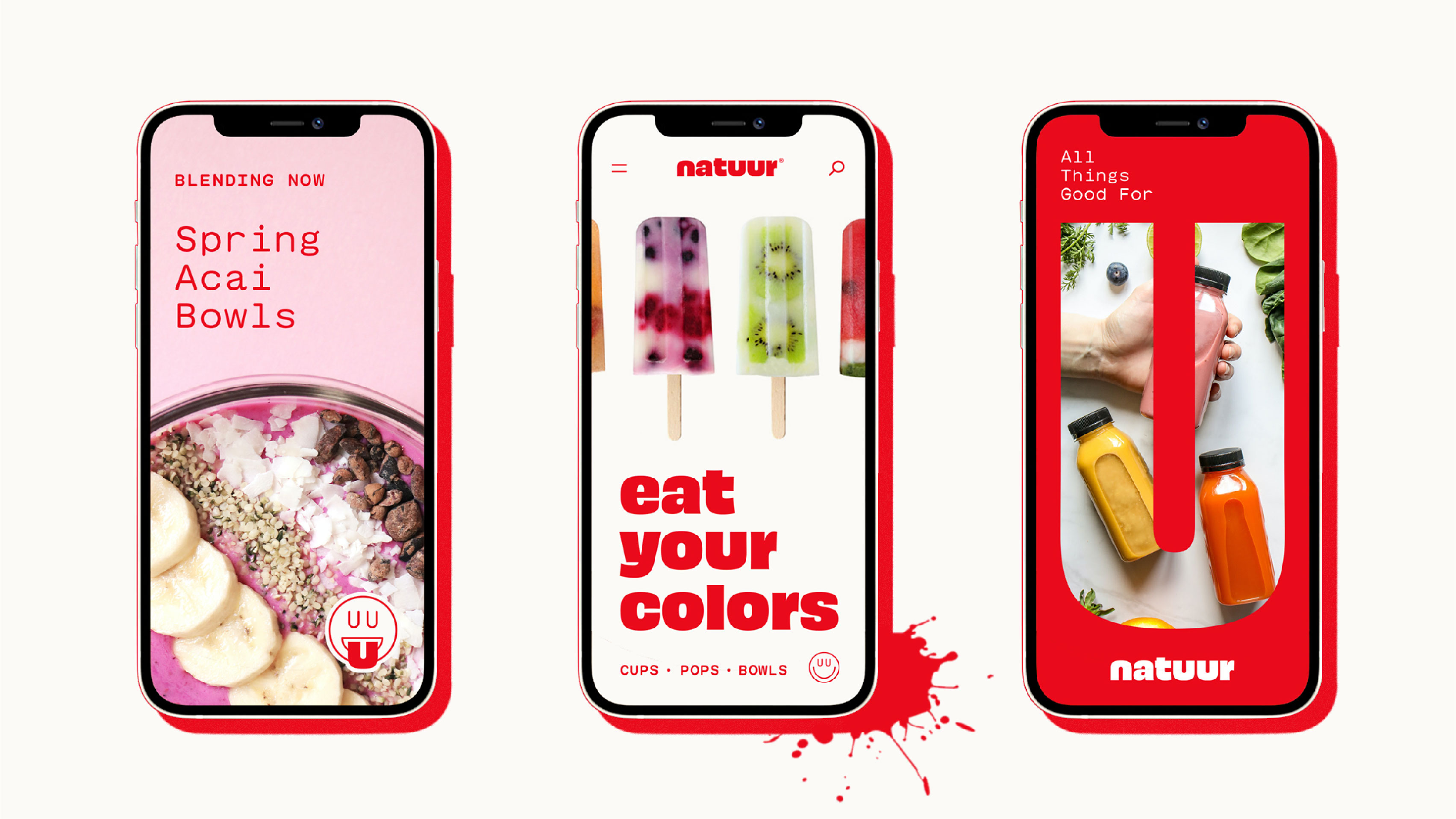
Natuur makes fresh, healthy, high-quality smoothies, bowls, and pops in a bright, fun, inviting community setting.
Our goal was to differentiate Natuur in this crowded and often cliched space. We began with a visual analysis of the competition. Judging by the dominant visual cliches in the world of healthy smoothies, the main way to convey “freshness” is with bright pastels, so-cal beachy aesthetic, and super-skinny typography.
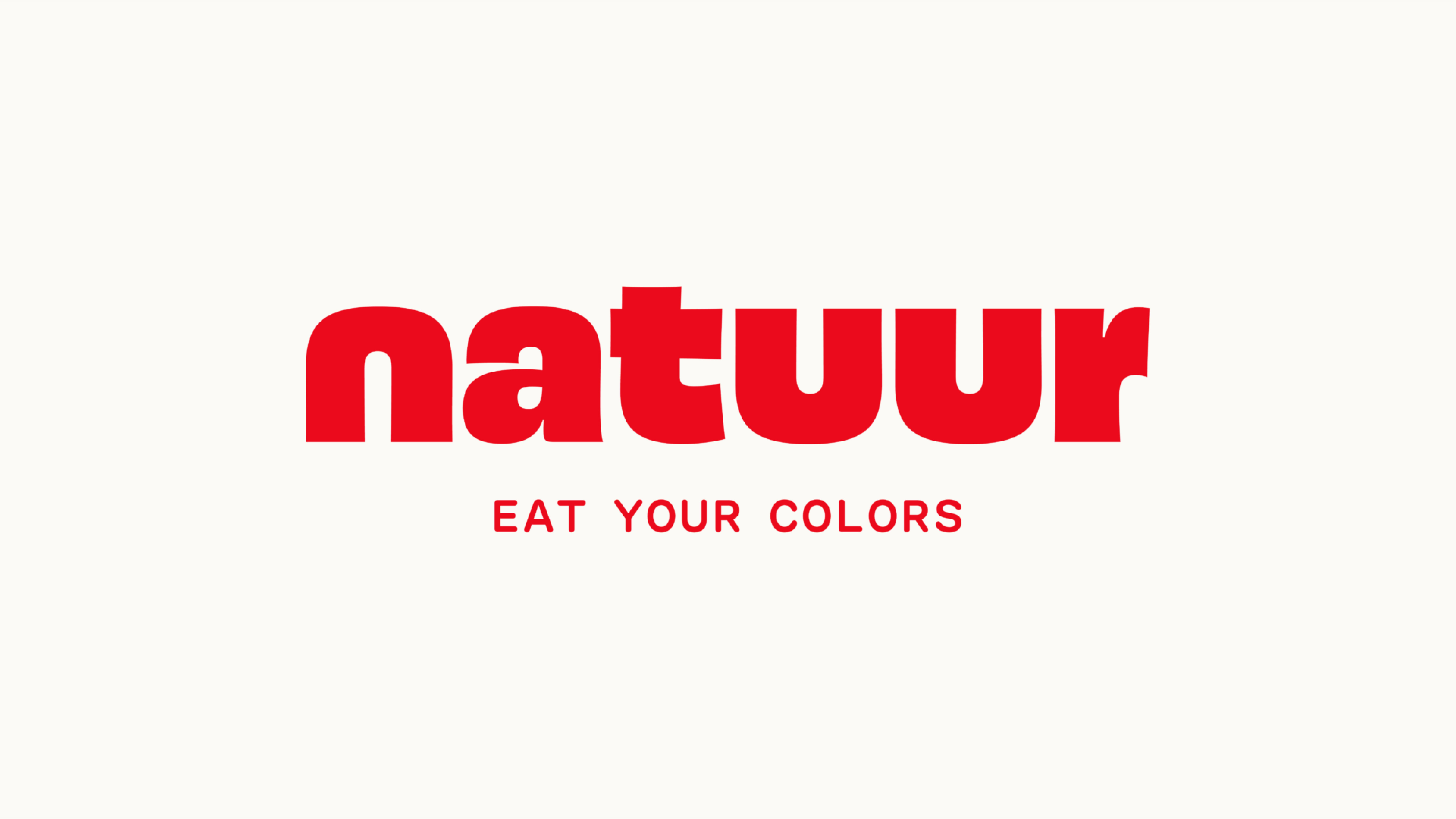
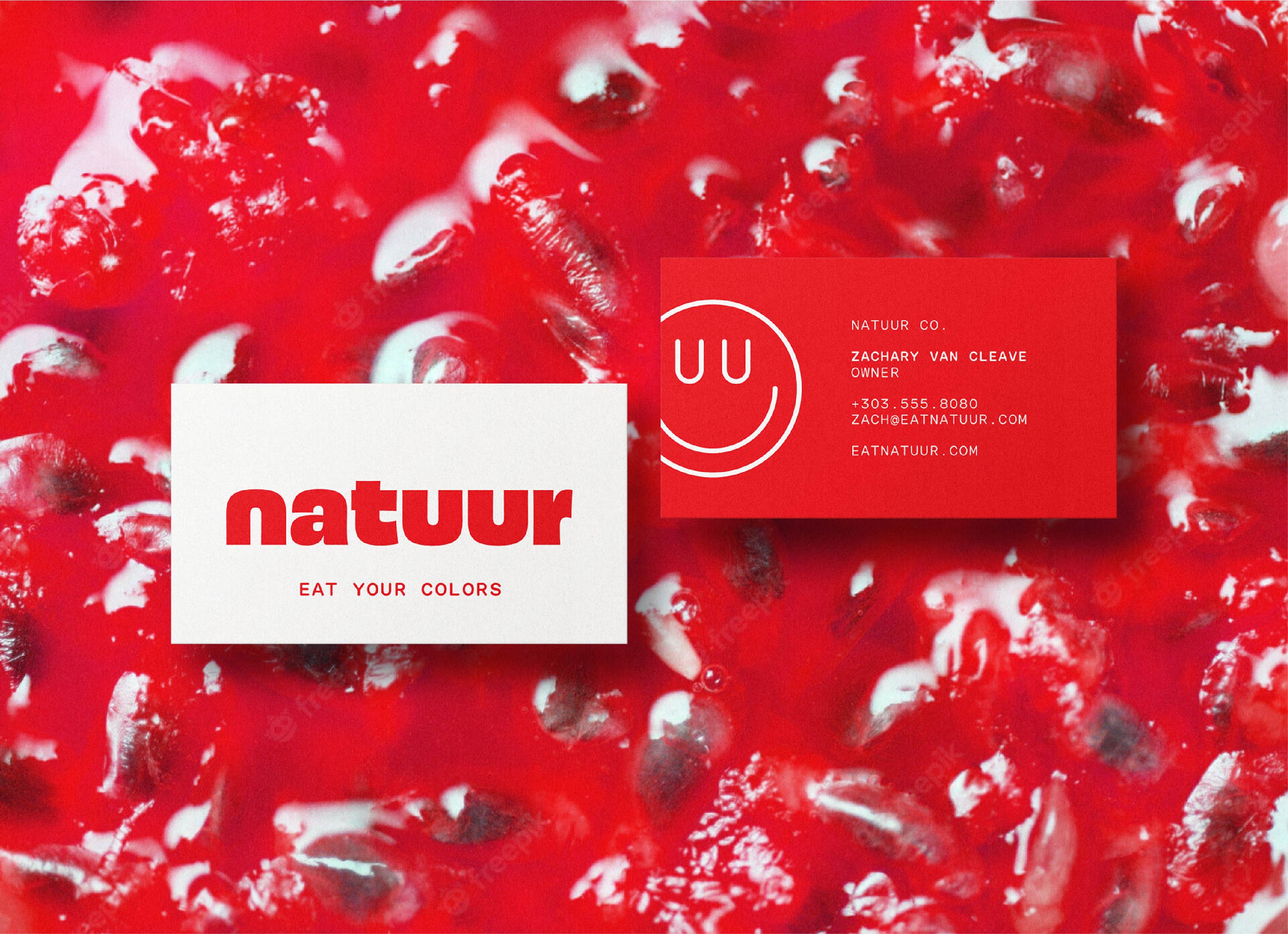
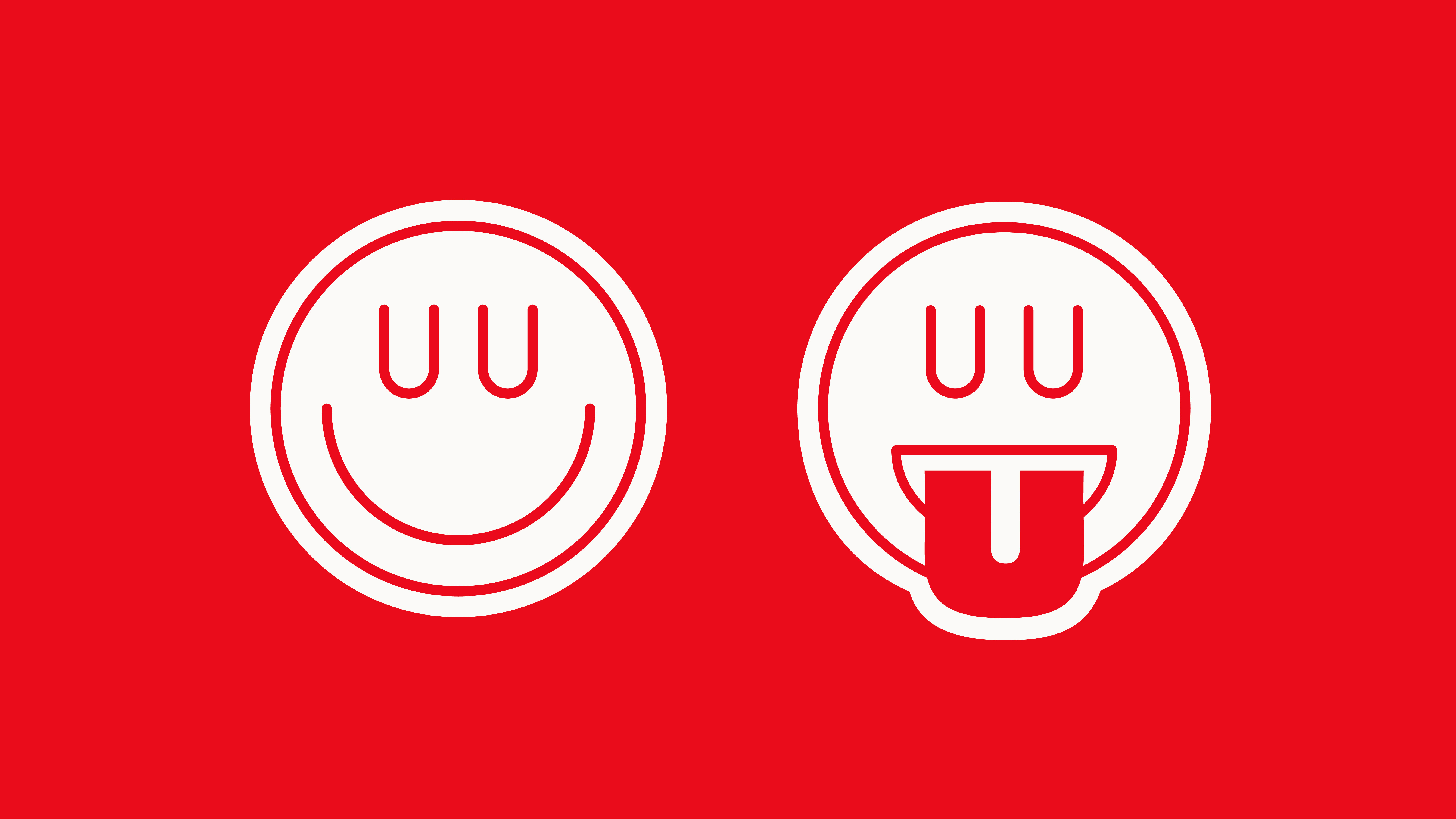
Resisting these tired trends, we took a fresh approach for Natuur’s name, logo, and visual identity that embraced bold, juicy typography, a single saturated punch of color, and a playfully irreverent icon. We positioned the new brand with four core ideas: Fresh, Energetic, Inviting, and Elevated.
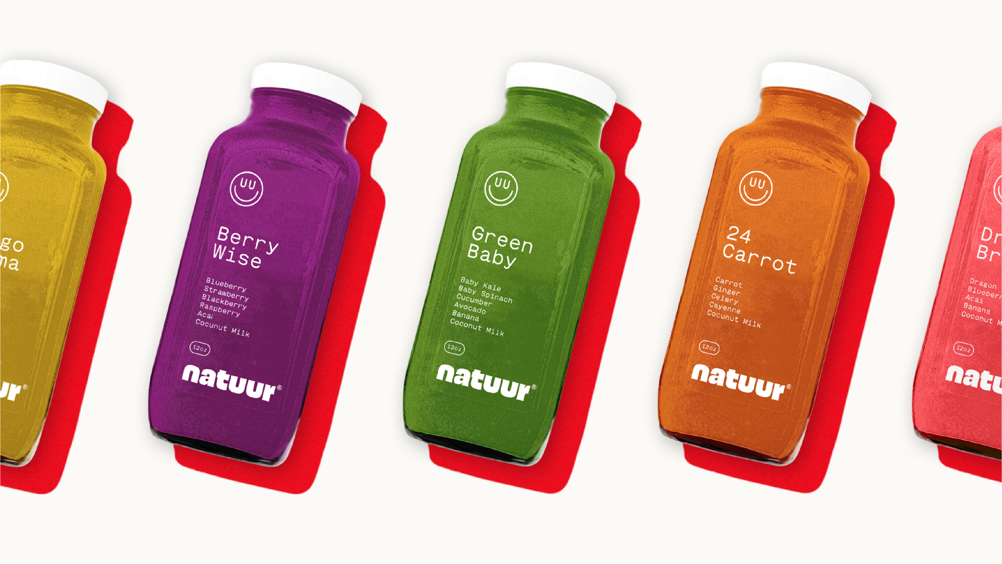
A punchy, minimal color palette feels fresh and juicy. Bold typography conveys a vibrant energy. Playful copy invites customers in. And everything is elevated by careful restraint in layouts paired with a minimal monospaced secondary typeface.
We also developed short-form copy that promoted healthy eating without feeling preachy. “Eat Your Colors” turns old irksome advice into a colorful adventure.
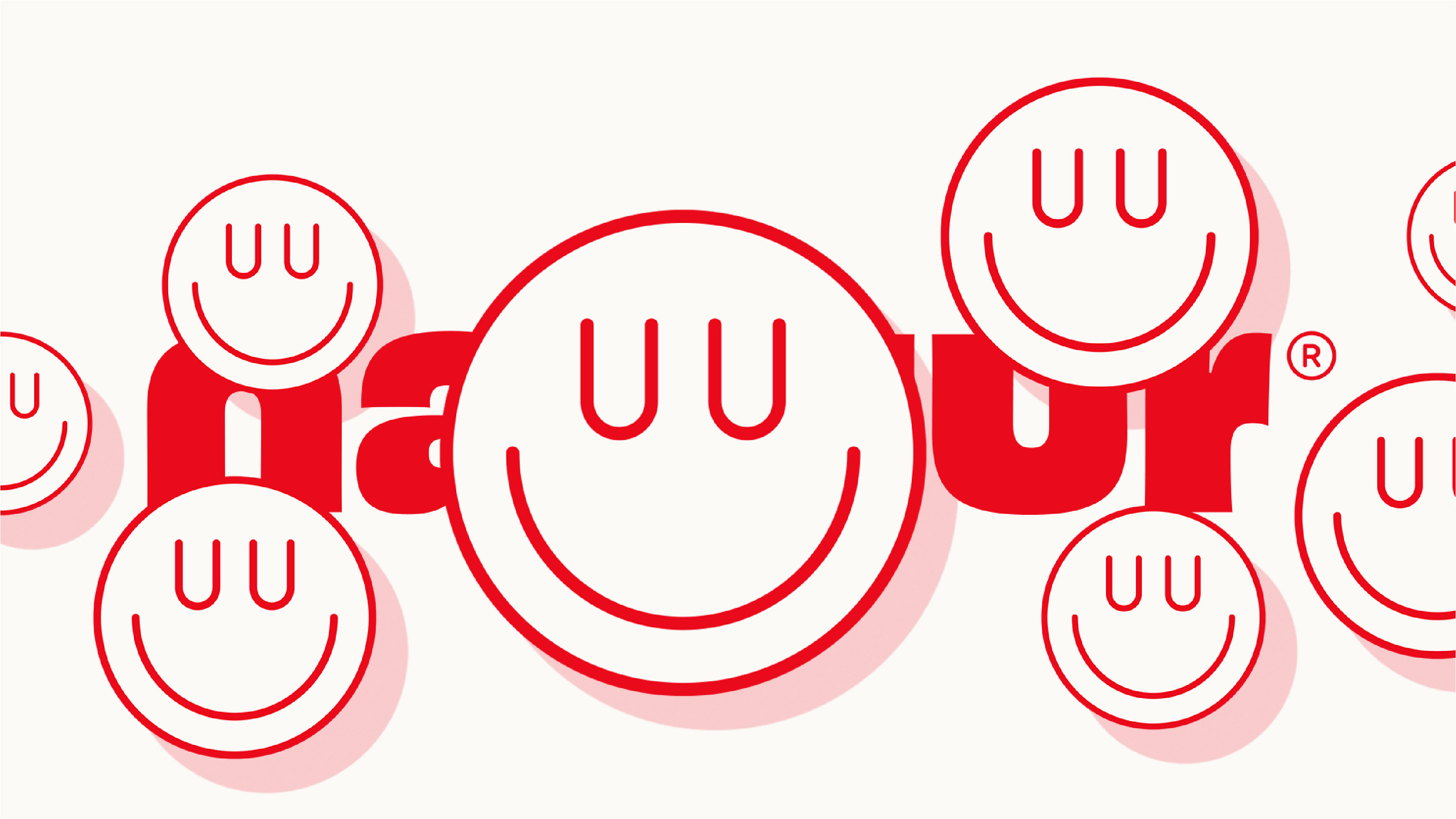
The memorable wordmark is a carefully customized version of Oh No Type foundry’s playful “Obviously” typeface. We altered the double “U”s and leading “N” to reflect the “cups, pops, & bowls” offered in Natuur’s flagship store.
Ultimately we created a fresh and clean visual identity that avoids health-world cliches, embracing the unique name by pairing a bold, juicy custom logotype with a simple satisfied smile.
CREDIT
- Agency/Creative: The Made Shop
- Article Title: The Made Shop Creates Natuur Brand Design
- Organisation/Entity: Agency
- Project Type: Identity
- Project Status: Non Published
- Agency/Creative Country: United States
- Agency/Creative City: Denver
- Market Region: North America
- Project Deliverables: 2D Design, Brand Identity, Typography
- Industry: Food/Beverage
- Keywords: health, wellness, signage design, exterior, bowls, smoothies, Denver
-
Credits:
Creative Direction: Marke Johnson
Creative Direction: Adam Blake
Designer: Davis Scruggs
Designer: Kate Petrik


