


” It was somewhere in 2015 when I got my first e-mail from Cameron Woodbridge – the acclaimed vintner of Stormy Weather Wines. He stumbled upon my Salla White wine label design which I did a few years ago for Salla Estate and was truly impressed by the details I did on the horse head. That was just the foreword. In fact the story was much more intriguing.
Cameron has just started his new project called Wolf’s Head Vineyards. What is really interesting here was that his first email contained attachment with satellite photo of his new vineyards in Napa, California and the silhouette of those vineyards were very much like a head of a wolf. No need to speak more about what happened after that!
So we needed a wolf’s head very much realistic but at the same time close to the vineyards satellite photo – not an easy task! After sketching nearly 20 heads I finally got my best image done and almost instantly started developing it to become better and better and at the same time I had to keep in mind that I shouldn’t go into very thin and tiny details. So I got my Pilot Parallel Pen and starting my drawing again but now it was 4 times bigger than the one printed on the label. I was ready within several hours and I did it really quick because I already knew how to implement it in my design.
On the next day I had the label almost done and immediately sent it to Cameron.
His reaction was quite emotional as this wolf was very close to what he had in his mind. We did some minor changes and the label was almost done in no time.
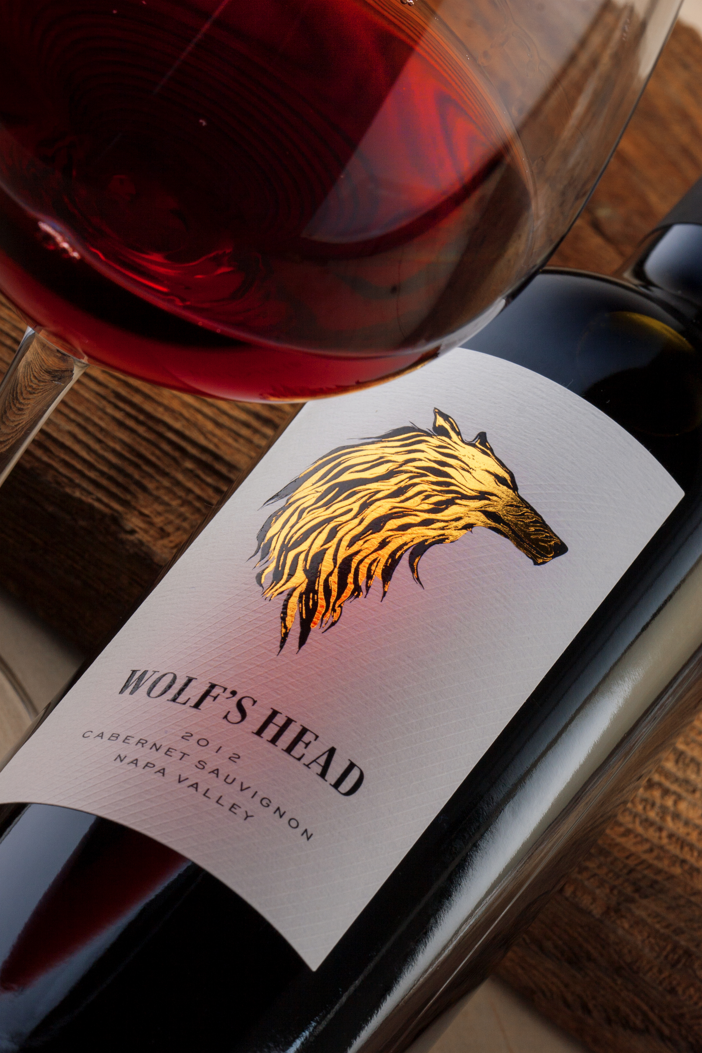
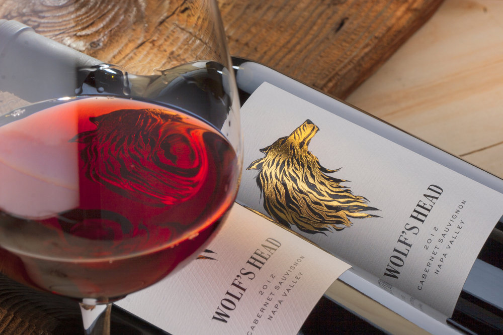
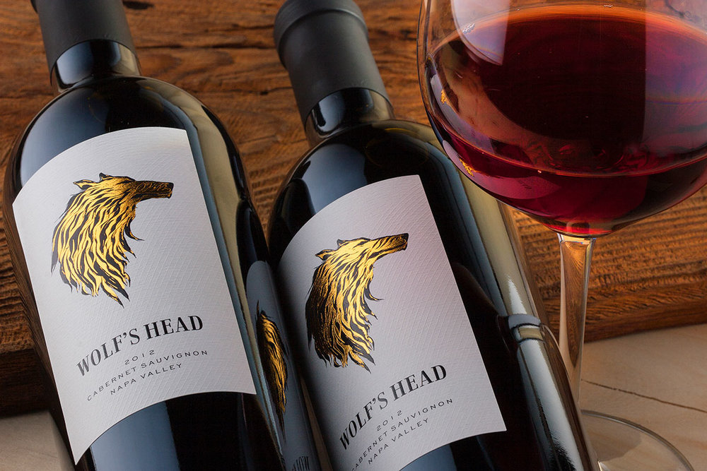
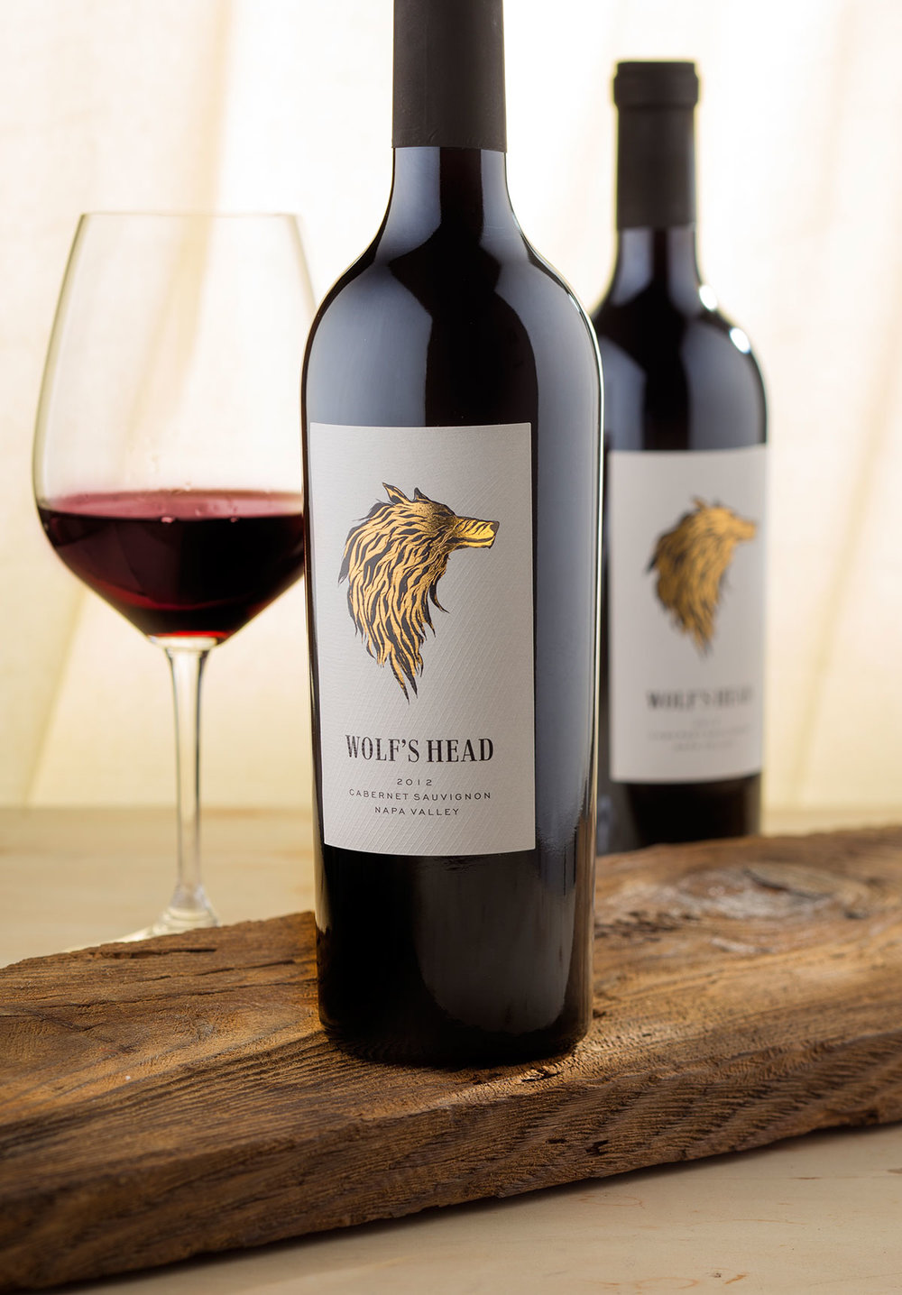
I consider this design for one of my iconic images as it communicates extremely well with the audience, I am really happy with the result and the bottles shine with their own beauty on the shelf.
The wolf’s head is printed with black ink on very thick textured paper. Initially I wanted to keep it black and white and overprint it with raised varnish but then Cameron said that it would be really nice if we add some rich gold hot foil and this was actually the final touch to my work on this label.
The heading Wolf’s Head is using the amazing Jeles typeface designed by my friends from Tour de Fours font foundry.
Last but not least – we picked the incredible EDEN bottle for this Cabernet Sauvignon designed by Saverglass. Heavy and masculine bottle with strong presence – a perfect choice for our Wolf of California!”
CREDIT
- Agency/Creative: the Labelmaker
- Article Title: the Labelmaker – Wolf’s Head wine
- Project Type: Packaging
- Format: Bottle
- Substrate: Glass, Metal, Pulp Paper


