


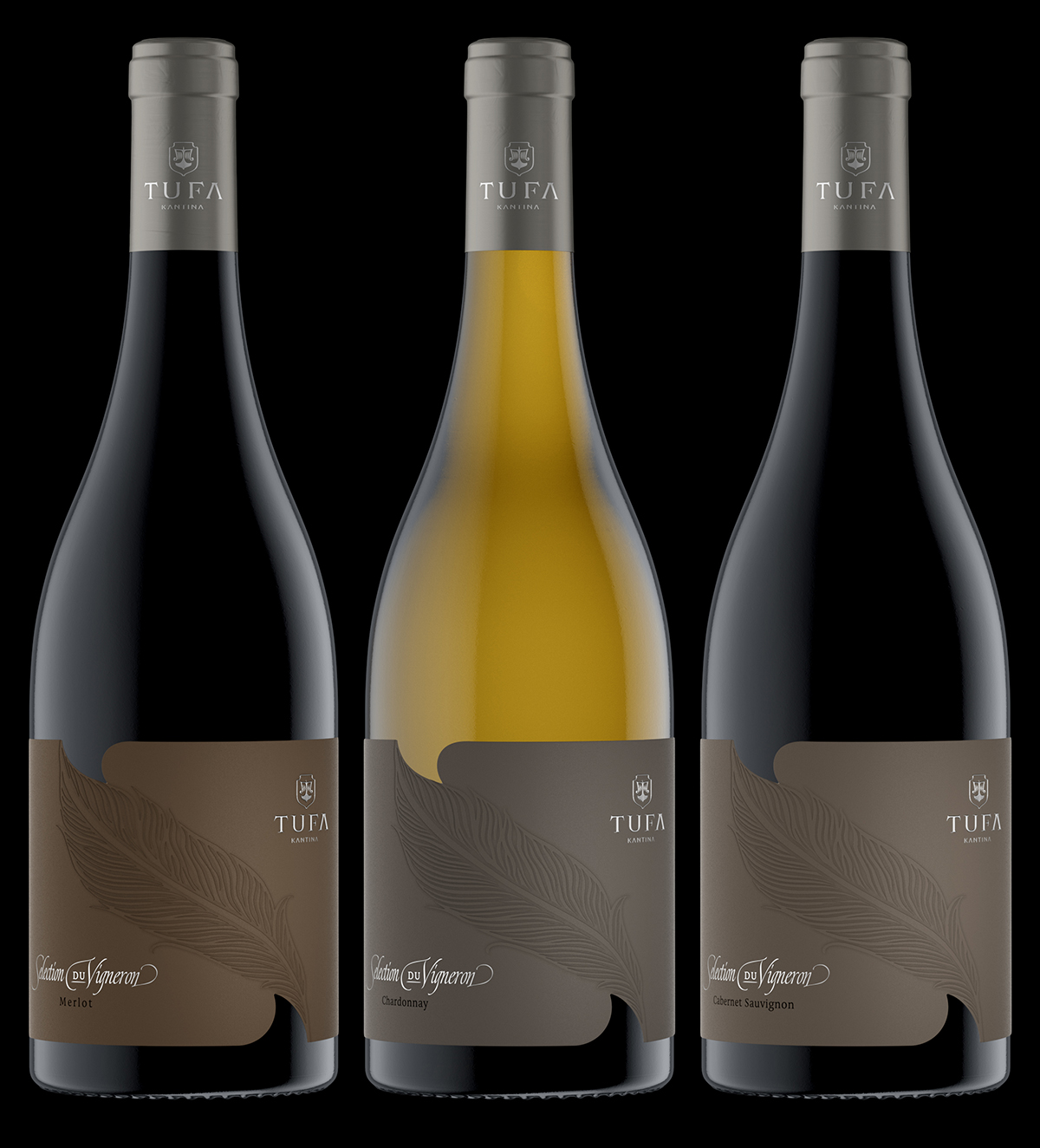
Tufa Sélection du Vigneron
The Art of Subtle Sophistication
In designing the Tufa – Sélection du Vigneron label series, I set out to create something that truly embodies the art of subtle sophistication. I wanted the visual language to speak softly, yet leave a lasting impression — not through bold color or loud patterns, but through quiet, confident design choices that reveal their depth upon closer inspection.
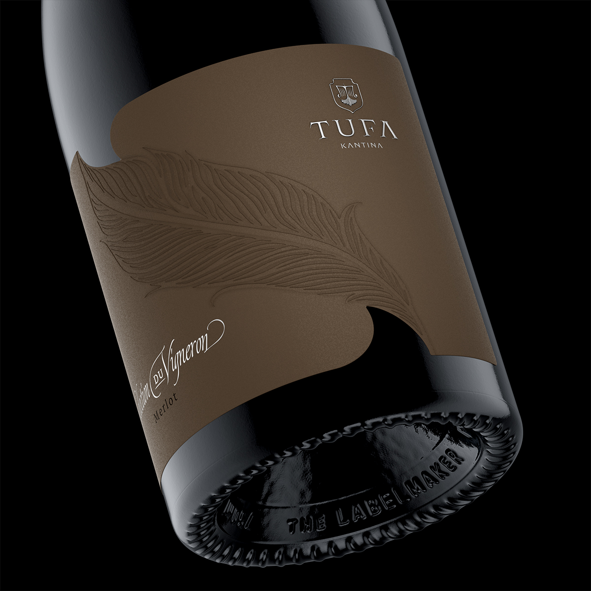
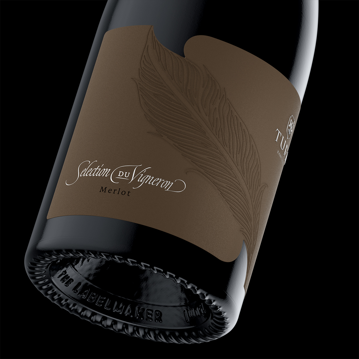
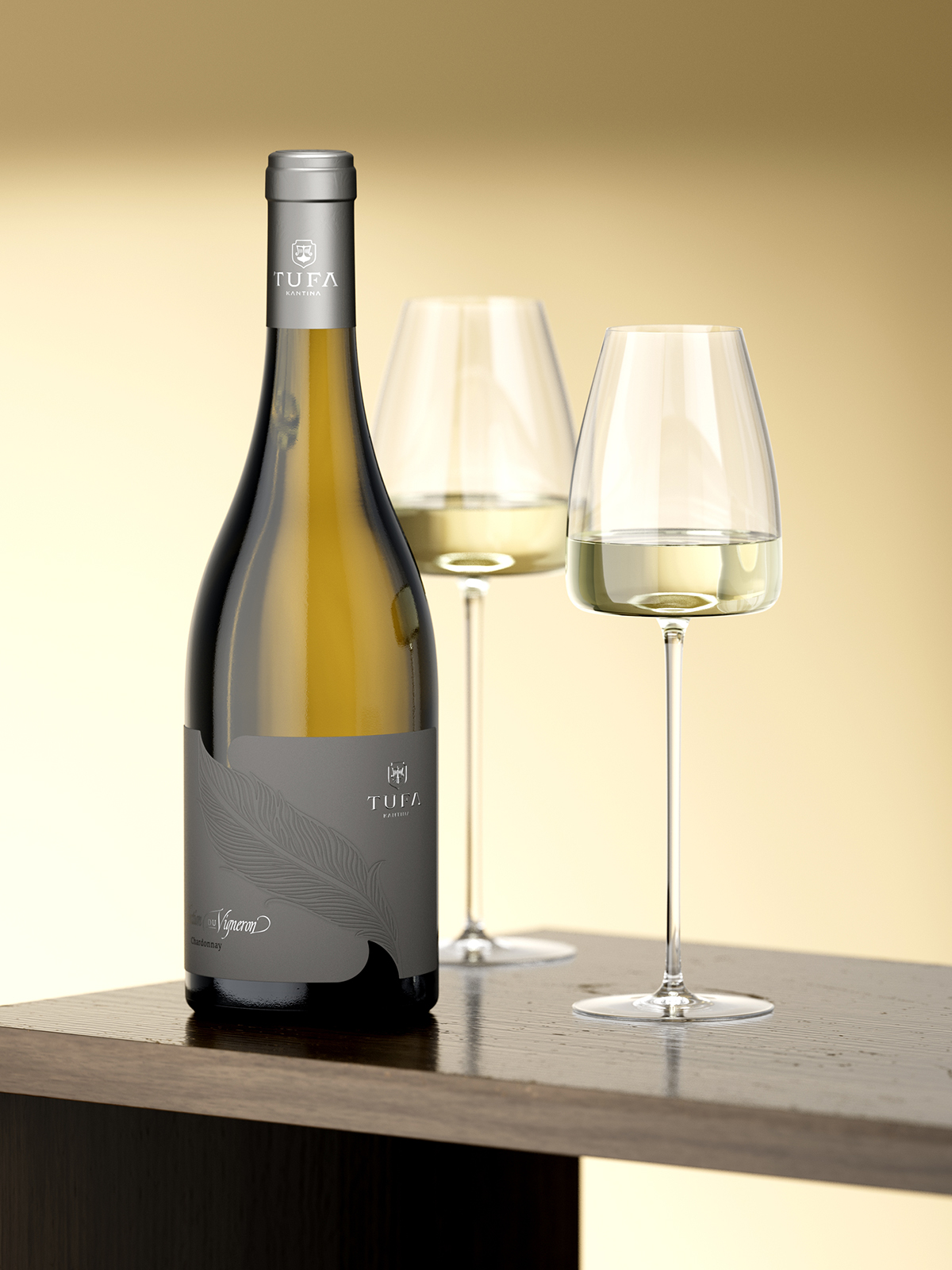
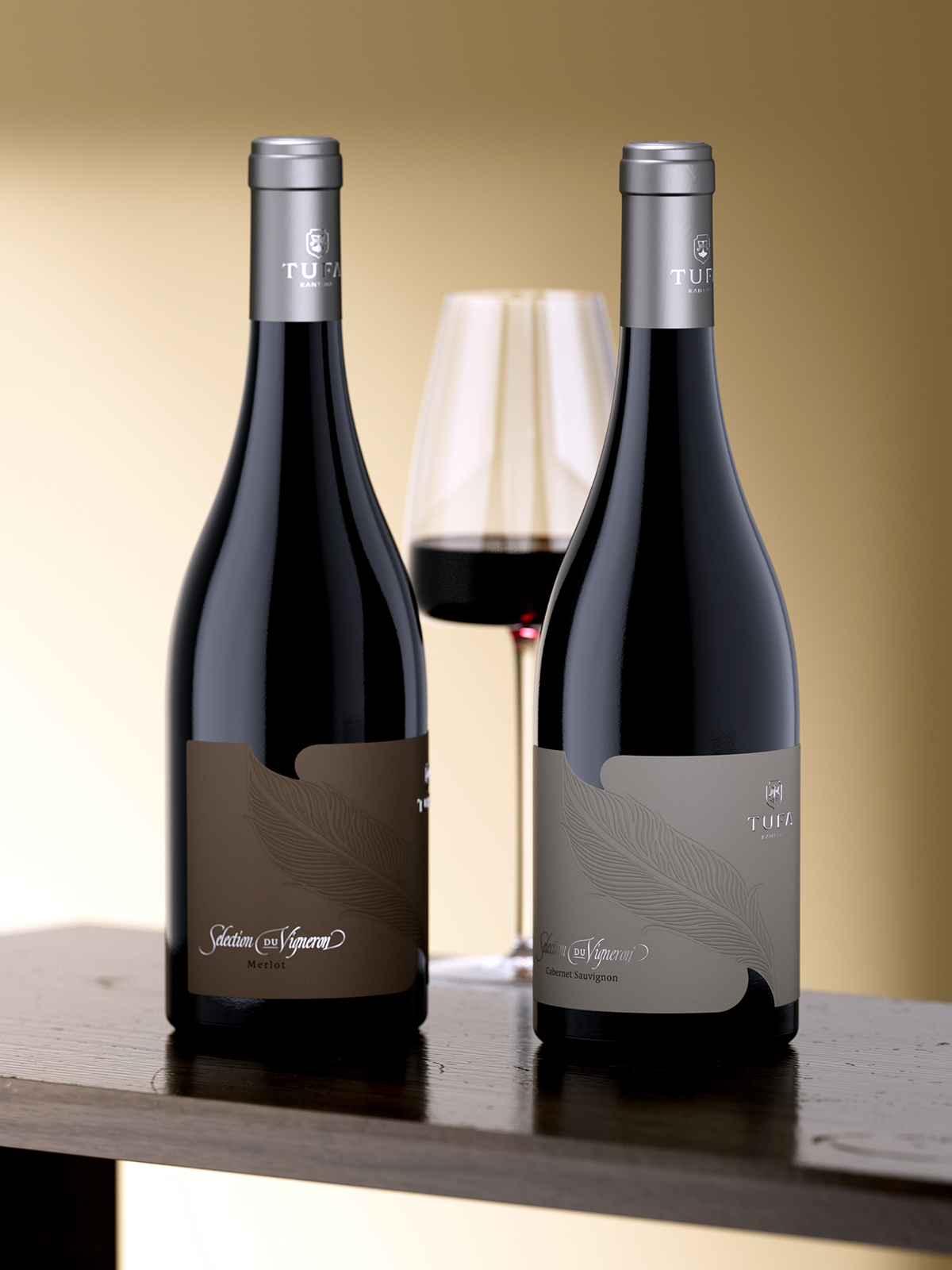
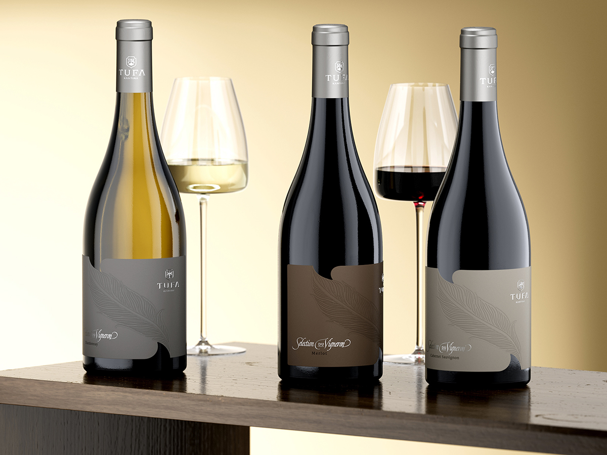
The collection features three wines all united by a visual approach that is both minimal and tactile. Each label is printed on ultra-premium cotton paper, chosen for its natural texture and solid presence in the hand. This material became the perfect canvas for the central graphic element – a single feather, pressed deep into the surface using strong debossing. Unlike traditional embossing, this recessed detail pulls the viewer in, casting real shadow and depth that can be felt as much as seen.
The feather is more than a decorative motif. It reflects the quiet precision of both the winemaker and the design process – a symbol of balance, restraint, and control. This direction allowed me to fully explore the art of subtle sophistication by letting the materials and finishes do most of the storytelling.
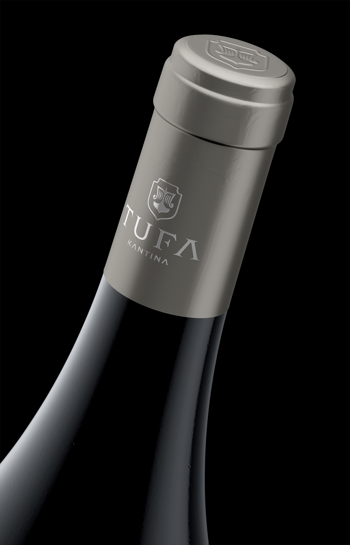
I also created an entirely new logo for TUFA, developed specifically for this range. It appears in a clean, serif style and is stamped in elegant embossed silver foil on both the label and the capsule, acting as a contemporary signature without overpowering the rest of the composition.
The die-cut shape of the label adds an extra layer of nuance: two soft curves — one above and one below the feather — gently interrupt the rectangular format adding a sense of movement and direction. These asymmetrical cut-ins mirror the flow of the bottle itself, enhancing the visual rhythm without distracting from the quiet central message.
Typography plays a restrained supporting role, combining classical and modern tones to echo the timeless character of the wines. Every element — layout, material, cut, and finish — was intentionally chosen to contribute to the overall expression of refined understatement.
Once again, I collaborated with Dagaprint, whose precision and technical mastery ensured that every detail — especially the deep debossing — was flawlessly executed on press.
For me, this project is a clear example of how powerful a label can be when it embraces the art of subtle sophistication — where elegance is found not in excess, but in thoughtful restraint and tactile honesty.
CREDIT
- Agency/Creative: the Labelmaker
- Article Title: The Labelmaker Elevates Tufa Sélection Du Vigneron With a Refined and Tactile Wine Label Design
- Organisation/Entity: Agency
- Project Type: Packaging
- Project Status: Published
- Agency/Creative Country: Bulgaria
- Agency/Creative City: Sofia
- Market Region: Europe
- Project Deliverables: CGI, Label Design, Packaging Design
- Format: Bottle
- Industry: Food/Beverage
- Keywords: ultra-premium cotton paper, minimal tactile design, deep debossing, feather motif, subtle sophistication, quiet visual language, debossed graphic element, natural texture, refined restraint, asymmetrical die-cut, soft curves, serif logo embossing, silver foil accents, balanced typography, silent branding, elegant understatement, Dagaprint precision, the Labelmaker, tufa winery, kantina tufa, jordan jelev, wine of albania
-
Credits:
Design & CGI Photo: the Labelmaker


