


Expressive Wine Label Design — My Summer Chill for Château De Val
A Fresh and Emotional Approach to Wine Label Design
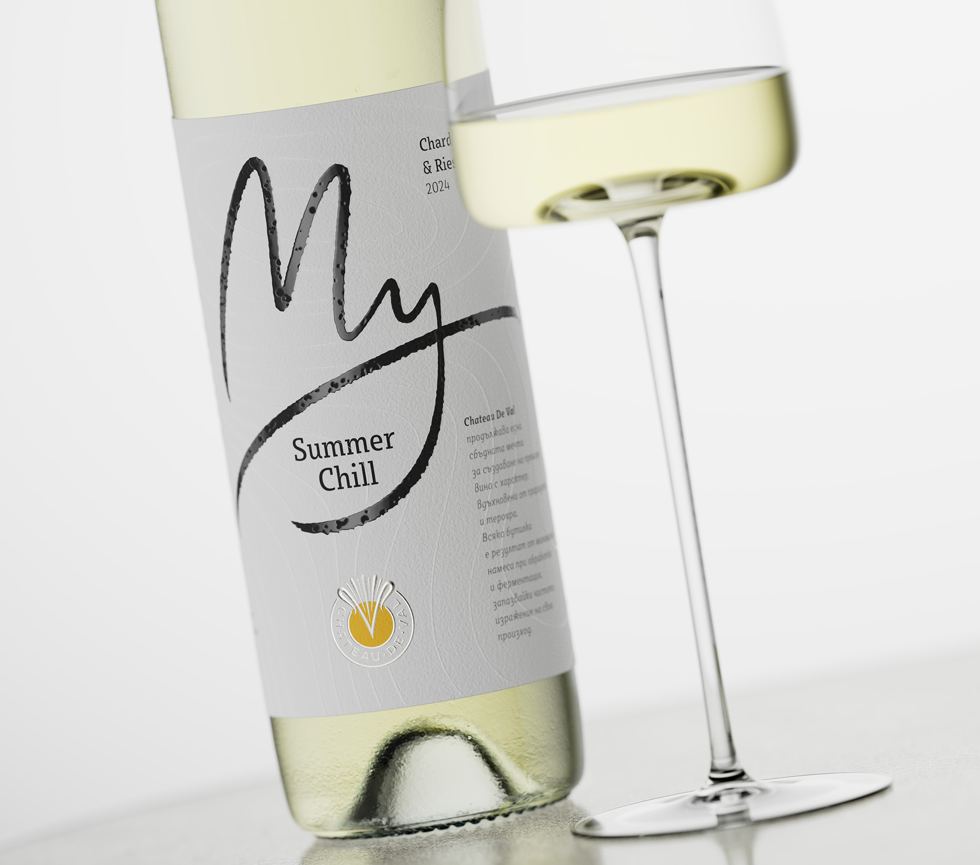
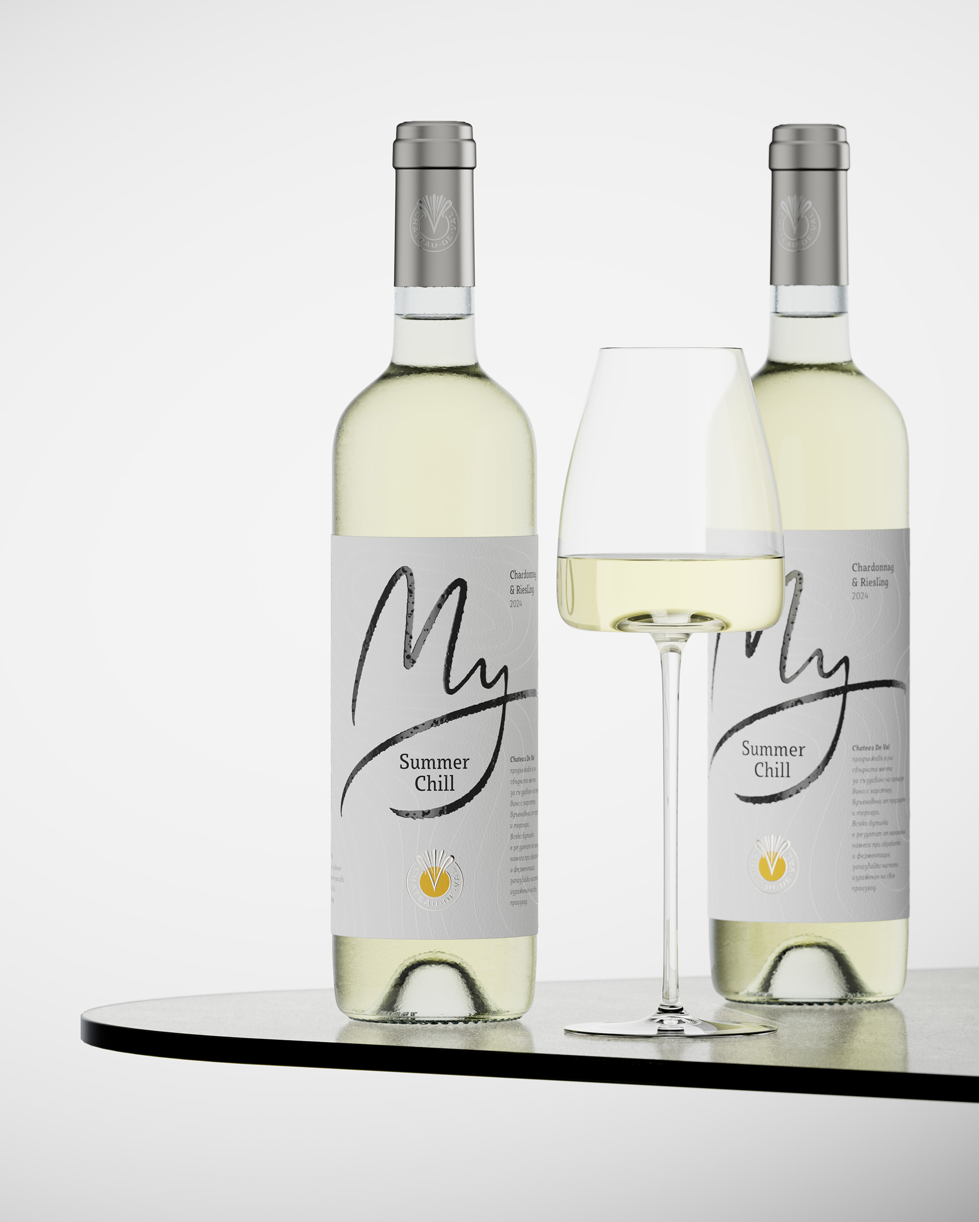
I created My Summer Chill — a Chardonnay & Riesling 2024 from Château De Val as an example of what I like to call Expressive Wine Label Design.
For me, label design is not just about visual balance or decoration. It’s about emotion the feeling a wine communicates before you even open the bottle. My Summer Chill is a label that speaks softly but leaves a strong impression: light, elegant, and full of character.
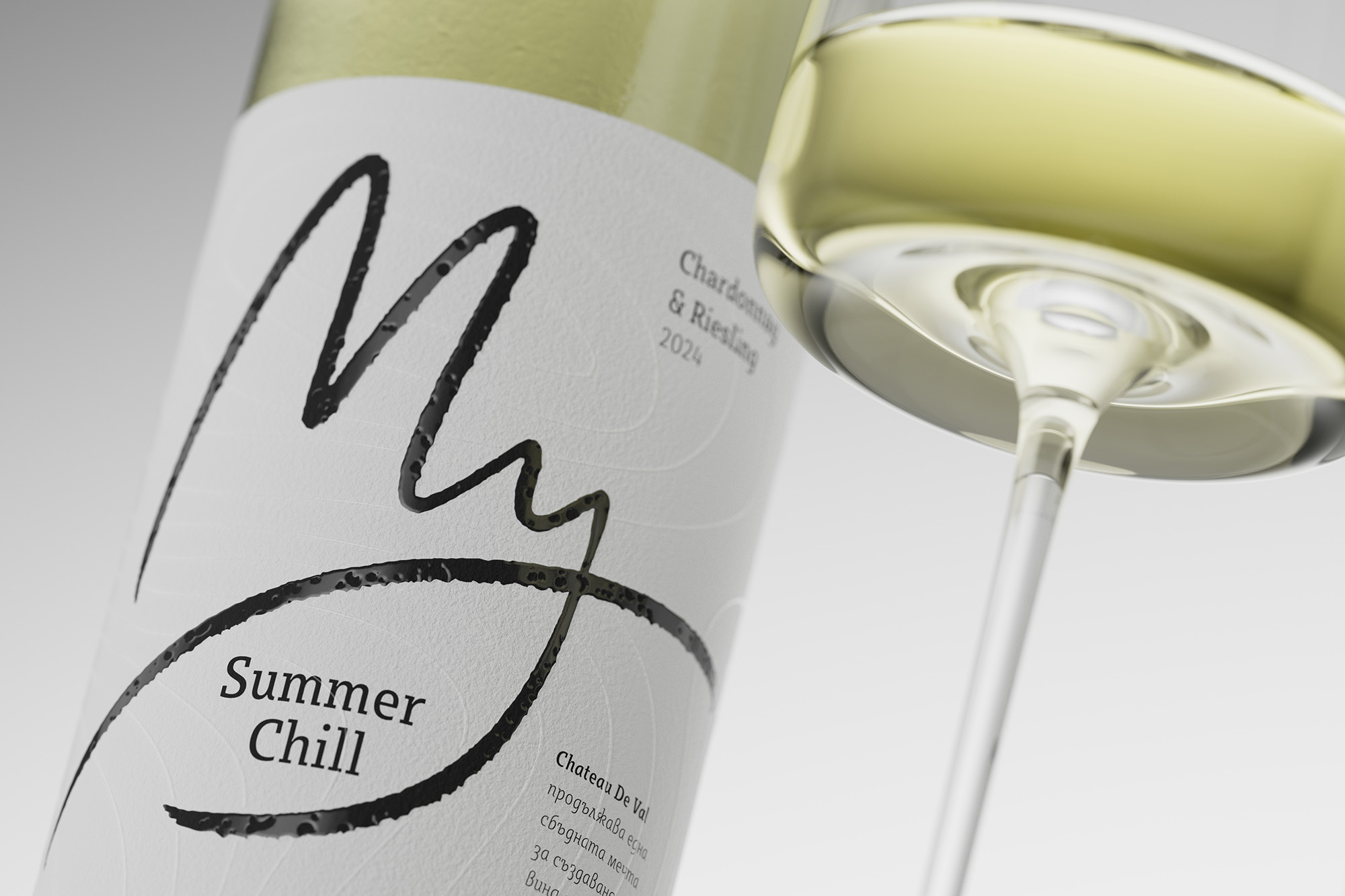
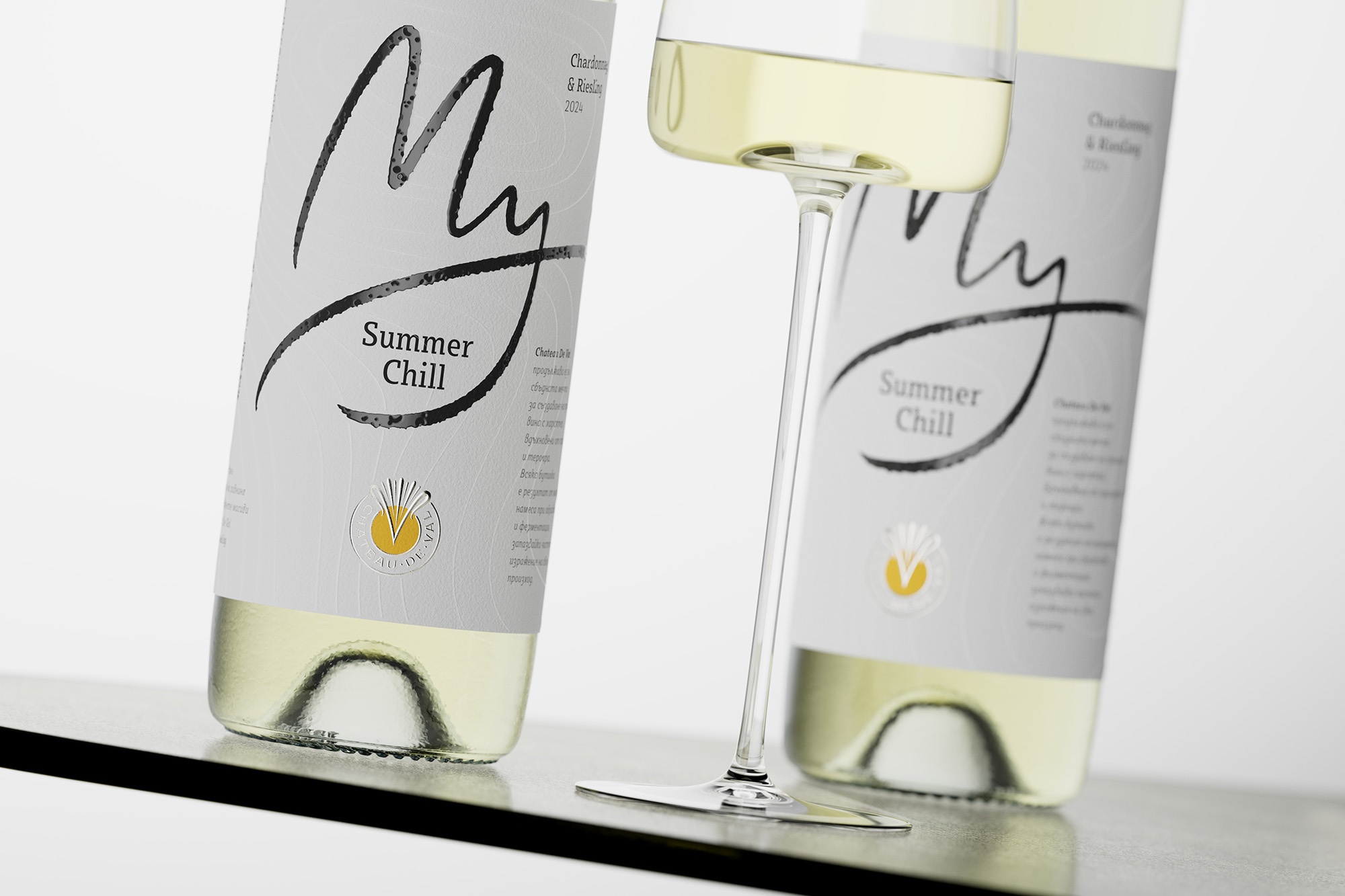
The concept came from the idea of a relaxed summer afternoon that moment of calm when everything feels easy and genuine. The design follows the same spirit: clean and minimal, yet expressive and human. The white paper base creates a natural, tactile background, while the handwritten “My” adds personality an open gesture that invites you in.
Capturing Emotion Through Expressive Details
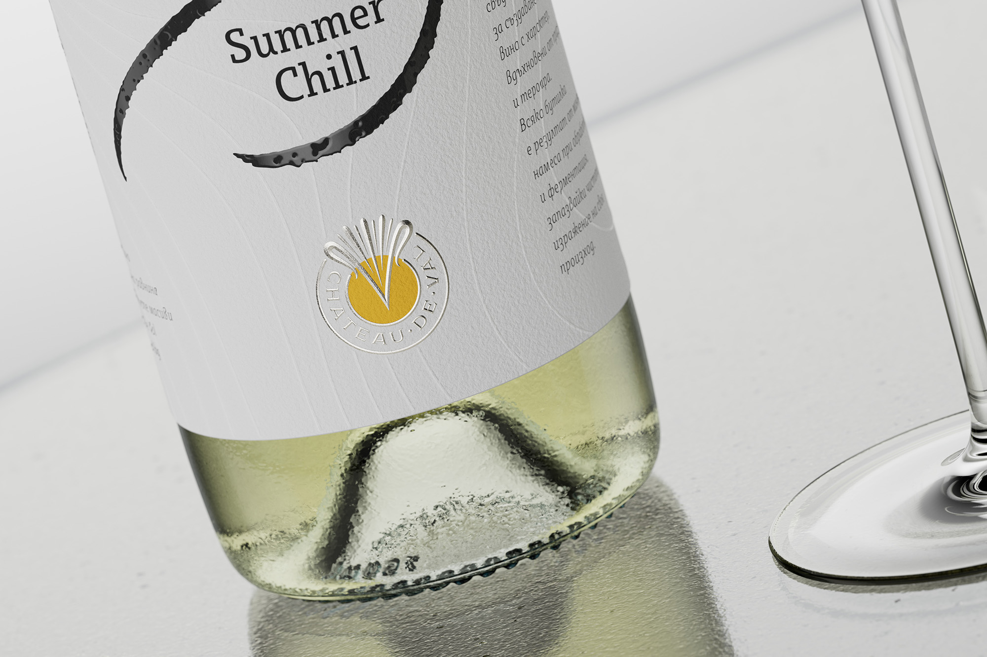
At the heart of this Expressive Wine Label Design lies the handwritten word “My.”
To make it feel truly personal, we used a special raised varnish with intentionally created dents a subtle but important detail that gives the lettering a realistic, hand-drawn quality. You can feel its texture when you touch the label, and that tactile moment creates an instant emotional connection.
The background carries a pattern of elegant topographic lines, produced in soft relief. These lines are more than decoration they evoke the sense of terroir, the land and the origin of the wine. It’s a quiet reference to nature, geography, and craftsmanship all embedded in one design layer.
Each embossed detail was produced with Roof Embossing, a special geometric embossing technique that creates crisp edges and sharper tactile definition. This precision gives the label its refined structure and depth essential in every expressive design.
Collaboration and Printing by DAGAPRINT
To bring this Expressive Wine Label Design to life, I worked closely with DAGAPRINT.
Together, we combined advanced printing technologies and premium materials to achieve a perfectly balanced, high-quality finish.
Technical features:
Roof Embossing for sharper, three-dimensional details
Raised varnish with dents for a handmade, authentic feel
Topographic relief pattern representing the wine’s terroir
Silver hot foil stamping for the Château’s emblem
High-definition digital printing for precise color and line control
Smooth elegant texture to complete the tactile experience
This careful blend of techniques results in a label that’s not only visually striking but also emotionally engaging exactly what Expressive Wine Label Design is about.
The Signature of Château De Val
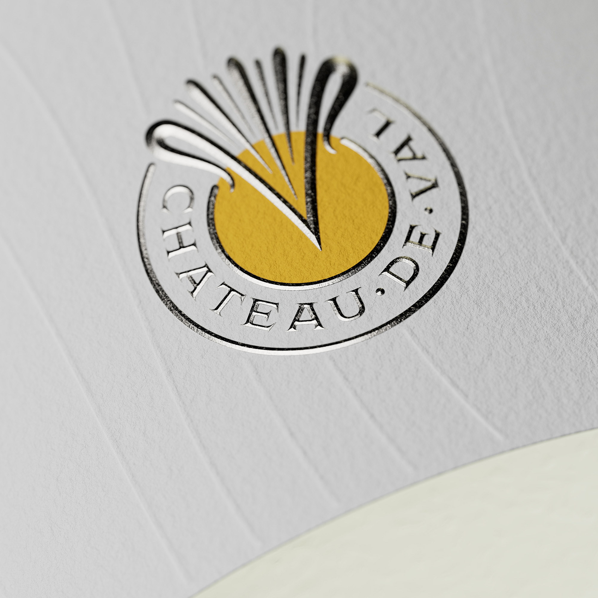
The emblem of Château De Val sits at the base of the label a circular V-shaped mark with a golden sunburst accent, symbolizing warmth, optimism, and craftsmanship.
Produced with Roof Embossing and silver foil, the logo reflects the light with subtle brilliance and anchors the whole composition.
It’s more than a finishing detail it’s a moment of identity. In this design, the emblem becomes part of the storytelling, expressing the heritage and refinement behind every bottle from Château De Val.
A Label That Feels Like Summer
My Summer Chill was not just a design project it was an emotional exercise in simplicity and clarity.
This Expressive Wine Label Design captures a mood: bright, fresh, and effortless. Every layer from the raised varnish and embossed details to the soft matte texture adds depth and meaning.
Working on this label reminded me that the best designs don’t just decorate a product — they communicate it. And that’s what makes an Expressive Wine Label Design truly powerful.
This project continues my long-standing collaboration with DAGAPRINT a partnership defined by precision, innovation, and shared passion for great wine branding
CREDIT
- Agency/Creative: the Labelmaker
- Article Title: The Labelmaker Elevates My Summer Chill for Château De Val With Expressive Wine Label Design
- Organisation/Entity: Agency
- Project Type: Packaging
- Project Status: Published
- Agency/Creative Country: Bulgaria
- Agency/Creative City: Sofia
- Market Region: Europe
- Project Deliverables: Branding, CGI, Label Design, Packaging Design
- Format: Bottle
- Industry: Food/Beverage
- Keywords: Expressive Wine Label Design, Wine Label Design, Wine Branding, The Labelmaker, DAGAPRINT, Packaging Design, Wine Design, Luxury Packaging, Label Design, Chateau De Val, Wine Industry, Brand Identity, Design For Wineries, the Labelmaker, wine design, wine label art, wine labels designs
-
Credits:
Design & CGI Photo: the Labelmaker
Client: Chateau de Val
Print: Dagaprint
CGI Photo: Jordan Jelev


