A Classy Fresh Design for a Classic Wine Range
Erzetic Winery has been in my heart for quite a while.
I love small family wineries where crafting wine is equal to religion. This is something that has always been reflected by my labels.
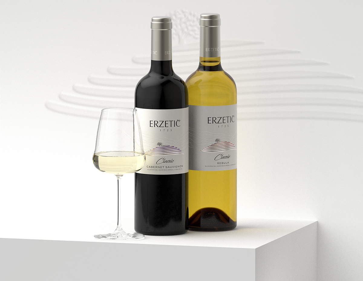
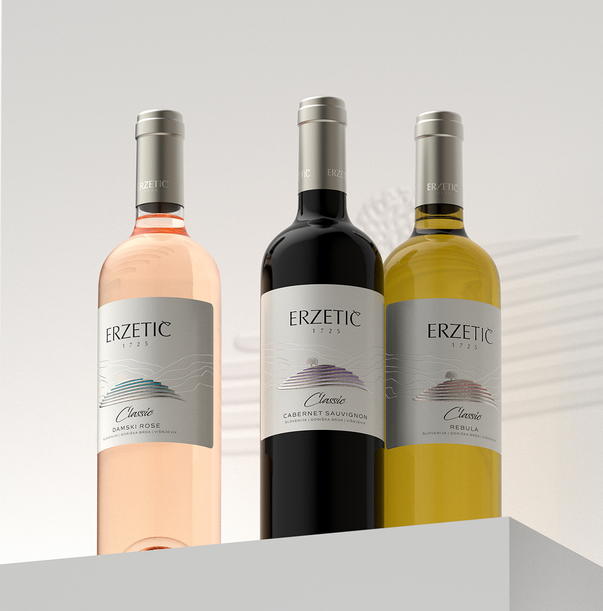
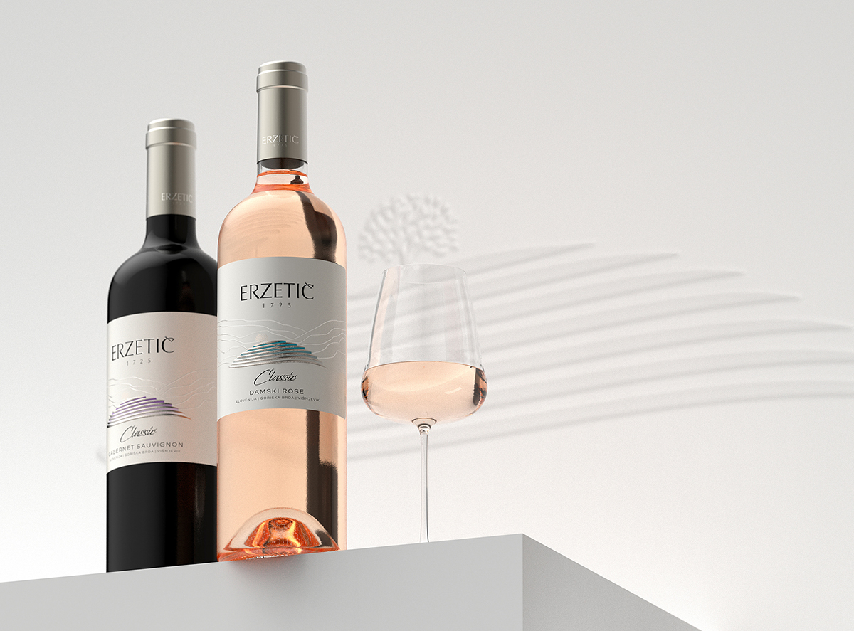
For Erzetic winery, I tried to give my best to do a classic design yet trying to implement some modern approaches mostly in using special materials and print embellishments.
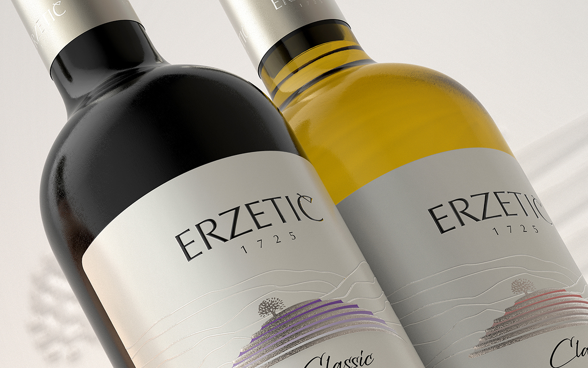
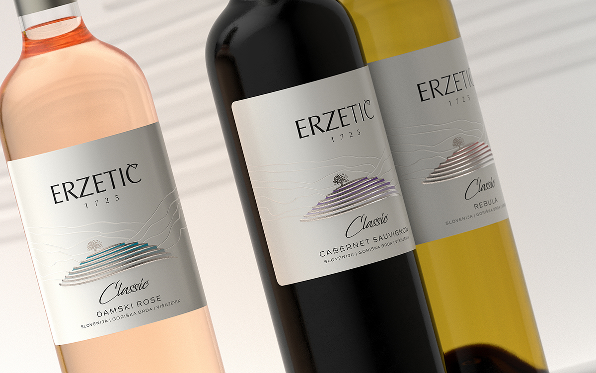
We picked a special paper with creamy mother of pearl finish that alters ink colors by adding some semi-metallic effect.
The Erzetic logo is printed with raised varnish along with the lines around Velik Vrh that were meant to somehow create a feeling for landscape, hills, nature, without stealing the whole attention.
Velik Vrh, just like in Orbis wine label design, was stamped with special silver hot foil and then an embossing effect was added so that you could touch it and sense it with your fingertips.
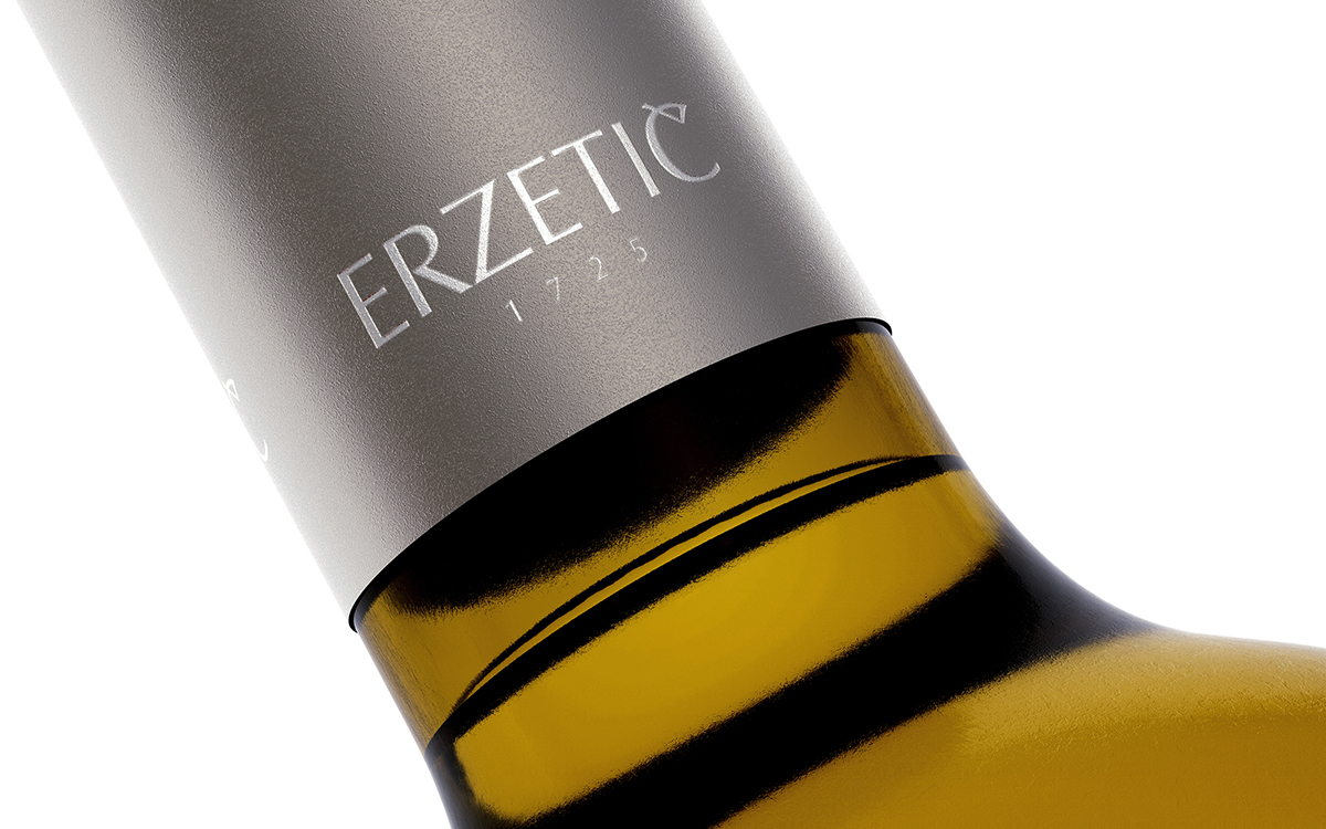
I wanted to use a simple silver polylaminate capsule, but here my collaboration with Erzetic family worked for a very special semi-matt capsule design with silver finished, gently dominated by brownish hues. I was very happy for this decision as it perfectly matched with the label; it also added some extra seriousness to the overall impression of the design without ruining its freshness and elegance.
CREDIT
- Agency/Creative: the Labelmaker
- Article Title: The Labelmaker: Classic Wines by Erzetic Winery, Slovenia
- Organisation/Entity: Agency
- Project Type: Packaging
- Project Status: Published
- Agency/Creative Country: Slovenia
- Agency/Creative City: Sofia
- Market Region: Europe
- Project Deliverables: Branding, CGI, Graphic Design, Label Design, Packaging Design
- Format: Bottle
- Substrate: Glass Bottle
- Industry: Food/Beverage
- Keywords: the labelmaker, wine label art, wine label designer, wine label design, wine design, wine branding, wine label print, hot foil stamping, microembossing, silver hot foil, jordan jelev, erzetic winery
-
Credits:
Design: the Labelmaker


