Background:
Four Friends, a privately-held, boutique winery, is renowned for its commitment to creating exceptional wines in limited quantities. At the helm of Four Friends is Peter Iliev, a celebrated winemaker whose vision and expertise have shaped the winery’s reputation for excellence. One of the most distinguished offerings from this winery is its premium wine brand, The Copper Pot – a blend that masterfully balances tradition with innovation, carving out a niche in the premium wine segment.
The Wine:
The Copper Pot is a special wine, defined by its unique blend of eight different grape varieties, meticulously selected each year based on the quality of the harvest. This dynamic approach means that the blend evolves from vintage to vintage, ensuring each release is a reflection of that year’s best grapes. The philosophy behind The Copper Pot is simple: use only the “best of the best.” This commitment to quality extends to the aging process, where the wine is aged in three different types of barrels, each imparting its own character to the final product. Some barrels have been used multiple times in previous vintages, adding complex layers of flavors and nuances that only time can develop.
Design Philosophy:
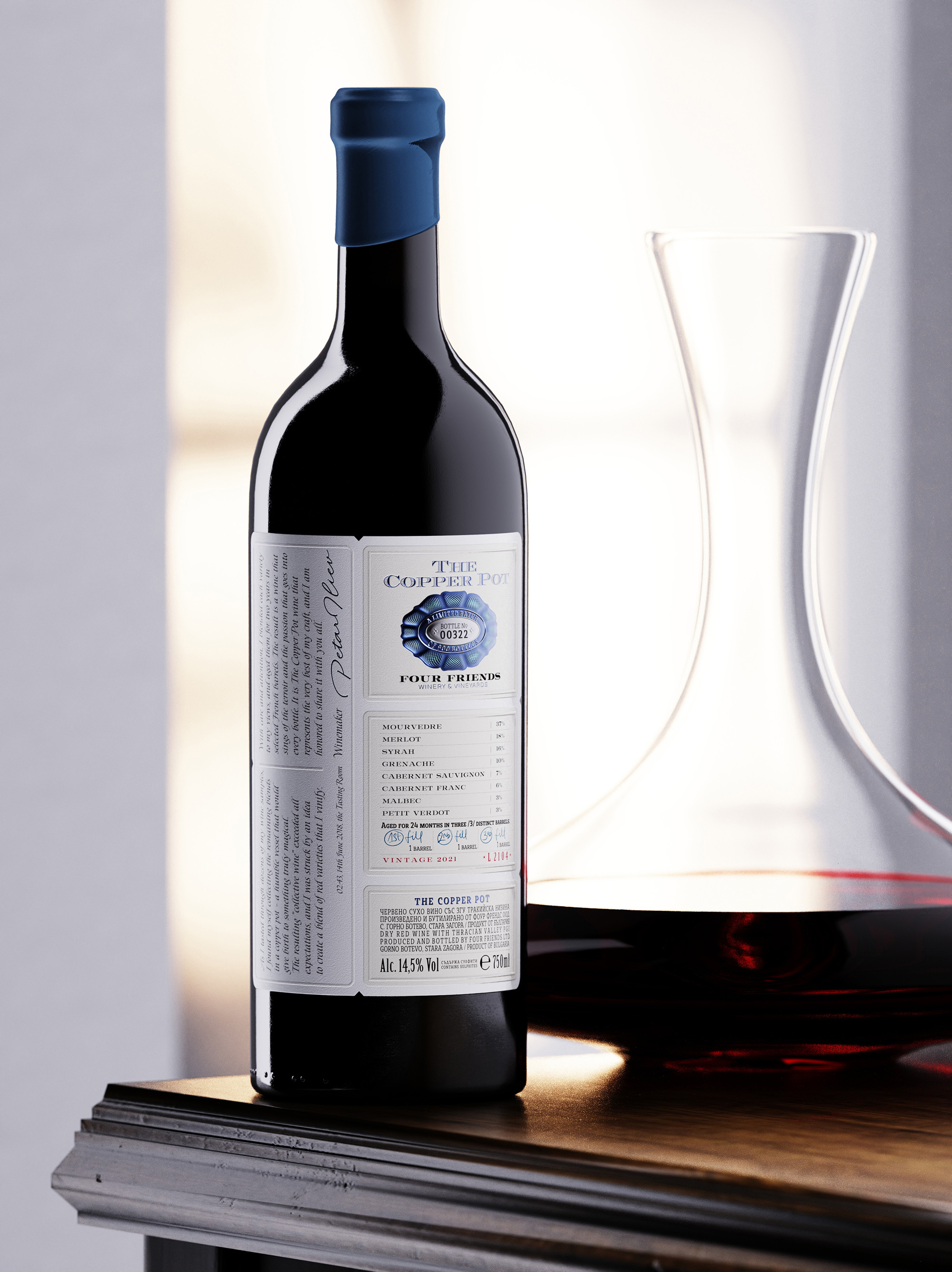
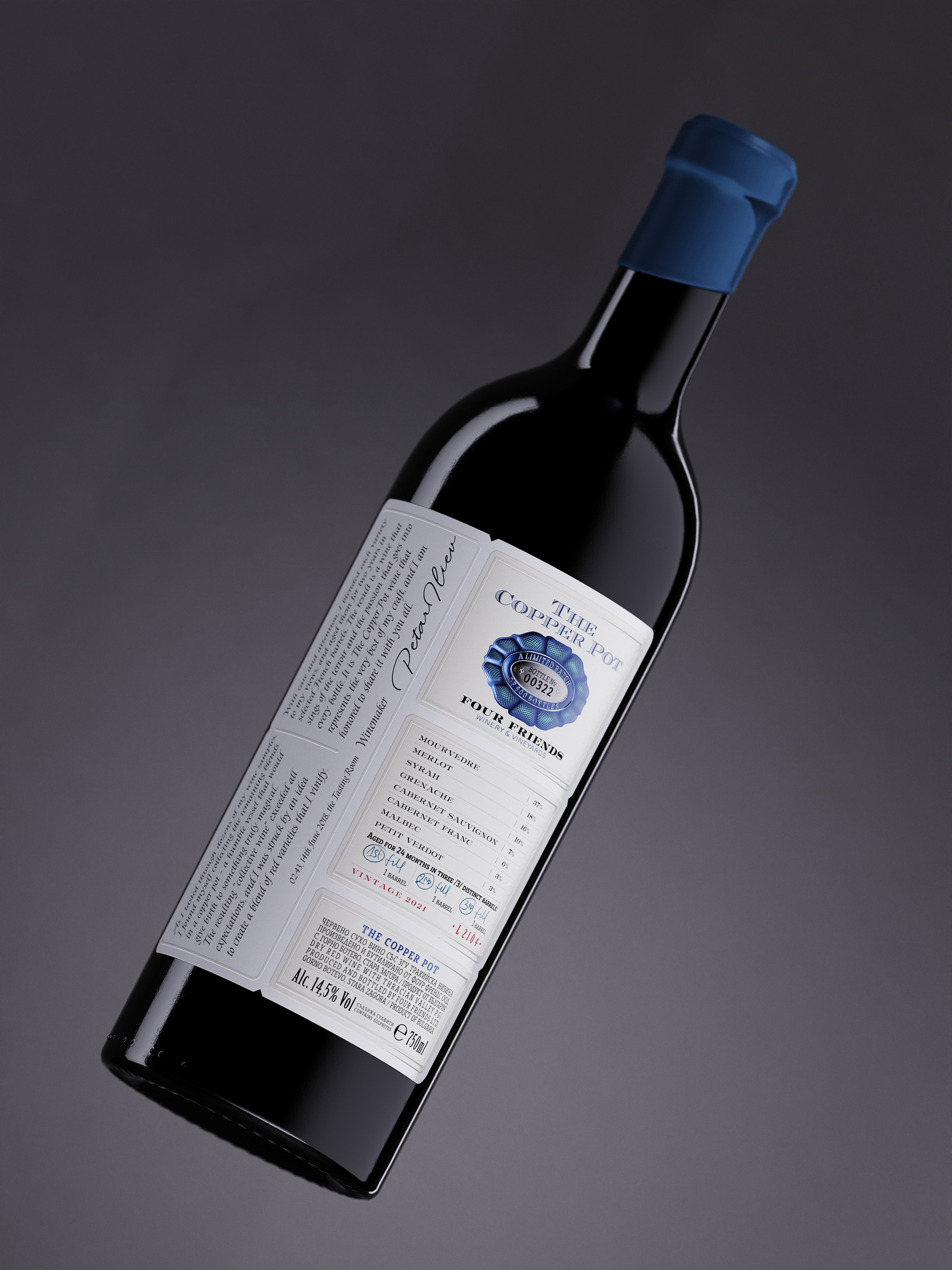
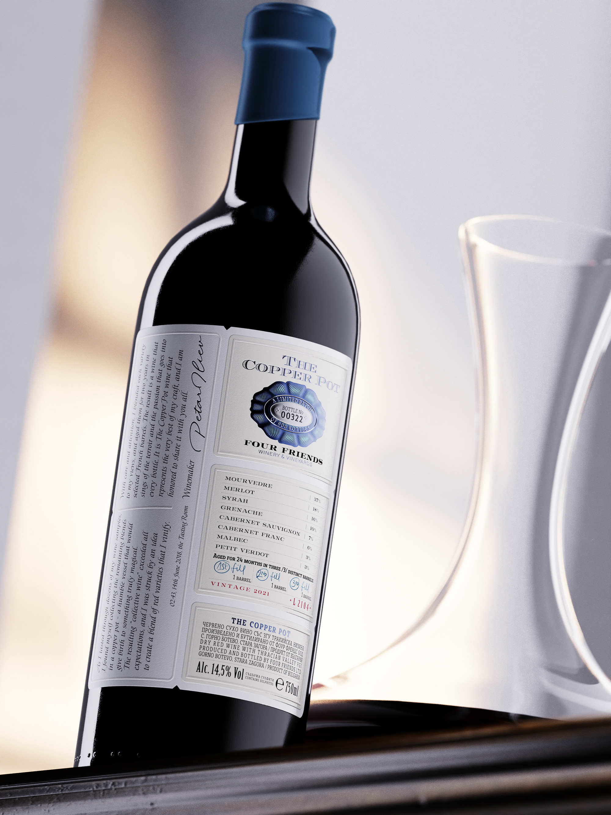
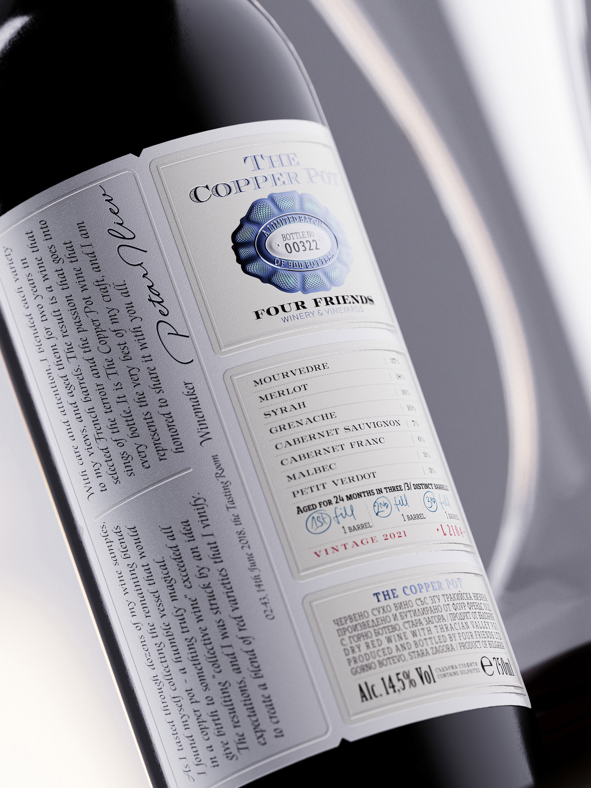
Given the wine’s intricate and multi-dimensional profile, we aimed to create a label design that would reflect its depth and complexity. The result is a multi-layered label concept that mirrors the layered experience of tasting The Copper Pot. The label is crafted using three different types of paper stock fused into one expansive design—a tribute to the multiple layers found both in the wine’s taste and the dedication of its makers.
The main label structure is created with two distinct types of cotton paper—snow white and pale creamy—carefully chosen to represent the wine’s premium quality. The snow-white paper features a romantic text by winemaker Peter Iliev, while the pale creamy paper contains the technical details of the wine, balancing poetic expression with informative clarity.
Top Layer:
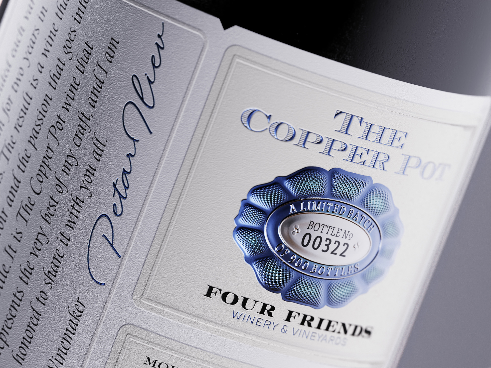
The topmost layer of the label is an intricately designed piece made from special metal foil, featuring 3D embossing and custom numbering. This detail emphasizes the exclusivity of The Copper Pot, as each wine is individually numbered—only 900 bottles are produced for each vintage. The custom numbering not only marks the uniqueness of every piece but also reinforces the brand’s dedication to quality and exclusivity.
Influences and Inspirations:
The design of The Copper Pot label draws inspiration from the refined elegance of 18th and 19th-century banknote and bond designs. This influence is particularly evident in the micro-engraved Guilloché texture on the metal foil label, a classic technique that adds depth and complexity. The label design successfully marries timeless elements with a modern aesthetic, resulting in a design that is both sophisticated and contemporary.
Print Challenges and Successes:
The label is printed by Dagaprint, a print house known for its ability to take on bold and innovative challenges. Printing a label that combines three different paper stocks, special metal foil, 3D embossing, and custom numbering was no small feat. The expertise and commitment of Dagaprint were crucial in bringing this complex design to life, ensuring that every detail—from the delicate texture of the cotton paper to the shimmering foil—was executed to perfection.
Favorite Details:
Among the many features that make The Copper Pot label truly remarkable is the tactile sensation provided by the cotton papers used in the design. The use of two different shades of cotton paper adds a luxurious feel, aligning perfectly with the premium nature of the wine. The custom metal foil layer, with its 3D embossing and Guilloché texture, adds an additional layer of refinement and exclusivity. The custom numbering for each bottle not only speaks to the wine’s limited production but also makes each bottle a coveted collector’s item.
Conclusion:
The Copper Pot wine, from its inception to its final presentation, is a celebration of the art of winemaking and design. Every element—from the expertly blended varieties of grapes to the meticulously layered label—is a reflection of the careful attention to detail and passion that Peter Iliev and his team at Four Friends pour into every bottle. The label, with its combination of classic and modern elements, ensures that The Copper Pot stands out on the shelf and resonates with wine enthusiasts who appreciate the story behind the bottle as much as the wine within. This wine is not just a drink—it is an experience, an exploration of taste, history, and craftsmanship.
CREDIT
- Agency/Creative: the Labelmaker
- Article Title: The Labelmaker Captured The Copper Pot’s Elegance with a Sophisticated Label Design
- Organisation/Entity: Agency
- Project Type: Packaging
- Project Status: Published
- Agency/Creative Country: Bulgaria
- Agency/Creative City: Varna
- Market Region: Europe
- Project Deliverables: Brand Naming, CGI, Graphic Design, Label Design, Packaging Design
- Format: Bottle
- Industry: Food/Beverage
- Keywords: thelabelmaker, dagaprint, thecopperpot, fourfriendswinery, winelabeldesign, winedesign, winelabelart, winelabelinspiration, embossedwinelabel, metalwinelabel, debossedwinelabel, winelabelprinting, fusedlabel, labeloverlabel, foiledlabel
-
Credits:
Design & CGI: the Labelmaker


