


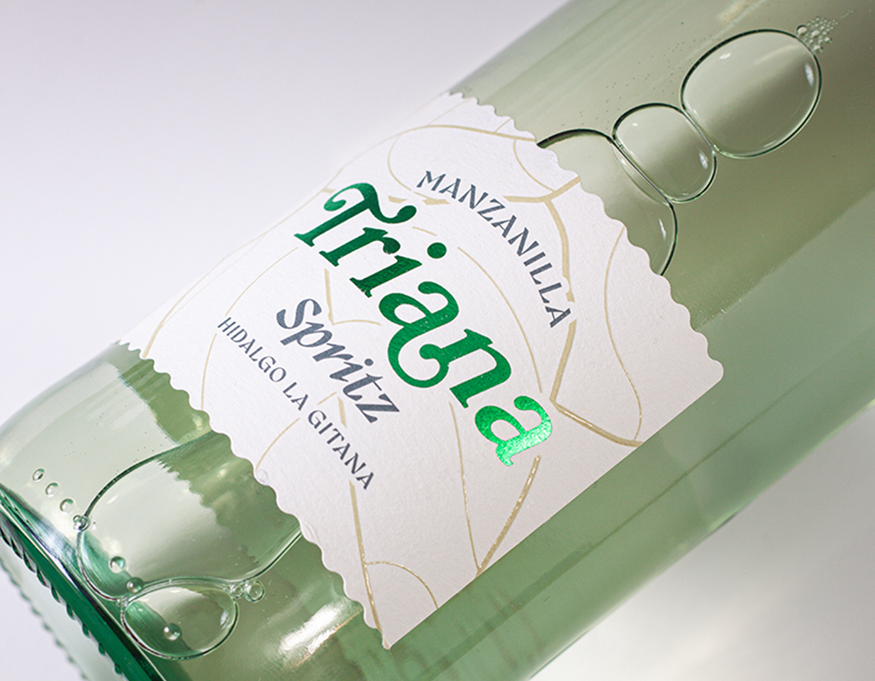
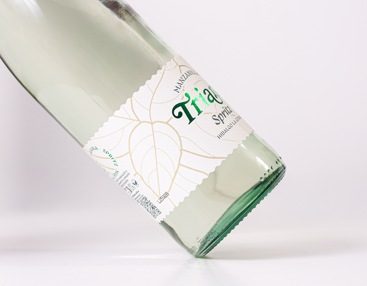
For Manzanilla Triana Spritz, natural freshness is the central pillar that defines its essence. Spearmint, a key ingredient, not only provides a refreshing and vibrant character but also infuses a distinctive energy that is sought to be conveyed in every detail. The inspiration for the label design comes from nature itself: the intricate veins of spearmint leaves, with their unique pattern, are compared to fingerprints, symbolizing the authenticity and uniqueness inherent in nature. This analogy underscores the brand’s commitment to authenticity and organic products.
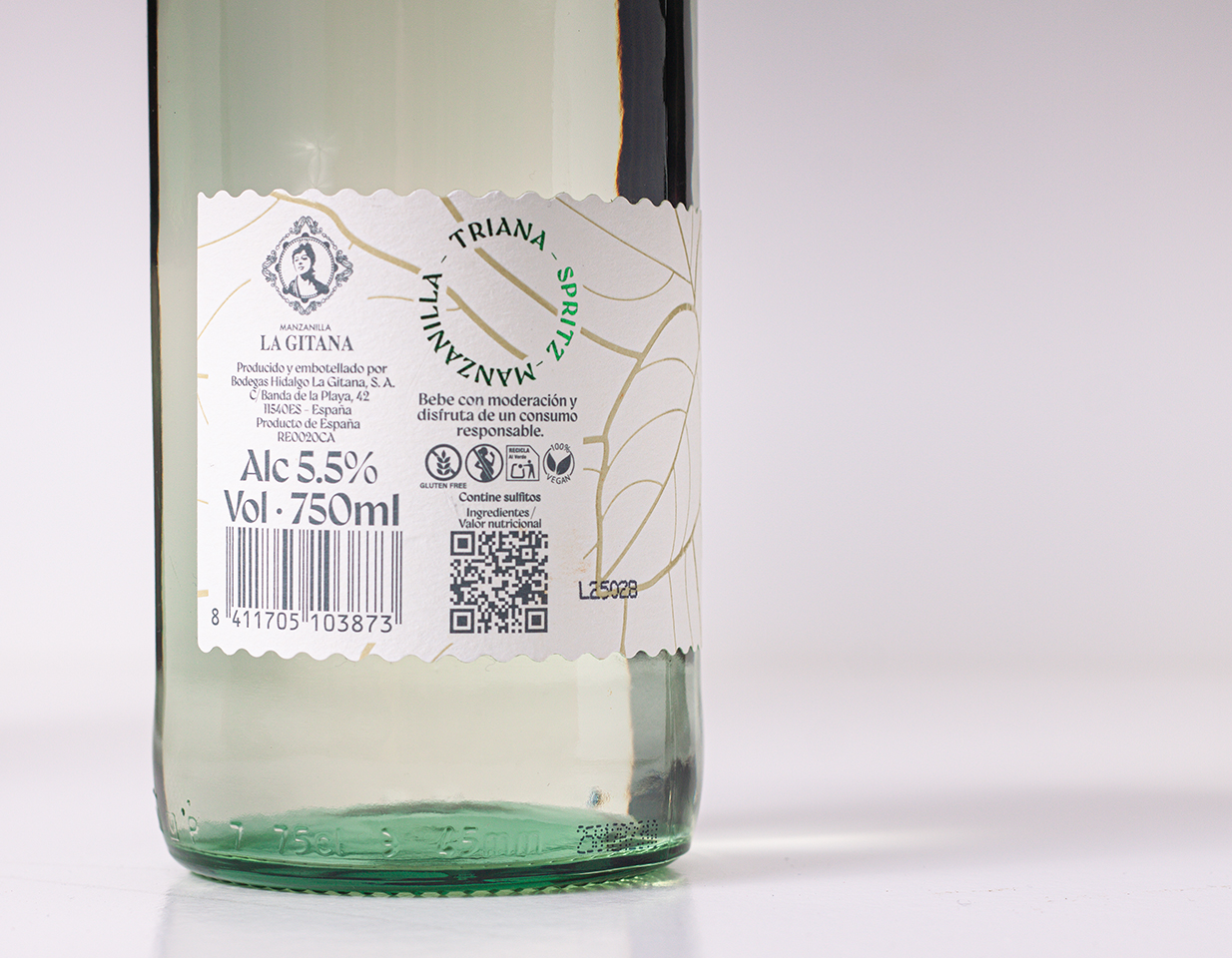
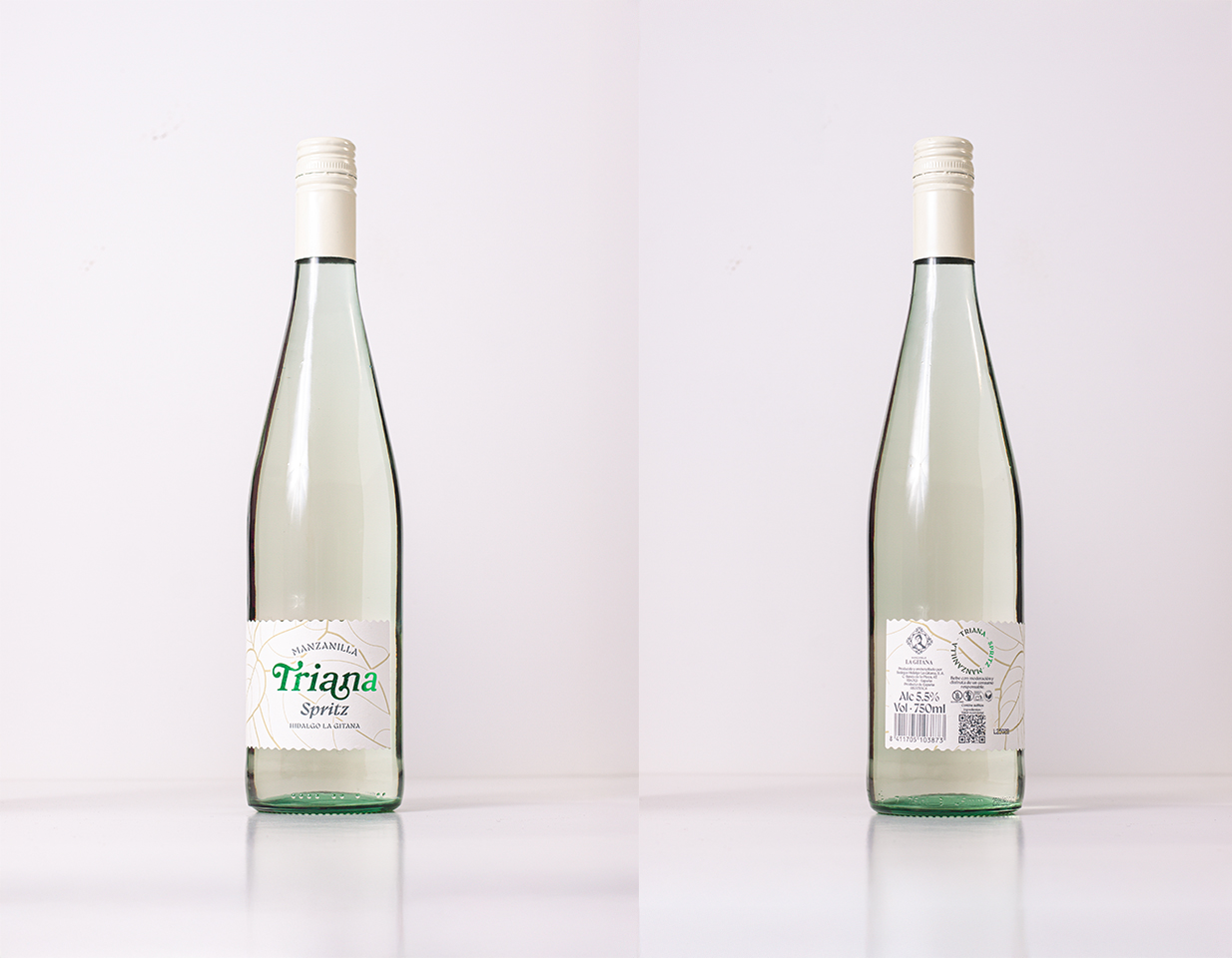
The main color chosen for the visual identity is a deep green, evoking the vitality of spearmint and the freshness of the spritz. This green is enhanced with an elegant stamping of the brand name, creating a subtle yet striking contrast that captures attention. The label is conceived as an extension of the product’s artisanal character. It will be printed on cream-colored recycled paper, selected for its rough, tactile texture, which invites the consumer to interact with it and reinforces the perception of a product made with care. This choice is not only a nod to sustainability but also adds a sensorial dimension to the packaging.
The label’s zigzagging die-cut is not an arbitrary aesthetic decision; its irregular and dynamic shape seeks to evoke the freshness and natural movement of mint leaves swaying in the breeze. This seemingly minor detail contributes significantly to the brand’s visual narrative, communicating lightness and liveliness.
Regarding the typography, a careful selection has been made to balance tradition with modernity. For the logo, Bookman was chosen, a typeface with character and legibility, conveying a sense of groundedness and timeless quality. For the descriptive texts, Gyst will be used, a font that complements Bookman with its contemporary and clear aesthetic, ensuring that the information is easily accessible to the consumer. The label layout adopts a flag format, with the text positioned on the left. This deliberately asymmetrical layout seeks to break with the conventional order and homogeneity of labels on store shelves, generating a unique and memorable visual proposition that stands out from the competition.
The label’s final finish incorporates high-quality elements that elevate its perception and add a touch of sophistication. In addition to the green stamping on the name, translucent screen-printed details will be applied to replicate the veins of mint leaves. This technique allows the veins to be subtly perceived through the paper, adding depth and a layer of realism to the design, almost as if the leaves were present on the label. This interplay of transparencies and textures not only beautifies the packaging but also reinforces the product’s intrinsic connection with nature and its star ingredient, mint, inviting the consumer to a complete and differentiated sensorial experience. The result is a label that not only informs but also evokes, seduces, and connects with the pure and refreshing essence of Manzanilla Triana Spritz.
CREDIT
- Agency/Creative: Interletraje®
- Article Title: The Label for Manzanilla Triana Spritz by Interletraje Transforms Mint Into a Visual Signature
- Organisation/Entity: Agency
- Project Type: Packaging
- Project Status: Published
- Agency/Creative Country: Spain
- Agency/Creative City: Sevilla
- Market Region: Europe
- Project Deliverables: Packaging Design
- Format: Bottle
- Industry: Food/Beverage
- Keywords: Packaging, Design, Wine, Spain
-
Credits:
Packaging: Manzanilla Triana Spritz


