


The Kelsey, a pioneering California based housing organization, has launched a new brand identity that signals its disability-inclusive approach to housing and its community partnerships. Created in collaboration with San Francisco design studio Landscape, the new identity supports The Kelsey’s mission in an emotional and beautiful way.
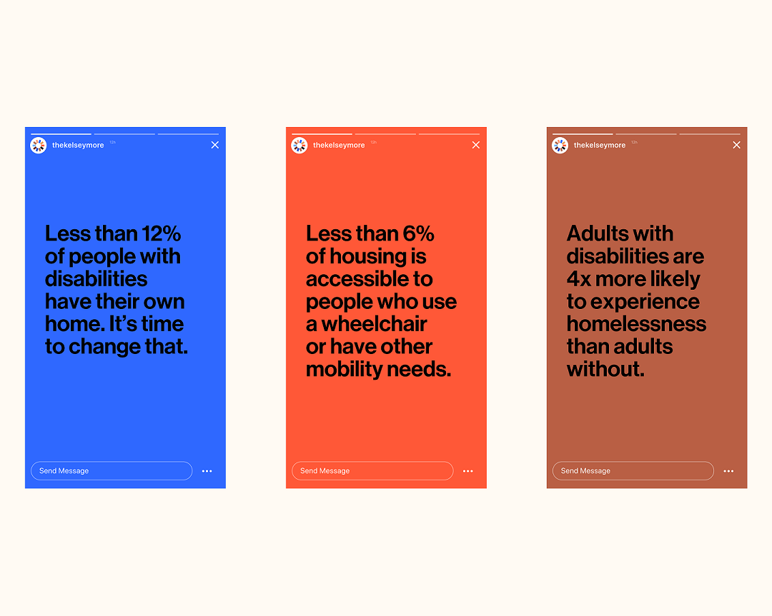
The Kelsey is a non-profit that centers on the lived experience of people with disabilities to innovate multifamily housing that is affordable and inclusive, starting with a 240+ home pipeline in one of the nation’s toughest housing markets. Working closely with community leaders, investors, developers and policymakers, it has made significant progress towards building a nationally scalable solution that blends public and private funding sources. The organization is currently advancing a housing pipeline worth over $180 million, having worked with nearly 1,000 community partners on creating new solutions.
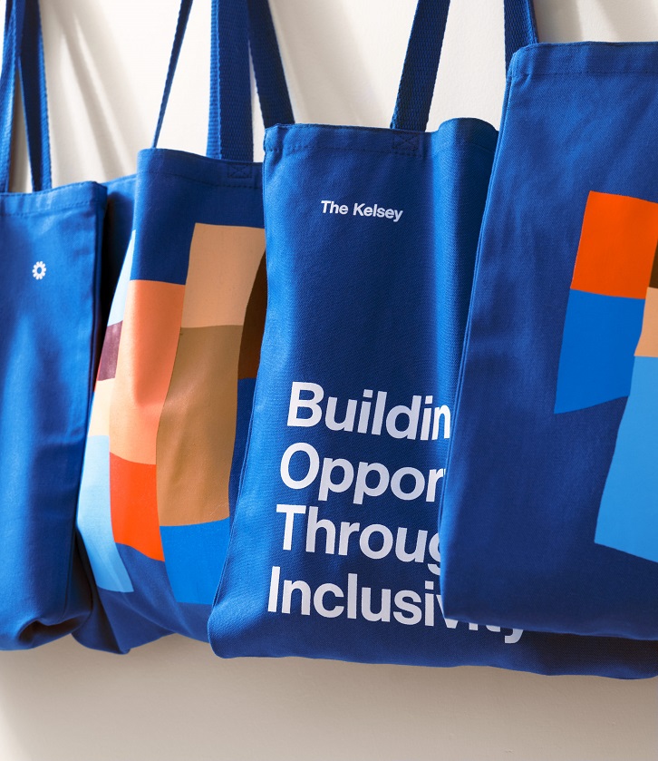
Supporting scale: The new identity needed to signal the organisation’s progress and engage a broad set of potential partners. Centered around the idea of ‘building opportunity through inclusivity’, it grounds The Kelsey’s work in creating opportunity that benefits people of all backgrounds, including people with disabilities. It reinforces the drive, attention to detail, scale and seriousness of the organization’s work. It positions The Kelsey as an innovative and credible organization that brings together diverse communities, funders, and policymakers for positive change.
“Our new identity reinforces The Kelsey’s mission to advance disability-forward, innovative, thoughtfully designed housing solutions,” says Micaela Connery, Co-founder and CEO of The Kelsey. “It now reflects all the impactful work underway at The Kelsey, the community that we serve, and the growth that we’ve experienced since our launch in 2018. Landscape dug into our mission, examined our impact to date, and talked to all our partners and allies to design a brand that reflects where we are today and where we’re going in the future.”
Reinforcing inclusion and design thinking: The brand identity supports the balance of high-level design thinking, business acumen, empathy, and energy that The Kelsey team applies to its projects, work and culture. The Kelsey is driven by a ‘disability-forward’ mindset, recognizing disability-inclusion as a critical component of a thriving society and as an identity that is valued and visible, to create spaces where people of all identities are seen, welcomed and supported.
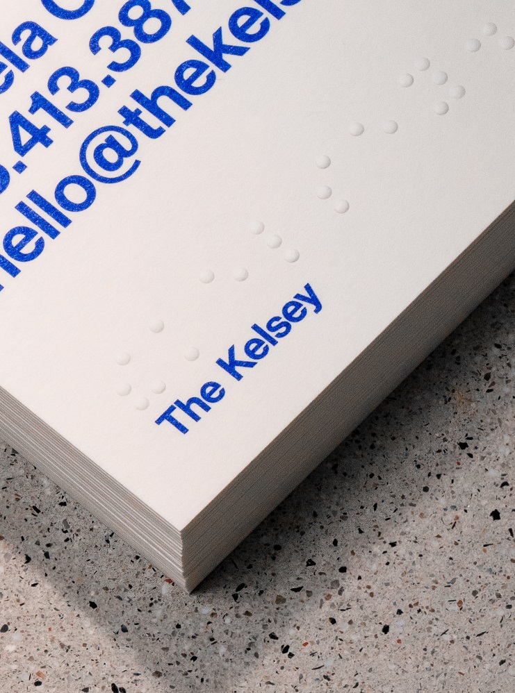
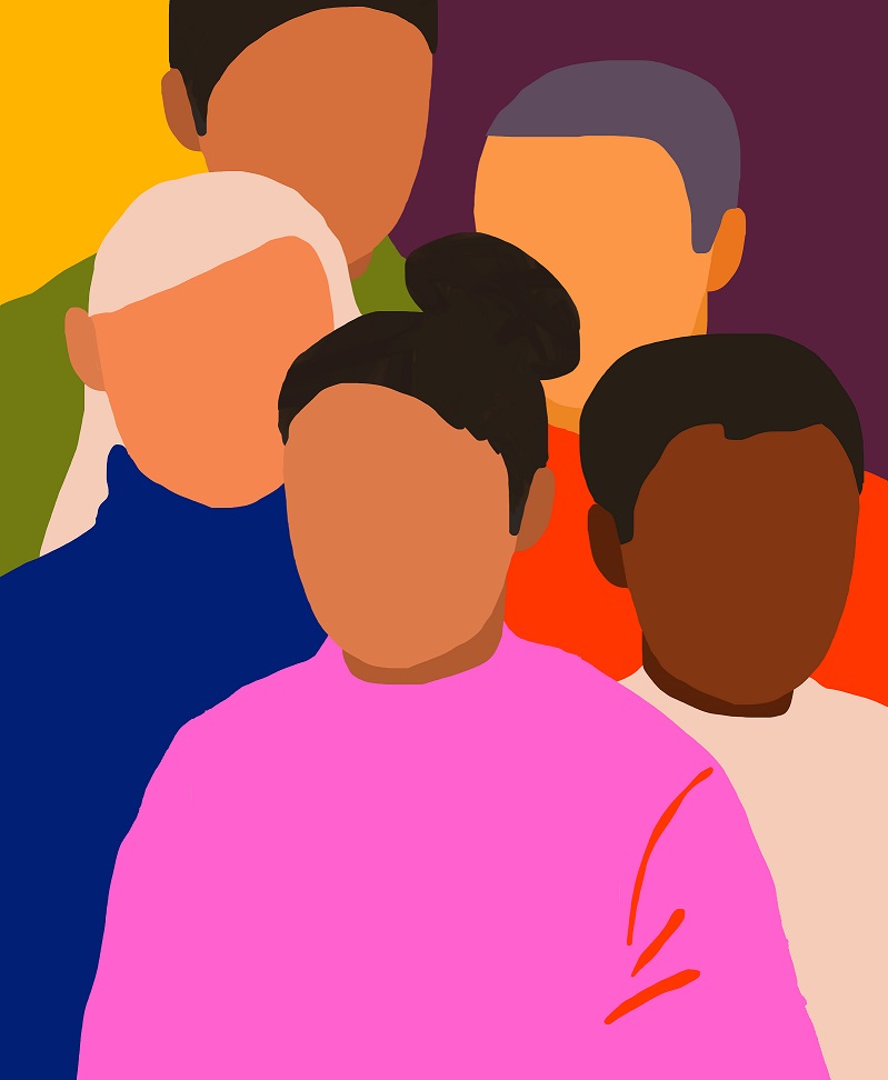
The visual execution reinforces this inclusion through whimsical illustrations, bold, universal typeface selection, and a color palette based on skin tones. It is grounded in vibrant colors reflecting the creative power of diversity and helping The Kelsey to break the visual stereotypes in the non-profit sector, making its mission accessible to a wider audience.
The photography portrays the lived experience of people with disabilities in a genuine way and conveys the power of their ideas, actions and voices.
“Design – which includes language – can play a critical role in making complex social topics accessible to broader audiences,” says Adam Weiss, creative director of Landscape. “But as importantly, good design also makes these topics easier to act on for everyone, inspiring more diverse groups of people to participate in positive social movements or changes. In the case of The Kelsey, designing for inclusivity also meant designing for and with people who have disabilities. Our team worked with disability advocates and external consultants to ensure that the design of the brand and site, from the user experience to colors, images, and words was designed to be as accessible as possible to people with a broad range of abilities.”
“We design buildings that are representative of their community, welcoming to everyone, and best-in-class; our brand should do the same,” adds Micaela Connery. “Too often beauty is dictated and is reserved for the select few, and not inclusive of the communities they serve. We don’t believe that should be the case.”


CREDIT
- Agency/Creative: Landscape
- Article Title: The Kelsey Launches a New Identity by Landscape
- Organisation/Entity: Agency, Published Commercial Design
- Project Type: Identity
- Agency/Creative Country: United States
- Market Region: North America
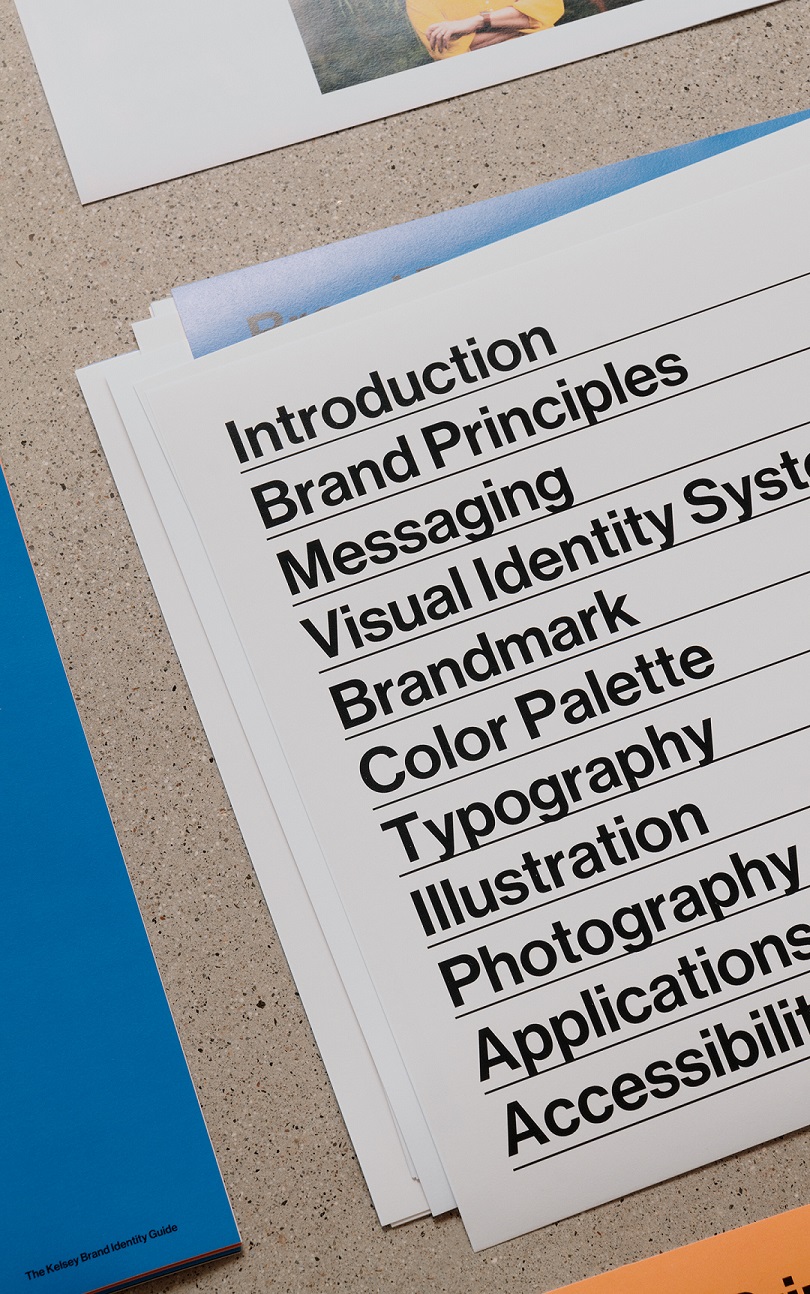
- Project Deliverables: Brand Experience, Brand Identity, Brand Redesign, Brand Strategy, Brand World, Branding, Graphic Design, Illustration, Photography, Rebranding, Research
- Industry: Non-Profit
- Keywords: Branding, design, website, inclusivity, housing


