


CUBA Creative Branding Studio – Frutmotiv
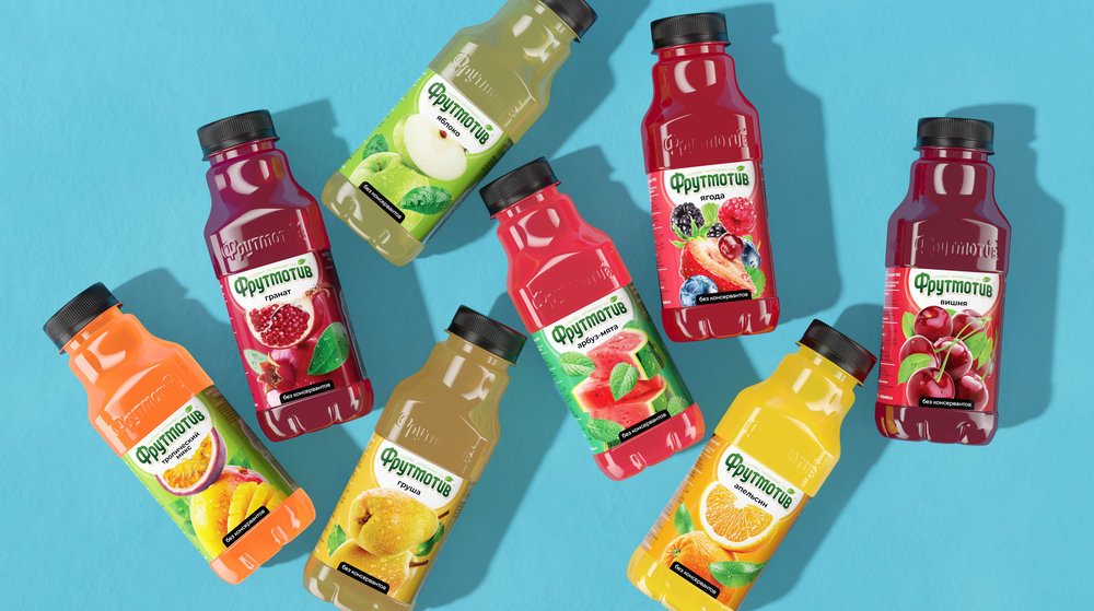
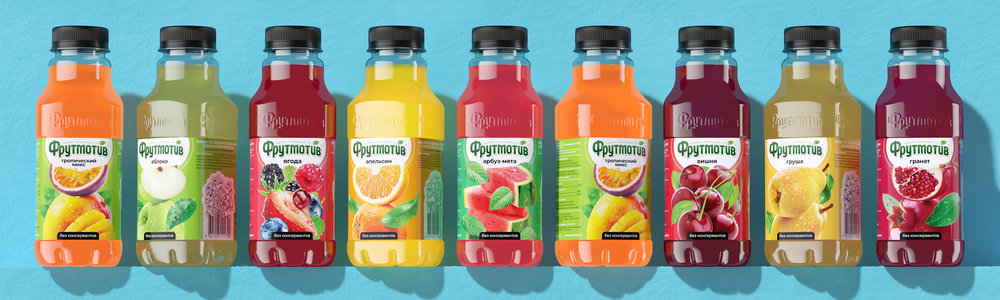
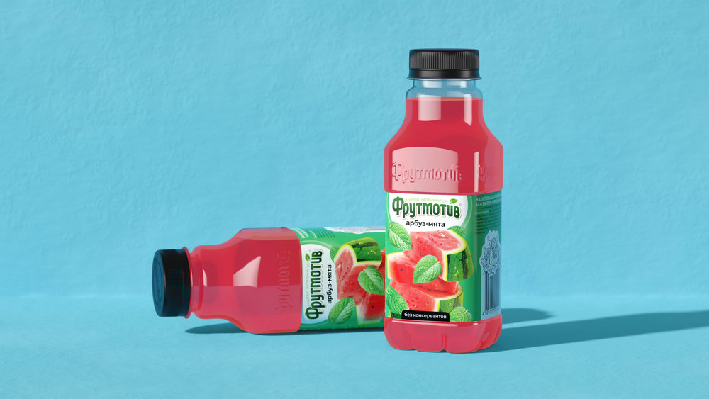
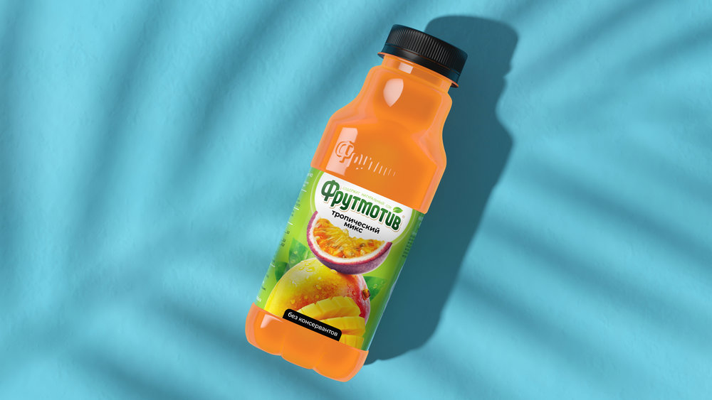
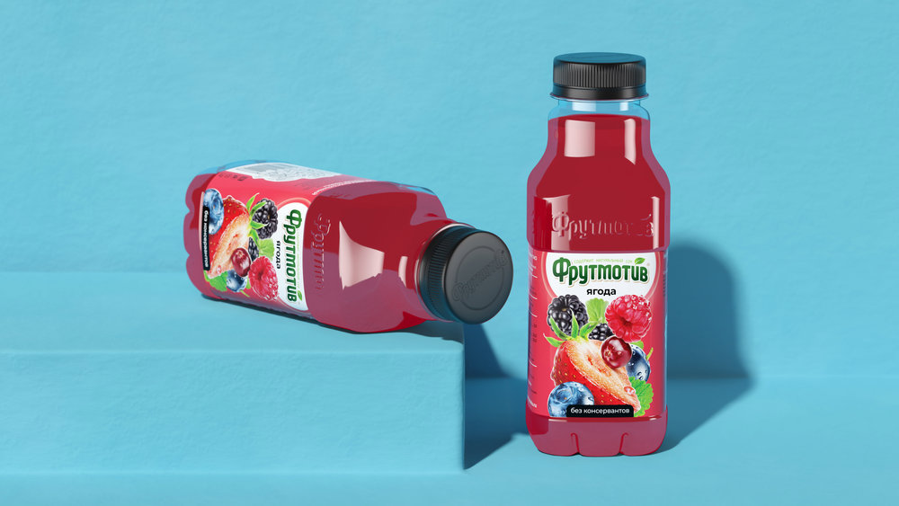
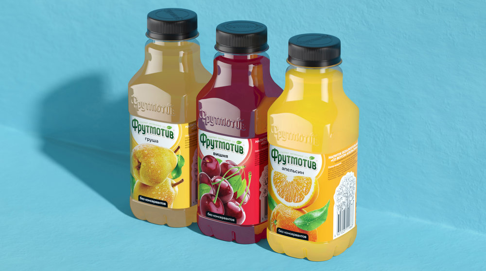
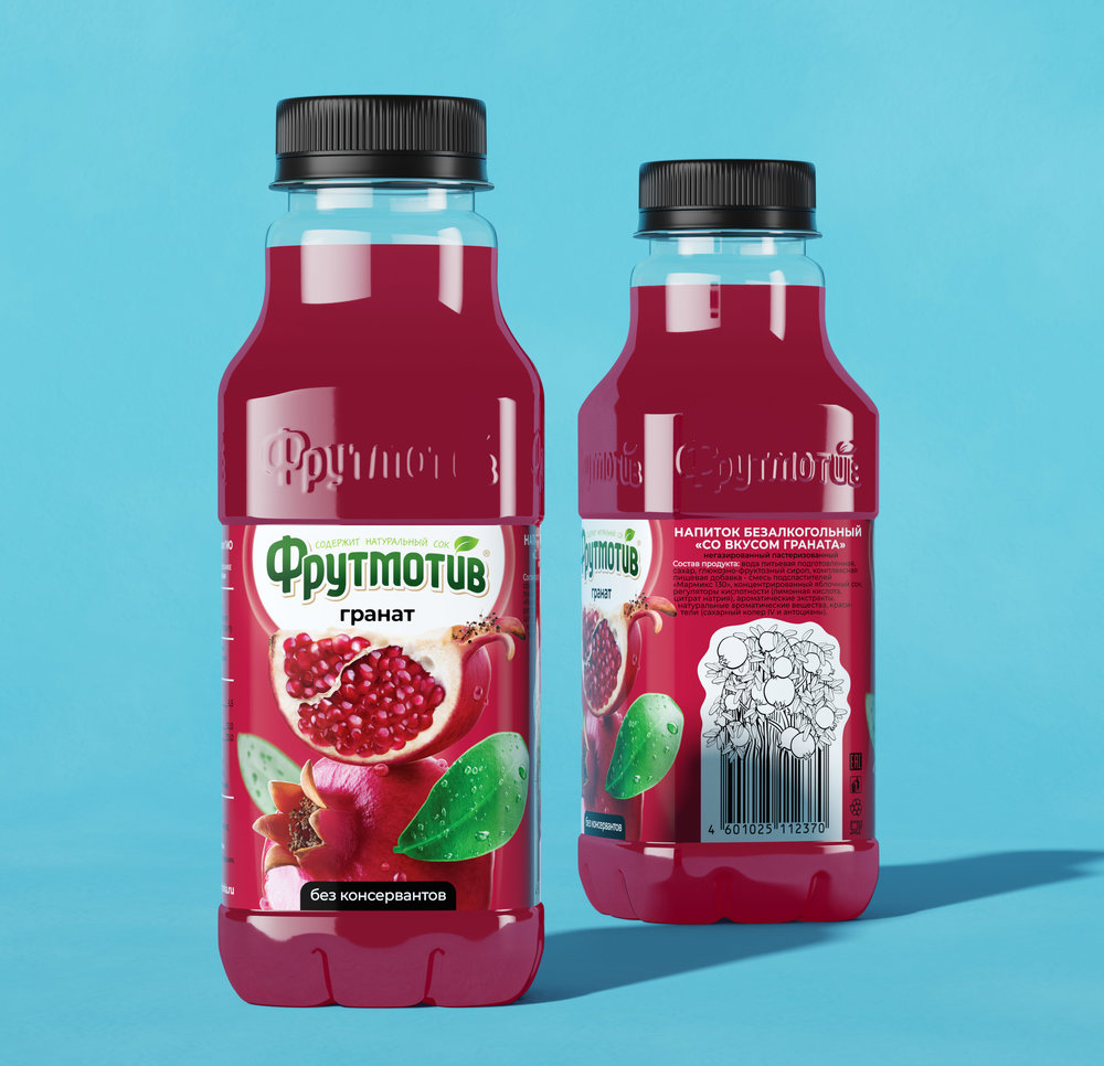
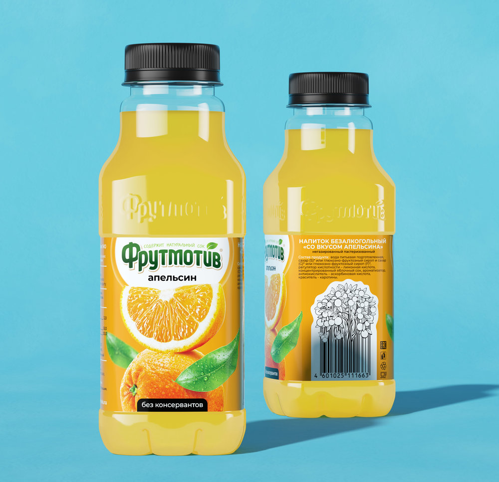
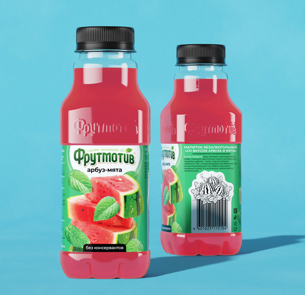
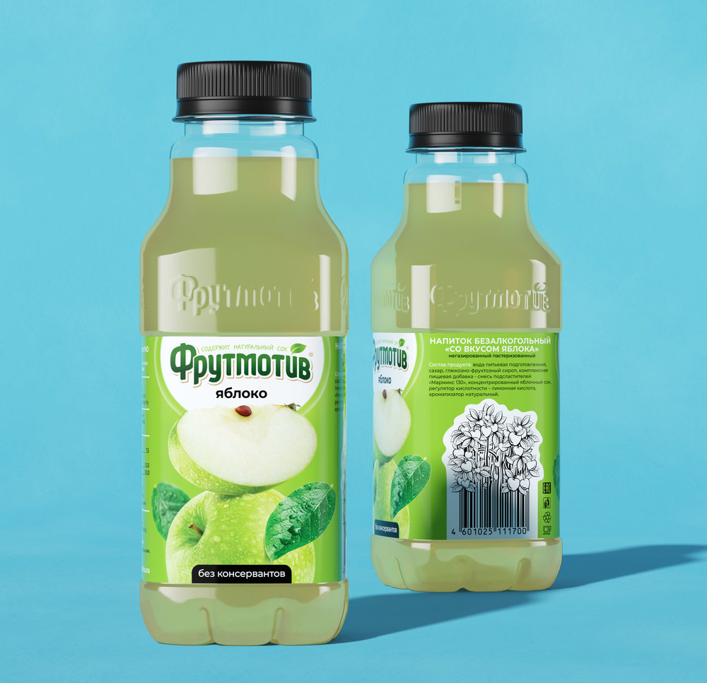
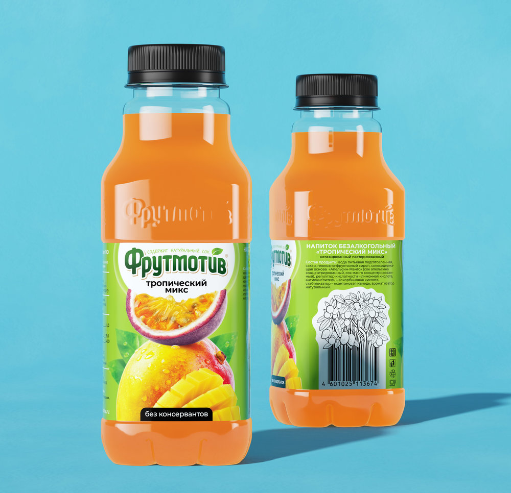
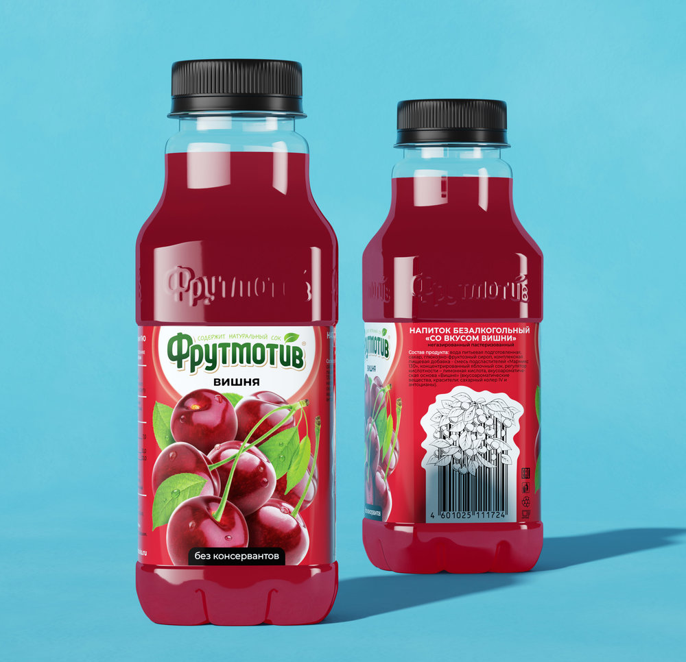
CUBA Creative Branding Studio performed a considerable scheduled brand update for the juice brand “Frutmotiv”. “Frutmotiv” brand was created by CUBA team for “Rosinka”, one of chiefs in soft drinks market in Russia.Launched more than ten years ago, “Frutmotiv” brand acquired a strong position in Russion soft drinks market and leads the ranking of best-selling brands (according to Canadean analytical company investigation). “Frutmotiv” is actually sold by all major retail chains and covers more than 70% of retail trade in Russia.Within the framework of scheduled brand update, we revised a brand strategy, brand core and label design, expanded new product lines and prepared marketing materials for a brand relaunch.

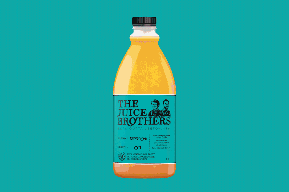
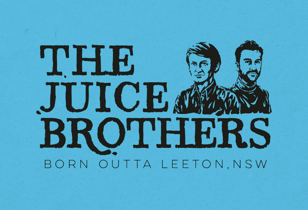
The Edison Agency – The Juice Brothers Brand Creation
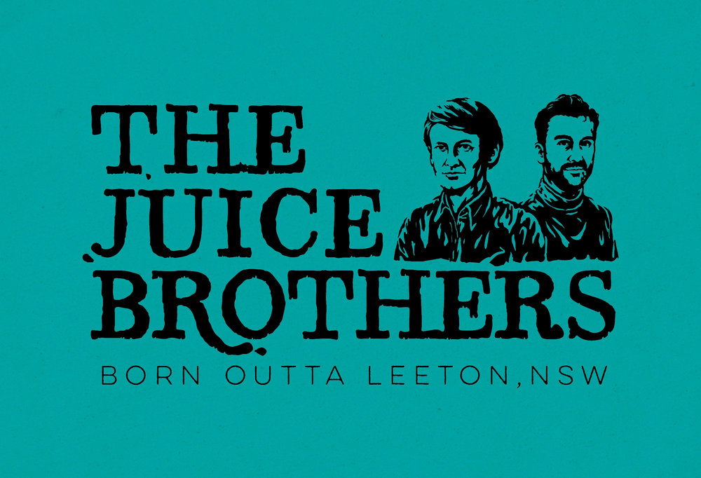
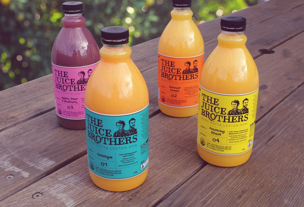
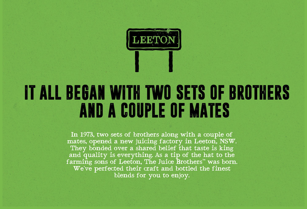
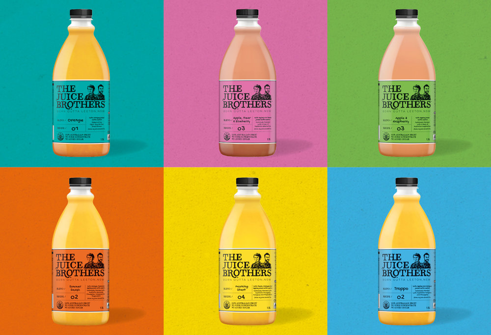
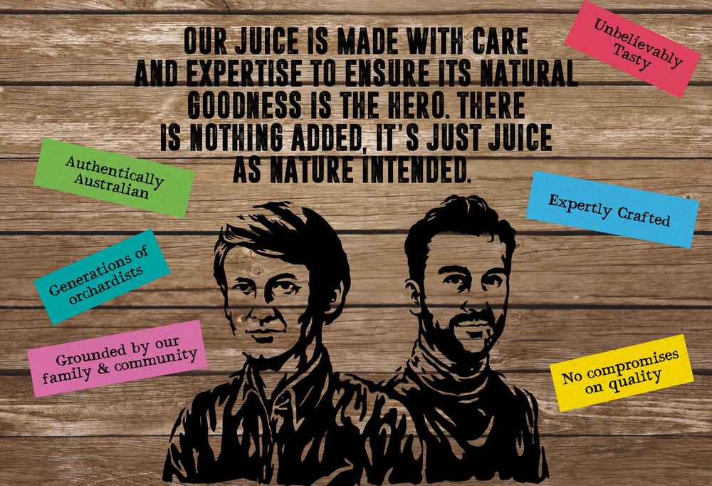
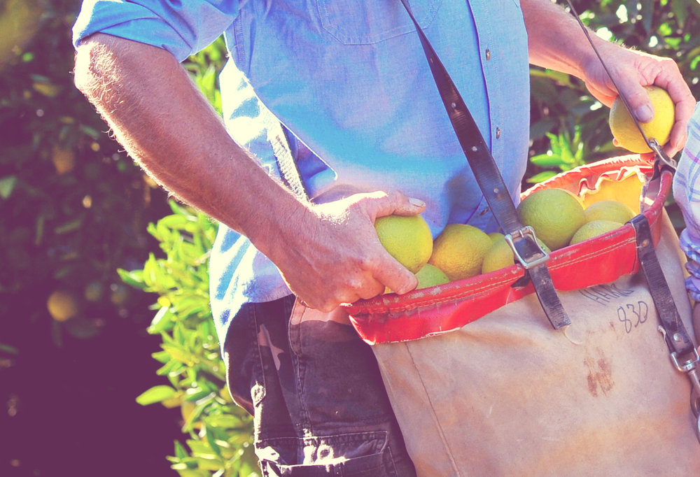
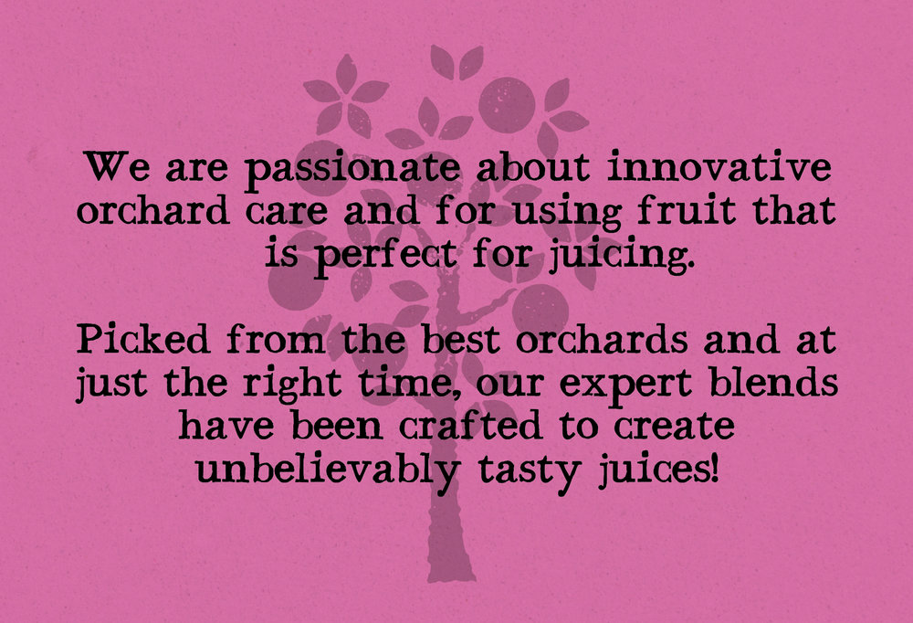
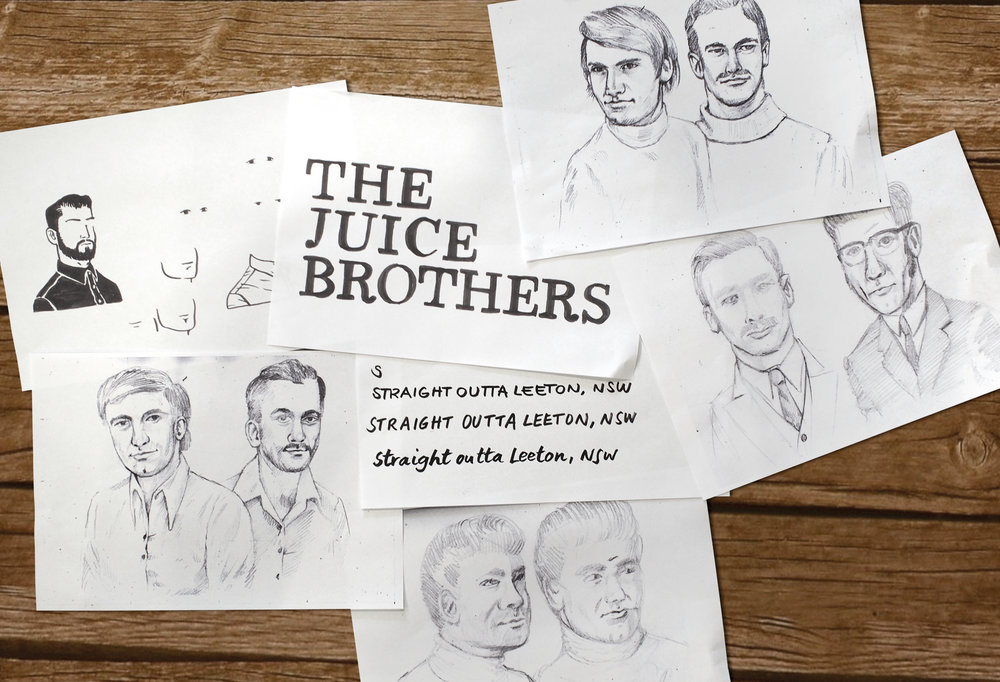
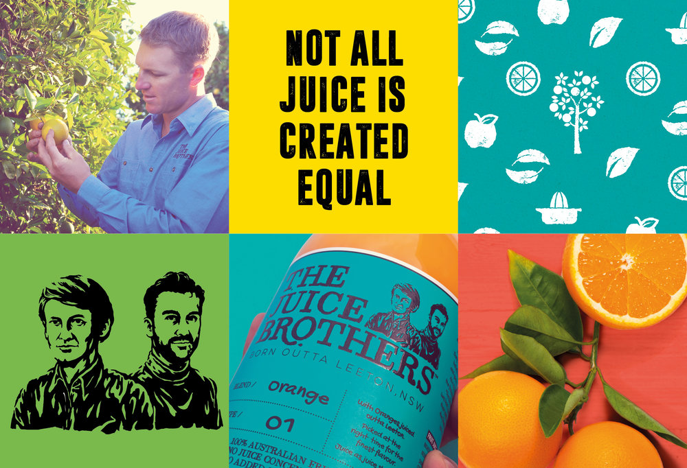
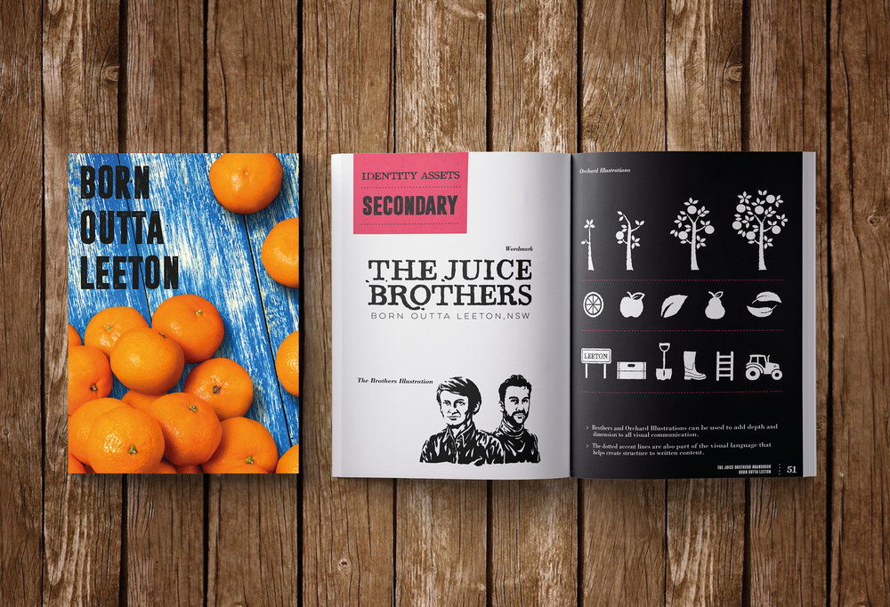
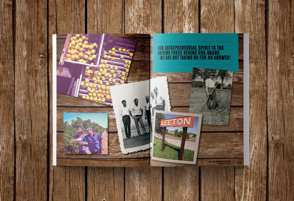
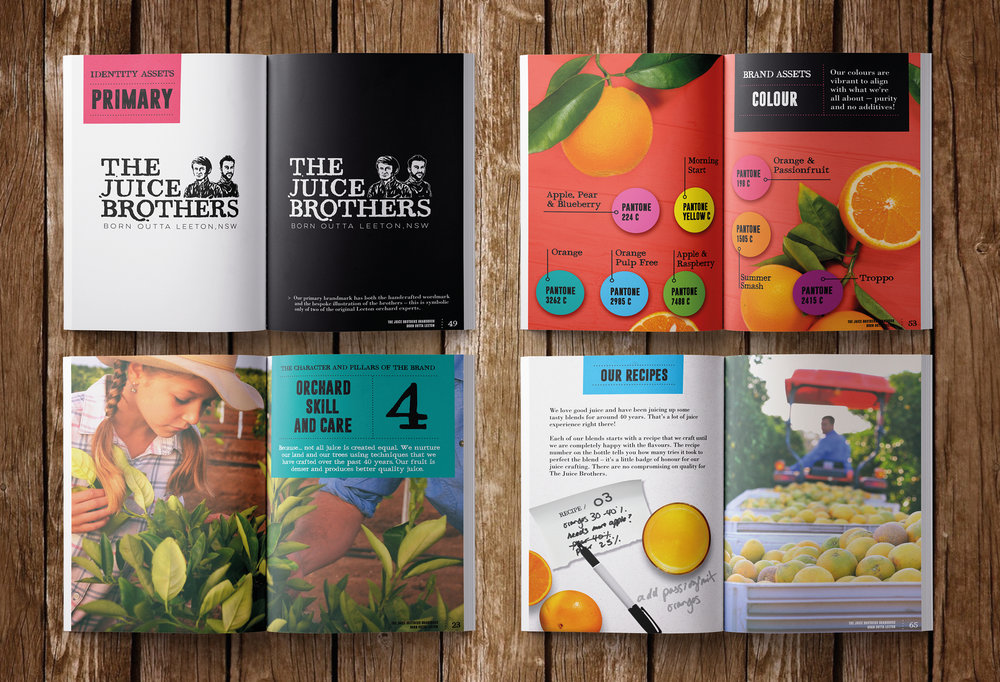
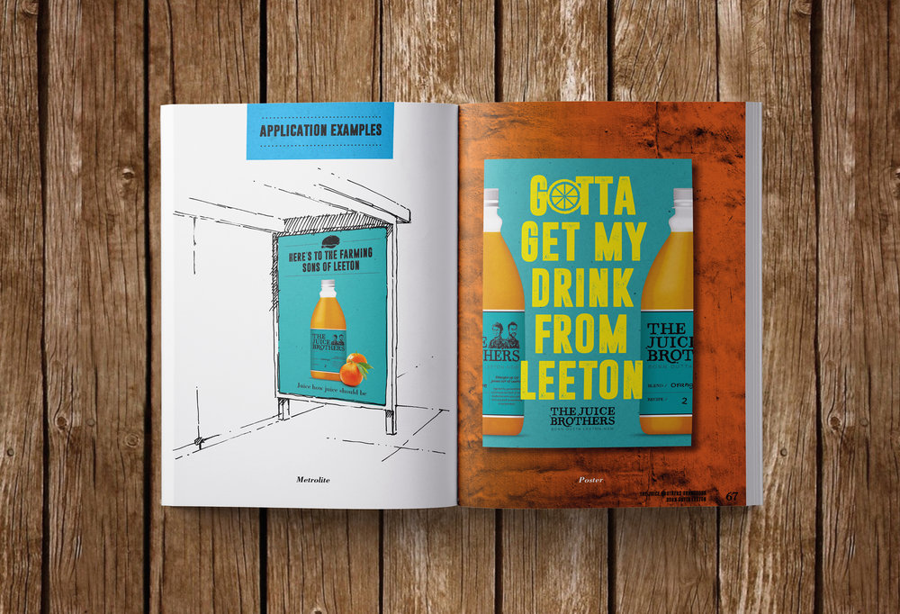
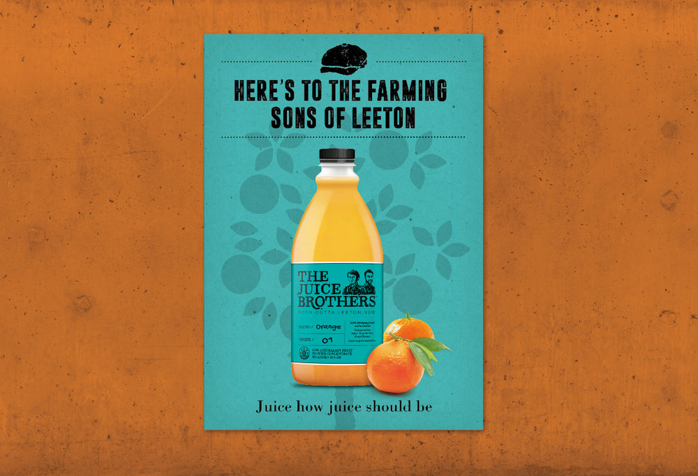
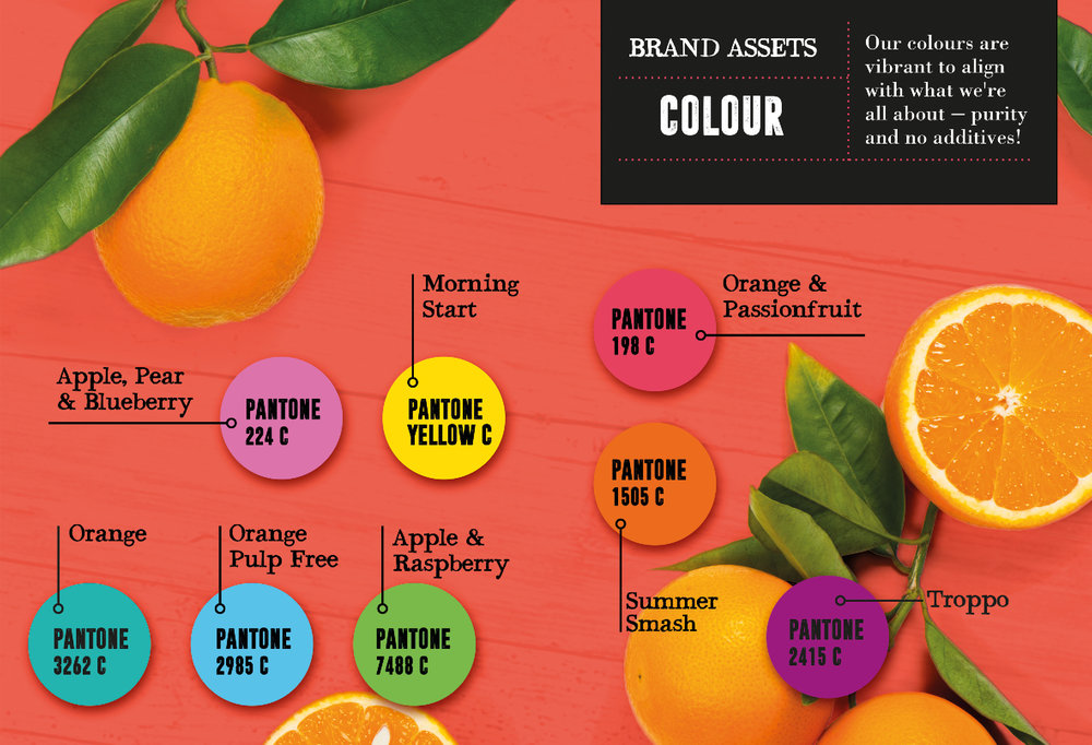
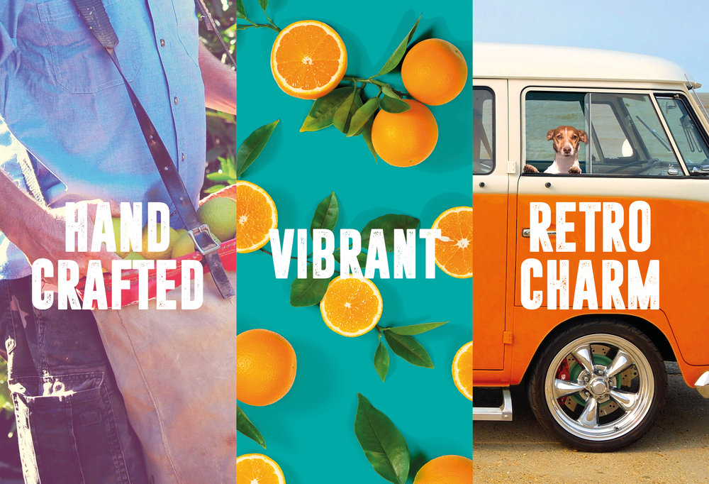
In 1973, two sets of brothers along with a couple of mates, opened a new juicing factory in Leeton, NSW. They bonded over a shared belief that taste is king and quality is everything. As a tip of the hat to the farming sons of Leeton, The Juice BrothersTM was born. The brand has perfected their craft and has bottled the finest blends for consumers to enjoy.In 2017, Lion approached The Edison Agency to develop a new brand that was anchored in a real home-grown story based on the historical story of their juicing factory in Leeton and their generations old ties with local growers in the area. The opportunity to embark on a project that allowed our team to work closely and collaboratively with people in marketing, consumer insights and farming experts meant the creative solution was more raw, authentic and filled with passion.Using our proprietary identity strategy tools we got to the core of what this brand meant and stood for – 100% Aussie fruit, with no juice concentrate and no added sugar, juice as juice should be. The unique Juice Brothers brandmark was commissioned specifically for the brand and inspired by two of the original “Juice Brothers”. The colour palette had guts – bold and disruptive and not following the crowd because hey, who says an orange juice bottle needs to be orange?This juice has attitude. Sure, it’s passionate and perfecting when it comes to juice quality, but it doesn’t take itself too seriously and isn’t’ afraid to be bold and zig when the other juices are zagging. It’s juice, as juice should be: no pretence, 100% Aussie fruit and always will be. The Juice Brothers pays homage to the skill and craft of generations of Leeton farmers because it believes that not all juice is created equal.
CREDIT
- Agency/Creative: The Edison Agency
- Article Title: The Juice Brothers – Not All Juice is Created Equal.
- Organisation/Entity: Agency, Published Commercial Design
- Project Type: Packaging
- Agency/Creative Country: Australia
- Market Region: Oceania
- Format: Bottle
- Substrate: Plastic


