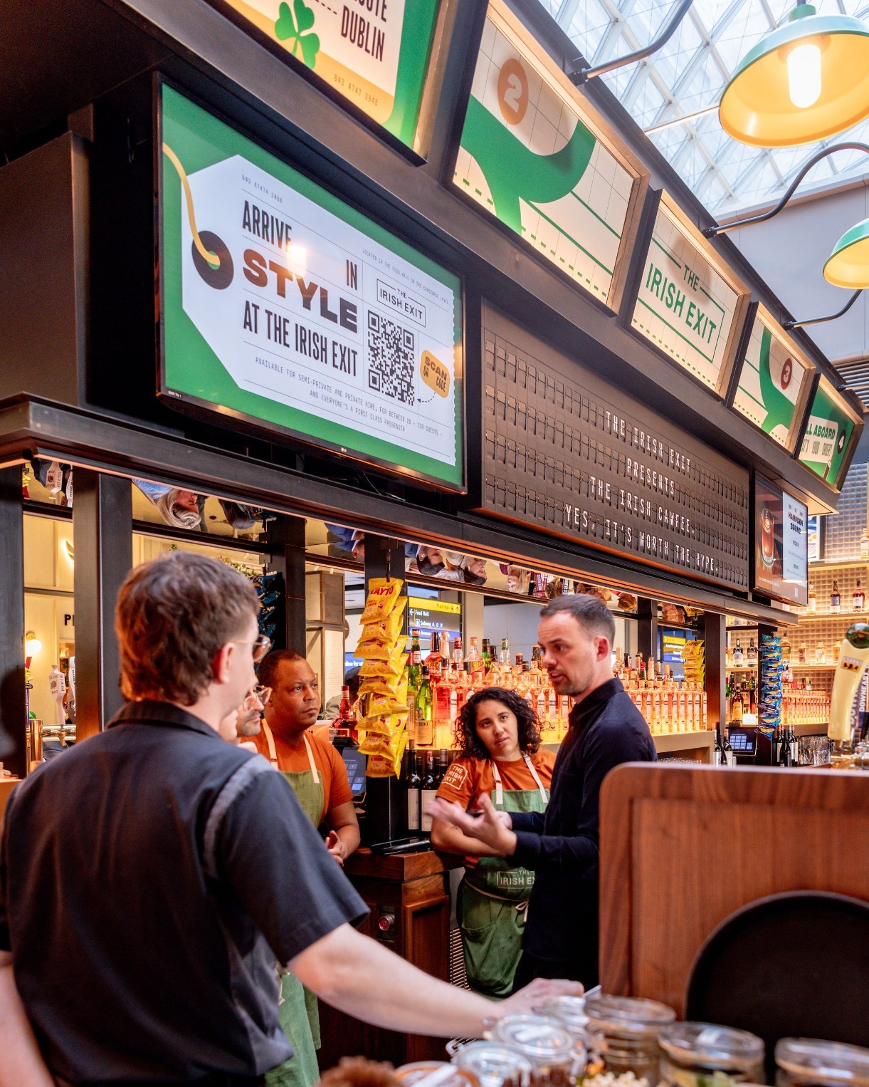
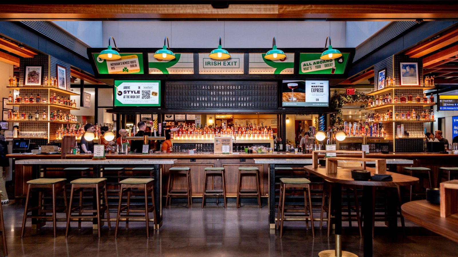
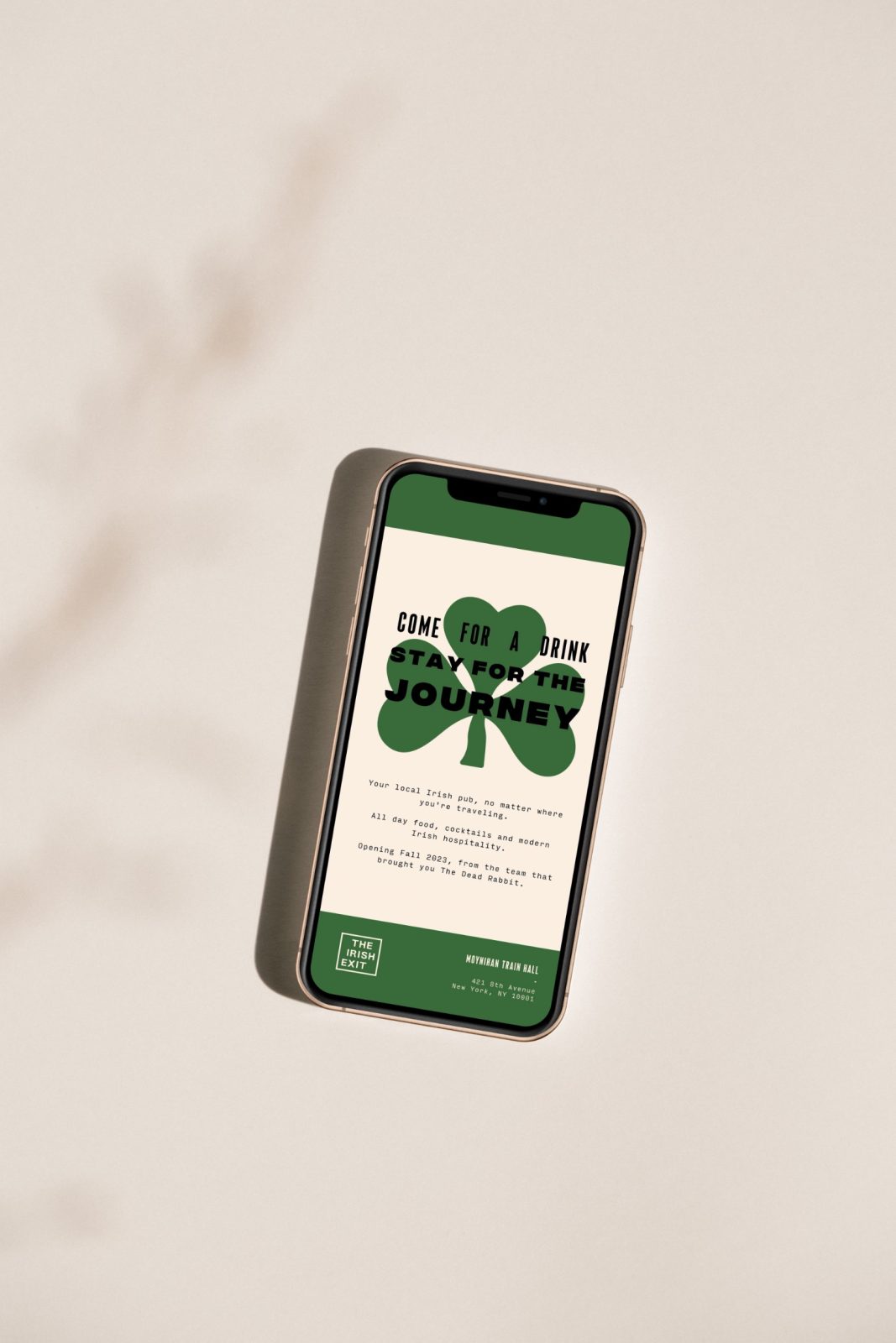
Named after a term used for leaving a party without saying goodbye – The Irish Exit is a beverage-centric destination for guests on the go. The bar carries a spirit that echoes Ireland with a character full of quirk and charisma. As the little sibling of The Dead Rabbit, The Irish Exit is complete with the same quality and expertise guests expect, with the twist of a quick service environment and easy-going personality. Whether in need of an imbibe or a bite on a journey, The Irish Exit welcomes those who stay for a little or a while.
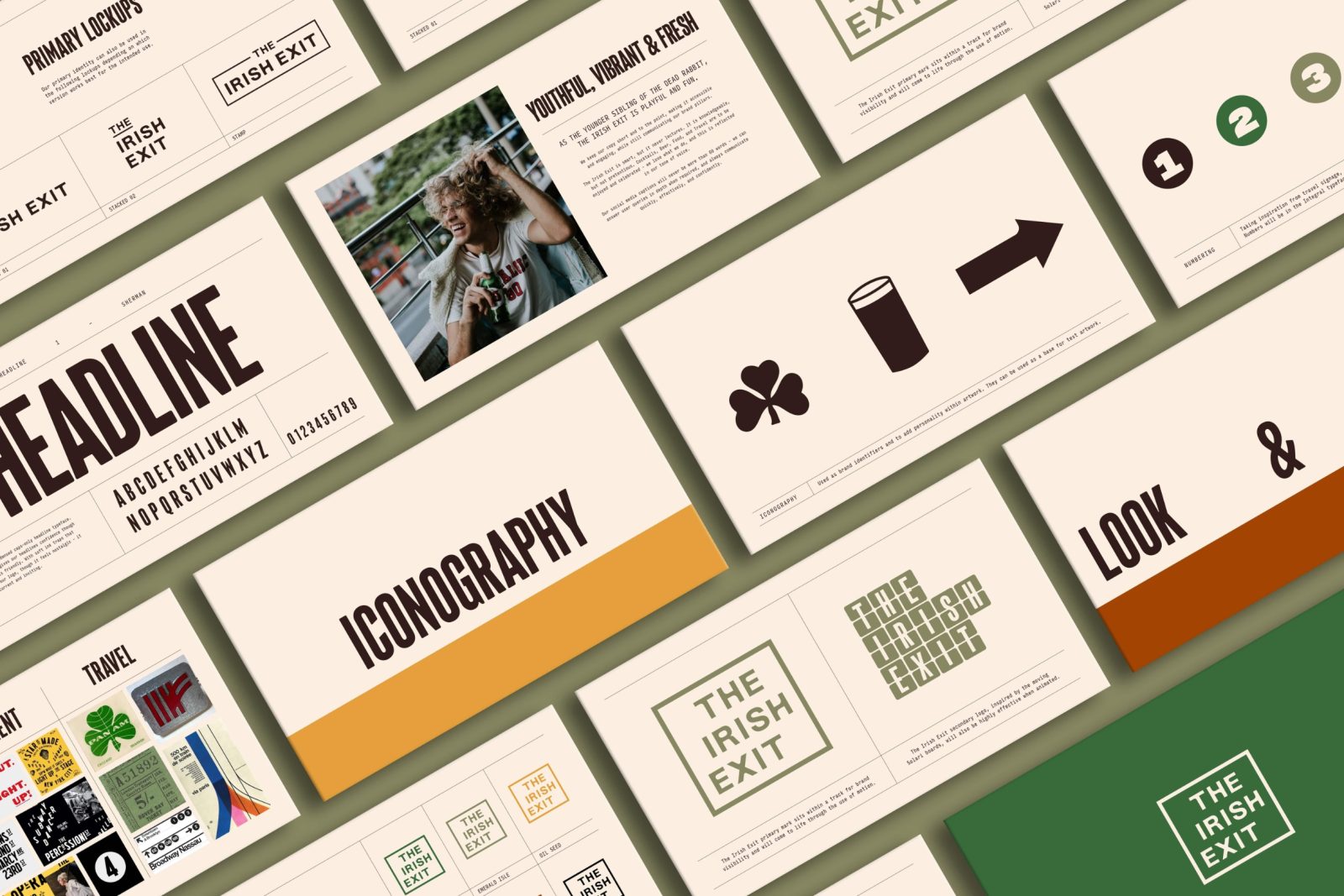
The brand identity is inspired by Ireland’s travel heritage throughout the 20th century, hinting at a romanticism of new destinations and the joy of a journey. Taking inspiration from railway signage, airline branding and road signs, with references to the bar’s first location at Moynihan Station, a custom-made logotype sits within a grid referencing the curves of a railroad track switch. Typography throughout the identity uses a type trio that speaks a quirky personality over the brand with brand language encapsulated in signage shapes. Inspired by the charm of letterpress and mid-century luggage tags, airline tickets and travel posters, typography features a combination of size and weights throughout the visual hierarchy to create a recognisable personality.
The brand colour palette is inspired by the emerald isle, featuring a field green, oilseed yellow, the dark ruby red of Guinness’s true colour and complimentary rust of road signage to capture the distinctly Irish character seen throughout the identity’s messaging and imagery.
As an identity with a digital focus, the brand comes to life through motion on digital screen menus. A complementary analogue clapper board resonates with the brand’s energy, highlighting featured cocktails and menu items with the charm of seeing your next destination on the station board.


CREDIT
- Agency/Creative: Crown Creative
- Article Title: The Irish Exit’s Brand Identity Sparkles with Irish Charm
- Organisation/Entity: Agency
- Project Type: Identity
- Project Status: Published
- Agency/Creative Country: United Kingdom
- Agency/Creative City: Belfast
- Market Region: Europe
- Project Deliverables: Brand Identity
- Industry: Food/Beverage
- Keywords: WBDS Agency Design Awards 2023/24
- Keywords: Identity, Brand Design Creation
-
Credits:
Creative Director: Ryan Crown
Designer: Emma Hetherington
Designer: Rachel Cunning


